CSS3 Gradient渐变效果
最近看到一遍关于渐变的文章,感觉很好,只是收藏感觉太可惜了,就转载了,好好学习!
CSS3 Gradient分为linear-gradient(线性渐变)和radial-gradient(径向渐变)。而我们今天主要是针对线性渐变来剖析其具体的用法。为了更好的应用CSS3 Gradient,我们需要先了解一下目前的几种现代浏览器的内核,主流内容主要有Mozilla(Gecko)(熟悉的有Firefox,Flock等浏览器)、WebKit(熟悉的有Safari、Chrome等浏览器)、Opera(presto)(Opera浏览器)、Trident(讨厌的IE浏览器)。本文照常忽略IE不管,我们主要看看在Mozilla、Webkit、Opera下的应用,当然在IE下也可以实现,他需要通过IE特有的滤镜来实现,在后面会列出滤镜的使用语法,但不会具体介绍如何实用,感兴趣的可以搜索相关技术文档。那我们了解了这些,现在就开始今天的主题吧。
CSS3的线性渐变
一、线性渐变在Mozilla下的应用
语法:
-moz-linear-gradient( [<point> || <angle>,]? <stop>, <stop> [, <stop>]* )
参数:其共有三个参数,第一个参数表示线性渐变的方向,top是从上到下、left是从左到右,如果定义成left top,那就是从左上角到右下角。第二个和第三个参数分别是起点颜色和终点颜色。你还可以在它们之间插入更多的参数,表示多种颜色的渐变。如图所示:

根据上面的介绍,我们先来看一个简单的例子:
HTML:
<div class="example example1"></div>
CSS:
.example {

   width: 150px;

   height: 80px;

 }
(如无特殊说明,我们后面的示例都是应用这一段html和css 的基本代码)
现在我们给这个div应用一个简单的渐变样式:
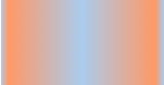
1 .example1 {

2    background: -moz-linear-gradient( top,#ccc,#000);

3 }
效果如下:

注:这个效果暂时只有在Mozilla内核的浏览器下才能正常显示。
二、线性渐变在Webkit下的应用
语法:
-webkit-linear-gradient( [<point> || <angle>,]? <stop>, <stop> [, <stop>]* )//最新发布书写语法

-webkit-gradient(<type>, <point> [, <radius>]?, <point> [, <radius>]? [, <stop>]*) //老式语法书写规则
参数:-webkit-gradient是webkit引擎对渐变的实现参数,一共有五个。第一个参数表示渐变类型(type),可以是linear(线性渐变)或者radial(径向渐变)。第二个参数和第三个参数,都是一对值,分别表示渐变起点和终点。这对值可以用坐标形式表示,也可以用关键值表示,比如 left top(左上角)和left bottom(左下角)。第四个和第五个参数,分别是两个color-stop函数。color-stop函数接受两个参数,第一个表示渐变的位置,0为起点,0.5为中点,1为结束点;第二个表示该点的颜色。如图所示:


我们先来看一个老式的写法示例:
background: -webkit-gradient(linear,center top,center bottom,from(#ccc), to(#000));
效果如下所示
接着我们在来看一下新式的写法:
-webkit-linear-gradient(top,#ccc,#000);
这个效果我就不在贴出来了,大家在浏览器中一看就明白了,他们是否一致的效果。仔细对比,在Mozilla和Webkit下两者的学法都基本上一致了,只是其前缀的区别,当然哪一天他们能统一成一样,对我们来说当然是更好了,那就不用去处理了。将大大节省我们的开发时间哟。
三、线性渐变在Opera下的应用
语法:
-o-linear-gradient([<point> || <angle>,]? <stop>, <stop> [, <stop>]); /* Opera 11.10+ */
参数:-o-linear-gradient有三个参数。第一个参数表示线性渐变的方向,top是从上到下、left是从左到右,如果定义成left top,那就是从左上角到右下角。第二个和第三个参数分别是起点颜色和终点颜色。你还可以在它们之间插入更多的参数,表示多种颜色的渐变。(注:Opera支持的版本有限,本例测试都是在Opera11.1版本下,后面不在提示),如图所示:

示例:
background: -o-linear-gradient(top,#ccc, #000);
效果如图所示
四、线性渐变在Trident (IE)下的应用
语法:
filter: progid:DXImageTransform.Microsoft.gradient(GradientType=0, startColorstr=#1471da, endColorstr=#1C85FB);/*IE<9>*/

-ms-filter: "progid:DXImageTransform.Microsoft.gradient (GradientType=0, startColorstr=#1471da, endColorstr=#1C85FB)";/*IE8+*/
IE依靠滤镜实现渐变。startColorstr表示起点的颜色,endColorstr表示终点颜色。GradientType表示渐变类型,0为缺省值,表示垂直渐变,1表示水平渐变。如图所示:

上面我们主要介绍了线性渐变在上述四大核心模块下的实现方法,接着我们主要针对线性渐变在MOZ、Webkit、Opera三大模块下实现各种不同线性渐变实例:
从上面的语法中我们可以很清楚的知道,要创建一个线性渐变,我们需要创建一个起点和一个渐变方向(或角度),定义一个起始色:
-moz-linear-gradient( [<point> || <angle>,]? <stop>, <stop> [, <stop>]* )

-webkit-linear-gradient( [<point> || <angle>,]? <stop>, <stop> [, <stop>]* )

-o-linear-gradient( [<point> || <angle>,]? <stop>, <stop> [, <stop>]* )
具体应用如下:
background:-moz-linear-gradient(left,#ace,#f96);/*Mozilla*/

background:-webkit-gradient(linear,0 50%,100% 50%,from(#ace),to(#f96));/*Old gradient for webkit*/

background:-webkit-linear-gradient(left,#ace,#f96);/*new gradient for Webkit*/

background:-o-linear-gradient(left,#ace,#f96); /*Opera11*/
效果如下:

起始点(Starting Point)的工作方式类似于background position。您可以设置水平和垂直位置为百分比,或以像素为单位,或在水平方向上可以使用left/center/right,在垂直方向上可以使用top/center/bottom。位置起始于左上角。如果你不指定水平或垂直位置,它将默认为center。其工作方式主要包含:Top → Bottom、Left → Right、bottom → top、right → left等,接着我们主要一种一种来看其实现的效果:
1、开始于center(水平方向)和top(垂直方向)也就是Top → Bottom:
/* Firefox 3.6+ */

background: -moz-linear-gradient(top, #ace, #f96);

/* Safari 4-5, Chrome 1-9 */

/* -webkit-gradient(,  [, ]?,  [, ]? [, ]*) */

background: -webkit-gradient(linear,top,from(#ace),to(#f96));

/* Safari 5.1+, Chrome 10+ */

background: -webkit-linear-gradient(top, #ace, #f96);

/* Opera 11.10+ */

background: -o-linear-gradient(top, #ace, #f96);
效果:

2、始于left(水平方向)和center(垂直方向)也是就Left → Right:
/* Firefox 3.6+ */

background: -moz-linear-gradient(left, #ace, #f96);

/* Safari 5.1+, Chrome 10+ */

background: -webkit-linear-gradient(left, #ace, #f96);

/* Opera 11.10+ */

background: -o-linear-gradient(left, #ace, #f96);
效果如下:

3、起始于left(水平方向)和top(垂直方向):
background: -moz-linear-gradient(left top, #ace, #f96);

background: -webkit-linear-gradient(left top, #ace, #f96);

background: -o-linear-gradient(left top, #ace, #f96);
效果如下:

4、Linear Gradient (with Even Stops):
/* Firefox 3.6+ */

background: -moz-linear-gradient(left, #ace, #f96, #ace, #f96, #ace);

/* Safari 4-5, Chrome 1-9 */

background: -webkit-gradient(linear, left top, right top, from(#ace), color-stop(0.25, #f96), color-stop(0.5, #ace), color-stop(0.75, #f96), to(#ace));

/* Safari 5.1+, Chrome 10+ */

background: -webkit-linear-gradient(left, #ace, #f96, #ace, #f96, #ace);

/* Opera 11.10+ */

background: -o-linear-gradient(left, #ace, #f96, #ace, #f96, #ace);
效果如下:

5、with Specified Arbitrary Stops:
 /* Firefox 3.6+ */

 background: -moz-linear-gradient(left, #ace, #f96 5%, #ace, #f96 95%, #ace);

 /* Safari 4-5, Chrome 1-9 */

 background: -webkit-gradient(linear, left top, right top, from(#ace), color-stop(0.05, #f96), color-stop(0.5, #ace), color-stop(0.95, #f96), to(#ace));

 /* Safari 5.1+, Chrome 10+ */

 background: -webkit-linear-gradient(left, #ace, #f96 5%, #ace, #f96 95%, #ace);

 /* Opera 11.10+ */

 background: -o-linear-gradient(left, #ace, #f96 5%, #ace, #f96 95%, #ace);
效果如下:
6、角度(Angle):
正如上面看到的示例,如果您不指定一个角度,它会根据起始位置自动定义。如果你想更多的控制渐变的方向,您不妨设置角度试试。例如,下面的两个渐变具有相同的起点left center,但是加上一个30度的角度。
没有角度的示例代码:
background: -moz-linear-gradient(left, #ace, #f96);

background: -webkit-linear-gradient(left,#ace,#f96);

background: -o-linear-gradient(left, #ace, #f96);
加上30度的角度代码:
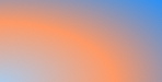
background: -moz-linear-gradient(left 30deg, #ace, #f96);

background: -webkit-gradient(linear, 0 0, 100% 100%, from(#ace),to(#f96));

background: -o-linear-gradient(30deg, #ace, #f96);
效果图如下:


当指定的角度,请记住,它是一个由水平线与渐变线产生的的角度,逆时针方向。因此,使用0deg将产生一个左到右横向梯度,而90度将创建一个从底部到顶部的垂直渐变。我来看看你核心代码:
background: -moz-linear-gradient(<angle>, #ace, #f96);

background: -webkit-gradient(<type>,<angle>, from(#ace), to(#f96));

background: -webkit-linear-gradient(<angle>, #ace, #f96);

background: -o-linear-gradient(<angle>, #ace, #f96);
我们来看看各角度的区别
 1 .deg0 {

 2   background: -moz-linear-gradient(0deg, #ace, #f96);

 3   background: -webkit-gradient(linear,0 50%,100% 50%,from(#ace),to(#f96));

 4   background: -webkit-linear-gradient(0deg, #ace, #f96);

 5   background: -o-linear-gradient(0deg, #ace, #f96);

 6 }

 7

 8 .deg45 {

 9   background: -moz-linear-gradient(45deg, #ace, #f96);

10   background: -webkit-gradient(linear,0 100%,100% 0%,from(#ace),to(#f96));

11   background: -webkit-linear-gradient(45deg, #ace, #f96);

12   background: -o-linear-gradient(45deg, #ace, #f96);

13 }

14 .deg90 {

15   background: -moz-linear-gradient(90deg, #ace, #f96);

16   background: -webkit-gradient(linear,50% 100%,50% 0%,from(#ace),to(#f96));

17   background: -webkit-linear-gradient(90deg, #ace, #f96);

18   background: -o-linear-gradient(90deg, #ace, #f96);

19 }

20 .deg135 {

21   background: -moz-linear-gradient(135deg, #ace, #f96);

22   background: -webkit-gradient(linear,100% 100%,0 0,from(#ace),to(#f96));

23   background: -webkit-linear-gradient(135deg, #ace, #f96);

24   background: -o-linear-gradient(135deg, #ace, #f96);

25 }

26 .deg180 {

27   background: -moz-linear-gradient(180deg, #ace, #f96);

28   background: -webkit-gradient(linear,100% 50%,0 50%,from(#ace),to(#f96));

29   background: -webkit-linear-gradient(180deg, #ace, #f96);

30   background: -o-linear-gradient(180deg, #ace, #f96);

31 }

32 .deg225 {

33   background: -moz-linear-gradient(225deg, #ace, #f96);

34   background: -webkit-gradient(linear,100% 0%,0 100%,from(#ace),to(#f96));

35   background: -webkit-linear-gradient(225deg, #ace, #f96);

36   background: -o-linear-gradient(225deg, #ace, #f96);

37 }

38 .deg270 {

39   background: -moz-linear-gradient(270deg, #ace, #f96);

40   background: -webkit-gradient(linear,50% 0%,50% 100%,from(#ace),to(#f96));

41   background: -webkit-linear-gradient(270deg, #ace, #f96);

42   background: -o-linear-gradient(270deg, #ace, #f96);

43 }

44 .deg315 {

45   background: -moz-linear-gradient(315deg, #ace, #f96);

46   background: -webkit-gradient(linear,0% 0%,100% 100%,from(#ace),to(#f96));

47   background: -webkit-linear-gradient(315deg, #ace, #f96);

48   background: -o-linear-gradient(315deg, #ace, #f96);

49 }

50 .deg360 {

51   background: -moz-linear-gradient(360deg, #ace, #f96);

52   background: -webkit-gradient(linear,0 50%,100% 50%,from(#ace),to(#f96));

53   background: -webkit-linear-gradient(360deg, #ace, #f96);

54   background: -o-linear-gradient(360deg, #ace, #f96);

55 }
效果如下:

除了起始位置和角度,你应该指定起止颜色。起止颜色是沿着渐变线,将会在指定位置(以百分比或长度设定)含有指定颜色的点。色彩的起止数是无限的。如果您使用一个百分比位置,0%代表起点和100%是终点,但区域外的值可以被用来达到预期的效果。 这也是通过CSS3 Gradient制作渐变的一个关键所在,其直接影响了你的设计效果,像我们这里的示例都不是完美的效果,只是为了能给大家展示一个渐变的效果,大家就这样先用着吧。我们接着看一下不同的起址色的示例:
background: -moz-linear-gradient(top, #ace, #f96 80%, #f96);

background: -webkit-linear-gradient(top,#ace,#f96 80%,#f96);

background: -o-linear-gradient(top, #ace, #f96 80%, #f96);
效果如下:

如果没有指定位置,颜色会均匀分布。如下面的示例:
background: -moz-linear-gradient(left, red, #f96, yellow, green, #ace);

background: -webkit-linear-gradient(left,red,#f96,yellow,green,#ace);

background: -o-linear-gradient(left, red, #f96, yellow, green, #ace);
效果如下

7、渐变上应用透明─透明度(Transparency):
透明度还支持透明渐变。这对于制作一些特殊的效果是相当有用的,例如,当堆叠多个背景时。这里是两个背景的结合:一张图片,一个白色到透明的线性渐变。我们来看一个官网的示例吧:
background: -moz-linear-gradient(right, rgba(255,255,255,0), rgba(255,255,255,1)),url(http://demos.hacks.mozilla.org/openweb/resources/images/patterns/flowers-pattern.jpg);

background: -webkit-linear-gradient(right, rgba(255,255,255,0), rgba(255,255,255,1)),url(http://demos.hacks.mozilla.org/openweb/resources/images/patterns/flowers-pattern.jpg);

background: -o-linear-gradient(right, rgba(255,255,255,0), rgba(255,255,255,1)),url(http://demos.hacks.mozilla.org/openweb/resources/images/patterns/flowers-pattern.jpg);
接着看看效果吧

大家可以时入这里和原图做一下比较,是不是很神奇呀。如果想体会的话,快点动手跟我一起做吧。
上面我们主要介绍了CSS3中线性渐变,文章一开始说过CSS3渐变包含两个部分,其一就是我们说的线性渐变,其二就是我们接下来要说的径向渐变。
CSS3的径向渐变
CSS3的径向渐变和其线性渐变是很相似的。我们首先来看其语法:
 -moz-radial-gradient([<bg-position> || <angle>,]? [<shape> || <size>,]? <color-stop>, <color-stop>[, <color-stop>]*);

 -webkit-radial-gradient([<bg-position> || <angle>,]? [<shape> || <size>,]? <color-stop>, <color-stop>[, <color-stop>]*);
(需要特别说明一点的是,径向渐变到目前还不支持Opera的内核浏览器,所以我们径向渐变都是在firefox,safari,chrome底下进行测试完成的。)
除了您已经在线性渐变中看到的起始位置,方向,和颜色,径向梯度允许你指定渐变的形状(圆形或椭圆形)和大小(最近端,最近角,最远端,最远角,包含或覆盖 (closest-side, closest-corner, farthest-side, farthest-corner, contain or cover))。 颜色起止(Color stops):就像用线性渐变,你应该沿着渐变线定义渐变的起止颜色。下面为了更好的理解其具体的用法,我们主要通过不同的示例来对比CSS3径向渐变的具体用法
示例一:
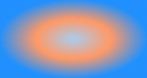
 background: -moz-radial-gradient(#ace, #f96, #1E90FF);

 background: -webkit-radial-gradient(#ace, #f96, #1E90FF);
效果:

示例二:
 background: -moz-radial-gradient(#ace 5%, #f96 25%, #1E90FF 50%);

 background: -webkit-radial-gradient(#ace 5%, #f96 25%, #1E90FF 50%);
效果:

从以上俩个示例的代码中发现,他们起止色想同,但就是示例二定位了些数据,为什么会造成这么大的区别呢?其实在径向渐变中虽然具有相同的起止色,但是在没有设置位置时,其默认颜色为均匀间隔,这一点和我们前面的线性渐变是一样的,但是设置了渐变位置就会按照渐变位置去渐变,这就是我们示例一和示例的区别之处:虽然圆具有相同的起止颜色,但在示例一为默认的颜色间隔均匀的渐变,而示例二每种颜色都有特定的位置。
示例三
  background: -moz-radial-gradient(bottom left, circle, #ace, #f96, #1E90FF);

  background: -webkit-radial-gradient(bottom left, circle, #ace, #f96, #1E90FF);
效果

示例四
background: -moz-radial-gradient(bottom left, ellipse, #ace, #f96, #1E90FF);

background: -webkit-radial-gradient(bottom left, ellipse, #ace, #f96, #1E90FF);
效果
示例三和示例四我们从效果中就可以看出,其形状不一样,示例三程圆形而示例四程椭圆形状,也是就是说他们存在形状上的差异。然而我们在回到两个示例的代码中,显然在示例三中设置其形状为circle而在示例四中ellipse,换而言之在径向渐变中,我们是可以会渐变设置其形状的。
示例五
background: -moz-radial-gradient(ellipse closest-side, #ace, #f96 10%, #1E90FF 50%, #f96);

background: -webkit-radial-gradient(ellipse closest-side, #ace, #f96 10%, #1E90FF 50%, #f96);
效果:

示例六
background: -moz-radial-gradient(ellipse farthest-corner, #ace, #f96 10%, #1E90FF 50%, #f96);

background: -webkit-radial-gradient(ellipse farthest-corner, #ace, #f96 10%, #1E90FF 50%, #f96);
效果:

从示例五和示例六中的代码中我们可以清楚知道,在示例五中我人应用了closest-side而在示例六中我们应用了farthest-corner。这样我们可以知道在径向渐变中我们还可以为其设置大小(Size):size的不同选项(closest-side, closest-corner, farthest-side, farthest-corner, contain or cover)指向被用来定义圆或椭圆大小的点。 示例:椭圆的近边VS远角 下面的两个椭圆有不同的大小。示例五是由从起始点(center)到近边的距离设定的,而示例六是由从起始点到远角的的距离决定的。
示例七:
background: -moz-radial-gradient(circle closest-side, #ace, #f96 10%, #1E90FF 50%, #f96);

background: -webkit-radial-gradient(circle closest-side, #ace, #f96 10%, #1E90FF 50%, #f96);
效果:

示例八:
background: -moz-radial-gradient(circle farthest-side, #ace, #f96 10%, #1E90FF 50%, #f96);

background: -webkit-radial-gradient(circle farthest-side, #ace, #f96 10%, #1E90FF 50%, #f96);
效果:

示例七和示例八主要演示了圆的近边VS远边 ,示例七的圆的渐变大小由起始点(center)到近边的距离决定,而示例八的圆则有起始点到远边的距离决定。
示例九:
background: -moz-radial-gradient(#ace, #f96, #1E90FF);

background: -webkit-radial-gradient(#ace, #f96, #1E90FF);
效果:

示例十:
background: -moz-radial-gradient(contain, #ace, #f96, #1E90FF);

background: -webkit-radial-gradient(contain, #ace, #f96, #1E90FF);
效果:
示例九和示例十演示了包含圆 。在这里你可以看到示例九的默认圈,同一渐变版本,但是被包含的示例十的圆。
最后我们在来看两个实例一个是应用了中心定位和full sized,如下所示:
1  /* Firefox 3.6+ */

2  background: -moz-radial-gradient(circle, #ace, #f96);

3  /* Safari 4-5, Chrome 1-9 */

4  /* Can't specify a percentage size? Laaaaaame. */

5  background: -webkit-gradient(radial, center center, 0, center center, 460, from(#ace), to(#f96));

6  /* Safari 5.1+, Chrome 10+ */

7  background: -webkit-radial-gradient(circle, #ace, #f96);
效果如下:

下面这个实例应用的是Positioned, Sized,请看代码和效果
1 /* Firefox 3.6+ */

2 /* -moz-radial-gradient( [ || ,]? [ || ,]? , [, ]* ) */

3 background: -moz-radial-gradient(80% 20%, closest-corner, #ace, #f96);

4 /* Safari 4-5, Chrome 1-9 */

5 background: -webkit-gradient(radial, 80% 20%, 0, 80% 40%, 100, from(#ace), to(#f96));

6 /* Safari 5.1+, Chrome 10+ */

7 background: -webkit-radial-gradient(80% 20%, closest-corner, #ace, #f96);
效果:

到此关于CSS3的两种渐变方式我们都介绍完了。在浪费大家一点时间,我们看看CSS的重复渐变的应用。
如果您想重复一个渐变,您可以使用-moz-repeating-linear-gradient和-moz-repeating-radial-gradient。 在下面的例子,每个实例都指定了两个起止颜色,并无限重复。
1 background: -moz-repeating-radial-gradient(#ace, #ace 5px, #f96 5px, #f96 10px);

2 background: -webkit-repeating-radial-gradient(#ace, #ace 5px, #f96 5px, #f96 10px);
1 background: -moz-repeating-linear-gradient(top left -45deg, #ace, #ace 5px, #f96 5px, #f96 10px);

2 background: -webkit-repeating-linear-gradient(top left -45deg, #ace, #ace 5px, #f96 5px, #f96 10px);
效果:


有关于CSS3渐变的东西就完了,大家看完了肯定会想,他主要用在哪些方面呢?这个说起来就多了,最简单的就是制作背景,我们还可以应用其制作一些漂亮的按钮,还可以用他来制作patterns,我在这里列出几种制作patterns的示例代码吧:
HTML代码:
1 <ul>

2    <li class="gradient gradient1"></li>

3    <li class="gradient gradient2"></li>

4    <li class="gradient gradient3"></li>

5    <li class="gradient gradient4"></li>

6    <li class="gradient gradient5"></li>

7    <li class="gradient gradient6"></li>

8    </ul>
CSS 代码:
  1 ul {

  2   overflow: hidden;

  3   margin-top: 20px;

  4 }

  5 li{

  6   width: 150px;

  7   height: 80px;

  8   margin-bottom: 10px;

  9   float: left;

 10   margin-right: 5px;

 11   background: #ace;

 12   /*Controls the size*/

 13   -webkit-background-size: 20px 20px;

 14   -moz-background-size: 20px 20px;

 15   background-size: 20px 20px;

 16 }

 17

 18 li.gradient1 {

 19   background-image: -webkit-gradient(

 20     linear,

 21     0 100%, 100% 0,

 22     color-stop(.25, rgba(255, 255, 255, .2)),

 23     color-stop(.25, transparent),

 24     color-stop(.5, transparent),

 25     color-stop(.5, rgba(255, 255, 255, .2)),

 26     color-stop(.75, rgba(255, 255, 255, .2)),

 27     color-stop(.75, transparent),

 28     to(transparent)

 29     );

 30   background-image: -moz-linear-gradient(

 31     45deg,

 32     rgba(255, 255, 255, .2) 25%,

 33     transparent 25%,

 34     transparent 50%,

 35     rgba(255, 255, 255, .2) 50%,

 36     rgba(255, 255, 255, .2) 75%,

 37     transparent 75%,

 38     transparent

 39     );

 40   background-image: -o-linear-gradient(

 41     45deg,

 42     rgba(255, 255, 255, .2) 25%,

 43     transparent 25%,

 44     transparent 50%,

 45     rgba(255, 255, 255, .2) 50%,

 46     rgba(255, 255, 255, .2) 75%,

 47     transparent 75%,

 48     transparent

 49   );

 50   background-image: linear-gradient(

 51     45deg,

 52     rgba(255, 255, 255, .2) 25%,

 53     transparent 25%,

 54     transparent 50%,

 55     gba(255, 255, 255, .2) 50%,

 56     rgba(255, 255, 255, .2) 75%,

 57     transparent 75%,

 58     transparent

 59     );

 60 }

 61

 62 li.gradient2 {

 63    background-image: -webkit-gradient(linear, 0 0, 100% 100%,

 64       color-stop(.25, rgba(255, 255, 255, .2)), color-stop(.25, transparent),

 65       color-stop(.5, transparent), color-stop(.5, rgba(255, 255, 255, .2)),

 66       color-stop(.75, rgba(255, 255, 255, .2)), color-stop(.75, transparent),

 67       to(transparent));

 68    background-image: -moz-linear-gradient(-45deg, rgba(255, 255, 255, .2) 25%, transparent 25%,

 69       transparent 50%, rgba(255, 255, 255, .2) 50%, rgba(255, 255, 255, .2) 75%,

 70       transparent 75%, transparent);

 71    background-image: -o-linear-gradient(-45deg, rgba(255, 255, 255, .2) 25%, transparent 25%,

 72       transparent 50%, rgba(255, 255, 255, .2) 50%, rgba(255, 255, 255, .2) 75%,

 73       transparent 75%, transparent);

 74    background-image: linear-gradient(-45deg, rgba(255, 255, 255, .2) 25%, transparent 25%,

 75       transparent 50%, rgba(255, 255, 255, .2) 50%, rgba(255, 255, 255, .2) 75%,

 76       transparent 75%, transparent);

 77 }

 78

 79 li.gradient3 {

 80   background-image: -webkit-gradient(linear, 0 0, 0 100%, color-stop(.5, rgba(255, 255, 255, .2)), color-stop(.5, transparent), to(transparent));

 81   background-image: -moz-linear-gradient(rgba(255, 255, 255, .2) 50%, transparent 50%, transparent);

 82   background-image: -o-linear-gradient(rgba(255, 255, 255, .2) 50%, transparent 50%, transparent);

 83   background-image: linear-gradient(rgba(255, 255, 255, .2) 50%, transparent 50%, transparent);

 84 }

 85

 86 li.gradient4 {

 87   background-image: -webkit-gradient(linear, 0 0, 100% 0, color-stop(.5, rgba(255, 255, 255, .2)), color-stop(.5, transparent), to(transparent));

 88   background-image: -moz-linear-gradient(0deg, rgba(255, 255, 255, .2) 50%, transparent 50%, transparent);

 89   background-image: -o-linear-gradient(0deg, rgba(255, 255, 255, .2) 50%, transparent 50%, transparent);

 90   background-image: linear-gradient(0deg, rgba(255, 255, 255, .2) 50%, transparent 50%, transparent);

 91 }

 92

 93 li.gradient5 {

 94   background-image: -webkit-gradient(linear, 0 0, 100% 100%, color-stop(.25, #555), color-stop(.25, transparent), to(transparent)),

 95       -webkit-gradient(linear, 0 100%, 100% 0, color-stop(.25, #555), color-stop(.25, transparent), to(transparent)),

 96       -webkit-gradient(linear, 0 0, 100% 100%, color-stop(.75, transparent), color-stop(.75, #555)),

 97       -webkit-gradient(linear, 0 100%, 100% 0, color-stop(.75, transparent), color-stop(.75, #555));

 98   background-image: -moz-linear-gradient(45deg, #555 25%, transparent 25%, transparent),

 99      -moz-linear-gradient(-45deg, #555 25%, transparent 25%, transparent),

100      -moz-linear-gradient(45deg, transparent 75%, #555 75%),

101      -moz-linear-gradient(-45deg, transparent 75%, #555 75%);

102   background-image: -o-linear-gradient(45deg, #555 25%, transparent 25%, transparent),

103      -o-linear-gradient(-45deg, #555 25%, transparent 25%, transparent),

104      -o-linear-gradient(45deg, transparent 75%, #555 75%),

105      -o-linear-gradient(-45deg, transparent 75%, #555 75%);

106   background-image: linear-gradient(45deg, #555 25%, transparent 25%, transparent),

107     linear-gradient(-45deg, #555 25%, transparent 25%, transparent),

108     linear-gradient(45deg, transparent 75%, #555 75%),

109     linear-gradient(-45deg, transparent 75%, #555 75%);

110 }

111

112 li.gradient6 {

113   background-image: -webkit-gradient(linear, 0 0, 0 100%, color-stop(.5, transparent), color-stop(.5, rgba(200, 0, 0, .5)), to(rgba(200, 0, 0, .5))),

114      -webkit-gradient(linear, 0 0, 100% 0, color-stop(.5, transparent), color-stop(.5, rgba(200, 0, 0, .5)), to(rgba(200, 0, 0, .5)));

115   background-image: -moz-linear-gradient(transparent 50%, rgba(200, 0, 0, .5) 50%, rgba(200, 0, 0, .5)),

116      -moz-linear-gradient(0deg, transparent 50%, rgba(200, 0, 0, .5) 50%, rgba(200, 0, 0, .5));

117   background-image: -o-linear-gradient(transparent 50%, rgba(200, 0, 0, .5) 50%, rgba(200, 0, 0, .5)),

118      -o-linear-gradient(0deg, transparent 50%, rgba(200, 0, 0, .5) 50%, rgba(200, 0, 0, .5));

119   background-image: linear-gradient(transparent 50%, rgba(200, 0, 0, .5) 50%, rgba(200, 0, 0, .5)),

120      linear-gradient(0deg, transparent 50%, rgba(200, 0, 0, .5) 50%, rgba(200, 0, 0, .5));

121 }
效果:

著作权归作者所有。
商业转载请联系作者获得授权,非商业转载请注明出处。
原文: http://www.w3cplus.com/content/css3-gradient © w3cplus.com
CSS3 Gradient渐变效果的更多相关文章
- CSS3 Gradient 渐变
转载自:http://www.w3cplus.com/content/css3-gradient CSS3发布很久了,现在在国外的一些页面上常能看到他的身影,这让我羡慕已久,只可惜在国内为了兼容IE, ...
- 深入理解CSS3 gradient斜向线性渐变——张鑫旭
by zhangxinxu from http://www.zhangxinxu.com本文地址:http://www.zhangxinxu.com/wordpress/?p=3639 一.问题没有想 ...
- CSS3 Gradient
CSS3CSS3发布很久了,现在在国外的一些页面上常能看到他的身影,这让我羡慕已久,只可惜在国内为了兼容IE,让这一项技术受到很大的限制,很多Web前端人员都望而止步.虽然如此但还是有很多朋友在钻研C ...
- CSS3 Gradient线性渐变
废话小说,看代码 <!DOCTYPE html > <html > <head> <meta charset="utf-8"> &l ...
- css3 Gradient背景
css3的gradient分为两种:线性渐变(linear)和径向渐变(radial). 一.线性渐变linear-gradient 1.介绍 linear-gradient([设置方向],[设置开始 ...
- -_-#【CSS3】CSS3 gradient transition with background-position
CSS3 gradient transition with background-position <!DOCTYPE html> <html> <head> &l ...
- 第七十九,CSS3背景渐变效果
CSS3背景渐变效果 学习要点: 1.线性渐变 2.径向渐变 本章主要探讨HTML5中CSS3背景渐变功能,主要有两种渐变方式:线性渐变和径向 (放射性)渐变. 一.线性渐变 linear-gradi ...
- 【01】CSS3 Gradient 分为 linear-gradient(线性渐变)和 radial-gradient(径 向渐变)(转)
CSS3 Gradient 分为 linear-gradient(线性渐变)和 radial-gradient(径 向渐变).而我们今天主要是针对线性渐变来剖析其具体的用法.为了更好的应用 CSS3 ...
- CSS3 & gradient & color & background
CSS3 & gradient & color & background css background https://developer.mozilla.org/en-US/ ...
随机推荐
- 关于java.lang.NoClassDefFoundError: org/apache/commons/collections/FastHashMap的错误解决办法
在JavaEE开发中,在把配置文件中的数据或用户表单提交上来的数据,封装在相应JavaBean的对象的对应属性中时:在实际开发中,使用第三方法工具包BeanUtils(commons-beanutil ...
- 深度学习GPU集群管理软件 OpenPAI 简介
OpenPAI:大规模人工智能集群管理平台 2018年5月22日,在微软举办的“新一代人工智能开放科研教育平台暨中国高校人工智能科研教育高峰论坛”上,微软亚洲研究院宣布,携手北京大学.中国科学技术大学 ...
- linux yum list、search、-y、install、update、remove、grouplist、groupinstall、groupremove
redhat使用yum需要付费yum安装的也是rpm包 centos的网络yum源默认已经配置好了,连接的是centos官方yum源,在国外,网速慢 yum源配置在/etc/yum.repos.d下 ...
- requestURI的组成部分
使用 java EE HttpServletRequest对象获取的 request.getRequestURL(); request.getRequestURI(); request.getCont ...
- 【转】Twitter Storm: 在生产集群上运行topology
Twitter Storm: 在生产集群上运行topology 发表于 2011 年 10 月 07 日 由 xumingming 作者: xumingming | 可以转载, 但必须以超链接形式标明 ...
- Mongodb的入门(1)window安装mongodb
mongodb: Mongodb,分布式文档存储数据库,由C++语言编写,旨在为WEB应用提供可扩展的高性能数据存储解决方案.MongoDB是一个高性能,开源,无模式的文档型数据库,是当前NoSql数 ...
- Ubuntu 安装python
1. wget http://mirrors.sohu.com/python/3.6.0/Python-3.6.0.tar.xz wget https://www.python.org/ftp/pyt ...
- Week6——Lifecycle of JSF and Facelets
一.JSF生命周期 JSF是基于事件驱动.JSF生命周期分为两个主要阶段:执行阶段和渲染阶段. 1.执行阶段 分为六个阶段: 恢复视图阶段 当客户端请求一个JavaServer Faces页面时,Ja ...
- SVN合并时报错:Merge tracking not allowed with missing subtrees; try restoring these items
使用的是TortoiseSVN; Merge tracking not allowed with missing subtrees; try restoring these items 下面会有跟着几 ...
- [C++] 用Xcode来写C++程序[2] 操作变量
用Xcode来写C++程序[2] 操作变量 此节讲解包括变量的初始化的几种方式,以及泛型编程的两种变量赋值方式. 最基本的变量赋值以及操作: // operating with variables # ...