
7. svg学习笔记-图案和渐变
之前,我们仅仅使用纯色来为图形填充颜色和绘制轮廓,除此之外,我们还可以使用图案和渐变来填充图形或者是绘制轮廓。
图案
图案的效果类似于,在网页中给一个元素指定背景图像,当背景图像的尺寸小于元素的尺寸的时候,背景图片会默认重复以填充整个元素。效果如下:
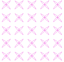
要创建一个图案,首先就需要定义一个重复用的图形对象,这个图形对象被称作tile(瓷砖),tile可以是任意的svg图形元素,包括<image>引用的外部图片文件,然后将tile放在<pattern>元素中作为子元素,建议将<pattern>元素放在<defs>元素中,虽然将<pattern>元素直接放在<svg>中也可以,但<pattern>元素本来就不会再画布上显示,将其放置在<defs>元素中更加规范。
<pattern>元素的属性有id,x,y,width,height,patternUnits。id是必须的属性,id唯一的标识图案,用来在其他图案中引用。x和y指定图案左上角的x和y坐标,width和height的值为数值或是百分数或是0到1之间的小数,用于指定tile占据容器的宽度和高度,patternUnits指定填充的方式,取值为objectBoundingBox和userSpaceOnUse,当取值为objectBoundingBox时,width和height值必须为百分数或0到1之间小数,此时不管被填充容器的大小,水平重复tile的次数为1/width,竖直重复tile的次数为1/height;当取值为useSpaceOnUse时,width和height的值必须为数值,意为tile的宽和高,水平和竖直重复的tile的次数和父容器的宽高有关,示例:
<!DOCTYPE html>

<html>

<head>

    <title>SVG</title>

</head>

<body>

    <svg widht="300" height="300" style="border:1px solid #000">

        <defs>

            <pattern id="basic" x="0" y="0" width="8%" height="8%" patternUnits="objectBoundingBox">

                <ellipse cx="20" cy="15" rx="10" ry="7.5" stroke="blue"></ellipse>

            </pattern>

        </defs>

        <rect x="0" y="0" width="300" height="300" stroke="black" fill="url(#basic)"></rect>

    </svg>

    <svg widht="300" height="300" style="border:1px solid #000">

        <defs>

            <pattern id="basic" x="0" y="0" width="20%" height="20%" patternUnits="objectBoundingBox">

                <ellipse cx="20" cy="15" rx="10" ry="7.5" stroke="blue"></ellipse>

            </pattern>

        </defs>

        <rect x="0" y="0" width="300" height="300" stroke="black" fill="url(#basic)"></rect>

    </svg>

</body>

</html>
效果如下:
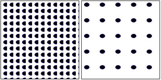
以上代码中我是用一个<ellipse>元素作为<pattern>元素的tile,在第一个svg中,我将<pattern>元素的patternUnits属性设置为objectBoundingBox,并将width和height设置为8%,所以在左边的图像中水平和竖直tile都重复了12.5次,但由于被填充容器的宽度不够,所以每个tile都只显示了一部分,而在第二个svg中,<pattern>元素的patternUnits属性依然设置为objectBoundingBox,但我将width和height设置为20%,容易看出,右边的图中有足够的空间填充tile,但是水平只填充了5个,竖直也填充了5个,这就是设置patternUnits为objectBoundingBox的填充特点。
示例:
<!DOCTYPE html>

<html>

<head>

    <title>SVG</title>

</head>

<body>

    <svg widht="300" height="300" style="border:1px solid #000">

        <defs>

            <pattern id="basic" x="0" y="0" width="30" height="25" patternUnits="userSpaceOnUse">

                <ellipse cx="20" cy="15" rx="10" ry="7.5" stroke="blue"></ellipse>

            </pattern>

        </defs>

        <rect x="0" y="0" width="300" height="300" stroke="black" fill="url(#basic)"></rect>

    </svg>

    <svg widht="300" height="300" style="border:1px solid #000">

        <defs>

            <pattern id="basic" x="0" y="0" width="20" height="20" patternUnits="userSpaceOnUse">

                <ellipse cx="20" cy="15" rx="10" ry="7.5" stroke="blue"></ellipse>

            </pattern>

        </defs>

        <rect x="0" y="0" width="300" height="300" stroke="black" fill="url(#basic)"></rect>

    </svg>

</body>

</html>
效果:
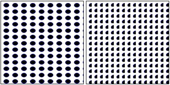
以上代码中我将两个svg中<pattern>元素中的patternUnits属性都设置为userSpaceOnUse,
但第一个的width和height均比第二个大,svg水平显示的tile个数是被填充容器的宽度除以<pattern>的宽度得出来的,竖直方向上类似,第二个svg中<pattern>元素的宽度不足以显示整个tile,所以显示为半个。当patternUnits设置为userSpaceOnUse时,tile重复的次数与被填充容器的宽度和<pattern>的宽度有关。
<pattern>元素还有个patternContentUnits属性
图案还可以嵌套图案,例如在一个图案中使用的tile引用了另一个图案作为填充,当填充元素引用这个图案时就会显示出嵌套图案。
渐变
渐变有两种,线性渐变和径向渐变,svg中,线性渐变用linearGradient表示,径向渐变以radialGradient表示。
和在ps中创建渐变色一样,线性渐变中必须指定渐变点,渐变点中间的部分由计算机自动计算添加颜色,通过向<linearGradient>元素中添加子元素<stop>元素来添加渐变点,通过<stop>的offset属性指定渐变点相对于父容器的位置,设置stop-color属性指定渐变点的颜色,stop-opacity属性指定渐变点颜色的透明度。线性渐变默认的方向是从左到右,通过为linearGradient设置渐变的起点和终点坐标可以改变渐变的方向,起点的坐标属性名为x1和y1,终点的坐标属性名为x2和y2,值必须是从0%到100%的百分数或者是从0到1的小数。示例如下:
<!DOCTYPE html>

<html>

<head>

    <title>SVG</title>

</head>

<body>

    <svg width="300" height="300" style="border:1px solid #000">

        <defs>

            <linearGradient id="g1">

                <stop offset="0%" stop-color="#4bf0df" stop-opacity="1"/>

                <stop offset="33.3%" stop-color="#f0ea4b" stop-opacity="0.7"/>

                <stop offset="100%" stop-color="#f0724b" stop-opacity="0"/>

            </linearGradient>

            <linearGradient id="g2" x1="100%" y1="0%" x2="0%" y2="0%">

                <stop offset="0%" stop-color="#4bf0df" stop-opacity="1"/>

                <stop offset="33.3%" stop-color="#f0ea4b" stop-opacity="0.7"/>

                <stop offset="100%" stop-color="#f0724b" stop-opacity="0"/>

            </linearGradient>

            <linearGradient id="g3" x1="0%" y1="0%" x2="0%" y2="100%">

                <stop offset="0%" stop-color="#4bf0df" stop-opacity="1"/>

                <stop offset="33.3%" stop-color="#f0ea4b" stop-opacity="0.7"/>

                <stop offset="100%" stop-color="#f0724b" stop-opacity="0"/>

            </linearGradient>

            <linearGradient id="g4" x1="0%" y1="100%" x2="0%" y2="0%">

                <stop offset="0%" stop-color="#4bf0df" stop-opacity="1"/>

                <stop offset="33.3%" stop-color="#f0ea4b" stop-opacity="0.7"/>

                <stop offset="100%" stop-color="#f0724b" stop-opacity="0"/>

            </linearGradient>

            <linearGradient id="g5" x1="0%" y1="0%" x2="100%" y2="100%">

                <stop offset="0%" stop-color="#4bf0df" stop-opacity="1"/>

                <stop offset="33.3%" stop-color="#f0ea4b" stop-opacity="0.7"/>

                <stop offset="100%" stop-color="#f0724b" stop-opacity="0"/>

            </linearGradient>

            <linearGradient id="g6" x1="100%" y1="0%" x2="0%" y2="100%">

                <stop offset="0%" stop-color="#4bf0df" stop-opacity="1"/>

                <stop offset="33.3%" stop-color="#f0ea4b" stop-opacity="0.7"/>

                <stop offset="100%" stop-color="#f0724b" stop-opacity="0"/>

            </linearGradient>

        </defs>

        <rect x="0" y="0" width="200" height="50" stroke="black" fill="url(#g1)"></rect>

        <rect x="0" y="50" width="200" height="50" stroke="black" fill="url(#g2)"></rect>

        <rect x="0" y="100" width="200" height="50" stroke="black" fill="url(#g3)"></rect>

        <rect x="0" y="150" width="200" height="50" stroke="black" fill="url(#g4)"></rect>

        <rect x="0" y="200" width="200" height="50" stroke="black" fill="url(#g5)"></rect>

        <rect x="0" y="250" width="200" height="50" stroke="black" fill="url(#g6)"></rect>

    </svg>

</body>

</html>
效果如下:
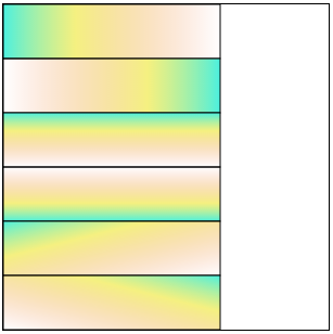
以上的渐变方向依次是从左到右,从右到左,从上到下,从下到上,从左上角到右下角,从右上角到左下角,渐变的方向其实就是<linearGradient>元素的x1,y1和x2,y2两点之间的直线方向。
我们上面创建的渐变都是从0%到100%的,如果是从10%到90%会出现什么情况:
<!DOCTYPE html>

<html>

<head>

    <title>SVG</title>

</head>

<body>

    <svg width="300" height="300" style="border:1px solid #000">

        <defs>

            <linearGradient id="g1">

                <stop offset="10%" stop-color="#f666cc"></stop>

                <stop offset="90%" stop-color="#e366f6"></stop>

            </linearGradient>

            <linearGradient id="g2">

                <stop offset="10%" stop-color="red"></stop>

                <stop offset="90%" stop-color="green"></stop>

            </linearGradient>

            <linearGradient id="g3">

                <stop offset="30%" stop-color="red"></stop>

                <stop offset="60%" stop-color="green"></stop>

            </linearGradient>

        </defs>

        <rect x="0" y="0" width="200" height="100" fill="url(#g1)"></rect>

        <rect x="50" y="100" width="200" height="100" fill="url(#g2)"></rect>

        <rect x="100" y="200" width="200" height="100" fill="url(#g3)"></rect>

    </svg>

</body>

</html>
效果如下:
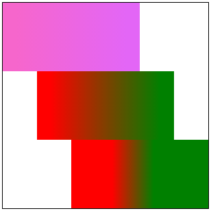
首先,讲一下上述的代码,第一个渐变的位置为从10%到90%,第二个也是从10%到90%,第三个是30%到60%,如果第一个图像不太明显,那么看第二个两个反色,如果实在看不出来看第三个总能明白了吧,svg中不在渐变范围的颜色默认以最靠近的渐变点的颜色填充。
也就是说在第三个图像中,从0%到30%以红色填充,30%到60%为红色到绿色的渐变,60%到100%为绿色填充。在线性渐变<linearGradient>元素中有个spreadMethod属性,它专门管这个情况,有三个值,分别是pad(起始和结束渐变点会扩展到对象的边缘),repeat(渐变会重复起点到终点的过程,直到填充满整个对象),reflect(渐变会按终点到起点,起点到终点的排列重复,直到填充满整个对象)。
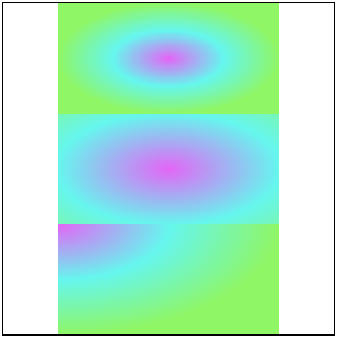
好,废话一大堆,终于说完了svg中的线性渐变(⊙﹏⊙)b,线性渐变明白了,径向渐变就简单的多了,径向渐变就是指定一个中心点,渐变以圆形的方式向外渐变,在svg中以<radialGradient>表示,属性 cx和cy表示渐变中心的坐标,r表示渐变半径,取值均是是从0%到100%的百分数或者是从0到1的小数,默认值均为50%。向<radialGradient>中添加渐变点的方式和径向渐变完全一致,此处不说了(口干舌燥┗( T﹏T )┛┗( T﹏T )┛),径向渐变也有spreadMethod属性,设置方式和线性渐变一致~致~致~~~~
看示例:
<!DOCTYPE html>

<html>

<head>

    <title>SVG</title>

</head>

<body>

    <svg width="300" height="300" style="border:1px solid #000">

        <defs>

            <radialGradient id="g1">

                <stop offset="0%" stop-color="#e366f6"></stop>

                <stop offset="50%" stop-color="#66f6ee"></stop>

                <stop offset="100%" stop-color="#8ff666"></stop>

            </radialGradient>

            <radialGradient id="g2" r="100%">

                <stop offset="0%" stop-color="#e366f6"></stop>

                <stop offset="50%" stop-color="#66f6ee"></stop>

                <stop offset="100%" stop-color="#8ff666"></stop>

            </radialGradient>

            <radialGradient id="g3" cx="0" cy="0" r="100%">

                <stop offset="0%" stop-color="#e366f6"></stop>

                <stop offset="50%" stop-color="#66f6ee"></stop>

                <stop offset="100%" stop-color="#8ff666"></stop>

            </radialGradient>

        </defs>

        <rect x="50" y="0" width="200" height="100" fill="url(#g1)"></rect>

        <rect x="50" y="100" width="200" height="100" fill="url(#g2)"></rect>

        <rect x="50" y="200" width="200" height="100" fill="url(#g3)"></rect>

    </svg>

</body>

</html>
效果:
7. svg学习笔记-图案和渐变的更多相关文章
- 8. svg学习笔记-文本
毫无疑问,文本也是svg中组成的重要部分,在svg中,用<text>元素来创建文本,文本的使用格式如下: <text x="20" y="30" ...
- 4. svg学习笔记-文档结构元素和样式的使用
svg除了绘图元素之外还有一部分是专门用于文档结构的,这类元素有<g>,<use>,<defs>,<symbol>等 <g>元素 如果我们仅 ...
- 2. svg学习笔记-svg中的坐标系统和viewbox
我是通过<SVG精髓>这本书学习的svg,说实话,这本书写的不好,或者说翻译的不好,我没有看过这本书的原版,不知道原文写的怎么样,但是翻译出来的有些句子真的很拗口.以前老师给我们API文档 ...
- svg的基本图形与属性【小尾巴的svg学习笔记1】
因为项目有可能用到, 所以学习了一下,做此笔记,图截自慕课网,侵删. 一.基本图形 1.矩形 x,y定义矩形的左上角坐标: width,height定义矩形的长度和宽度: rx,ry定义矩形的圆角半径 ...
- svg学习笔记(一)
SVG——可扩展适量图形,基于XML PC端:IE9+ wap端:表现良好,适合使用 基础图形: line(线段) <line x1="25" y1="150 ...
- svg学习笔记(二)
SMIL animation演示代码集锦 <svg width="1400" height="1600" xmlns="http://www.w ...
- svg学习笔记
<!DOCTYPE html> <html> <head lang="en"> <meta charset="UTF-8&quo ...
- [html5] 学习笔记-Canvas 绘制渐变图形与绘制变形图形
在 HTML5 中,使用 Canvas API 绘制图形的知识,可以对绘制图形进行处理,包含使用 Canvas API 绘制渐变图形,使用 Canvas API 的坐标轴变换处理功能绘制变形图形.其中 ...
- 9. svg学习笔记-裁剪和蒙版
裁剪 在svg中进行剪切,对整个svg元素而言,可以使用<svg>元素的viewbox属性,对于单个元素则可以使用<clipPath>元素.在单个图形元素上使用裁剪,可以在&l ...
随机推荐
- python基本操作
创建列表 sample_list = ['a',1,('a','b')] Python 列表操作 sample_list = ['a','b',0,1,3] 得到列表中的某一个值 value_star ...
- CSS语法基础
引言:CSS语法 CSS规则由两个主要的部分构成:选择器,以及一条或者多条声明. selector { property: value; property: value; ... property: ...
- Java基础系列--this、super关键字
原创作品,可以转载,但是请标注出处地址:http://www.cnblogs.com/V1haoge/p/8483623.html 一.概述 Java中this有两种用途,一种是用于指代当前对象,一种 ...
- Go标准库:深入剖析Go template
本文只关注Go text/template的底层结构,带上了很详细的图片以及示例帮助理解,有些地方也附带上了源码进行解释.有了本文的解释,对于Go template的语法以及html/template ...
- 2. 常见的Queue
package com.gf.conn013; import java.util.ArrayList; import java.util.Iterator; import java.util.List ...
- Android Studio 学习(二) UI
TextView android:gravity="center"居中对齐 //文字对齐方式 top bottom left right center android:textSi ...
- Laravel篇二之本地版本库关联github
以往的工作中都是使用svn作为版本控制,对git分布式的有些陌生,本篇主要记录的本地存储myWeb-laravel的git版本库与github建立关联. 1.首先进入本地myWeb-laravel,执 ...
- Puppeteer之爬虫入门
译者按: 本文通过简单的例子介绍如何使用Puppeteer来爬取网页数据,特别是用谷歌开发者工具获取元素选择器值得学习. 原文: A Guide to Automating & Scrapin ...
- CSS3使用transition属性实现过渡效果
transition属性目的是让css的一些属性(如background)的以平滑过渡的效果出现.它是一个合并属性,是由以下四个属性组合而成: transition-property:设置应用过渡的C ...
- 继续封装个 Volley 组件
本篇文章已授权微信公众号 dasu_Android(大苏)独家发布 前面已经封装了很多常用.基础的组件了:base-module, 包括了: crash 处理 常用工具类 apk 升级处理 log 组 ...