
WPF DataGrid 自定义样式 MVVM 删除 查询
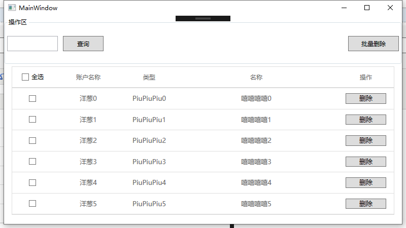
看到很多小伙伴在找Dategrid样式 就分享一个 ,有不好的地方 请指出
代码部分都加了注释 需要的可以自己修改为自己需要的样式
源码已经上传 地址: https://github.com/YC946586/WPF-DataGrid
联系方式 qq 29579895
  <!--单元格样式-->

        <Style   TargetType="{x:Type DataGridCell}">

            <Setter Property="FocusVisualStyle" Value="{x:Null}"/>

            <Setter Property="TextBlock.FontSize" Value="13" />

            <Setter Property="Padding" Value="10" />

            <Setter Property="Background" Value="Transparent"/>

            <Setter Property="BorderBrush" Value="Transparent"/>

            <Setter Property="BorderThickness" Value="0"/>

            <Setter Property="ToolTip" Value="{Binding RelativeSource={RelativeSource Mode=Self},Path=Content.Text}" />

            <Setter Property="Template">

                <Setter.Value>

                    <ControlTemplate TargetType="{x:Type DataGridCell}">

                        <Border BorderBrush="{TemplateBinding BorderBrush}" BorderThickness="0" Background="{TemplateBinding Background}" SnapsToDevicePixels="True">

                            <!--HorizontalAlignment 可以设置内容展示位置-->

                            <ContentPresenter SnapsToDevicePixels="{TemplateBinding SnapsToDevicePixels}" VerticalAlignment="Center" HorizontalAlignment="Center"

                                          Margin="{TemplateBinding Padding}"/>

                        </Border>

                    </ControlTemplate>

                </Setter.Value>

            </Setter>

            <Style.Triggers>

                <Trigger Property="IsKeyboardFocusWithin" Value="True">

                    <Setter Property="BorderBrush" Value="{DynamicResource MaterialDesignTextBoxBorder}"/>

                </Trigger>

                <MultiTrigger>

                    <MultiTrigger.Conditions>

                        <Condition Property="IsSelected" Value="True"/>

                        <Condition Property="Selector.IsSelectionActive" Value="False"/>

                    </MultiTrigger.Conditions>

                    <Setter Property="Background" Value="{DynamicResource MaterialDesignSelection}"/>

                </MultiTrigger>

                <MultiTrigger>

                    <MultiTrigger.Conditions>

                        <Condition Property="IsSelected" Value="True"/>

                        <Condition Property="Selector.IsSelectionActive" Value="True"/>

                    </MultiTrigger.Conditions>

                    <Setter Property="Foreground" Value="#666666"/>

                    <Setter Property="Background" Value="{DynamicResource MaterialDesignSelection}" />

                </MultiTrigger>

                <Trigger Property="IsEnabled" Value="False">

                    <Setter Property="Opacity" Value=".56"/>

                </Trigger>

            </Style.Triggers>

        </Style>

        <!--标题栏样式-->

        <Style TargetType="DataGridColumnHeader">

            <Setter Property="FocusVisualStyle" Value="{x:Null}"/>

            <Setter Property="SnapsToDevicePixels" Value="True" />

            <Setter Property="HorizontalContentAlignment" Value="Center"/>

            <Setter Property="MinWidth" Value="0" />

            <Setter Property="Background" Value="White"/>

            <Setter Property="MinHeight" Value="42" />

            <Setter Property="FontSize" Value="12" />

            <Setter Property="Cursor" Value="Hand" />

            <Setter Property="Foreground" Value="#666666" />

            <Setter Property="Template">

                <Setter.Value>

                    <ControlTemplate TargetType="{x:Type DataGridColumnHeader}">

                        <Grid>

                            <Border  BorderThickness="0,0,0,2"  BorderBrush="#DCDCDC"  Width="Auto" Background="White">

                                <Grid Background="White" HorizontalAlignment="Center">

                                    <Grid.ColumnDefinitions>

                                        <ColumnDefinition Width="Auto"/>

                                        <ColumnDefinition Width="*"/>

                                    </Grid.ColumnDefinitions>

                                    <Path x:Name="SortArrow" Visibility="Collapsed" Data="M537.6 230.4L704 390.4c12.8 12.8 12.8 32 0 44.8s-32 12.8-44.8 0L544 326.4v448c0 19.2-12.8 32-32 32s-32-12.8-32-32v-448L364.8 441.6c-12.8 6.4-32 6.4-44.8-6.4-12.8-12.8-12.8-32 0-44.8l160-160c6.4-6.4 32-32 57.6 0z" Stretch="Uniform"  Grid.Column="0"  Width="10" Height="10" Fill="#666666" Margin="0 0 5 0"

                                            VerticalAlignment="Center" RenderTransformOrigin="1,1" />

                                    <ContentPresenter Grid.Column="1" HorizontalAlignment="{TemplateBinding HorizontalContentAlignment}" RecognizesAccessKey="True" SnapsToDevicePixels="{TemplateBinding SnapsToDevicePixels}" VerticalAlignment="{TemplateBinding VerticalContentAlignment}"

                                                  Margin="{TemplateBinding Padding}"/>

                                </Grid>

                            </Border>

                            <Thumb x:Name="PART_LeftHeaderGripper" HorizontalAlignment="Left" />

                            <Thumb x:Name="PART_RightHeaderGripper" HorizontalAlignment="Right" />

                        </Grid>

                        <ControlTemplate.Triggers>

                            <Trigger Property="IsMouseOver" Value="True">

                                <Setter Property="Foreground" Value="#666666" />

                            </Trigger>

                            <!--升序-->

                            <Trigger Property="SortDirection" Value="Ascending">

                                <Setter TargetName="SortArrow" Property="Visibility" Value="Visible"></Setter>

                                <Setter Property="Foreground" Value="{DynamicResource MaterialDesignBody}" />

                            </Trigger>

                            <!--降序-->

                            <Trigger Property="SortDirection" Value="Descending">

                                <Setter TargetName="SortArrow" Property="Visibility" Value="Visible"></Setter>

                                <Setter TargetName="SortArrow" Property="Data" Value="M479.674543 842.808351L203.224783 566.358591c-12.496698-12.496698-32.758136-12.496698-45.254834 0-12.496698 12.496698-12.496698 32.758136 0 45.254834l331.014362 331.014362c12.496698 12.496698 32.758136 12.496698 45.254834 0l341.796326-339.144676c12.496698-12.496698 12.496698-32.758136 0-45.254834-12.496698-12.496698-32.758136-12.496698-45.254834 0l-287.105859 284.454209-0.03182-739.427925c0-17.673427-14.32669-32.000117-32.000117-32.000118-17.67272 0.000707-31.99941 14.327398-32.000118 32.000118l0.032527 739.553083z"></Setter>

                                <Setter Property="Foreground" Value="{DynamicResource MaterialDesignBody}" />

                            </Trigger>

                        </ControlTemplate.Triggers>

                    </ControlTemplate>

                </Setter.Value>

            </Setter>

        </Style>

        <Style TargetType="{x:Type DataGridRowHeader}">

            <Setter Property="FocusVisualStyle" Value="{x:Null}"/>

            <Setter Property="VerticalContentAlignment" Value="Center"/>

            <Setter Property="Template">

                <Setter.Value>

                    <ControlTemplate TargetType="{x:Type DataGridRowHeader}">

                        <Grid MinWidth="24">

                            <Border BorderBrush="{TemplateBinding BorderBrush}" BorderThickness="0" Background="{TemplateBinding Background}" Padding="{TemplateBinding Padding}">

                                <StackPanel Orientation="Horizontal">

                                    <ContentPresenter RecognizesAccessKey="True" SnapsToDevicePixels="{TemplateBinding SnapsToDevicePixels}" VerticalAlignment="Center"/>

                                    <Control SnapsToDevicePixels="false" Template="{Binding ValidationErrorTemplate, RelativeSource={RelativeSource AncestorType={x:Type DataGridRow}}}" />

                                </StackPanel>

                            </Border>

                            <Thumb x:Name="PART_TopHeaderGripper"  VerticalAlignment="Top"/>

                            <Thumb x:Name="PART_BottomHeaderGripper"  VerticalAlignment="Bottom"/>

                        </Grid>

                    </ControlTemplate>

                </Setter.Value>

            </Setter>

        </Style>

        <!--行样式-->

        <Style  TargetType="{x:Type DataGridRow}">

            <Setter Property="Background" Value="Transparent"/>

            <Setter Property="FocusVisualStyle" Value="{x:Null}"/>

            <Setter Property="SnapsToDevicePixels" Value="true"/>

            <Setter Property="BorderThickness" Value="0"/>

            <Setter Property="Validation.ErrorTemplate" Value="{x:Null}"/>

            <Setter Property="Template">

                <Setter.Value>

                    <ControlTemplate TargetType="{x:Type DataGridRow}">

                        <Border x:Name="DGR_Border" BorderBrush="{TemplateBinding BorderBrush}" BorderThickness="0" Background="{TemplateBinding Background}" SnapsToDevicePixels="True">

                            <SelectiveScrollingGrid>

                                <SelectiveScrollingGrid.ColumnDefinitions>

                                    <ColumnDefinition Width="Auto"/>

                                    <ColumnDefinition Width="*"/>

                                </SelectiveScrollingGrid.ColumnDefinitions>

                                <SelectiveScrollingGrid.RowDefinitions>

                                    <RowDefinition Height="*"/>

                                    <RowDefinition Height="Auto"/>

                                </SelectiveScrollingGrid.RowDefinitions>

                                <DataGridCellsPresenter Grid.Column="1" ItemsPanel="{TemplateBinding ItemsPanel}" SnapsToDevicePixels="{TemplateBinding SnapsToDevicePixels}"/>

                                <DataGridDetailsPresenter Grid.Column="1" Grid.Row="1" SelectiveScrollingGrid.SelectiveScrollingOrientation="{Binding AreRowDetailsFrozen, ConverterParameter={x:Static SelectiveScrollingOrientation.Vertical}, Converter={x:Static DataGrid.RowDetailsScrollingConverter}, RelativeSource={RelativeSource AncestorType={x:Type DataGrid}}}" Visibility="{TemplateBinding DetailsVisibility}"/>

                                <DataGridRowHeader Grid.RowSpan="2" SelectiveScrollingGrid.SelectiveScrollingOrientation="Vertical" Visibility="{Binding HeadersVisibility, ConverterParameter={x:Static DataGridHeadersVisibility.Row}, Converter={x:Static DataGrid.HeadersVisibilityConverter}, RelativeSource={RelativeSource AncestorType={x:Type DataGrid}}}"/>

                            </SelectiveScrollingGrid>

                        </Border>

                    </ControlTemplate>

                </Setter.Value>

            </Setter>

            <Style.Triggers>

                <Trigger Property="IsSelected" Value="True">

                    <Setter Property="Background" Value="#DEDEDE" />

                </Trigger>

                <Trigger Property="IsMouseOver" Value="True">

                    <Setter Property="Background" Value="#DEDEDE" />

                </Trigger>

                <Trigger Property="IsNewItem" Value="True">

                    <Setter Property="Margin" Value="{Binding NewItemMargin, RelativeSource={RelativeSource AncestorType={x:Type DataGrid}}}"/>

                </Trigger>

            </Style.Triggers>

        </Style>

        <!--DataGrid样式-->

        <Style  TargetType="{x:Type DataGrid}">

            <Setter Property="RowHeaderWidth" Value="0"/>

            <Setter Property="AutoGenerateColumns" Value="False"/>

            <Setter Property="VerticalAlignment" Value="Top"/>

            <Setter Property="IsReadOnly" Value="True"/>

            <Setter Property="AlternationCount" Value="2"/>

            <Setter Property="SelectionMode" Value="Single"/>

            <Setter Property="Cursor" Value="Hand"/>

            <Setter Property="CanUserSortColumns" Value="True"/>

            <Setter Property="Background" Value="White"/>

            <Setter Property="CanUserAddRows" Value="False"/>

            <Setter Property="CanUserResizeColumns" Value="false"/>

            <Setter Property="BorderBrush" Value="#DEDEDE" />

            <Setter Property="BorderThickness" Value="1"></Setter>

            <Setter Property="Foreground" Value="#666666"/>

            <Setter Property="FontSize" Value="13"/>

            <Setter Property="GridLinesVisibility" Value="Horizontal" />

            <Setter Property="RowDetailsVisibilityMode" Value="VisibleWhenSelected"/>

            <Setter Property="HeadersVisibility" Value="Column" />

            <Setter Property="ScrollViewer.PanningMode" Value="Both"/>

            <Setter Property="Stylus.IsFlicksEnabled" Value="False"/>

            <Setter Property="FocusVisualStyle" Value="{x:Null}"/>

            <Setter Property="HorizontalGridLinesBrush">

                <Setter.Value>

                    <!--设置行边线颜色-->

                    <SolidColorBrush Color="#DEDEDE"/>

                </Setter.Value>

            </Setter>

            <Setter Property="VerticalGridLinesBrush">

                <Setter.Value>

                    <SolidColorBrush Color="Transparent"/>

                </Setter.Value>

            </Setter>

        </Style>
WPF DataGrid 自定义样式 MVVM 删除 查询的更多相关文章
- WPF DataGrid自定义样式
微软的WPF DataGrid中有很多的属性和样式,你可以调整,以寻找合适的(如果你是一名设计师).下面,找到我的小抄造型的网格.它不是100%全面,但它可以让你走得很远,有一些非常有用的技巧和陷阱. ...
- WPF CheckBox 自定义样式
WPF 自定义样式.CheckBox <Style x:Key="EmptyCheckBox" TargetType="CheckBox"> < ...
- Wpf ScrollBar自定义样式
Wpf的ScrollBar可以分为六个区域:A.背景.B.向上按钮.C.向下的按钮.D.Track里面向上的按钮.E.Track里面向下的按钮.F.Track的Thumb 详情见下图 下面通过一个例子 ...
- WPF DataGrid自定义列DataGridTextColumn.ElementStyle和DataGridTemplateColumn.CellTemplate
<Window x:Class="DataGridExam.MainWindow" xmlns="http://schemas.microsoft.c ...
- WPF自定义控件与样式(7)-列表控件DataGrid与ListView自定义样式
一.前言 申明:WPF自定义控件与样式是一个系列文章,前后是有些关联的,但大多是按照由简到繁的顺序逐步发布的等,若有不明白的地方可以参考本系列前面的文章,文末附有部分文章链接. 本文主要内容: Dat ...
- 【转】WPF自定义控件与样式(7)-列表控件DataGrid与ListView自定义样式
一.前言 申明:WPF自定义控件与样式是一个系列文章,前后是有些关联的,但大多是按照由简到繁的顺序逐步发布的等. 本文主要内容: DataGrid自定义样式: ListView自定义样式: 二.Dat ...
- WPF 4 DataGrid 控件(自定义样式篇)
原文:WPF 4 DataGrid 控件(自定义样式篇) 在<WPF 4 DataGrid 控件(基本功能篇)>中我们已经学习了DataGrid 的基本功能及使用方法.本篇将继续 ...
- WPF自定义样式篇-DataGrid
WPF自定义样式篇-DataGrid 先上效果图: 样式: <!--DataGrid样式--> <Style TargetType="DataGrid"& ...
- WPF自定义控件与样式(2)-自定义按钮FButton
一.前言.效果图 申明:WPF自定义控件与样式是一个系列文章,前后是有些关联的,但大多是按照由简到繁的顺序逐步发布的等,若有不明白的地方可以参考本系列前面的文章,文末附有部分文章链接. 还是先看看效果 ...
随机推荐
- JMeter性能测试入门--简单使用
1.JMeter整体简介 Apache JMeter是Apache组织开发的基于Java的压力测试工具.用于对软件做压力测试,它最初被设计用于Web应用测试,但后来扩展到其他测试领域. 它可以用于测试 ...
- (九)分布式服务----Zookeeper注册中心
==>>点击查看本系列文章目录 首先看一下几种注册中心: 最老的就是Zookeeper了, 比较新的有Eureka,Consul 都可以做注册中心.可以自行搜索对比三者的优缺点. Zook ...
- Mobx总结以及mobx和redux区别
Mobx解决的问题 传统react使用的数据管理库为Redux.Redux要解决的问题是统一数据流,数据流完全可控并可追踪.要实现该目标,便需要进行相关的约束 Redux由此引出dispatch ac ...
- js中对象字面量
一.对象字面量语法 var person={ name:'小王', age:18, _pri:233 } 成员名称的单引号不是必须的 最后一个成员结尾不要用逗号,不然在某些浏览器中会抛出错误 成员名相 ...
- i春秋暑期训练营丨渗透测试工程师开课啦
每个人的夏天 都有专属的解锁方式 或来一次难忘的旅行 或躺在家里吹着空调吃西瓜 又或者是和小伙伴参加暑期训练营 i春秋暑期渗透测试工程师 报名通道已全部开启 为了保证课程质量,采取小班教学,每班仅限3 ...
- maven 学习---Maven 构建配置文件
什么是构建配置文件? 构建配置文件是一组配置的集合,用来设置或者覆盖 Maven 构建的默认配置.使用构建配置文件,可以为不同的环境定制构建过程,例如 Producation 和 Developmen ...
- https://support.microsoft.com/zh-cn/help/2290714/error-message-when-you-install-office-2010-on-a-windows-7-based-comput
Error message when you install Office 2010 on a Windows 7-based computer "The installation of M ...
- Jenkins 打tag回滚
利用jenkins,从gitlab上拉取代码,然后发布,如果想进行代码回退,其实还是代码发布,拉取的时候,选择合适的标签. 一.利用Git parameter插件选择branch或tag.下面的文本参 ...
- SpringBoot 整合Mybatis操作数据库
1.引入依赖: <dependency> <groupId>org.mybatis.spring.boot</groupId> <artifactId> ...
- spring boot jsp里面的静态资源访问不到解决办法
闲着没事写的小Demo 用到了jsp页面,里面有些静态资源, springboot 默认的静态资源的值有四个:Default: classpath:/META-INF/resources/,class ...