
第四界css大会 黑魔法-css网格背景、颜色拾取器、遮罩、文字颜色渐变、标题溢出渐变等
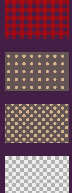
1.css网格背景
<!DOCTYPE html>

<html lang="en">

<head>

    <meta charset="UTF-8">

    <title>css网格背景</title>

    <style type="text/css">

    body{ background-color: #451F46}

        div{margin:20px;}

        .stripe1{

          width: 250px;

          height: 150px;

          margin: 50px;

          background: linear-gradient(90deg,rgba(200,0,0,.5) 50%,transparent 0),

                      linear-gradient(rgba(200,0,0,.5) 50%,transparent 0);

          background-size: 30px 30px;

        }

        .stripe2{

          width: 250px;

          height: 150px;

          margin: 50px;

          background-color: #655;

          background-image: radial-gradient(tan 30%,transparent 0);

          background-size: 30px 30px;

        }

        .stripe3{

          width: 250px;

          height: 150px;

          margin: 50px;

          background-color: #655;

          background-image: radial-gradient(tan 30%,transparent 0),

                            radial-gradient(tan 30%,transparent 0);

          background-size: 30px 30px;

          background-position: 0 0,15px 15px;

        }

        .stripe4{

          width: 250px;

          height: 150px;

          margin: 50px;

          background-image: linear-gradient(45deg,rgba(0,0,0,.25) 25%,transparent 0,transparent 75%,rgba(0,0,0,.25) 0),

                            linear-gradient(45deg,rgba(0,0,0,.25) 25%,transparent 0,transparent 75%,rgba(0,0,0,.25) 0);

          background-color: #eee;

          background-size: 30px 30px;

          background-position: 0 0,15px 15px;

        }

    </style>

</head>

<body>

    <div class="stripe1"></div>

    <div class="stripe2"></div>

    <div class="stripe3"></div>

    <div class="stripe4"></div>

</body>

</html>
效果图:
2.遮罩
<!DOCTYPE html>

<html lang="en">

<head>

    <meta charset="UTF-8">

    <title>透明遮罩</title>

    <style type="text/css">

    .trans {

        /*transition*/

        -webkit-transition: 0.3s ease;

        -moz-transition: 0.3s ease;

        -ms-transition: 0.3s ease;

        -o-transition: 0.3s ease;

        transition: 0.3s ease;

    }

    .test_outer {

        width: 320px;

        height: 480px;

        margin: 1em auto;

        position: relative;

        overflow: hidden;

    }

    .test_cover {

        width: 60px;

        height: 60px;

        border: 480px solid rgba(0, 0, 0, .45);

        border-radius: 50%;

        position: absolute;

    }

    .test_cover_pos1 {

        left: -227px;

        top: -478px;

    }

    .test_cover_pos1:after {

        content: '第一个';

        margin: 16px 0 0 -140px;

    }

    .test_cover_pos2 {

        left: -447px;

        top: -378px;

    }

    .test_cover_pos2:after {

        width: 140px;

        content: '第二个';

        margin: 16px 0 0 60px;

    }

    .test_cover_pos3 {

        left: -337px;

        top: -48px;

    }

    .test_cover_pos3:after {

        content: '第三个';

        margin: -20px 0 0 -20px;

        white-space: nowrap;

    }

    .test_cover_pos1:after,

    .test_cover_pos2:after,

    .test_cover_pos3:after {

        color: #fff;

        font-family: '微软雅黑';

        text-shadow: 1px 1px rgba(0, 0, 0, .35);

        position: absolute;

    }

    </style>

</head>

<body>

    <div class="test_outer">

        <span id="testCover" class="test_cover test_cover_pos1 trans"></span>

        <img src="http://img.d1xz.net/d/2018/09/5b90cde1ceab0.jpg"  border="0" />

    </div>

    <script type="text/javascript">

    (function(stepIndex) {

        var objStep = document.getElementById("testCover");

        var funStep = function() {

            objStep.className = objStep.className.replace(/\d/, (stepIndex + 1));

            stepIndex++;

            if (stepIndex > 2) {

                stepIndex = 0;

            }

            setTimeout(funStep, 3000);

        };

        setTimeout(funStep, 3000);

    })(1);

    </script>

</body>

</html>
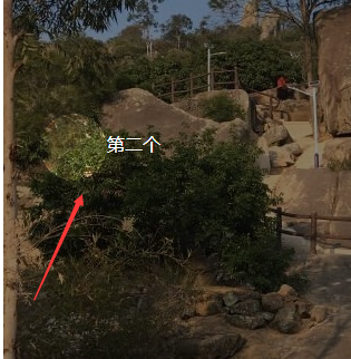
效果图:
3.透明遮罩
<!DOCTYPE html>

<html lang="en">

<head>

    <meta charset="UTF-8">

    <title>透明遮罩</title>

    <style type="text/css">

    body{background:url(images/img.jpg) top center no-repeat; }

    .editor-shell {

        width: 200px;

        height: 200px;

        border: 1px solid red;

        position: absolute;

        pointer-events: none;

        z-index: 1;

        box-shadow: 0 0 0 9999px rgba(0, 0, 0, .5);

    }

    </style>

</head>

<body>

    <div class="wrap">

        <div class="editor-shell" id="demo"></div>

    </div>

    <script src="http://apps.bdimg.com/libs/jquery/1.9.1/jquery.min.js" type="text/javascript"></script>

    <script>

    $(document).on("mousemove", function(event) {

        $("#demo").css({

            "top": event.pageY,

            "left": event.pageX

        });

    });

    </script>

</body>

</html>
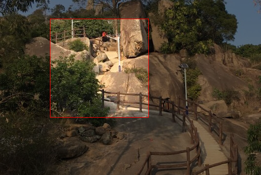
效果图:
4.颜色拾取器
<!DOCTYPE html>

<html lang="en">

<head>

    <meta charset="UTF-8">

    <title>颜色拾取器</title>

    <style type="text/css">

    body {

        background-color: #451F46

    }

    .rainbow {

        width: 20px;

        height: 150px;

        background-image: linear-gradient( -180deg,

        #f00 0%,

        #f0f 15%,

        #00f 33%,

        #0ff 49%,

        #0f0 67%,

        #ff0 84%,

        #f00 100%)

    }

    .rainbow-block {

        width: 150px;

        height: 150px;

        background-image: linear-gradient(

        180deg,rgba(255,255,255,0) 0%,

        rgb(255,255,255) 100%),

        linear-gradient( -90deg,

        #f00 0%,

        #f0f 15%,

        #00f 33%,

        #0ff 49%,

        #0f0 67%,

        #ff0 84%,

        #f00 100%)

    }

    </style>

</head>

<body>

    <div class="rainbow"></div>

    <div class="rainbow-block"></div>

</body>

</html>
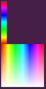
效果图:
5.文字颜色渐变
<!DOCTYPE html>

<html lang="en">

<head>

    <meta charset="UTF-8">

    <title>背景网格</title>

    <style type="text/css">

    .demo {

        text-align: center;

        margin: 100px auto 0;

        background-clip: text;

        background-image: linear-gradient( 146.976deg,

        rgb(107, 25, 207) 0%,

        rgb(242, 255, 0) 21.1765%,

        rgb(31, 222, 216) 35.8824%,

        rgb(255, 0, 153) 71.4706%,

        rgb(0, 0, 0) 100%);

        font-size: 70px;

        font-weight: 700;

        /*文字填充渐变色*/

        -webkit-background-clip: text;

        color: transparent;

    }

    .words {

        margin: 50px auto;

        font-size: 100px;

        font-weight: bold;

        text-align: center;

        text-transform: uppercase;

        color: transparent;

        background: url(images/img.jpg) no-repeat;

        background-size: cover;

        background-position: center center;

        -webkit-background-clip: text;

        /*文字描边*/

        -webkit-text-fill-color:transparent;

        -webkit-text-stroke:3px red;

    }

    </style>

</head>

<body>

    <div class="demo">文字颜色渐变</div>

    <div class="words"> 文字图案填充、描边</div>

</body>

</html>
效果图:
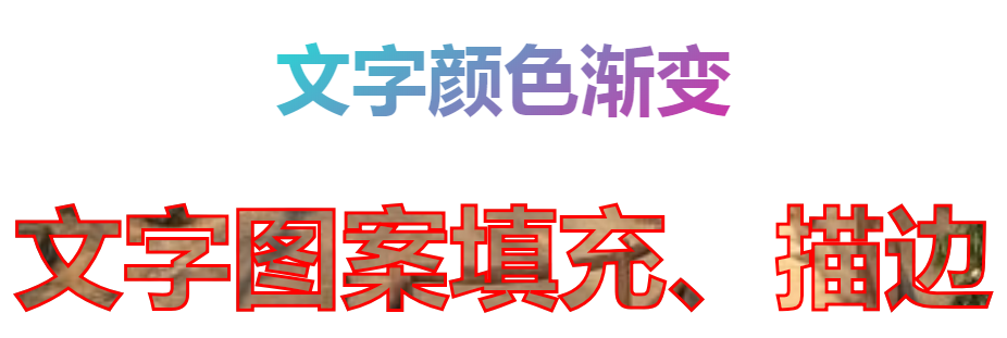
6.标题溢出渐变
<!DOCTYPE html>

<html lang="en">

<head>

    <meta charset="UTF-8">

    <title>Document</title>

    <style type="text/css">

        *{margin:0;padding:0;}

        a{ color: #333; text-decoration: none; }

        .demo{ width: 500px; height: 400px; margin:0 auto; background-color: red}

        .demo a{

            width: 260px;

            height: 30px;

            line-height: 30px;

            font-size: 20px;

            display: block;

            overflow:hidden;

            /*text-overflow: ellipsis;

            white-space: nowrap;*/

            position: relative;

        }

        .demo a:after{

            content: "";

            background: linear-gradient(to right,rgba(255, 255, 255, 0), #fff) no-repeat;

            position: absolute;

            right: 0;

            width: 20px;

            height: 30px;

        }

    </style>

</head>

<body>

    <div class="demo">

        <a href="波浪.html">维尼亚维尼亚官方海外旗舰店</a>

    </div>

</body>

</html>
效果图:

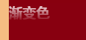
css3字渐变:
<!DOCTYPE html>

<html lang="en">

<head>

    <meta charset="UTF-8">

    <title>Document</title>

    <style type="text/css">

    * {

        margin: 0;

        padding: 0;

    }

    .text-gradient {

        display: inline-block;

        color: green;

        font-size: 10em;

        font-family: '微软雅黑';

        background-image: -webkit-gradient(linear, 0 0, 0 bottom, from(rgba(0, 128, 0, 1)), to(rgba(51, 51, 51, 1)));

        -webkit-background-clip: text;

        -webkit-text-fill-color: transparent;

    }

    ;

    </style>

</head>

<body>

    <h2 class="text-gradient">渐变色</h2>

</body>

</html>
效果图:

css3文字渐变色2:
<!DOCTYPE html>

<html>

<head>

    <meta charset="utf-8">

    <style>

    .gradient-text {

        background-image: -webkit-linear-gradient(bottom, red, #fd8403, yellow);

        -webkit-background-clip: text;

        -webkit-text-fill-color: transparent;

    }

    </style>

</head>

<body>

    <h3 class="gradient-text">文字渐变</h3>

</body>

</html>
效果图:

body{background: #}

.index_form_title{ font-weight: ; font-size: 80px; text-align: center;

background-image: -webkit-linear-gradient(bottom, rgb(, , ), rgb(, , ));

-webkit-background-clip: text;

-webkit-text-fill-color: transparent;}

伪元素渐变:
<p class="index_form_title" data-text="渐变色"></p>
.index_form_wrap{ background: # }

.index_form_title{ position: relative; font-weight: ; font-size: 20px; height: 50px; }

 .index_form_title::after {

            content: attr(data-text);

            color: #fff;

            position: absolute;

            left: ;

            z-index: ;

            -webkit-mask-image: -webkit-gradient(linear,  ,  bottom, from(rgb(, , )), to(rgba(, , , )));

        }
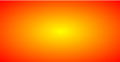
css3径向渐变
.radial-gradient {

    width: 400px; height: 200px;

    background: radial-gradient(yellow, red);

}
原链接:
https://www.zhangxinxu.com/wordpress/2017/11/css3-radial-gradient-syntax-example/
https://www.runoob.com/css3/css3-gradients.html
第四界css大会 黑魔法-css网格背景、颜色拾取器、遮罩、文字颜色渐变、标题溢出渐变等的更多相关文章
- css实现网格背景
只使用一个渐变时,我们能创建的图案并不多,当我们把多个渐变图案组合起来,让他们透过彼此的透明区域显现时,神奇的事情就发生了!我们首先想到的是把水平和水质条纹叠加起来,就可以得到各种各样的网格. 1. ...
- CSS 3学习——box-sizing和背景
box-sizing 在CSS 2中设置元素的width和height仅仅是设置了元素内容区的宽和高,元素实际的尺寸是margin + border + padding + 内容区. CSS 3(截止 ...
- CSS之生成全屏背景图片
在CSS中背景图片的填充方法: background-position:x,y(背景图片x,y轴的定位) background-repeat:no-repeat(不平铺) background-rep ...
- [CSS] css的background及多背景设置
问题 首先是一个 div 块里需要一张背景,带文本和图案的那种,但是身为容器的 div 是能够随数据的改变而变化长度的,所以一张静态图片不免的会有拉伸和挤扁的状态,尤其是有图案和文本的情况下最为明显 ...
- [css 揭秘] :CSS揭秘 技巧(五):条纹背景
条纹背景 https://github.com/FannieGirl/ifannie/问题:条纹背景 在设觉设计中无处不在,我们真的可以用css 创建图案吗? 这一章相对还是比较复杂的哦!一起get. ...
- CSS基本属性—文本属性和背景属性
一.CSS常用文本属性 [css中的颜色表示方式] 1.直接使用颜色的单词表示:red.green.blue 2.使用颜色的十六进制表示:#ff0000,#00ff00: 六位数,两两 ...
- 移动端(视口(meta),像素比,二倍图(图片,背景图,精灵图),css初始化(normalize.css),特殊样式,常见屏幕尺寸)
1. 视口:(布局视口(layout viewport),视觉视口(visual viewport),理想视口(ideal viewport)) meta 视口标签 <meta name = ...
- CSS页面布局与网格(下)
3.二维布局:CSS Grid Layout CSS Grid Layout模块为了能在二维空间里控制元素的顺序.位置和大小而定义了一组CSS属性. 被设值为display: grid的元素叫网格容器 ...
- from表单、css选择器、css组合器、字体样式、背景属性、边框设置、display设置
目录 一.form表单 1.form表单功能 2.表单使用原理 二.前端基础之css 1.关于css的介绍 2.css语法 3.三种编写CSS的方式 3.1.style内部直接编写css代码 3.2. ...
随机推荐
- 怎样给oracle数据库的用户解锁
找到并进入运行窗口:(可以用windows+r快捷键哦)输入sqlplus命令:如图 进入新窗口后使用scott/tiger用户和密码进行登录会发现登录不成功:如图 这时我们可以使用syste ...
- nodejs-supervisor
小技巧——使用 supervisor 如果你有 PHP 开发经验,会习惯在修改 PHP 脚本后直接刷新浏览器以观察结果,而你在开发 Node.js 实现的 HTTP 应用时会发现,无论你修改了代码的哪 ...
- Frequently Used Shell Commands
[Common Use Shell Commands] 1.ps aux:查看当前所有进程 ,以用户名为主键.可以查看到 USER.PID.COMMAND(binary所有位置) 2.netstat ...
- Prism之初识
首先,简单地介绍说一下单一应用程序与复合应用程序. 一.单一应用程序 看看上面这张图片,假如我们当前的需求是实现主界面如图所示.如果将其构建成具有用户控件的传统 WPF 应用程序,首先应构建一个顶层窗 ...
- 【bzoj1087】互不侵犯King 状态压缩dp
AC通道:http://www.lydsy.com/JudgeOnline/problem.php?id=1087 [题解] 用f[i][j][k]表示前i行放了j个棋子且第i行的状态为k的方案数. ...
- unity3d 移动与旋转 2
这次的代码示例是配合动画系统使用的 4.3新的动画系统允许动画带有位置偏移,只需要在Animator组件中勾选Apply Root Motion我们就可以使用它了. using UnityEngine ...
- 如何去掉UItableview headerview黏性
有时候使用UITableView所实现的列表,会使用到header view,但是又不希望它粘在最顶上而是跟随滚动而消失或者出现,下面的代码片段就是实现此功能 sectionHeaderHeight ...
- C++ std::thread
std::thread Defined in header class thread The class thread represents a single thread of execution. ...
- [Training Video - 1] [Selenium Basics] [Download and Install Selenium]
Download Selenium Jars Configure jars in eclipse Webdriver http://docs.seleniumhq.org/download/ Sele ...
- 如何提取kinect中深度图的点云数据
https://bbs.csdn.net/topics/391080654 在Matlab中调用Kinect教程:https://jingyan.baidu.com/article/af9f5a2d1 ...