记录一些WPF常用样式方便以后复用(转)
TextBox文本框

<Style x:Key="TextBoxStyle1" BasedOn="{x:Null}" TargetType="{x:Type TextBox}">
<Setter Property="Foreground" Value="{DynamicResource {x:Static SystemColors.ControlTextBrushKey}}"/>
<Setter Property="Background" Value="{DynamicResource {x:Static SystemColors.WindowBrushKey}}"/>
<Setter Property="BorderBrush" Value="{StaticResource TextBoxBorder}"/>
<Setter Property="BorderThickness" Value="1"/>
<Setter Property="Padding" Value="1"/>
<Setter Property="AllowDrop" Value="true"/>
<Setter Property="FocusVisualStyle" Value="{x:Null}"/>
<Setter Property="ScrollViewer.PanningMode" Value="VerticalFirst"/>
<Setter Property="Stylus.IsFlicksEnabled" Value="False"/>
<Setter Property="Template">
<Setter.Value>
<ControlTemplate TargetType="{x:Type TextBox}">
<Border x:Name="Bd" SnapsToDevicePixels="true" BorderBrush="#FFDDDDDD" BorderThickness="1" ClipToBounds="False" CornerRadius="5">
<Border.Effect>
<DropShadowEffect Color="White" Direction="0" ShadowDepth="0" BlurRadius="10"/>
</Border.Effect>
<!--这个Border主要用来遮挡框内的阴影,只要外阴影,如果只要内阴影不要外阴影,那么设置border的 ClipToBounds="True" 剪切外部内容,即可实现内阴影-->
<Border Background="White" CornerRadius="5">
<ScrollViewer x:Name="PART_ContentHost" SnapsToDevicePixels="{TemplateBinding SnapsToDevicePixels}" Background="{x:Null}" BorderBrush="{x:Null}" Foreground="{x:Null}">
</ScrollViewer>
</Border>
</Border>
<ControlTemplate.Triggers>
<Trigger Property="IsMouseOver" Value="True">
<Setter Property="BorderBrush" TargetName="Bd" Value="#FF66AFE9"/>
</Trigger>
<Trigger Property="IsFocused" Value="True">
<Setter Property="Effect" TargetName="Bd">
<Setter.Value>
<DropShadowEffect BlurRadius="10" Color="#FFE5F2FC" Direction="0" ShadowDepth="0"/>
</Setter.Value>
</Setter>
<Setter Property="BorderBrush" TargetName="Bd" Value="#FF66AFE9"/>
</Trigger>
</ControlTemplate.Triggers>
</ControlTemplate>
</Setter.Value>
</Setter>
</Style>
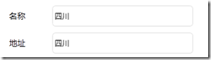
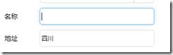
<TextBox Text="四川" Grid.Column="1" Grid.Row="2" BorderBrush="{x:Null}" Background="{x:Null}" SelectionBrush="#FFE237EA" HorizontalAlignment="Left" VerticalAlignment="Center" VerticalContentAlignment="Center" Style="{DynamicResource TextBoxStyle1}" Height="34" Width="230" Margin="4,5,0,5" />
ComboBox下拉框
<Style x:Key="ComboBoxStyle1" TargetType="{x:Type ComboBox}">
<Setter Property="BorderThickness" Value="1"/>
<Setter Property="ScrollViewer.HorizontalScrollBarVisibility" Value="Auto"/>
<Setter Property="ScrollViewer.VerticalScrollBarVisibility" Value="Auto"/>
<Setter Property="Padding" Value="4,3"/>
<Setter Property="ScrollViewer.CanContentScroll" Value="true"/>
<Setter Property="ScrollViewer.PanningMode" Value="Both"/>
<Setter Property="Stylus.IsFlicksEnabled" Value="False"/>
<Setter Property="ItemContainerStyle">
<Setter.Value>
<!--ComBoxItem-->
<Style TargetType="ComboBoxItem">
<Setter Property="MinHeight" Value="22"></Setter>
<Setter Property="MinWidth" Value="60"></Setter>
<Setter Property="Template">
<Setter.Value>
<ControlTemplate TargetType="ComboBoxItem">
<Border Name="Back" Background="Transparent" BorderThickness="0,0,0,0" BorderBrush="#81D779" Height="30" >
<ContentPresenter ContentSource="{Binding Source}" VerticalAlignment="Center" HorizontalAlignment="Left" Margin="5,0,0,0"></ContentPresenter>
</Border>
<ControlTemplate.Triggers>
<Trigger Property="IsMouseOver" Value="True">
<Setter TargetName="Back" Property="Background" Value="LightGray"></Setter>
</Trigger>
<Trigger Property="IsHighlighted" Value="True">
<Setter TargetName="Back" Property="Background" Value="LightGray"></Setter>
</Trigger>
</ControlTemplate.Triggers>
</ControlTemplate>
</Setter.Value>
</Setter>
</Style>
</Setter.Value>
</Setter>
<Setter Property="Template">
<Setter.Value>
<ControlTemplate TargetType="{x:Type ComboBox}">
<Grid x:Name="MainGrid" SnapsToDevicePixels="true" FocusVisualStyle="{x:Null}" Background="White" >
<Grid.ColumnDefinitions>
<ColumnDefinition Width="*"/>
<ColumnDefinition MinWidth="{DynamicResource {x:Static SystemParameters.VerticalScrollBarWidthKey}}" Width="0"/>
</Grid.ColumnDefinitions>
<Popup IsOpen="{TemplateBinding IsDropDownOpen}" Placement="Bottom" x:Name="Popup" Focusable="False" AllowsTransparency="True" PopupAnimation="Slide">
<Border CornerRadius="1" MaxHeight="{TemplateBinding MaxDropDownHeight}" MinWidth="{TemplateBinding ActualWidth}" x:Name="DropDown" SnapsToDevicePixels="True">
<Border.Effect>
<DropShadowEffect Color="Black" BlurRadius="2" ShadowDepth="0" Opacity="0.5"/>
</Border.Effect>
<ScrollViewer Margin="1,2,2,6" MaxHeight="{TemplateBinding MaxDropDownHeight}" SnapsToDevicePixels="True" HorizontalScrollBarVisibility="Auto" VerticalScrollBarVisibility="Auto" CanContentScroll="True">
<!-- StackPanel 用于显示子级,方法是将 IsItemsHost 设置为 True -->
<StackPanel IsItemsHost="True" KeyboardNavigation.DirectionalNavigation="Contained" Background="White"/>
</ScrollViewer>
</Border>
</Popup>
<ToggleButton x:Name="toggleButton" FocusVisualStyle="{x:Null}" BorderBrush="#FFDDDDDD" Grid.ColumnSpan="2" IsChecked="{Binding IsDropDownOpen, Mode=TwoWay, RelativeSource={RelativeSource TemplatedParent}}" Style="{StaticResource ComboBoxReadonlyToggleButton}" />
<TextBox Text="{TemplateBinding SelectionBoxItem}" HorizontalAlignment="Left" VerticalAlignment="Center" Margin="5,0,0,0" BorderThickness="0" BorderBrush="{x:Null}" Background="Transparent" SelectionBrush="#FFFF334F" IsReadOnly="True" Cursor="Arrow" FocusVisualStyle="{x:Null}" ></TextBox>
<!--<ContentPresenter ContentTemplate="{TemplateBinding SelectionBoxItemTemplate}" ContentTemplateSelector="{TemplateBinding ItemTemplateSelector}" Content="{TemplateBinding SelectionBoxItem}" ContentStringFormat="{TemplateBinding SelectionBoxItemStringFormat}" HorizontalAlignment="{TemplateBinding HorizontalContentAlignment}" IsHitTestVisible="false" Margin="{TemplateBinding Padding}" SnapsToDevicePixels="{TemplateBinding SnapsToDevicePixels}" VerticalAlignment="{TemplateBinding VerticalContentAlignment}"/>-->
</Grid>
<ControlTemplate.Triggers>
<Trigger Property="IsMouseOver" Value="True">
<Setter Property="BorderBrush" TargetName="toggleButton" Value="#FF66AFE9"/>
</Trigger>
<Trigger Property="IsEnabled" Value="false">
<Setter Property="Foreground" Value="{DynamicResource {x:Static SystemColors.GrayTextBrushKey}}"/>
<Setter Property="Background" Value="#FFF4F4F4"/>
</Trigger>
<Trigger Property="IsGrouping" Value="true">
<Setter Property="ScrollViewer.CanContentScroll" Value="false"/>
</Trigger>
</ControlTemplate.Triggers>
</ControlTemplate>
</Setter.Value>
</Setter>
<Style.Triggers>
<Trigger Property="IsEditable" Value="true">
<Setter Property="BorderBrush" Value="{StaticResource TextBoxBorder}"/>
<Setter Property="Background" Value="{DynamicResource {x:Static SystemColors.WindowBrushKey}}"/>
<Setter Property="IsTabStop" Value="false"/>
<Setter Property="Padding" Value="3"/>
</Trigger>
</Style.Triggers>
</Style>
<!--Combobox里ToggleButton的样式-->
<Style x:Key="ComboBoxReadonlyToggleButton" TargetType="{x:Type ToggleButton}">
<Setter Property="OverridesDefaultStyle" Value="true"/>
<Setter Property="ClickMode" Value="Press"/>
<Setter Property="Background" Value="Transparent"/>
<Setter Property="Template">
<Setter.Value>
<ControlTemplate TargetType="{x:Type ToggleButton}">
<Border x:Name="border1" ClipToBounds="True" BorderBrush="{TemplateBinding BorderBrush}" BorderThickness="1" CornerRadius="5" >
<Border.Effect>
<DropShadowEffect BlurRadius="5" ShadowDepth="0" Color="#FFF9F7F7" />
</Border.Effect>
<Grid>
<Grid.ColumnDefinitions>
<ColumnDefinition />
<ColumnDefinition Width="40" />
</Grid.ColumnDefinitions>
<Border x:Name="border" Grid.Column="1" BorderBrush="{TemplateBinding BorderBrush}" BorderThickness="1,0,0,0" Background="{x:Null}">
<Path x:Name="Arrow" Grid.Column="1" HorizontalAlignment="Center" VerticalAlignment="Center" Width="13" Height="10.25" Data="M 0 0 L 4 4 L 8 0 Z" Stretch="Fill" Fill="#FFEB5948" />
</Border>
</Grid>
</Border>
<ControlTemplate.Triggers>
<Trigger Property="IsMouseOver" Value="True">
<Setter Property="BorderBrush" TargetName="border1" Value="#FF66AFE9"/>
</Trigger>
<Trigger Property="IsMouseOver" Value="True">
<Setter Property="BorderBrush" TargetName="border1" Value="#FF66AFE9"/>
</Trigger>
<Trigger Property="IsMouseOver" Value="True" SourceName="border">
<Setter Property="Fill" TargetName="Arrow" Value="#FFC91E64"/>
</Trigger>
<Trigger Property="IsChecked" Value="true">
<!--<Setter Property="RenderPressed" TargetName="Chrome" Value="true"/>-->
</Trigger>
<Trigger Property="IsEnabled" Value="false">
<Setter Property="Fill" TargetName="Arrow" Value="#AFAFAF"/>
</Trigger>
</ControlTemplate.Triggers>
</ControlTemplate>
</Setter.Value>
</Setter>
</Style>
<!--引用样式-->
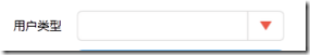
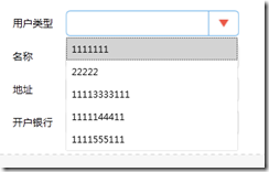
<ComboBox Grid.Row="3" Grid.Column="1" Height="33" Width="230" FocusVisualStyle="{x:Null}" Style="{DynamicResource ComboBoxStyle1}" HorizontalAlignment="Left" VerticalAlignment="Center" Margin="4,5,0,5">
<ListBoxItem>1111111</ListBoxItem>
<ListBoxItem>22222</ListBoxItem>
<ListBoxItem>11113333111</ListBoxItem>
<ListBoxItem>1111144411</ListBoxItem>
<ListBoxItem>1111555111</ListBoxItem>
</ComboBox>
记录一些WPF常用样式方便以后复用(转)的更多相关文章
- 记录一些WPF常用样式方便以后复用(二)(Button、CheckBox、输入账号密码框)(转)
Button (一) <Style x:Key="ButtonSaveStyle" TargetType="{x:Type Button}"> &l ...
- WPF常用样式总结
常用控件样式: <ResourceDictionary xmlns="http://schemas.microsoft.com/winfx/2006/xaml/presentation ...
- WPF 常用样式
TextBox <Window x:Class="WpfDemo.ListBoxTemaple" xmlns="http://schemas.microsoft.c ...
- 【基于WPF+OneNote+Oracle的中文图片识别系统阶段总结】之篇一:WPF常用知识以及本项目设计总结
篇一:WPF常用知识以及本项目设计总结:http://www.cnblogs.com/baiboy/p/wpf.html 篇二:基于OneNote难点突破和批量识别:http://www.cnblog ...
- WPF常用控件应用demo
WPF常用控件应用demo 一.Demo 1.Demo截图如下: 2.demo实现过程 总体布局:因放大缩小窗体,控件很根据空间是否足够改变布局,故用WrapPanel布局. <ScrollVi ...
- wpf 导出Excel Wpf Button 样式 wpf简单进度条 List泛型集合对象排序 C#集合
wpf 导出Excel 1 private void Button_Click_1(object sender, RoutedEventArgs e) 2 { 3 4 ExportDataGrid ...
- WPF中样式和行为和触发器
原文:WPF中样式和行为和触发器 样式简介:样式(style)是组织和重用格式化选项的重要工具,不是使用重复的标记填充XAML,以便设置外边距.内边距.颜色以及字体等细节.而是创建一系列封装所有这些细 ...
- 02-CSS常用样式
本篇主要介绍css的常用样式,以及网页布局相关知识.绝对定位和相对定位,盒子模型.css权重.以及css选择器: 绪论:CSS基本介绍 为了让网页元素的样式更加丰富,也为了让网页的内容和样式能拆分开, ...
- CSS/CSS3常用样式小结
1.强制文本单行显示: white-space:nowrap; 多行文本最后省略号: display: -webkit-box; -webkit-line-clamp:2; overflow: hid ...
随机推荐
- MooseFS技术详解
原文 http://www.tuicool.com/articles/vQvEZ3y MooseFS是一款具有冗余容错功能的分布式文件系统.它把数据分散在多台服务器上,确保一份数据多个备份副本,对外提 ...
- 设计模式--访问者模式C++实现
访问者模式C++实现 1定义Visitor Pattern 封装一些作用于某种数据结构中各元素的操作,他可以在不改变数据结构的前提下定义作用于这些元素新的操作 2类图 角色分析 Visitor抽象访问 ...
- OpenCL双边滤波实现美颜功能
OpenCL是一个并行异构计算的框架,包括intel,AMD,英伟达等等许多厂家都有对它的支持,不过英伟达只到1.2版本,主要发展自己的CUDA去了.虽然没有用过CUDA,但个人感觉CUDA比Open ...
- 51nod-1670-打怪兽(递推/组合数学)
1670 打怪兽 基准时间限制:1 秒 空间限制:131072 KB 分值: 40 难度:4级算法题 收藏 关注 lyk在玩一个叫做“打怪兽”的游戏.游戏的规则是这样的.lyk一开始会有一个初始 ...
- HDU 5698 大组合数取模(逆元)
瞬间移动 Time Limit: 4000/2000 MS (Java/Others) Memory Limit: 65536/65536 K (Java/Others)Total Submis ...
- EBS Certifications
Last Updated: September 29, 2017. This summary cross-references published blog articles and the off ...
- Linux命令 ls -l 输出内容含义详解
Linux命令 ls -l s输出内容含义详解 1. ls 只显示文件名或者文件目录 2. ls -l(这个参数是字母L的小写,不是数字1) 用来查看详细的文件资料 在某个目录下键入ls -l可 ...
- 022——VUE中remove()方法的使用:
<!DOCTYPE html> <html lang="en"> <head> <meta charset="UTF-8&quo ...
- ZOJ 1609 Equivalence(状压+dfs减枝)
ZOJ Problem Set - 1609 Equivalence Time Limit: 5 Seconds Memory Limit: 32768 KB When learning m ...
- js 滚到页面顶部
一.滚到顶部,且滚动中,用户滚动鼠标无效 <style> .div1, .div2, .div3, .div4 { height: 400px; width: 400px; } .div1 ...