
CSS奇思妙想图形(心形、气泡三角形、切角、梯形、饼图等)
今天看到一篇不错文章,在原来CSS3图形创建基础上扩展了很多。
这里记录总结下
心形
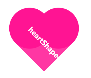
原理:利用 圆形 和 正方形实现
HTML:
<div class="heartShaped">

    <h1>heartShaped</h1>

</div>
CSS:
.heartShaped {

    position: absolute;

    top: 50%;

    left: 50%;

    transform: translate(-50%, -50%) rotate(45deg);

    background: rgba(255, 20, 147, .85);

    width: 140px;

    line-height: 140px;

    text-align: center;

    color: white;

    font-size: 12px;

}

.heartShaped:before, .heartShaped:after {

    content: '';

    position: absolute;

    top:;

    left: -70px;

    width: 140px;

    height: 140px;

    border-radius: 50%;

    background: rgb(255, 20, 147);

    z-index: -1;

}

.heartShaped:after {

    top: -70px;

    left:;

}
气泡三角形

原理:利用 border 的 transparent 特性实现
HTML:
<div class="bubbly">

    <p>heartShaped</p>

</div>
CSS:
.bubbly {

    position: absolute;

    top: 50%;

    left: 50%;

    transform: translate(-50%, -50%);

    background: #00aabb;

    border-radius: .4em;

    width: 260px;

    padding: 60px 20px;

    text-align: center;

    color: white;

    font-size: 200%;

}

.bubbly:after {

    content: '';

    position: absolute;

    bottom:;

    left: 50%;

    border: 34px solid transparent;

    border-top-color: #00aabb;

    border-bottom:;

    border-left:;

    margin: 0 0 -34px -17px;

}
切角
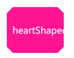
原理:使用线性渐变实现
HTML:
<div class="notching">

    <p>heartShaped</p>

</div>
CSS:
.notching {

            position: absolute;

            top: 50%;

            left: 50%;

            transform: translate(-50%, -50%);

            width: 160px;

            padding: 60px 20px;

            text-align: center;

            color: white;

            font-size: 200%;

        }

        .notching {

            background: linear-gradient(135deg, transparent 15px, deeppink 0) top left, linear-gradient(-135deg, transparent 15px, deeppink 0) top right, linear-gradient(-45deg, transparent 15px, deeppink 0) bottom right, linear-gradient(45deg, transparent 15px, deeppink 0) bottom left;

            background-size: 50% 50%;

            background-repeat: no-repeat;

        }
弧形切角
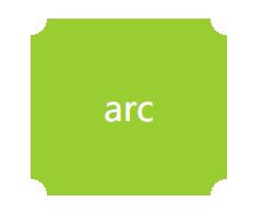
原理:使用径向渐变实现
HTML:
<div class="arc">

    <p>arc</p>

</div>
CSS:
.arc {

    position: absolute;

    top: 50%;

    left: 50%;

    transform: translate(-50%, -50%);

    width: 60px;

    padding: 60px;

    text-align: center;

    color: white;

    font-size: 200%;

}

.arc {

    background: radial-gradient(circle at top left, transparent 15px, yellowgreen 0) top left, radial-gradient(circle at top right, transparent 15px, yellowgreen 0) top right, radial-gradient(circle at bottom right, transparent 15px, yellowgreen 0) bottom right, radial-gradient(circle at bottom left, transparent 15px, yellowgreen 0) bottom left;

    background-size: 50% 50%;

    background-repeat: no-repeat;

}
单个颜色实现 hover 和 active 时的明暗变化效果
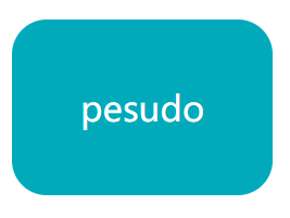
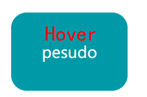
原理:利用伪类及透明度实现
HTML:
<div class="pesudo">

    <p>pesudo</p>

</div>
CSS:
.pesudo {

    position: absolute;

    top: 50%;

    left: 50%;

    transform: translate(-50%, -50%);

    width: 120px;

    padding: 60px;

    text-align: center;

    color: white;

    font-size: 200%;

    border-radius: 1em;

    background: #00aabb;

    cursor: pointer;

}

.pesudo:before {

    position: absolute;

    top:;

    right:;

    bottom:;

    left:;

    z-index: -1;

    border-radius: 1em;

    background: rgba(0, 0, 0, .1);

}

.pesudo:hover:before {

    content: "";

}

.pesudo:after {

    position: absolute;

    top:;

    right:;

    bottom:;

    left:;

    z-index: -1;

    border-radius: 1em;

    background: rgba(255, 255, 255, .2);

}

.pesudo:active:after {

    content: "";

}
梯形
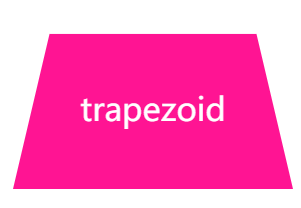
原理:利用伪类加旋转透视实现
HTML:
<div class="trapezoid">

    <p>trapezoid</p>

</div>
CSS
.trapezoid {

    position: absolute;

    top: 50%;

    left: 50%;

    transform: translate(-50%, -50%);

    width: 160px;

    padding: 60px;

    text-align: center;

    color: white;

    font-size: 200%;

}

.trapezoid:before {

    content: "";

    position: absolute;

    top:;

    right:;

    bottom:;

    left:;

    transform: perspective(40px) scaleY(1.3) rotateX(5deg);

    transform-origin: bottom;

    background: deeppink;

    z-index: -1;

}
饼图

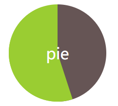
原理:利用伪类、线性渐变、旋转实现
HTML:
<div class="pie">

    <p>pie</p>

</div>
CSS
.pie {

    position: absolute;

    top: 50%;

    left: 50%;

    transform: translate(-50%, -50%);

    width: 200px;

    line-height: 200px;

    border-radius: 50%;

    text-align: center;

    color: white;

    font-size: 200%;

    background-color: yellowgreen;

    overflow: hidden;

    background-image: linear-gradient(to right, transparent 50%, #655 0);

    cursor: pointer;

}

.pie:before {

    content: "";

    position: absolute;

    top: 0;

    left: 50%;

    width: 50%;

    height: 100%;

    background-color: inherit;

    transform-origin: left;

    z-index: -1;

    transform: rotate(.1turn);

}

.pie:hover:before {

    transition: all 1s;

    transform: rotate(.45turn);

}
平行四边形
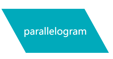
原理:利用伪类、拉伸实现
HTML:
<div class="parallelogram">

    <p>parallelogram</p>

</div>
CSS
.parallelogram {

    position: absolute;

    top: 50%;

    left: 50%;

    transform: translate(-50%, -50%);

    width: 280px;

    line-height: 150px;

    text-align: center;

    color: white;

    font-size: 200%;

}

.parallelogram:before {

    content: '';

    position: absolute;

    top:;

    right:;

    bottom:;

    left:;

    background-color: #00aabb;

    z-index: -1;

    transform: skew(.08turn);

}
菱形
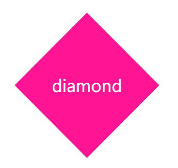
原理:利用伪类、旋转实现
HTML:
<div class="diamond">

    <p>diamond</p>

</div>
CSS
.diamond {

    position: absolute;

    top: 50%;

    left: 50%;

    transform: translate(-50%, -50%);

    width: 200px;

    line-height: 200px;

    text-align: center;

    color: white;

    font-size: 200%;

}

.diamond:before {

    content: '';

    position: absolute;

    top:;

    right:;

    bottom:;

    left:;

    background-color: deeppink;

    z-index: -1;

    transform: rotateZ(45deg);

}
折角
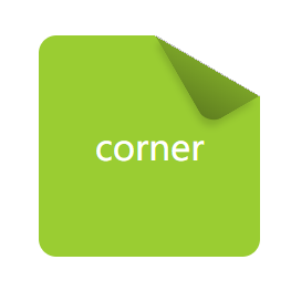
原理:利用切角、伪类、渐变、旋转实现
HTML:
<div class="corner">

    <p>corner</p>

</div>
CSS
.corner {

    position: absolute;

    top: 50%;

    left: 50%;

    transform: translate(-50%, -50%);

    width: 120px;

    line-height: 120px;

    padding: 40px;

    text-align: center;

    color: white;

    font-size: 200%;

    background: linear-gradient(-150deg, transparent 1.5em, yellowgreen 0);

    border-radius: .5em;

}

.corner:before {

    content: '';

    position: absolute;

    top:;

    right:;

    background: linear-gradient(to left bottom, transparent 50%, rgba(0, 0, 0, .2) 0, rgba(0, 0, 0, .4)) 100% 0 no-repeat;

    width: 1.73em;

    height: 3em;

    transform: translateY(-1.3em) rotate(-30deg);

    transform-origin: bottom right;

    border-bottom-left-radius: inherit;

    box-shadow: -.2em .2em .3em -.1em rgba(0, 0, 0, .15);

}
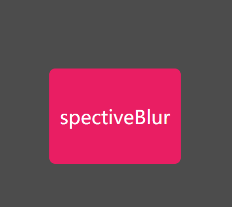
spectiveBlur
纯 CSS 方案实现背景变暗效果(hover按钮触发)
HTML:
<div class="spectiveBlur">

    <p>spectiveBlur</p>

</div>
CSS
.spectiveBlur {

    position: absolute;

    top: 50%;

    left: 50%;

    width: 220px;

    line-height: 160px;

    transform: translate(-50%, -50%);

    border-radius: 10px;

    overflow: hidden;

    background: #E91E63;

    color: #fff;

    font-size: 200%;

    text-align: center;

    cursor: pointer;

    transition: transform .2s;

}

.spectiveBlur:hover {

    box-shadow: 0 0 0 1920px rgba(0, 0, 0, .7);

    transform: translate(-50%, -50%) scale(1.2);

}
条纹背景图
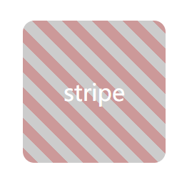
原理:利用渐变实现
HTML
<div class="stripe">

    <p>stripe</p>

</div>
CSS
.stripe {

    position: absolute;

    top: 50%;

    left: 50%;

    transform: translate(-50%, -50%);

    width: 200px;

    line-height: 200px;

    text-align: center;

    color: white;

    font-size: 200%;

    background: deeppink;

    border-radius: .5em;

    background: repeating-linear-gradient(45deg, #CC9999, #CC9999 15px, #CCCCCC 0, #CCCCCC 30px)

}
晴天(sun)(单标签实现)

原理:利用线性渐变、阴影、旋转实现
HTML:
<div class="sun">

    <p>sun</p>

</div>
CSS
.sun {

    position: absolute;

    top: 50%;

    left: 50%;

    width: 200px;

    height: 260px;

    transform: translate(-50%, -50%);

    text-align: center;

    font-size: 200%;

    color: #fff;

    background: #0BF;

    border-radius: 5px;

}

.sun:before {

    content: "";

    position: absolute;

    width: 80px;

    height: 80px;

    left: 50%;

    top: 50%;

    transform: translate(-50%, -50%);

    border-radius: 50%;

    background: rgba(255, 238, 68, 1);

    box-shadow: 0 0 0 15px rgba(255, 255, 0, 0.2), 0 0 15px #fff;

    z-index: -10;

}

.sun:after {

    content: "";

    position: absolute;

    top: 50%;

    left: 50%;

    height: 160px;

    width: 160px;

    transform: translate(-50%, -50%) rotate(30deg);

    z-index: -100;

    background-image: -webkit-linear-gradient(top, rgba(255, 255, 255, 0) 0%, rgba(255, 255, 255, 0.8) 50%, rgba(255, 255, 255, 0) 100%), -webkit-linear-gradient(left, rgba(255, 255, 255, 0) 0%, rgba(255, 255, 255, 0.8) 50%, rgba(255, 255, 255, 0) 100%);

    background-size: 20px 100%, 100% 20px;

    background-repeat: no-repeat;

    background-position: center center, center center;

    animation: sunRotate 10s linear infinite;

}

@keyframes sunRotate {

    0% {

        transform: translate(-50%, -50%) rotate(30deg);

    }

    100% {

        transform: translate(-50%, -50%) rotate(390deg);

    }

}
多云(cloudy)(单标签实现)

原理:利用线性渐变、阴影、缩放实现
HTML
<div class="cloudy">

    <p>cloudy</p>

</div>
CSS
.cloudy {

    position: absolute;

    top: 50%;

    left: 50%;

    width: 200px;

    height: 260px;

    transform: translate(-50%, -50%);

    text-align: center;

    font-size: 200%;

    color: #fff;

    background: #2EB5E5;

    border-radius: 5px;

}

.cloudy:before {

    content: "";

    text-indent: 23px;

    font-size: 22px;

    line-height: 40px;

    color: #333;

    position: absolute;

    height: 50px;

    width: 50px;

    background: #FFFFFF;

    left: 30%;

    top: 45%;

    transform: translate(-50%, -50%);

    border-radius: 50%;

    box-shadow: #FFFFFF 65px -15px 0 -5px, #FFFFFF 25px -25px, #FFFFFF 30px 10px, #FFFFFF 60px 15px 0 -10px, #FFFFFF 85px 5px 0 -5px, #C8C8C8 35px -35px, #C8C8C8 66px -27px 0 -5px, #C8C8C8 91px -10px 0 -8px;

    animation: cloudy 5s ease-in-out infinite;

}

.cloudy:after {

    content: "";

    position: absolute;

    top: 80%;

    left: 50%;

    height: 15px;

    width: 120px;

    background: rgba(0, 0, 0, .5);

    border-radius: 50%;

    transform: translate(-50%, -50%);

    animation: cloudy_shadow 5s ease-in-out infinite;

}

@keyframes cloudy {

    50% {

        transform: translate(-50%, -70%);

    }

    100% {

        transform: translate(-50%, -50%);

    }

}

@keyframes cloudy_shadow {

    50% {

        transform: translate(-50%, -50%) scale(0.8);

        background: rgba(0, 0, 0, .2);

    }

    100% {

        transform: translate(-50%, -50%) scale(1);

        background: rgba(0, 0, 0, .5);

    }

}
更多效果可以参考原网站:CSS实现各种图形
PS:这些CSS效果都是奇技淫巧,不过可以加深对CSS样式的理解,值得尝试
CSS奇思妙想图形(心形、气泡三角形、切角、梯形、饼图等)的更多相关文章
- CSS 魔法系列:纯 CSS 绘制图形(心形、六边形等)
<CSS 魔法系列>继续给大家带来 CSS 在网页中以及图形绘制中的使用.这篇文章给大家带来的是纯 CSS 绘制五角星.六角形.五边形.六边形.心形等等. 我们的网页因为 CSS 而呈现千 ...
- css3实现三角形,聊天背景气泡,心形等形状
1.聊天背景气泡: css代码如下: #talkbubble {width: 120px;margin:auto; background: red; position: relative; -moz- ...
- css画心形、三角形的总结
.heart { width: 10px; height: 10px; /* position: fixed; */ background: #fff; transform: rotate(45deg ...
- css实现心形图案
用1个标签实现心形图案,show you the code; <!DOCTYPE html> <html lang="en"> <head> & ...
- CSS实现心形、六角星、六边形、平行四边形等几何
本文将利用border属性实现简单几何的绘制: 效果图: 正八角星 说明:采用两个正方形以中心进行旋转叠加: /* 八角星 */ #burst-8 { background: #6376ff1f; w ...
- CSS图形基础:纯CSS绘制图形
为了在页面中利用CSS3绘制图形,在页面中定义 <div class="container"> <div class="shape"> ...
- CSS 不规则图形绘制
基础技能1 - 神奇的border 我们先来画一个长方形: .Rectangle { height: 100px; width: 200px; background: darkgray; border ...
- CSS制作图形速查表
很少会有人意识到,当浏览器绘制的border,会有一个角度的问题.我们就是得用这样的一个技巧来制作三角的效果.我们只需要保证一边的边框是有色,其他边框色为透明色,这样我们就很容易制作出三角形,然后改变 ...
- 【转】CSS制作图形速查表-存档
http://www.w3cplus.com/css/css-simple-shapes-cheat-sheet http://www.cnblogs.com/powertoolsteam/p/c ...
随机推荐
- Caused by: com.mysql.jdbc.MysqlDataTruncation: Data truncation: Truncated incorrect DOUBLE value: 'L
1.错误描述 [ERROR:]2015-06-08 09:49:42,523 [异常拦截] org.hibernate.exception.DataException: error executing ...
- 修改MyEclipse行数的颜色
修改MyEclipse行数的颜色 1.未修改前,行数的颜色 2.依次选择"Window--->Preferences" 3.选择"General--->Edi ...
- java.lang.NoClassDefFoundError: org/apache/jsp/jsp/Container_jsp
1.错误描述 八月 20, 2014 7:10:18 下午 org.apache.catalina.core.StandardWrapperValve invoke 严重: Servlet.servi ...
- Windows DLL资料整理
1.使用Visual C++ 6.0创建dll 2. 函数的调用规则(__cdecl,__stdcall,__fastcall,__pascal) 要点: 1. 如果你的程序中没有涉及可变参数,最好使 ...
- Qtree3题解(树链剖分(伪)+线段树+set)
外话:最近洛谷加了好多好题啊...原题入口 这题好像是SPOJ的题,挺不错的.看没有题解还是来一篇... 题意: 很明显吧.. 题解: 我的做法十分的暴力:树链剖分(伪)+线段树+\(set\)... ...
- UOJ207:共价大爷游长沙
题面 UOJ Sol 神题 给每个点对随机一个权值,把这两个点的权值异或上这个随机的值 用\(LCT\)维护子树信息,若子树异或和为所有点对的异或和那么就是答案 大常数代码 # include < ...
- Luogu4175:[CTSC2008]网络管理Network
题面 Luogu4175:[CTSC2008]网络管理Network Sol 路径第\(k\)大 无解直接判断就好了 然后整体二分,加上树链剖分+树状数组统计 # include <bits/s ...
- STM32高级定时器TIM1产生两路互补的PWM波(带死区)
测试环境:Keil 5.20.0.0 STM32F103RBT6 固件库版本:STM32F10x_StdPeriph_Lib_V3.5.0(2011) 本文使用TIM1的通道1,通道2,产生两路1kh ...
- Delphi子窗体随主窗体大小而变化
当然办法有很多种,我建议用TRzsplitter更好点, TRzsplitter分割,在其上边放置panel,然后把align置为alClient,则可以随着主窗体的大小而一起变动 选中此控件右键ed ...
- unity(c# ioc框架) 使用总结
这里的unity指的是完成依赖注入的unity而不是游戏引擎. 原本项目完成依赖注入用的是spring.net,但是spring.net已经很久没人维护了,所以微软官方推出的Unity成为了替代spr ...