flex布局快速成型(原创)
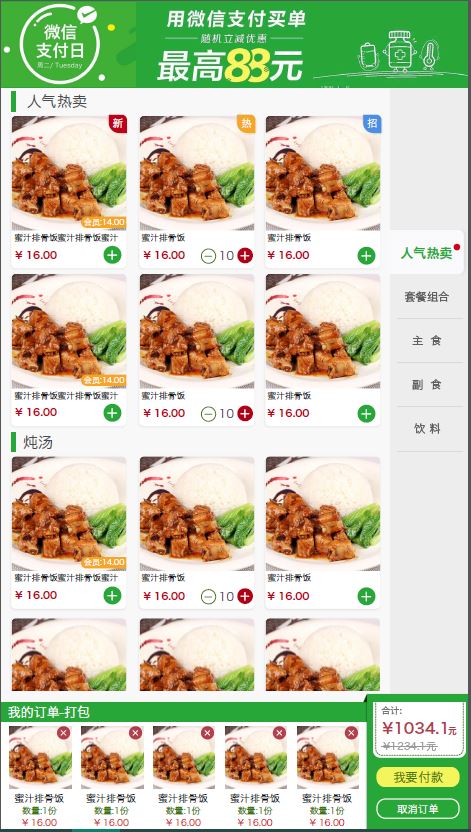
最近我根据一个UI设计,耗时3h快速实现较复杂页面布局,如上图。根据这份UI设计图,实现代码如下,暂不考虑具体细节,先以成型为主:
<!DOCTYPE html>

<html>

<style type="text/css">

*{

    padding: 0;

    margin: 0;

    font-size: 62.5%;

}

li{

    list-style:none

}

html{

    height:100%;

}

body{

    height:100%;

}

</style>

<head>

    <title>点餐页</title>

</head>

<body>

    <header style="width:100%;height:14.28%;background:red"></header>

    <div style="width:100%;height:71.42%;display:flex;">

        <span style="width:85.72%;overflow-y: auto">

            <div style="display: flex;flex-direction:column;height: 50rem">

                <span style="width: 100%;height:10%;background:black;margin: 0.5rem 0"></span>

                <ul style="width: 100%;background:pink;display: flex;flex-wrap:wrap;justify-content:space-between;">

                    <li style="width: 30%;height: 20rem;margin: 1rem;display: flex;flex-direction: column">

                        <span style="background:black ;height: 70%"></span>

                        <span style="height:10%;background:black;margin: 1rem  0"></span>

                        <span style="height:15%;background:blue;display: flex;justify-content:space-between;align-items: center;">

                            <span style="font-size: 2rem">123</span>

                            <button style="width: 25%">+</button>

                        </span>

                    </li>

                    <li style="width: 30%;height: 20rem;background: black;margin: 1rem"></li>

                    <li style="width: 30%;height: 20rem;background: black;margin: 1rem"></li>

                    <li style="width: 30%;height: 20rem;background: black;margin: 1rem"></li>

                    <li style="width: 30%;height: 20rem;background: black;margin: 1rem"></li>

                    <li style="width: 30%;height: 20rem;background: black;margin: 1rem"></li>

                </span>

            </div>

            <div style="display: flex;flex-direction:column;height: 50rem">

                <span style="width: 100%;height:10%;background:green;margin: 0.5rem 0"></span>

                <ul style="width: 100%;background:pink;display: flex;flex-wrap:wrap;justify-content:space-between;">

                    <li style="width: 30%;height: 20rem;margin: 1rem;display: flex;flex-direction: column">

                        <span style="background:black ;height: 70%"></span>

                        <span style="height:10%;background:black;margin: 1rem  0"></span>

                        <span style="height:15%;background:blue;display: flex;justify-content:space-between;align-items: center;">

                            <span style="font-size: 2rem">123</span>

                            <button style="width: 25%">+</button>

                        </span>

                    </li>

                    <li style="width: 30%;height: 20rem;background: black;margin: 1rem"></li>

                    <li style="width: 30%;height: 20rem;background: black;margin: 1rem"></li>

                    <li style="width: 30%;height: 20rem;background: black;margin: 1rem"></li>

                    <li style="width: 30%;height: 20rem;background: black;margin: 1rem"></li>

                    <li style="width: 30%;height: 20rem;background: black;margin: 1rem"></li>

                </ul>

            </div>

        </span>

        <span style="width:14.28%;background:blue"></div>

        </div>

        <footer style="width:100%;height:14.28%;display: flex">

            <span style="width: 75%;height: 100%">

                <div style="display: flex;height: 100%;flex-direction: column;">

                    <span style="height: 20%;background: green;width: 100%"></span>

                    <span style="height:80%;width: 100%">

                        <ul style="width: 100%;height: 100%;display: flex;flex-direction: row;overflow-x: auto;">

                            <li style="width: 10rem;height: 100%;display: flex;flex-direction: column;margin: 0 0.5rem;flex-shrink:0">

                                <span style="background:black ;height: 55%;width: 100%"></span>

                                <span style="height:10%;background:black;margin-top: 0.3rem ;width: 100%">

                                </span>

                                <span style="height:10%;background:black;margin: 0.3rem  0;width: 100%">

                                </span>

                                <span style="height:15%;background:blue;width: 100%"></span>

                            </li>

                                <li style="width: 10rem;height: 100%;display: flex;flex-direction: column;margin: 0 0.5rem;flex-shrink:0">

                                <span style="background:black ;height: 55%;width: 100%"></span>

                                <span style="height:10%;background:black;margin-top: 0.3rem ;width: 100%">

                                </span>

                                <span style="height:10%;background:black;margin: 0.3rem  0;width: 100%">

                                </span>

                                <span style="height:15%;background:blue;width: 100%"></span>

                            </li>

                                    <li style="width: 10rem;height: 100%;display: flex;flex-direction: column;margin: 0 0.5rem;flex-shrink:0">

                                <span style="background:black ;height: 55%;width: 100%"></span>

                                <span style="height:10%;background:black;margin-top: 0.3rem ;width: 100%">

                                </span>

                                <span style="height:10%;background:black;margin: 0.3rem  0;width: 100%">

                                </span>

                                <span style="height:15%;background:blue;width: 100%"></span>

                            </li>

                        </ul>

                    </span>

                </div>

            </span>

            <span style="width: 25%">

                <div style="display: flex;flex-direction: column;height: 100%;">

                    <span style="height: 50%;background: black"></span>

                    <span style="height: 25%;background:blue"></span>

                    <span style="height: 25%;background: pink"></span>

                </div>

            </span>

        </footer>

    </body>

    </html>
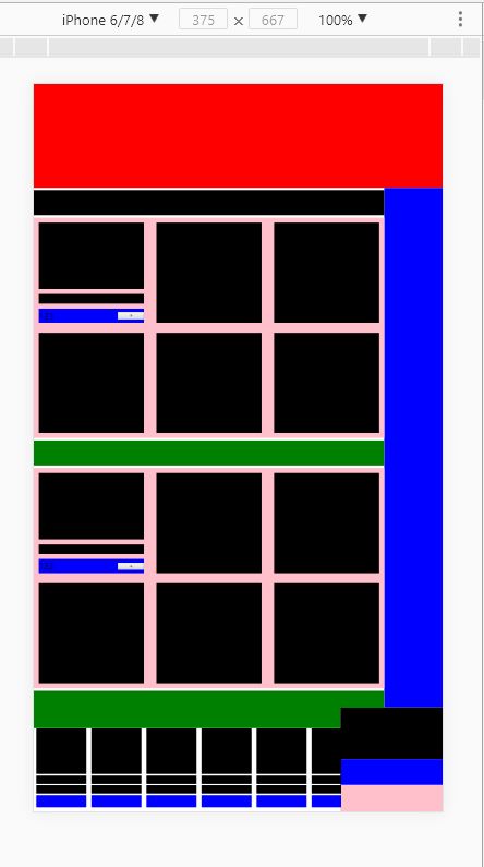
效果如图:
flex布局快速成型(原创)的更多相关文章
- CSS flex 布局快速入门
以前已经学过flex了,一直没做笔记,现在做下笔记再回忆下. 首先,flex布局的迷之属性们,如果一知半解,机械记忆的话,那不到半个月基本忘光光.先感受一下这12个flex布局属性,是不是很“迷”人. ...
- flex布局帮助你快速实现布局
flex布局可以帮我们快速布局一些区块,实现你想要的效果,不用再去float,position之类的.我们在布局网页的时候很多时候都是一些特殊布局,flex就能帮我快速去布局,不需要去定位. 任何一个 ...
- 【原创】display:flex布局大全
全都是自己写的 希望大家可以点个赞 谢谢! Html代码(没时间精简 请多包涵) <!DOCTYPE html> <html lang="en"> < ...
- css3 深入理解flex布局
一.简要介绍 css3最喜欢的新属性之一便是flex布局属性,用六个字概括便是简单.方便.快速. flex( flexible box:弹性布局盒模型),是2009年w3c提出的一种可以简洁.快速弹性 ...
- 写给 Android 开发的小程序布局指南,Flex 布局!
一.序 Hi,大家好,我是承香墨影! 最近在做小程序,验证一些方向,开发效率确实很快,就是各种微信的审核有点费劲,但是总归是有办法解决的. 想要开发一款小程序,其实和我们正常写一款 App 类似,你需 ...
- 30分钟彻底弄懂flex布局
欢迎大家前往腾讯云+社区,获取更多腾讯海量技术实践干货哦~ 本文由elson发表于云+社区专栏 目前在不考虑IE以及低端安卓机(4.3-)的兼容下,已经可以放心使用flex进行布局了.什么是flex布 ...
- CSS魔法堂:Flex布局
前言 Flex是Flexible Box的缩写,就是「弹性布局」.从2012年已经面世,但由于工作环境的原因一直没有详细了解.最近工作忙到头晕脑胀,是要学点新东西刺激一下大脑,打打鸡血. Flex就 ...
- 【Taro】363- 玩转 Taro 跨端之 flex 布局篇
Taro 是一套遵循 React 语法规范的跨平台开发解决方案,但是目前当我们使用 Taro 的时候,在不同平台上的开发体验还有不一致的地方,所以我们也都期待有一套跨平台统一的解决方案,能够以最小差异 ...
- 谈谈flex布局实现水平垂直居中
我们在这要谈的是用flex布局来实现水平和垂直居中.随着移动互联网的发展,对于网页布局来说要求越来越高,而传统的布局方案对于实现特殊布局非常不方便,比如垂直居中.所以09年,W3C 提出了一种新的方案 ...
随机推荐
- 第三讲 smart qq 登录成功后获取 vfwebqq ,psessionid,hash
public static void Login_GetPHV() { string urldata = "{\"ptwebqq\":\"#{ptwebqq}\ ...
- win7卸载JDK出现windows Installer程序包有问题
旭日Follow_24 的CSDN 博客 ,全文地址请点击: https://mp.csdn.net/postedit/82387967 操作系统:Windows 7 (64位) jdk版本:jdk1 ...
- ajax 跨域请求解决方案
1.为什么出现跨域: 前端和后端同一个项目下,ajax请求的地址是localhost同一个端口是话,是不会出现跨域问题的,所以相反前端和后端分开时,ajax请求的地址或者端口不是跟后台相同时就会出现跨 ...
- 字符串拼接引发的BUG
译者按: bug虽小,却是个磨人的小妖精! 原文: Fixing a bug: when concatenated strings turn into numbers in JavaScript 译者 ...
- 基于jquery二维码生成插件qrcode
1.首先在页面中加入jquery库文件和qrcode插件. ? 1 2 <script type="text/javascript" src="jquery.js& ...
- JavaScript中判断整字类型最简洁的实现方法
这篇文章主要介绍了JavaScript中判断整字类型最简洁的实现方法,本文给出多个判断整数的方法,最后总结出一个最短.最简洁的实现方法,需要的朋友可以参考下 我们知道JavaScript提供了type ...
- CSS实现移动端横向滑动
html: <div class="chosen-container"> <div class="chosen-swiper"> < ...
- MySQL 查看执行计划
MySQL 使用 explain + sql 语句查看 执行计划,该执行计划不一定完全正确但是可以参考. EXPLAIN SELECT * FROM user WHERE nid = 3; selec ...
- 洛谷P4104 [HEOI2014]平衡(dp 组合数学)
题意 题目链接 Sol 可以把题目转化为从\([1, 2n + 1]\)中选\(k\)个数,使其和为\((n+1)k\). 再转化一下:把\((n+1)k\)划分为\(k\)个数,满足每个数在范围在\ ...
- Elasticsearch Search APIs
Elasticsearch Search APIs By:授客 QQ:1033553122 1. 搜索 1 在单个索引的所有类型中搜索 1 在单个索引的指定类型中搜索 1 在多个指定的索引中搜索 1 ...