
FCC---Create a Graphic Using CSS---新月图形
By manipulating different selectors and properties, you can make interesting shapes. One of the easier ones to try is a crescent moon shape.
For this challenge you need to work with the box-shadow property that sets the shadow of an element, along with the border-radius property that controls the roundness of the element's corners.
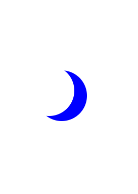
You will create a round, transparent object with a crisp shadow that is slightly offset to the side - the shadow is actually going to be the moon shape you see.
In order to create a round object, the border-radius property should be set to a value of 50%.
You may recall from an earlier challenge that the box-shadow property takes values for offset-x, offset-y, blur-radius, spread-radius and a color value in that order. The blur-radius and spread-radius values are optional.
原始代码下的图形如下:

练习题:
Manipulate the square element in the editor to create the moon shape.
First, change the background-color to transparent, then set the border-radius property to 50% to make the circular shape.
Finally, change the box-shadow property to set the offset-x to 25px, the offset-y to 10px, blur-radius to 0, spread-radius to 0, and color to blue.
- 先把蓝色的背景调成透明
- 再调整后面绿色box-shadow阴影的边界半径,到50%
- 最后是微调box-shadow,之前做过关于这个的练习,做过我都已经忘记了,所以自己调了下不同值的看了下效果。基本就是把新月的颜色从绿色改到蓝色,边缘模糊的变锐化了,以后遇到再细看吧
练习代码:
<style>

  .center {

    position: absolute;

    margin: auto;

    top: ;

    right: ;

    bottom: ;

    left: ;

    width: 100px;

    height: 100px;

    background-color: transparent;

    border-radius: %;

    box-shadow: 25px 10px   blue;

  }

</style>

<div class="center"></div>
效果:
FCC---Create a Graphic Using CSS---新月图形的更多相关文章
- CSS 魔法系列:纯 CSS 绘制图形(心形、六边形等)
<CSS 魔法系列>继续给大家带来 CSS 在网页中以及图形绘制中的使用.这篇文章给大家带来的是纯 CSS 绘制五角星.六角形.五边形.六边形.心形等等. 我们的网页因为 CSS 而呈现千 ...
- 用css绘制图形
巧用css的border-radius属性,也能绘制出好看的图形 html部分 <!DOCTYPE html><html> <head> <meta char ...
- CSS制作图形速查表
很少会有人意识到,当浏览器绘制的border,会有一个角度的问题.我们就是得用这样的一个技巧来制作三角的效果.我们只需要保证一边的边框是有色,其他边框色为透明色,这样我们就很容易制作出三角形,然后改变 ...
- 【转】CSS制作图形速查表-存档
http://www.w3cplus.com/css/css-simple-shapes-cheat-sheet http://www.cnblogs.com/powertoolsteam/p/c ...
- CSS 魔法系列:纯 CSS 绘制图形(各种形状的钻石)
我们的网页因为 CSS 而呈现千变万化的风格.这一看似简单的样式语言在使用中非常灵活,只要你发挥创意就能实现很多比人想象不到的效果.特别是随着 CSS3 的广泛使用,更多新奇的 CSS 作品涌现出来. ...
- css画图形
博客: 史上最强大的40多个纯cs图形 问题:看了上面的博客思考简单的三角行是怎么形成的? #triangle-up { width: 0; height: 0; border-left: 50px ...
- CSS奇思妙想图形(心形、气泡三角形、切角、梯形、饼图等)
今天看到一篇不错文章,在原来CSS3图形创建基础上扩展了很多. 这里记录总结下 心形 原理:利用 圆形 和 正方形实现 HTML: <div class="heartShaped&qu ...
- CSS 不规则图形绘制
基础技能1 - 神奇的border 我们先来画一个长方形: .Rectangle { height: 100px; width: 200px; background: darkgray; border ...
- 利用CSS制作图形效果
前言 关于如何使用CSS来制作图形,比如说圆形,半圆形,三角形等的相关教程还是挺多的,今天我主要想解释一下里面一些demo的实现原理,话不多说,开始吧 以下所有内容只使用一个HTML元素.任何类型 ...
随机推荐
- 6、UnityConfig实现AOP
需求:我们需要给已经开发好的服务如这里的UserService,添加额外的执行逻辑,但是又不想破坏原有的服务,如:我们需要给UserService添加监控逻辑,监控的目的是看UserService服务 ...
- C#基础——break ,continue, return用法
- 如何正确使用 Spring Cloud?【上】
如何更快地交付软件,每周.每天甚至每个小时向用户发布新特性?如何让新员工在入职后就能部署代码?在如此快的节奏下如何保证质量?快,我们应用开发面临的主要挑战,交付越快就越能紧密地收集到用户反馈,从而更有 ...
- 开源资产管理系统Snipe-IT
CentOS7安装IT资产管理系统Snipe-IT介绍资产管理工具Github:https://github.com/snipe/snipe-it官网:https://snipeitapp.com/D ...
- Android设置EditText不可编辑
版权声明:本文为xing_star原创文章,转载请注明出处! 本文同步自http://javaexception.com/archives/224 禁用EditText 这个其实很简单,最简单的一种方 ...
- java月考题JSD1908第二次月考(含答案和解析)
考试 .container { clear: both; margin: 0 auto; text-align: left; /*width: 1200px;*/ } .container:after ...
- MySQL MHA /usr/share/perl5/vendor_perl/MHA/ServerManager.pm, ln301] install_driver(mysql) failed: Attempt to reload DBD/mysql.pm aborted
在公司随便找3台测试机搭个MHA,下面这个问题折腾了三天,之前没遇到过,查了OS版本发现一致,可能是不同人弄的OS吧,知道是cpan的问题就是搞不定,郁闷...[root@test247 ~]# ma ...
- 常用的数据压缩lib
最近项目需要使用数据压缩,下面针对数据压缩库进行调研,并进行简单记录,对于关于库的介绍,可以在官网阅读最新的文档,我就不在这里重复了: A fast compressor/decompressor: ...
- Linux 版本控制工具之rabbitvcs
原文地址:http://www.robotshell.com/2017/11/04/Linux-%E7%89%88%E6%9C%AC%E6%8E%A7%E5%88%B6%E5%B7%A5%E5%85% ...
- Dockerfile制作镜像
Dockerfile简介 dockerfile 是一个文本格式的配置文件, 用户可以使用 Dockerfile 来快速创建自定义的镜像, 另外,使用Dockerfile去构建镜像好比使用pom去构建m ...