win10 UWP 等级控件Building a UWP Rating Control using XAML and the Composition API | XAML Brewer, by Diederik Krols
原文:Building a UWP Rating Control using XAML and the Composition API | XAML Brewer, by Diederik Krols
Building a UWP Rating Control using XAML and the Composition API
In this article we’ll build a XAML and C# Rating Control for the Windows Universal Platform which will be entirely drawn by the Composition API. It’s a custom Control that comes with the following dependency properties:
- Maximum (int): the number of stars (or other images) to display,
- StepFrequency (double): the rounding interval for the Value (a percentage, e.g. 0.25)
- Value (double): the current value (from 0 to Maximum)
- ItemHeight (int): height (and width) of each image in device independent pixels
- ItemPadding (int): the number of pixels between images
- FilledImage (uri): path to the filled image
- EmptyImage (uri): path to the empty image
- IsInteractive (bool): whether or not the control responds to user input (tapping or sliding)
The names of the core properties (Maximum, StepFrequency, and Value) are borrowed from the Slider class because after all –just like the slider- a Rating control is just a control to set and display a value within a range.
The Rating control’s behavior is also inspired by the slider:
- tap on an image to set a value, and
- slide horizontally over the control to decrease and increase the value with StepFrequency steps.
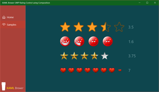
Here are some instances of the control in action:
An almost empty XAML template
The UI of the control is drawn entirely using the Composition API, so I kept the XAML template as simple as possible. I was tempted to use an ItemsControl as basis, but went for a Panel.. If the control were purely XAML, then a horizontal StackPanel would suffice as ControlTemplate. The star (or other) images will be displayed using the Composition API, in a layer on top of that StackPanel. This layer makes the panel itself unable to detect Tapped or ManipulationDelta events. The template contains extra Grid controls to put a ‘lid’ on the control.
The control template makes the distinction between the part that displays the images (PART_Images), and the part that deals with user input (PART_Interaction) through touch, pen, mouse or something else (like X-Box controller or Kinect – remember it’s a UWP app).
Here’s the default style definition in Themes/Generic.xaml:
<Style TargetType="local:Rating"> <Setter Property="Template"> <Setter.Value> <ControlTemplate TargetType="local:Rating"> <Grid> <!-- Holds the images. --> <StackPanel x:Name="PART_Items" Orientation="Horizontal" HorizontalAlignment="Center" VerticalAlignment="Center" /> <!-- Interacts with touch and mouse and so. --> <Grid x:Name="PART_Interaction" ManipulationMode="TranslateX" Background="Transparent" /> </Grid> </ControlTemplate> </Setter.Value> </Setter></Style> |
The code behind
Set-up
By convention, all named elements in the style start their name with “PART_” and are decorated with a TemplatePart:
[TemplatePart(Name = ItemsPartName, Type = typeof(StackPanel))][TemplatePart(Name = InteractionPartName, Type = typeof(UIElement))]public class Rating : Control{ private const string ItemsPartName = "PART_Items"; private const string InteractionPartName = "PART_Interaction"; // ...} |
All properties are defined as Dependency Property, which allows two-way binding in XAML and automatic property change notification. All of the properties also have a default value, so that the control can be used immediately without specifying mandatory property values. And last but not least, all of the properties have a PropertyChanged callback in their PropertyMetadata, so the UI of the control is updated automatically at runtime when one of the properties changes. The dependency property registrations use the nameof() expression instead of a hard-coded string [which is still in the propdp code snippet].
Here’s how the ItemHeight property is registered:
public static readonly DependencyProperty ItemHeightProperty = DependencyProperty.Register( nameof(ItemHeight), typeof(int), typeof(Rating), new PropertyMetadata(12, OnStructureChanged)); |
In the OnApplyTemplate the control is drawn by a call to OnStructureChanged – the property changed callback that also redraws the control at runtime – and the event handlers for touch interaction –Tapped and ManipulationDelta– are registered:
protected override void OnApplyTemplate(){ // Ensures that ActualWidth is actually the actual width. HorizontalAlignment = HorizontalAlignment.Left; OnStructureChanged(this); var surface = this.GetTemplateChild(InteractionPartName) as UIElement; if (surface != null) { surface.Tapped += Surface_Tapped; surface.ManipulationDelta += Surface_ManipulationDelta; } base.OnApplyTemplate();} |
The OnstructureChanged method is called when the control is rendered initially, or whenever one of the main UI characteristics is changed (things like item height or padding, maximum, ore one of the images).
The method starts with verifying if the user provided custom images. If not, a default empty and full star image is taken from the control’s own resources. To my surprise, the initialization of the default image path did not work in the dependency property registration, nor in OnApplyTemplate:
private static void OnStructureChanged(DependencyObject d){ Rating c = (Rating)d; if (c.EmptyImage == null) { c.EmptyImage = new Uri( "ms-appx:///XamlBrewer.Uwp.RatingControl/Assets/defaultStar_empty.png"); } if (c.FilledImage == null) { c.FilledImage = new Uri( "ms-appx:///XamlBrewer.Uwp.RatingControl/Assets/defaultStar_full.png"); } // ...} |
The next step in OnStructureChanged is to make sure that the StepFrequency falls in the expected range, which is greater than zero but maximum one:
if ((c.StepFrequency <= 0) || (c.StepFrequency > 1)){ c.StepFrequency = 1;} |
Loading the images
Then it’s time to load the two images. In the current version of the Composition API you’ll need some extra help for this. My favorite helper is the Microsoft.UI.Composition.Toolkit, a small C++ project that comes with the Windows UI Dev Labs samples on GitHub:

Every image is loaded once into a CompositionSurfaceBrush that we’ll reuse for each item in the list of rating images. Here’s the code that creates the two brushes:
var panel = c.GetTemplateChild(ItemsPartName) as StackPanel;if (panel != null){ // ... // Load images. var root = panel.GetVisual(); var compositor = root.Compositor; var options = new CompositionImageOptions() { DecodeWidth = c.ItemHeight, DecodeHeight = c.ItemHeight }; var imageFactory = CompositionImageFactory.CreateCompositionImageFactory(compositor); var image = imageFactory.CreateImageFromUri(c.EmptyImage, options); var emptyBrush = compositor.CreateSurfaceBrush(image.Surface); image = imageFactory.CreateImageFromUri(c.FilledImage, options); var fullBrush = compositor.CreateSurfaceBrush(image.Surface); // ...} |
The reason why I prefer to use the Composition Toolkit for loading images is the fact that you can control the DecodeWidth and DecodeHeight. Alternatively, you can use the C# CompositionImageLoader project, also on GitHub. It comes with a NuGet package:

Here’s how the code looks like when you use this library:
// Load images.var root = panel.GetVisual();var compositor = root.Compositor;var imageLoader = ImageLoaderFactory.CreateImageLoader(compositor);var surface = imageLoader.LoadImageFromUri(c.EmptyImage);var emptyBrush = compositor.CreateSurfaceBrush(surface);surface = imageLoader.LoadImageFromUri(c.FilledImage);var fullBrush = compositor.CreateSurfaceBrush(surface); |
I had the intention to copy relevant code of the CompositionImageLoader into my project in order to create a full C# control with as few as possible external dependencies (only Win2D). But then I noticed a loss in image quality when using CompositionImageLoader. It looks like there’s a loss in DPI, even if you specify the size of the target image on load:
surface = imageLoader.LoadImageFromUri( c.FilledImage, new Size(c.ItemHeight, c.ItemHeight)); |
Here’s a screenshot of the sample app using CompositionImageLoader:

And here’s the same app using Micsosoft.Composition.UI.Toolkit:

There’s a significant loss of quality in the devil and 3D star images. To see it, you may need to click on the screenshots to see them in full size, or try another monitor – the difference is not always obvious. Anyway, it made me hit the undo button in Source Control…
Rendering the control
The two composition surface brushes are loaded into SpriteVisual instances that are hooked to a padded Grid that is created for each item in the list of rating images. The full image will be drawn on top of the empty one. Based on the Value, we’ll calculate the clipping rectangle for each ‘full’ image. Here’s a 3D view on the structure. The yellow surface represents the StackPanel from the control’s template, the green rectangles are the root Grid elements for each image, and the images are … well … the images:

At runtime, we’ll change the InsetClip values of the images on top, so the control maintains the references to these:
private List<InsetClip> Clips { get; set; } = new List<InsetClip>(); |
Here’s the code that creates all the layers – the full images are right-clipped at zero, so they don’t appear:
var rightPadding = c.ItemPadding;c.Clips.Clear();for (int i = 0; i < c.Maximum; i++){ if (i == c.Maximum - 1) { rightPadding = 0; } // Create grid. var grid = new Grid { Height = c.ItemHeight, Width = c.ItemHeight, Margin = new Thickness(0, 0, rightPadding, 0) }; panel.Children.Add(grid); var gridRoot = grid.GetVisual(); // Empty image. var spriteVisual = compositor.CreateSpriteVisual(); spriteVisual.Size = new Vector2(c.ItemHeight, c.ItemHeight); gridRoot.Children.InsertAtTop(spriteVisual); spriteVisual.Brush = emptyBrush; // Filled image. spriteVisual = compositor.CreateSpriteVisual(); spriteVisual.Size = new Vector2(c.ItemHeight, c.ItemHeight); var clip = compositor.CreateInsetClip(); c.Clips.Add(clip); spriteVisual.Clip = clip; gridRoot.Children.InsertAtTop(spriteVisual); spriteVisual.Brush = fullBrush;} |
We’re at the end of the OnstructureChanged code now. The control is rendered or re-rendered with the correct number of the correct images at the correct size and padding. It’s time to update the value:
OnValueChanged(c); |
Changing the value
When the Value of the control is changed, we calculate the InsetClip for each image in the top layer (the ‘full’ stars). The images left of the value will be fully shown (clipped to the full width), the images right of the value will be hidden (clipped to zero). For the image in the middle, we calculate the number of pixels to be shown:
private static void OnValueChanged(DependencyObject d){ Rating c = (Rating)d; var panel = c.GetTemplateChild(ItemsPartName) as StackPanel; if (panel != null) { for (int i = 0; i < c.Maximum; i++) { if (i <= Math.Floor(c.Value - 1)) { // Filled image. c.Clips[i].RightInset = 0; } else if (i > Math.Ceiling(c.Value - 1)) { // Empty image. c.Clips[i].RightInset = c.ItemHeight; } else { // Curtain. c.Clips[i].RightInset = (float)(c.ItemHeight * (1 + Math.Floor(c.Value) - c.Value)); } } }} |
The images come from reusable brushes and are never reloaded at runtime, so I think that this rating control is very efficient in its resource usage.
The behavior
The Value property changes by sliding over the image. We have to round it to the nearestStepFrequency fraction. Here’s the rounding routine:
public static double RoundToFraction(double number, double fraction){ // We assume that fraction is a value between 0 and 1. if (fraction <= 0) { return 0; } if (fraction > 1) { return number; } double modulo = number % fraction; if ((fraction - modulo) <= modulo) modulo = (fraction - modulo); else modulo *= -1; return number + modulo;} |
The behavior of the rating control is defined by two interactions:
- tapping for fast initialization, and
- sliding to adjust more precisely.
As already mentioned, the event handlers for the control’s interaction are defined on the entire control surface, not on each image. So when an image is tapped or clicked, we need to detect which one was actually hit. We then set the control to a new value which is rounded to the integer, so the whole tapped/clicked images becomes selected:
private void Surface_Tapped(object sender, TappedRoutedEventArgs e){ if (!IsInteractive) { return; } Value = (int)(e.GetPosition(this).X / (ActualWidth + ItemPadding) * Maximum) + 1;} |
The calculation for deriving the Value from the the horizontal sliding manipulation is a bit more complex because we want the ‘curtain’ to closely follow the finger/pointer. We don’t change the control’s Value while sliding between the images, which creates a very natural user experience:
private void Surface_ManipulationDelta(object sender, ManipulationDeltaRoutedEventArgs e){ if (!IsInteractive) { return; } // Floor. var value = Math.Floor(e.Position.X / (ActualWidth + ItemPadding) * Maximum); // Step. value += Math.Min(RoundToFraction( ((e.Position.X - (ItemHeight + ItemPadding) * (value)) / (ItemHeight)), StepFrequency), 1); // Keep within range. if (value < 0) { value = 0; } else if (value > Maximum) { value = Maximum; } Value = value;} |
Using the Rating Control
When you want to use the rating control in your app, just declare its namespace in the XAML:
xmlns:controls="using:XamlBrewer.Uwp.Controls" |
Then draw a Rating control and set its properties – as already mentioned: all of the properties have a default value:
<controls:Rating x:Name="Devils" Maximum="4" ItemHeight="60" ItemPadding="24" StepFrequency=".1" EmptyImage="ms-appx:///Assets/RatingImages/devil_empty.png" FilledImage="ms-appx:///Assets/RatingImages/devil_full.png" /> |
That’s all there is.
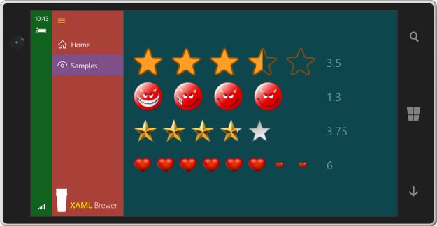
It’s a UWP control, so it runs on PC’s, tablets, Raspberry Pi, Xbox, and Hololens. Since I don’t own all of these (yet), here’s a screenshot from the phone:
Source code
The XAML-and-Composition Rating Control for UWP lives here on GitHub, together with the sample app.
Enjoy!
Like this:
Related
Building a custom UWP control with XAML and the Composition APIIn "Composition API"
This entry was posted in Composition API, User Controls, UWP on July 11, 2016 by xamlbrewer.
win10 UWP 等级控件Building a UWP Rating Control using XAML and the Composition API | XAML Brewer, by Diederik Krols的更多相关文章
- 2018-2-13-win10-UWP-等级控件
title author date CreateTime categories win10 UWP 等级控件 lindexi 2018-2-13 17:23:3 +0800 2018-2-13 17: ...
- UWP Composition API - New FlexGrid 锁定行列
如果之前看了 UWP Jenkins + NuGet + MSBuild 手把手教你做自动UWP Build 和 App store包 这篇的童鞋,针对VS2017,需要对应更新一下配置,需要的童鞋点 ...
- UWP开发随笔——UWP新控件!AutoSuggestBox!
摘要 要开发一款优秀的application,控件肯定是必不可少的,uwp就为开发者提供了各种各样的系统控件,AutoSuggestBox就是uwp极具特色的控件之一,也是相对于之前win8.1的ua ...
- WindowsXamlHost:在 WPF 中使用 UWP 的控件(Windows Community Toolkit)
Windows Community Toolkit 再次更新到 5.0.以前可以在 WPF 中使用有限的 UWP 控件,而现在有了 WindowsXamlHost,则可以使用更多 UWP 原生控件了. ...
- win10 uwp 使用 msbuild 命令行编译 UWP 程序
原文:win10 uwp 使用 msbuild 命令行编译 UWP 程序 版权声明:博客已迁移到 http://lindexi.gitee.io 欢迎访问.如果当前博客图片看不到,请到 http:// ...
- [UWP小白日记-12]使用新的Composition API来实现控件的阴影
前言 看了好久官方的Windows UI Dev Labs示例好久才有点心得,真是头大.(其实是英语幼儿园水平(⊙﹏⊙)b) 真的网上关于这个API的资料可以说几乎没有. 正文 首先用这东西的添加WI ...
- UWP Composition API - RadialMenu
用Windows 8.1的童鞋应该知道OneNote里面有一个RadialMenu.如下图,下图是WIn10应用Drawboard PDF的RadialMenu,Win8.1的机器不好找了.哈哈,由于 ...
- UWP Composition API - 锁定列的FlexGrid
需求是第一列锁定,那么怎么让锁定列不跟着滚动条向做移动呢? 其实很简单,让锁定列跟scrollviewer的滚动做反方向移动. 先看一下这个控件的模板,嗯,其实很简单,就是ListView的模板,不同 ...
- UWP Composition API - GroupListView(二)
还是先上效果图: 看完了上一篇UWP Composition API - GroupListView(一)的童鞋会问,这不是跟上一篇一样的吗??? 骗点击的?? No,No,其实相对上一个有更简单粗暴 ...
随机推荐
- centos 7.2安装git2.x版本
前言 今天在我的centos7.2开发环境安装git2.x时候遇到了各种问题,还好一一解决,为方便大家,这里列出遇到的问题和解决办法,yum默认安装的git1.8版本的,公司git服务器在window ...
- PAT甲级 散列题_C++题解
散列 PAT (Advanced Level) Practice 散列题 目录 <算法笔记> 重点摘要 1002 A+B for Polynomials (25) 1009 Product ...
- PAT甲级 二叉查找树 相关题_C++题解
二叉查找树 PAT (Advanced Level) Practice 二叉查找树 相关题 目录 <算法笔记> 重点摘要 1099 Build A Binary Search Tree ( ...
- 切片(Slice)
Python提供了切片(Slice)操作符:可以一次取出多个列表元素 L[0:3]表示,从索引0开始取,直到索引3为止,但不包括索引3.0可以省略:L[:3] L[:]:就是整个列表 补充: 前1 ...
- 自定义模块,time,datetime以及random
自定义模块,time,datetime以及random 1.自定义模块 自定义一个模块 import #导入 (拿工具箱) 模块分类 1.内置模块(标准库) --python解释器自带的.py文件(模 ...
- Python开发【模块】:paramiko
一.堡垒机前戏 开发堡垒机之前,先来学习Python的paramiko模块,该模块基于SSH用于连接远程服务器并执行相关操作 模块安装 C:\Program Files\Python 3.5\Scri ...
- HTML中关于动态创建的标签无法绑定js事件的解决方法:.on()方法的 [.selector]
在前端页面的时候,会经常遇到用JavaScript动态创建出来的Button按钮或其他标签无法使用点击事件的问题.如下代码,使用jquery在body中动态创建一个class为demo的Button按 ...
- android 自动化测试案例之 MonkeyRunner
#-*- coding: UTF-8 -*- #上面第一行是设置文件编码,windows下第一行必须是这个#文件名 MonkeyRunner.py#功能: 使用monkey runner测试app,此 ...
- ASP.NET Core 中的脚本标记帮助程序
官网地址:https://docs.microsoft.com/zh-cn/aspnet/core/mvc/views/tag-helpers/built-in/script-tag-helper?v ...
- Ubuntu 14.04 64位机上不带CUDA支持的Caffe
Caffe是一个高效的深度学习框架.它既可以在CPU上执行也可以在GPU上执行. 下面介绍在Ubuntu上不带CUDA的Caffe配置编译过程: 1. 安装BLAS:$ sudo apt-g ...