
Python使用Plotly绘图工具,绘制柱状图
使用Plotly绘制基本的柱状图,需要用到的函数是graph_objs 中 Bar函数
通过参数,可以设置柱状图的样式。
通过barmod进行设置可以绘制出不同类型的柱状图出来。
我们先来实现一个简单的柱状图:
# -*- coding: utf-8 -*-

import plotly as py

import plotly.graph_objs as go

pyplt = py.offline.plot

# Trace

trace_basic = [go.Bar(

            x = ['Variable_1', 'Variable_2', 'Variable_3','Variable_4','Variable_5'],

            y = [1, 2, 3, 2, 4],

    )]

# Layout

layout_basic = go.Layout(

            title = 'The Graph Title',

            xaxis = go.XAxis(range = [-0.5,4.5], domain = [0,1])

    )

# Figure

figure_basic = go.Figure(data = trace_basic, layout = layout_basic)

# Plot

pyplt(figure_basic, filename='tmp/1.html')

上面这个例子,就是一个简单的柱状图。
下面我们讲下另外一种图,柱状簇
实现过程则是,在基本的柱状图中,加入多租数据即可实现,柱状簇
import plotly as py

import plotly.graph_objs as go

pyplt = py.offline.plot

# Traces

trace_1 = go.Bar(

            x = ["西南石油", "东方明珠", "海泰发展"],

            y = [4.12, 5.32, 0.60],

            name = ""

    )

trace_2 = go.Bar(

            x = ["西南石油", "东方明珠", "海泰发展"],

            y = [3.65, 6.14, 0.58],

            name = ""

    )

trace_3 = go.Bar(

            x = ["西南石油", "东方明珠", "海泰发展"],

            y = [2.15, 1.35, 0.19],

            name = ""

    )

trace = [trace_1, trace_2, trace_3]

# Layout

layout = go.Layout(

            title = '净资产收益率对比图'

    )

# Figure

figure = go.Figure(data = trace, layout = layout)

# Plot

pyplt(figure, filename='tmp/2.html')
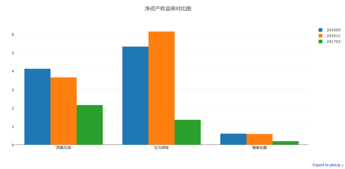
执行上述代码,我们可以看到如上图所示柱状簇图例
可将数据堆叠生成。
接下来在讲讲如何绘制层叠柱状图
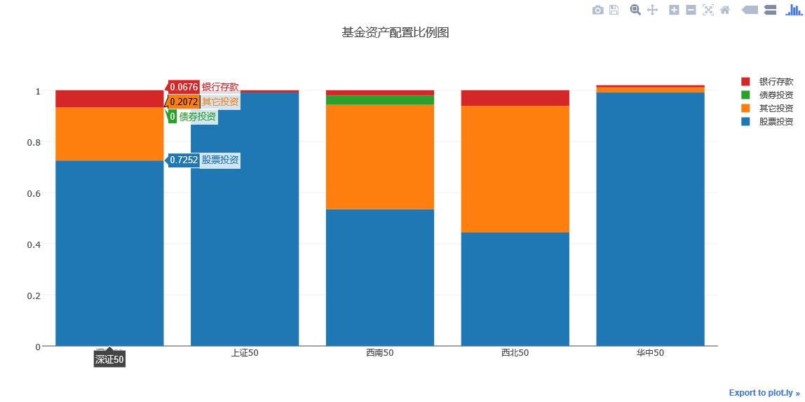
层叠柱状图的绘制方法与柱状簇的绘制方法基本差不多
也就是对同一个柱状簇进行叠加,实现方法是对Layout中的barmode属性进行设置
barmode = 'stack'
其余参数,与柱状簇相同。
# -*- coding: utf-8 -*-

import plotly as py

import plotly.graph_objs as go

pyplt = py.offline.plot

# Stacked Bar Chart

trace_1 = go.Bar(

    x = ['深证50', '上证50', '西南50', '西北50','华中50'],

    y = [0.7252, 0.9912, 0.5347, 0.4436, 0.9911],

    name = '股票投资'

)

trace_2 = go.Bar(

    x = ['深证50', '上证50', '西南50', '西北50','华中50'],

    y = [0.2072, 0, 0.4081, 0.4955, 0.02],

    name='其它投资'

)

trace_3 = go.Bar(

    x = ['深证50', '上证50', '西南50', '西北50','华中50'],

    y = [0, 0, 0.037, 0, 0],

    name='债券投资'

)

trace_4 = go.Bar(

    x = ['深证50', '上证50', '西南50', '西北50','华中50'],

    y = [0.0676, 0.0087, 0.0202, 0.0609, 0.0087],

    name='银行存款'

)

trace = [trace_1, trace_2, trace_3, trace_4]

layout = go.Layout(

    title = '基金资产配置比例图',

    barmode='stack'

)

fig = go.Figure(data = trace, layout = layout)

pyplt(fig, filename='tmp/1.html')
瀑布式柱状图
瀑布式柱状图是层叠柱状图的另外一种表现
可以选择性地显示层叠部分来实现柱状图的悬浮效果。
# -*- coding: utf-8 -*-

import plotly as py

import plotly.graph_objs as go

pyplt = py.offline.plot

x_data = ['资产1', '资产2',

          '资产3','资产4', '总资产']

y_data = [56000000, 65000000, 65000000, 81000000, 81000000]

text = ['666,999,888万元', '8,899,666万元', '88,899,666万元', '16,167,657万元', '888,888,888万元']

# Base

trace0 = go.Bar(

    x=x_data,

    y=[0, 57999848, 0, 66899764, 0],

    marker=dict(

        color='rgba(1,1,1, 0.0)',

    )

)

# Trace

trace1 = go.Bar(

    x=x_data,

    y=[57999848, 8899916, 66899764,16167657, 83067421],

    marker=dict(

        color='rgba(55, 128, 191, 0.7)',

        line=dict(

            color='rgba(55, 128, 191, 1.0)',

            width=2,

        )

    )

)

data = [trace0, trace1]

layout = go.Layout(

    title = '测试图例',

    barmode='stack',

    showlegend=False

)

annotations = []

for i in range(0, 5):

    annotations.append(dict(x=x_data[i], y=y_data[i], text=text[i],

                                  font=dict(family='Arial', size=14,

                                  color='rgba(245, 246, 249, 1)'),

                                  showarrow=False,))

    layout['annotations'] = annotations

fig = go.Figure(data=data, layout=layout)

pyplt(fig, filename = 'tmp/1.html')
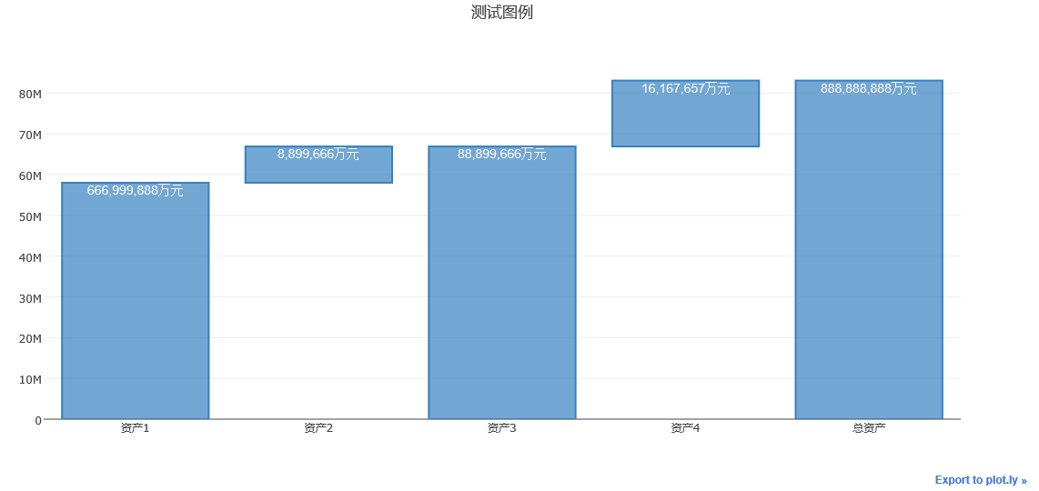
运行上述代码,可以得到如上图所示的瀑布式柱状图。
下面我们说说,图形样式的设置。
对于柱状图颜色与样式的设置可以通过设置下面这个案例来说明。
import plotly as py

import plotly.graph_objs as go

pyplt = py.offline.plot

# Customizing Individual Bar Colors

volume = [0.49,0.71,1.43,1.4,0.93]

width = [each*3/sum(volume) for each in volume]

trace0 = go.Bar(

    x = ['AU.SHF', 'AG.SHF', 'SN.SHF',

       'PB.SHF', 'CU.SHF'],

    y = [0.85, 0.13, -0.93, 0.46, 0.06],

    width = width,

    marker = dict(

        color=['rgb(205,38,38)', 'rgb(205,38,38)',

               'rgb(34,139,34)', 'rgb(205,38,38)',

               'rgb(205,38,38)'],

        line=dict(

            color='rgb(0,0,0)',

            width=1.5,

        )),

        opacity = 0.8,

)

data = [trace0]

layout = go.Layout(

    title = '有色金属板块主力合约日内最高涨幅与波动率图',

    xaxis=dict(tickangle=-45),

)

fig = go.Figure(data=data, layout=layout)

pyplt(fig, filename='tmp/4.html')
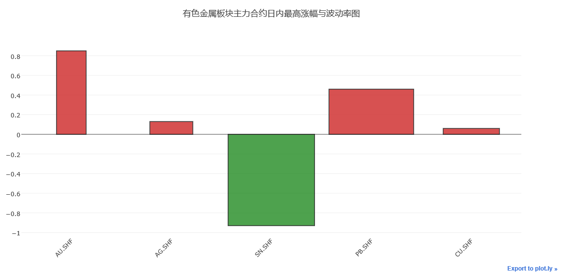
运行上述代码,可以看到上图所示图例
柱状图展示了5种金属,在某个交易日的最高涨幅与波动率情况,柱形图宽度表示相对波动率的高低
柱形图越宽,波动率越大,高度表示涨幅,红色表示上涨,绿色表示下跌。
用line设置柱状图外部线框,用width设置柱状图的宽度,用opacity设置柱状图颜色的透明度情况。
基本的柱状图情况,就讲到这里。
Python使用Plotly绘图工具,绘制柱状图的更多相关文章
- Python使用Plotly绘图工具,绘制面积图
今天我们来讲一下如何使用Python使用Plotly绘图工具,绘制面积图 绘制面积图与绘制散点图和折线图的画法类似,使用plotly graph_objs 中的Scatter函数,不同之处在于面积图对 ...
- Python使用Plotly绘图工具,绘制直方图
今天我们再来讲解一下Python使用Plotly绘图工具如何绘制直方图 使用plotly绘制直方图需要用到graph_objs包中的Histogram函数 我们将数据赋值给函数中的x变量,x = da ...
- Python使用Plotly绘图工具,绘制饼图
今天我们来学习一下如何使用Python的Plotly绘图工具,绘制饼图 使用Plotly绘制饼图的方法,我们需要使用graph_objs中的Pie函数 函数中最常用的两个属性values,用于赋值给需 ...
- Python使用Plotly绘图工具,绘制甘特图
今天来讲一下如何使用Python 的绘图工具Plotly来绘制甘特图的方法 甘特图大家应该了解熟悉,就是通过条形来显示项目的进度.时间安排等相关情况的. 我们今天来学习一下,如何使用ployly来绘制 ...
- Python使用Plotly绘图工具,绘制气泡图
今天来讲讲如何使用Python 绘图工具,Plotly来绘制气泡图. 气泡图的实现方法类似散点图的实现.修改散点图中点的大小,就变成气泡图. 实现代码如下: import plotly as py i ...
- Python使用Plotly绘图工具,绘制水平条形图
水平条形图与绘制柱状图类似,大家可以先看看我之前写的博客,如何绘制柱状图 水平条形图需要在Bar函数中设置orientation= 'h' 其他的参数与柱状图相同.也可以通过设置barmode = ' ...
- Python使用Plotly绘图工具,绘制散点图、线形图
今天在研究Plotly绘制散点图的方法 使用Python3.6 + Plotly Plotly版本2.0.0 在开始之前先说说,还需要安装库Numpy,安装方法在我的另一篇博客中有写到:https:/ ...
- Plotly绘图工具(多用于统计)
作者:桂. 时间:2017-04-23 23:52:14 链接:http://www.cnblogs.com/xingshansi/p/6754769.html 前言 无意中考到一个小工具,网址为: ...
- 小白学Python(13)——pyecharts 绘制 柱状图/条形图 Bar
Bar-基本示例 from example.commons import Faker from pyecharts import options as opts from pyecharts.char ...
随机推荐
- [SQL]LeetCode196. 删除重复的电子邮箱 | Delete Duplicate Emails
Write a SQL query to delete all duplicate email entries in a table named Person, keeping only unique ...
- [Swift]LeetCode937. 重新排列日志文件 | Reorder Log Files
You have an array of logs. Each log is a space delimited string of words. For each log, the first w ...
- Underscore.js 源码学习笔记(下)
上接 Underscore.js 源码学习笔记(上) === 756 行开始 函数部分. var executeBound = function(sourceFunc, boundFunc, cont ...
- Docker 删除所有无名称的镜像(悬空镜像)
我们在build镜像的过程中,可能会产生一些临时的不具有名称也没有作用的镜像他们的名称一般都是<none>,我们可以执行下面的命令将其清除掉: docker rmi $(docker im ...
- 从.Net到Java学习第二篇——IDEA and start spring boot
从.Net到Java学习第一篇——开篇 所谓工欲善其事,必先利其器,做java开发也一样,在比较了目前最流行的几个java IDE(eclipse,myeclipse.IDEA)之后,我果断选择IDE ...
- asp.net core 系列 3 依赖注入服务
一. 依赖注入概述 在软件设计的通用原则中,SOLID是非常流行的缩略语,它由5个设计原则的首字母构成:单一原则(S).开放封闭原则(O).里氏替换原则(L).接口分离原则(I).依赖反转原则(D). ...
- Chapter 5 Blood Type——18
"The Red Cross is having a blood drive in Port Angeles next weekend, so I thought you should al ...
- MySQL 个人学习笔记
最早之前学习了Mysql,不知道是多长时间了 O(∩_∩)O,今天突然发现之前学习过程中的这个笔记,于是,就分享给大家,希望,能帮助到有需要的朋友,有不足的地方欢迎大家多多交流 b( ̄▽ ̄)d 1. ...
- MaxCompute在高德大数据上的应用
2019年1月18日,由阿里巴巴 MaxCompute开发者社区和阿里云栖社区联合主办的“阿里云栖开发者沙龙大数据技术专场”走近北京联合大学,本次技术沙龙上,高德数据技术专家苗翌辰为大家分享了高德如何 ...
- java集合框架容器 java框架层级 继承图结构 集合框架的抽象类 集合框架主要实现类
本文关键词: java集合框架 框架设计理念 容器 继承层级结构 继承图 集合框架中的抽象类 主要的实现类 实现类特性 集合框架分类 集合框架并发包 并发实现类 什么是容器? 由一个或多个确 ...