android ——悬浮按钮及可交互提示
一、悬浮按钮
FloatingActionButton是Design Support中的一个控件,它会默认colorAccent作为按钮的颜色,还可以给按钮一个图标。
这是没有图标的 ,这是有图标的
 。
。
然后布局文件这样写:
<android.support.design.widget.FloatingActionButton

            android:id="@+id/fab"

            android:layout_width="wrap_content"

            android:layout_height="wrap_content"

            android:layout_gravity="bottom|end"

            android:layout_margin="16dp"

            android:src="@drawable/ic_done"

            app:elevation="8dp"/>
layout_gravity的属性值bottomb表示在底部,end会根据系统确定是在左下还是右下。elevation表示按钮的悬浮高度,属性值越大,阴影就越小。。。其实区别并不大,平时用默认的就好了。
然后是按钮响应:
//悬浮按钮

        FloatingActionButton fab = (FloatingActionButton) findViewById(R.id.fab);

        fab.setOnClickListener(new View.OnClickListener() {

            @Override

            public void onClick(View view) {

                Toast.makeText(MainActivity.this,"你点击了悬浮按钮",Toast.LENGTH_SHORT).show();

            }

        });
和普通按钮差不多。。
然后通过drawable来实现一个简单的阴影效果:
在drawable创建一个fab.xml
<?xml version="1.0" encoding="utf-8"?>
<selector xmlns:android="http://schemas.android.com/apk/res/android">
<item android:state_pressed="true">
<layer-list>
<!-- Shadow -->
<item android:top="1dp" android:right="1dp">
<layer-list>
<item>
<shape android:shape="oval">
<solid android:color="#08000000"/>
<padding
android:bottom="3px"
android:left="3px"
android:right="3px"
android:top="3px"
/>
</shape>
</item>
<item>
<shape android:shape="oval">
<solid android:color="#09000000"/>
<padding
android:bottom="2px"
android:left="2px"
android:right="2px"
android:top="2px"
/>
</shape>
</item>
<item>
<shape android:shape="oval">
<solid android:color="#10000000"/>
<padding
android:bottom="2px"
android:left="2px"
android:right="2px"
android:top="2px"
/>
</shape>
</item>
<item>
<shape android:shape="oval">
<solid android:color="#11000000"/>
<padding
android:bottom="1px"
android:left="1px"
android:right="1px"
android:top="1px"
/>
</shape>
</item>
<item>
<shape android:shape="oval">
<solid android:color="#12000000"/>
<padding
android:bottom="1px"
android:left="1px"
android:right="1px"
android:top="1px"
/>
</shape>
</item>
<item>
<shape android:shape="oval">
<solid android:color="#13000000"/>
<padding
android:bottom="1px"
android:left="1px"
android:right="1px"
android:top="1px"
/>
</shape>
</item>
<item>
<shape android:shape="oval">
<solid android:color="#14000000"/>
<padding
android:bottom="1px"
android:left="1px"
android:right="1px"
android:top="1px"
/>
</shape>
</item>
<item>
<shape android:shape="oval">
<solid android:color="#15000000"/>
<padding
android:bottom="1px"
android:left="1px"
android:right="1px"
android:top="1px"
/>
</shape>
</item>
<item>
<shape android:shape="oval">
<solid android:color="#16000000"/>
<padding
android:bottom="1px"
android:left="1px"
android:right="1px"
android:top="1px"
/>
</shape>
</item>
</layer-list>
</item> <!-- Blue button pressed -->
<item>
<shape android:shape="oval">
<solid android:color="#90CAF9"/>
</shape>
</item>
</layer-list>
</item> <item android:state_enabled="true"> <layer-list>
<!-- Shadow -->
<item android:top="2dp" android:right="1dp">
<layer-list>
<item>
<shape android:shape="oval">
<solid android:color="#08000000"/>
<padding
android:bottom="4px"
android:left="4px"
android:right="4px"
android:top="4px"
/>
</shape>
</item>
<item>
<shape android:shape="oval">
<solid android:color="#09000000"/>
<padding
android:bottom="2px"
android:left="2px"
android:right="2px"
android:top="2px"
/>
</shape>
</item>
<item>
<shape android:shape="oval">
<solid android:color="#10000000"/>
<padding
android:bottom="2px"
android:left="2px"
android:right="2px"
android:top="2px"
/>
</shape>
</item>
<item>
<shape android:shape="oval">
<solid android:color="#11000000"/>
<padding
android:bottom="1px"
android:left="1px"
android:right="1px"
android:top="1px"
/>
</shape>
</item>
<item>
<shape android:shape="oval">
<solid android:color="#12000000"/>
<padding
android:bottom="1px"
android:left="1px"
android:right="1px"
android:top="1px"
/>
</shape>
</item>
<item>
<shape android:shape="oval">
<solid android:color="#13000000"/>
<padding
android:bottom="1px"
android:left="1px"
android:right="1px"
android:top="1px"
/>
</shape>
</item>
<item>
<shape android:shape="oval">
<solid android:color="#14000000"/>
<padding
android:bottom="1px"
android:left="1px"
android:right="1px"
android:top="1px"
/>
</shape>
</item>
<item>
<shape android:shape="oval">
<solid android:color="#15000000"/>
<padding
android:bottom="1px"
android:left="1px"
android:right="1px"
android:top="1px"
/>
</shape>
</item>
<item>
<shape android:shape="oval">
<solid android:color="#16000000"/>
<padding
android:bottom="1px"
android:left="1px"
android:right="1px"
android:top="1px"
/>
</shape>
</item>
</layer-list>
</item> <!-- Blue button --> <item>
<shape android:shape="oval">
<solid android:color="#03A9F4"/>
</shape>
</item>
</layer-list> </item> </selector>
然后在悬浮按钮布局文件这里加上属性:background
        <android.support.design.widget.FloatingActionButton

            android:id="@+id/fab"

            android:layout_width="wrap_content"

            android:layout_height="wrap_content"

            android:background="@drawable/fab"

            android:layout_gravity="bottom|end"

            android:layout_margin="16dp"

            android:src="@drawable/ic_done"

            app:elevation="8dp"/>
二、Snackbar
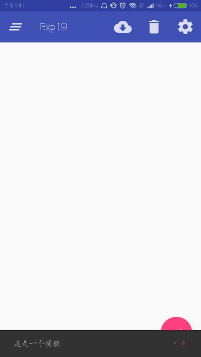
和Toast一样用于提示的,但是它的提示当中有一个按钮,具体用法和效果就是:
        //悬浮按钮

        FloatingActionButton fab = (FloatingActionButton) findViewById(R.id.fab);

        fab.setOnClickListener(new View.OnClickListener() {

            @Override

            public void onClick(View view) {

                Snackbar.make(view,"这是一个提醒", Snackbar.LENGTH_SHORT)

                        .setAction("可点", new View.OnClickListener() {

                            @Override

                            public void onClick(View view) {

                                Toast.makeText(MainActivity.this,"你点了",Toast.LENGTH_SHORT).show();

                            }

                        })

                        .show();

            }

        });
调用make()方法创建一个对象,第一个参数是当前布局的任意一个View,另外两个参数和Toast一样。setAction就是那个可以点击的按钮的设定,第一个参数是按钮的内容,然后就是响应了。
三、CoordinatorLayout
可以用来替换原来的FrameLayout,它可以监听各个子控件的各种事件,自动 做出合理的响应。
例如,把上面的布局文件修改成这样:
    <android.support.design.widget.CoordinatorLayout

        android:layout_width="match_parent"

        android:layout_height="match_parent">

        <android.support.v7.widget.Toolbar

            android:id="@+id/toolbar"

            android:layout_width="match_parent"

            android:layout_height="?attr/actionBarSize"

            android:background="?attr/colorPrimary"

            android:theme="@style/ThemeOverlay.AppCompat.Dark.ActionBar"

            app:popupTheme="@style/ThemeOverlay.AppCompat.Light"/>

        <android.support.design.widget.FloatingActionButton

            android:id="@+id/fab"

            android:layout_width="wrap_content"

            android:layout_height="wrap_content"

            android:background="@drawable/fab"

            android:layout_gravity="bottom|end"

            android:layout_margin="16dp"

            android:src="@drawable/ic_done"

            app:elevation="8dp"/>

    </android.support.design.widget.CoordinatorLayout>
重新点击一下悬浮按钮:
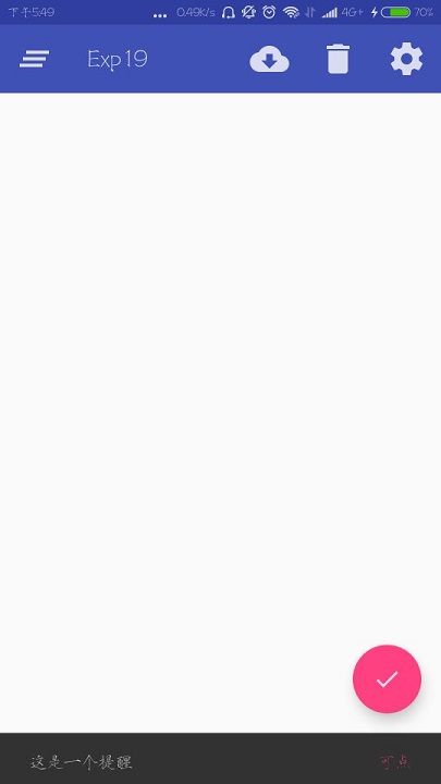
之前Snackbar出现的时候会挡住这个悬浮按钮,从FrameLayout改成CoordinatorLayout就不会了。
android ——悬浮按钮及可交互提示的更多相关文章
- android悬浮按钮(Floating action button)的两种实现方法
原文: http://www.jcodecraeer.com/a/anzhuokaifa/androidkaifa/2014/1028/1857.html 最近android中有很多新的设计规范被引入 ...
- Android用悬浮按钮实现翻页效果
今天给大家分享下自己用悬浮按钮点击实现翻页效果的例子. 首先,一个按钮要实现悬浮,就要用到系统顶级窗口相关的WindowManager,WindowManager.LayoutParams.那么在An ...
- Android 5.0新控件——FloatingActionButton(悬浮按钮)
Android 5.0新控件--FloatingActionButton(悬浮按钮) FloatingActionButton是5.0以后的新控件,一个悬浮按钮,之所以叫做悬浮按钮,主要是因为自带阴影 ...
- 013 Android ActionFloatingButton悬浮按钮组件与Snackbar组件使用
1.导入ActionFloatingButton组件(点击下载按钮,安装组件) 2,.ImageView图片XML设置 <ImageView android:id="@+id/imag ...
- Android FloatingActionButton(FAB) 悬浮按钮
FloatingActionButton 悬浮按钮 ...
- FloatingActionButtonDemo【悬浮按钮的使用,顺带snackBar的使用】
版权声明:本文为HaiyuKing原创文章,转载请注明出处! 前言 FloatingActionButton简称FAB. 一. 对于App或某个页面中是否要使用FloatingActionButton ...
- Android客户端与服务端交互之登陆示例
Android客户端与服务端交互之登陆示例 今天了解了一下android客户端与服务端是怎样交互的,发现其实跟web有点类似吧,然后网上找了大神的登陆示例,是基于IntentService的 1.后台 ...
- FloatingActionButton(悬浮按钮)使用学习<一>
FloatingActionButton简称FAB. 一. 对于App或某个页面中是否要使用FloatingActionButton必要性: FAB代表一个App或一个页面中最主要的操 ...
- Android悬浮窗及其拖动事件
主页面布局很简单,只有一个RelativelyLayout <?xml version="1.0" encoding="utf-8"?> <R ...
随机推荐
- 关于过两级mux的时序约束的添加(一个非常经典的时序约束问题)
非常开心自己的微信公众号: <数字集成电路设计及EDA教程> 关注者超过了1700 里面主要讲解数字IC前端.后端.DFT.低功耗设计以及验证等相关知识,并且讲解了其中用到的各种EDA工具 ...
- C++学习书籍推荐《C++ Concurrency in Action》下载
百度云及其他网盘下载地址:点我 目录 Hello, world of concurrency in C++! Managing threads Sharing data between threads ...
- Mysql CPU使用率长期100%的解决思路备忘
最近一台服务器的CPU使用率长期保持在100%的状态,查看进程发现是Mysql服务导致的.于是搜索各方资料,终于成功解决问题.备忘以及分享一下,希望可以帮助各位新手朋友. (服务器运行环境是Windo ...
- Bzoj 3624: [Apio2008]免费道路 (贪心+生成树)
Sample Input 5 7 2 1 3 0 4 5 1 3 2 0 5 3 1 4 3 0 1 2 1 4 2 1 Sample Output 3 2 0 4 3 0 5 3 1 1 2 1 这 ...
- 【动态规划例题-数塔问题】-C++
描述 观察下面的数字金字塔.写一个程序查找从最高点到底部任意处结束的路径,使路径经过数字的和最大.每一步可以 从当前点走到左下方的点也可以到达右下方的点. 在上面的样例中,从13到8到26到15到24 ...
- csv文件数据导出到mongo数据库
from pymongo import MongoClientimport csv# 创建连接MongoDB数据库函数def connection(): # 1:连接本地MongoDB数据库服务 co ...
- java开发---关于ORA00604和ORA12705
MyEclipse和oracle连接中出现的一个问题: 在使用工具连接orcale数据库时报了这两个异常 ORA-00604和ORA12705 ; 查找问题原因: 大概猜测是与字符集有关系 , 确认 ...
- jenkins +Jmeter 完成分布式性能测试
1.Jmeter 压测机器配置. 下载Jmeter 版本:https://jmeter.apache.org/download_jmeter.cgi 我下的是5.1.1 将下载后的版本进行解压. ...
- Git 安装及使用指南
1 简介1.1 Git1.2 Github2 Git 在 Windows 下的安装和使用2.1 msysgit2.2 Tortoisegit2.2.1 安装2.2.2 配置2.2.3 简单使用 1 简 ...
- 小白开学Asp.Net Core《二》
小白开学Asp.Net Core<二> ——数据仓储层(Repositroy) 一.历史现象 在后端开发中,数据库操作是最频繁的,每一个开发人员都会接触,甚至不少开发人员每天的工作就是与数 ...