
WPF 截图控件之绘制方框与椭圆(四) 「仿微信」
前言
接着上周写的截图控件继续更新 绘制方框与椭圆。
1.WPF实现截屏「仿微信」
2.WPF 实现截屏控件之移动(二)「仿微信」
3.WPF 截图控件之伸缩(三) 「仿微信」
正文
有开发者在B站反馈第三篇有Issues已修复。
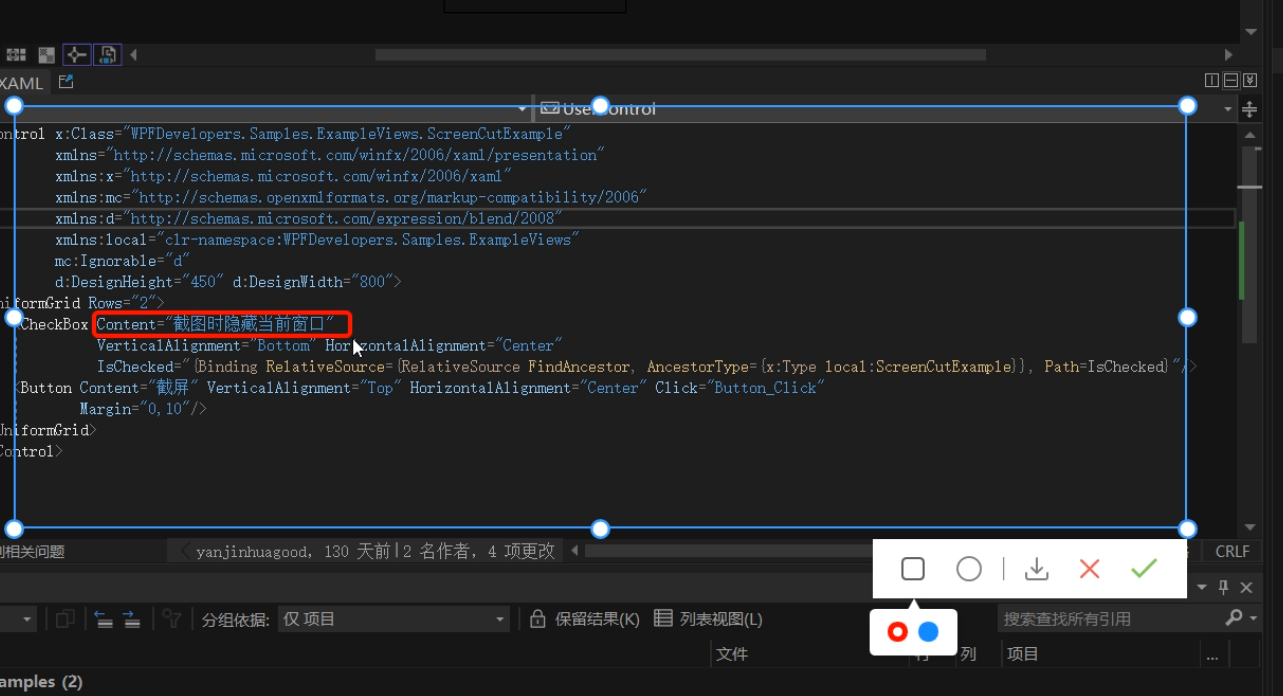
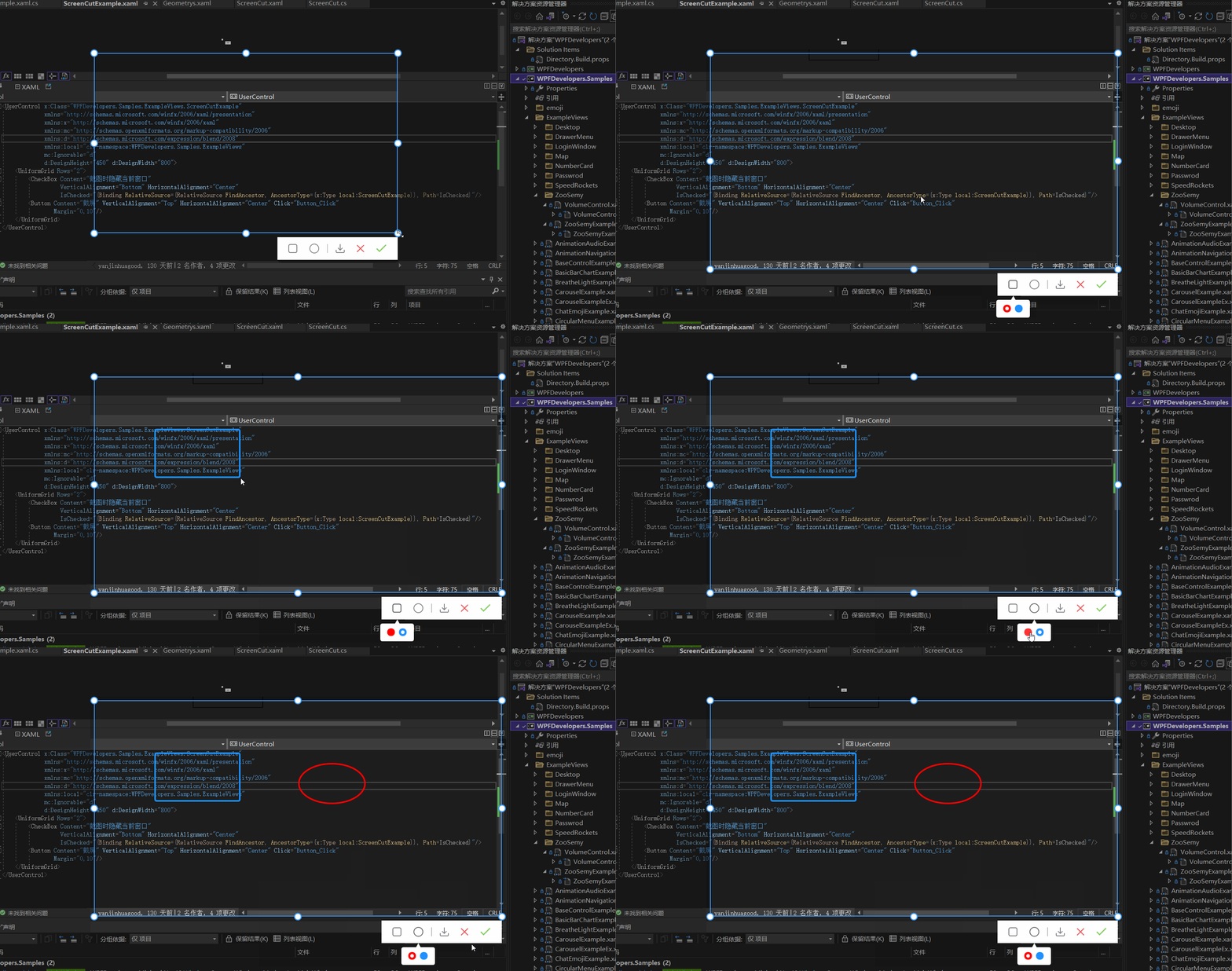
实现在截图区域内绘制 方框与椭圆 有两种方式
1)可以在截图的区域内部添加一个Canvas宽高填充至区域内,在进行绘制方框或椭圆。
2)直接在外层的Canvas中添加,这样需要判断鼠标按下的位置和移动的位置必须在已截图区域内,如超出范围也不绘制到区域外。
本章使用了第二种方式
此篇更新截图时隐藏当前窗口
一、首先接着ScreenCut继续发电。
1.1
新增定义 画方框、椭圆、颜色选择框Popup、Popup内部Border、Border内部RadioButton的父容器
     [TemplatePart(Name = RadioButtonRectangleTemplateName, Type = typeof(RadioButton))]

  [TemplatePart(Name = RadioButtonEllipseTemplateName, Type = typeof(RadioButton))]

  [TemplatePart(Name = PopupTemplateName, Type = typeof(Popup))]

  [TemplatePart(Name = PopupBorderTemplateName, Type = typeof(Border))]

  [TemplatePart(Name = WrapPanelColorTemplateName, Type = typeof(WrapPanel))]

     private const string RadioButtonRectangleTemplateName = "PART_RadioButtonRectangle";

      private const string RadioButtonEllipseTemplateName = "PART_RadioButtonEllipse";

      private const string PopupTemplateName = "PART_Popup";

      private const string PopupBorderTemplateName = "PART_PopupBorder";

      private const string WrapPanelColorTemplateName = "PART_WrapPanelColor";

      private Popup _popup;

      private WrapPanel _wrapPanel;

      /// <summary>

      /// 当前绘制矩形

      /// </summary>

      private Border borderRectangle;

      /// <summary>

      /// 绘制当前椭圆

      /// </summary>

      private Ellipse drawEllipse;

      /// <summary>

      /// 当前选择颜色

      /// </summary>

      private Brush _currentBrush;
1.2
新增RadioButtonStyles为了选择方框、椭圆、颜色
<ResourceDictionary xmlns="http://schemas.microsoft.com/winfx/2006/xaml/presentation"

                   xmlns:x="http://schemas.microsoft.com/winfx/2006/xaml">

   <ResourceDictionary.MergedDictionaries>

       <ResourceDictionary Source="Basic/ControlBasic.xaml"/>

   </ResourceDictionary.MergedDictionaries>

   <Style x:Key="PathRadioButton" TargetType="{x:Type RadioButton}" BasedOn="{StaticResource ControlBasicStyle}">

       <Setter Property="FocusVisualStyle" Value="{x:Null}"/>

       <Setter Property="FrameworkElement.OverridesDefaultStyle" Value="True" />

       <Setter Property="HorizontalContentAlignment" Value="Center" />

       <Setter Property="VerticalContentAlignment" Value="Center" />

       <Setter Property="BorderThickness" Value="1" />

       <Setter Property="Padding" Value="8" />

       <Setter Property="Cursor" Value="Hand"/>

       <Setter Property="Template">

           <Setter.Value>

               <ControlTemplate TargetType="{x:Type RadioButton}">

                   <Border Background="Transparent">

                       <ContentPresenter HorizontalAlignment="{TemplateBinding HorizontalContentAlignment}"

                                         Margin="{TemplateBinding Padding}"

                                         VerticalAlignment="{TemplateBinding VerticalContentAlignment}"

                                         x:Name="PART_ContentPresenter" Opacity=".8"/>

                   </Border>

                   <ControlTemplate.Triggers>

                       <Trigger Property="IsChecked" Value="True">

                           <Setter Property="Opacity" TargetName="PART_ContentPresenter" Value="1"/>

                       </Trigger>

                       <Trigger Property="IsMouseOver" Value="True">

                           <Setter Property="Opacity" TargetName="PART_ContentPresenter" Value="1"/>

                       </Trigger>

                   </ControlTemplate.Triggers>

               </ControlTemplate>

           </Setter.Value>

       </Setter>

   </Style>

   <Style x:Key="ColorRadioButton" TargetType="{x:Type RadioButton}" BasedOn="{StaticResource ControlBasicStyle}">

       <Setter Property="FocusVisualStyle" Value="{x:Null}"/>

       <Setter Property="FrameworkElement.OverridesDefaultStyle" Value="True" />

       <Setter Property="HorizontalContentAlignment" Value="Center" />

       <Setter Property="VerticalContentAlignment" Value="Center" />

       <Setter Property="Padding" Value="8" />

       <Setter Property="Width" Value="15"/>

       <Setter Property="Height" Value="15"/>

       <Setter Property="Cursor" Value="Hand"/>

       <Setter Property="Template">

           <Setter.Value>

               <ControlTemplate TargetType="{x:Type RadioButton}">

                   <Border Background="{TemplateBinding Background}"

                           BorderThickness="0"

                           x:Name="PART_Border"

                           CornerRadius="7"

                           Width="{TemplateBinding Width}"

                           Height="{TemplateBinding Height}">

                       <VisualStateManager.VisualStateGroups>

                           <VisualStateGroup x:Name="CheckStates">

                               <VisualState x:Name="Checked">

                                   <Storyboard>

                                       <ObjectAnimationUsingKeyFrames Storyboard.TargetProperty="(UIElement.Visibility)"

                                                Storyboard.TargetName="PART_Ellipse">

                                           <DiscreteObjectKeyFrame KeyTime="0"

                                           Value="{x:Static Visibility.Visible}" />

                                       </ObjectAnimationUsingKeyFrames>

                                   </Storyboard>

                               </VisualState>

                               <VisualState x:Name="Unchecked" />

                               <VisualState x:Name="Indeterminate" />

                           </VisualStateGroup>

                       </VisualStateManager.VisualStateGroups>

                       <Ellipse x:Name="PART_Ellipse"

                                Width="7"

                                Height="7"

                                Fill="{DynamicResource WhiteSolidColorBrush}"

                                Visibility="Collapsed"/>

                   </Border>

                   <ControlTemplate.Triggers>

                       <Trigger Property="IsMouseOver" Value="True">

                           <Setter Property="Opacity" Value=".8"/>

                       </Trigger>

                   </ControlTemplate.Triggers>

               </ControlTemplate>

           </Setter.Value>

       </Setter>

   </Style>

</ResourceDictionary>
1.3
ScreenCut.xaml增加代码如下
<RadioButton x:Name="PART_RadioButtonRectangle"

                                                Style="{DynamicResource PathRadioButton}"

                                                ToolTip="方框"

                                               Margin="4,0">

                                      <RadioButton.Content>

                                          <Path Fill="{DynamicResource RegularTextSolidColorBrush}"

                                        Width="18" Height="18" Stretch="Fill"

                                        Data="{StaticResource PathRectangle}"/>

                                      </RadioButton.Content>

                                  </RadioButton>

                                  <RadioButton x:Name="PART_RadioButtonEllipse"

                                                Style="{DynamicResource PathRadioButton}"

                                                ToolTip="椭圆"

                                               Margin="4,0">

                                      <ToggleButton.Content>

                                          <Ellipse Width="19" Height="19"

                                                   StrokeThickness="1.5"

                                                   SnapsToDevicePixels="True"

                                                   UseLayoutRounding="True"

                                                   Stroke="{DynamicResource RegularTextSolidColorBrush}"/>

                                      </ToggleButton.Content>

                                  </RadioButton>

<Popup x:Name="PART_Popup"

                                 AllowsTransparency="True"

                                 Placement="Bottom"

                                 VerticalOffset="13">

                              <Border Effect="{DynamicResource PopupShadowDepth}"

                                      Background="{DynamicResource WhiteSolidColorBrush}"

                                      Margin="10,30,10,10"

                                      CornerRadius="{Binding Path=(helpers:ControlsHelper.CornerRadius),RelativeSource={RelativeSource TemplatedParent}}"

                                      x:Name="PART_PopupBorder">

                                  <Grid>

                                      <Path Data="{StaticResource PathUpperTriangle}"

                                        Fill="{DynamicResource WhiteSolidColorBrush}"

                                        Stretch="Uniform"

                                        Width="10" VerticalAlignment="Top"

                                        Margin="0,-8,0,0"

                                        SnapsToDevicePixels="True"

                                        UseLayoutRounding="True"/>

                                      <WrapPanel Margin="10"

                                                 VerticalAlignment="Center"

                                                 x:Name="PART_WrapPanelColor">

                                          <RadioButton Style="{DynamicResource ColorRadioButton}"

                                                       Margin="4,0" Background="Red"

                                                       IsChecked="True">

                                          </RadioButton>

                                          <RadioButton Style="{DynamicResource ColorRadioButton}"

                                                       Margin="4,0"

                                                       Background="DodgerBlue">

                                          </RadioButton>

                                      </WrapPanel>

                                  </Grid>

                              </Border>

                          </Popup>
二、ScreenCut.cs 增加的后台逻辑如下
2.1 RadioButton选中方框和椭圆的切换Popup并设置ScreenCutMouseType枚举和鼠标:
    _radioButtonRectangle = GetTemplateChild(RadioButtonRectangleTemplateName) as RadioButton;

         if (_radioButtonRectangle != null)

             _radioButtonRectangle.Click += _radioButtonRectangle_Click;

         _radioButtonEllipse = GetTemplateChild(RadioButtonEllipseTemplateName) as RadioButton;

         if (_radioButtonEllipse != null)

             _radioButtonEllipse.Click += _radioButtonEllipse_Click;

             private void _radioButtonRectangle_Click(object sender, RoutedEventArgs e)

     {

         RadioButtonChecked(_radioButtonRectangle, ScreenCutMouseType.DrawRectangle);

     }

     private void _radioButtonEllipse_Click(object sender, RoutedEventArgs e)

     {

         RadioButtonChecked(_radioButtonEllipse, ScreenCutMouseType.DrawEllipse);

     }

     void RadioButtonChecked(RadioButton radioButton, ScreenCutMouseType screenCutMouseTypeRadio)

     {

         if (radioButton.IsChecked == true)

         {

             screenCutMouseType = screenCutMouseTypeRadio;

             _border.Cursor = Cursors.Arrow;

             if (_popup.PlacementTarget != null && _popup.IsOpen)

                 _popup.IsOpen = false;

             _popup.PlacementTarget = radioButton;

             _popup.IsOpen = true;

         }

         else

         {

             if (screenCutMouseType == screenCutMouseTypeRadio)

                 Restore();

         }

     }

     void Restore()

     {

         _border.Cursor = Cursors.SizeAll;

         if (screenCutMouseType == ScreenCutMouseType.Default) return;

         screenCutMouseType = ScreenCutMouseType.Default;

     }
2.2 ScreenCut绘制方框和椭圆代码如下:
void DrawMultipleControl(Point current)

        {

            if (current == pointStart) return;

            if (current.X > rect.BottomRight.X

                ||

                current.Y > rect.BottomRight.Y)

                return;

            var drawRect = new Rect(pointStart, current);

            switch (screenCutMouseType)

            {

                case ScreenCutMouseType.DrawRectangle:

                    if (borderRectangle == null)

                    {

                        borderRectangle = new Border()

                        {

                            BorderBrush = _currentBrush == null ? Brushes.Red : _currentBrush,

                            BorderThickness = new Thickness(3),

                            CornerRadius = new CornerRadius(3),

                        };

                        _canvas.Children.Add(borderRectangle);

                    }

                    break;

                case ScreenCutMouseType.DrawEllipse:

                    if (drawEllipse == null)

                    {

                        drawEllipse = new Ellipse()

                        {

                            Stroke = _currentBrush == null ? Brushes.Red : _currentBrush,

                            StrokeThickness = 3,

                        };

                        _canvas.Children.Add(drawEllipse);

                    }

                    break;

            }

            var _borderLeft = drawRect.Left - Canvas.GetLeft(_border);

            if (_borderLeft < 0)

                _borderLeft = Math.Abs(_borderLeft);

            if (drawRect.Width + _borderLeft < _border.ActualWidth)

            {

                var wLeft = Canvas.GetLeft(_border) + _border.ActualWidth;

                var left = drawRect.Left < Canvas.GetLeft(_border) ? Canvas.GetLeft(_border) : drawRect.Left > wLeft ? wLeft : drawRect.Left;

                if (borderRectangle != null)

                {

                    borderRectangle.Width = drawRect.Width;

                    Canvas.SetLeft(borderRectangle, left);

                }

                if (drawEllipse != null)

                {

                    drawEllipse.Width = drawRect.Width;

                    Canvas.SetLeft(drawEllipse, left);

                }

            }

            var _borderTop = drawRect.Top - Canvas.GetTop(_border);

            if(_borderTop < 0)

                _borderTop = Math.Abs(_borderTop);

            if (drawRect.Height + _borderTop < _border.ActualHeight)

            {

                var hTop = Canvas.GetTop(_border) + _border.Height;

                var top = drawRect.Top < Canvas.GetTop(_border) ? Canvas.GetTop(_border) : drawRect.Top > hTop ? hTop : drawRect.Top;

                if (borderRectangle != null)

                {

                    borderRectangle.Height = drawRect.Height;

                    Canvas.SetTop(borderRectangle, top);

                }

                if (drawEllipse != null)

                {

                    drawEllipse.Height = drawRect.Height;

                    Canvas.SetTop(drawEllipse, top);

                }

            }

        }
2.3 Popup跟随问题这里解决办法是先关闭再打开代码如下:
 if (_popup != null && _popup.IsOpen)

           {

               _popup.IsOpen = false;

               _popup.IsOpen = true;

           }
2.4 ScreenCut使用方式如下:
 public partial class ScreenCutExample : UserControl

   {

       public bool IsChecked

       {

           get { return (bool)GetValue(IsCheckedProperty); }

           set { SetValue(IsCheckedProperty, value); }

       }

       public static readonly DependencyProperty IsCheckedProperty =

           DependencyProperty.Register("IsChecked", typeof(bool), typeof(ScreenCutExample), new PropertyMetadata(false));

       public ScreenCutExample()

       {

           InitializeComponent();

       }

       private void Button_Click(object sender, RoutedEventArgs e)

       {

           var screenCut = new ScreenCut();

           if (IsChecked)

           {

               App.CurrentMainWindow.WindowState = WindowState.Minimized;

               screenCut.Show();

               screenCut.Activate();

           }

           else

               screenCut.ShowDialog();

       }

   }
完整代码如下
项目地址
WPF 截图控件之绘制方框与椭圆(四) 「仿微信」的更多相关文章
- WPF 截图控件之绘制箭头(五)「仿微信」
前言 接着上周写的截图控件继续更新 绘制箭头. 1.WPF实现截屏「仿微信」 2.WPF 实现截屏控件之移动(二)「仿微信」 3.WPF 截图控件之伸缩(三) 「仿微信」 4.WPF 截图控件之绘制方 ...
- WPF 截图控件之文字(七)「仿微信」
前言 接着上周写的截图控件继续更新添加 文字. 1.WPF实现截屏「仿微信」 2.WPF 实现截屏控件之移动(二)「仿微信」 3.WPF 截图控件之伸缩(三) 「仿微信」 4.WPF 截图控件之绘制方 ...
- WPF 截图控件之画笔(八)「仿微信」
前言 接着上周写的截图控件继续更新添加 画笔. 1.WPF实现截屏「仿微信」 2.WPF 实现截屏控件之移动(二)「仿微信」 3.WPF 截图控件之伸缩(三) 「仿微信」 4.WPF 截图控件之绘制方 ...
- WPF 截图控件之移除控件(九)「仿微信」
WPF 截图控件之移除控件(九)「仿微信」 WPF 截图控件之移除控件(九)「仿微信」 作者:WPFDevelopersOrg 原文链接: https://github.com/WPFDevelope ...
- WPF常用控件应用demo
WPF常用控件应用demo 一.Demo 1.Demo截图如下: 2.demo实现过程 总体布局:因放大缩小窗体,控件很根据空间是否足够改变布局,故用WrapPanel布局. <ScrollVi ...
- WPF第三方控件盘点
WPF统一的编程模型.语言和框架,实现了界面设计人员和开发人员工作可以分离的境界,鉴于WPF强大的优势,且一直是开发者关注的地方,下面和大家分享基于WPF项目开发需要用到的第三方控件,包括业界最受好评 ...
- WPF开源控件扩展库 - MaterialDesignExtensions
Material Design Extensions 在WPF开源控件库 Material Design in XAML Toolkit(本站介绍:链接)的基础上进行了控件扩展和特性新增.本开源项目中 ...
- C# WPF开源控件库:MahApps.Metro
其实站长很久之前就知道这个开源WPF控件库了,只是一直欣赏不了这种风格,但也star了该项目.每次浏览该仓库时,发现star越来越多,也看到很多网友对它的褒奖,所以今天就向大家推荐这款WPF控件库. ...
- WPF Popup 控件导致被遮挡内容不刷新的原因
WPF Popup 控件导致被遮挡内容不刷新的原因 周银辉 今天在写一个WPF控件时用到了Popup控件,很郁闷的情况是:当popup关闭时,原来被popup挡住的界面部分不刷新,非要手动刷新一下(比 ...
随机推荐
- Java学习笔记-基础语法Ⅴ
学习一些Java常用的API Math:包含执行基本数字运算的方法 如果没有构造方法,一般类的成员都是静态的,通过类名可以直接调用 Java中有两种random函数,Math.Random()函数能够 ...
- netty系列之:netty中常用的xml编码解码器
目录 简介 XmlFrameDecoder XmlDecoder 总结 简介 在json之前,xml是最常用的数据传输格式,虽然xml的冗余数据有点多,但是xml的结构简单清晰,至今仍然运用在程序中的 ...
- 每日一题20180330-Linux
一.问题 1.1 统计/var/log/下所有文件个数 1.2 查找出/var/log目录下面修改时间是7天以前,大小在50k到2M之间,并以.log结尾的文件把这些文件复制到/data目录中 1.3 ...
- 好客租房48-组件的props(基本使用)
组件是封闭的 要接受外部数据应该通过props来实现 props的作用:接受传递给组件的数据 传递数据:给组件标签添加属性 接收数据:函数组件通过参数props接收数据 类组件通过this.props ...
- Object类和对象类型转换
学习内容:Object类和对象类型转换 一.Object类 1.Object类是所有类的父类,是Java类层中最高层的类. 2.getClass()方法:返回对象执行时的Class实例,然后用此实例调 ...
- Calico网络插件
以下大部分是本人参考各种资料{官方文档.书籍}对知识的汇总和整理,其中有理解错误的地方请大神留言和指正,嘿嘿~~ 1.概述 参考文档:https://projectcalico.docs.tigera ...
- 每天一个 HTTP 状态码 102
102 Processing 102 Processing 是用于 WebDAV协议 请求的状态码. 这个状态码表示服务器已经收到了客户端的请求,正在处理,但暂时还没有可接触的响应.可以用于防止客户端 ...
- CA证书介绍与格式转换
CA证书介绍与格式转换 概念 PKCS 公钥加密标准(Public Key Cryptography Standards, PKCS),此一标准的设计与发布皆由RSA资讯安全公司(英语:RSA Sec ...
- 儿童节,和 AI 一起通关 “超级马里奥兄弟”
摘要:六一儿童节,快来训练一款自己的游戏 AI,用代码让马里奥从大反派酷霸王的魔掌里救回桃花公主. 本文分享自华为云社区<儿童节,和 AI 一起通关 "超级马里奥兄弟"> ...
- CabloyJS v4.0.0支持工作流引擎及更多 🎉
截至2020年12月21日冬至,花了近5年时间作出最小可用NodeJS开源全栈框架,这就是CabloyJS V4.0.0 5年,90个模块,30万行代码,5400次提交(Commits),开启Node ...