
Android GradientDrawable(shape标签定义) 静态使用和动态使用(圆角,渐变实现)
Android GradientDrawable使用优势:
1. 快速实现一些基本图形(线,矩形,圆,椭圆,圆环)
2. 快速实现一些圆角,渐变,阴影等效果
3. 代替图片设置为View的背景
4. 可以减少apk大小,提升用户下载意愿
5. 还可以减少内存占用
6. 方便修改与维护
基于上面几种优势,我们很多时候都会选择使用android的shape,下面分别介绍shape的静态使用和动态使用
1. GradientDrawable的静态使用(xml中使用shape标签定义)
在drawable中创建一个xml文件,在布局文件中直接引用这个xml文件即可
<?xml version="1.0" encoding="utf-8"?>

 <!--

    android:shape=["rectangle" | "oval" | "line" | "ring"]

    shape的形状,默认为矩形,可以设置为矩形(rectangle)、椭圆形(oval)、线(line)、环形(ring)

    下面的属性只有在android:shape="ring时可用:

    android:innerRadius           内环的半径。

    android:innerRadiusRatio    浮点型,以环的宽度比率来表示内环的半径,

    例如,如果android:innerRadiusRatio,表示内环半径等于环的宽度除以5,这个值是可以被覆盖的,默认为9.

    android:thickness              环的厚度

    android:thicknessRatio      浮点型,以环的宽度比率来表示环的厚度,例如,如果android:thicknessRatio="2",

    那么环的厚度就等于环的宽度除以2。这个值是可以被android:thickness覆盖的,默认值是3.

    android:useLevel            boolean值,如果当做是LevelListDrawable使用时值为true,否则为false.

  -->

<shape xmlns:android="http://schemas.android.com/apk/res/android"

       android:shape="rectangle" >

    <!--宽度和高度

        android:width   整型 宽度

        android:height  整型 高度

    -->

    <size

        android:width="50dp"

        android:height="50dp"/>

    <!--圆角

        android:radius                    整型 半径

        android:topLeftRadius           整型 左上角半径

        android:topRightRadius               整型 右上角半径

        android:bottomLeftRadius           整型 左下角半径

        android:bottomRightRadius         整型 右下角半径

    -->

    <corners

        android:radius="10dp"/><!-- 设置圆角半径,可以分别设置4个角 -->

    <!--渐变,这个设置之后一般就不要设置solid填充色了

        android:startColor  颜色值     起始颜色

        android:endColor    颜色值     结束颜色

        android:centerColor 整型       渐变中间颜色,即开始颜色与结束颜色之间的颜色

        android:angle       整型
     渐变角度(PS:当angle=0时,渐变色是从左向右。 然后逆时针方向转,当angle=90时为从下往上。angle必须为45的整数倍)

        android:type        ["linear" | "radial" | "sweep"] 渐变类型(取值:linear、radial、sweep)

                            linear 线性渐变,这是默认设置

                            radial 放射性渐变,以开始色为中心。

                            sweep 扫描线式的渐变。

        android:useLevel     ["true" | "false"]
     如果要使用LevelListDrawable对象,就要设置为true。设置为true无渐变。false有渐变色

        android:gradientRadius 整型

        渐变色半径.当 android:type="radial" 时才使用。单独使用 android:type="radial"会报错。

        android:centerX      整型     渐变中心X点坐标的相对位置

        android:centerY      整型     渐变中心Y点坐标的相对位置

    -->

    <gradient

        android:startColor="@android:color/white"

        android:centerColor="@android:color/black"

        android:endColor="@android:color/black"

        android:useLevel="true"

        android:angle="45"

        android:type="radial"

        android:centerX="0"

        android:centerY="0"

        android:gradientRadius="90"/>

    <!-- 间隔

        内边距,即内容与边的距离

        android:left        整型 左内边距

        android:top        整型 上内边距

        android:right      整型 右内边距

        android:bottom   整型 下内边距

    -->

    <padding

        android:left="5dp"

        android:top="5dp"

        android:right="5dp"

        android:bottom="5dp"/>

    <!--填充

        android:color   颜色值 填充颜色

    -->

    <solid

        android:color="@android:color/white"/><!-- 填充的颜色 -->

    <!--描边

        android:width          整型      描边的宽度

        android:color           颜色值    描边的颜色

        android:dashWidth   整型      表示描边的样式是虚线的宽度, 值为0时,表示为实线。值大于0则为虚线。

        android:dashGap     整型      表示描边为虚线时,虚线之间的间隔 即“ - - - - ”

    -->

    <stroke

        android:width="1dp" <!-- 边框宽度 -->

        android:color="@android:color/black"

        android:dashWidth="1dp"

        android:dashGap="2dp"/>

</shape>
2. 动态创建GradientDrawable并使用
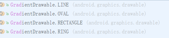
用shape标签定义的xml,最终都是转化为GradientDrawable对象,而不是ShapeDrawable, 也不是起类型对应的 OvalShape,RoundRectShape等。
GradientDrawable可以动态设置类型如下图所示,跟xml文件中类型android:shape的值一一对应。
View view = null;    // 这个view是你需要设置背景的view

int strokeWidth = 1;     // 1dp 边框宽度

int roundRadius = 5;     // 5dp 圆角半径

int strokeColor = Color.parseColor("#FFFF0000");//边框颜色

int fillColor = Color.parseColor("#FF00FF00"); //内部填充颜色


GradientDrawable gd = new GradientDrawable();//创建drawable

gd.setColor(fillColor);

gd.setCornerRadius(roundRadius);

gd.setStroke(strokeWidth, strokeColor);
gd.setGradientType(GradientDrawable.RECTANGLE);

view.setBackgroundDrawable(gd);

// 创建渐变的shape drawable

int colors[] = { 0xff255779 , 0xff3e7492, 0xffa6c0cd };//分别为开始颜色,中间夜色,结束颜色

GradientDrawable gradientDrawable = new GradientDrawable(GradientDrawable.Orientation.TOP_BOTTOM, colors);

view.setBackgroundDrawable(gd);
3. 动态改变GradientDrawable的属性
既然GradientDrawable都能动态创建,那么肯定能过动态修改,我们可以通过先获取view上设置的background drawable
如果是GradientDrawable则强制转换为GradientDrawable,这个时候就可以修改里面的属性,像动态创建时一样设置,设置好之后重新设置给view.
GradientDrawable drawable =(GradientDrawable)view.getBackground();

drawable.setColor(fillColor); // 设置填充色

drawable.gd.setStroke(strokeWidth, strokeColor); // 设置边框宽度和颜色

gd.setColors(colors);    // 设置渐变颜色数组
总结:
请注意区分 GradientDrawable 和 ShapeDrawable,这两个 Drawable 官方文档解释都是可以使用 shape 标签来定义,但实际使用过程却发现使用 shape 标签定义的 Drawable 属于 GradientDrawabl。使用 shape 标签能定义多种多样的 Drawable,能够方便实现圆角,渐变等效果,更多 shape 标签定义请参考 Drawable实战解析:Android XML shape 标签使用详解 。
Android GradientDrawable(shape标签定义) 静态使用和动态使用(圆角,渐变实现)的更多相关文章
- Drawable实战解析:Android XML shape 标签使用详解(apk瘦身,减少内存好帮手)
Android XML shape 标签使用详解 一个android开发者肯定懂得使用 xml 定义一个 Drawable,比如定义一个 rect 或者 circle 作为一个 View 的背景. ...
- Android XML shape 标签使用详解(apk瘦身,减少内存好帮手)
Android XML shape 标签使用详解 一个android开发者肯定懂得使用 xml 定义一个 Drawable,比如定义一个 rect 或者 circle 作为一个 View 的背景. ...
- Android NDK生成及连接静态库与动态库
对于Android应用开发,大部分情况下我们使用Java就能完整地实现一个应用.但是在某些情况下,我们需要借助C/C++来写JNI本地代码.比如,在使用跨平台的第三方库的时候:为了提升密集计算性能的时 ...
- android NDK 使用(多个)静态库生成动态库
android NDK 使用(多个)静态库生成动态库. 1.编写Android.mk文件:如下两种方式都可以,用于NDK编译工具生成的两个.a文件来生成最终的libtwolib-second.so动态 ...
- Android 使用shape定义不同控件的的颜色、背景色、边框色
Android 使用shape定义不同控件的的颜色.背景色.边框色 设置按钮的右边框和底边框颜色为红色,边框大小为3dp: 在drawable新建一个 buttonstyle.xml的文件,内容如下: ...
- 详解shape标签
转载自:http://blog.csdn.net/harvic880925/article/details/41850723 一.简单使用 刚开始,就先不讲一堆标签的意义及用法,先简单看看shape标 ...
- Android实现AppWidget、Broadcast静态注册
Android实现AppWidget.Broadcast静态注册 本篇博客是基于我上一篇博客继续修改的,详情请看Android实现AppWidget.Broadcast动态注册 开发工具:Andori ...
- Android中shape属性详解
一.简单使用 刚开始,就先不讲一堆标签的意义及用法,先简单看看shape标签怎么用. 1.新建shape文件 首先在res/drawable文件夹下,新建一个文件,命名为:shape_radius.x ...
- 【转】【Android】Android Drawable Shape 组合画田字格
使用layer-list组合多个Shap <?xml version="1.0" encoding="utf-8"?> <layer-list ...
随机推荐
- 对抗假人 —— 前后端结合的 WAF
前言 之前介绍了一些前后端结合的中间人攻击方案.由于 Web 程序的特殊性,前端脚本的参与能大幅弥补后端的不足,从而达到传统难以实现的效果. 攻防本为一体,既然能用于攻击,类似的思路同样也可用于防御. ...
- ASP.NET从零开始学习EF的增删改查
ASP.NET从零开始学习EF的增删改查 最近辞职了,但是离真正的离职还有一段时间,趁着这段空档期,总想着写些东西,想来想去,也不是很明确到底想写个啥,但是闲着也是够 ...
- 免费开源的.NET多类型文件解压缩组件SharpZipLib(.NET组件介绍之七)
前面介绍了六种.NET组件,其中有一种组件是写文件的压缩和解压,现在介绍另一种文件的解压缩组件SharpZipLib.在这个组件介绍系列中,只为简单的介绍组件的背景和简单的应用,读者在阅读时可以结合官 ...
- 如果你也会C#,那不妨了解下F#(7):面向对象编程之继承、接口和泛型
前言 面向对象三大基本特性:封装.继承.多态.上一篇中介绍了类的定义,下面就了解下F#中继承和多态的使用吧.
- MATLAB中绘制质点轨迹动图并保存成GIF
工作需要在MATLAB中绘制质点轨迹并保存成GIF以便展示. 绘制质点轨迹动图可用comet和comet3命令,使用例子如下: t = 0:.01:2*pi;x = cos(2*t).*(cos(t) ...
- 设计模式C#合集--工厂方法模式
简单工厂,代码: public interface ISpeak { public void Say(); } public class Hello : ISpeak { public void Sa ...
- 【夯实PHP基础】UML序列图总结
原文地址 序列图主要用于展示对象之间交互的顺序. 序列图将交互关系表示为一个二维图.纵向是时间轴,时间沿竖线向下延伸.横向轴代表了在协作中各独立对象的类元角色.类元角色用生命线表示.当对象存在时,角色 ...
- PHP设计模式(四)单例模式(Singleton For PHP)
今天讲单例设计模式,这种设计模式和工厂模式一样,用的非常非常多,同时单例模式比较容易的一种设计模式. 一.什么是单例设计模式 单例模式,也叫单子模式,是一种常用的软件设计模式.在应用这个模式时,单例对 ...
- CSS学习笔记
CSS学习笔记 2016年12月15日整理 CSS基础 Chapter1 在console输入escape("宋体") ENTER 就会出现unicode编码 显示"%u ...
- Android中Activity的四大启动模式实验简述
作为Android四大组件之一,Activity可以说是最基本也是最常见的组件,它提供了一个显示界面,从而实现与用户的交互,作为初学者,必须熟练掌握.今天我们就来通过实验演示,来帮助大家理解Activ ...