Python数据可视化之matplotlib
常用模块导入
import numpy as np

import matplotlib

import matplotlib.mlab as mlab

import matplotlib.pyplot as plt

import matplotlib.font_manager as fm

from mpl_toolkits.mplot3d import Axes3D
解决显示异常问题
中文乱码
myfont = fm.FontProperties(fname="字体文件路径")
负号显示为方块
matplotlib.rcParams['axes.unicode_minus']=False
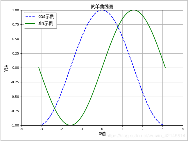
折线图
生成数据
x = np.linspace(-np.pi, np.pi, 256, endpoint=True)  # 从-π到π 等间隔取256个点

y_cos, y_sin = np.cos(x), np.sin(x)  # 对应x的cos与sin值
初始化画布
plt.figure(figsize=(8, 6), dpi=80)  # figsize定义画布大小,dpi定义画布分辨率

plt.title("简单折线图", fontproperties=myfont)  # 设定标题,中文需要指定字体

plt.grid(True)  # 是否显示网格
设置坐标轴
# 设置X轴

plt.xlabel("X轴", fontproperties=myfont)  # 轴标签

plt.xlim(-4.0, 4.0)  # 轴范围

plt.xticks(np.linspace(-4, 4, 9, endpoint=True))  # 轴刻度

# 设置Y轴

plt.ylabel("Y轴", fontproperties=myfont)

plt.ylim(-1.0, 1.0)

plt.yticks(np.linspace(-1, 1, 9, endpoint=True))
绘制数据
线类型有几种:"g+-", "r*-", "b.-", "yo-",第一个字代表颜色,第二个字符代表节点样式,第三个字符代表连线样式
plt.plot(x, y_cos, "b--", linewidth=2.0, label="cos示例") # 前两个参数是坐标值,第三个参数为线类型,linewidth为线宽,label为图例文字

plt.plot(x, y_sin, "g-", linewidth=2.0, label="sin示例")
设置图例
plt.legend(loc="upper left", prop=myfont, shadow=True) # loc可以是upper、lower和left, right, center的组合
图形显示
plt.show()
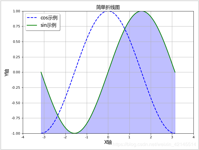
面积图
plt.fill_between(x, -1, y_sin, where=True, color="blue", alpha=0.25)

plt.show()
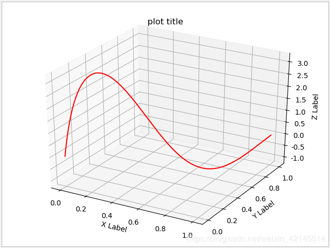
三维折线图
# 生成测试数据

x = np.linspace(0, 1, 1000)

y = np.linspace(0, 1, 1000)

z = np.sin(x * 2 * np.pi) / (y + 0.1)

# 生成画布(两种形式)

fig = plt.figure()

ax = fig.gca(projection="3d", title="plot title")

# ax = fig.add_subplot(111, projection="3d", title="plot title")

# 画三维折线图

ax.plot(x, y, z, color="red", linestyle="-")

# 设置坐标轴图标

ax.set_xlabel("X Label")

ax.set_ylabel("Y Label")

ax.set_zlabel("Z Label")

# 图形显示

plt.show()
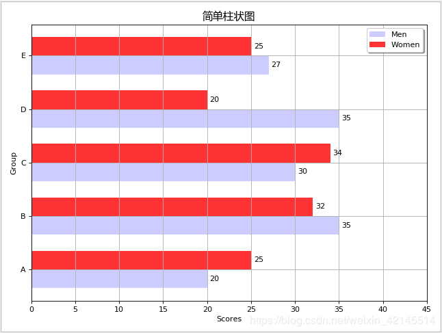
柱状图
生成数据
# 生成测试数据

means_men = np.array((20, 35, 30, 35, 27))

means_women = np.array((25, 32, 34, 20, 25))
初始化画布
plt.figure(figsize=(8, 6), dpi=80)  # figsize定义画布大小,dpi定义画布分辨率

plt.title("简单柱状图", fontproperties=myfont)  # 设定标题,中文需要指定字体

plt.grid(True)  # 是否显示网格
设置坐标轴
index = np.arange(len(means_men)) [0,1,2,3,4]

bar_height = 0.35  # 柱宽度

plt.xlim(0, 45)  # 轴范围

plt.xlabel("Scores")  # 轴标签

plt.ylabel("Group")

plt.yticks(index + (bar_height / 2), ("A", "B", "C", "D", "E")) # 轴刻度
绘制数据
# 绘制横向柱状图

plt.barh(index, means_men, height=bar_height, alpha=0.2, color="b", label="Men")

plt.barh(index + bar_height, means_women, height=bar_height, alpha=0.8, color="r", label="Women")
设置图例
plt.legend(loc="upper right", shadow=True)
显示数据值
for i, v in zip(index, means_men):

    plt.text(v + 0.3, i, v, ha="left", va="center")

for i, v in zip(index, means_women):

    plt.text(v + 0.3, i + bar_height, v, ha="left", va="center")
图形显示
plt.show()
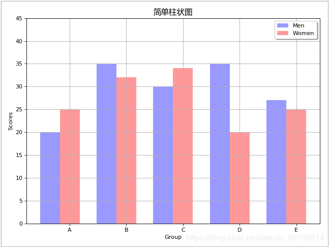
竖向柱形图
设置坐标轴,x与y对调
index = np.arange(len(means_men)) [0,1,2,3,4]

bar_height = 0.35  # 柱宽度

plt.ylim(0, 45)

plt.ylabel("Scores")

plt.xlabel("Group")

plt.xticks(index + (bar_height / 2), ("A", "B", "C", "D", "E"))
绘制数据
# 绘制竖向柱状图

plt.bar(index-bar_height/2, means_men, width=bar_height, alpha=0.4, color="b", label="Men")

plt.bar(index+bar_height/2, means_women, width=bar_height, alpha=0.4, color="r", label="Women")
图形显示
plt.show()
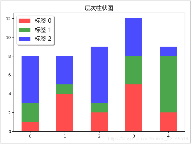
堆叠柱状图
# 生成测试数据

data = np.array([

    [1, 4, 2, 5, 2],

    [2, 1, 1, 3, 6],

    [5, 3, 6, 4, 1]

])

# 设置标题

plt.title("层次柱状图", fontproperties=myfont)

# 设置相关参数

index = np.arange(len(data[0]))

color_index = ["r", "g", "b"]

# 声明底部位置

bottom = np.array([0, 0, 0, 0, 0])

# 依次画图,并更新底部位置

for i in range(len(data)):

    plt.bar(index, data[i], width=0.5, color=color_index[i], bottom=bottom, alpha=0.7, label="标签 %d" % i)

    bottom += data[i]

# 设置图例位置

plt.legend(loc="upper left", prop=myfont, shadow=True)

# 图形显示

plt.show()
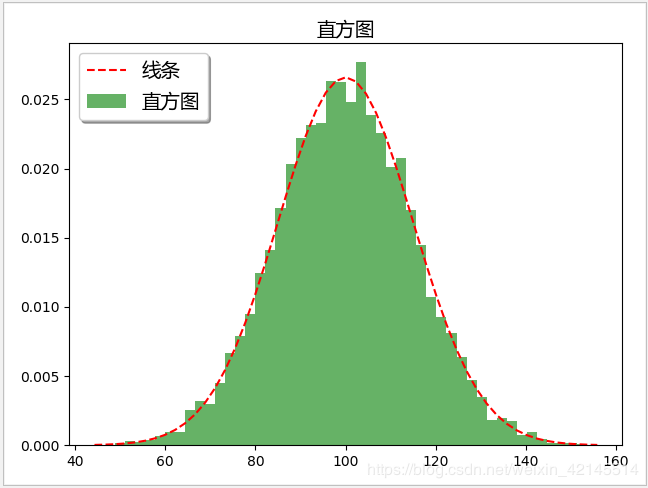
直方图
# 生成测试数据

mu, sigma = 100, 15

x = mu + sigma * np.random.randn(10000)

# 设置标题

plt.title("直方图", fontproperties=myfont)

# 画直方图, 并返回相关结果

n, bins, patches = plt.hist(x, bins=50, density=1, cumulative=False, color="green", alpha=0.6, label="直方图")

# # 根据直方图返回的结果, 画折线图

y = mlab.normpdf(bins, mu, sigma)

plt.plot(bins, y, "r--", label="线条")

# 设置图例位置

plt.legend(loc="upper left", prop=myfont, shadow=True)

# 图形显示

plt.show()
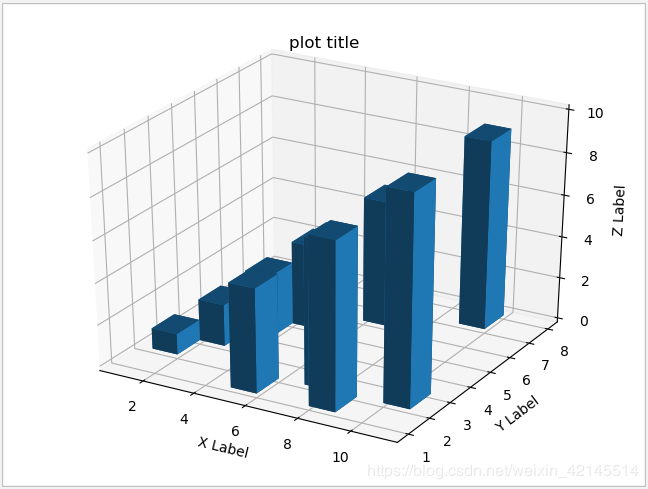
三维柱形图
# 生成测试数据(位置数据)

xpos = [1, 2, 3, 4, 5, 6, 7, 8, 9, 10]

ypos = [2, 3, 4, 5, 1, 6, 2, 1, 7, 2]

zpos = [0, 0, 0, 0, 0, 0, 0, 0, 0, 0]

# 生成测试数据(柱形参数)

dx = [1, 1, 1, 1, 1, 1, 1, 1, 1, 1]

dy = [1, 1, 1, 1, 1, 1, 1, 1, 1, 1]

dz = [1, 2, 3, 4, 5, 6, 7, 8, 9, 10]

# 生成画布(两种形式)

fig = plt.figure()

ax = fig.gca(projection="3d", title="plot title")

# 设置坐标轴图标

ax.set_xlabel("X Label")

ax.set_ylabel("Y Label")

ax.set_zlabel("Z Label")

# 画三维柱状图

ax.bar3d(xpos, ypos, zpos, dx, dy, dz, alpha=0.5)

# 图形显示

plt.show()
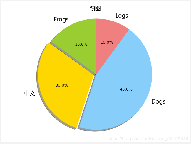
饼状图
生成数据
# 生成测试数据

sizes = [15, 30, 45, 10]  # 数值

labels = ["Frogs", "中文", "Dogs", "Logs"]  # 标签

colors = ["yellowgreen", "gold", "lightskyblue", "lightcoral"]  # 颜色
初始化画布
plt.figure(figsize=(8, 6), dpi=80)  # figsize定义画布大小,dpi定义画布分辨率

plt.title("简单饼状图", fontproperties=myfont)  # 设定标题,中文需要指定字体
设置扇区偏离值
explode = [0, 0.05, 0, 0]
绘制数据
patches, l_text, p_text = plt.pie(sizes, explode=explode, labels=labels, colors=colors, autopct="%1.1f%%", shadow=True, startangle=90)  # autopct设置显示百分比的格式,startangle设置图像转动方向

for text in l_text:

    text.set_fontproperties(myfont)  # 设置字体,避免中文乱码
图形显示
plt.show()
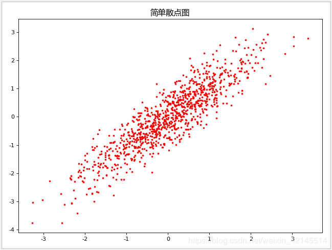
散点图
生成数据
N = 1000

x = np.random.randn(N)

y = x + np.random.randn(N)*0.5
初始化画布
plt.figure(figsize=(8, 6), dpi=80)  # figsize定义画布大小,dpi定义画布分辨率

plt.title("简单散点图", fontproperties=myfont)  # 设定标题,中文需要指定字体
绘制数据
plt.scatter(x, y, s=5, c="red", marker="o") # s表示点的大小,c表示点的颜色,marker表示点的形状
图形显示
plt.show()
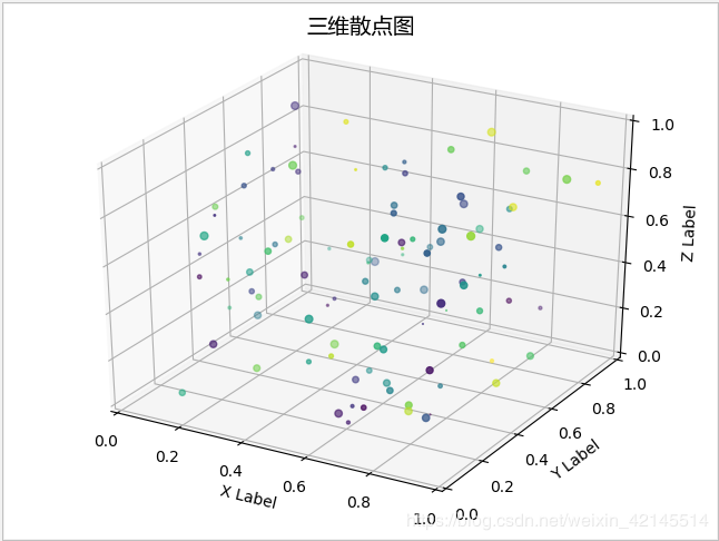
三维散点图
# 生成测试数据

x = np.random.random(100)

y = np.random.random(100)

z = np.random.random(100)

color = np.random.random(100)

scale = np.random.random(100) * 100

# 生成画布(两种形式)

fig = plt.figure()

fig.suptitle("三维散点图", fontproperties=myfont)

ax = fig.add_subplot(111, projection="3d")

# 设置坐标轴图标

ax.set_xlabel("X Label")

ax.set_ylabel("Y Label")

ax.set_zlabel("Z Label")

# 设置坐标轴范围

ax.set_xlim(0, 1)

ax.set_ylim(0, 1)

ax.set_zlim(0, 1)

# 画三维散点图

ax.scatter(x, y, z, s=scale, c=color, marker=".")

# 图形显示

plt.show()
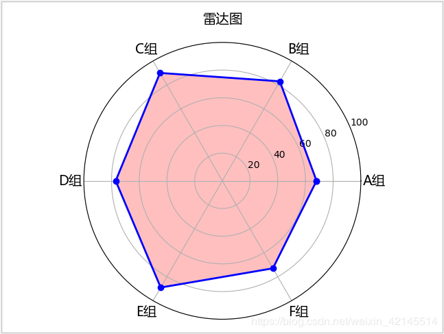
雷达图
生成数据
labels = np.array(["A组", "B组", "C组", "D组", "E组", "F组"])

data = np.array([68, 83, 90, 77, 89, 73])

theta = np.linspace(0, 2 * np.pi, len(data), endpoint=False)  # 每个维度的角度值
初始化画布
plt.subplot(111, polar=True)  # 3个数字,前两位表示把画布分为几行几列,后一位表示花在哪个位置上

plt.title("雷达图", fontproperties=myfont)
设置坐标轴
plt.ylim(0, 100) # 轴范围
绘制数据
plt.thetagrids(theta * (180 / np.pi), labels=labels, fontproperties=myfont)
图形显示
plt.show()
想进一步了解编程开发相关知识,与我一同成长进步,请关注我的公众号“松果仓库”,共同分享宅&程序员的各类资源,谢谢!!!
Python数据可视化之matplotlib的更多相关文章
- Python数据可视化——使用Matplotlib创建散点图
Python数据可视化——使用Matplotlib创建散点图 2017-12-27 作者:淡水化合物 Matplotlib简述: Matplotlib是一个用于创建出高质量图表的桌面绘图包(主要是2D ...
- python 数据可视化(matplotlib)
matpotlib 官网 :https://matplotlib.org/index.html matplotlib 可视化示例:https://matplotlib.org/gallery/inde ...
- Python数据可视化库-Matplotlib(一)
今天我们来学习一下python的数据可视化库,Matplotlib,是一个Python的2D绘图库 通过这个库,开发者可以仅需要几行代码,便可以生成绘图,直方图,功率图,条形图,错误图,散点图等等 废 ...
- Python数据可视化之Matplotlib实现各种图表
数据分析就是将数据以各种图表的形式展现给领导,供领导做决策用,因此熟练掌握饼图.柱状图.线图等图表制作是一个数据分析师必备的技能.Python有两个比较出色的图表制作框架,分别是Matplotlib和 ...
- Python数据可视化利器Matplotlib,绘图入门篇,Pyplot介绍
Pyplot matplotlib.pyplot是一个命令型函数集合,它可以让我们像使用MATLAB一样使用matplotlib.pyplot中的每一个函数都会对画布图像作出相应的改变,如创建画布.在 ...
- Python数据可视化库-Matplotlib(二)
我们接着上次的继续讲解,先讲一个概念,叫子图的概念. 我们先看一下这段代码 import matplotlib.pyplot as plt fig = plt.figure() ax1 = fig.a ...
- python数据可视化(matplotlib)
- python数据可视化-matplotlib入门(7)-从网络加载数据及数据可视化的小总结
除了从文件加载数据,另一个数据源是互联网,互联网每天产生各种不同的数据,可以用各种各样的方式从互联网加载数据. 一.了解 Web API Web 应用编程接口(API)自动请求网站的特定信息,再对这些 ...
- Python数据可视化-seaborn库之countplot
在Python数据可视化中,seaborn较好的提供了图形的一些可视化功效. seaborn官方文档见链接:http://seaborn.pydata.org/api.html countplot是s ...
随机推荐
- 在VS2013下配置BOOST库
1.安装Boost库 (1).首先打开Boost的官网(http://www.boost.org/),找到下载位置,如下图中红框所示,此时最新的版本是1.64.0: (2).点击进入下载页面,选择你需 ...
- go-json类
package main import ( "encoding/json" "fmt" ) /* { "company":"itc ...
- 3.如何理解开多线程可以充分利用CPU?
如何理解开多线程可以充分利用CPU? <1>操作系统采用时间片轮转调度算法分配的时间片给每个进程中的线程 <2>操作系统的时间片轮转调度算法分配的时间片 在别的进程中都没有准备 ...
- PowerShell渗透--Empire(三)
会话注入 我们可以使用usemodule management/psinject模块来进程注入,获取权限 设置下Listeners和ProcID这2个参数,这里的ProcID就是之前的CMD的pid, ...
- ESP8266开发之旅 网络篇⑩ UDP服务
授人以鱼不如授人以渔,目的不是为了教会你具体项目开发,而是学会学习的能力.希望大家分享给你周边需要的朋友或者同学,说不定大神成长之路有博哥的奠基石... QQ技术互动交流群:ESP8266&3 ...
- 【MongoDB详细使用教程】五、MongoDB的数据库管理
目录 1.数据库安全 1.1.创建管理员账号和密码 1.2.设置服务状态为需要验证用户 1.3.创建用户账户和密码 1.4.忘记密码/修改密码 2.主从服务器 2.1.创建服务器目录,用于分别存放主从 ...
- zepto源码分析·core模块
准备说明 该模块定义了库的原型链结构,生成了Zepto变量,并将其以'Zepto'和'$'的名字注册到了window,然后开始了其它模块的拓展实现. 模块内部除了对选择器和zepto对象的实现,就是一 ...
- 基于SEER的区块链版赛亚麻将游戏Pre alpha版本内测啦!
游戏基于SEER测试网络文体平台模块(Culture and Sports Platform,CSP),正在进行数据调试等工作,大家可以尝鲜体验. 此游戏账户和资金等核心系统完全基于区块链,但目前运行 ...
- Redis(七)Redis的噩梦:阻塞
为什么说阻塞是Redis的噩梦: Redis是典型的单线程架构,所有的读写操作都是在一条主线程中完成的.当Redis用于高并发场景时,这条线程就变成了它的生命线.如果出现阻塞,哪怕是很短时间,对于应用 ...
- 微服务SpringCloud之GateWay路由
在前面博客学习了网关zuul,今天学下spring官方自带的网关spring cloud gateway.Zuul(1.x) 基于 Servlet,使用阻塞 API,它不支持任何长连接,如 WebSo ...