一起学HTML基础-格式与布局fixed/absolute/relative/z-index/float

很多网页都存在一个悬浮的操作条或者广告区,无论如何上下滚动网页,操作条或广告区都不会动,这个就是div制作,位置锁定在屏幕指定位置,现在我们就学习下网页的格式与布局。
position 位置,来给div定位
1、position:fixed;锁定位置(相当于浏览器窗口的位置),默认层数最高。例如有些网站的右下角弹窗。
练习:在右下角做一个弹窗,锁定位置,不随网页滚动而滚动。
步骤:
一、先做一个文字的弹窗
<head>

<meta http-equiv="Content-Type" content="text/html; charset=utf-8" />

<title>格式与布局</title>

<style type="text/css">

.wtc

{

    width:200px; height:150px; background-color:#F00;

    border:yellow solid 6px;

    line-height:150px; text-align:center;

}

</style>

</head>

<body>

<div class="wtc"><b><u>Welcom To China!</u></b></div>

</body>

</html>
welcome to china

二、将弹窗放置在屏幕右下角并锁定位置(插入空行加长页面来已显示滚动条)——若不写position:fixed;代码,弹窗设置的位置无法确定相对于谁的位置
<head>

<meta http-equiv="Content-Type" content="text/html; charset=utf-8" />

<title>格式与布局</title>

<style type="text/css">

.wtc

{

    width:200px; height:150px; background-color:#F00;

    border:yellow solid 6px;

    line-height:150px; text-align:center;

}

</style>

</head>

<body>

<div class="wtc" style="right:30px; bottom:30px; position:fixed;"><b><u>Welcom To China!</u></b></div><br />

<br />

<br />

<br />

<br />

<br />

<br />

<br />

<br />

<br />

<br />

<br />

<br />

<br />

<br />

<br />

<br />

<br />

<br />

<br />

<br />

<br />

<br />

<br />

<br />

<br />

<br />

<br />

<br />

<br />

<br />

<br />

<br />

<br />

<br />

<br />

<br />

<br />

<br />

<br />

<br />

<br />

<br />

<br />

<br />

<br />

<br />

<br />

<br />

<br />

<br />

<br />

<br />

<br />

<br />

<br />

<br />

<br />

<br />

<br />

<br />

</body>

</html>
position:fixed

2、position:absolute 绝对位置
外层没有position:absolute(或relative);那么div相对于浏览器定位,外层有position:absolute(或relative);那么div相对于外层边框定位
练习:a、指定一个div,蓝色边框背景白色,内部再指定一个div,红色背景有文字,外部div不指定position,两个div都不指定position
<head>

<meta http-equiv="Content-Type" content="text/html; charset=utf-8" />

<title>格式与布局</title>

<style type="text/css">

.wtc

{

    width:200px; height:150px; background-color:#F00;

    border:yellow solid 6px;

    line-height:150px; text-align:center;

}

</style>

</head>

<body>

<div style="border:10px blue solid; width:500px; height:400px;"><div class="wtc"><b><u>Welcom To China!</u></b></div></div>

</body>
不指定position

b、上述div,外部div指定一个position:absolute;后,外部div会带着内部div移动,且随着滚动条会移动位置,是相对于整个网页锁定了位置
absolute绝对位置,会跟随网页滚动而改变在窗口的位置,相对于整个网页位置不变
<head>

<meta http-equiv="Content-Type" content="text/html; charset=utf-8" />

<title>格式与布局</title>

<style type="text/css">

.wtc

{

    width:200px; height:150px; background-color:#F00;

    border:yellow solid 6px;

    line-height:150px; text-align:center;

}

</style>

</head>

<body>

<div style="border:10px blue solid; width:500px; height:400px; position:absolute; right:250px; top:100px;"><div class="wtc"><b><u>Welcom To China!</u></b></div></div><br />

<br />

<br />

<br />

<br />

<br />

<br />

<br />

<br />

<br />

<br />

<br />

<br />

<br />

<br />

<br />

<br />

<br />

<br />

<br />

<br />

<br />

<br />

<br />

<br />

<br />

<br />

<br />

<br />

<br />

<br />

<br />

<br />

<br />

<br />

<br />

<br />

<br />

<br />

<br />

<br />

<br />

<br />

<br />

<br />

<br />

<br />

<br />

<br />

<br />

<br />

<br />

<br />

<br />

<br />

<br />

<br />

<br />

</body>
外部div-position

c、上述div,外部div不指定position,内部div指定一个position:absolute;后,外部div没有改变位置,内部div相对于整个网页改变了位置
<head>

<meta http-equiv="Content-Type" content="text/html; charset=utf-8" />

<title>格式与布局</title>

<style type="text/css">

.wtc

{

    width:200px; height:150px; background-color:#F00;

    border:yellow solid 6px;

    line-height:150px; text-align:center;

}

</style>

</head>

<body>

<div style="border:10px blue solid; width:500px; height:400px;"><div class="wtc" style="position:absolute; right:25px; top:10px;"><b><u>Welcom To China!</u></b></div></div><br />

</body>
内部div-position

d、上述div,同时设置内外div的position,此时,外部div相对于网页确定位置,内部div相对于外边框(外部div)确定位置
<head>

<meta http-equiv="Content-Type" content="text/html; charset=utf-8" />

<title>格式与布局</title>

<style type="text/css">

.wtc

{

    width:200px; height:150px; background-color:#F00;

    border:yellow solid 6px;

    line-height:150px; text-align:center;

}

</style>

</head>

<body>

<div style="border:10px blue solid; width:500px; height:400px; position:absolute; right:250px; top:100px;"><div class="wtc" style="position:absolute; right:25px; top:10px;"><b><u>Welcom To China!</u></b></div></div>

</body>
内外position

3、position:relative;相对位置
a、输入三个div,仅指定长宽和背景颜色
<body>

<div style="background-color:#F00; width:200px; height:100px;"></div>

<div style="background-color:#CF0; width:200px; height:100px;"></div>

<div style="background-color:#0F0; width:200px; height:100px;"></div>

</body>
3个div

b、在a的基础上,设置第二个div黄色区域向下、向右移动,position用absolute定位,黄色区域相对于浏览器窗口定位,而绿色区域向上紧跟红色区域
<body>

<div style="background-color:#F00; width:200px; height:100px;"></div>

<div style="background-color:#CF0; width:200px; height:100px; top:50px; left:100px; position:absolute;"></div>

<div style="background-color:#0F0; width:200px; height:100px;"></div>

</body>
移动div-absolute定位

c、在a的基础上,设置第二个div黄色区域向下、向右移动,position用relative定位,黄色区域相对于原有位置定位,而绿色区域还在原黄色位置下方
<body>

<div style="background-color:#F00; width:200px; height:100px;"></div>

<div style="background-color:#CF0; width:200px; height:100px; top:50px; left:100px; position:relative;"></div>

<div style="background-color:#0F0; width:200px; height:100px;"></div>

</body>
移动div-relative定位

结合b和c,说明absolute绝对位置是相对于浏览器页面位置定位,此时div不占有实际位置,所以绿色区域紧跟红色区域;relative相对位置是相对于div原有位置定位,此时div是实际占有位置的,所以绿色区域保持在原来黄色区域下方。
4、分层(z-index)
屏幕显示窗口虽然是在二维页面上显示,但实际是三维显示,因为窗口是重叠的,有上下层之分,上层总是覆盖下层,就像是一摞纸。
在上述c中,黄色区域覆盖了绿色区域,如何让绿色区域覆盖黄色区域?在绿色区域div-style中添加代码“z-index:2; position:relative;”即可
<body>

<div style="background-color:#F00; width:200px; height:100px;"></div>

<div style="background-color:#CF0; width:200px; height:100px; top:50px; left:100px; position:relative;;"></div>

<div style="background-color:#0F0; width:200px; height:100px; position:relative; z-index:2;"></div>

</body>
z-index

5、float:left;(right)流式布局
left、right时不需要规定位置(top、right),直接相对于浏览器,若外部被包裹,相对于外部div的位置的左上或右上显示。
a、在新建的html中输入两个div,分别指定float:left;和float:right;
<body>

<div style="background-color:#0F0; width:100px; height:300px; float:left;"></div>

<div style="background-color:#FF0; width:100px; height:300px; float:right;"></div>

</body>
float:left(right)

b、用一个div包裹这两个div,并居中,这种样式就像网站中悬浮的广告框
<body>

<div style="border:#F00 solid 5px; width:700px; height:500px; margin:0px auto;">

<div style="background-color:#0F0; width:100px; height:300px; float:left;"></div>

<div style="background-color:#FF0; width:100px; height:300px; float:right;"></div>

</div>

</body>
用div包裹

c、在a的基础上,我们用边框代替背景色,复制粘贴多个float,发现,div是从左至右、从右至左的顺序进行排列
<body>

<div style="border:#F00 solid 5px; width:700px; height:500px; margin:0px auto;">

<div style="border:#0F0 solid 3px; width:100px; height:300px; float:left;">a</div>

<div style="border:#0F0 solid 3px; width:100px; height:300px; float:left;">b</div>

<div style="border:#0F0 solid 3px; width:100px; height:300px; float:left;">c</div>

<div style="border:#FF0 solid 3px; width:100px; height:300px; float:right;">d</div>

<div style="border:#FF0 solid 3px; width:100px; height:300px; float:right;">e</div>

<div style="border:#FF0 solid 3px; width:100px; height:300px; float:right;">f</div>

</div>

</body>
多个float

d、将多个div放在网页中,设置float
<body>

<div style="border:#0F0 solid 3px; width:100px; height:300px; float:left;">a</div>

<div style="border:#0F0 solid 3px; width:100px; height:300px; float:left;">b</div>

<div style="border:#0F0 solid 3px; width:100px; height:300px; float:left;">c</div>

<div style="border:#0F0 solid 3px; width:100px; height:300px; float:left;">d</div>

<div style="border:#0F0 solid 3px; width:100px; height:300px; float:left;">e</div>

<div style="border:#0F0 solid 3px; width:100px; height:300px; float:left;">f</div>

<div style="border:#FF0 solid 3px; width:100px; height:300px; float:right;">aa</div>

<div style="border:#FF0 solid 3px; width:100px; height:300px; float:right;">bb</div>

<div style="border:#FF0 solid 3px; width:100px; height:300px; float:right;">cc</div>

<div style="border:#FF0 solid 3px; width:100px; height:300px; float:right;">dd</div>

<div style="border:#FF0 solid 3px; width:100px; height:300px; float:right;">ee</div>

<div style="border:#FF0 solid 3px; width:100px; height:300px; float:right;">ff</div>

</body>
多个float
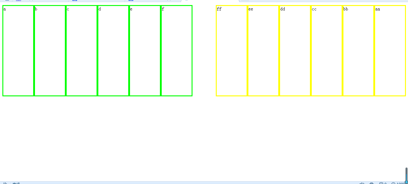
此时,缩小浏览器会发现,所有div像流水一样排列

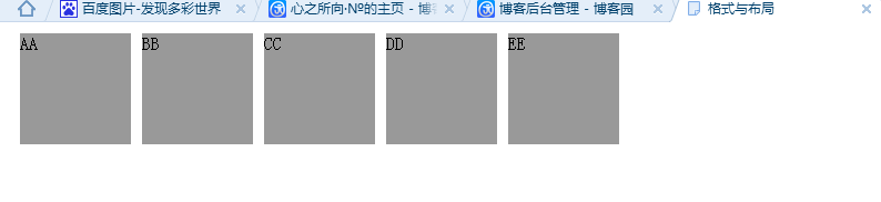
e、练习
第一步:用float:left;排5个灰色区域
<head>

<meta http-equiv="Content-Type" content="text/html; charset=utf-8" />

<title>格式与布局</title>

<style type="text/css">

.a

{

background-color:#; width:100px; height:100px; margin:10px;    float:left;

}

</style>

</head>

<body>

<div class="a">AA</div>

<div class="a">BB</div>

<div class="a">CC</div>

<div class="a">DD</div>

<div class="a">EE</div>

</body>
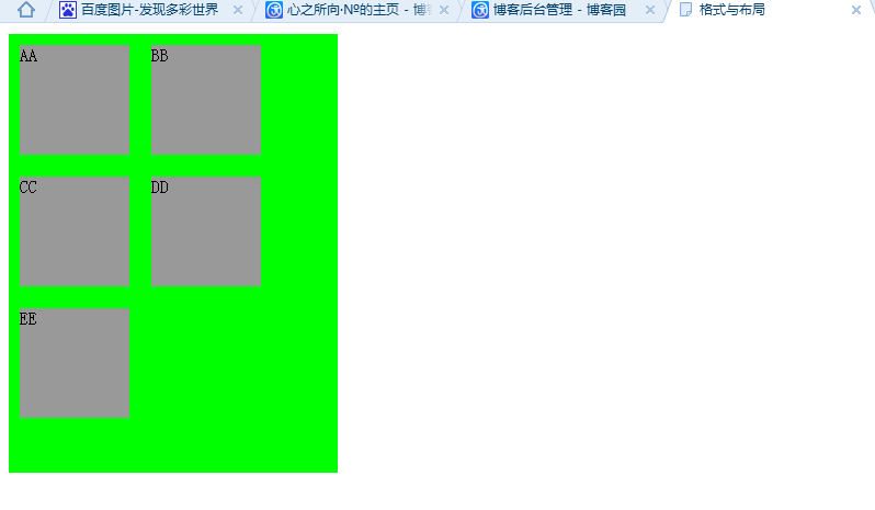
第二步:用一个div包含他们
<head>

<meta http-equiv="Content-Type" content="text/html; charset=utf-8" />

<title>格式与布局</title>

<style type="text/css">

.a

{

background-color:#; width:100px; height:100px; margin:10px;    float:left;

}

</style>

</head>

<body>

<div style="background-color:#0F0; width:300px; height:400px;">

<div class="a">AA</div>

<div class="a">BB</div>

<div class="a">CC</div>

<div class="a">DD</div>

<div class="a">EE</div>

</div>

</body>
一起学HTML基础-格式与布局fixed/absolute/relative/z-index/float的更多相关文章
- HTML-★★★格式与布局fixed/absolute/relative/z-index/float★★★
很多网页都存在一个悬浮的操作条或者广告区,无论如何上下滚动网页,操作条或广告区都不会动,这个就是div制作,位置锁定在屏幕指定位置,现在我们就学习下网页的格式与布局. position 位置,来给di ...
- css 定位(fixed > absolute > relative)与层级zIndex 的权限认知
原则1: fixed > absolute > relative原则2: zIndex 越高越牛逼,不管你是谁无视身份.原则3: 青出于蓝而胜于蓝,儿子永远比父亲强原则4: 平台很重要. ...
- 2016/2/19 position: fixed absolute relative z-index float 半透明效果
一.position:fixed 锁定位置(相对于浏览器的位置),例如有些网站的右下角的弹出窗口. 显示效果 无论滚动条怎么移动 都固定在显示页面的一个位置不动 二.position:a ...
- 关于CSS格式与布局中的基础知识的简单操作
<!DOCTYPE html PUBLIC "-//W3C//DTD XHTML 1.0 Transitional//EN" "http://www.w3.org/ ...
- 9月11日上午HTML有序列表、无序列表、网页的格式和布局
样式表 六.列表方块 1.有序列表变无序列表 <ol> <li>张店</li> <li>桓台</li> <li>淄川</l ...
- css样式表 格式与布局
1 样式表 内联样式表 内嵌样式表 外部样式表 2 选择器 标签选择器 <style type="text\css" class 选择器 以.开头 ID选择器 以#开 ...
- Android UI基础之五大布局
Android UI基础之五大布局 Android的界面是有布局和组件协同完成的,布局好比是建筑里的框架,而组件则相当于建筑里的砖瓦.组件按照布局的要求依次排列,就组成了用户所看见的界面.Andro ...
- css样式表:样式分类,选择器。样式属性,格式与布局
样式表分类: 1.内联样式表, 和html联合显示,例:<p style="font-size:14px;">内联样式表</p> 2.内嵌样式表 作为一个独 ...
- css样式,边界和边框,格式和布局
1.大小:width:宽:heigh:高 2.背景:1)background-color:背景颜色 2)background-image:背景图片url路径 3)background-repeat:图 ...
随机推荐
- 在Flex4中嵌入字体
如果要使用的字体不是系统字体,可以把字体嵌入到Flash中,然后引用该字体.不过字体文件一般都比较大,慎重使用该功能. 官方例子 http://help.adobe.com/en_US/flex/us ...
- Hibernate一对一关系映射
Hibernate提供了两种一对一映射关联关系的方式: 1)按照外键映射 2)按照主键映射 下面以员工账号表和员工档案表(员工账号和档案表之间是一对一的关系)为例,介绍这两种映射关系,并使用这两种 映 ...
- window10 安装出现the error code is 2503错误的解决方法
window10 安装出现the error code is 2503错误的解决方法: 设置 C:\WINDOWS\TEMP的权限
- Mysql优化系列(1)--Innodb引擎下mysql自身配置优化
1.简单介绍InnoDB给MySQL提供了具有提交,回滚和崩溃恢复能力的事务安全(ACID兼容)存储引擎.InnoDB锁定在行级并且也在SELECT语句提供一个Oracle风格一致的非锁定读.这些特色 ...
- 关闭tomcat, 部署并启动tomcat的脚本
/opt/tomcat/bin/shutdown.sh rm -f /opt/tomcat/webapps/ibank.war rm -rf /opt/tomcat/webapps/ibank cp ...
- mysql游标循环的使用
CREATE PROCEDURE `test`.`new_procedure` () BEGIN DECLARE done INT DEFAULT FALSE; -- 需要定义接收游标数据的变量 ); ...
- mac 下卸载mysql的方法
今天在mac上瞎折腾时,把mysql玩坏了,想卸载重装,却发现找不到卸载程序,百度了下,将操作步骤备份于此: cd ~/ sudo rm /usr/local/mysqlsudo rm -rf /us ...
- 数据字典生成工具之旅(8):SQL查询表的约束默认值等信息
上一篇代码生成工具里面已经用到了读取表结构的SQL,这篇将更加详细的介绍SQL SERVER常用的几张系统表和视图! 阅读目录 系统表视图介绍 实际应用 本章总结 工具源代码下载 学习使用 回到顶部 ...
- Android Intent的几种用法全面总结
Android Intent的几种用法全面总结 Intent, 用法 Intent应该算是Android中特有的东西.你可以在Intent中指定程序要执行的动作(比如:view,edit,dial), ...
- pageEncoding与contentType属性
1图例分析 由图中可以看出,这个两个属性没有任何关系. 把这两个设置成不同的编码格式对中文显示不会产生任何影响 2.原因分析 pageEncoding规定了以什么编码方式存储和读取,使两者保持一致性, ...