
[UWP]涨姿势UWP源码——UI布局
懒癌晚期兼正月里都是过年,一直拖到今天才继续更新。之前的几篇介绍了数据的来源,属于准备工作。本篇我们正式开始构建涨姿势UWP程序的UI界面。
我们这个Hello World程序比较简单,总共只有一个页面,在PC和Tablet上呈左右分开,左边以列表显示新闻标题及简述,右边则显示新闻正文。
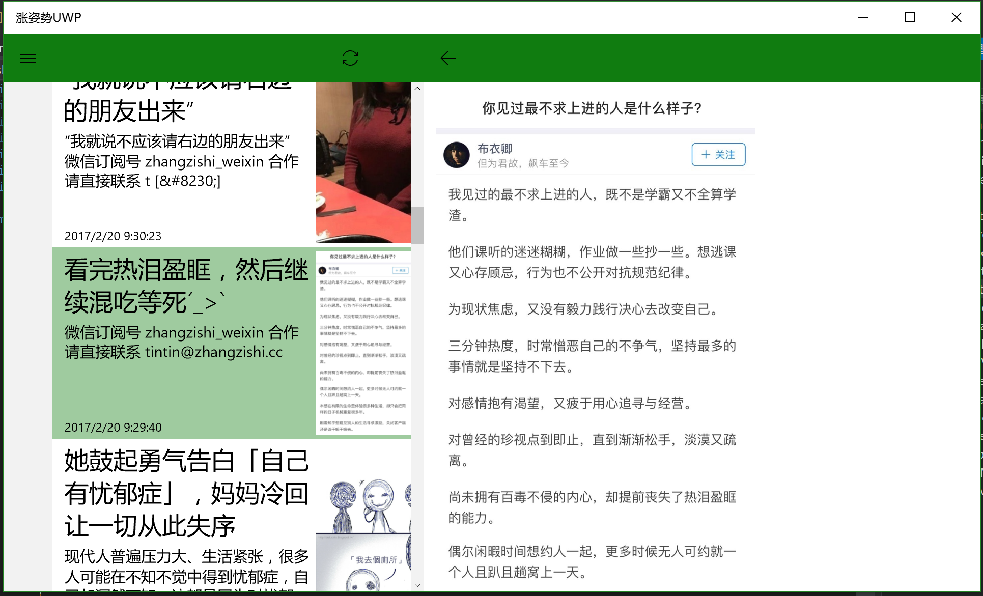
对于这样的一个布局,Grid无疑是最为合适的Panel,大体是以下的结构:
                <Grid>

                    <Grid.ColumnDefinitions>

                        <ColumnDefinition x:Name="columnLeft" Width="4*"></ColumnDefinition>

                        <ColumnDefinition x:Name="columnRight" Width="6*"></ColumnDefinition>

                    </Grid.ColumnDefinitions>

                    <ListView x:Name="listViewItems" Grid.Column="0" SelectedItem="{Binding SelectedItem,Mode=TwoWay}"

                        ItemsSource="{Binding Items}" ItemTemplate="{StaticResource ZzsItemTemplate}" ItemContainerStyle="{StaticResource ZzsItemStyle}" >

                    </ListView>

                    <ProgressBar  Grid.Column="0" IsIndeterminate="True" Visibility="{Binding IsLoading,Converter={StaticResource boolToVisible}}" ></ProgressBar>

                    <ContentControl Grid.Column="1" VerticalContentAlignment="Stretch" HorizontalContentAlignment="Stretch" Margin="4,0"

                        ContentTemplate="{StaticResource WebViewTemplate}" Content="{Binding}"></ContentControl>

                </Grid>
仔细观察可以发现,左上角参照UWP APP的风格,设置了一个汉堡包菜单,通过点击这个按钮会弹出部分选项:

弹出部分的效果通常都是通过SplitView控件来实现,SplitView在UWP中是横向划分空间的不二法宝,也可以参考系统自带的“邮件”APP,其中嵌套了多层SplitView来实现递进的渐次布局。
        <SplitView Grid.Row="1" x:Name="splitView" DisplayMode="CompactOverlay" CompactPaneLength="48" IsPaneOpen="{Binding IsOpen}">

            <SplitView.Pane>

                <ListView ItemsSource="{Binding CategoryList}"

                        ItemTemplate="{StaticResource NavigationItemTemplate}"

                        ItemContainerStyle="{StaticResource NavigationItemStyle}"

                        SelectedItem="{Binding SelectedCategory,Mode=TwoWay}"></ListView>

            </SplitView.Pane>

            <SplitView.Content>

                <Grid>

                <!-- 这里是上面那个主体内容的Grid -->

         </Grid>

            </SplitView.Content>

        </SplitView>
可以看到SplitView的Pane里放了一个CategoryList,Content就放了主体内容的Grid,在IsPaneOpen属性变化为True时,则展开显示。
到目前为止,尚未涉及顶部的绿色工具栏。这里不得不感慨一下,虽然UWP可以做到在不同尺寸的Windows10设备上运行,但是UI的适配确实是很麻烦的,同时考虑到Windows Phone的占有率,UWP APP不出Phone版就不难理解了。

为了能够适配Phone的竖屏界面,使工具栏的按钮能按比列分配到左右两边,同时不被SplitView的Pane遮挡。我在SplitView的外层再包了一层Grid,可以看到作为最外层的Grid,仅有两行。工具栏Height=Auto置于顶部,第二行放置SplitView占据剩余空间。
<Grid>
<Grid.RowDefinitions>
<RowDefinition Height="Auto"></RowDefinition>
<RowDefinition Height="*"></RowDefinition>
</Grid.RowDefinitions>
<Grid Grid.Row="0">
<Grid.ColumnDefinitions>
<ColumnDefinition x:Name="columnLeftBar" Width="4*"></ColumnDefinition>
<ColumnDefinition Width="Auto" ></ColumnDefinition>
<ColumnDefinition x:Name="columnRightBar" Width="6*"></ColumnDefinition>
</Grid.ColumnDefinitions>
<Grid Grid.Column="0" Background="{StaticResource SystemControlBackgroundAccentBrush}">
<Button Content="" FontFamily="{ThemeResource SymbolThemeFontFamily}"
HorizontalAlignment="Left" Background="{StaticResource SystemControlBackgroundAccentBrush}"
Width="48" Height="48" Command="{Binding OpenPaneCommand,Mode=OneTime}"></Button>
<Button x:Name="buttonSync" Content="" FontFamily="{ThemeResource SymbolThemeFontFamily}"
HorizontalAlignment="Right" Background="{StaticResource SystemControlBackgroundAccentBrush}"
Width="48" Height="48" Command="{Binding SyncCommand,Mode=OneTime}"></Button>
</Grid>
<Border x:Name="borderMiddle" Grid.Column="1" Background="{StaticResource SystemControlBackgroundAccentBrush}"> </Border>
<Border Grid.Column="2" Background="{StaticResource SystemControlBackgroundAccentBrush}">
<Button Content="" FontFamily="{ThemeResource SymbolThemeFontFamily}" Background="{StaticResource SystemControlBackgroundAccentBrush}"
Width="48" Height="48" Command="{Binding GoBackCommand,Mode=OneTime}"></Button>
</Border> </Grid>
<SplitView Grid.Row="1" x:Name="splitView" DisplayMode="CompactOverlay" CompactPaneLength="48" IsPaneOpen="{Binding IsOpen}">
<!-- SplitView -->
</SplitView>
</Grid>
这里值得一提的是微软提供了大量系统的icon图标,在XAML中,仅需将FontFamily设置成SymbolThemeFontFamily,同时填写编号,即可使用这些非常精致的系统图标。例如:
<Button Content="" FontFamily="{ThemeResource SymbolThemeFontFamily}"
HorizontalAlignment="Left" Background="{StaticResource SystemControlBackgroundAccentBrush}"
Width="48" Height="48" Command="{Binding OpenPaneCommand,Mode=OneTime}"></Button>
具体的icon图标可以参考这两篇:
https://docs.microsoft.com/zh-cn/windows/uwp/style/segoe-ui-symbol-font
https://docs.microsoft.com/en-us/uwp/api/Windows.UI.Xaml.Controls.Symbol
除了icon图标以外,我们同样可以发现一些的系统定义的样式,比如:
<Grid Grid.Column="0" Background="{StaticResource SystemControlBackgroundAccentBrush}">
鼠标放在SystemControlBackgroundAccentBrush上,右键菜单点击转到定义,会打开一个genric.xaml,该文件存在大量的系统配色和样式,非常方便且值得使用。
我们也可以增加一些自定义的Style,例如ListView的ItemContainerStyle:
<ListView ItemsSource="{Binding CategoryList}"

                        ItemTemplate="{StaticResource NavigationItemTemplate}"

                        ItemContainerStyle="{StaticResource NavigationItemStyle}"

                        SelectedItem="{Binding SelectedCategory,Mode=TwoWay}"></ListView>
这里的ItemContainerStyle经常需要自定义样式,一般的做法是通过左侧文档大纲,找到ListView节点,然后再选择“编辑其他模板”->“编辑生成的项目容器(ItemContainerStyle)”,通常会在xaml文件的顶部生成<Page.Resources>节点,其中会包含控件本身的Default Style,在此基础上进行修改事半功倍。

如果需要完全重新定义的模板,例如:ItemTemplate="{StaticResource NavigationItemTemplate}"
假设这个NavigationItemTemplate会在多处使用,那可以考虑将该资源定义在App.xaml中供整个程序使用:
    <Application.Resources>

        <ResourceDictionary>

            <local:ViewModelLocator x:Key="Locator" />

            <local:BoolToVisible x:Key="boolToVisible"></local:BoolToVisible>

            <DataTemplate x:Key="NavigationItemTemplate">

                <TextBlock Text="{Binding}" Margin="48,0"></TextBlock>

            </DataTemplate>

        </ResourceDictionary>

    </Application.Resources>
以上就是MainPage.xaml的大概内容分析,下一篇会结合MainPage.xaml.cs的代码来进一步介绍涨姿势UWP的相关内容。
GitHub源代码地址:
https://github.com/manupstairs/ZhangZiShiRSSRead
Windows Store:
https://www.microsoft.com/zh-cn/store/p/%e6%b6%a8%e5%a7%bf%e5%8a%bfuwp/9nblggh3zqd1
[UWP]涨姿势UWP源码——UI布局的更多相关文章
- [UWP]涨姿势UWP源码——IsolatedStorage
前一篇涨姿势UWP源码分析从数据源着手,解释了RSS feed的获取和解析,本篇则会就数据源的保存和读取进行举例. 和之前的Windows Runtime一样,UWP采用IsolatedStorage ...
- [UWP]涨姿势UWP源码——适配电脑和手机
上一篇我们介绍了绘制主界面的MainPage.xaml,本篇则会结合MainPage.xaml.cs来讲一讲如何适配电脑和手机这些不同尺寸的设备. 同时适配电脑和手机存在几个麻烦的地方: 屏幕尺寸差距 ...
- [UWP]涨姿势UWP源码——Unit Test
之前我们讨论了涨姿势UWP的RSS数据源获取,以及作为文件存储到本地,再将数据转化成Model对象.这部分非UI的内容非常适合添加Unit Test.不涉及UI的话,UT写起来简单高效,很是值得投入一 ...
- [UWP]涨姿势UWP源码——RSS feed的获取和解析
本篇开始具体分析涨姿势UWP这个APP的代码,首先从数据的源头着手,即RSS feed的获取和解析,相关的类为RssReader,所有和数据相关的操作均放在里面. 涨姿势网站提供的RSS feed地址 ...
- [UWP]涨姿势UWP源码——极简的RSS阅读器
涨姿势UWP,一个开源的RSS阅读器,一个纯粹的项目,一个有道德的APP,一个脱离了低级趣味的作者,一些有益于人民的代码.骚年,还等什么,来涨点姿势吧! 该项目代码可能会引起部分人群的不适,敏感人群请 ...
- win10 UWP Markdown 含源码
Windows下没有比較好的Markdown编辑器 我就自己写一个 csdn的Markdown非常好,就是我须要截图保存有麻烦 须要把我的截图保存在本地,然后上传 这个过程比較麻烦 csdn的图没法外 ...
- [置顶] Android 高级开发 源码 UI 缓存 网络
1.Android 源码剖析 性能优化 开源代码 2.Android UI效果源码 3.http://mzh3344258.blog.51cto.com/1823534/d-3 4.微信公众平台开发 ...
- 查看Android源码和源码布局
一.查看源码 1.https://github.com/android 2.http://grepcode.com/project/repository.grepcode.com/java/ext/c ...
- Android6.0源码分析之录音功能(一)【转】
本文转载自:http://blog.csdn.net/zrf1335348191/article/details/54949549 从现在开始一周时间研究录音,下周出来一个完整的博客,监督,激励!!! ...
随机推荐
- java数据结构整理(二)
一.List接口,有序的Collection接口,能够精确地控制每个元素插入的位置,允许有相同的元素 1.链表,LinkedList实现了List接口,允许null元素,提供了get().remove ...
- BZOJ2720: [Violet 5]列队春游
2720: [Violet 5]列队春游 Time Limit: 5 Sec Memory Limit: 128 MBSubmit: 173 Solved: 125[Submit][Status] ...
- Bzoj3756
传送门:http://www.lydsy.com/JudgeOnline/problem.php?id=3756 题解:乱搞 代码: #include<iostream> #include ...
- iOS UITabBar
参考文章:http://www.cnblogs.com/wendingding/p/3775488.html 简单明了,不用再总结了.
- 背景图片等比缩放的写法background-size简写法
1.背景图片或图标也可像img一样给其宽高就能指定其缩放大小了. 比如一个实际宽高36*28的图标,要缩小一半引用进来的写法就是: background:rgba(0, 0, 0, 0) url(&q ...
- iOS 引导页
1. 目标需求 引导页无限轮播,且轮播到最后一张时没有跳转到头一个的感觉 pageControl的显示为可选项 是否无限轮播为可选项 手动切换图片,并再次启动自动轮转 实现点击事件 2. 实现思路 初 ...
- onfocus在火狐、ie10浏览器失效解决方法方法
<script> function setit(){ if(document.all){ document.getElementById("myfr ...
- Java多线程(学习篇)
Java多线程:(学习篇) 1.什么是线程 2.线程状态 3.线程中断 4.线程交互 5.同步机制 6.锁机制 7.堵塞队列与堵塞栈 8.条件变量.原子量.线程池等 9.线性安全类和Callable与 ...
- C# 程序只能执行一次
应用程序的主入口点. //每一个程序只能运行一个实例 bool isRun = false; System.Threading.Mutex m = new System.Threading.Mutex ...
- Target runtime Apache Tomcat v8.0 is not defined.
Target runtime Apache Tomcat v8.0 is not defined. Window-Preference-MyEclipse-Targeted Runtimes,选择存在 ...