css3动画(animation)效果3-正方体合成
<!DOCTYPE html>
<html lang="en">
<head>
<meta charset="UTF-8">
<title>旋转的星球</title>
<style type="text/css">
ul{
margin: 0;
padding: 0;
list-style: none;
}
.box{
height: 100px;
width: 100px;
perspective: 500px;
margin: 50px 0 0 50px;
}
.list{
position: relative;
height: 100px;
width: 100px;
background-color: blue;
transform-style: preserve-3d;
transform-origin: 0 0 0;
animation: rotate 1s 10s 3 both linear;
}
.in{
position: absolute;
height: 100px;
width: 100px;
}
.list .in:nth-child(6){
background-color: pink;
transform-origin: top;
animation: in6 2s both;
}
.list .in:nth-child(5){
background-color: lightgreen;
transform-origin: right;
animation: in5 2s 2s both;
}
.list .in:nth-child(4){
background-color: lightblue;
transform-origin: bottom;
animation: in4 2s 4s both;
}
.list .in:nth-child(3){
background-color: lightcoral;
transform-origin: left;
animation: in3 2s 6s both;
}
.list .in:nth-child(2){
background-color: lightcyan;
animation: in2 2s 8s both;
}
.list .in:nth-child(1){background-color: lightsalmon;}
.box:hover .list{animation-play-state: paused;}
.box:hover .in{animation-play-state: paused;}
@keyframes in6{100%{transform: rotateX(90deg);}}
@keyframes in5{100%{transform: rotateY(90deg);}}
@keyframes in4{100%{transform: rotateX(-90deg);}}
@keyframes in3{100%{transform: rotateY(-90deg);}}
@keyframes in2{100%{transform: translateZ(100px);}}
@keyframes rotate{100%{transform: rotate3d(1,1,1,360deg);}}
</style>
</head>
<body>
<div class="box">
<ul class="list" id="list">
<li class="in"></li>
<li class="in"></li>
<li class="in"></li>
<li class="in"></li>
<li class="in"></li>
<li class="in"></li>
</ul>
</div>
<script type="text/javascript">
list.addEventListener('animationend',function(e){
e = e || event;
var target = e.target || e.srcElement;
if(target.nodeName == 'UL'){
list.style.animationName = 'none';
var children = list.getElementsByTagName('li');
for(var i = 0; i < children.length;i++){
children[i].style.animationName = 'none';
}
setTimeout(function(){
list.style.animationName = 'rotate';
var children = list.getElementsByTagName('li');
for(var i = 0; i < children.length;i++){
children[i].style.animationName = 'in' + (i+1);
}
},100);
}
},false);
</script>
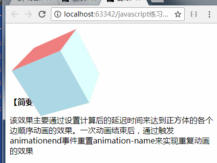
<strong>【简要介绍】</strong>
<p>该效果主要通过设置计算后的延迟时间来达到正方体的各个边顺序动画的效果。一次动画结束后,通过触发animationend事件重置animation-name来实现重复动画的效果</p>
</body>
</html>
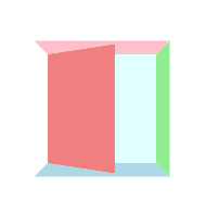
效果图:
原链接:https://www.cnblogs.com/xiaohuochai/p/5419236.html
css3动画(animation)效果3-正方体合成的更多相关文章
- 前端CSS3动画animation用法
前端CSS3动画animation用法 学习如下动画属性 @keyframes animation-name animation-duration animation-delay animation- ...
- CSS3 动画animation
关键帧 什么是关键帧.一如上面对Flash原理的描述一样,我们知道动画其实由许多静态画面组成,第一个这样的静态画面可以表述为一帧.其中关键帧是在动画过程中体现了物理明显变化的那些帧. 比如之前的例子中 ...
- css3 动画(animation)-简单入门
css3之动画(animation) css3中我们可以使用动画,由于取代以前的gif图片,flash动画,以及部分javascript代码(相信有很多同学都用过jquery中的animate方法来做 ...
- CSS3 动画 animation和@keyframes
CSS3 @keyframes 规则 如需在 CSS3 中创建动画,您需要学习 @keyframes 规则. @keyframes 规则用于创建动画.在 @keyframes 中规定某项 CSS 样式 ...
- CSS3动画animation认识,animate.css的使用
CSS动画 可以取代js动画 在移动端会更加流畅! 下面是一个的绘制太阳系各大行星运行轨迹笔记,可以自学参考! -------------------------------------------- ...
- css3动画animation
动画:animation animations这物似乎还是只在webkit,moz核心的浏览器上起作用 <!DOCTYPE html><html lang="en&qu ...
- CSS3 动画Animation的8大属性
animation复合属性.检索或设置对象所应用的动画特效. 如果有多个属性值时以","隔开,适用于所有元素,包含伪对象:after和:before 1.animation-nam ...
- css3动画-animation
animation驱使一组css style变化到另外一组css style,它可以定义keyframes的集合,指定style的开始和结束状态,它是transition的增强. 配置animatio ...
- 最新的css3动画按钮效果
效果演示 插件下载
- 纯CSS3动画按钮效果
在线演示 本地下载
随机推荐
- 将DataTable中的数据导出成Excel
public bool ExportFile(System.Data.DataTable dt){ SaveFileDialog sfd = new SaveFileDialog(); s ...
- MyBatis 体系结构
- Linux实战教学笔记23:Inotify事件监控工具
第二十三节 inotify事件监控工具 标签(空格分隔): Linux实战教学笔记-陈思齐 ---本教学笔记是本人学习和工作生涯中的摘记整理而成,此为初稿(尚有诸多不完善之处),为原创作品,允许转载, ...
- 【LA4043 训练指南】蚂蚁 【二分图最佳完美匹配,费用流】
题意 给出n个白点和n个黑点的坐标,要求用n条不相交的线段把他们连接起来,其中每条线段恰好连接一个白点和一个黑点,每个点恰好连接一条线段. 分析 结点分黑白,很容易想到二分图.其中每个白点对应一个X结 ...
- js-判断字符串中是否存在emoji表情
function isEmojiCharacter(substring) { for(var i = 0; i < substring.length; i++) { var hs = subst ...
- 256. Paint House房屋染色
[抄题]: There are a row of n houses, each house can be painted with one of the three colors: red, blue ...
- RTX二次开发笔记1
在客户端,一个rtx用户给另一个rtx用户发送消息! 我的解决方案:在rtx服务端部署一个 wcf服务 或 webservice 服务,然后程序在客户端调用服务就行. 1,C#版 (服务端需要4个DL ...
- 推荐一个好用的sql版本控制和美化工具SQLToolbelt
SQL Toolbelt含Red Gate公司目前出品的所有SQL Server工具和新版本.也就是说,当你使用SQL Server数据库工作时,您可以很方便的获得您所需要的一套强大的工具,包括SQL ...
- Python 解析配置模块之ConfigParser详解-乾颐堂
1.基本的读取配置文件 -read(filename) 直接读取ini文件内容 -sections() 得到所有的section,并以列表的形式返回 -options(section) 得到该sect ...
- mac iterm2
配置的效果图 : 先讲 iterm2 的配色,再讲 显示分支以及高亮. 一. 配色 打开iterm的官方主题配置站 github.com/mbadolato/iTerm2-Color-Schemes, ...