基于Python的某大学某学院新生高考成绩分析
# coding=gbk

import pandas as pd

import numpy as np

import matplotlib.pyplot as plt

from pylab import mpl

mpl.rcParams['font.sans-serif'] = ['FangSong'] # 指定默认字体

mpl.rcParams['axes.unicode_minus'] = False # 解决保存图像是负号'-'显示为方块的问题
# 读入数据

data = pd.read_excel("score.xls")
# 各省份数据分析

score_province = data.groupby("shengfen")
# 求取各省份高考成绩均值
score_province_mean = score_province.agg({"tdcj": "mean"})
score_province_mean = pd.DataFrame(score_province_mean)
score_province_mean = score_province_mean.sort_values(by="tdcj", ascending=False)
score_province_mean
# 提取出省份以及平均分
provinces = score_province_mean.index.tolist()
scores = score_province_mean["tdcj"].tolist()
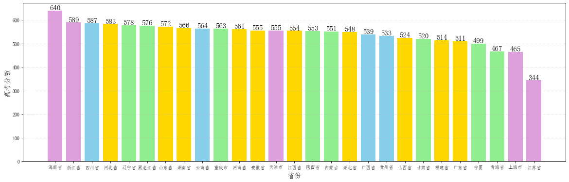
# 开始画图
# 根据不同省的不同试卷规定柱子的颜色
TestPaper1 = ['河南省', '河北省', '山西省', '江西省', '湖北省', '湖南省', '安徽省', '福建省', '山东省', '广东省'] #全国一卷
TestPaper2 = ['甘肃省', '青海省', '内蒙古', '黑龙江省', '辽宁省', '宁夏', '新疆省', '西藏', '陕西省', '重庆市']# 全国二卷
TestPaper3 = ['云南省', '广西省', '贵州省', '四川省'] #全国三卷
color = []
# gold 全国一卷
# lightgreen 全国二卷
# skyblue 全国三卷
# plum 自主命题
for i in provinces:
if i in TestPaper1:
color.append("gold")
elif i in TestPaper2:
color.append("lightgreen")
elif i in TestPaper3:
color.append("skyblue")
else:
color.append("plum")
# 开始作图
fig = plt.figure(figsize=(20,6)) # 设置画布大小
plt.grid(linestyle="-.", axis='y', alpha=0.4)
for a,b in zip(provinces,scores):
plt.text(a, b-0.3,'%.0f'%b, ha = 'center',va = 'bottom',fontsize=15)
plt.xlabel("省份", fontsize=15)
plt.ylabel("高考分数", fontsize=15)
plt.bar(provinces,scores,color=color)
<BarContainer object of 27 artists>
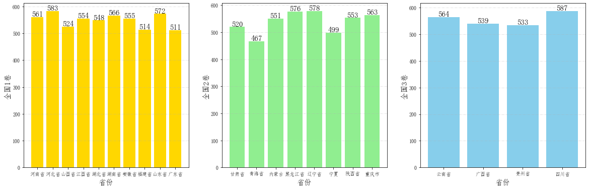
# 将相同试卷的省份拿出来进行对比作图

TestPaper1 =  ['河南省', '河北省', '山西省', '江西省', '湖北省', '湖南省', '安徽省', '福建省', '山东省', '广东省'] #全国一卷

TestPaper2 = ['甘肃省', '青海省', '内蒙古', '黑龙江省', '辽宁省', '宁夏', '陕西省', '重庆市']# 全国二卷

TestPaper3 = ['云南省', '广西省', '贵州省', '四川省'] #全国三卷

scores1 = [scores[provinces.index(i)] for i in TestPaper1]

scores2 = [scores[provinces.index(i)] for i in TestPaper2]

scores3 = [scores[provinces.index(i)] for i in TestPaper3]

# 创建子图

fig = plt.figure(figsize=(20,6))

ax1 = fig.add_subplot(1,3,1)

ax2 = fig.add_subplot(1,3,2)

ax3 = fig.add_subplot(1,3,3)

ax1.grid(linestyle="-.", axis='y', alpha=0.4)

for a,b in zip(TestPaper1,scores1):

    ax1.text(a, b-0.3,'%.0f'%b, ha = 'center',va = 'bottom',fontsize=15)

ax1.set_xlabel("省份", fontsize=15)

ax1.set_ylabel("全国1卷", fontsize=15)

ax2.grid(linestyle="-.", axis='y', alpha=0.4)

for a,b in zip(TestPaper2,scores2):

    ax2.text(a, b-0.3,'%.0f'%b, ha = 'center',va = 'bottom',fontsize=15)

ax2.set_xlabel("省份", fontsize=15)

ax2.set_ylabel("全国2卷", fontsize=15)

ax3.grid(linestyle="-.", axis='y', alpha=0.4)

for a,b in zip(TestPaper3,scores3):

    ax3.text(a, b-0.3,'%.0f'%b, ha = 'center',va = 'bottom',fontsize=15)

ax3.set_xlabel("省份", fontsize=15)

ax3.set_ylabel("全国3卷", fontsize=15)

ax1.bar(TestPaper1,scores1, color="gold")

ax2.bar(TestPaper2,scores2, color="lightgreen")

ax3.bar(TestPaper3,scores3, color="skyblue")
<BarContainer object of 4 artists>
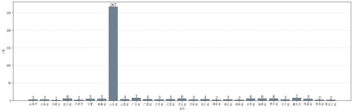
# 查看各省人数

numbers = score_province.count()

numbers = pd.DataFrame(numbers)

numbers = numbers["lqxy"]

# 提取出省份以及各省人数

provinces = numbers.index.tolist()

num_stu = numbers.tolist()

# 开始画图

fig = plt.figure(figsize=(20,6))    # 设置画布大小

plt.grid(linestyle="-.", axis='y', alpha=0.4)

for a,b in zip(provinces,num_stu):

    plt.text(a, b-0.3,'%.0f'%b, ha = 'center',va = 'bottom',fontsize=15)

plt.xlabel("省份")

plt.ylabel("人数")

plt.bar(provinces,num_stu, color="slategray")
<BarContainer object of 27 artists>
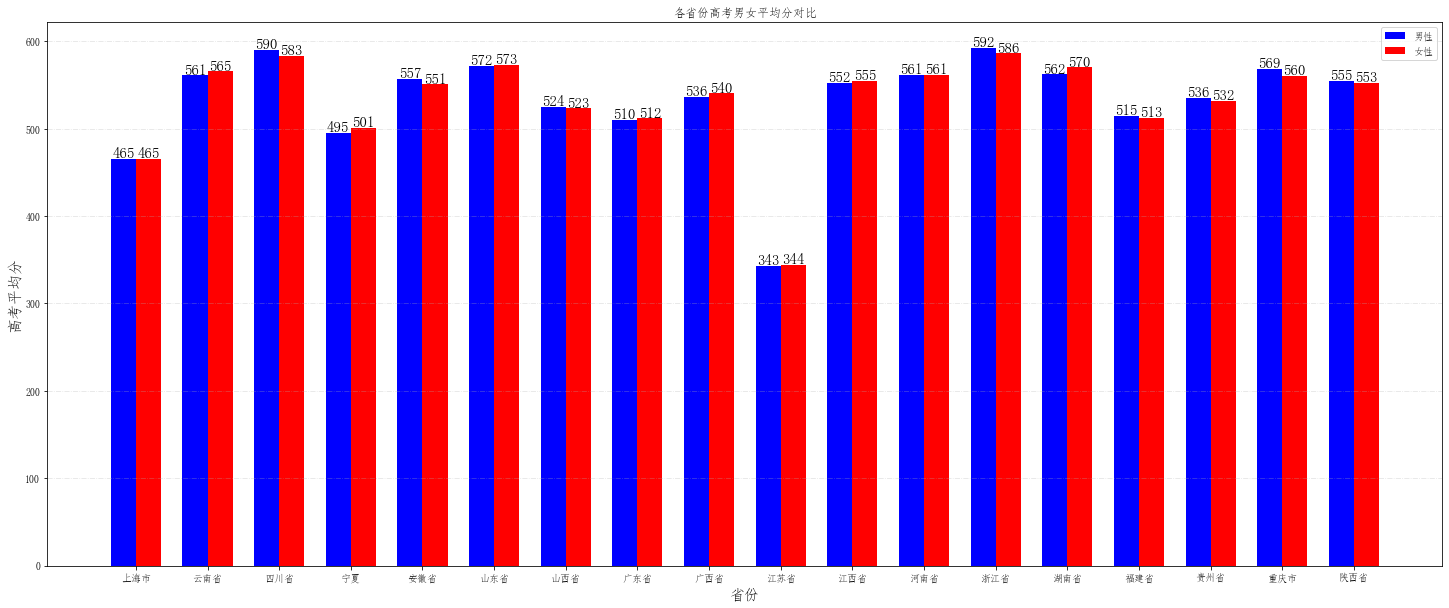
## 下面开始统计各省男女平均分数对比

sex_province_score = data.groupby(["shengfen", "xbmc"])["tdcj"].mean()

male = []

female = []

drop_list = []

for i in provinces:

    try:

        male.append(sex_province_score[i,"男"])

    except:

        male.append(0)

        drop_list.append(provinces.index(i))

    try:

        female.append(sex_province_score[i,"女"])

    except:

        female.append(0)

        drop_list.append(provinces.index(i))

male = np.delete(male, drop_list).tolist()

female = np.delete(female, drop_list).tolist()

provinces = np.delete(provinces, drop_list).tolist()

# 开始作图

fig = plt.figure(figsize=(25,10))

plt.grid(linestyle="-.", axis='y', alpha=0.35)

bar_width = 0.35  # 条形宽度

index_male = np.arange(len(provinces))  # 男生条形图的横坐标

index_female = index_male + bar_width  # 女生条形图的横坐标

# 使用两次 bar 函数画出两组条形图

plt.bar(index_male, male, width=bar_width, color='b', label='男性')

plt.bar(index_female, female, width=bar_width, color='r', label='女性')

for a,b in zip(index_male, male):

    plt.text(a, b-0.3,'%.0f'%b, ha = 'center',va = 'bottom',fontsize=15)

for a,b in zip(index_female,female):

    plt.text(a, b-0.3,'%.0f'%b, ha = 'center',va = 'bottom',fontsize=15)

plt.legend()  # 显示图例

plt.xticks(index_male + bar_width/2, provinces)  # 设置xticks index_male + bar_width/2 为横坐标轴刻度的位置

plt.ylabel('高考平均分', fontsize=15)  # 纵坐标轴标题

plt.xlabel('省份', fontsize=15)  # 纵坐标轴标题

plt.title('各省份高考男女平均分对比')  # 图形标题

plt.show()
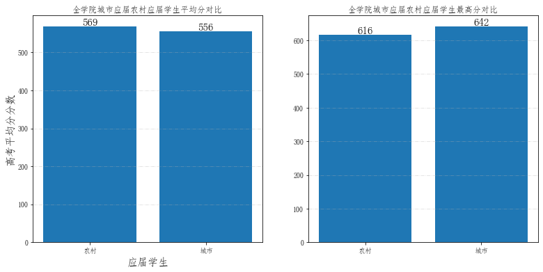
##下面开始统计城市应届与农村应届平均分数对比 以及 城市应届与农村应届男女平均分数对比

## 数据预处理

for index, row in data.iterrows():

     if "农" in data.loc[index, "kslbmc"]:

        data.loc[index, "kslbmc"] = "农村"

     elif "城" in data.loc[index, "kslbmc"]:

        data.loc[index, "kslbmc"] = "城市"

     else:

        data.drop(index=index, inplace=True)

city_village_data = data.groupby("kslbmc")

city_village_data = city_village_data["tdcj"]

city_village_data_max = pd.DataFrame(city_village_data.max())

city_village_data = pd.DataFrame(city_village_data.mean())

# 提取数据,以供作图

place = city_village_data.index.tolist()

score = city_village_data["tdcj"].tolist()

max_score = city_village_data_max["tdcj"].tolist()

# 开始作图

fig = plt.figure(figsize=(13,6))    # 设置画布大小

ax1 = fig.add_subplot(1,2,1)

ax2 = fig.add_subplot(1,2,2)

ax1.grid(linestyle="-.", axis='y', alpha=0.4)

ax2.grid(linestyle="-.", axis='y', alpha=0.4)

for a,b in zip(place,score):

    ax1.text(a, b-0.3,'%.0f'%b, ha = 'center',va = 'bottom',fontsize=15)

for a,b in zip(place,max_score):

    ax2.text(a, b-0.3,'%.0f'%b, ha = 'center',va = 'bottom',fontsize=15)

ax1.set_xlabel("应届学生", fontsize=15)

ax1.set_ylabel("高考平均分分数", fontsize=15)

ax1.set_title('全学院城市应届农村应届学生平均分对比')  # 图形标题

ax2.set_title('全学院城市应届农村应届学生最高分对比')  # 图形标题

ax1.bar(place,score)

ax2.bar(place, max_score)
<BarContainer object of 2 artists>
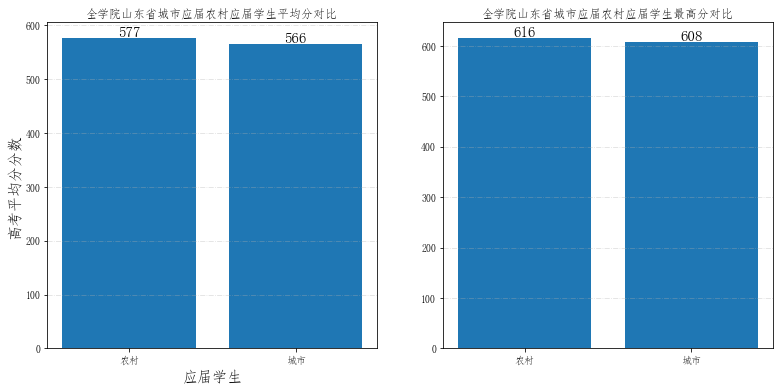
## 单独计算一下山东省城市应届农村应届平均分对比

temp= data.groupby("shengfen")

for i in temp:

    if i[0] == "山东省":

        ShanDong_data = i[1]

        break

ShanDong_data = ShanDong_data.groupby("kslbmc")

ShanDong_data = ShanDong_data["tdcj"]

ShanDong_data_max = pd.DataFrame(ShanDong_data.max())

print(ShanDong_data_max)

ShanDong_data = pd.DataFrame(ShanDong_data.mean())

# 提取数据,以供作图

place = ShanDong_data.index.tolist()

score = ShanDong_data["tdcj"].tolist()

max_score = ShanDong_data_max["tdcj"].tolist()

# 开始作图

fig = plt.figure(figsize=(13,6))    # 设置画布大小

ax1 = fig.add_subplot(1,2,1)

ax2 = fig.add_subplot(1,2,2)

ax1.grid(linestyle="-.", axis='y', alpha=0.4)

ax2.grid(linestyle="-.", axis='y', alpha=0.4)

for a,b in zip(place,score):

    ax1.text(a, b-0.3,'%.0f'%b, ha = 'center',va = 'bottom',fontsize=15)

for a,b in zip(place,max_score):

    ax2.text(a, b-0.3,'%.0f'%b, ha = 'center',va = 'bottom',fontsize=15)

ax1.set_xlabel("应届学生", fontsize=15)

ax1.set_ylabel("高考平均分分数", fontsize=15)

ax1.set_title('全学院山东省城市应届农村应届学生平均分对比')  # 图形标题

ax2.set_title('全学院山东省城市应届农村应届学生最高分对比')  # 图形标题

ax1.bar(place,score)

ax2.bar(place, max_score)
              tdcj

kslbmc

农村      616.000000

城市      608.128223

<BarContainer object of 2 artists>
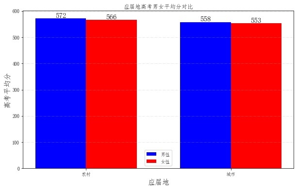
# 查看一下山东省农村应届与城市应届学生男女平均分数

# 数据预处理

for index, row in data.iterrows():

     if "女" in data.loc[index, "xbmc"]:

        data.loc[index, "xbmc"] = "女"

     elif "男" in data.loc[index, "xbmc"]:

        data.loc[index, "xbmc"] = "男"

     else:

        data.drop(index=index, inplace=True)

sex_cv_score = data.groupby(["kslbmc", "xbmc"])["tdcj"].mean()

print(sex_cv_score)

place = ["农村", "城市"]

male = []

female = []

for i in place:

    female.append(sex_cv_score[i,"女"])

    male.append(sex_cv_score[i,"男"])

# 开始作图

fig = plt.figure(figsize=(10,6))

plt.grid(linestyle="-.", axis='y', alpha=0.35)

bar_width = 0.35  # 条形宽度

index_male = np.arange(len(place))  # 男生条形图的横坐标

index_female = index_male + bar_width  # 女生条形图的横坐标

# 使用两次 bar 函数画出两组条形图

plt.bar(index_male, male, width=bar_width, color='b', label='男性')

plt.bar(index_female, female, width=bar_width, color='r', label='女性')

for a,b in zip(index_male, male):

    plt.text(a, b-0.3,'%.0f'%b, ha = 'center',va = 'bottom',fontsize=15)

for a,b in zip(index_female,female):

    plt.text(a, b-0.3,'%.0f'%b, ha = 'center',va = 'bottom',fontsize=15)

plt.legend()  # 显示图例

plt.xticks(index_male + bar_width/2, place)  # 设置xticks index_male + bar_width/2 为横坐标轴刻度的位置

plt.ylabel('高考平均分', fontsize=15)  # 纵坐标轴标题

plt.xlabel('应届地', fontsize=15)  # 纵坐标轴标题

plt.title('应届地高考男女平均分对比')  # 图形标题

plt.show()
kslbmc  xbmc

农村      女       566.241910

        男       572.030391

城市      女       553.481005

        男       557.798552

Name: tdcj, dtype: float64
基于Python的某大学某学院新生高考成绩分析的更多相关文章
- 基于Python项目的Redis缓存消耗内存数据简单分析(附详细操作步骤)
目录 1 准备工作 2 具体实施 1 准备工作 什么是Redis? Redis:一个高性能的key-value数据库.支持数据的持久化,可以将内存中的数据保存在磁盘中,重启的时候可以再次加载进行使 ...
- 基于python、jupyter-notebook 的金融领域用户交易行为分析
说明:本文重在说明交易数据统计.分析方法,所有数据均为生成的数据 时间原因代码未定义成函数 统计指标:1.用户单日交易行为数据 2.按小时为计算单位,统计用户行为数据(旨在求得一天24小时中每个小时的 ...
- 基于Python玩转人工智能最火框架 TensorFlow应用实践✍✍✍
基于Python玩转人工智能最火框架 TensorFlow应用实践 随着 TensorFlow 在研究及产品中的应用日益广泛,很多开发者及研究者都希望能深入学习这一深度学习框架.而在昨天机器之心发起 ...
- 【Machine Learning】决策树案例:基于python的商品购买能力预测系统
决策树在商品购买能力预测案例中的算法实现 作者:白宁超 2016年12月24日22:05:42 摘要:随着机器学习和深度学习的热潮,各种图书层出不穷.然而多数是基础理论知识介绍,缺乏实现的深入理解.本 ...
- 基于Python+Django的Kubernetes集群管理平台
➠更多技术干货请戳:听云博客 时至今日,接触kubernetes也有一段时间了,而我们的大部分业务也已经稳定地运行在不同规模的kubernetes集群上,不得不说,无论是从应用部署.迭代,还是从资源调 ...
- 关于《selenium2自动测试实战--基于Python语言》
关于本书的类型: 首先在我看来技术书分为两类,一类是“思想”,一类是“操作手册”. 对于思想类的书,一般作者有很多年经验积累,这类书需要细读与品位.高手读了会深有体会,豁然开朗.新手读了不止所云,甚至 ...
- psutil一个基于python的跨平台系统信息跟踪模块
受益于这个模块的帮助,在这里我推荐一手. https://pythonhosted.org/psutil/#processes psutil是一个基于python的跨平台系统信息监视模块.在pytho ...
- 一次完整的自动化登录测试-基于python+selenium进行cnblog的自动化登录测试
Web登录测试是很常见的测试!手动测试大家再熟悉不过了,那如何进行自动化登录测试呢!本文作者就用python+selenium结合unittest单元测试框架来进行一次简单但比较完整的cnblog自动 ...
- 搭建基于python +opencv+Beautifulsoup+Neurolab机器学习平台
搭建基于python +opencv+Beautifulsoup+Neurolab机器学习平台 By 子敬叔叔 最近在学习麦好的<机器学习实践指南案例应用解析第二版>,在安装学习环境的时候 ...
随机推荐
- 【LeetCode】939. Minimum Area Rectangle 解题报告(Python & C++)
作者: 负雪明烛 id: fuxuemingzhu 个人博客: http://fuxuemingzhu.cn/ 目录 题目描述 题目大意 解题方法 确定对角线,找另外两点(4sum) 字典保存出现的x ...
- CS起源-havana地图红方打法分析
作者:海底淤泥 havana是美国第一人称射击游戏<反恐精英>中的地图之一,编号为cs_havana,这张地图发生在古巴哈瓦那的某座城市中,恐怖分子们挟持了几名美裔的重要政治人物,以此为筹 ...
- 【操作系统】编程模拟FIFO,LRU,NUR,OPT页面置换算法
#include<stdio.h> #include<stdlib.h> #include<time.h> #define random(x) (rand()%x) ...
- Bristol大学密码学博士生的五十二个知识点
Bristol大学密码学博士生的五十二个知识点 这个系列,是Bristol大学的密码安全工作组为密码学和信息安全相关的博士准备了52个基本知识点. 原地址:http://bristolcrypto.b ...
- Scalable Rule-Based Representation Learning for Interpretable Classification
目录 概 主要内容 Wang Z., Zhang W., Liu N. and Wang J. Scalable rule-based representation learning for inte ...
- JPEG原理详解 (转载)
JPEG算法解密 by jinchao 图片压缩有多重要,可能很多人可能并没有一个直观上的认识,举个例子,一张800X800大小的普通图片,如果未经压缩,大概在1.7MB左右,这个体积如果存放文本 ...
- CapstoneCS5265设计替代CH7211 |Type-C转HDMI2.0方案|替代CH7211
龙迅Chrontel的CH7211是一款Type-C转HDMI2.0半导体设备,可通过USB Type-C连接器将DisplayPort信号转换为HDMI/DVI.这款创新的基于USB Type-C的 ...
- Linux时间与日期
date date:显示当前时间[年月日时分秒] date +%[选项] Y:年 m:月 d:日 H:时 M:分 S:秒 date "+%Y-%m-%d":格式化显示,格式可自定. ...
- Hadoop单点安装(伪分布式)
Hadoop单点安装,基于版本2.7.1, 在一台Lunix主机上面安装Hdoop, 包括Hdfs的NameNode和DataNode, 以及Yarn的ResouceManager和NodeManag ...
- Xstart远程连接Linux图形用户界面
目标: 在自己的Windows桌面打开Linux的firefox浏览器 工具: Windows: Xmanager的Xstart工具 Linux: xterm,firefox 说明: 使用Xstart ...