【Matplotlib】数据可视化实例分析
数据可视化实例分析
作者:白宁超
2017年7月19日09:09:07
摘要:数据可视化主要旨在借助于图形化手段,清晰有效地传达与沟通信息。但是,这并不就意味着数据可视化就一定因为要实现其功能用途而令人感到枯燥乏味,或者是为了看上去绚丽多彩而显得极端复杂。为了有效地传达思想概念,美学形式与功能需要齐头并进,通过直观地传达关键的方面与特征,从而实现对于相当稀疏而又复杂的数据集的深入洞察。然而,设计人员往往并不能很好地把握设计与功能之间的平衡,从而创造出华而不实的数据可视化形式,无法达到其主要目的,也就是传达与沟通信息。数据可视化与信息图形、信息可视化、科学可视化以及统计图形密切相关。当前,在研究、教学和开发领域,数据可视化乃是一个极为活跃而又关键的方面。“数据可视化”这条术语实现了成熟的科学可视化领域与较年轻的信息可视化领域的统一。(本文原创编著,转载注明出处:数据可视化实例分析)
1 折线图的制作
1.1 需求描述
1.2 源码
#coding=utf-8
import matplotlib as mpl
import matplotlib.pyplot as plt
import pylab
# 解决中文乱码问题
mpl.rcParams['font.sans-serif']=['SimHei']
mpl.rcParams['axes.unicode_minus']=False # squares = [1,35,43,3,56,7]
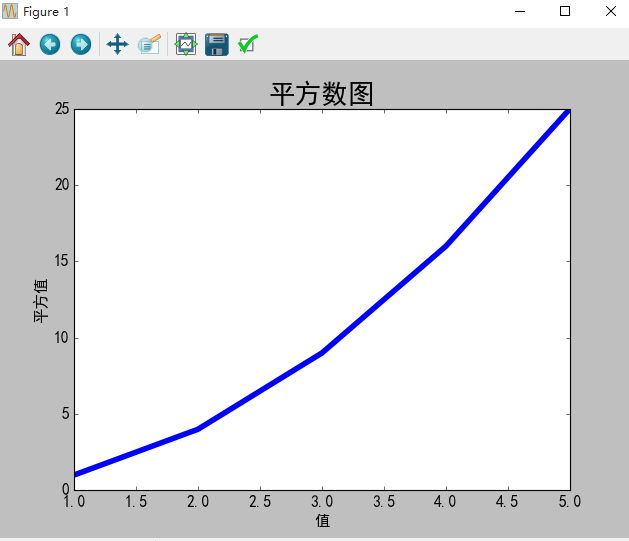
input_values = [1,2,3,4,5]
squares = [1,4,9,16,25]
# 设置折线粗细
plt.plot(input_values,squares,linewidth=5) # 设置标题和坐标轴
plt.title('平方数图',fontsize=24)
plt.xlabel('值',fontsize=14)
plt.ylabel('平方值',fontsize=14) # 设置刻度大小
plt.tick_params(axis='both',labelsize=14) plt.show()
1.3 生成结果
2 scatter()绘制散点图
2.1 需求描述
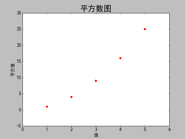
使用matplotlib绘制一个简单的散列点图,在对其进行定制,以实现信息更加丰富的数据可视化,绘制(1,2,3,4,5)的散点图。
2.2 源码
#coding=utf-8

import matplotlib as mpl

import matplotlib.pyplot as plt

import pylab

# 解决中文乱码问题

mpl.rcParams['font.sans-serif']=['SimHei']

mpl.rcParams['axes.unicode_minus']=False

# 设置散列点纵横坐标值

x_values = [1,2,3,4,5]

y_values = [1,4,9,16,25]

# s设置散列点的大小,edgecolor='none'为删除数据点的轮廓

plt.scatter(x_values,y_values,c='red',edgecolor='none',s=40)

# 设置标题和坐标轴

plt.title('平方数图',fontsize=24)

plt.xlabel('值',fontsize=14)

plt.ylabel('平方值',fontsize=14)

# 设置刻度大小

plt.tick_params(axis='both',which='major',labelsize=14)

# 自动保存图表,参数2是剪裁掉多余空白区域

plt.savefig('squares_plot.png',bbox_inches='tight')

plt.show()
2.3 生成结果
2.4 需求改进
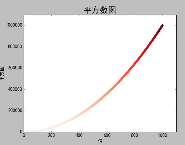
使用matplotlib绘制一个简单的散列点图,在对其进行定制,以实现信息更加丰富的数据可视化,绘制1000个数的散点图。并自动统计数据的平方,自定义坐标轴
2.5 源码改进
#coding=utf-8

import matplotlib as mpl

import matplotlib.pyplot as plt

import pylab

# 解决中文乱码问题

mpl.rcParams['font.sans-serif']=['SimHei']

mpl.rcParams['axes.unicode_minus']=False

# 设置散列点纵横坐标值

# x_values = [1,2,3,4,5]

# y_values = [1,4,9,16,25]

# 自动计算数据

x_values = list(range(1,1001))

y_values = [x**2 for x in x_values]

# s设置散列点的大小,edgecolor='none'为删除数据点的轮廓

# plt.scatter(x_values,y_values,c='red',edgecolor='none',s=40)

# 自定义颜色c=(0,0.8,0.8)红绿蓝

# plt.scatter(x_values,y_values,c=(0,0.8,0.8),edgecolor='none',s=40)

# 设置颜色随y值变化而渐变

plt.scatter(x_values,y_values,c=y_values,cmap=plt.cm.Reds,edgecolor='none',s=40)

# 设置标题和坐标轴

plt.title('平方数图',fontsize=24)

plt.xlabel('值',fontsize=14)

plt.ylabel('平方值',fontsize=14)

#设置坐标轴的取值范围

plt.axis([0,1100,0,1100000])

# 设置刻度大小

plt.tick_params(axis='both',which='major',labelsize=14)

# 自动保存图表,参数2是剪裁掉多余空白区域

plt.savefig('squares_plot.png',bbox_inches='tight')

plt.show()
2.6 改进结果
3 随机漫步图
3.1 需求描述
3.2 源码
random_walk.py
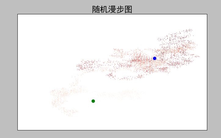
from random import choice

class RandomWalk():

    '''一个生成随机漫步数据的类'''

    def __init__(self,num_points=5000):

        '''初始化随机漫步属性'''

        self.num_points = num_points

        self.x_values = [0]

        self.y_values = [0]

    def fill_walk(self):

        '''计算随机漫步包含的所有点'''

        while len(self.x_values)<self.num_points:

            # 决定前进方向及沿着该方向前进的距离

            x_direction = choice([1,-1])

            x_distance = choice([0,1,2,3,4])

            x_step = x_direction*x_distance

            y_direction = choice([1,-1])

            y_distance = choice([0,1,2,3,4])

            y_step = y_direction*y_distance

            # 拒绝原地踏步

            if x_step == 0 and y_step == 0:

                continue

            # 计算下一个点的x和y

            next_x = self.x_values[-1] + x_step

            next_y = self.y_values[-1] + y_step

            self.x_values.append(next_x)

            self.y_values.append(next_y)
rw_visual.py
#-*- coding: utf-8 -*-

#coding=utf-8

import matplotlib as mpl

import matplotlib.pyplot as plt

import pylab

from random_walk  import RandomWalk

# 解决中文乱码问题

mpl.rcParams['font.sans-serif']=['SimHei']

mpl.rcParams['axes.unicode_minus']=False

# 创建RandomWalk实例

rw = RandomWalk()

rw.fill_walk()

plt.figure(figsize=(10,6))

point_numbers = list(range(rw.num_points))

# 随着点数的增加渐变深红色

plt.scatter(rw.x_values,rw.y_values,c=point_numbers,cmap=plt.cm.Reds,edgecolors='none',s=1)

# 设置起始点和终点颜色

plt.scatter(0,0,c='green',edgecolors='none',s=100)

plt.scatter(rw.x_values[-1],rw.y_values[-1],c='blue',edgecolors='none',s=100)

# 设置标题和纵横坐标

plt.title('随机漫步图',fontsize=24)

plt.xlabel('左右步数',fontsize=14)

plt.ylabel('上下步数',fontsize=14)

# 隐藏坐标轴

plt.axes().get_xaxis().set_visible(False)

plt.axes().get_yaxis().set_visible(False)

plt.show()
3.3 生成结果
4 Pygal模拟掷骰子
4.1 需求描述
4.2 源码
Die类
import random

class Die:

    """

    一个骰子类

    """

    def __init__(self, num_sides=6):

        self.num_sides = num_sides

    def roll(self):

        # 返回一个1和筛子面数之间的随机数

        return random.randint(1, self.num_sides)
die_visual.py
#coding=utf-8

from die import Die

import pygal

import matplotlib as mpl

# 解决中文乱码问题

mpl.rcParams['font.sans-serif']=['SimHei']

mpl.rcParams['axes.unicode_minus']=False

die1 = Die()

die2 = Die()

results = []

for roll_num in range(1000):

    result =die1.roll()+die2.roll()

    results.append(result)

# print(results)

# 分析结果

frequencies = []

max_result = die1.num_sides+die2.num_sides

for value in range(2,max_result+1):

    frequency = results.count(value)

    frequencies.append(frequency)

print(frequencies)

# 直方图

hist = pygal.Bar()

hist.title = '骰子投掷1000次各面结果统计图'

hist.x_labels =[x for x in range(2,max_result+1)]

hist.x_title ='结果'

hist.y_title = '结果分布'

hist.add('D6+D6',frequencies)

hist.render_to_file('die_visual.svg')

# hist.show()
4.3 生成结果
5 同时掷两个骰子
5.1 需求描述
5.2 源码
#conding=utf-8

from die import Die

import pygal

import matplotlib as mpl

# 解决中文乱码问题

mpl.rcParams['font.sans-serif']=['SimHei']

mpl.rcParams['axes.unicode_minus']=False

die1 = Die()

die2 = Die(10)

results = []

for roll_num in range(5000):

    result = die1.roll() + die2.roll()

    results.append(result)

# print(results)

# 分析结果

frequencies = []

max_result = die1.num_sides+die2.num_sides

for value in range(2,max_result+1):

    frequency = results.count(value)

    frequencies.append(frequency)

# print(frequencies)

hist = pygal.Bar()

hist.title = 'D6 和 D10 骰子5000次投掷的结果直方图'

# hist.x_labels=['2','3','4','5','6','7','8','9','10','11','12','13','14','15','16']

hist.x_labels=[x for x in range(2,max_result+1)]

hist.x_title = 'Result'

hist.y_title ='Frequency of Result'

hist.add('D6 + D10',frequencies)

hist.render_to_file('dice_visual.svg')
5. 生成结果

6 绘制气温图表
6.1 需求描述
6.2 源码
csv文件中2014年7月部分数据信息
AKDT,Max TemperatureF,Mean TemperatureF,Min TemperatureF,Max Dew PointF,MeanDew PointF,Min DewpointF,Max Humidity, Mean Humidity, Min Humidity, Max Sea Level PressureIn, Mean Sea Level PressureIn, Min Sea Level PressureIn, Max VisibilityMiles, Mean VisibilityMiles, Min VisibilityMiles, Max Wind SpeedMPH, Mean Wind SpeedMPH, Max Gust SpeedMPH,PrecipitationIn, CloudCover, Events, WindDirDegrees

2014-7-1,64,56,50,53,51,48,96,83,58,30.19,30.00,29.79,10,10,10,7,4,,0.00,7,,337

2014-7-2,71,62,55,55,52,46,96,80,51,29.81,29.75,29.66,10,9,2,13,5,,0.14,7,Rain,327

2014-7-3,64,58,53,55,53,51,97,85,72,29.88,29.86,29.81,10,10,8,15,4,,0.01,6,,258

2014-7-4,59,56,52,52,51,50,96,88,75,29.91,29.89,29.87,10,9,2,9,2,,0.07,7,Rain,255

2014-7-5,69,59,50,52,50,46,96,72,49,29.88,29.82,29.79,10,10,10,13,5,,0.00,6,,110

2014-7-6,62,58,55,51,50,46,80,71,58,30.13,30.07,29.89,10,10,10,20,10,29,0.00,6,Rain,213

2014-7-7,61,57,55,56,53,51,96,87,75,30.10,30.07,30.05,10,9,4,16,4,25,0.14,8,Rain,211

2014-7-8,55,54,53,54,53,51,100,94,86,30.10,30.06,30.04,10,6,2,12,5,23,0.84,8,Rain,159

2014-7-9,57,55,53,56,54,52,100,96,83,30.24,30.18,30.11,10,7,2,9,5,,0.13,8,Rain,201

2014-7-10,61,56,53,53,52,51,100,90,75,30.23,30.17,30.03,10,8,2,8,3,,0.03,8,Rain,215

2014-7-11,57,56,54,56,54,51,100,94,84,30.02,30.00,29.98,10,5,2,12,5,,1.28,8,Rain,250

2014-7-12,59,56,55,58,56,55,100,97,93,30.18,30.06,29.99,10,6,2,15,7,26,0.32,8,Rain,275

2014-7-13,57,56,55,58,56,55,100,98,94,30.25,30.22,30.18,10,5,1,8,4,,0.29,8,Rain,291

2014-7-14,61,58,55,58,56,51,100,94,83,30.24,30.23,30.22,10,7,0,16,4,,0.01,8,Fog,307

2014-7-15,64,58,55,53,51,48,93,78,64,30.27,30.25,30.24,10,10,10,17,12,,0.00,6,,318

2014-7-16,61,56,52,51,49,47,89,76,64,30.27,30.23,30.16,10,10,10,15,6,,0.00,6,,294

2014-7-17,59,55,51,52,50,48,93,84,75,30.16,30.04,29.82,10,10,6,9,3,,0.11,7,Rain,232

2014-7-18,63,56,51,54,52,50,100,84,67,29.79,29.69,29.65,10,10,7,10,5,,0.05,6,Rain,299

2014-7-19,60,57,54,55,53,51,97,88,75,29.91,29.82,29.68,10,9,2,9,2,,0.00,8,,292

2014-7-20,57,55,52,54,52,50,94,89,77,29.92,29.87,29.78,10,8,2,13,4,,0.31,8,Rain,155

2014-7-21,69,60,52,53,51,50,97,77,52,29.99,29.88,29.78,10,10,10,13,4,,0.00,5,,297

2014-7-22,63,59,55,56,54,52,90,84,77,30.11,30.04,29.99,10,10,10,9,3,,0.00,6,Rain,240

2014-7-23,62,58,55,54,52,50,87,80,72,30.10,30.03,29.96,10,10,10,8,3,,0.00,7,,230

2014-7-24,59,57,54,54,52,51,94,84,78,29.95,29.91,29.89,10,9,3,17,4,28,0.06,8,Rain,207

2014-7-25,57,55,53,55,53,51,100,92,81,29.91,29.87,29.83,10,8,2,13,3,,0.53,8,Rain,141

2014-7-26,57,55,53,57,55,54,100,96,93,29.96,29.91,29.87,10,8,1,15,5,24,0.57,8,Rain,216

2014-7-27,61,58,55,55,54,53,100,92,78,30.10,30.05,29.97,10,9,2,13,5,,0.30,8,Rain,213

2014-7-28,59,56,53,57,54,51,97,94,90,30.06,30.00,29.96,10,8,2,9,3,,0.61,8,Rain,261

2014-7-29,61,56,51,54,52,49,96,89,75,30.13,30.02,29.95,10,9,3,14,4,,0.25,6,Rain,153

2014-7-30,61,57,54,55,53,52,97,88,78,30.31,30.23,30.14,10,10,8,8,4,,0.08,7,Rain,160

2014-7-31,66,58,50,55,52,49,100,86,65,30.31,30.29,30.26,10,9,3,10,4,,0.00,3,,217
highs_lows.py文件信息
import csv

from datetime import datetime

from matplotlib import pyplot as plt

import matplotlib as mpl

# 解决中文乱码问题

mpl.rcParams['font.sans-serif']=['SimHei']

mpl.rcParams['axes.unicode_minus']=False

# Get dates, high, and low temperatures from file.

filename = 'death_valley_2014.csv'

with open(filename) as f:

    reader = csv.reader(f)

    header_row = next(reader)

    # print(header_row)

    # for index,column_header in enumerate(header_row):

    #     print(index,column_header)

    dates, highs,lows = [],[], []

    for row in reader:

        try:

            current_date = datetime.strptime(row[0], "%Y-%m-%d")

            high = int(row[1])

            low = int(row[3])

        except ValueError: # 处理

            print(current_date, 'missing data')

        else:

            dates.append(current_date)

            highs.append(high)

            lows.append(low)

# 汇制数据图形

fig = plt.figure(dpi=120,figsize=(10,6))

plt.plot(dates,highs,c='red',alpha=0.5)# alpha指定透明度

plt.plot(dates,lows,c='blue',alpha=0.5)

plt.fill_between(dates,highs,lows,facecolor='orange',alpha=0.1)#接收一个x值系列和y值系列,给图表区域着色

#设置图形格式

plt.title('2014年加利福尼亚死亡谷日气温最高最低图',fontsize=24)

plt.xlabel('日(D)',fontsize=16)

fig.autofmt_xdate() # 绘制斜体日期标签

plt.ylabel('温度(F)',fontsize=16)

plt.tick_params(axis='both',which='major',labelsize=16)

# plt.axis([0,31,54,72]) # 自定义数轴起始刻度

plt.savefig('highs_lows.png',bbox_inches='tight')

plt.show()
6.3 生成结果
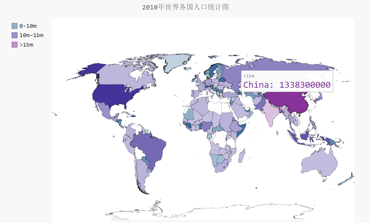
7 制作世界人口地图:JSON格式
7.1 需求描述
7.2 源码
json数据population_data.json部分信息
countries.py
from pygal.maps.world import COUNTRIES

for country_code in sorted(COUNTRIES.keys()):

    print(country_code, COUNTRIES[country_code])
countries_codes.py
from pygal.maps.world import COUNTRIES

def get_country_code(country_name):

    """Return the Pygal 2-digit country code for the given country."""

    for code, name in COUNTRIES.items():

        if name == country_name:

            return code

    # If the country wasn't found, return None.

    return

print(get_country_code('Thailand'))

# print(get_country_code('Andorra'))
americas.py
import pygal

wm =pygal.maps.world.World()

wm.title = 'North, Central, and South America'

wm.add('North America', ['ca', 'mx', 'us'])

wm.add('Central America', ['bz', 'cr', 'gt', 'hn', 'ni', 'pa', 'sv'])

wm.add('South America', ['ar', 'bo', 'br', 'cl', 'co', 'ec', 'gf',

    'gy', 'pe', 'py', 'sr', 'uy', 've'])

wm.add('Asia', ['cn', 'jp', 'th'])

wm.render_to_file('americas.svg')
world_population.py
#conding = utf-8

import json

from matplotlib import pyplot as plt

import matplotlib as mpl

from country_codes import get_country_code

import pygal

from pygal.style import RotateStyle

from pygal.style import LightColorizedStyle

# 解决中文乱码问题

mpl.rcParams['font.sans-serif']=['SimHei']

mpl.rcParams['axes.unicode_minus']=False

# 加载json数据

filename='population_data.json'

with open(filename) as f:

    pop_data = json.load(f)

    # print(pop_data[1])

# 创建一个包含人口的字典

cc_populations={}

# cc1_populations={}

# 打印每个国家2010年的人口数量

for pop_dict in pop_data:

    if pop_dict['Year'] == '':

        country_name = pop_dict['Country Name']

        population = int(float(pop_dict['Value'])) # 字符串数值转化为整数

        # print(country_name + ":" + str(population))

        code = get_country_code(country_name)

        if code:

            cc_populations[code] = population

    # elif pop_dict['Year'] == '2009':

    #     country_name = pop_dict['Country Name']

    #     population = int(float(pop_dict['Value'])) # 字符串数值转化为整数

    #     # print(country_name + ":" + str(population))

    #     code = get_country_code(country_name)

    #     if code:

    #         cc1_populations[code] = population

cc_pops_1,cc_pops_2,cc_pops_3={},{},{}

for cc,pop in cc_populations.items():

    if pop <10000000:

        cc_pops_1[cc]=pop

    elif pop<1000000000:

        cc_pops_2[cc]=pop

    else:

        cc_pops_3[cc]=pop

# print(len(cc_pops_1),len(cc_pops_2),len(cc_pops_3))

wm_style = RotateStyle('#336699',base_style=LightColorizedStyle)

wm =pygal.maps.world.World(style=wm_style)

wm.title = '2010年世界各国人口统计图'

wm.add('0-10m', cc_pops_1)

wm.add('10m-1bm',cc_pops_2)

wm.add('>1bm',cc_pops_3)

# wm.add('2009', cc1_populations)

wm.render_to_file('world_populations.svg')
7.3 生成结果
countries.py
world_population.py
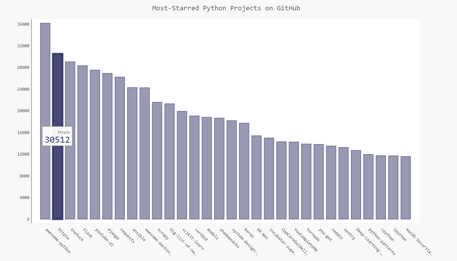
8 Pygal可视化github仓库
8.1 需求描述
8.2 源码
python_repos.py
# coding=utf-8

import requests

import pygal

from pygal.style import LightColorizedStyle as LCS, LightenStyle as LS

# Make an API call, and store the response.

url = 'https://api.github.com/search/repositories?q=language:python&sort=stars'

r = requests.get(url)

print("Status code:", r.status_code) # 查看请求是否成功,200表示成功

response_dict = r.json()

# print(response_dict.keys())

print("Total repositories:", response_dict['total_count'])

# Explore information about the repositories.

repo_dicts = response_dict['items']

print("Repositories returned:",len(repo_dicts))

# 查看项目信息

# repo_dict =repo_dicts[0]

# print('\n\neach repository:')

# for repo_dict in repo_dicts:

#     print("\nName:",repo_dict['name'])

#     print("Owner:",repo_dict['owner']['login'])

#     print("Stars:",repo_dict['stargazers_count'])

#     print("Repository:",repo_dict['html_url'])

#     print("Description:",repo_dict['description'])

# 查看每个项目的键

# print('\nKeys:',len(repo_dict))

# for key in sorted(repo_dict.keys()):

#     print(key)

names, plot_dicts = [], []

for repo_dict in repo_dicts:

    names.append(repo_dict['name'])

    plot_dicts.append(repo_dict['stargazers_count'])

# 可视化

my_style = LS('#333366', base_style=LCS)

my_config = pygal.Config() # Pygal类Config实例化

my_config.x_label_rotation = 45 # x轴标签旋转45度

my_config.show_legend = False # show_legend隐藏图例

my_config.title_font_size = 24 # 设置图标标题主标签副标签的字体大小

my_config.label_font_size = 14

my_config.major_label_font_size = 18

my_config.truncate_label = 15 # 较长的项目名称缩短15字符

my_config.show_y_guides = False # 隐藏图表中的水平线

my_config.width = 1000 # 自定义图表的宽度

chart = pygal.Bar(my_config, style=my_style)

chart.title = 'Most-Starred Python Projects on GitHub'

chart.x_labels = names

chart.add('', plot_dicts)

chart.render_to_file('python_repos.svg')
8.3 生成结果
9 参考文献
2 天气数据官网
3 实验数据下载
5 Plotly
6 Jpgraph
【Matplotlib】数据可视化实例分析的更多相关文章
- 【Data Visual】一文搞懂matplotlib数据可视化
一文搞懂matplotlib数据可视化 作者:白宁超 2017年7月19日09:09:07 摘要:数据可视化主要旨在借助于图形化手段,清晰有效地传达与沟通信息.但是,这并不就意味着数据可视化就一定因为 ...
- matplotlib 数据可视化
图的基本结构 通常,使用 numpy 组织数据, 使用 matplotlib API 进行数据图像绘制. 一幅数据图基本上包括如下结构: Data: 数据区,包括数据点.描绘形状 Axis: 坐标轴, ...
- Matplotlib数据可视化(1):入门介绍
1 matplot入门指南¶ matplotlib是Python科学计算中使用最多的一个可视化库,功能丰富,提供了非常多的可视化方案,基本能够满足各种场景下的数据可视化需求.但功能丰富从另一方面来 ...
- Python - matplotlib 数据可视化
在许多实际问题中,经常要对给出的数据进行可视化,便于观察. 今天专门针对Python中的数据可视化模块--matplotlib这块内容系统的整理,方便查找使用. 本文来自于对<利用python进 ...
- 利用selenium 爬取豆瓣 武林外传数据并且完成 数据可视化 情绪分析
全文的步骤可以大概分为几步: 一:数据获取,利用selenium+多进程(linux上selenium 多进程可能会有问题)+kafka写数据(linux首选必选耦合)windows直接采用的是写my ...
- 数据可视化之分析篇(一)使用Power BI进行动态帕累托分析
https://zhuanlan.zhihu.com/p/57763423 通过简单的点击交互,就能进行动态分析发现见解,才是我们需要的,恰好这也是 PowerBI 所擅长的. 就帕累托分析来说,能从 ...
- 数据可视化实例(三): 散点图(pandas,matplotlib,numpy)
关联 (Correlation) 关联图表用于可视化2个或更多变量之间的关系. 也就是说,一个变量如何相对于另一个变化. 散点图(Scatter plot) 散点图是用于研究两个变量之间关系的经典的和 ...
- 数据可视化实例(十四):带标记的发散型棒棒糖图 (matplotlib,pandas)
偏差 (Deviation) 带标记的发散型棒棒糖图 (Diverging Lollipop Chart with Markers) 带标记的棒棒糖图通过强调您想要引起注意的任何重要数据点并在图表中适 ...
- 数据可视化实例(五): 气泡图(matplotlib,pandas)
https://datawhalechina.github.io/pms50/#/chapter2/chapter2 关联 (Correlation) 关联图表用于可视化2个或更多变量之间的关系. 也 ...
随机推荐
- 几种常见SQL分页方式效率比较
分页很重要,面试会遇到.不妨再回顾总结一下: 一:创建测试环境,(插入100万条数据大概耗时5分钟). create database DBTestuse DBTest 二:--创建测试表 creat ...
- asp.net core 微信H5支付(扫码支付,H5支付,公众号支付,app支付)之2
上一篇说到微信扫码支付,今天来分享下微信H5支付,适用场景为手机端非微信浏览器调用微信H5支付惊醒网站支付业务处理.申请开通微信H5支付工作不多做介绍,直接上代码. 首先是微信支付业务类(WxPayS ...
- MySQL_join连接
join连接 table1: table2: 笛卡尔积: 就是一个表里的记录要分别和另外一个表的记录匹配为一条记录,即如果表A有2条记录,表B也有2条记录,经过笛卡尔运算之后就应该有2*2即4条记录. ...
- Machine Learning 学习笔记1 - 基本概念以及各分类
What is machine learning? 并没有广泛认可的定义来准确定义机器学习.以下定义均为译文,若以后有时间,将补充原英文...... 定义1.来自Arthur Samuel(上世纪50 ...
- 使用PhoneGap搭建一个山寨京东APP(转)
为什么要写一个App 首先解释下写出来的这个App,其实无任何功能,只是用HTML和CSS模仿JD移动端界面写的一个适配移动端的Web界面.本篇主要内容是介绍如何使用PhoneGap把开发出来的m ...
- mongodb的几种启动方法
1 mongodb的几种启动方法 启动Mongodb服务有两种方式,前台启动或者Daemon方式启动,前者启动会需要保持当前Session不能被关闭,后者可以作为系统的fork进程执行,下文中的p ...
- 不一样的go语言之入门篇-Hello World
这是<不一样的go语言>的开篇之作,我尝试以java语言转变者的角度来聊一聊go语言.所以今天先从go语言的基础开始,即语法. 学习一门新的编程语言,必从语法开始.但需要注意的是, ...
- [洛谷P2066]机器分配
题目描述 总公司拥有高效设备M台,准备分给下属的N个分公司.各分公司若获得这些设备,可以为国家提供一定的盈利.问:如何分配这M台设备才能使国家得到的盈利最大?求出最大盈利值.其中M≤15,N≤10.分 ...
- IdentityServer4-端点
一.发现端点 二.授权端点 三.令牌端点 四.UserInfo端点 五.Introspection端点 六.撤销端点 七.结束会话端点 一.发现端点 发现端点可用于检索有关IdentityServer ...
- 17,EasyNetQ-替换EasyNetQ组件
EasyNetQ是一个由小型组件组成的库. 当你写: var bus = RabbitHutch.CreateBus("host=localhost"); ...静态方法Creat ...