html的小例子
常用的前端实例:
1略
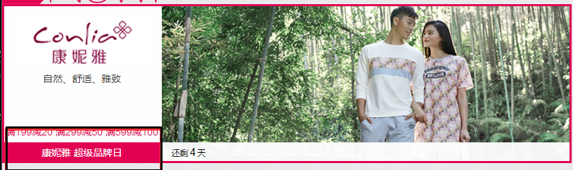
2、在网页商城中的图片当我们把鼠标放上去之后,图片会显示一个有颜色的外边框,图片某一部分的字体的颜色并发生改变
鼠标放上去之前

鼠标放上去之后:
实现的代码:
<!DOCTYPE html>

<html lang="en">

<head>

    <meta charset="UTF-8" content="text/html" http-equiv="Content-Type">

    <title>Title</title>

    <style>

        .ele{

            /*先给图片的变框设置一个有宽度的变框这个鼠标放上去看到的效果就是静态的*/

            border: 1px solid transparent;

            /*加变框是为了不希望看到图片的位置发生改变*/

        }

        .ele:hover{

            /*伪类 :鼠标放上去会出现一个外边框*/

            border: 1px solid gray;

        }

        /*鼠标放上去 一部分的字体颜色发生改变*/

        .ele:hover .ele-item{

            color: red;

        }

    </style>

</head>

<body>

    <div class="ele">

        <div>123</div>

        <div class="ele-item">123</div>

    </div>

</body>

</html>
边框加颜色-并改变某一部分的字体颜色
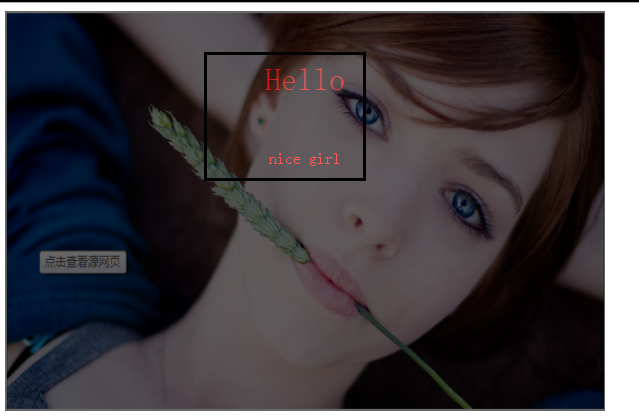
3、鼠标放到图片上,图片上会显示一些相关的信息:
之前的效果:

设置代码之后的效果:
上代码:
<!DOCTYPE html>

<html lang="en">

<head>

    <meta charset="UTF-8" content="text/html" http-equiv="Content-Type">

    <title>隐藏</title>

    <style>

        .touch{

            /*父亲div的position采用relative

            那么在其内部的div只需要使用absolute就可以定位在父div的任意位置*/

            overflow: hidden;

            position: relative;

            width: 600px;

            height: 400px;

        }

        .touch img{

            /*设置图片的宽和高让它在框架的div中铺满*/

            width: 600px;

            height: 400px;

        }

        .touch .content{

            position: absolute;

            top:0;

            left:0;

            right:0;

            bottom:0;

            background-color: black;

            opacity: 0.6;   /*透明度*/

            color: red;

            text-align: center;

            visibility: hidden;

        }

        .touch:hover .content{

            /*内容设置一个伪类 鼠标放上去让其可见*/

            visibility: visible;

        }

        .touch .content .c1{

            font-size: 32px;

            padding: 50px 0;

        }

     </style>

</head>

<body>

    <div class="touch">

        <div><img src="nice.png"></div>

        <div class="content">

            <div class="c1">Hello</div>

            <div class="c2">nice girl</div>

        </div>

    </div>

</body>

</html>
图片上边加一层效果
4、画三角形:
4.1、border的特性:拐角处是特殊的样式:
|
1
2
3
4
5
6
7
8
9
10
11
12
13
14
15
16
17
18
|
<!DOCTYPE html><html lang="en"><head> <meta charset="UTF-8" content="text/html" http-equiv="Content-Type"> <title>画图</title> <style> .picture{ border-top: 30px solid black; border-bottom: 30px solid red; border-right: 30px solid purple; border-left: 30px solid pink; } </style></head><body><div class="picture"></div></body></html> |
拉长的效果是由于div是块级标签
4.2、将图形变成一个正方形:

<!DOCTYPE html>

<html lang="en">

<head>

    <meta charset="UTF-8" content="text/html" http-equiv="Content-Type">

    <title>画图</title>

    <style>

        .picture{

            border-top: 30px solid black;

            border-bottom: 30px solid red;

            border-right: 30px solid purple;

            border-left: 30px solid pink;

            /*将块级变成内联的且可以设置宽度高度*/

            display: inline-block;

        }

    </style>

</head>

<body>

<div class="picture"></div>

</body>

</html>
画一个正方形
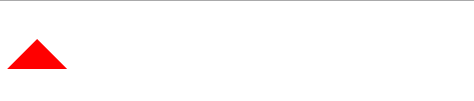
4.3画一个上三角形
就是把上边的正方的其他边设置成透明色就可以达到设置三角的目的:
<!DOCTYPE html>

<html lang="en">

<head>

    <meta charset="UTF-8" content="text/html" http-equiv="Content-Type">

    <title>画三角</title>

    <style>

        .up{

            border-top: 30px solid transparent;

            border-bottom: 30px solid red;

            border-right: 30px solid transparent;

            border-left: 30px solid transparent;

            /*将块级变成内联的且可以设置宽度高度*/

            display: inline-block;

        }

    </style>

</head>

<body>

<div class="up"></div>

</body>

</html>
上三角
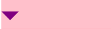
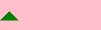
4.4画一个下三角,鼠标放上去变成下三角且颜色不一样:
<!DOCTYPE html>

<html lang="en">

<head>

    <meta charset="UTF-8" content="text/html" http-equiv="Content-Type">

    <title>尖角</title>

    <style>

                .c1{

            border: 30px solid transparent;

            border-top: 30px solid purple;

           margin-top: 40px;

            display: inline-block;

        }

        .c1:hover{

            border: 30px solid transparent;

            border-bottom: 30px solid green;

            margin-top: 10px;

        }

           </style>

</head>

<body>

<div style="height: 100px;background-color: pink;">

    <div class="c1"></div>

</div>

</body>

</html>
下三角变上三角
5、引用特殊的图标:(awesome)

<!DOCTYPE html>

<html lang="en">

<head>

    <meta charset="UTF-8" content="text/html" http-equiv="Content-Type">

    <title>图标</title>

    <link rel="stylesheet" href="font-awesome/css/font-awesome.css">

    <style>

    </style>

</head>

<body>

    <i class="icon-cny"></i>

    <i class="icon-collapse"></i>

    <i class="icon-twitter-sign"></i>

</body>

</html>
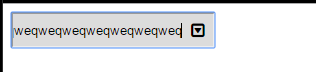
6、输入框
<!DOCTYPE html>

<html lang="en">

<head>

    <meta charset="UTF-8" content="text/html" http-equiv="Content-Type">

    <title>form-input</title>

    <link href="font-awesome/css/font-awesome.css" rel="stylesheet">

    <style>

        .user{

            position: relative;

            /*background-color: purple;*/

            width: 250px;

        }

        .user input{

            height: 30px;

            width: 170px;

            background-color: gainsboro;

            padding-right: 30px;

        }

        .user .ren{

            position: absolute;

            top: 10px;

            left: 180px;

        }

        .icon-collapse{

            cursor: pointer;

        }

    </style>

</head>

<body>

    <div class="user">

        <input type="text">

        <span class="ren icon-collapse"></span>

    </div>

</body>

</html>
form-input
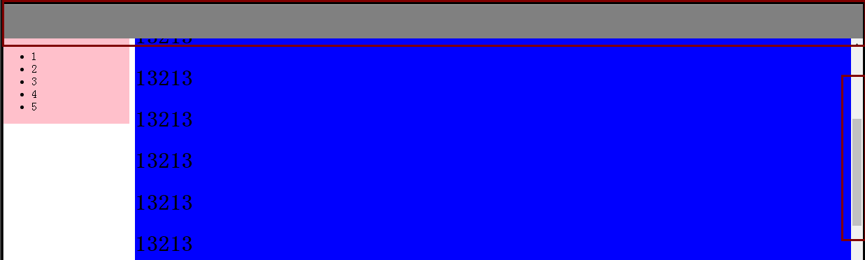
7、页面布局:
- 导航栏固定
- 菜单栏如果超出屏幕范围则有下拉框
- 内容部分超出页面也会有下拉框
<!DOCTYPE html>

<html lang="en">

<head>

    <meta charset="UTF-8" content="text/html" http-equiv="Content-Type">

    <title>布局页-1</title>

    <style>

        body{

            margin: 0;

        }

        .pg-body{

            height: 48px;

            background-color: gray;

        }

        .pg-body .body-menu{

            top: 48px;

            position: absolute;

            width: 180px;

            background-color: pink;

            left: 0px;

        }

        .pg-body .body-content{

            position:absolute;

            top: 48px;

            left: 188px;

            right:0;

            bottom:0;

            background-color: blue;

            overflow: auto;

        }

    </style>

</head>

<body>

<div class="pg-header">

</div>

<div class="pg-body">

    <div class="body-menu">

        <ul>

            <li>1</li>

            <li>2</li>

            <li>3</li>

            <li>4</li>

            <li>5</li>

        </ul>

    </div>

    <div class="body-content">

        <h1>13213</h1><h1>13213</h1><h1>13213</h1><h1>13213</h1><h1>13213</h1><h1>13213</h1><h1>13213</h1><h1>13213</h1><h1>13213</h1><h1>13213</h1><h1>13213</h1><h1>13213</h1>

        <h1>13213</h1><h1>13213</h1><h1>13213</h1><h1>13213</h1><h1>13213</h1><h1>13213</h1><h1>13213</h1><h1>13213</h1><h1>13213</h1><h1>13213</h1><h1>13213</h1><h1>13213</h1><h1>13213</h1><h1>13213</h1>

        <h1>13213</h1><h1>13213</h1><h1>13213</h1><h1>13213</h1><h1>13213</h1><h1>13213</h1><h1>13213</h1><h1>13213</h1><h1>13213</h1><h1>13213</h1><h1>13213</h1><h1>13213</h1><h1>13213</h1><h1>13213</h1>

    </div>

</div>

<div></div>

</body>

</html>
页面布局
8、有些页面打开之后我们点击登录,会弹出一个小的文本框,在屏幕的中间让用户登录或者注册,且页面的内容是可见的;
效果如下:
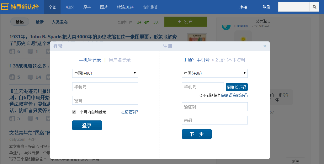
这个画面共有三个层次,最底部是网页,第二层是一个遮罩层(透明的灰色), 第三层就是我们看到的登录注册的页面且在页面偏上的位置:
<!DOCTYPE html>

<html lang="en">

<head>

    <meta charset="UTF-8" content="text/html" http-equiv="Content-Type">

    <title>模态对话框</title>

    <style>

        body{

            margin: 0;

            padding: 0;

        }

        .model{

            position: fixed;

            top:0;

            left:0;

            bottom:0;

            right:0;

            background: rgba(0,0,0,.6);

            z-index: 2;

        }

        .content{

            height: 300px;

            width: 400px;

            background-color: white;

            position: fixed;

            top:50%;

            left: 50%;

            z-index: 3;

            margin-top: -200px;

            margin-left: -200px;

        }

    </style>

</head>

<body>

<div style="height: 2000px;background-color: gainsboro">

    <h1>132</h1><h1>132</h1><h1>132</h1><h1>132</h1><h1>132</h1>

    <h1>132</h1><h1>132</h1><h1>132</h1>

</div>

    <div class="model"></div>

    <div class="content"></div>

</body>

</html>
模拟对话框
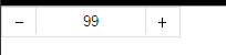
9、购物的时候可以选择一个或者多个
<!DOCTYPE html>

<html lang="en">

<head>

    <meta charset="UTF-8" content="text/html" http-equiv="Content-Type">

    <title>商品数量的加减</title>

    <style>

        body{

            margin: 0;

        }

        .left{

            float: left;

        }

        .center{

            line-height: 26px;

            text-align: center;

        }

        .wrap{

            width: 160px;

            height: 26px;

            border: 1px solid #dddddd;

            /*background-color: gainsboro;*/

        }

        .wrap .minus{

            height: 26px;

            width: 30px;

            cursor: pointer;

        }

        .wrap .plus{

            height: 26px;

            width: 30px;

            cursor: pointer;

        }

        .wrap .count input{

            height: 24px;

            border: 0;

            width: 98px;

            padding: 0;

            border-right: 1px solid #dddddd;

            border-left: 1px solid #dddddd;

            text-align: center;

        }

    </style>

</head>

<body>

<div class="wrap">

    <div class="minus left center" onclick="Minus();">-</div>

    <div class="count left">

        <input id="count" type="text" value="">

    </div>

    <div class="plus left center" onclick="Plus();">+</div>

</div>

<script type="text/javascript">

    function Plus(){

        var old_str = document.getElementById("count").value;

        var old_int = parseInt(old_str);

        var new_int = old_int + 1;

        document.getElementById('count').value = new_int;

    }

    function Minus(){

        var old_str = document.getElementById("count").value;

        var old_int = parseInt(old_str);

        var new_int = old_int - 1;

        document.getElementById('count').value = new_int;

    }

</script>

</body>

</html>
商品数量的加减
html的小例子的更多相关文章
- springmvc入门的第一个小例子
今天我们探讨一下springmvc,由于是初学,所以简单的了解一下 springmvc的流程,后续会持续更新... 由一个小例子来简单的了解一下 springmvc springmvc是spring框 ...
- java即时通信小例子
学习java一段时间了,今天写来一个即时通信的小例子练手在其过程中也学到了一些知识拿出来和大家分享,请路过的各位大神多多赐教... 好了下面讲一下基本的思路: 首先,编写服务器端的程序,简单点说吧就是 ...
- Runtime的几个小例子(含Demo)
一.什么是runtime(也就是所谓的“运行时”,因为是在运行时实现的.) 1.runtime是一套底层的c语言API(包括很多强大实用的c语言类型,c语言函数); [runti ...
- bootstrap 模态 modal 小例子
bootstrap 模态 modal 小例子 <html> <head> <meta charset="utf-8" /> <title ...
- INI配置文件分析小例子
随手写个解析INI配置字符串的小例子 带测试 #include <iostream> #include <map> #include <string> #inclu ...
- JavaScript小例子:复选框全选
JavaScript小例子:复选框全选 这只是一个小例子,很简单,但是这个功能还是很常用的: 实现后效果如图: JavaScript代码: <script type="text/jav ...
- 【zTree】 zTree使用的 小例子
使用zTree树不是第一次了 但是 还是翻阅着之前做的 对照着 使用起来比较方便 这里就把小例子列出来 总结一下使用步骤 这样方便下次使用起来方便一点 使用zTree树的步骤: 1.首先 在 ...
- js小例子(标签页)
运用js写的一个小例子,实现点击不同的标签出现不同的内容: <!DOCTYPE html> <html> <head> <meta chaset=" ...
- sbrk与brk的使用小例子
sbrk() 和 brk() - Unix的系统函数 sbrk()和brk() 系统的底层会维护一个位置,通过位置的移动完成内存的分配和回收.映射内存时 以一个内存页作为基本单位. void* ...
- c# BackGroundWorker 多线程操作的小例子
在我们的程序中,经常会有一些耗时较长的运算,为了保证用户体验,不引起界面不响应,我们一般会采用多线程操作,让耗时操作在后台完成,完成后再进行处理或给出提示,在运行中,也会时时去刷新界面上的进度条等显示 ...
随机推荐
- 在Debian 9上安装和配置Observium网络监控
https://blog.csdn.net/csgd2000/article/details/80780697
- UVA Rails(stl-stack)
具体思路是从B方向的序列 倒推 栈C 的入栈出栈顺序, 以B方向的5,4,3,2,1为例子:从一个数字5开始,要想从栈C拿到5号车厢,5号车厢得入栈C,且5号车厢处于栈顶位置,为了保证5号车 厢在 ...
- 32、Django实战第32天:我的收藏
我的收藏有3个页面:课程机构,授课教师,公开课程 课程机构 1.编辑usercenter-fav-org.html继承usercenter-base.html 2.编辑users.views.py . ...
- 【动态规划】bzoj1633 [Usaco2007 Feb]The Cow Lexicon 牛的词典
f[i]=min{f[i+1]+1,f[i+len[j]+cant]+cant}(for i=L-1 downto 0)(1<=j<=w) #include<cstdio> # ...
- [CF773D]Perishable Roads
[CF773D]Perishable Roads 题目大意: 一个\(n(n\le2000)\)个点的完全图\(G\),定义\(d(x)\)为生成树上点\(x\)到根路径上的最小边权.问图\(G\)的 ...
- iOS 获取自定义cell上按钮所对应cell的indexPath.row的方法
在UITableView或UICollectionView的自定义cell中创建一button,在点击该按钮时知道该按钮所在的cell在UITableView或UICollectionView中的行数 ...
- 网络采集软件核心技术剖析系列(2)---如何使用C#语言获得任意站点博文的正文及标题
一 本系列随笔概览及产生的背景 本系列开篇受到大家的热烈欢迎,这对博主是莫大的鼓励,此为本系列第二篇,希望大家继续支持,为我继续写作提供动力. 自己开发的豆约翰博客备份专家软件工具问世3年多以来,深受 ...
- perspective 的笔记
以前看到别人做的banner图,3d变化,很羡慕啊,一直不知道怎么做,直到看到了这个样式perspective,然后就知道怎么实现了 一个简单的例子,扫起 demo下在地址 http://fil ...
- HTML5:绘制图形
canvas绘图通过属于 canvas 的 JavaScript 方法完成 针对不支持html5的IE浏览器 <!--[if IE]> <script type="text ...
- Mac的文件比对工具:Meld、Beyond Compare
Meld开源免费 Beyond Compare可以在Windows.Mac下使用,但是收费,需要自己破解