UWP 轻量级样式定义(Lightweight Styling)
在 UWP 中,可以通过给空间直接设置属性或在 Style 中设置属性来定制空间的样式;不过这样的样式定义十分有限,比如按钮按下时的样式就没法儿设置。当然可以通过修改 Template 来设置控件的样式,然而 UWP 中控件的样式代码实在是太多太复杂了,还不容易从 Blend 中复制了大量代码出来改,下个版本样式又不一样,于是我们就丢了不少功能。
本文将介绍 UWP 轻量级样式定义(Lightweight styling),你既不用写太多代码,又能获得更多的样式控制。
本文内容
轻量级样式定义
看一段简单的代码,你一定能立刻明白本文想说的是什么。
<Page.Resources>

    <ResourceDictionary>

        <ResourceDictionary.ThemeDictionaries>

            <ResourceDictionary x:Key="Light">

                <SolidColorBrush x:Key="ButtonBackground" Color="Transparent"/>

                <SolidColorBrush x:Key="ButtonForeground" Color="#dd5145"/>

                <SolidColorBrush x:Key="ButtonBorderBrush" Color="#dd5145"/>

            </ResourceDictionary>

        </ResourceDictionary.ThemeDictionaries>

    </ResourceDictionary>

</Page.Resources>
本段代码摘抄自 XAML Lightweight styling - UWP app developer - Microsoft Docs
▲ 按钮的颜色定制
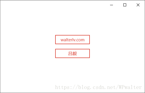
以上代码可以写在 Page 中,即可在 Page 范围内获得这些主题资源的重写。当然,如果需要更大范围,可以考虑去 App 类中重写。
官网上举例的这种类型的样式定义其实普通的 Style 也能很容易实现的,真正厉害的是 Style 里设置不了的那些鼠标滑过颜色和鼠标按下颜色。于是,我们额外添加一些代码:
<SolidColorBrush x:Key="ButtonBackground" Color="Transparent"/>

<SolidColorBrush x:Key="ButtonForeground" Color="#dd5145"/>

<SolidColorBrush x:Key="ButtonBorderBrush" Color="#dd5145"/>

<SolidColorBrush x:Key="ButtonBackgroundPointerOver" Color="#10dd5145"/>

<SolidColorBrush x:Key="ButtonForegroundPointerOver" Color="#ffcd44"/>

<SolidColorBrush x:Key="ButtonBorderBrushPointerOver" Color="#ffcd44"/>

<SolidColorBrush x:Key="ButtonBackgroundPressed" Color="#10ca5100"/>

<SolidColorBrush x:Key="ButtonForegroundPressed" Color="#ca5100"/>

<SolidColorBrush x:Key="ButtonBorderBrushPressed" Color="#ca5100"/>
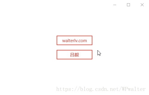
现在我们只是设置一些颜色值即修改了按钮在多种状态下的外观。而且在按下的过程中,还保留了按钮按下时的倾斜效果。
▲ 按钮更多的颜色定制
相比于 Template -> Edit Copy 这种重量级的样式与模板定义,在保证足够的样式定义的情况下,代码量是不是少了非常多了呢?
如何找到控件支持的主题资源
前面我们知道了如何定制轻量级样式,但实际做 UI 的时候,我怎么知道有哪些样式主题资源的值可以使用呢?
一种方法是直接看微软官方文档,比如这里 XAML theme resources;你可以在这篇文章中找到很多通用的主题资源的 Key 用来重写。不过实际上由于 Windows Community Toolkit 以及各种第三方控件库的存在,所以没有什么文档是可以把这些 Key 写全的;所以更重要的方法是我们能自己找到有哪些 Key 可以使用。
找到 Key 的方法和定义一个全新的 Style / Template 一样,都可以通过 Visual Studio 的设计器视图(或者 Blend)实现。
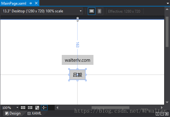
第一步:前往 Visual Studio 设计器视图
▲ Visual Studio 设计器视图
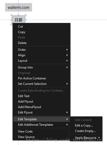
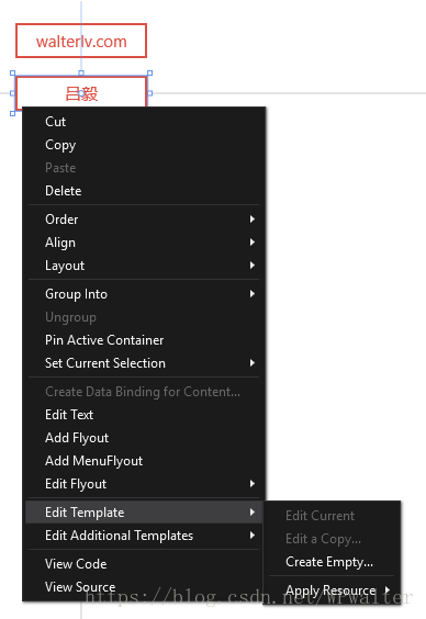
第二步:在其中一个你想定制样式的控件上 右键 -> 编辑模板 -> 编辑副本
▲ 编辑模板
特别注意,如果你发现你的 “编辑副本” 是灰色的,说明你已经定制过样式了。将你已经定制的样式删除后,就可以再编辑副本了。
▲ 灰色的 “编辑副本”
第三步:寻找你感兴趣的主题资源的 Key,记下来准备定义
在编辑副本后,你可以在副本的代码中找到按钮的原生样式定义。比如一个按钮的样式是这样的:
<Style x:Key="ButtonStyle1" TargetType="Button">

    <Setter Property="Background" Value="{ThemeResource ButtonBackground}"/>

    <Setter Property="Foreground" Value="{ThemeResource ButtonForeground}"/>

    <Setter Property="BorderBrush" Value="{ThemeResource ButtonBorderBrush}"/>

    <Setter Property="BorderThickness" Value="{ThemeResource ButtonBorderThemeThickness}"/>

    <Setter Property="Padding" Value="8,4,8,4"/>

    <Setter Property="HorizontalAlignment" Value="Left"/>

    <Setter Property="VerticalAlignment" Value="Center"/>

    <Setter Property="FontFamily" Value="{ThemeResource ContentControlThemeFontFamily}"/>

    <Setter Property="FontWeight" Value="Normal"/>

    <Setter Property="FontSize" Value="{ThemeResource ControlContentThemeFontSize}"/>

    <Setter Property="UseSystemFocusVisuals" Value="{StaticResource UseSystemFocusVisuals}"/>

    <Setter Property="FocusVisualMargin" Value="-3"/>

    <Setter Property="Template">

        <Setter.Value>

            <ControlTemplate TargetType="Button">

                <Grid x:Name="RootGrid" Background="{TemplateBinding Background}">

                    <VisualStateManager.VisualStateGroups>

                        <VisualStateGroup x:Name="CommonStates">

                            <VisualState x:Name="Normal">

                                <Storyboard>

                                    <PointerUpThemeAnimation Storyboard.TargetName="RootGrid"/>

                                </Storyboard>

                            </VisualState>

                            <VisualState x:Name="PointerOver">

                                <Storyboard>

                                    <ObjectAnimationUsingKeyFrames Storyboard.TargetName="RootGrid" Storyboard.TargetProperty="Background">

                                        <DiscreteObjectKeyFrame KeyTime="0" Value="{ThemeResource ButtonBackgroundPointerOver}"/>

                                    </ObjectAnimationUsingKeyFrames>

                                    <ObjectAnimationUsingKeyFrames Storyboard.TargetName="ContentPresenter" Storyboard.TargetProperty="BorderBrush">

                                        <DiscreteObjectKeyFrame KeyTime="0" Value="{ThemeResource ButtonBorderBrushPointerOver}"/>

                                    </ObjectAnimationUsingKeyFrames>

                                    <ObjectAnimationUsingKeyFrames Storyboard.TargetName="ContentPresenter" Storyboard.TargetProperty="Foreground">

                                        <DiscreteObjectKeyFrame KeyTime="0" Value="{ThemeResource ButtonForegroundPointerOver}"/>

                                    </ObjectAnimationUsingKeyFrames>

                                    <PointerUpThemeAnimation Storyboard.TargetName="RootGrid"/>

                                </Storyboard>

                            </VisualState>

                            <VisualState x:Name="Pressed">

                                <Storyboard>

                                    <ObjectAnimationUsingKeyFrames Storyboard.TargetName="RootGrid" Storyboard.TargetProperty="Background">

                                        <DiscreteObjectKeyFrame KeyTime="0" Value="{ThemeResource ButtonBackgroundPressed}"/>

                                    </ObjectAnimationUsingKeyFrames>

                                    <ObjectAnimationUsingKeyFrames Storyboard.TargetName="ContentPresenter" Storyboard.TargetProperty="BorderBrush">

                                        <DiscreteObjectKeyFrame KeyTime="0" Value="{ThemeResource ButtonBorderBrushPressed}"/>

                                    </ObjectAnimationUsingKeyFrames>

                                    <ObjectAnimationUsingKeyFrames Storyboard.TargetName="ContentPresenter" Storyboard.TargetProperty="Foreground">

                                        <DiscreteObjectKeyFrame KeyTime="0" Value="{ThemeResource ButtonForegroundPressed}"/>

                                    </ObjectAnimationUsingKeyFrames>

                                    <PointerDownThemeAnimation Storyboard.TargetName="RootGrid"/>

                                </Storyboard>

                            </VisualState>

                            <VisualState x:Name="Disabled">

                                <Storyboard>

                                    <ObjectAnimationUsingKeyFrames Storyboard.TargetName="RootGrid" Storyboard.TargetProperty="Background">

                                        <DiscreteObjectKeyFrame KeyTime="0" Value="{ThemeResource ButtonBackgroundDisabled}"/>

                                    </ObjectAnimationUsingKeyFrames>

                                    <ObjectAnimationUsingKeyFrames Storyboard.TargetName="ContentPresenter" Storyboard.TargetProperty="BorderBrush">

                                        <DiscreteObjectKeyFrame KeyTime="0" Value="{ThemeResource ButtonBorderBrushDisabled}"/>

                                    </ObjectAnimationUsingKeyFrames>

                                    <ObjectAnimationUsingKeyFrames Storyboard.TargetName="ContentPresenter" Storyboard.TargetProperty="Foreground">

                                        <DiscreteObjectKeyFrame KeyTime="0" Value="{ThemeResource ButtonForegroundDisabled}"/>

                                    </ObjectAnimationUsingKeyFrames>

                                </Storyboard>

                            </VisualState>

                        </VisualStateGroup>

                    </VisualStateManager.VisualStateGroups>

                    <ContentPresenter x:Name="ContentPresenter" AutomationProperties.AccessibilityView="Raw" BorderThickness="{TemplateBinding BorderThickness}" BorderBrush="{TemplateBinding BorderBrush}" ContentTemplate="{TemplateBinding ContentTemplate}" Content="{TemplateBinding Content}" ContentTransitions="{TemplateBinding ContentTransitions}" HorizontalContentAlignment="{TemplateBinding HorizontalContentAlignment}" Padding="{TemplateBinding Padding}" VerticalContentAlignment="{TemplateBinding VerticalContentAlignment}"/>

                </Grid>

            </ControlTemplate>

        </Setter.Value>

    </Setter>

</Style>
从中我们可以找到这些可以定义的主题资源 Key:
- ButtonBackground
- ButtonForeground
- ButtonBorderBrush
- ButtonBorderThemeThickness
- ContentControlThemeFontFamily
- ControlContentThemeFontSize
- ButtonBackgroundPointerOver
- ButtonBorderBrushPointerOver
- ButtonForegroundPointerOver
- ButtonBackgroundPressed
- ButtonBorderBrushPressed
- ButtonForegroundPressed
- ButtonBackgroundDisabled
- ButtonBorderBrushDisabled
- ButtonForegroundDisabled
第四步:轻量级样式定义
请先删除这份副本样式,这样你就可以进行 “轻量级样式定义” 了。代码量相比于上面这份完整样式可以少非常多。
UWP 轻量级样式定义(Lightweight Styling)的更多相关文章
- CSS样式定义的优先级顺序总结
CSS样式定义的优先级顺序总结 层叠优先级是: 浏览器缺省 < 外部样式表 < 内部样式表 < 内联样式 其中样式表又有: 类选择器 < 类派生选择器 < ID选择器 & ...
- mathtype样式系统使用技巧-通过样式定义来更改方程中的字体
本教程中,我们主要介绍MathType Desktop的样式系统.演示如何通过更改样式定义来更改方程中的字体.通过样式可以快速轻松地实现我们所需的公式格式,并统一所有公式的样式. 我们以如下公式来作为 ...
- JavaScript获取非行间样式/定义样式
html节点的样式分为以下几种 (1)浏览器默认样式 (2)引用样式(引用外部css文件的样式.style标签内定义的样式) 引用外部css样式:<link rel="styleshe ...
- Silverlight样式定义
方法一.定义在控件内部 <Canvas Background="Red" Height="100" HorizontalAlignment="L ...
- console 中的格式化打印(占位符),和样式定义
格式化打印 Gecko 9.0 (Firefox 9.0 / Thunderbird 9.0 / SeaMonkey 2.6) 首次发布对string substitutions的支持.你可以在传递给 ...
- js获取非行间样式/定义样式
<!--DOCTYPE html--> <html> <head> <meta charset="utf-8" /> <sty ...
- table的样式定义
table的cellpadding和cellpadding我们经常会用如下的方式来清除默认样式: <table cellspacing="0" cellpadding=&qu ...
- UWP appButtonBar样式
UWP 的appButtonBar使用<AppBarButton Icon = "Next" Label = "Next" /> Icon是 Sym ...
- 28. 表单css样式定义格式
form>table>tbody>tr>td{padding:5px;font-size:14px;font-family:"Microsoft YaHei" ...
随机推荐
- JavaScript的基础语法
对于Javascript的而言没有数据类型的全部都是通过var来定义创建的.比如: <!DOCTYPE html> <html> <head> <meta c ...
- uva 1456
这题说的是 给了 n 个 点 然后每个点 都有 相应的概率,你要将这n个点划分成w个集合使得 下面定义的这种算法 得到的 值最小 n1 是集合一的 个数 是 集合一内的每个点的概率和, 下面是分成两 ...
- table--边框样式设置
Table的一些设置(自适应以及溢出) table的两个属性 单行溢出点点显示 表格的宽度设置 双栏自适应连续连续英文符换行 1.table重置的两个属性: ①border-collapse: c ...
- Ubuntu安装配置rclone(Onedrive应用)
rclone安装 命令行安装 脚本安装 curl https://rclone.org/install.sh | sudo bash # 或者 curl https://rclone.org/inst ...
- 20145309 李昊 《网络攻防》 Exp2 后门原理与实践
实践内容: (1)理解免杀技术原理(1分) (2)正确使用msf编码器,veil-evasion,自己利用shellcode编程等免杀工具或技巧:(2分) (3)通过组合应用各种技术实现恶意代码免杀( ...
- js二进制转换十进制
var a = 1010;alert(a.toString(2)); //转成二进制 alert(parseInt( "101110100 ",2)) ;//转成十进制 null
- POJ 2112 Optimal Milking(二分+最大流)
http://poj.org/problem?id=2112 题意: 现在有K台挤奶器和C头奶牛,奶牛和挤奶器之间有距离,每台挤奶器每天最多为M头奶挤奶,现在要安排路程,使得C头奶牛所走的路程中的最大 ...
- Codeforces Round #320 (Div. 2) [Bayan Thanks-Round] E. Weakness and Poorness 三分
E. Weakness and Poorness time limit per test 2 seconds memory limit per test 256 megabytes input sta ...
- css可应用的渐进增强新特性
1. 让有滚动行为的元素平滑滚动 scroll-behavior: smooth; <div class="smooth"> </dvi> .smooth ...
- jquery ui是什么
jquery ui是什么 一.总结 一句话总结:jQuery UI [1] 是以 jQuery 为基础的开源 JavaScript 网页用户界面代码库.包含底层用户交互.动画.特效和可更换主题的可视 ...