
CSS3绘制不规则图形,代码收集
三角形系列(三角形、倒三角、左三角、右三角、左上三角、右上三角、左下三角、右下三角)
主要用到的是:宽度高度设置为0, border的各个边的设置(各个边的透明或不透明);

.triangle-up {

  /* 三角形 */

  width: 0;

  height: 0;

  border-left: 50px solid transparent;

  border-right: 50px solid transparent;

  border-bottom: 100px solid #f00;

}

.triangle-down {

  /* 倒三角 */

  width: 0;

  height: 0;

  border-left: 50px solid transparent;

  border-right: 50px solid transparent;

  border-top: 100px solid #f00;

}

.triangle-left {

  /* 左三角 */

  width: 0;

  height: 0;

  border-top: 50px solid transparent;

  border-bottom: 50px solid transparent;

  border-right: 100px solid #f00;

}

.triangle-right {

  /* 右三角 */

  width: 0;

  height: 0;

  border-top: 50px solid transparent;

  border-bottom: 50px solid transparent;

  border-left: 100px solid #f00;

}

.triangle-topleft {

  /* 左上三角 */

  width: 0;

  height: 0;

  border-right: 100px solid transparent;

  border-top: 100px solid #f00;

}

.triangle-topright {

  /* 右上三角 */

  width: 0;

  height: 0;

  border-left: 100px solid transparent;

  border-top: 100px solid #f00;

}

.triangle-downleft {

  /* 左下三角 */

  width: 0;

  height: 0;

  border-right: 100px solid transparent;

  border-bottom: 100px solid #f00;

}

.triangle-downright {

  /* 右下三角 */

  width: 0;

  height: 0;

  border-left: 100px solid transparent;

  border-bottom: 100px solid #f00;

}
圆形、椭圆、扇形、圆环、月牙

.circular {

    /* 圆形 */

    width: 100px;

    height: 100px;

    background: #f00;

    border-radius: 50%;

}

.oval {

    /* 椭圆 */

    width: 200px;

    height: 100px;

    background: #f00;

    border-radius: 100px / 50px;

}

.sector {

    /* 扇形 */

    width: 0;

    height: 0;

    border-left: 50px solid transparent;

    border-right: 50px solid transparent;

    border-top: 100px solid #f00;

    border-radius: 50%;

}

.ring {

    /* 圆环 */

    width: 100px;

    height: 100px;

    border: 5px solid #f00;

    border-radius: 50%;

}

.crescent {

    /* 月牙 */

    width: 100px;

    height: 100px;

    border-radius: 50%;

    box-shadow: 20px 20px 0 0 #f00;

}
正方形、长方形、菱形、平行四边形、梯形

.square {

    /* 正方形 */

    width: 100px;

    height: 100px;

    background: #f00;

}

.rectangle {

    /* 长方形 */

    width: 200px;

    height: 100px;

    background: #f00;

}

.rhomb {

    /* 菱形 */

    width: 100px;

    height: 100px;

    background: #f00;

    transform: rotate(45deg);

}

.parallelogram {

    /* 平行四边形 */

    width: 200px;

    height: 100px;

    background: #f00;

    transform: skew(-20deg);

}

.trapezoid {

    /* 梯形 */

    width: 100px;

    height: 0;

    border-bottom: 100px solid #f00;

    border-left: 50px solid transparent;

    border-right: 50px solid transparent;

}
五边形、六边形、八边形
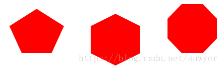
.pentagon {

    /* 五边形:三角形和梯形的结合 */

    width: 60px;

    height: 0;

    position: relative;

    border-top: 55px solid #f00;

    border-left: 25px solid transparent;

    border-right: 25px solid transparent;

}

.pentagon:before {

    content: "";

    position: absolute;

    width: 0px;

    height: 0;

    border-left: 55px solid transparent;

    border-right: 55px solid transparent;

    border-bottom: 35px solid #f00;

    left: -25px;

    top: -90px;

}

.hexagon {

    /*六边形:在长方形上面和下面各放置一个三角形*/

    width: 100px;

    height: 55px;

    background: #f00;

    position: relative;

}

.hexagon:before {

    content: "";

    width: 0;

    height: 0;

    position: absolute;

    top: -25px;

    left: 0;

    border-left: 50px solid transparent;

    border-right: 50px solid transparent;

    border-bottom: 25px solid #f00;

}

.hexagon:after {

    content: "";

    width: 0;

    height: 0;

    position: absolute;

    bottom: -25px;

    left: 0;

    border-left: 50px solid transparent;

    border-right: 50px solid transparent;

    border-top: 25px solid #f00;

}

.octagon {

    /* 八边形:长方形、上下各放置一个梯形 */

    width: 100px;

    height: 100px;

    background: #f00;

    position: relative;

}

.octagon:before {

    content: "";

    position: absolute;

    width: 42px;

    height: 0;

    border-left: 29px solid #fff;

    border-right: 29px solid #fff;

    border-bottom: 30px solid #f00;

    top: 0;

    left: 0;

}

.octagon:after {

    content: "";

    position: absolute;

    width: 42px;

    height: 0;

    border-left: 29px solid #fff;

    border-right: 29px solid #fff;

    border-top: 30px solid #f00;

    bottom: 0;

    left: 0;

}
爱心

.love {

    /* 爱心 */

    position: relative;

}

.love:before {

    content: "";

    width: 70px;

    height: 110px;

    background: #f00;

    position: absolute;

    border-top-left-radius: 50%;

    border-top-right-radius: 50%;

    transform: rotate(45deg);

}

.love:after {

    content: "";

    width: 70px;

    height: 110px;

    background: #f00;

    position: absolute;

    border-top-left-radius: 50%;

    border-top-right-radius: 50%;

    transform: rotate(-45deg);

    left: -30px;

}
无穷大符号

.infinity {

    /* 无穷大 */

    width: 190px;

    height: 100px;

    position: relative;

}

.infinity:before {

    content: "";

    width: 50px;

    height: 50px;

    position: absolute;

    top: 0;

    left: 0;

    border: 20px solid #f00;

    border-radius: 50px 50px 0 50px;

    transform: rotate(-45deg);

}

.infinity:after {

    content: "";

    width: 50px;

    height: 50px;

    position: absolute;

    top: 0;

    right: 0;

    border: 20px solid #f00;

    border-radius: 50px 50px 50px 0;

    transform: rotate(45deg);

}
鸡蛋
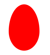
.egg {

    /* 鸡蛋 */

    width: 120px;

    height: 180px;

    background: #f00;

    border-radius: 60% 60% 60% 60% / 70% 70% 50% 50%;

}
食人豆
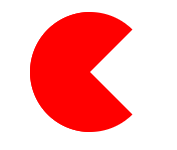
.pacman {

    /* 食人豆 */

    width: 0;

    height: 0;

    border: 60px solid #f00;

    border-right: 60px solid transparent;

    border-radius: 100%;

}
对话框
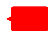
.alertDialog {

    /* 对话框:一个圆角矩形和一个小三角形 */

    width: 150px;

    height: 100px;

    background: #f00;

    border-radius: 10px;

    position: relative;

}

.alertDialog:before {

    content: "";

    width: 0;

    height: 0;

    position: absolute;

    left: -20px;

    top: 40px;

    border-top: 10px solid transparent;

    border-bottom: 10px solid transparent;

    border-right: 20px solid #f00;

}
钻石
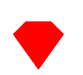
.diamond {

    /* 钻石:梯形和三角形组成 */

    width: 50px;

    height: 0;

    position: relative;

    border-bottom: 25px solid #f00;

    border-left: 25px solid transparent;

    border-right: 25px solid transparent;

}

.diamond:before {

    content: "";

    width: 0;

    height: 0;

    position: absolute;

    border-left: 50px solid transparent;

    border-right: 50px solid transparent;

    border-top: 70px solid #f00;

    left: -25px;

    top: 25px;

}
八卦图

.eightDiagrams {

    /* 八卦:多个圆形组成 */

    width: 100px;

    height: 50px;

    border-color: #f00;

    border-width: 2px 2px 50px 2px;

    border-style: solid;

    border-radius: 50%;

    position: relative;

}

.eightDiagrams:before {

    content: "";

    position: absolute;

    width: 12px;

    height: 12px;

    background: #fff;

    border-radius: 50%;

    top: 50%;

    left: 0;

    border: 19px solid #f00;

}

.eightDiagrams:after {

    content: "";

    position: absolute;

    width: 12px;

    height: 12px;

    background: #f00;

    border-radius: 50%;

    top: 50%;

    left: 50%;

    border: 19px solid #fff;

}
五角星

.starFive {

    /* 五角星: */

    width: 0;

    height: 0;

    position: relative;

    border-left: 80px solid transparent;

    border-right: 80px solid transparent;

    border-bottom: 60px solid #f00;

    transform: rotate(35deg);

}

.starFive:before {

    content: "";

    position: absolute;

    width: 0;

    height: 0;

    border-left: 80px solid transparent;

    border-right: 80px solid transparent;

    border-bottom: 60px solid #f00;

    transform: rotate(-70deg);

    top: 3px;

    left: -80px;

}

.starFive:after {

    content: "";

    position: absolute;

    width: 0;

    height: 0;

    border-bottom: 60px solid #f00;

    border-right: 20px solid transparent;

    border-left: 20px solid transparent;

    transform: rotate(-35deg);

    top: -40px;

    left: -49px;

}
六角形、八角星、十二角星
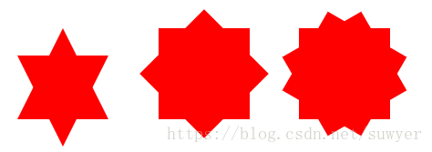
.starSix {

    /* 六角形:两个三角形组成 */

    width: 0;

    height: 0;

    position: relative;

    border-left: 50px solid transparent;

    border-right: 50px solid transparent;

    border-bottom: 100px solid #f00;

}

.starSix:before {

    content: "";

    width: 0;

    height: 0;

    position: absolute;

    top: 30px;

    left: -50px;

    border-left: 50px solid transparent;

    border-right: 50px solid transparent;

    border-top: 100px solid #f00;

}

.starEight {

    /* 八角星:两个正方形,旋转角度 */

    width: 100px;

    height: 100px;

    background: #f00;

    position: relative;

}

.starEight:before {

    content: "";

    width: 100px;

    height: 100px;

    background: #f00;

    position: absolute;

    top: 0;

    left: 0;

    transform: rotate(45deg);

}

.starTwelve {

    /* 十二角星:三个正方形,旋转角度 */

    width: 100px;

    height: 100px;

    background: #f00;

    position: relative;

}

.starTwelve:before {

    content: "";

    width: 100px;

    height: 100px;

    background: #f00;

    position: absolute;

    top: 0;

    left: 0;

    transform: rotate(-30deg)

}

.starTwelve:after {

    content: "";

    width: 100px;

    height: 100px;

    background: #f00;

    position: absolute;

    top: 0;

    left: 0;

    transform: rotate(30deg)

}
CSS3绘制不规则图形,代码收集的更多相关文章
- Canvas绘制不规则图形,实现可拖动,编辑--V1.0第一篇
目前的工作在做在线的标注工具,接触canvas一年了,各种绘制,基本上图像的交互canvas都可以完成,也写了几篇关于canvas的文章,遇到的问题也写博客上了,对于canvas有问题的朋友可以去看看 ...
- css3创建多边形clip属性,可用来绘制不规则图形了
.path1 { clip-path: polygon(5px 10px, 16px 3px, 16px 17px); } .path2 { clip-path: polygon(3px 5px, 1 ...
- div+css3绘制基本图形
基本图形包括:矩形.圆角矩形.圆形.椭圆形.三角形.值线.弧 这些图形的绘制用到了CSS圆角属性,不考虑IE8. 下面的实现在chrome浏览器运行通过. 1.矩形 比较简单,通过CSS设置宽度.高度 ...
- CSS3绘制特殊图形
- 使用CSS 3创建不规则图形 文字围绕
前言 CSS 创建复杂图形的技术即将会被广泛支持,并且应用到实际项目中.本篇文章的目的是为大家开启它的冰山一角.我希望这篇文章能让你对不规则图形有一个初步的了解. 现在,我们已经可以使用CSS 3 常 ...
- 使用CSS 3创建不规则图形
前言 CSS 创建复杂图形的技术即将会被广泛支持,并且应用到实际项目中.本篇文章的目的是为大家开启它的冰山一角.我希望这篇文章能让你对不规则图形有一个初步的了解. 现在,我们已经可以使用CSS 3 常 ...
- CSS 不规则图形绘制
基础技能1 - 神奇的border 我们先来画一个长方形: .Rectangle { height: 100px; width: 200px; background: darkgray; border ...
- CSS3:优雅地绘制不规则ICON
早上在w3ctech上看到 中国第二届CSS Conf总结 的时候,真是开心极了: 自从去年在慕课网上看了第一届CSS conf 视频之后,整个人都震惊了,原来还有大会是专门用来讨论CSS的,而且分 ...
- css绘制特殊图形,meida查询,display inline-box间隙问题以及calc()函数
本文同时发表于本人个人网站 www.yaoxiaowen.com 距离上一篇文章已经一个月了,相比于写代码,发现写文章的确是更需要坚持的事情.言归正传,梳理一下这一个月来,在写ife任务时,有必要记录 ...
随机推荐
- AcWing 799. 最长连续不重复子序列 双指针(一般先写一个朴素暴力的做法,然后看两个指针直接是否存在单调关系,如果存在,就想方法优化)
https://www.acwing.com/problem/content/801/ #include<bits/stdc++.h> using namespace std ; int ...
- B1027 打印沙漏
题目链接:https://pintia.cn/problem-sets/994805260223102976/problems/994805294251491328 1027 打印沙漏 (20 分) ...
- Excel 不同文件、sheet 关联引用(vlookup函数)
有时候在excel办公中会遇到,两个sheet相同的一列数据,作为关联(就像数据库的表的外键),其中一个sheet想要获取另一个sheet的其他列数据,这样就用到了vlookup函数,下面演示一下: ...
- CentOS6.5-6.9安装 docker
安装docker yum -y install docker-io 备注:查看内核版本uname -r ;卸载docker版本命令 yum remove docker 更改配置文件 vim /etc/ ...
- [Python] CondaHTTPError: HTTP 000 CONNECTION FAILED for url
CondaHTTPError: HTTP 000 CONNECTION FAILED for url 遇到这个问题 解决方法如下两个 一.C:\Users\Administrator 目录下 编辑 . ...
- 推荐一个手机端切换地址gps的app
在写脚本的时候遇到的 客户提供了这个app 免费 自身可以防检测 苹果和安卓都可以使用 官网 http://www.daniu.net/ 搜索 大牛 或者danniu即可
- Javascript模块化编程之CommonJS,AMD,CMD,UMD模块加载规范详解
JavaSript模块化 在了解AMD,CMD规范前,还是需要先来简单地了解下什么是模块化,模块化开发? 模块化是指在解决某一个复杂问题或者一系列的杂糅问题时,依照一种分类的思维把问 题进行系 ...
- yii2之ActiveRecord 模型
Active Record 模型是一种设计模式,用面向对象的方式抽象地访问数据的模式.在 Yii2 中,每一个 Active Record 模型对象的实例是 yii\db\ActiveRe ...
- Vacation
题目看上去倒是蛮复杂的样子嘞!
- 2019,.Net开发者的高光时刻
随着微软发布的一系列关于Windows..net和C#的公告,.Net开发者将在2019年,迎来自己的高光时刻,毕竟“世界上只有少数几种语言是多功能的,而没有一个像C#那样干净整洁.” 一.现在学C# ...