Python3 使用 matplotlib 画折线图
ChartUtil.py
import matplotlib.pyplot as plt

from pylab import mpl

def plotLine(xData,yData,xLabel,chartTitle):

    mpl.rcParams['font.sans-serif'] = ['FangSong']  # 指定默认字体

    mpl.rcParams['axes.unicode_minus'] = False  # 解决保存图像是负号'-'显示为方块的问题

    fig = plt.figure()

    ax = fig.add_subplot(1, 1, 1)

    #xData = range(0, 5)

    #xLabel = ["2009-June", "2009-Dec", "2010-June", "2010-Dec", "2011-June"]

    ax.set_xticks(range(len(xLabel)))

    ax.set_xticklabels(xLabel, rotation=40)

    ax.set_title(chartTitle)#设置标题

    #yData = [10, 13, 5, 40, 30]

    ax.plot(xData, yData, marker='o')

    # plt.plot(x1,y1,label='Frist line',linewidth=1.5,color='blue',marker='o',markerfacecolor='red',markersize=7)

    # plt.plot(x1,y1,'bo')

    plt.show()
使用
import  DbUtil as dbu

import ChartUtil as cu

conn, cursor = dbu.getDbConnection()

sql="select * from data_house where create_time BETWEEN '2017-09-18 00:00:00' and '2017-09-19 00:00:00' ";

cursor.execute(sql);

results = cursor.fetchall();

xLable=[]

yData=[]

for row in results:

    xLable.append(row[3])

    yData.append(row[4])

    createTime=row[2]

dbu.closeDb(conn, cursor)

dataCount=len(xLable)

xData=range(0,dataCount,1)

chartTitle=str(createTime) + '      Average Price'

cu.plotLine(xData, yData, xLable,chartTitle)
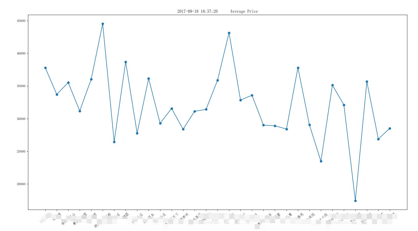
结果
Python3 使用 matplotlib 画折线图的更多相关文章
- python中matplotlib画折线图实例(坐标轴数字、字符串混搭及标题中文显示)
最近在用python中的matplotlib画折线图,遇到了坐标轴 "数字+刻度" 混合显示.标题中文显示.批量处理等诸多问题.通过学习解决了,来记录下.如有错误或不足之处,望请指 ...
- Matplotlib学习---用matplotlib画折线图(line chart)
这里利用Jake Vanderplas所著的<Python数据科学手册>一书中的数据,学习画图. 数据地址:https://raw.githubusercontent.com/jakevd ...
- python用matplotlib画折线图
折线图: import matplotlib.pyplot as plt y1=[10,13,5,40,30,60,70,12,55,25] x1=range(0,10) x2=range(0,10) ...
- SAS 画折线图PROC GPLOT
虽然最后做成PPT里的图表会被要求用EXCEL画,但当我们只是在分析的过程中,想看看数据的走势,直接在SAS里画会比EXCEL画便捷的多. 修改起来也会更加的简单,,不用不断的修改程序然后刷新EXCE ...
- Matplotlib学习---用matplotlib画雷达图(radar chart)
雷达图常用于对多项指标的全面分析.例如:HR想要比较两个应聘者的综合素质,用雷达图分别画出来,就可以进行直观的比较. 用Matplotlib画雷达图需要使用极坐标体系,可点击此链接,查看对极坐标体系的 ...
- python使用matplotlib绘制折线图教程
Matplotlib是一个Python工具箱,用于科学计算的数据可视化.借助它,Python可以绘制如Matlab和Octave多种多样的数据图形.下面这篇文章主要介绍了python使用matplot ...
- echars画折线图的一种数据处理方式
echars画折线图的一种数据处理方式 <!DOCTYPE html> <html> <head> <meta charset="utf-8&quo ...
- 使用OpenCV画折线图
使用OpenCV画直方图是一件轻松的事情,画折线图就没有那么Easy了,还是使用一个库吧: GraphUtils 源代码添加入工程 原文链接:http://www.360doc.com/content ...
- python3绘图示例3(基于matplotlib:折线图等)
#!/usr/bin/env python# -*- coding:utf-8 -*-from pylab import *from numpy import *import numpy # 数据点图 ...
随机推荐
- Codeforces Round #375 (Div. 2) A. The New Year: Meeting Friends 水题
A. The New Year: Meeting Friends 题目连接: http://codeforces.com/contest/723/problem/A Description There ...
- HDU 5832 A water problem 水题
A water problem 题目连接: http://acm.hdu.edu.cn/showproblem.php?pid=5832 Description Two planets named H ...
- Codeforces Round #515 (Div. 3)
Codeforces Round #515 (Div. 3) #include<bits/stdc++.h> #include<iostream> #include<cs ...
- 微信小程序自定义音频组件,自定义滚动条,单曲循环,循环播放
小程序自定义音频组件,带滚动条 摘要:首先自定义音频组件,是因为产品有这样的需求,需要如下样式的 而微信小程序API给我们提供的就是这样的 而且产品需要小程序有后台播放功能,所以我们不考虑小程序的 a ...
- 使用 IntraWeb (10) - CSS
IW 会把大多数的视觉属性转换为 CSS; 我们主动使用 CSS 要分两步: 第一步: {通过窗体的 StyleSheet 属性指定要链接的 CSS 文件} procedure TIWForm1.IW ...
- OpenVPN相同证书不同客户端设置不同静态IP的问题
无解!只能老老实实的使用不同证书不同客户端实现设置不同的静态IP.OpenVPN设置静态IP是根据证书名设置的,不能是登录名,无效. 无解! 无解!
- Dapper Miser implementation of CMSIS-DAP, MC HCK as SWD Adapter
Dapper Miser In late 2013, I created a functional implementation of CMSIS-DAP that runs in a low cos ...
- STM32F4: Generating parallel signals with the FSMC
STM32F4: Generating parallel signals with the FSMC The goal: The memory controller can be used to ge ...
- [Go] Http包 使用简介
请求的结构 HTTP 的交互以请求和响应的应答模式.Go 的请求我们早就见过了,handler 函数的第二个参数 http.Requests.其结构为: type Request struct { M ...
- 【优化】COUNT(1)、COUNT(*)、COUNT(常量)、COUNT(主键)、COUNT(ROWID)等
http://blog.itpub.net/26736162/viewspace-2136339/