css3中的多列布局columns详解
columns语法:columns:[ column-width ] || [ column-count ]
设置或检索对象的列数和每列的宽度
其中:[ column-width ]:设置或检索对象每列的宽度;[ column-count ]:设置或检索对象的列数。
css代码:
body{font:14px/1.5 georgia,serif,sans-serif;}

p{margin:;padding:5px 10px;background:#eee;}

h1{margin:10px 0;font-size:16px;}

.test{

    width:628px;

    border:10px solid #000;

    -moz-columns:200px 3;

    -webkit-columns:200px 3;

    columns:200px 3;

}

.test2{

    border:10px solid #000;

    -moz-columns:200px;

    -webkit-columns:200px;

    columns:200px;

}
html代码:
<h1>列数及列宽固定:</h1>

<div class="test">

    <p>This module describes multi-column layout in CSS. By using functionality described in this document, style sheets can declare that the content of an element is to be laid out in multiple columns. </p>

    <p>On the Web, tables have also been used to describe multi-column layouts. The main benefit of using CSS-based columns is flexibility; content can flow from one column to another, and the number of columns can vary depending on the size of the viewport. Removing presentation table markup from documents allows them to more easily be presented on various output devices including speech synthesizers and small mobile devices.</p>

</div>

<h1>列宽固定,根据容器宽度液态分布列数:</h1>

<div class="test2">

    <p>This module describes multi-column layout in CSS. By using functionality described in this document, style sheets can declare that the content of an element is to be laid out in multiple columns. </p>

    <p>On the Web, tables have also been used to describe multi-column layouts. The main benefit of using CSS-based columns is flexibility; content can flow from one column to another, and the number of columns can vary depending on the size of the viewport. Removing presentation table markup from documents allows them to more easily be presented on various output devices including speech synthesizers and small mobile devices.</p>

</div>
结果如图所示: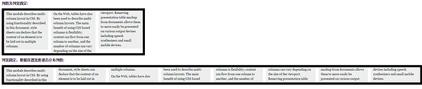
以下列出column运用的相关属性
1.column-width:<length> | auto 设置或检索对象每列的宽度
如:-moz-column-width:200px;
2.column-count:<integer> | auto 设置或检索对象的列数
如:-webkit-column-count:3;
3.column-gap:<length> | normal 设置或检索对象的列与列之间的间隙
如:column-gap:normal;column-gap:40px;
4.column-rule:[ column-rule-width ] || [ column-rule-style ] || [ column-rule-color ]设置或检索对象的列与列之间的边框。复合属性。相当于border属性
如:column-rule:10px solid #090;
5.column-span:none | all 设置或检索对象元素是否横跨所有列。
如:column-span:all;
6.column-fill:auto | balance 设置或检索对象所有列的高度是否统一。
auto:列高度自适应内容
balance:所有列的高度以其中最高的一列统一
如:column-fill:balance;
7.column-break-before:auto | always | avoid | left | right | page | column | avoid-page | avoid-column 设置或检索对象之前是否断行。
auto:既不强迫也不禁止在元素之前断行并产生新列
always:总是在元素之前断行并产生新列
avoid:避免在元素之前断行并产生新列
8.column-break-after:auto | always | avoid | left | right | page | column | avoid-page | avoid-column 设置或检索对象之后是否断行。
auto:既不强迫也不禁止在元素之后断行并产生新列
always:总是在元素之后断行并产生新列
avoid:避免在元素之后断行并产生新列
9.column-break-inside:auto | avoid | avoid-page | avoid-column 设置或检索对象内部是否断行。
auto:既不强迫也不禁止在元素内部断行并产生新列
avoid:避免在元素内部断行并产生新列
其实常用的也就前面5条。
css3中的多列布局columns详解的更多相关文章
- CSS3之多列布局columns详解
CSS3之多列布局columns详解 CSS3提供了个新属性columns用于多列布局.基本属性如下: 1. columns: <'column-width'> || <'colum ...
- CSS3布局之多列布局columns详解
columns语法:columns:[ column-width ] || [ column-count ]设置或检索对象的列数和每列的宽度 其中:[ column-width ]:设置或检索对象每列 ...
- CSS3中的弹性流体盒模型技术详解
先回顾一下CSS1 和 CSS2中都已经定义了哪些布局方面的属性,这样也会增加我们理解弹性布局. 其实我们现在有很多一部分人,你们刚刚接触CSS层叠样式表,或者接触有一段时间了,但是却没有很好的去 ...
- CSS3中-webkit-overflow-scrolling: touch 的使用方法详解
-webkit-overflow-scrolling 属性控制元素在移动设备上是否使用滚动回弹效果. auto 使用普通滚动, 当手指从触摸屏上移开,滚动会立即停止. touch 使用具有回弹效果的滚 ...
- CSS3 多列布局——Columns
CSS3 多列布局——Columns 语法: columns:<column-width> || <column-count> 多列布局columns属性参数主要就两个属性参数 ...
- 多列布局——Columns
为了能在Web页面中方便实现类似报纸.杂志那种多列排版的布局,W3C特意给CSS3增加了一个多列布局模块(CSS Multi Column Layout Module).它主要应用在文本的多列布局方面 ...
- 160427、CSS3实战笔记--多列布局
通过阅读和学习书籍<CSS3实战>总结 <CSS3实战>/成林著.—北京机械工业出版社2011.5 多列布局适合纯文字版式设计,如报纸内和杂志类网页布局,不适合做网页结构布 ...
- css3中动画(transition)和过渡(animation)详析
css3中动画(transition)和过渡(animation)详析
- ExtJs常用布局--layout详解(含实例)
序言: 笔者用的ExtJs版本:ext-3.2.0 ExtJs常见的布局方式有:border.form.absolute.column.accordion.table.fit.card.anchor ...
随机推荐
- CountDownLatch,CyclicBarrier,Semaphore
CountDownLatch是倒数,doneSignal = new CountDownLatch(LATCH_SIZE);赋初值后,在主线程中等待doneSignal.await();其它线程中,每 ...
- [moka同学笔记]linux服务器防火墙的设置
网站突然打不开:服务器停止了,重启后,防火墙自动启动,导致网站打不开. 1.查看防火墙 systemctl status firewalld 2.关闭防火墙 systemctl stop firewa ...
- IBATIS动态SQL(转)
直接使用JDBC一个非常普遍的问题就是动态SQL.使用参数值.参数本身和数据列都是动态SQL,通常是非常困难的.典型的解决办法就是用上一堆的IF-ELSE条件语句和一连串的字符串连接.对于这个问题,I ...
- ahjesus不断完善的js小"内裤"
String.prototype.isNullOrWhiteSpace = function () { /// <summary> /// 变量是undefined或者null或者空字符串 ...
- 「C语言」文件的概念与简单数据流的读写函数
写完「C语言」单链表/双向链表的建立/遍历/插入/删除 后,如何将内存中的链表信息及时的保存到文件中,又能够及时的从文件中读取出来进行处理,便需要用到”文件“的相关知识点进行文件的输入.输出. 其实, ...
- 【GOF23设计模式】享元模式
来源:http://www.bjsxt.com/ 一.[GOF23设计模式]_享元模式.享元池.内部状态.外部状态.线程池.连接池 package com.test.flyweight; /** * ...
- [ASP.NET MVC] 使用CLK.AspNet.Identity提供以角色为基础的访问控制(RBAC)
[ASP.NET MVC] 使用CLK.AspNet.Identity提供以角色为基础的访问控制(RBAC) 程序代码下载 程序代码下载:点此下载 前言 ASP.NET Identity是微软所贡献的 ...
- ResponsiveSlides.js 幻灯片实例演示
在线实例 默认效果 导航和分页 缩略图 描述说明 回调函数 <div class="wrap"> <ul class="rslides" ...
- 复杂表格的树形结构的添加删除行div实现
公司倒闭,换了工作,无奈选择了做外包这个差事,大公司进不去,小公司工资太低,可能也只能如此了.但无奈之举,亦不可浪费时间,多多磨练自己吧! 众所周知,做外包项目,其实就是做一些大公司的内部系统,多以管 ...
- 使用svcutil.exe 工具来生成调用文件
svcutil.exe http://localhost:9065/ServiceDemo.svc?wsdl 这将生成一个配置文件和一个包含客户端类的代码文件. 下面我们就用这个是怎么生成的: 1,打 ...