Python_散点图与折线图绘制
在数据分析的过程中,经常需要将数据可视化,目前常使用的:散点图 折线图
需要import的外部包 一个是绘图 一个是字体导入
import matplotlib.pyplot as plt

from matplotlib.font_manager import FontProperties
在数据处理前需要获取数据,从TXT XML csv excel 等文本中获取需要的数据,保存到list
 def GetFeatureList(full_path_file):

     file_name = full_path_file.split('\\')[-1][0:4]

     # print(file_name)

     # print(full_name)

     K0_list = []

     Area_list = []

     all_lines = []

     f = open(full_path_file,'r')

     all_lines = f.readlines()

     lines_num = len(all_lines)

     # 数据清洗

     if lines_num > 5000:

         for i in range(3,lines_num-1):

             temp_k0 = int(all_lines[i].split('\t')[1])

             if temp_k0 == 0:

                 K0_list.append(ComputK0(all_lines[i]))

             else:

                 K0_list.append(temp_k0)

             Area_list.append(float(all_lines[i].split('\t')[15]))

         # K0_Scatter(K0_list,Area_list,file_name)

     else:

         print('{} 该样本量少于5000'.format(file_name))

     return K0_list, Area_list,file_name
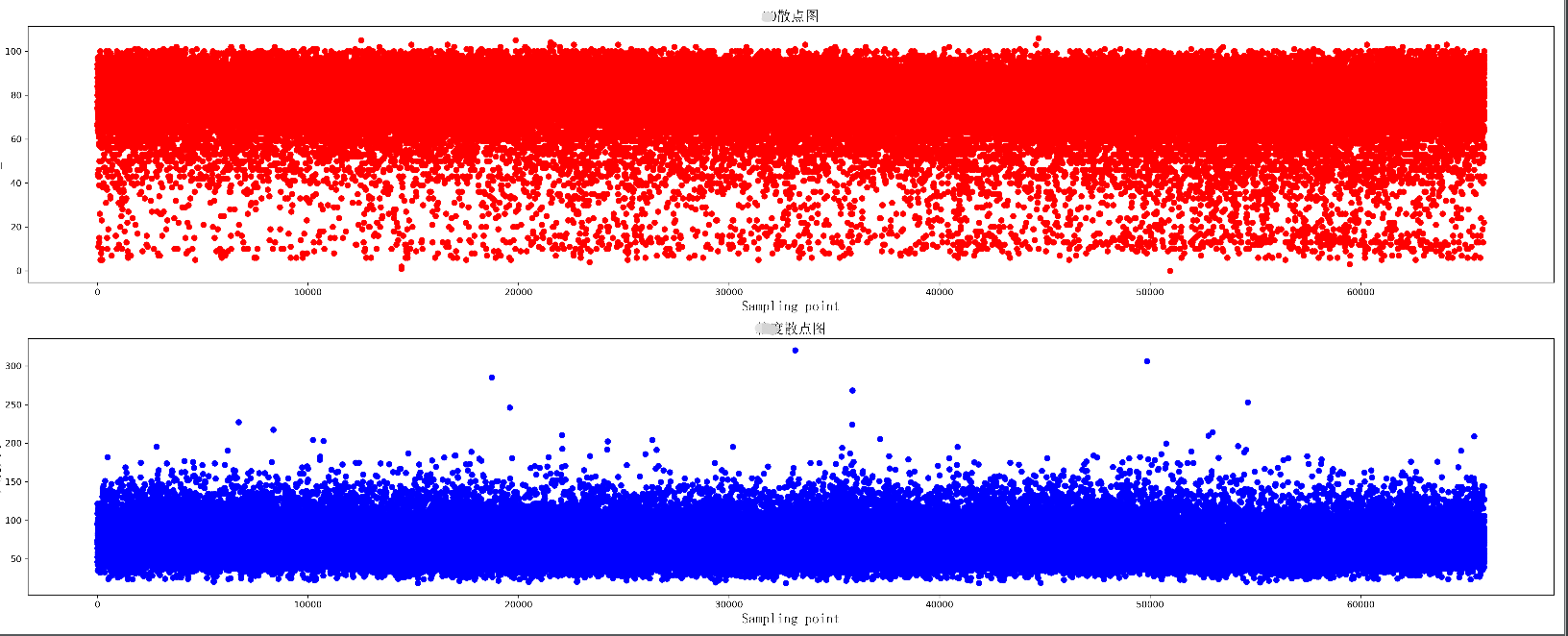
绘制两组数据的散点图,同时绘制两个散点图,上下分布在同一个图片中
 def K0_Scatter(K0_list, area_list, pic_name):

     plt.figure(figsize=(25, 10), dpi=300)

     # 导入中文字体,及字体大小

     zhfont = FontProperties(fname='C:/Windows/Fonts/simsun.ttc', size=16)

     ax = plt.subplot(211)

     # print(K0_list)

     ax.scatter(range(len(K0_list)), K0_list, c='r', marker='o')

     plt.title(u'散点图', fontproperties=zhfont)

     plt.xlabel('Sampling point', fontproperties=zhfont)

     plt.ylabel('K0_value', fontproperties=zhfont)

     ax = plt.subplot(212)

     ax.scatter(range(len(area_list)), area_list, c='b', marker='o')

     plt.xlabel('Sampling point', fontproperties=zhfont)

     plt.ylabel(u'大小', fontproperties=zhfont)

     plt.title(u'散点图', fontproperties=zhfont)

     # imgname = 'E:\\' + pic_name + '.png'

     # plt.savefig(imgname, bbox_inches = 'tight')

     plt.show()
散点图显示
绘制一个折线图 每个数据增加标签
 def K0_Plot(X_label, Y_label, pic_name):

     plt.figure(figsize=(25, 10), dpi=300)

     # 导入中文字体,及字体大小

     zhfont = FontProperties(fname='C:/Windows/Fonts/simsun.ttc', size=16)

     ax = plt.subplot(111)

     # print(K0_list)

     ax.plot(X_label, Y_label, c='r', marker='o')

     plt.title(pic_name, fontproperties=zhfont)

     plt.xlabel('coal_name', fontproperties=zhfont)

     plt.ylabel(pic_name, fontproperties=zhfont)

     # ax.xaxis.grid(True, which='major')

     ax.yaxis.grid(True, which='major')

     for a, b in zip(X_label, Y_label):

         str_label = a + str(b) + '%'

         plt.text(a, b, str_label, ha='center', va='bottom', fontsize=10)

     imgname = 'E:\\' + pic_name + '.png'

     plt.savefig(imgname, bbox_inches = 'tight')

     # plt.show()

绘制多条折线图
 def K0_MultPlot(dis_name, dis_lsit, pic_name):

     plt.figure(figsize=(80, 10), dpi=300)

     # 导入中文字体,及字体大小

     zhfont = FontProperties(fname='C:/Windows/Fonts/simsun.ttc', size=16)

     ax = plt.subplot(111)

     X_label = range(len(dis_lsit[1]))

     p1 = ax.plot(X_label, dis_lsit[1], c='r', marker='o',label='Euclidean Distance')

     p2 = ax.plot(X_label, dis_lsit[2], c='b', marker='o',label='Manhattan Distance')

     p3 = ax.plot(X_label, dis_lsit[4], c='y', marker='o',label='Chebyshev Distance')

     p4 = ax.plot(X_label, dis_lsit[5], c='g', marker='o',label='weighted Minkowski Distance')

     plt.legend()

     plt.title(pic_name, fontproperties=zhfont)

     plt.xlabel('coal_name', fontproperties=zhfont)

     plt.ylabel(pic_name, fontproperties=zhfont)

     # ax.xaxis.grid(True, which='major')

     ax.yaxis.grid(True, which='major')

     for a, b,c in zip(X_label, dis_lsit[5],dis_name):

         str_label = c + '_'+ str(b)

         plt.text(a, b, str_label, ha='center', va='bottom', fontsize=5)

     imgname = 'E:\\' + pic_name + '.png'

     plt.savefig(imgname,bbox_inches = 'tight')

     # plt.show()

图形显示还有许多小技巧,使得可视化效果更好,比如坐标轴刻度的定制,网格化等,后续进行整理
Python_散点图与折线图绘制的更多相关文章
- Qt数据可视化(散点图、折线图、柱状图、盒须图、饼状图、雷达图)开发实例
目录 散点图 折线图 柱状图 水平柱状图 水平堆叠图 水平百分比柱状图 盒须图 饼状图 雷达图 Qt散点图.折线图.柱状图.盒须图.饼状图.雷达图开发实例. 在开发过程中我们会使用多各种各样的图 ...
- python 绘图---2D、3D散点图、折线图、曲面图
python中绘制2D曲线图需要使用到Matplotlib,Matplotlib 是一个 Python 的 2D绘图库,它以各种硬拷贝格式和跨平台的交互式环境生成出版质量级别的图形,通过 Matplo ...
- qt外部数据传入实现动态的折线图绘制
在嵌入式开发中,实现数据收集与显示很常见,对于希望数据稳定的应用来说, 折现图的表现形式很符合条件. 本实现是通过qt的signal-slot来 ...
- [Python Study Notes]折线图绘制
''''''''''''''''''''''''''''''''''''''''''''''''''''''''''''''''''''''''''''''''''''''''''''''''''' ...
- JAVA Swing使用JFreeChart实现折线图绘制
效果如下: 实现步骤: 1.导入JAR包 jfreechart官网下载的zip文件中包含这两个jar包 2.代码编写 import org.jfree.chart.ChartFactory; impo ...
- matplotlib常见绘图基础代码小结:折线图、散点图、条形图、直方图、饼图
一.折线图 二.散点图 三.条形图 四.直方图 五.饼图 一.折线图折线图用于显示随时间或有序类别的变化趋势 from matplotlib import pyplot as plt x = rang ...
- Matplotlib数据可视化(4):折线图与散点图
In [1]: from matplotlib import pyplot as plt import numpy as np import matplotlib as mpl mpl.rcParam ...
- OpenGL——折线图柱状图饼图绘制
折线图绘制代码: #include<iostream> //旧版本 固定管线 #include<Windows.h> #include <GL/glut.h> // ...
- R in action读书笔记(15)第十一章 中级绘图 之二 折线图 相关图 马赛克图
第十一章 中级绘图 本节用到的函数有: plot legend corrgram mosaic 11.2折线图 如果将散点图上的点从左往右连接起来,那么就会得到一个折线图. 创建散点图和折线图: &g ...
随机推荐
- java中的equals方法与"=="运算符解说
在编程的时候,我们可能经常会用到equals方法,那么这个equals方法和运算符“==”有什么样的区别? public class equal { /** * @param args */ publ ...
- 二分练习题2 查找大于等于x的最小元素 题解
题目描述 现在告诉你一个长度为 \(n\) 的有序数组 \(a_1, a_2, ..., a_n\) ,以及 \(q\) 次询问,每次询问会给你一个数 \(x\) ,对于每次询问,你需要输出数组 \( ...
- centos7 下安装mysql5.7 数据库并使用nevicat连接数据库
安装mysql5.7的教程: https://www.cnblogs.com/yybrhr/p/9810375.html 遇到的问题: 无法连接,到阿里云服务器安全组设置3306端口
- FJUT2019暑假周赛一题解
A.排队问题*-* 题意就是有长度为L的序列,每位的取值可以是'f'或者'm',问不包含'fff'和'fmf'的个数. 打表找规律 不难找出递推公式为F[n] = F[n-1] + F[n-3] + ...
- ACM团队周赛题解(3)
940和822两套div.2 老规矩 #define MAXN 1000000+5#define MOD 1000000007#define PI (acos(-1.0))#define EPS 1e ...
- 摩托罗拉GP68对讲机官方说明书下载,包含使用说明压音表和电路结构等
摩托罗拉GP68对讲机官方说明书,包含使用说明和电路结构等 1.使用说明书 链接: https://pan.baidu.com/s/1fhXXaBp-MSuQs9Sv3v_Crg 提取码: mc3e ...
- charles 界面
本文参考:charles 界面 没有用过,先留个记号,以后再来看 profiles contain a complete copy of all your configuration settings ...
- 浅谈ViewPager与TabLayout的简单用法
今天介绍一下ViewPager与TabLayout的简单用法 1.准备 在一切开始之前,你懂得,先导库,老方法,在build.gradle直接添加下面这一句 implementation ...
- 【PTA】浙江大学数据结构慕课 课后编程作业 03-树1 树的同构
题目内容 给定两棵树T1和T2.如果T1可以通过若干次左右孩子互换就变成T2,则我们称两棵树是"同构"的.例如图1给出的两棵树就是同构的,因为我们把其中一棵树的结点A.B.G的左右 ...
- JavaScript之数学对象Math
Javascript 中Math和其他对象不同,它具有数学常数和函数的属性和方法.因为它的属性是数学常数,所以不能被改变(可以进行赋值操作,但最后值不变). Math的方法就是普通函数,调用他们直接用 ...