Python_散点图与折线图绘制
在数据分析的过程中,经常需要将数据可视化,目前常使用的:散点图 折线图
需要import的外部包 一个是绘图 一个是字体导入
import matplotlib.pyplot as plt

from matplotlib.font_manager import FontProperties
在数据处理前需要获取数据,从TXT XML csv excel 等文本中获取需要的数据,保存到list
 def GetFeatureList(full_path_file):

     file_name = full_path_file.split('\\')[-1][0:4]

     # print(file_name)

     # print(full_name)

     K0_list = []

     Area_list = []

     all_lines = []

     f = open(full_path_file,'r')

     all_lines = f.readlines()

     lines_num = len(all_lines)

     # 数据清洗

     if lines_num > 5000:

         for i in range(3,lines_num-1):

             temp_k0 = int(all_lines[i].split('\t')[1])

             if temp_k0 == 0:

                 K0_list.append(ComputK0(all_lines[i]))

             else:

                 K0_list.append(temp_k0)

             Area_list.append(float(all_lines[i].split('\t')[15]))

         # K0_Scatter(K0_list,Area_list,file_name)

     else:

         print('{} 该样本量少于5000'.format(file_name))

     return K0_list, Area_list,file_name
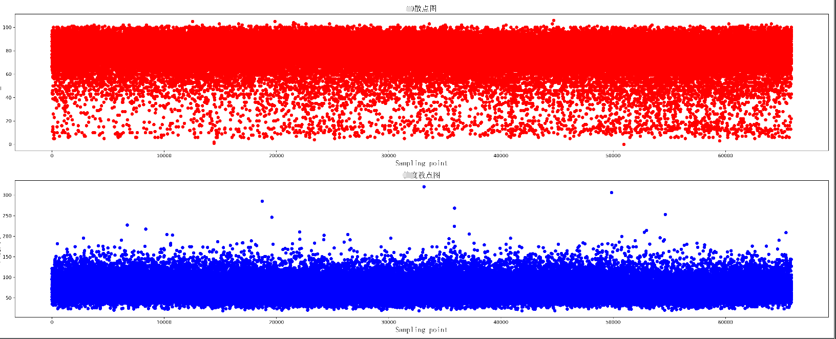
绘制两组数据的散点图,同时绘制两个散点图,上下分布在同一个图片中
 def K0_Scatter(K0_list, area_list, pic_name):

     plt.figure(figsize=(25, 10), dpi=300)

     # 导入中文字体,及字体大小

     zhfont = FontProperties(fname='C:/Windows/Fonts/simsun.ttc', size=16)

     ax = plt.subplot(211)

     # print(K0_list)

     ax.scatter(range(len(K0_list)), K0_list, c='r', marker='o')

     plt.title(u'散点图', fontproperties=zhfont)

     plt.xlabel('Sampling point', fontproperties=zhfont)

     plt.ylabel('K0_value', fontproperties=zhfont)

     ax = plt.subplot(212)

     ax.scatter(range(len(area_list)), area_list, c='b', marker='o')

     plt.xlabel('Sampling point', fontproperties=zhfont)

     plt.ylabel(u'大小', fontproperties=zhfont)

     plt.title(u'散点图', fontproperties=zhfont)

     # imgname = 'E:\\' + pic_name + '.png'

     # plt.savefig(imgname, bbox_inches = 'tight')

     plt.show()
散点图显示
绘制一个折线图 每个数据增加标签
 def K0_Plot(X_label, Y_label, pic_name):

     plt.figure(figsize=(25, 10), dpi=300)

     # 导入中文字体,及字体大小

     zhfont = FontProperties(fname='C:/Windows/Fonts/simsun.ttc', size=16)

     ax = plt.subplot(111)

     # print(K0_list)

     ax.plot(X_label, Y_label, c='r', marker='o')

     plt.title(pic_name, fontproperties=zhfont)

     plt.xlabel('coal_name', fontproperties=zhfont)

     plt.ylabel(pic_name, fontproperties=zhfont)

     # ax.xaxis.grid(True, which='major')

     ax.yaxis.grid(True, which='major')

     for a, b in zip(X_label, Y_label):

         str_label = a + str(b) + '%'

         plt.text(a, b, str_label, ha='center', va='bottom', fontsize=10)

     imgname = 'E:\\' + pic_name + '.png'

     plt.savefig(imgname, bbox_inches = 'tight')

     # plt.show()

绘制多条折线图
 def K0_MultPlot(dis_name, dis_lsit, pic_name):

     plt.figure(figsize=(80, 10), dpi=300)

     # 导入中文字体,及字体大小

     zhfont = FontProperties(fname='C:/Windows/Fonts/simsun.ttc', size=16)

     ax = plt.subplot(111)

     X_label = range(len(dis_lsit[1]))

     p1 = ax.plot(X_label, dis_lsit[1], c='r', marker='o',label='Euclidean Distance')

     p2 = ax.plot(X_label, dis_lsit[2], c='b', marker='o',label='Manhattan Distance')

     p3 = ax.plot(X_label, dis_lsit[4], c='y', marker='o',label='Chebyshev Distance')

     p4 = ax.plot(X_label, dis_lsit[5], c='g', marker='o',label='weighted Minkowski Distance')

     plt.legend()

     plt.title(pic_name, fontproperties=zhfont)

     plt.xlabel('coal_name', fontproperties=zhfont)

     plt.ylabel(pic_name, fontproperties=zhfont)

     # ax.xaxis.grid(True, which='major')

     ax.yaxis.grid(True, which='major')

     for a, b,c in zip(X_label, dis_lsit[5],dis_name):

         str_label = c + '_'+ str(b)

         plt.text(a, b, str_label, ha='center', va='bottom', fontsize=5)

     imgname = 'E:\\' + pic_name + '.png'

     plt.savefig(imgname,bbox_inches = 'tight')

     # plt.show()

图形显示还有许多小技巧,使得可视化效果更好,比如坐标轴刻度的定制,网格化等,后续进行整理
Python_散点图与折线图绘制的更多相关文章
- Qt数据可视化(散点图、折线图、柱状图、盒须图、饼状图、雷达图)开发实例
目录 散点图 折线图 柱状图 水平柱状图 水平堆叠图 水平百分比柱状图 盒须图 饼状图 雷达图 Qt散点图.折线图.柱状图.盒须图.饼状图.雷达图开发实例. 在开发过程中我们会使用多各种各样的图 ...
- python 绘图---2D、3D散点图、折线图、曲面图
python中绘制2D曲线图需要使用到Matplotlib,Matplotlib 是一个 Python 的 2D绘图库,它以各种硬拷贝格式和跨平台的交互式环境生成出版质量级别的图形,通过 Matplo ...
- qt外部数据传入实现动态的折线图绘制
在嵌入式开发中,实现数据收集与显示很常见,对于希望数据稳定的应用来说, 折现图的表现形式很符合条件. 本实现是通过qt的signal-slot来 ...
- [Python Study Notes]折线图绘制
''''''''''''''''''''''''''''''''''''''''''''''''''''''''''''''''''''''''''''''''''''''''''''''''''' ...
- JAVA Swing使用JFreeChart实现折线图绘制
效果如下: 实现步骤: 1.导入JAR包 jfreechart官网下载的zip文件中包含这两个jar包 2.代码编写 import org.jfree.chart.ChartFactory; impo ...
- matplotlib常见绘图基础代码小结:折线图、散点图、条形图、直方图、饼图
一.折线图 二.散点图 三.条形图 四.直方图 五.饼图 一.折线图折线图用于显示随时间或有序类别的变化趋势 from matplotlib import pyplot as plt x = rang ...
- Matplotlib数据可视化(4):折线图与散点图
In [1]: from matplotlib import pyplot as plt import numpy as np import matplotlib as mpl mpl.rcParam ...
- OpenGL——折线图柱状图饼图绘制
折线图绘制代码: #include<iostream> //旧版本 固定管线 #include<Windows.h> #include <GL/glut.h> // ...
- R in action读书笔记(15)第十一章 中级绘图 之二 折线图 相关图 马赛克图
第十一章 中级绘图 本节用到的函数有: plot legend corrgram mosaic 11.2折线图 如果将散点图上的点从左往右连接起来,那么就会得到一个折线图. 创建散点图和折线图: &g ...
随机推荐
- 代码整洁 vs 代码肮脏
写出整洁的代码,是每个程序员的追求.<clean code>指出,要想写出好的代码,首先得知道什么是肮脏代码.什么是整洁代码:然后通过大量的刻意练习,才能真正写出整洁的代码. WTF/mi ...
- HTML5有哪些新特性,移除了哪些元素?如何处理HTML5新标签的浏览器兼容性问题?如何区分HTML和HTML5?
HTML5现在已经不是SGML的子集,主要是关于图像,位置,存储,多任务等功能的增加. 绘画canvas: 用于媒介回放的video和audio元素: 本地离线存储localStorage长期存储数据 ...
- 剖析nsq消息队列(二) 去中心化代码源码解析
在上一篇帖子剖析nsq消息队列(一) 简介及去中心化实现原理中,我介绍了nsq的两种使用方式,一种是直接连接,还有一种是通过nslookup来实现去中心化的方式使用,并大概说了一下实现原理,没有什么难 ...
- 2、顺序表的实现(java代码)
1.这里实现了简单的顺序表的,为空判断.是否已满判断,插入.删除,查询元素下标等功能 public class Linear_List { private int[] arr; //用来保存数据 pr ...
- 关于设置tomcat端口为80的事
今天有人要求tomcat服务器的访问地址不能带端口访问, 也就是说只能用80端口访问网站. 那么问题来了, Ubuntu系统禁止root用户以外的用户访问1024以下的商品, 因此tomcat 默认为 ...
- CTC安装及其错误解决办法:binding.cpp:92:49: error: cannot convert ‘THCudaTensor*’ to ‘const THFloatTensor*’ for argument ‘1’ to ‘int64_t THFloatTensor_size(const THFloatTensor*, int)’
CTC安装: 1. 在终端执行命令:git clone https://github.com/SeanNaren/warp-c) (效果如下图,大家不用管我前面括号的内容,那是我打开的虚拟环境) 2. ...
- 【JVM学习】2.Java虚拟机运行时数据区
来源: 公众号: 猿人谷 这里我们先说句题外话,相信大家在面试中经常被问到介绍Java内存模型,我在面试别人时也会经常问这个问题.但是,往往都会令我比较尴尬,我还话音未落,面试者就会"背诵& ...
- 使用Hexo搭建个人博客并部署到GitHub或码云上全过程
一.前言 如上图所示:GitHub有Github Pages,而码云也有码云 Pages 1.Github Pages或Gitee Pages是什么呢? Github Pages或者Gitee Pag ...
- 《Ansible自动化运维:技术与最佳实践》第三章读书笔记
Ansible 组件介绍 本章主要通过对 Ansible 经常使用的组件进行讲解,使对 Ansible 有一个更全面的了解,主要包含以下内容: Ansible Inventory Ansible Ad ...
- git远程仓库常用命令
1. git add . 将工作区的文件推到暂存区: 2. git commit -m " 备注信息" 将暂存区内容提交 ...