css3 绘制书本
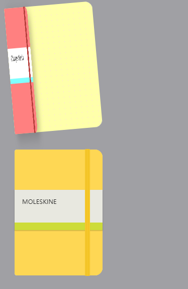
<!DOCTYPE html>

<html>

<head>

    <meta charset="utf-8" />

    <title>翻书的效果</title>

<style>

body{

    background-color:#A0A0A4;

    }

.book-wrapper{

    width: calc(100%/5);

    }

.book-notbook{

    margin:20px;

    position:relative;

    width: 175px;

    height: 250px;

    transition:.5s linear;

    transform-origin:left center 0;

    }

  .book-notbook:hover{

    transform:rotateZ(-5deg);

    }

.book-cover{

    position:absolute;

    background-color:#FF8080;

    width: 175px;

    height: 250px;

    z-index:10;

    border-radius:4px 15px 15px 4px;

    transition: all .5s linear;

    transform-origin:left center 0;

    }

  .book-notbook:hover .book-cover{

    transform:rotateY(-75deg);

    box-shadow: 20px 10px 50px rgb(0,0,0,.2);

    }

.book-cover:before{

    position:absolute;

    right:10%;

    top:-1px;

    content:" ";

    width:10px;

    height:calc(100% + 2px);

    border-radius:2px;

    z-index:100;

    transition: 2s ease;

    background:linear-gradient(to right,#9c2e2b 0%,  #cc4b48 15%, #9c2e2b 30%,  #cc4b48 45%, #9c2e2b 60%,  #cc4b48 75%, #9c2e2b 90%,  #cc4b48 100%)

    }

.book-title{

    position:relative;

    height:50px;

    top:80px;

    background-color:#fff;

    padding:10px 20px;

    font-size:14px;

    }

.book-title:before{

    content:"";

    position:absolute;

    left:0;

    bottom:0;

    width:100%;

    height:10px;

    background-color:#7FFFFF;

    }

.book-content{

    position:absolute;

    top:0;

    border-radius:4px 15px 15px 4px;

    width:175px;

    height:250px;

    background-color:#fbfae8;

    overflow: hidden;

    z-index:0;

    }

.book-content.dotted{

    transition:.5s linear;

    transform-origin:left center 0;

    }

.page1{

    background:linear-gradient(90deg, #FFA 10px, transparent 1%) center,linear-gradient(#FFA 10px, transparent 1%) center, #FCF;

    background-size: 11px 11px;

    z-index:3;

    }

.book-content:hover.page1{

    transform:rotateY(-70deg);

    box-shadow: 20px 10px 50px rgb(0,0,0,.2);

    }

.page2{

    background:linear-gradient(90deg, #CCF 10px, transparent 1%) center,linear-gradient(#CCF 10px, transparent 1%) center, #D40000;

    background-size: 11px 11px;

    z-index:2;

    }

.page3{

    z-index:1;

    background:linear-gradient(90deg, #fbfae8 10px, transparent 1%) center,linear-gradient(#fbfae8 10px, transparent 1%) center, #999;

    background-size: 11px 11px;

    }

.moleskine-wrapper {

  max-width: calc(100% / 4);

}

.moleskine-notebook {

  height: 250px;

  width: 175px;

  position: relative;

  transition: .5s linear;

  border-radius: 5px 15px 15px 5px;

  transform-origin: left center 0px;

  /* display: inline-block; */

  margin: 30px;

}

.moleskine-notebook:hover {

  transform: rotateZ(-10deg);

}

.moleskine-notebook:hover .notebook-cover {

  transform: rotateY(-50deg);

  z-index: 999;

  box-shadow: 20px 10px 50px rgba(0, 0, 0, 0.2);

}

.notebook-cover {

  background: #cc4b48;

  height: 250px;

  width: 175px;

  position: absolute;

  border-radius: 5px 15px 15px 5px;

  z-index: 10;

  transition: .5s linear;

  transform-style: preserve-3d;

  transform-origin: left center 0px;

}

.notebook-cover:before {

  content: "";

  position: absolute;

  width: 10px;

  height: calc(100% + 2px);

  top: -1px;

  z-index: 100;

  border-radius: 2px;

  right: 25px;

  transition: 2s ease;

  background: linear-gradient(to right, #9c2e2b 0%, #cc4b48 12%, #9c2e2b 25%, #cc4b48 37%, #9c2e2b 50%, #cc4b48 62%, #9c2e2b 75%, #cc4b48 87%, #9c2e2b 100%);

}

.notebook-cover.yellow {

  background: #fed754;

}

.notebook-cover.yellow:before {

  background: linear-gradient(to right, #ebb501 0%, #fed754 12%, #ebb501 25%, #fed754 37%, #ebb501 50%, #fed754 62%, #ebb501 75%, #fed754 87%, #ebb501 100%);

}

.notebook-skin {

  height: 50px;

  background: #e8e8e0;

  margin-top: 80px;

  padding: 15px;

  font-size: 12px;

  position: relative;

  z-index: 10;

  color: #222;

  text-align: left;

  box-shadow: 0 1px 1px rgba(0, 0, 0, 0.2);

}

.notebook-skin:before {

  content: '';

  position: absolute;

  width: 100%;

  height: 15px;

  left: 0;

  bottom: 0;

  background: #cddc39;

}

.notebook-page {

  height: 100%;

  width: 175px;

  position: absolute;

  background-color: #fbfae8;

  z-index: 0;

  border-radius: 5px 16px 16px 5px;

  overflow: hidden;

}

.notebook-page.squared {

  background-image: linear-gradient(#e4e4e4 1px, transparent 1px), linear-gradient(90deg, #e4e4e4 1px, transparent 1px);

  background-size: 10px 10px, 10px 10px, 2px 2px, 2px 2px;

}

</style>

</head>

<body>

    <div class="book-wrapper">

        <div class="book-notbook">

           <div class="book-cover">

                   <div class="book-title">

                   Change World

                </div>

           </div>

           <div class="book-content dotted page1"></div>

           <div class="book-content dotted page2"></div>

           <div class="book-content dotted page3"></div>

        </div>

    </div>

    <div class="moleskine-wrapper">

    <div class="moleskine-notebook">

      <div class="notebook-cover yellow">

        <div class="notebook-skin">MOLESKINE</div>

      </div>

      <div class="notebook-page squared"></div>

    </div>

  </div>

</body>

</html>
css3 绘制书本的更多相关文章
- CSS3绘制六边形
因为很简单,所以先总结一下:使用CSS3绘制六边形主要使用伪类:before和:after在源元素之前和之后再绘制两个元素,并利用css3的边框样式,将这两个元素变成三角形放置在源元素的两端即可. ( ...
- CSS3绘制旋转的太极图案(一)
实现步骤: 基础HTML: <div class="box-taiji"> <div class="circle-01">< ...
- css3绘制几何图形
用css3绘制你需要的几何图形 1.圆形 示例: 思路:给任何正方形元素设置一个足够大的 border-radius ,就可以把它变成一个圆形.代码如下: html: <div class=&q ...
- 用纯CSS3绘制萌系漫画人物动态头像
大家已经见惯了用CSS3画的图标.LOGO.头像,这次台湾同学Rei给我们带来了用纯CSS3绘制的日本动漫<轻音少女>女主角秋山澪的动态头像.看到动图我震惊了!!!CSS3的强大再次霸气测 ...
- css3绘制腾讯logo
CSS3绘制的腾讯LOGO,下边是对比图. 演示地址
- 【项目1-1】使用HTML5+CSS3绘制HTML5的logo
作为一个WEB小萌新,自学了有一段时间,总是感觉停滞不前.最近反思中,想到前贤一句话:书读百遍其义自见.说到底,还是项目做的少,如果做多了,想必自然会得心应手. 利用HTML5+CSS3绘制HTML5 ...
- CSS3绘制砖墙-没实用不论什么图片
<!DOCTYPE html PUBLIC "-//W3C//DTD XHTML 1.0 Transitional//EN" "http://www.w3.org/ ...
- 使用 CSS3 绘制 Hello Kitty
偶然间看到了 SegmentFault 上的一篇文章,感觉这个 Hello Kitty 画的还不错,心血来潮也用 CSS3 画了个 Hello Kitty,现在在这里记录一下详细的绘制过程.想要源码. ...
- 详解使用CSS3绘制矩形、圆角矩形、圆形、椭圆形、三角形、弧
1.矩形 绘制矩形应该是最简单的了,直接设置div的宽和高,填充颜色,效果就出来了. 2.圆角矩形 绘制圆角矩形也很简单,在1的基础上,在使用css3的border-radius,即可. 3.圆 根据 ...
随机推荐
- Spring MVC学习总结(13)——Spring MVC集成Swagger时文档无法排序问题
添加排序属性: window.swaggerUi = new SwaggerUi({ ... apisSorter: "alpha", // can also ...
- JavaSE 学习笔记之Jdk5.0新特性(十九)
Jdk5.0新特性: Collection在jdk1.5以后,有了一个父接口Iterable,这个接口的出现的将iterator方法进行抽取,提高了扩展性. --------------------- ...
- 超级钢琴(codevs 2934)
题目描述 Description 小Z是一个小有名气的钢琴家,最近C博士送给了小Z一架超级钢琴,小Z希望能够用这架钢琴创作出世界上最美妙的音乐. 这架超级钢琴可以弹奏出n个音符,编号为1至n.第i个音 ...
- js禁止滚动条滚动,并且滚动条不消失,页面大小不变
//禁止滚动条滚动 function unScroll() { var top = $(document).scrollTop(); $(document).on('scroll.unable',fu ...
- ASM instance正常启动,但是用sqlplus 连不上的问题
首先,这是oracle 11g 11.0.2.3 版本.这是一个神奇的问题. asm instance启动正常,但是用sqlplus 去连接的时候会显示如下: [oracle@racnode1 ~]$ ...
- 第十五周oj刷题——Problem M: C++习题 矩阵求和--重载运算符
Description 有两个矩阵a和b,均为2行3列.求两个矩阵之和.重载运算符"+",使之能用于矩阵相加(如c=a+b). 重载流插入运算符"<<&quo ...
- cordova windows环境配置
* 安装Cordova 1.cordova是利用nodeJS进行管理,所以要先下载nodeJS. 2. 打开命令窗口,输入:“npm install -g cordova”即可安装 3. 安装后,输入 ...
- JQuery之replace以及给控件赋值
<input type="hidden" name="ImgUrl" readonly="readonly"> <inpu ...
- Android 自己定义圆圈进度并显示百分比例控件(纯代码实现)
首先,感谢公司能给我闲暇的时间,来稳固我的技术,让我不断的去探索研究,在此不胜感激. 先不说实现功能,上图看看效果 watermark/2/text/aHR0cDovL2Jsb2cuY3Nkbi5uZ ...
- codeforce1070 2018-2019 ICPC, NEERC, Southern Subregional Contest (Online Mirror, ACM-ICPC Rules, Teams Preferred) 题解
秉承ACM团队合作的思想懒,这篇blog只有部分题解,剩余的请前往星感大神Star_Feel的blog食用(表示男神汉克斯更懒不屑于写我们分别代写了下...) C. Cloud Computing 扫 ...