html+css第四篇
浮动
float浮动:

1、块在一排显示

    2、内联支持宽高

    3、默认内容撑开宽度

     4、脱离文档流

    5、提升层级半层

float:left | right | none | inherit;

文档流是文档中可显示对象在排列时所占用的位置。

浮动的定义:使元素脱离文档流,按照指定方向发生移动,遇到父级边界或者相邻的浮动元素停了下来。

clear:left | right | both | none | inherit;元素的某个方向上不能有浮动元素

    clear:both;  在左右两侧均不允许浮动元素。

清除浮动方法:

1.加高

问题:扩展性不好

2.父级浮动

问题:页面中所有元素都加浮动,margin左右自动失效(floats bad !)

3.inline-block 清浮动方法:

    问题:margin左右自动失效;

4.空标签清浮动

问题:IE6 最小高度 19px;(解决后IE6下还有2px偏差)

.br清浮动

问题:不符合工作中:结构、样式、行为,三者分离的要求。

6.after伪类 清浮动方法(现在主流方法)

.clear:after{content:'';display:block;clear:both;}

.clear{zoom:1;}

after伪类: 元素内部末尾添加内容;

        :after{content"添加的内容";} IE6,7下不兼容

zoom 缩放

        a、触发 IE下 haslayout,使元素根据自身内容计算宽高。

        b、FF 不支持;

7.overflow:hidden 清浮动方法;

    问题:需要配合 宽度 或者 zoom 兼容IE6 IE7;

overflow:  scroll | auto | hidden;

    overflow:hidden;溢出隐藏(裁刀!)

IE6双边距BUG(IE6下块属性标签浮动,并且有横向margin,横向margin加倍。):

    a、IE6

    b、浮动

    c、横向margin

    d、块属性标签(加display:inline;)

IE6下 li部分兼容性问题:

    a、左右两列布局,右边右浮动IE6 IE7下折行;(左边元素浮动)

    b、IE6 IE7  li  下元素都浮动 在IE6 IE7下 li 下方会产生4px间隙问题;(加vertical-align:top;)

vertical-align 垂直对齐方式

a、加垂直对齐方式的同排元素都要加垂直对齐方式;

b、垂直对齐方式可以解决元素下方间隙问题;

图片下方间隙问题

    a、display:block; (改变标签本身特性)

    b、overflow:hidden; (必须知道图片高度)

    d、vertical-align (暂时最完美的方案)
day01-浮动
<!DOCTYPE HTML>
<html>
<head>
<meta http-equiv="Content-Type" content="text/html; charset=utf-8">
<title>无标题文档</title>
<style>
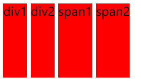
div,span{height:100px;background:red; display:inline-block;}
/*
inline-block 1.使块元素在一行显示 2.使内嵌支持宽高 3.换行被解析了 4.不设置宽度的时候宽度由内容撑开 5.在IE6,7下不支持块标签 */
</style>
</head>
<body>
<div class="div1">div1</div>
<div class="div2">div2</div>
<span class="span1">span1</span>
<span class="span2">span2</span>
</body>
</html>
效果:
day02-浮动
<!DOCTYPE HTML>

<html>

<head>

<meta http-equiv="Content-Type" content="text/html; charset=utf-8">

<title>无标题文档</title>

<style>

div,span{height:100px;background:red;border:1px solid #000; float:left;}

/*

inline-block

1.使块元素在一行显示

2.使内嵌支持宽高

3.换行被解析了

4.不设置宽度的时候宽度由内容撑开

5.在IE6,7下不支持块标签

浮动:

1.使块元素在一行显示

2.使内嵌支持宽高

3.不设置宽度的时候宽度由内容撑开

*/

</style>

</head>

<body>

<div class="div1">div1</div>

<div class="div2">div2</div>

<span class="span1">span1</span>

<span class="span2">span2</span>

</body>

</html>
效果:

day03-浮动
<!DOCTYPE HTML>
<html>
<head>
<meta http-equiv="Content-Type" content="text/html; charset=utf-8">
<title>无标题文档</title>
<style>
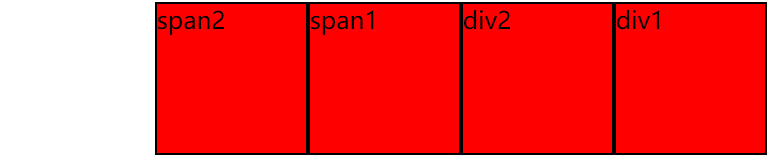
div,span{height:100px;background:red;border:1px solid #000; float:right; width:100px;}
/*
inline-block 1.使块元素在一行显示 2.使内嵌支持宽高 3.换行被解析了 4.不设置宽度的时候宽度由内容撑开 5.在IE6,7下不支持块标签 浮动: left/right/none
1.使块元素在一行显示 2.使内嵌支持宽高 3.不设置宽度的时候宽度由内容撑开 */
</style>
</head>
<body>
<div class="div1">div1</div>
<div class="div2">div2</div>
<span class="span1">span1</span>
<span class="span2">span2</span>
</body>
</html>
效果:
day04-浮动
<!DOCTYPE HTML>
<html>
<head>
<meta http-equiv="Content-Type" content="text/html; charset=utf-8">
<title>无标题文档</title>
<style>
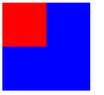
.box1{ width:100px;height:100px;background:red; float:left;}
.box2{ width:200px;height:200px;background:blue;}
/*
浮动: left/right/none 元素加了浮动,会脱离文档流 ,按照指定的一个方向移动直到碰到父级的边界或者另外一个浮动元素停止 1.使块元素在一行显示 2.使内嵌支持宽高 3.不设置宽度的时候宽度由内容撑开 4.脱离文档流 ** 文档流是文档中可显示对象在排列时所占用的位置
*/
</style>
</head>
<body>
<div class="box1"></div>
<div class="box2"></div>
</body>
</html>
效果:
day05-浮动
<!DOCTYPE HTML>
<html>
<head>
<meta http-equiv="Content-Type" content="text/html; charset=utf-8">
<title>无标题文档</title>
<style>
body{ font-size:20px;}
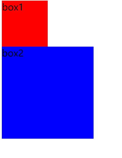
.box1{ width:100px;height:100px;background:red; float:left;}
.box2{ width:200px;height:200px;background:blue; clear:both;}
/*
浮动: left/right/none 元素加了浮动,会脱离文档流 ,按照指定的一个方向移动直到碰到父级的边界或者另外一个浮动元素停止 1.使块元素在一行显示 2.使内嵌支持宽高 3.不设置宽度的时候宽度由内容撑开 4.脱离文档流 5.提升层级半层 ** 文档流是文档中可显示对象在排列时所占用的位置 clear left/right/both/none 元素的某个方向不能有浮动元素
left 在左侧不允许浮动元素。
right 在右侧不允许浮动元素。
both 在左右两侧均不允许浮动元素。
none 默认值。允许浮动元素出现在两侧。
inherit 规定应该从父元素继承 clear 属性的值 */
</style>
</head>
<body>
<div class="box1">box1</div>
<div class="box2">box2</div>
</body>
</html>
效果:
day06-浮动
<!DOCTYPE HTML>
<html>
<head>
<meta http-equiv="Content-Type" content="text/html; charset=utf-8">
<title>无标题文档</title>
<style>
body{margin:0;}
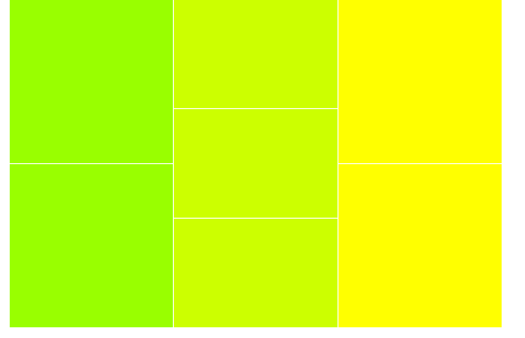
.box{width:900px;margin:0 auto;}
.left{width:300px;float:left;}
.left div{height:298px; background:#9F0;border:1px solid #fff;}
.center{width:300px;float:left;}
.center div{ height:198px;background:#CF0;border:1px solid #fff;}
.right{width:300px; float:right;}
.right div{ height:298px;background:#FF0;border:1px solid #fff;} </style>
</head>
<body>
<div class="box">
<div class="left">
<div></div>
<div></div>
</div>
<div class="center">
<div></div>
<div></div>
<div></div>
</div>
<div class="right">
<div></div>
<div></div>
</div>
</div>
</body>
</html>
效果:
day07-清浮动
<!DOCTYPE HTML>
<html>
<head>
<meta http-equiv="Content-Type" content="text/html; charset=utf-8">
<title>无标题文档</title>
<style>
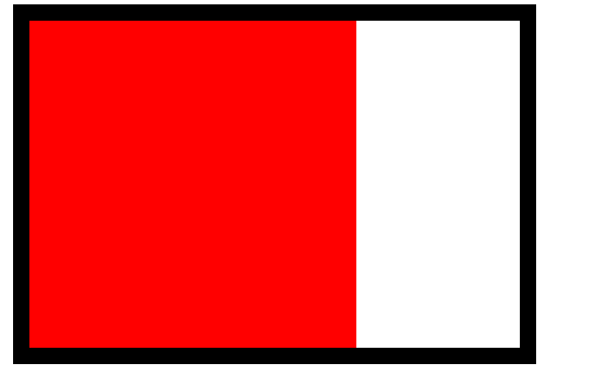
.box{ width:300px;margin:0 auto;border:10px solid #000; float:left;}
.div{ width:200px;height:200px;background:red;float:left;}
/*
清浮动
1.给父级也加浮动
*/
</style>
</head>
<body>
<div class="box">
<div class="div"></div>
</div>
</body>
</html>
效果:
day08-清浮动
<!DOCTYPE HTML>
<html>
<head>
<meta http-equiv="Content-Type" content="text/html; charset=utf-8">
<title>无标题文档</title>
<style>
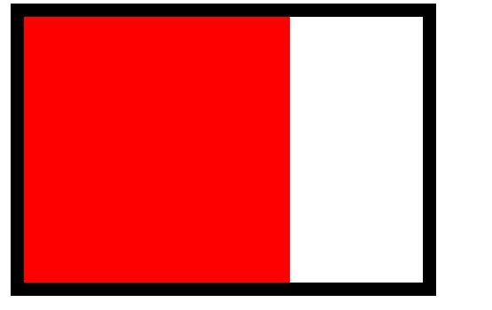
.box{ width:300px;margin:0 auto;border:10px solid #000; display:inline-block;}
.div{ width:200px;height:200px;background:red;float:left;}
/*
清浮动
1.给父级也加浮动
2.给父级加display:inline-block
*/
</style>
</head>
<body>
<div class="box">
<div class="div"></div>
</div>
</body>
</html>
效果:
day09-清浮动
<!DOCTYPE HTML>
<html>
<head>
<meta http-equiv="Content-Type" content="text/html; charset=utf-8">
<title>无标题文档</title>
<style>
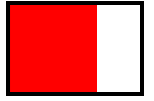
.box{ width:300px;margin:0 auto;border:10px solid #000;}
.div{ width:200px;height:200px;background:red;float:left;}
.clear{ height:0px;font-size:0;clear:both;}
/*
清浮动
1.给父级也加浮动
2.给父级加display:inline-block
3.在浮动元素下加<div class="clear"></div>
.clear{ height:0px;font-size:0;clear:both;}
*/
</style>
</head>
<body>
<div class="box">
<div class="div"></div>
<div class="clear"></div>
</div>
</body>
</html>
效果:

day10-IE6下的最小高度问题
<!DOCTYPE HTML>

<html>

<head>

<meta http-equiv="Content-Type" content="text/html; charset=utf-8">

<title>无标题文档</title>

<style>

body{ margin:0;background:#000;}

.box{height:5px;background:red; font-size:0;}

/*

    在IE6下高度小于19px的元素,高度会被当做19px来处理

    解决办法:font-size:0;

*/

</style>

</head>

<body>

<div class="box"></div>

</body>

</html>
效果:

day11-清浮动
<!DOCTYPE HTML>

<html>

<head>

<meta http-equiv="Content-Type" content="text/html; charset=utf-8">

<title>无标题文档</title>

<style>

.box{ width:300px;margin:0 auto;border:10px solid #000;}

.div{ width:200px;height:200px;background:red;float:left;}

/*

    清浮动

    1.给父级也加浮动

    2.给父级加display:inline-block

    3.在浮动元素下加<div class="clear"></div>

    .clear{ height:0px;font-size:0;clear:both;}

    4.在浮动元素下加<br clear="all"/>

*/

</style>

</head>

<body>

<div class="box">

    <div class="div"></div>

    <br clear="all"/>

</div>

</body>

</html>
效果:
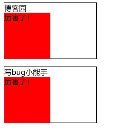
day12-after 在每个 <p> 元素的内容之后插入新内容:
<!DOCTYPE HTML>

<html>

<head>

<meta http-equiv="Content-Type" content="text/html; charset=utf-8">

<title>无标题文档</title>

<style>

p{width:200px;border:1px solid #000;}

p:after{content:"厉害了!";

 background:red; display:block;width:100px;height:100px;}

/*

    IE6,7下不支持after伪类

*/

</style>

</head>

<body>

<p>博客园</p>

<p>写bug小能手</p>

</body>

</html>
效果:
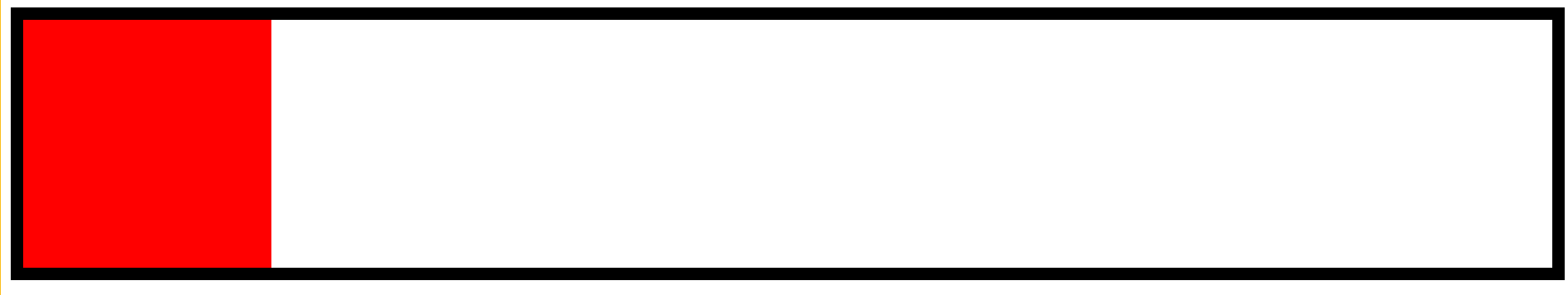
day13-清浮动
<!DOCTYPE HTML>

<html>

<head>

<meta http-equiv="Content-Type" content="text/html; charset=utf-8">

<title>无标题文档</title>

<style>

.box{margin:0 auto;border:10px solid #000;}

.div{ width:200px;height:200px;background:red;float:left;}

.clear{zoom:1;}

.clear:after{content:""; display:block;clear:both;}

/*

    清浮动

    1.给父级也加浮动

    2.给父级加display:inline-block

    3.在浮动元素下加<div class="clear"></div>

    .clear{ height:0px;font-size:0;clear:both;}

    4.在浮动元素下加<br clear="all"/>

    5. 给浮动元素的父级加{zoom:1;}

    :after{content:""; display:block;clear:both;}

    **在IE6,7下浮动元素的父级有宽度就不用清浮动

    haslayout 根据元素内容的大小 或者父级的父级的大小来重新的计算元素的宽高

  display: inline-block

  height: (任何值除了auto)

  float: (left 或 right)

  width: (任何值除了auto)

  zoom: (除 normal 外任意值)

*/

</style>

</head>

<body>

<div class="box clear">

    <div class="div"></div>

</div>

</body>

</html>
如图:
day14-overflow
<!DOCTYPE HTML>

<html>

<head>

<meta http-equiv="Content-Type" content="text/html; charset=utf-8">

<title>无标题文档</title>

<style>

.box{width:300px;height:300px;border:1px solid #000; font-size:12px;line-height:30px;overflow:hidden;}

h3{width:100px;height:30px;background:red;margin:0;}

/*

    overflow 溢出

        auto 溢出显示滚动条

        scroll 默认就显示滚动条

        hidden 溢出隐藏

*/

</style>

</head>

<body>

<div class="box">

    haslayout 是Windows Internet Explorer渲染引擎的一个内部组成部分。在InternetExplorer中,一个元素要么自己对自身的内容进行计算大小和组织,要么依赖于父元素来计算尺寸和组织内容。为了调节这两个不同的概念,渲染引擎采用了 hasLayout 的属性,属性值可以为true或false。当一个元素的 hasLayout属性值为true时,我们说这个元素有一个布局(layout)

要想更好的理解 css, 尤其是 IE 下对 css 的渲染,haslayout 是一个非常有必要彻底弄清楚的概念。大多IE下的显示错误,就是源于 haslayout。如果它设置成了true,它就不得不去渲染它自己,因此元素不得不扩展去包含它的流出的内容。例如浮动或者很长很长的没有截断的单词,如果haslayout没有被设置成true,那么元素得依靠某个祖先元素来渲染它。这就是很多的ie bugs诞生的地方。

</div>

<h3>写bug小能手</h3>

</body>

</html>
如图:

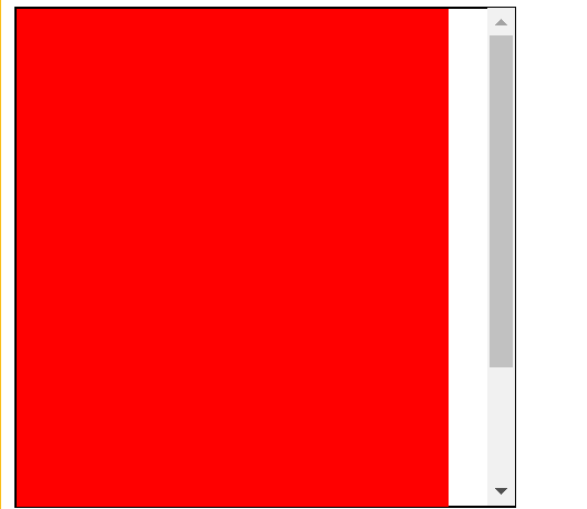
day15-overflow
<!DOCTYPE HTML>

<html>

<head>

<meta http-equiv="Content-Type" content="text/html; charset=utf-8">

<title>无标题文档</title>

<style>

.box{ width:300px;height:300px;border:1px solid #000;overflow:auto;}

.div1{ width:260px;height:400px;background:Red;float:left;}

</style>

</head>

<body>

<div class="box">

    <div class="div1"></div>

</div>

</body>

</html>
如图:
16.小练习
<!DOCTYPE HTML>

<html>

<head>

<meta http-equiv="Content-Type" content="text/html; charset=utf-8">

<title>无标题文档</title>

<style>

body,ul,dl,dd{margin:0;padding:0; font-family:"宋体";}

li{ list-style:none;}

a{ text-decoration:none;color:#4f6c84;}

img{ border:none; vertical-align:top;}

.clear{zoom:1;}

.clear:after{ content:"";display:block;clear:both;}

.wrap{width:445px;margin:30px auto;padding:12px 8px 0 7px; background:url(img/bg.gif) no-repeat 220px 0;}

.left{width:212px;float:left;}

.leftTop .pic{width:124px; background:url(img/picBg.gif) no-repeat right 0;padding-right:5px;float:left;}

.leftTop .pic a{border:1px solid #c3cfd9; display:block;padding:3px; height:86px;}

.leftTop dl{float:left;width:60px;padding-left:5px; font-size:12px; line-height:20px;color:#7190a6;}

.leftBottom{padding-top:10px;}

.leftBottom li{font-size:12px; line-height:20px;padding-left:10px; background:url(img/liBg.gif) no-repeat 0 7px;}

.right{width:220px;float:right;}

.right li{width:100px;float:left;padding-left:10px;}

.right a{ display:block;}

.right img{border:1px solid #c3cfd9;padding:3px;}

.right strong{ display:block;padding-top:3px;font:normal 12px/24px "宋体"; text-align:center;}

</style>

</head>

<body>

<div class="wrap clear">

    <div class="left">

        <div class="leftTop clear">

            <div class="pic">

                <a href="#">

                    <img src="img/pic.gif" />

                </a>

            </div>

            <dl>

                <dt><a href="#">潜伏</a></dt>

                <dd>导演:姜伟</dd>

                <dd>主演:姚晨 孙红雷</dd>

            </dl>

        </div>

        <ul class="leftBottom">

            <li><a href="#">海清张嘉译演绎房奴生活《蜗居》</a></li>

            <li>

                <a href="#">琼瑶经典言情剧集锦</a>

                <a href="#">梦露电影知多少</a>

            </li>

        </ul>

    </div>

    <ul class="right">

        <li>

            <a href="#">

                <img src="img/pic2.gif" />

                <strong>将爱情进行到底</strong>

            </a>

        </li>

        <li>

            <a href="#">

                <img src="img/pic2.gif" />

                <strong>将爱情进行到底</strong>

            </a>

        </li>

    </ul>

</div>

<!--

<div class="pic">

    <a href="#">

        <img/>

    </a>

</div>

<h3><a href="#">将爱情进行到底</a></h3>-->

</body>

</html>
效果:

html+css第四篇的更多相关文章
- IIS负载均衡-Application Request Route详解第四篇:使用ARR实现三层部署架构(转载)
IIS负载均衡-Application Request Route详解第四篇:使用ARR实现三层部署架构 系列文章链接: IIS负载均衡-Application Request Route详解第一篇: ...
- 2天驾驭DIV+CSS (技巧篇)(转)
这是去年看到的一片文章,感觉在我的学习中,有不少的影响.于是把它分享给想很快了解css的兄弟们.本文是技巧篇. 基础篇[知识一] “DIV+CSS” 的叫法是不准确的[知识二] “DIV+CSS” ...
- 2天驾驭DIV+CSS (实战篇)(转)
这是去年看到的一片文章,感觉在我的学习中,有不少的影响.于是把它分享给想很快了解css的兄弟们.本文是实战篇. 基础篇[知识一] “DIV+CSS” 的叫法是不准确的[知识二] “DIV+CSS” ...
- 2天驾驭DIV+CSS (基础篇)(转)
这是去年看到的一片文章,感觉在我的学习中,有不少的影响.于是把它分享给想很快了解css的兄弟们. 基础篇[知识一] “DIV+CSS” 的叫法是不准确的[知识二] “DIV+CSS” 将你引入两大误区 ...
- 如何使用纯 CSS 制作四子连珠游戏
序言:你是否想过单纯使用 CSS 也可以制作一款游戏?甚至可以双人对决!这是一篇非常有趣的文章,作者详细讲解了使用纯 CSS 制作四子连珠游戏的思路以及使用奇淫巧技解决困难问题的方法.因为案例本身比较 ...
- 前端第四篇---前端基础之jQuery
前端第四篇---前端基础之jQuery 一.jQuery介绍 二.jQuery对象 三.jQuery基础语法 四.事件 五.动画效果 六.补充each 一.jQuery简介 1.jQuery介绍 jQ ...
- 从0开始搭建SQL Server AlwaysOn 第四篇(配置异地机房节点)
从0开始搭建SQL Server AlwaysOn 第四篇(配置异地机房节点) 第一篇http://www.cnblogs.com/lyhabc/p/4678330.html第二篇http://www ...
- 第四篇 Entity Framework Plus 之 Batch Operations
用 Entity Framework 进行 增,删,改.都是基于Model进行的,且Model都是有状态追踪的.这样Entity Framework才能正常增,删,改. 有时候,要根据某个字段,批量 ...
- 【第四篇】ASP.NET MVC快速入门之完整示例(MVC5+EF6)
目录 [第一篇]ASP.NET MVC快速入门之数据库操作(MVC5+EF6) [第二篇]ASP.NET MVC快速入门之数据注解(MVC5+EF6) [第三篇]ASP.NET MVC快速入门之安全策 ...
随机推荐
- RA-28000 账号被锁定的解决办法
ORA-28000 账号被锁定的解决办法 错误场景:当使用sqlplus进行登录时报错:ORA-28000 账号被锁定.错误原因:由于oracle 11g 在默认在default概要文件中设置了密码最 ...
- 【HMS Core 6.0全球上线】华为钥匙环服务,打造跨应用跨形态无缝登录体验
华为钥匙环服务(Keyring),是HMS Core在安全领域开放的全新服务,为全球开发者提供用户认证凭据(以下简称"凭据")本地存储和跨应用.跨形态共享能力,帮助您在安卓应用.快 ...
- CSP-J 2021 复赛游记
Day-1 啥也没干 晚上看了看洛谷的讨论,据说freopen在打开的最后要加 fclose(stdin);fclose(stdout); 不加也可.不过据说Linux在return 0之前不会自动关 ...
- SpringCloud-初见
目录 前言 微服务概述 微服务与微服务架构 微服务优缺点 微服务技术栈 为什么选择SpringCloud作为微服务架构 SpringCloud入门 SpringCloud和SpringBoot的关系 ...
- 2020BUAA软工个人博客作业
2020BUAA软工个人博客作业 17373010 杜博玮 项目 内容 这个作业属于哪个课程 2020春季计算机学院软件工程(罗杰 任健) 这个作业的要求在哪里 个人博客作业 我在这个课程的目标是 学 ...
- HZOI帝国2019欢乐时刻
前言: update 只是恢复一下原来手残删掉的博客,不是在水,嘤嘤嘤 update 以后改成Stack,但是之前的就懒得改了... by 10.31 为了窝的访问量大家的好心情,模仿学长搞了一个这个 ...
- vs2017和Qt5的字符编码问题
默认vs2017的源文件字符编码是gbk的格式,Qt5的内部字符编码为utf8的格式,Qt5又去掉了设置字符串的接口,这样在源文件中使用了字符串之后,就会出现乱码问题,对原有代码逐个修改字符串是不可能 ...
- NOIP模拟86(多校19)
T1 特殊字符串 解题思路 \(f_{i,j}\) 表示前 \(i\) 个字符中结尾为 \(j\) 的最大贡献. 转移枚举当前位置于之前位置结尾的组合加上贡献即可. 对于边界问题,容易发现选择 1 一 ...
- linux下创建文件的文件权限问题
今天发现创建文件的权限和自己规定的权限不一致,了解到了权限掩码的问题,这里总结一下. 首先权限掩码umask是chmod配套的,总共为4位(gid/uid,属主,组权,其它用户的权限),不过通常我们都 ...
- Manacher算法 求 最长回文子串
1 概述(扯淡) 在了解Manacher算法之前,我们得先知道什么是回文串和子串. 回文串,就是正着看反着看都一样的字符串.比如说"abba"就是一个回文串,"abbc& ...