bootstrap初探
- bootstrap资源
- http://getbootstrap.com
- http://github.com/twbs
- http://www.bootcss.com
- bootstrap栅格系统
- 容器:流体(container-fluid)、固定(container)
- 分12列,阈值 分辨率>=1200,container固定尺寸为1170px,若阈值在992到1200之间container固定尺寸为970px,若分辨率在992以下778以上为750px,778px以下为自适应,没有固定的宽度值
<!DOCTYPE HTML>

<html>

    <head>

        <meta http-equiv="Content-Type" content="text/html; charset=utf-8">

        <title>无标题文档</title>

        <meta http-equiv="X-UA-Compatible" content="IE=edge">

        <meta name="viewport" content="width=device-width, initial-scale=1">

        <link rel="stylesheet" href="css/bootstrap.css">

        <style>

            .container{ border:1px #000 solid;}

        </style>

    </head>

<body>

<!--<div class="container-fluid">

    aaaaaaaaa

</div>

-->

<div class="container">

    aaaaaaaaa

</div>

</body>

    <script src="js/jquery-2.1.3.js"></script>

    <script src="js/bootstrap.js"></script>

</html>
- 分为12列,可根据列数确定,demo如下
 <!DOCTYPE HTML>

 <html>

     <head>

         <meta http-equiv="Content-Type" content="text/html; charset=utf-8">

         <title>无标题文档</title>

         <meta http-equiv="X-UA-Compatible" content="IE=edge">

         <meta name="viewport" content="width=device-width, initial-scale=1">

         <link rel="stylesheet" href="css/bootstrap.css">

         <style>

             .container{ border:1px #000 solid; background: #CCC;}

             div[class*=col-] { color: white; border: 1px solid red;}

         </style>

     </head>

 <body>

 <div class="container">

     <div class="col-lg-1">col-lg-1</div>

     <div class="col-lg-11">col-lg-1</div>

 </div>

 </body>

     <script src="js/jquery-2.1.3.js"></script>

     <script src="js/bootstrap.js"></script>

 </html>
- 不同分辨率下,设置col-lg表示超大分辨率,col-md是中等分辨率,col-sm是pad类似大小,col-xs是移动设备,如果设置了col-*那么会按照相应的分辨率显示,如果小于相应的分辨率则会变为几行,demo如下,可自行运行,以及对应demo图片
<!DOCTYPE HTML>

<html>

    <head>

        <meta http-equiv="Content-Type" content="text/html; charset=utf-8">

        <title>无标题文档</title>

        <meta http-equiv="X-UA-Compatible" content="IE=edge">

        <meta name="viewport" content="width=device-width, initial-scale=1">

        <link rel="stylesheet" href="css/bootstrap.css">

        <style>

            .container{ border:1px #000 solid; background: #CCC;}

            div[class*=col-] { color: white; border: 1px solid red;}

        </style>

    </head>

<body>

<!--div class="container">

    <div class="col-lg-1">col-lg-1</div>

    <div class="col-lg-11">col-lg-1</div>

</div-->

<div class="container">

    <div class="row">

        <div class="col-lg-4">col-lg-4</div>

        <div class="col-lg-4">col-lg-4</div>

        <div class="col-lg-4">col-lg-4</div>

    </div>

    <div class="row">

        <div class="col-md-4">col-md-4</div>

        <div class="col-md-4">col-md-4</div>

        <div class="col-md-4">col-md-4</div>

    </div>

    <div class="row">

        <div class="col-sm-4">col-sm-4</div>

        <div class="col-sm-4">col-sm-4</div>

        <div class="col-sm-4">col-sm-4</div>

    </div>

    <div class="row">

        <div class="col-xs-4">col-xs-4</div>

        <div class="col-xs-4">col-xs-4</div>

        <div class="col-xs-4">col-xs-4</div>

    </div>

</div>

</body>

    <script src="js/jquery-2.1.3.js"></script>

    <script src="js/bootstrap.js"></script>

</html>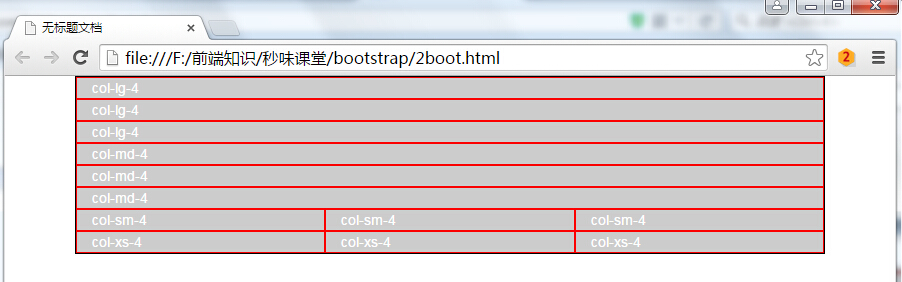
- 组合布局,可设置多个class,在分辨率为一个值得时候按照某个class显示,如果分辨率换成另外一个按照另外一个class显示,如下面demo所示,当分辨率大于1200时,按照col-lg显示四列,如果分辨率小于1200大于992,按照col-md显示三列
<!DOCTYPE HTML>

<html>

    <head>

        <meta http-equiv="Content-Type" content="text/html; charset=utf-8">

        <title>无标题文档</title>

        <meta http-equiv="X-UA-Compatible" content="IE=edge">

        <meta name="viewport" content="width=device-width, initial-scale=1">

        <link rel="stylesheet" href="css/bootstrap.css">

        <style>

            .container{ border:1px #000 solid; background: #CCC;}

            div[class*=col-] { color: white; border: 1px solid red;}

        </style>

    </head>

<body>

<div class="container">

    <div class="row">

        <div class="col-lg-3 col-md-4">col-lg-3 col-md-4</div>

        <div class="col-lg-3 col-md-4">col-lg-3 col-md-4</div>

        <div class="col-lg-3 col-md-4">col-lg-3 col-md-4</div>

        <div class="col-lg-3 col-md-4">col-lg-3 col-md-4</div>

    </div>

</div>

</body>

    <script src="js/jquery-2.1.3.js"></script>

    <script src="js/bootstrap.js"></script>

</html>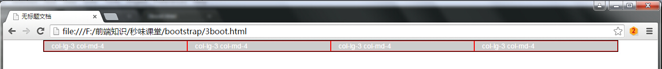

- 列偏移col-lg-offset-4,向右偏移4个网格距离,demo如下,代码运行效果如下
<!DOCTYPE HTML>

<html>

    <head>

        <meta http-equiv="Content-Type" content="text/html; charset=utf-8">

        <title>无标题文档</title>

        <meta http-equiv="X-UA-Compatible" content="IE=edge">

        <meta name="viewport" content="width=device-width, initial-scale=1">

        <link rel="stylesheet" href="css/bootstrap.css">

        <style>

            .container{ border:1px #000 solid; background: #CCC;}

            div[class^=col-] { color: white; border: 1px solid red;}

        </style>

    </head>

<body>

<div class="container">

    <div class="row">

        <div class="col-lg-3">col-lg-3</div>

        <div class="col-lg-3">col-lg-3</div>

        <div class="col-lg-3">col-lg-3</div>

        <div class="col-lg-3">col-lg-3</div>

    </div>

    <div class="row">

        <div class="col-lg-4 col-lg-offset-3">col-lg-4</div>

    </div>

</div>

</body>

    <script src="js/jquery-2.1.3.js"></script>

    <script src="js/bootstrap.js"></script>

</html>
- 最多偏移为12,若大于12则不起任何作用,demo以及代码运行效果如下
<!DOCTYPE HTML>

<html>

    <head>

        <meta http-equiv="Content-Type" content="text/html; charset=utf-8">

        <title>无标题文档</title>

        <meta http-equiv="X-UA-Compatible" content="IE=edge">

        <meta name="viewport" content="width=device-width, initial-scale=1">

        <link rel="stylesheet" href="css/bootstrap.css">

        <style>

            .container{ border:1px #000 solid; background: #CCC;}

            div[class^=col-] { color: white; border: 1px solid red;}

        </style>

    </head>

<body>

<div class="container">

    <div class="row">

        <div class="col-lg-3">col-lg-3</div>

        <div class="col-lg-3">col-lg-3</div>

        <div class="col-lg-3">col-lg-3</div>

        <div class="col-lg-3">col-lg-3</div>

    </div>

    <div class="row">

        <div class="col-lg-4 col-lg-offset-13">col-lg-4 col-lg-offset-13</div>

    </div>

</div>

</body>

    <script src="js/jquery-2.1.3.js"></script>

    <script src="js/bootstrap.js"></script>

</html>
- 列排序col-lg-push往后(往右)移动若干个,col-lg-pull往前(往左)移动若干个
<!DOCTYPE HTML>

<html>

    <head>

        <meta http-equiv="Content-Type" content="text/html; charset=utf-8">

        <title>无标题文档</title>

        <meta http-equiv="X-UA-Compatible" content="IE=edge">

        <meta name="viewport" content="width=device-width, initial-scale=1">

        <link rel="stylesheet" href="css/bootstrap.css">

        <style>

            .container{ border:1px #000 solid; background: #CCC;}

            div[class^=col-] { color: white; border: 1px solid red;}

        </style>

    </head>

<body>

<div class="container">

    <div class="row">

        <div class="col-lg-2">col-lg-2</div>

        <div class="col-lg-10">col-lg-10</div>

    </div>

    <div class="row">

        <div class="col-lg-2 col-lg-push-10">col-lg-2</div>

        <div class="col-lg-10 col-lg-pull-2">col-lg-10</div>

    </div>

</div>

</body>

    <script src="js/jquery-2.1.3.js"></script>

    <script src="js/bootstrap.js"></script>

</html>
bootstrap初探的更多相关文章
- bootstrap初探2
控制是否显示:visible-(lg | md | sm |sx)-(block | inline | inline-block), hidden-(lg | md | sm |sx) <!DO ...
- 初探Bootstrap之十二栅格
模型1: <!-- 4/12 --> <div class="container"> <div class="row"> & ...
- Ext JS 5初探(二) ——Bootstrap.js
在Bootstrap.js文件中,总共有1500行(包含注释和空行),使用编辑器的代码折叠功能就如下图可以一窥全貌了. 从代码可以看到,这里主要定义了Ext.Boot.Ext.globalEval.E ...
- C#进阶系列——DDD领域驱动设计初探(七):Web层的搭建
前言:好久没更新博客了,每天被该死的业务缠身,今天正好一个模块完成了,继续来完善我们的代码.之前的六篇完成了领域层.应用层.以及基础结构层的部分代码,这篇打算搭建下UI层的代码. DDD领域驱动设计初 ...
- tomcat线程初探
博主:handsomecui,希望路过的各位大佬留下你们宝贵的意见,在这里祝大家冬至快乐. 缘由: 初探缘由,在业务层想要通过(当前线程的栈)来获取到控制层的类名,然后打日志,可是发现并不能通过当前线 ...
- django初探-创建简单的博客系统(二)
上篇django初探-创建简单的博客系统(一)已经记录了Django实现博客的发布的整个过程,接下来继续说明博客标题和内容的显示. 显示博客详细 将博客内容保存到数据库还不是发布博客的终极目的,博客一 ...
- ASP.NET Core 微服务初探[1]:服务发现之Consul
ASP.NET Core 微服务初探[1]:服务发现之Consul 在传统单体架构中,由于应用动态性不强,不会频繁的更新和发布,也不会进行自动伸缩,我们通常将所有的服务地址都直接写在项目的配置文件 ...
- freeswitch编译安装,初探, 以及联合sipgateway, webrtc server的使用场景。
本文主要记录freeswitch学习过程. 一 安装freeswitch NOTE 以下两种安装方式,再安装的过程中遇到了不少问题,印象比较深刻的就是lua库找到不到这个问题.这个问题发生在make ...
- 《ASP.NET MVC 5 破境之道》:第一境 ASP.Net MVC5项目初探 — 第三节:View层简单改造
第一境 ASP.Net MVC5项目初探 — 第三节:View层简单改造 MVC默认模板的视觉设计从MVC1到MVC3都没有改变,比较陈旧了:在MVC4中做了升级,好看些,在不同的分辨率下,也能工作得 ...
随机推荐
- 二分查找里的upper bound与lower bound的实现与分析
1. 问题引入 最近参选了学堂在线的课程数据结构(2015秋).课程由清华大学的邓俊辉老师主讲,在完成课后作业时,遇到了这样一个题目范围查询.在这个题目中,我需要解决这样一个子问题:给定了一组已经排好 ...
- ActiveX控件资料
Visual Studio 2008(c#)开发ActiveX控件及制作CAB包总结(1) 分类: C#2011-05-27 15:50 403人阅读 评论(0) 收藏 举报 c#stringhook ...
- js监控键盘大小写事件
JavaScript键盘事件侦听 在使用JavaScript做WEB键盘事件侦听捕获时,主要采用onkeypress.onkeydown.onkeyup三个事件进行出来.该三个事 件的执行顺序如 ...
- 关于自定义Adapter实现ListView的使用
以下为使用BaseAdapter作扩展,自定义Adapter来使用ListView控件: 需要注意以下的几点: 1.自定义Adapter时,需要特别注意Adapter类中getView()方法覆盖,注 ...
- UVA - 524 Prime Ring Problem(dfs回溯法)
UVA - 524 Prime Ring Problem Time Limit:3000MS Memory Limit:0KB 64bit IO Format:%lld & % ...
- noi 3531 判断整除
3531:判断整除 查看 提交 统计 提问 总时间限制: 1000ms 内存限制: 65536kB 描述 一个给定的正整数序列,在每个数之前都插入+号或-号后计算它们的和.比如序列:1.2.4共有 ...
- setNeedsDisplay 和 setNeedsLayout-b
setNeedsDisplay: Marks the receiver’s entire bounds rectangle as needing to be redrawn. drawRect: Th ...
- libcurl 下载上传
近来一个新的项目需要使用到http. 本来用socket来写一个的,后来发现功能实在太简单,有点捉襟见肘. 于是改用libcur来做. 首先下载libcur的源码,然后配置: ./configure ...
- ionic list item-radio checked
<div class="list"> <label class="item item-radio" ng-repeat="k in ...
- Period
uvalive3026:https://icpcarchive.ecs.baylor.edu/index.php?option=com_onlinejudge&Itemid=8&pag ...