wpf自定义带刻度的柱状图控件
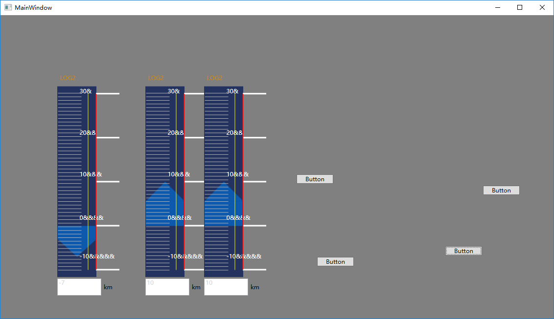
效果图:
主要代码xaml:
<UserControl x:Class="INSControls._01Conning.Steer.ConningSpeedBar"

             xmlns="http://schemas.microsoft.com/winfx/2006/xaml/presentation"

             xmlns:x="http://schemas.microsoft.com/winfx/2006/xaml"

             xmlns:mc="http://schemas.openxmlformats.org/markup-compatibility/2006"

             xmlns:d="http://schemas.microsoft.com/expression/blend/2008"

             xmlns:ec="http://schemas.microsoft.com/expression/2010/controls"

             xmlns:ed="http://schemas.microsoft.com/expression/2010/drawing"

             mc:Ignorable="d"

             d:DesignHeight="300"

             d:DesignWidth="80" Focusable="False" FocusVisualStyle="{x:Null}" Loaded="UserControl_Loaded">

    <Grid>

        <Grid.RowDefinitions>

            <RowDefinition Height="Auto" />

            <RowDefinition Height="Auto" />

            <RowDefinition Height="*" />

            <RowDefinition Height="40" />

        </Grid.RowDefinitions>

        <Label HorizontalAlignment="Left"

               VerticalAlignment="Center"

               Content="{Binding Title, RelativeSource={RelativeSource AncestorType=UserControl}}"

               Foreground="{Binding  LabelColor, RelativeSource={RelativeSource AncestorType=UserControl} }"

               FontFamily="微软雅黑"></Label>

        <Label HorizontalAlignment="Left"

               VerticalAlignment="Center"

               Margin="0,0,0,5"

               Foreground="#cc8800"

               FontFamily="微软雅黑"

               Content="LOG2"

               Grid.Row="1" />

        <Border Width="80"

                HorizontalAlignment="Left"

                Grid.Row="2"

                Background="#24325f">

            <Grid Margin="1,14,0,14"

                  x:Name="mainGrid">

                <!--具体的值填充的柱状图形-->

                <Grid x:Name="graphicGrid"

                      Height="10"

                      VerticalAlignment="Top"  RenderTransformOrigin="0.5,0.5">

                    <Grid.RowDefinitions>

                        <RowDefinition Height="Auto" />

                        <RowDefinition Height="*" />

                    </Grid.RowDefinitions>

                             <Path   Data="M40,0 L80,40 L0,40 z"

                              Fill="#cc0663c2" Stretch="Fill"  x:Name="path"  />

                    <Border Grid.Row="1"

                            Background="#cc0663c2" />

                    <Grid.RenderTransform>

                        <RotateTransform Angle="0" x:Name="polygonRotateAngel" />

                    </Grid.RenderTransform>

                </Grid>

                <!--短刻度-->

                <ec:PathListBox Background="Transparent"

                                x:Name="shortTicks"

                                ItemsSource="{Binding ShortTicks,RelativeSource={RelativeSource AncestorType=UserControl}}"

                                Focusable="False"

                                FocusVisualStyle="{x:Null}">

                    <ec:PathListBox.ItemTemplate>

                        <DataTemplate>

                            <Rectangle Width="1"

                                       Height="48"

                                       Margin="0,0,0,49"

                                       Fill="#b5b5b5"

                                       Focusable="False"

                                       FocusVisualStyle="{x:Null}" />

                            <!--<Border Width="1"

                                    Height="48"

                                    Background="#b5b5b5"

                                    UseLayoutRounding="True"

                                    Margin="0,0,0,49" />-->

                        </DataTemplate>

                    </ec:PathListBox.ItemTemplate>

                    <ec:PathListBox.LayoutPaths>

                        <ec:LayoutPath  Distribution="Even"

                                        Orientation="OrientToPath"

                                        SourceElement="{Binding ElementName=ShortTickPath}" >

                        </ec:LayoutPath>

                    </ec:PathListBox.LayoutPaths>

                </ec:PathListBox>

                <!--  长刻度  -->

                <ec:PathListBox x:Name="LongTick"

                                IsHitTestVisible="False"

                                ItemsSource="{Binding LongTicks, RelativeSource={RelativeSource AncestorType=UserControl}}"

                                Focusable="False"

                                FocusVisualStyle="{x:Null}" >

                    <ec:PathListBox.ItemTemplate>

                        <DataTemplate>

                            <Rectangle Width="48"

                                       Height="3"

                                       Margin="48,0,0,0"

                                       Fill="White"

                                       Focusable="False"

                                       FocusVisualStyle="{x:Null}" />

                            <!--<Border Width="3"

                                    Height="48"

                                    Background="White"

                                    SnapsToDevicePixels="True"

                                    UseLayoutRounding="True"

                                    Margin="0,0,0,49">

                            </Border>-->

                        </DataTemplate>

                    </ec:PathListBox.ItemTemplate>

                    <ec:PathListBox.LayoutPaths>

                        <ec:LayoutPath Distribution="Even"

                                       Orientation="None"

                                       SourceElement="{Binding ElementName=LongTickPath}" />

                    </ec:PathListBox.LayoutPaths>

                </ec:PathListBox>

                <!--  刻度上显示的数字  -->

                <ec:PathListBox IsHitTestVisible="False"

                                ItemsSource="{Binding TickMarks,RelativeSource={RelativeSource AncestorType=UserControl}}">

                    <ec:PathListBox.ItemTemplate>

                        <DataTemplate>

                            <TextBlock x:Name="tb" HorizontalAlignment="Left" Foreground="White"

                                       Text="{Binding}"  RenderTransformOrigin="0,0" Margin="0,50,0,0">

                                <TextBlock.RenderTransform>

                                    <RotateTransform Angle="-90"/>

                                </TextBlock.RenderTransform>

                            </TextBlock>

                        </DataTemplate>

                    </ec:PathListBox.ItemTemplate>

                    <ec:PathListBox.LayoutPaths>

                        <ec:LayoutPath Distribution="Even"

                                       Orientation="OrientToPath"

                                       SourceElement="{Binding ElementName=NumberPath}" />

                    </ec:PathListBox.LayoutPaths>

                </ec:PathListBox>

                <Path   x:Name="LongTickPath"

                        Data="M0,0 v1"

                        VerticalAlignment="Top"

                        HorizontalAlignment="Right"

                        Stretch="Fill" Fill="Red" Stroke="Red" StrokeThickness="2"

                        Grid.RowSpan="2"

                        Margin="0,0"

                        Focusable="False"

                        FocusVisualStyle="{x:Null}" />

                <Path x:Name="ShortTickPath"

                      Data="M0,0 V1"

                      VerticalAlignment="Top"

                      HorizontalAlignment="Left"

                      Stretch="Fill"

                      Grid.RowSpan="2"

                      Margin="0,0"

                      Focusable="False"

                      FocusVisualStyle="{x:Null}" />

                <Path x:Name="NumberPath"

                      Data="M0,0 V1"

                      Margin="45,0,0,0"

                      VerticalAlignment="Top"

                      HorizontalAlignment="Center"

                      Stretch="Fill"

                      Grid.RowSpan="2"

                      Focusable="False"

                      FocusVisualStyle="{x:Null}"  Stroke="Yellow" StrokeThickness="1"/>

            </Grid>

        </Border>

        <StackPanel Grid.Row="3"

                    Orientation="Horizontal">

            <TextBox Width="90"

                     Height="35"

                     IsReadOnly="True"

                     Foreground="{Binding TextboxColor,RelativeSource={RelativeSource AncestorType=UserControl}}"

                     VerticalAlignment="Center"

                     Text="{ Binding CurrentValue, RelativeSource={RelativeSource Mode=FindAncestor, AncestorType=Control}}" />

            <Label VerticalAlignment="Center"

                   Content="km"

                   Foreground="{Binding LabelColor, RelativeSource={RelativeSource AncestorType=UserControl}}"></Label>

        </StackPanel>

    </Grid>

</UserControl>
.cs文件:
using System;

using System.Collections.Generic;

using System.Linq;

using System.Text;

using System.Windows;

using System.Windows.Controls;

using System.Windows.Data;

using System.Windows.Documents;

using System.Windows.Input;

using System.Windows.Media;

using System.Windows.Media.Imaging;

using System.Windows.Navigation;

using System.Windows.Shapes;

namespace INSControls._01Conning.Steer

{

    /// <summary>

    /// ConningSpeedBar.xaml 的交互逻辑

    /// </summary>

    public partial class ConningSpeedBar : UserControl

    {

        public ConningSpeedBar()

        {

            InitializeComponent();

        }

        public List<string> TickMarks

        {

            get { return (List<string>)GetValue(TickMarksProperty); }

            set { SetValue(TickMarksProperty, value); }

        }

        // Using a DependencyProperty as the backing store for TickMarks.  This enables animation, styling, binding, etc...

        public static readonly DependencyProperty TickMarksProperty =

            DependencyProperty.Register("TickMarks", typeof(List<string>), typeof(ConningSpeedBar), new PropertyMetadata(null));

        public List<object> LongTicks

        {

            get { return (List<object>)GetValue(LongTicksProperty); }

            set { SetValue(LongTicksProperty, value); }

        }

        // Using a DependencyProperty as the backing store for LongTicks.  This enables animation, styling, binding, etc...

        public static readonly DependencyProperty LongTicksProperty =

            DependencyProperty.Register("LongTicks", typeof(List<object>), typeof(ConningSpeedBar), new PropertyMetadata(null));

        public List<object> ShortTicks

        {

            get { return (List<object>)GetValue(ShortTicksProperty); }

            set { SetValue(ShortTicksProperty, value); }

        }

        // Using a DependencyProperty as the backing store for ShortTicks.  This enables animation, styling, binding, etc...

        public static readonly DependencyProperty ShortTicksProperty =

            DependencyProperty.Register("ShortTicks", typeof(List<object>), typeof(ConningSpeedBar), new PropertyMetadata(null));

        public double CurrentValue

        {

            get { return (double)GetValue(CurrentValueProperty); }

            set { SetValue(CurrentValueProperty, value); }

        }

        // Using a DependencyProperty as the backing store for CurrentValue.  This enables animation, styling, binding, etc...

        public static readonly DependencyProperty CurrentValueProperty =

            DependencyProperty.Register("CurrentValue", typeof(double), typeof(ConningSpeedBar), new PropertyMetadata(0.0, CurrentValueChangeCallback));

        private static void CurrentValueChangeCallback(DependencyObject d, DependencyPropertyChangedEventArgs e)

        {

            ConningSpeedBar c = d as ConningSpeedBar;

            UpdateUICurrentvalue((double)e.NewValue, c);

        }

        private static void UpdateUICurrentvalue(double currentValue, ConningSpeedBar c)

        {

            if (c.mainGrid.ActualHeight==0)

            {

                return;

            }

            if (currentValue > 0)

            {

                c.polygonRotateAngel.Angle = 0;

                double totalValue = c.MaxValue - c.MinValue;

                //计算显示图形位置

                double top = (c.MaxValue - currentValue) * c.mainGrid.ActualHeight / totalValue;

                //计算显示图形大小

                double height = currentValue * c.mainGrid.ActualHeight / totalValue;

                c.graphicGrid.Margin = new Thickness(0, top, 0, 0);

                if (height > 40)

                {

                    c.graphicGrid.Height = height;

                }

                else

                {

                    c.graphicGrid.Height = c.path.Height = height;

                }

            }

            else

            {

                c.polygonRotateAngel.Angle = 180;

                double totalValue = c.MaxValue - c.MinValue;

                //计算显示图形位置

                double top = (c.MaxValue) * c.mainGrid.ActualHeight / totalValue;

                //计算显示图形大小

                double height = -currentValue * c.mainGrid.ActualHeight / totalValue;

                c.graphicGrid.Margin = new Thickness(0, top, 0, 0);

                if (height > 40)

                {

                    c.graphicGrid.Height = height;

                }

                else

                {

                    c.graphicGrid.Height = c.path.Height = height;

                }

            }

        }

        public SolidColorBrush LabelColor

        {

            get { return (SolidColorBrush)GetValue(LabelColorProperty); }

            set { SetValue(LabelColorProperty, value); }

        }

        // Using a DependencyProperty as the backing store for LabelColor.  This enables animation, styling, binding, etc...

        public static readonly DependencyProperty LabelColorProperty =

            DependencyProperty.Register("LabelColor", typeof(SolidColorBrush), typeof(ConningSpeedBar), new PropertyMetadata(Brushes.Black));

        public SolidColorBrush TextboxColor

        {

            get { return (SolidColorBrush)GetValue(TextboxColorProperty); }

            set { SetValue(TextboxColorProperty, value); }

        }

        // Using a DependencyProperty as the backing store for TextboxColor.  This enables animation, styling, binding, etc...

        public static readonly DependencyProperty TextboxColorProperty =

            DependencyProperty.Register("TextboxColor", typeof(SolidColorBrush), typeof(ConningSpeedBar), new PropertyMetadata(new SolidColorBrush(Color.FromRgb(214, 214, 214))));

        public string Title

        {

            get { return (string)GetValue(TitleProperty); }

            set { SetValue(TitleProperty, value); }

        }

        // Using a DependencyProperty as the backing store for Title.  This enables animation, styling, binding, etc...

        public static readonly DependencyProperty TitleProperty =

            DependencyProperty.Register("Title", typeof(string), typeof(ConningSpeedBar), new PropertyMetadata(""));

        public double MaxValue

        {

            get { return (double)GetValue(MaxValueProperty); }

            set { SetValue(MaxValueProperty, value); }

        }

        // Using a DependencyProperty as the backing store for MaxValue.  This enables animation, styling, binding, etc...

        public static readonly DependencyProperty MaxValueProperty =

            DependencyProperty.Register("MaxValue", typeof(double), typeof(ConningSpeedBar), new PropertyMetadata(30d));

        public double MinValue

        {

            get { return (double)GetValue(MinValueProperty); }

            set { SetValue(MinValueProperty, value); }

        }

        // Using a DependencyProperty as the backing store for MinValue.  This enables animation, styling, binding, etc...

        public static readonly DependencyProperty MinValueProperty =

            DependencyProperty.Register("MinValue", typeof(double), typeof(ConningSpeedBar), new PropertyMetadata(-10d));

        private void UserControl_Loaded(object sender, RoutedEventArgs e)

        {

            //短刻度

            List<object> shortticks = new List<object>();

            for (int i = 0; i < 50; i++)

            {

                shortticks.Add(new object());

            }

            ShortTicks = shortticks;

            //显示刻度文字

            List<string> numbers = new List<string>();

            //长刻度

            List<object> longticks = new List<object>();

            for (int i = 0; i < 5; i++)

            {

                //计算长度信息,等比例地减去间隔值

                string tickInfo = (MaxValue - i * (MaxValue - MinValue) / 4).ToString();

                numbers.Add(tickInfo+new string('&',i+1));

                longticks.Add(new object());

            }

            LongTicks = longticks;

            TickMarks = numbers;

           UpdateUICurrentvalue(CurrentValue, this) ;

        }

    }

}
源码地址:
https://files.cnblogs.com/files/chlm/%E5%88%BB%E5%BA%A6%E7%BA%BF.rar
wpf自定义带刻度的柱状图控件的更多相关文章
- WPF自学入门(六)WPF带标题的内容控件简单介绍
在WPF自学入门(二)WPF-XAML布局控件的文章中分别介绍StackPanel,WarpPanel,DockPanel,Grid,Canvas五种布局容器的使用,可以让我们大致了解容器可以使用在什 ...
- WPF自定义控件与样式(10)-进度控件ProcessBar自定义样
一.前言 申明:WPF自定义控件与样式是一个系列文章,前后是有些关联的,但大多是按照由简到繁的顺序逐步发布的等,若有不明白的地方可以参考本系列前面的文章,文末附有部分文章链接. 本文主要内容: Pro ...
- WPF中自定义的DataTemplate中的控件,在Window_Loaded事件中加载机制初探
原文:WPF中自定义的DataTemplate中的控件,在Window_Loaded事件中加载机制初探 最近因为项目需要,开始学习如何使用WPF开发桌面程序.使用WPF一段时间之后,感 ...
- Android 自定义带刻度的seekbar
自定义带刻度的seekbar 1.布局 <span style="font-family:SimHei;font-size:18px;"><com.imibaby ...
- 封装:WPF中可以绑定的BindPassWord控件
原文:封装:WPF中可以绑定的BindPassWord控件 一.目的:本身自带的PassWord不支持绑定 二.Xaml部分 <UserControl x:Class="HeBianG ...
- WPF自定义控件与样式(9)-树控件TreeView与菜单Menu-ContextMenu
一.前言 申明:WPF自定义控件与样式是一个系列文章,前后是有些关联的,但大多是按照由简到繁的顺序逐步发布的等,若有不明白的地方可以参考本系列前面的文章,文末附有部分文章链接. 本文主要内容: 菜单M ...
- 创建一个带模版的用户控件 V.3
再重构此篇<创建一个带模版的用户控件 V.2>http://www.cnblogs.com/insus/p/4164149.html 让其它动态实现header,Item和Footer. ...
- 创建一个带模版的用户控件 V.2
前面有做练习<创建一个带模版的用户控件>http://www.cnblogs.com/insus/p/4161544.html .过于简化.通常使用数据控件Repeater会有网页写好He ...
- WPF中不规则窗体与WebBrowser控件的兼容问题解决办法
原文:WPF中不规则窗体与WebBrowser控件的兼容问题解决办法 引言 这几天受委托开发一个网络电视项目,要求初步先使用内嵌网页形式实现视频播放和选单,以后再考虑将网页中的所有功能整合进桌面程序. ...
随机推荐
- Android TextView,EditText要求固定行数自动调整TextSize
最近项目有个需求要求文本最多显示3行,继续输入则字体变小,删除已经输入的文字,那么字体变大,不管变大变小都不能超过3行.网上怎么找也找不到相关的解决方案,自己动手,丰衣足食了! 说一下算法思路,后面给 ...
- SpringMVC3,使用RequestMappint的Param参数,实现一个url绑定多个方法
SpringMVC中,默认不能把多个相同的url绑定到同一个方法.如果需要绑定,需要增加param参数,而且值要不同. 我自己没有这个需求,或者就是有需求,我也想到的是使用不同的url. 项目中有少部 ...
- 【t101】小明搬家
Time Limit: 1 second Memory Limit: 128 MB [问题描述] 小明要搬家了,大家都来帮忙. 小明现在住在第N楼,总共K个人要把X个大箱子搬上N楼. 最开始X个箱子都 ...
- 并发新特性—Executor 框架与线程池
兰亭风雨 · 更新于 2018-11-14 09:00:31 并发新特性-Executor 框架与线程池 Executor 框架简介 在 Java 5 之后,并发编程引入了一堆新的启动.调度和管理线程 ...
- Java泛型解析(02):通配符限定
Java泛型解析(02):通配符限定 考虑一个这种场景.计算数组中的最大元素. [code01] public class ArrayUtil { public static <T&g ...
- 三次握手、四次握手、backlog
TCP:三次握手.四次握手.backlog及其他 TCP是什么 首先看一下OSI七层模型: 然后数据从应用层发下来,会在每一层都加上头部信息进行封装,然后再发送到数据接收端,这个基本的流程中每个数 ...
- SpringBoot JPA 专题
Error: Error starting ApplicationContext. To display the auto-configuration report re-run your appli ...
- Java访问修饰符(转)
类.方法.成员变量和局部变量的可用修饰符 修饰符 类 成员方法 构造方法 成员变量 局部变量 abstract(抽象的) √ √ - - - static (静态的) - √ - √ - public ...
- sql操作xml小总结
一.前言 SQL Server 2005 引入了一种称为 XML 的本机数据类型.用户可以创建这样的表,它在关系列之外还有一个或多个 XML 类型的列:此外,还允许带有变量和参数.为了更好地支持 XM ...
- HDU 1143 Tri Tiling (递推)
Tri Tiling Time Limit: 2000/1000 MS (Java/Others) Memory Limit: 65536/32768 K (Java/Others) Total ...