statistical thinking in Python EDA
Histgram直方图适合于单个变量的value分布图形
seaborn在matplotlib基础上做了更高层的抽象,方便对基础的图表绘制。也可以继续使用matplotlib直接绘图,但是调用seabon的set()方法就能获得好看的样式。
# Import plotting modules

import matplotlib.pyplot as plt

import seaborn as sns

# Set default Seaborn style

sns.set()

# Plot histogram of versicolor petal lengths

plt.hist(versicolor_petal_length,bins = 20)

plt.xlabel('petal length (cm)')

plt.ylabel('count')

# Show histogram

plt.show()
但是直方图有以下缺点:
1. 受bins参数的影响,可能相同的数据图形化后却得到完全不同的解读
2. 我们使用bin将数据做了切分,因此并不能展示全部数据
3. 直方图只能用于单个变量的数值分布,并不能很好地看出数据分布和另一个类别变量之间的关系
为了克服这些缺点,我们可以使用Bee swarm(蜂群)图表,也可以称为swarm图
import seabon as sns

# Create bee swarm plot with Seaborn's default settings

_ = sns.swarmplot(x='species',y='petal length (cm)',data=df)

# Label the axes

_ = plt.xlabel('species')

_ =  plt.ylabel('petal length (cm)')

# Show the plot

plt.show()
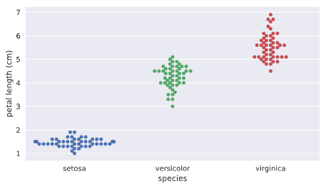
注意在swarm图中水平轴的宽度没有实质关系,因为数量很多的话会自然沿着类别型变量来做伸展,主要看数据密集度以及其y轴高度的分布。
从上图我们可以看出以下信息:
不同花的类别对应的花瓣长度有明显的不同,因此花瓣长度可以作为一个非常重要的变量。
swarm图的缺点:
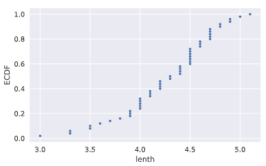
如果数据量过大的话,数据之间互相重叠,不容易看出单个x范围内数据的分布情况,这时我们可能要使用ECDF(empirical cumulative distribution function)
ECDF:
ECDF可以全景看到数据是如何分布的,类似于统计中的概率累积分布图。主要用于给定一个一维数组,咱们研究该数据的分布情况
def ecdf(data):
"""Compute ECDF for a one-dimensional array of measurements."""
n = len(data)
# x-data for the ECDF: x
x = np.sort(data)
# y-data for the ECDF: y
y = np.arange(1,n+1)/n
return x, y
# Compute ECDF for versicolor data: x_vers, y_vers

x_vers,y_vers = ecdf(versicolor_petal_length)

# Generate plot

plt.plot(x_vers,y_vers,marker='.',linestyle ='none')

# Label the axes

plt.xlabel('lenth')

plt.ylabel('ECDF')

# Display the plot

plt.show()
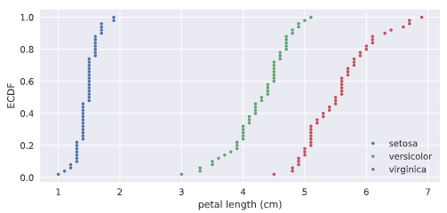
为了进行对比,我们也可以将三种花的CDF进行堆叠,
# Compute ECDFs

x_set,y_set = ecdf(setosa_petal_length)

x_vers,y_vers = ecdf(versicolor_petal_length)

x_virg,y_virg = ecdf(virginica_petal_length)

# Plot all ECDFs on the same plot

plt.plot(x_set,y_set,marker='.',linestyle='none')

plt.plot(x_vers,y_vers,marker='.',linestyle='none')

plt.plot(x_virg,y_virg,marker='.',linestyle='none')

# Annotate the plot

plt.legend(('setosa', 'versicolor', 'virginica'), loc='lower right')

_ = plt.xlabel('petal length (cm)')

_ = plt.ylabel('ECDF')

# Display the plot

plt.show()
产生如下的效果:
summary统计数值计算和图表化
mean/median/percentile/IQR(25%-75%)
mean_length_vers = np.mean(versicolor_petal_length)

meadian_length_vers = np.median(versicolor_petal_length)

meadian_length_vers = np.percentile(versicolor_petal_length,[25,50,75])
其中median中位数就是50%的percentile
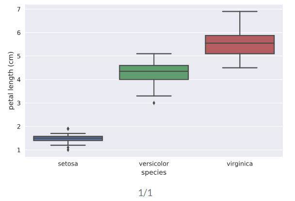
box plot用于图形化显示percentile数据的图表。一般x轴为类别性变量,y轴为连续性数值变量
# Create box plot with Seaborn's default settings

sns.boxplot(x='species',y='petal length (cm)',data=df)

# Label the axes

_ = plt.xlabel('species')

_ = plt.ylabel('petal length (cm)')

# Show the plot

plt.show()
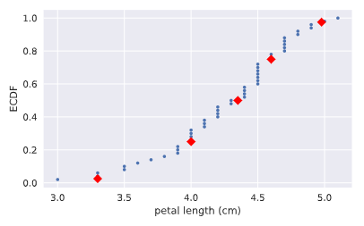
我们也可以把CDF图和对应的分位数标记重叠画出整合的一个图来。
# Plot the ECDF

_ = plt.plot(x_vers, y_vers, '.')

_ = plt.xlabel('petal length (cm)')

_ = plt.ylabel('ECDF')

# Overlay percentiles as red diamonds.

# ptiles_vers = [2.5,25,50,75,97.5]

# percentiles = [ 2.5, 25. , 50. , 75. , 97.5]

_ = plt.plot(ptiles_vers, percentiles/100, marker='D', color='red',

         linestyle='none')

# Show the plot

plt.show()
variance/mse/std
方差反映了数据的分散程度,方差越大,说明变化越大。标准差则是方差取平方根的结果。
# Array of differences to mean: differences

means = np.mean(versicolor_petal_length)*np.ones(len(versicolor_petal_length))

differences = versicolor_petal_length - means

# Square the differences: diff_sq

diff_sq = differences**2

# Compute the mean square difference: variance_explicit

variance_explicit = np.sum(diff_sq)/len(versicolor_petal_length)

# Compute the variance using NumPy: variance_np

variance_np = np.var(versicolor_petal_length)
variancestd_np = np.std(versicolor_petal_length)
# variance_np == variance_explicit print(variance_explicit,variance_np) # Print the results
covriance,协方差系数(Pearson r)及协方差矩阵
$$covariance = \frac{1}{n}\sum_{i=1}^{n} (x_i-\bar x)(y_i-\bar y)$$
$$\rho = Pearson \enspace correlation = \frac{covariance}{(std \enspace of \enspace x)(std \enspace of \enspace y)} \in [-1,1]$$
协方差可以反映两个变量之间的线性关系,特别是协方差系数由于去除了量纲的影响,更加客观。当协方差系数为正时为正相关,当等于0时,不相关。下面的代码我们先画出散点图,直观看到两个变量之间的线性关系,随后通过np.cov来计算起协方差矩阵。
# Make a scatter plot

plt.scatter(versicolor_petal_length,versicolor_petal_width)

# Label the axes

plt.xlabel('length')

plt.ylabel('width')

# Show the result

plt.show()

covariance_matrix = np.cov(versicolor_petal_length,versicolor_petal_width)
corr_mat = np.corrcoef(x,y) # 计算皮尔逊协方差系数

print(covariance_matrix)
统计推断(statistical inferrence)
概率思想的核心就是给定我们一组数据,以概率语言表达:如果我们继续采样下一组数据,我们将能期待数字特征是什么,可以得到什么推断。因为可以肯定的是,当我们拿到下一组数据时,相关统计指标边然不同。这些统计指标本身就具有不确定性和随机性,但是却具有概率意义的稳定性。
统计推断的目标就是指出如果我们继续收集更多的数据,则能得出什么概率性的结论。也就是说,通过较少的数据能够得出更加通用性的结论。
统计模拟(simulation)
对于概率性的事件,我们可以通过实际实验来观察结果,大量的实验结果就呈现出一定的统计规律性。但是,很多时候重复性的实验是不现实的,甚至是不可能的,这时,我们就可以通过numpy的random伪随机引擎来不断做模拟,以便得到我们感兴趣的事件的统计特性。
统计模拟hacker stats probability的步骤
0. 抽象定义清楚你要研究问题的随机变量;
1. 找到一个如何模拟产生实验数据从而得到随机变量值的计算方法;
2. 模拟非常非常多的次数,得到每次的结果;
3. 概率的计算就是使用对应模拟过程结果中属于我们所感兴趣结果的数据发生次数除以实验总次数
只要我们能够使用np.random来模拟一个实验得到结果,那么我们就可以得到相应的概率分布PDF
首个使用numpy random模拟一个数字发生器,看看其直方图中各个bin的分布情况:
# Seed the random number generator

np.random.seed(42)

# Initialize random numbers: random_numbers

random_numbers = np.empty(1000000)

# Generate random numbers by looping over range(1000000)

for i in range(1000000):

    random_numbers[i] = np.random.random(1)[0]

# Plot a histogram

_ = plt.hist(random_numbers)

# Show the plot

plt.show()

一个完整的银行贷款坏账概率模拟计算例子(基于np.random.random从头开始做起):
# 模拟n重伯努利实验函数
def perform_bernoulli_trials(n, p):
"""Perform n Bernoulli trials with success probability p
and return number of successes."""
# Initialize number of successes: n_success
n_success = 0
# Perform trials
for i in range(n):
# Choose random number between zero and one: random_number
random_number = np.random.random() # If less than p, it's a success so add one to n_success
if random_number < p:
n_success +=1 return n_success
# Seed random number generator
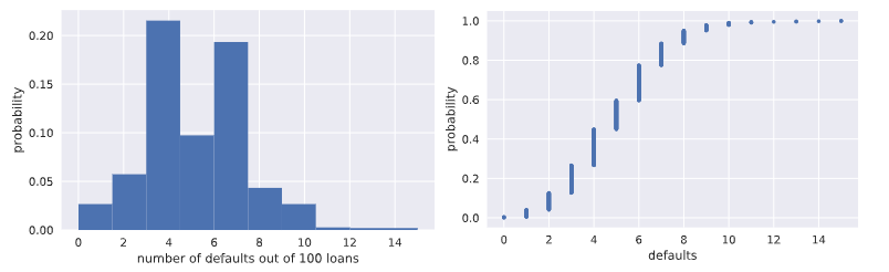
np.random.seed(42) # Initialize the number of defaults: n_defaults
n_defaults = np.empty(1000) # 模拟执行1000次100重0.05概率的伯努利实验,查看每百次
# 实验中出现拖欠的次数分布情况
for i in range(1000):
n_defaults[i] = perform_bernoulli_trials(n=100,p=0.05) # 将模拟实验结果拖欠随机变量数的直方图画出来
_ = plt.hist(x=n_defaults, density=True)
_ = plt.xlabel('number of defaults out of 100 loans')
_ = plt.ylabel('probability') # Show the plot
plt.show() # Compute ECDF: x, y
x,y = ecdf(n_defaults)
# 计算并且画出每百次贷款拖欠数这个随机变量的CDF概率分布图
# Plot the ECDF with labeled axes
plt.plot(x,y,marker='.',linestyle='none')
plt.xlabel('defaults')
plt.ylabel('probability') # Show the plot
plt.show()
# 计算每100次贷款中有超过10次拖欠的次数
# Compute the number of 100-loan simulations with 10 or more defaults: n_lose_money
n_defaults2 = n_defaults >=10
n_lose_money = 0
for i in range(len(n_defaults)):
n_lose_money += n_defaults2[i]
# Compute and print probability of losing money
# 计算百次贷款拖欠10人次以上事件的概率
print('Probability of losing money =', n_lose_money / len(n_defaults))
改进型模拟,直接使用np.random.binomial采样画图,得到相同的CDF模拟结果
# Take 10,000 samples out of the binomial distribution: n_defaults

n_defaults = np.random.binomial(100,0.05,size=10000)

# Compute CDF: x, y

x, y = ecdf(n_defaults)

# Plot the CDF with axis labels

plt.plot(x,y,marker='.',linestyle='none')

plt.xlabel('defaults')

plt.ylabel('propabability')

# Show the plot

plt.show()
plotting the binomial PMF(使用直方图模拟,目前还不会画纯粹的PMF)
# Compute bin edges: bins

bins = np.arange(0, max(n_defaults)+1.5) - 0.5

# Generate histogram

plt.hist(n_defaults,bins=bins,normed=True)

# Label axes

plt.xlabel('defaults number')

plt.ylabel('proportion')

# Show the plot

plt.show()
泊松分布(Poisson process/Poison distribution)
story: 在每特定间隔内发生事件数均值为$\lambda$次的泊松过程中,在给定事件内发生泊松过程r符合泊松分布。比如:如果一个网站在1小时内平均会有6次访问,那么在一个小时内网站的访问次数这个随机变量就符合泊松分布;
泊松分布可以看做是Binomial分布的极限:当n重伯努利实验中事件概率极低,而试验次数非常巨大时,也就是说针对小概率事件下的伯努利分布。
由于泊松分布只有一个参数,相对Binomial伯努利分布简单,因此常常可以使用泊松分布来近似逼近伯努利分布。
连续性随机变量分布
normal distribution
通过使用np.random.normal从相同mean值,但是不同标准差的正态分布中采样100000个数据,随后将这些数据的直方图画出来,就可以近似作为正态分布的密度函数PDF了.
# Draw 100000 samples from Normal distribution with stds of interest: samples_std1, samples_std3, samples_std10

samples_std1 = np.random.normal(20,1,100000)

samples_std3 = np.random.normal(20,3,100000)

samples_std10 = np.random.normal(20,10,100000)

# Make histograms

plt.hist(samples_std1,bins = 100,normed = True,histtype='step')

plt.hist(samples_std3,bins = 100,normed = True,histtype='step')

plt.hist(samples_std10,bins = 100,normed = True,histtype='step')

# Make a legend, set limits and show plot

_ = plt.legend(('std = 1', 'std = 3', 'std = 10'))

plt.ylim(-0.01, 0.42)

plt.show()

# Generate CDFs

x_std1,y_std1 = ecdf(samples_std1)

x_std3,y_std3 = ecdf(samples_std3)

x_std10,y_std10=ecdf(samples_std10)

# Plot CDFs

plt.plot(x_std1,y_std1,marker='.',linestyle = 'none')

plt.plot(x_std3,y_std3,marker='.',linestyle = 'none')

plt.plot(x_std10,y_std10,marker='.',linestyle = 'none')

# Make a legend and show the plot

_ = plt.legend(('std = 1', 'std = 3', 'std = 10'), loc='lower right')

plt.show()

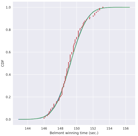
使用样本均值和样本方差作为总体均值和方差,探究样本是否真正符合正态分布
# Compute mean and standard deviation: mu, sigma

mu = np.mean(belmont_no_outliers)

sigma = np.std(belmont_no_outliers)

# Sample out of a normal distribution with this mu and sigma: samples

samples = np.random.normal(mu,sigma,size=10000)

# Get the CDF of the samples and of the data

x_theor,y_theor = ecdf(samples)

x,y = ecdf(belmont_no_outliers)

# Plot the CDFs and show the plot

_ = plt.plot(x_theor, y_theor)

_ = plt.plot(x, y, marker='.', linestyle='none')

_ = plt.xlabel('Belmont winning time (sec.)')

_ = plt.ylabel('CDF')

plt.show()
使用上面的mu,sigma数据定义的正态分布曲线,我们就假设对应赛马时间符合该分布,来计算小于144秒的概率能达到多大
# Take a million samples out of the Normal distribution: samples

samples = np.random.normal(mu,sigma,size=1000000)

# Compute the fraction that are faster than 144 seconds: prob

prob = np.sum(samples<144)/1000000

# Print the result

print('Probability of besting Secretariat:', prob)

##### 打印出0.000691
指数分布 Exponential Distribution
story: 两个Poison过程发生时的等待时间符合指数分布。
只有一个参数:平均等待时长
LSR
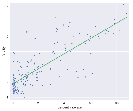
# Plot the illiteracy rate versus fertility

_ = plt.plot(illiteracy, fertility, marker='.', linestyle='none')

plt.margins(0.02)

_ = plt.xlabel('percent illiterate')

_ = plt.ylabel('fertility')

# Perform a linear regression using np.polyfit(): a, b

a, b = np.polyfit(illiteracy,fertility,1)

# Print the results to the screen

print('slope =', a, 'children per woman / percent illiterate')

print('intercept =', b, 'children per woman')

# Make theoretical line to plot

x = illiteracy

y = a * x + b

# Add regression line to your plot

_ = plt.plot(x, y)

# Draw the plot

plt.show()
Bootstrapping
bootstrapping通常使用有放回地重采样构造的多个数据样本来执行统计推断,比如对于均值这个统计量,原来只有一个样本,因此均值就是从这个样本通过定义计算出来的,但是我们如何对这个统计量来研究呢?可行的办法就是通过bootstrapping重新采样获取多个样本,这样就能计算出多个均值来,我们据此就可以研究这个样本均值随机变量的统计特性,比如它的均值,方差,置信区间。。。
Bootstrap Replicate:有放回重抽样
在前面介绍的统计方法研究数据时,往往对已知的一个数据样本来计算相应的统计特征,比如mean, median, mse等。但是我们想一想如果有可能的话,再做了一组实验得到新的数据,这些统计值是否相同呢?显然这些统计值本身也是随机变量,因此新的数据样本的mean,median肯定是不相同的。那么我们又有什么信心就告诉我们目前这个样本算出来的均值本身就是可靠的呢? 有没有什么办法模拟出更多类似的样本呢?一个可行的方法就被称为有放回抽样的Bootstrap Replicate方法.Resample的过程就像是在重复相同的实验一样不断获取新的数据。。。
bootstrap sample:指通过bootstrap有放回抽样重组的新样本数组;
bootstrap replicate:指从resampled array(bootstrap sample)中计算出来的统计量值
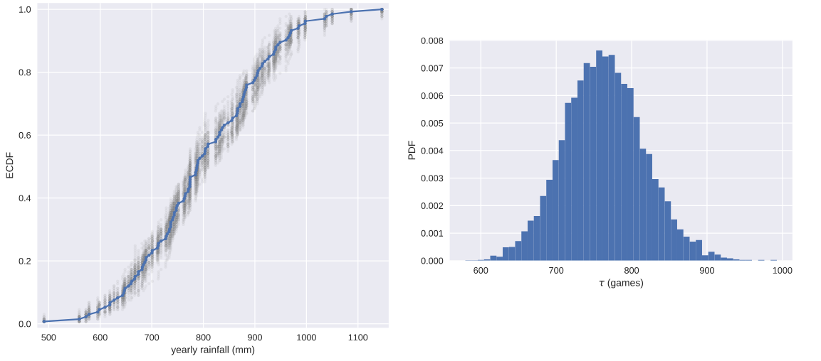
通过bootstrap方法创造新数据,和原始dataset重叠比较
for _ in range(50):

    # Generate bootstrap sample: bs_sample

    bs_sample = np.random.choice(rainfall, size=rainfall.size)

    # Compute and plot ECDF from bootstrap sample

    x, y = ecdf(bs_sample)

    _ = plt.plot(x, y, marker='.', linestyle='none',color='gray',alpha=0.1)

# Compute and plot ECDF from original data

x, y = ecdf(rainfall)

_ = plt.plot(x, y, marker='.')

# Make margins and label axes

plt.margins(0.02)

_ = plt.xlabel('yearly rainfall (mm)')

_ = plt.ylabel('ECDF')

# Show the plot

plt.show()
数据集统计量置信区间的数值方法
我们知道,对于有命名的著名的统计分布,可以通过分析的方法计算出对应的置信区间。但是,对于计算机来说,往往更加通用化的做法是使用bootstrapping方法计算出来。。。
通过bootstrap方法创造新的数据集,并且计算对应的均值,方差。。。,得到均值方差的一组值,我们再使用np.percentile(bs_replicates,[2.5,97.5])就可以得到相应均值或者方差的95%置信区间。
# Draw bootstrap replicates of the mean no-hitter time (equal to tau): bs_replicates

bs_replicates = draw_bs_reps(nohitter_times,np.mean,size=10000)

# Compute the 95% confidence interval: conf_int

conf_int = np.percentile(bs_replicates,[2.5,97.5])

# Print the confidence interval

print('95% confidence interval =', conf_int, 'games')

# Plot the histogram of the replicates

_ = plt.hist(bs_replicates, bins=50, normed=True)

_ = plt.xlabel(r'$\tau$ (games)')

_ = plt.ylabel('PDF')

# Show the plot

plt.show()
注意:当我们使用bootstrap方法计算统计指标的置信区间时,并不会对随机变量的分布做任何假设,没有任何的未知参数,仅仅是通过数值计算得出。但是当我们做类似线性回归模型的参数估计时,我们就有斜率和截距两个参数,被称为parametric estimate.这种场景下,最优参数也是由样本数据来决定的,这一点和均值,方差等统计量随机变量是一样的,也就是说,如果我们拿到另一组数据,则我们就可以得到另外一组最优的斜率和截距参数。我们也可以通过bootstrap estimate的方法来计算得到斜率和截距这两个随机变量的置信区间,也就是说,我们think probabilistically.
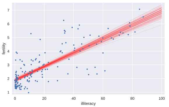
Pairs Bootstrap
以LSR线性回归为例,我们要建模投票总数和奥巴马得票数之间的线性关系,这时如果简单使用每个州县随机的投票总数和奥巴马得票数可能并不合理,因为这两者之间本来就具有某种线性关系,如果完全随机会破坏这种随机性。
我们使用称为Pairs Bootstrap的方法来有放回地重新抽样重组数据,每次resample,得到一组数据,我们按照原始数据集相同个数来做resample获得bootstrap sample,重新计算斜率和截距,得到一个bootstrap replicate。这个流程重复10000次,就能得到1万组斜率和截距的估计值。这样就能够使用np.percentile有效地计算参数估计的置信区间confidence interval了。
def draw_bs_pairs_linreg(x, y, size=1):

    """Perform pairs bootstrap for linear regression."""

    # Set up array of indices to sample from: inds

    inds = np.arange(len(x))

    # Initialize replicates: bs_slope_reps, bs_intercept_reps

    bs_slope_reps = np.empty(size)

    bs_intercept_reps = np.empty(size)

    # Generate replicates

    for i in range(size):

        bs_inds = np.random.choice(inds, size=len(inds))

        bs_x, bs_y = x[bs_inds], y[bs_inds]

        bs_slope_reps[i], bs_intercept_reps[i] = np.polyfit(bs_x,bs_y,1)

    return bs_slope_reps, bs_intercept_reps

# Generate replicates of slope and intercept using pairs bootstrap

bs_slope_reps, bs_intercept_reps = draw_bs_pairs_linreg(illiteracy,fertility,size=1000)

# Compute and print 95% CI for slope

print(np.percentile(bs_slope_reps,[2.5,97.5]))

# Plot the histogram

_ = plt.hist(bs_slope_reps, bins=50, normed=True)

_ = plt.xlabel('slope')

_ = plt.ylabel('PDF')

plt.show()

从这个例子我们就能看到文盲率和生育率之间线性关系的slope参数估计的pdf概率分布,当然就容易计算得出其95%的置信区间.
我们将通过bootstrap方法计算得到的前100个斜率和截距的值所代表的直线绘制出来,就有一个大致的概念,也就是说,如果重新做实验,则新的直线参数估计形成以下直线集
# Generate array of x-values for bootstrap lines: x

x = np.array([0,100])

# Plot the bootstrap lines

for i in range(100):

    _ = plt.plot(x, bs_slope_reps[i]*x + bs_intercept_reps[i],

                 linewidth=0.5, alpha=0.2, color='red')

# Plot the data

_ = plt.plot(illiteracy,fertility,marker='.',linestyle = 'none')

# Label axes, set the margins, and show the plot

_ = plt.xlabel('illiteracy')

_ = plt.ylabel('fertility')

plt.margins(0.02)

plt.show()
Formulating and simulating a hypothesis
上面的学习中,我们假设数据符合线性模型,随后对线性模型的参数进行估计。但是问题是:我们的假设是否合理?这就需要用到统计学中的假设检验。我们假设一个推断是正确的(比如假设变量之间是线性关系,再比如,我们假设乘坐头等舱和经济舱的乘客在泰坦尼克沉船事故中存活的概率分布是相同的),那么我们的观测数据是否合理,多大程度上是合理的??
permutation:将数组里面的数据顺序打乱就称为permutation.
permutation sample:打乱顺序后的数据重新截取形成新的sample就称为permutation sample.
statistical thinking in Python EDA的更多相关文章
- Statistics in Python
Statistics in Python Materials for the “Statistics in Python” euroscipy 2015 tutorial. Requirements ...
- A Complete Tutorial to Learn Data Science with Python from Scratch
A Complete Tutorial to Learn Data Science with Python from Scratch Introduction It happened few year ...
- python常用工具库介绍
Numpy:科学计算 HOME: http://www.numpy.org/ NumPy is the fundamental package for scientific computing wi ...
- frequentism-and-bayesianism-chs-iv
frequentism-and-bayesianism-chs-iv 频率主义与贝叶斯主义 IV:Python的贝叶斯工具 这个notebook出自Pythonic Perambulations的 ...
- pasty公式
sklearn实战-乳腺癌细胞数据挖掘(博主亲自录制视频) https://study.163.com/course/introduction.htm?courseId=1005269003& ...
- What programming language is best for a bioinformatics beginner?
probably Unix Shell scripts, Perl, or Python and R can be the best options. ---------- 1-python 2-R ...
- python进行EDA探索性数据分析
1.查看数据的类型概况 cols = [c for c in train.columns] #返回数据的列名到列表里 print('Number of features: {}'.format(l ...
- [Python] Statistical analysis of time series
Global Statistics: Common seen methods as such 1. Mean 2. Median 3. Standard deviation: the larger ...
- python Pandas Profiling 一行代码EDA 探索性数据分析
文章大纲 1. 探索性数据分析 代码样例 效果 解决pandas profile 中文显示的问题 1. 探索性数据分析 数据的筛选.重组.结构化.预处理等都属于探索性数据分析的范畴,探索性数据分析是帮 ...
随机推荐
- 【树】Construct Binary Tree from Inorder and Postorder Traversal
题目: Given inorder and postorder traversal of a tree, construct the binary tree. 思路: 后序序列的最后一个元素就是树根, ...
- 【数组】Remove Duplicates from Sorted Array II
题目: Follow up for "Remove Duplicates":What if duplicates are allowed at most twice? For ex ...
- OpenGL11-绘制汉字最高效方法(使用Freetype)(代码已更新)
最新版本,之前的版本有些文件没有打包 视频教程请关注 http://edu.csdn.net/lecturer/lecturer_detail?lecturer_id=440 OpenGL本身并没有绘 ...
- maven私服配置
1.maven私服setting.xml的配置 <?xml version="1.0" encoding="UTF-8"?> <setting ...
- CentOS7安装SaltStack的踩坑经历
虚拟机镜像:centOS7 minion 版本 软件版本: salt-master-2017.7.2-1.el7.noarchsalt-minion-2017.7.2-1.el7.noarchsalt ...
- CentOS SVN Failed to load JavaHL Library
在CentOS 6上的eclipse安装了svbclipse插件后,svn不能使用,并且第一次使用的时候还出现下面错误窗口提示 Failed to load JavaHL Library. These ...
- 使用vue2+Axios+Router 之后的总结以及遇到的一些坑
构建 vue有自己的脚手架构建工具vue-cli,使用起来非常方便,使用webpack来集成各种开发便捷工具,比如: 代码热更新,修改代码之后网页无刷新改变,对前端开发来说非常的方便 PostCss, ...
- JBoss 实战(1)
转自:https://www.cnblogs.com/aiwz/p/6154594.html JBOSS的诞生 1998年,在硅谷SUN公司的SAP实验室,一个年轻人正坐在电脑前面思考,然后写着什么东 ...
- 初识IntPtr
一:什么是IntPtr 先来看看MSDN上说的:用于表示指针或句柄的平台特定类型.这个其实说出了这样两个事实,IntPtr 可以用来表示指针或句柄.它是一个平台特定类型.对于它的解释,这个哥们写的比较 ...
- [日常] Go语言圣经-命令行参数
1.编译 go build hello.go 2.go get gopl.io/ch1/helloworld 命令,就会从网上获取代码,并放到对应目录中 下载的代码会放在$GOPATH/src/gop ...