css3之图形绘制
由于近期的项目中出现了不规则的边框和图形, 所以重新温习一下CSS3的图形绘制。。。样式绘制的图形比图片的性能要好,体验更佳,关键一点是更加有趣!
以下几个例子主要是运用了css3中border、bordr-radius、transform、伪元素等属性来完成的,我们先了解下它们的基本原理。
border:简单的来说border语法主要包含(border-width、border-style、border-color)三个属性。
- border-top(上边框):border-width border-style border-color
- border-right(右边框):border-width border-style border-color
- border-bottom(下边框):border-width border-style border-color
- border-left(左边框):border-width border-style border-color
border-radius:border-radius 的语法比我们想像中灵活得多。你可能会惊讶地发现 border-radius 原来是一个简写属性。它所对应的各个展开式属性:
- border-top-left-radius(左上圆角半径)
- border-top-right-radius (右上圆角半径)
- border-bottom-right-radius (右下圆角半径)
- border-bottom-left-radius(左下圆角半径)
border-image:共有三个属性,分别是图片(border-image-source)、剪裁位置(border-image-slice)、重复性(border-image-repeat)。
图片:使用URL调用
剪裁位置:共有1~4个参数,没有单位(默认是像素),也可以用百分比
- 第一个参数a:距离上边相应长度进行裁剪
- 第二个参数b:距离右边相应长度进行裁剪
- 第三个参数c:距离下边相应长度进行裁剪
- 第四个参数d:距离左边相应长度进行裁剪
重复性:有三个参数 stretch(默认值),round,repeat
- 默认值是stretch,拉伸的意思,可以看到上面的效果图中,“2”是垂直拉伸的,“>”是水平拉伸的,而中间的格子是水平垂直一起拉伸的。
- round是平铺
- repeat是重复
话不多说,来直接看下效果:
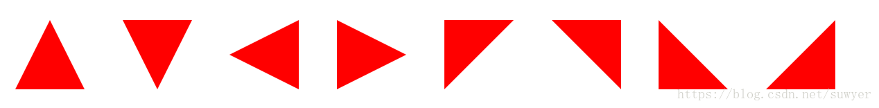
1、三角形系列(三角形、倒三角、左三角、右三角、左上三角、右上三角、左下三角、右下三角)
主要用到的是:宽度高度设置为0, border的各个边的设置(各个边的透明或不透明);
 .triangle-up {

			/* 三角形 */

			width: 0;

			height: 0;

			border-left: 50px solid transparent;

    		        border-right: 50px solid transparent;

        	        border-bottom: 100px solid #f00;

		}

		.triangle-down {

			/* 倒三角 */

			width: 0;

			height: 0;

			border-left: 50px solid transparent;

    		        border-right: 50px solid transparent;

        	        border-top: 100px solid #f00;

		}

		.triangle-left {

			/* 左三角 */

			width: 0;

			height: 0;

			border-top: 50px solid transparent;

    		        border-bottom: 50px solid transparent;

        	        border-right: 100px solid #f00;

		}

		.triangle-right {

			/* 右三角 */

			width: 0;

			height: 0;

			border-top: 50px solid transparent;

    		        border-bottom: 50px solid transparent;

        	        border-left: 100px solid #f00;

		}

		.triangle-topleft {

			/* 左上三角 */

			width: 0;

			height: 0;

    		        border-right: 100px solid transparent;

        	        border-top: 100px solid #f00;

		}

		.triangle-topright {

			/* 右上三角 */

			width: 0;

			height: 0;

			border-left: 100px solid transparent;

        	        border-top: 100px solid #f00;

		}

		.triangle-downleft {

			/* 左下三角 */

			width: 0;

			height: 0;

    		        border-right: 100px solid transparent;

        	        border-bottom: 100px solid #f00;

		}

		.triangle-downright {

			/* 右下三角 */

			width: 0;

			height: 0;

			border-left: 100px solid transparent;

        	        border-bottom: 100px solid #f00;

		}
2、梯形(三角形的变体,设置左右两条边相等,并且给它设置一个宽度)

       .Trapezium {

                    height: 0;

                    width: 100px;

                    border-bottom: 100px solid #dc2500;

                    border-left: 50px solid transparent;

                    border-right: 50px solid transparent;

                  }
2、爱心(心形的制作是非常复杂的,可以使用伪元素来制作,分别将伪元素旋转不同的角度,并修改transform-origin属性来元素的旋转中心点)

                .love {

			/* 爱心 */

			position: relative;

		}

		.love:before {

			content: "";

			width: 70px;

			height: 110px;

			background: #f00;

			position: absolute;

			border-top-left-radius: 50%;

			border-top-right-radius: 50%;

			transform: rotate(45deg);

		}

		.love:after {

			content: "";

			width: 70px;

			height: 110px;

			background: #f00;

			position: absolute;

			border-top-left-radius: 50%;

			border-top-right-radius: 50%;

			transform: rotate(-45deg);

			left: -30px;

		}
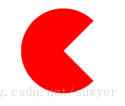
3、 食人豆(吃豆人的制作方法是先在一个圆形里面制作一个透明的三角形)
                .pacman {

			/* 食人豆 */

			width: 0;

		        height: 0;

		        border: 60px solid #f00;

		        border-right: 60px solid transparent;

		        border-radius: 100%;

		}
4、对话框(消息提示框可以先制作一个圆角矩形,然后在需要的地方放置一个三角形)

               .alertDialog {

			/* 对话框:一个圆角矩形和一个小三角形 */

			width: 150px;

			height: 100px;

			background: #f00;

			border-radius: 10px;

			position: relative;

		}

		.alertDialog:before {

			content: "";

			width: 0;

			height: 0;

			position: absolute;

		        left: -20px;

		        top: 40px;

			border-top: 10px solid transparent;

		        border-bottom: 10px solid transparent;

		        border-right: 20px solid #f00;

		}
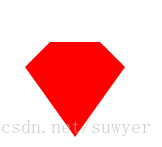
5、钻石(首先画一个直角梯形,再通过伪类元素在其下方画一个三角形)
               .diamond {

			/* 钻石:梯形和三角形组成 */

			width: 50px;

			height: 0;

			position: relative;

			border-bottom: 25px solid #f00;

			border-left: 25px solid transparent;

			border-right: 25px solid transparent;

		}

		.diamond:before {

			content: "";

			width: 0;

			height: 0;

			position: absolute;

		        border-left: 50px solid transparent;

		        border-right: 50px solid transparent;

		        border-top: 70px solid #f00;

		        left: -25px;

		        top: 25px;

		}
6、五角星(星形的实现方式比较复杂,主要是使用transform属性来旋转不同的边)

                .starFive {

			/* 五角星: */

			width: 0;

			height: 0;

			position: relative;

			border-left: 80px solid transparent;

			border-right: 80px solid transparent;

			border-bottom: 60px solid #f00;

			transform: rotate(35deg);

		}

		.starFive:before {

			content: "";

			position: absolute;

			width: 0;

			height: 0;

			border-left: 80px solid transparent;

			border-right: 80px solid transparent;

			border-bottom: 60px solid #f00;

			transform: rotate(-70deg);

			top: 3px;

			left: -80px;

		}

		.starFive:after {

			content: "";

			position: absolute;

			width: 0;

			height: 0;

			border-bottom: 60px solid #f00;

			border-right: 20px solid transparent;

			border-left: 20px solid transparent;

			transform: rotate(-35deg);

		        top: -40px;

		        left: -49px;

		}
7、菜单(结合::before和::after两个伪元素)

.btn-hamburger i {

    /* position: relative; */

    display: -moz-inline-stack;

    display: inline-block;

    zoom: 1;

    width: 22px;

    height: 3px;

    color: #fff;

    font: bold .24rem/0.4 Helvetica;

    text-transform: uppercase;

    text-indent: -55px;

    background: #fff;

    transition: all 0.2s ease-out;

}

.btn-hamburger i::before, .btn-hamburger i::after {

    content: '';

    width: 22px;

    height: 3px;

    background: #fff;

    position: absolute;

    left: 0;

    transition: 0.2s;

}

.btn-hamburger i::before {

    top: -7px;

}

.btn-hamburger i::after {

    bottom: -7px;

}
css3之图形绘制的更多相关文章
- 推荐12个最好的 JavaScript 图形绘制库
众多周知,图形和图表要比文本更具表现力和说服力.图表是数据图形化的表示,通过形象的图表来展示数据,比如条形图,折线图,饼图等等.可视化图表可以帮助开发者更容易理解复杂的数据,提高生产的效率和 Web ...
- 【Windows编程】系列第五篇:GDI图形绘制
上两篇我们学习了文本字符输出以及Unicode编写程序,知道如何用常见Win32输出文本字符串,这一篇我们来学习Windows编程中另一个非常重要的部分GDI图形绘图.Windows的GDI函数包含数 ...
- 13个JavaScript图表(JS图表)图形绘制插件【转】
现在网络上又有越来越多的免费的(JS 图表)JavaScript图表图形绘制插件.我之前给一家网站做过复杂的图形,我们用的是 highchart.在那段时间,没有很多可供选择的插件.但现在不同了,很容 ...
- C#中的GDI+图形绘制方法
GDI+图形绘制方法 1.首先对于绘制图形,必须的先将命名空间导入:using System.Drawing.Drawing2D; 2.然后在一个事件中写入程序 首先先将Graphics这个对象实例化 ...
- cocos2d-x 图形绘制
转自:http://blog.csdn.net/zhy_cheng/article/details/8480048 图形绘制的话,在cocos2d-x自带的TestCpp里有,包括绘制点,直线,多边形 ...
- 图形绘制 Canvas Paint Path 详解
图形绘制简介 Android中使用图形处理引擎,2D部分是android SDK内部自己提供,3D部分是用Open GL ES 1.0.大部分2D使用的api都在android.grap ...
- HTML5图形绘制学习(1)-- Canvas 元素简介
Canvas元素是HTML5中新增的一个专门用来进行图形绘制的元素.和其名称Canvas一样,它就相当于一个画布,我们可以在其上描绘各种图形. 这里所说的绘制图型,不是指我们可以进行可视化的图形绘制, ...
- 【D3.V3.js系列教程】--(十五)SVG基本图形绘制
[D3.V3.js系列教程]--(十五)SVG基本图形绘制 1.path <!DOCTYPE html> <html> <head> <meta charse ...
- 13个JavaScript图表(JS图表)图形绘制插件
转自:http://blog.jobbole.com/13671/ 1. Flash 过去是最佳解决方案,但很多人多在从那迁移: 2. 现代浏览器及其更强大的计算能力,使其在转化绘制实时数据方面的能力 ...
随机推荐
- Java框架之spring 项目 附加之noteresult(status msg data uuid MD5)
1.1创建类 实体类 NoteResult<T> 注意<T> private int status; private String msg; private T dat ...
- 魔法少女 LJJ——线段树
题目 [题目描述] 在森林中见过会动的树,在沙漠中见过会动的仙人掌过后,魔法少女 LJJ 已经觉得自己见过世界上的所有稀奇古怪的事情了. LJJ 感叹道“这里真是个迷人的绿色世界,空气清新.淡雅,到处 ...
- DB2存储过程标准
CREATE OR REPLACE PROCEDURE "FCT"."PROC_FCT_DSB_SERIES"(IN ACCOUNTING_DATE DATE) ...
- 关于Intel芯片架构的发展史
---恢复内容开始--- 当你真正的深入去行走在底层的道路上,你就会接触大量的一些貌似懂的概念性名词,比如Intel公司的x86架构,x64等等,又或者是当年的386,486等等,唉,有的时候真的是 ...
- 最长回文串:LeetCode:Longest Palindromic Substring
class Solution { public: string longestPalindrome(string s) { int length=s.length(); ; ; ][]={false} ...
- C++基础学习7:new/delete操作符
在C语言中,动态分配和释放内存的函数是malloc.calloc和free,而在C++语言中,new.new[].delete和delete[]操作符通常会被用来动态地分配内存和释放内存. 需要注意的 ...
- java中所有开源注解收集
@resource: resource全名为@Resource ,用来激活一个命名资源(namedresource)的依赖注入,在JavaEE应用程序中,该注解被典型地转换为绑定于JNDI conte ...
- sqoop数据校验
sqoop数据校验 # check data oracle_cnt=$(sqoop eval \ -Dmapred.job.queue.name=${queue} \ --connect ${conn ...
- OpenCV教程(转自:浅墨_毛星云博客)
2.图像的载入,显示和输出 一站式完全解析 本系列文章由@浅墨_毛星云 出品,转载请注明出处. 文章链接:http://blog.csdn.net/poem_qianmo/article/detail ...
- js学习笔记 -- 随记
js不区分整数和浮点数,统一用Number表示, js'=='比较会自动转换类型,会产生奇怪结果,'==='不会转换比较类型,如果不一致返回false,因此js判断始终用'===' `` 保留换行,也 ...