background-position 之剑走偏锋
转自:http://www.cnblogs.com/yizuierguo/archive/2009/03/10/1407860.html
在设置background-image属性时,经常会遇到一个background-position ;一直不怎么会用,今天有空研究下.
版本:CSS1 兼容性:IE4+ NS6+ 继承性:无
语法:
background-position : length || length
background-position : position || position
取值:
length
:
百分数 | 由浮点数字和单位标识符组成的长度值。请参阅长度单位
position
:
top | center | bottom | left | center | right
说明:
设置或检索对象的背景图像位置。必须先指定background-image属性。
该属性定位不受对象的补丁属性(padding)设置影响。
默认值为: 0% 0% 。此时背景图片将被定位于对象不包括补丁(padding)的内容区域的左上角。
如果只指定了一个值,该值将用于横坐标。纵坐标将默认为 50% 。如果指定了两个值,第二个值将用于纵坐标。
如果设置值为 right center ,因为 right 作为横坐标值将会覆盖 center 值,所以背景图片将被居右定位。
对应的脚本特性为 backgroundPosition 。
示例:
div { background: url("images/aardvark.gif"); background-position: 35% 80%; }
menu { background: url("images/aardvark.gif"); background-position: 35% 2.5cm; }
a { background: url("images/aardvark.gif"); background-position: 3.25in; }
body { background: url("images/aardvark.gif"); background-position: top right; }
其实background-position就是用来控制background-image的position
如果指定一个值,该值用于横坐标,纵坐标采用默认,即50%(center)
如果指定两个值,第二个值用于纵坐标,
例如你写定:background-position: left center;其实和background-position: left;是一样的都是左对齐,垂直居中对齐
如果指定:background-position: left left;就是左对齐,垂直居中对齐
如果指定:background-position: right right;就是右对齐,垂直居中对齐
如果指定:background-position: left right;其实这两个值都是在横坐标上的作用,right会覆盖left属性,所以最后显示的还是就是右对齐,垂直居中对齐。
除了left center right 还有TOP bottom,这两个分别是顶部对齐,底部对齐.
例如指定:background-position: left top;那么图片将位于左上角。
利用这个特性可以实现一个非常酷的效果
<!DOCTYPE html PUBLIC "-//W3C//DTD XHTML 1.0 Transitional//EN" "http://www.w3.org/TR/xhtml1/DTD/xhtml1-transitional.dtd">
<html xmlns="http://www.w3.org/1999/xhtml">
<head>
<meta http-equiv="Content-Type" content="text/html; charset=gb2312" />
<title>让我们共同推广WEB标准在中国的发展</title> <style type="text/css">
<!--
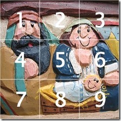
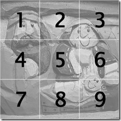
ul#menu { width:300px; height:300px; margin:0px auto; padding:0px; overflow:hidden; background:transparent url(/articleimg/2006/04/3366/01.jpg)}
ul#menu li { list-style-type:none; float:left; width:100px; height:100px;}
ul#menu li a { display:block; width:100px; height:100px; text-decoration:none; background:transparent url(/articleimg/2006/04/3366/02.jpg) no-repeat 500px 500px;}
a#item1:hover {background-position: 0 0; }
a#item2:hover {background-position: -100px 0;}
a#item3:hover {background-position: -200px 0;}
a#item4:hover {background-position: 0 -100px;}
a#item5:hover {background-position: -100px -100px;}
a#item6:hover {background-position: -200px -100px;}
a#item7:hover {background-position: 0 -200px;}
a#item8:hover {background-position: -100px -200px;}
a#item9:hover {background-position: -200px -200px;} -->
</style>
</head>
<body>
<ul id="menu">
<li><a id="item1" href="#" title="Item 1"> </a></li>
<li><a id="item2" href="#" title="Item 2"> </a></li>
<li><a id="item3" href="#" title="Item 3"> </a></li>
<li><a id="item4" href="#" title="Item 4"> </a></li>
<li><a id="item5" href="#" title="Item 5"> </a></li>
<li><a id="item6" href="#" title="Item 6"> </a></li>
<li><a id="item7" href="#" title="Item 7"> </a></li>
<li><a id="item8" href="#" title="Item 8"> </a></li>
<li><a id="item9" href="#" title="Item 9"> </a></li>
</ul>
</body>
</html>
是不是非常简单,而我们所用到的图片也仅仅是下面的2张而已:
background-position 之剑走偏锋的更多相关文章
- html5+css3中的background: -moz-linear-gradient 用法
在CSS中background: -moz-linear-gradient 让网站背景渐变的属性,目前火狐3.6以上版本和google浏览器支持这个属性. background: -moz-linea ...
- html5+css3中的background: -moz-linear-gradient 用法 (转载)
转载至-->http://www.cnblogs.com/smile-ls/archive/2013/06/03/3115599.html 在CSS中background: -moz-linea ...
- css3的Background新属性
前言 CSS3中出现了几种关于背景图片的新属性:background-origin.background-clip.background-position等.之前大致了解了下,但是background ...
- CSS3 Gradient 渐变
转载自:http://www.w3cplus.com/content/css3-gradient CSS3发布很久了,现在在国外的一些页面上常能看到他的身影,这让我羡慕已久,只可惜在国内为了兼容IE, ...
- jQuery视差滚动插件,(附原理分析,调用方法)
演示地址:http://www.jq22.com/jquery-info1799 jquery插件,使用验证过可用. 分析源代码后总结原理:设置background样式为fixed,判断浏览器滚动距离 ...
- CSS3 Gradient
CSS3CSS3发布很久了,现在在国外的一些页面上常能看到他的身影,这让我羡慕已久,只可惜在国内为了兼容IE,让这一项技术受到很大的限制,很多Web前端人员都望而止步.虽然如此但还是有很多朋友在钻研C ...
- CSS 笔记一(Selectors/ Backgrounds/ Borders/ Margins/ Padding/ Height and Width)
Selectors/ Backgrounds/ Borders/ Margins/ Padding/ Height and Width CSS Introduction: CSS stands for ...
- CSS3 线性渐变(linear-gradient) 兼容IE8,IE9
一.线性渐变在 Mozilla 下的应用 语法: -moz-linear-gradient( [<point> || <angle>,]? <stop>, ...
- 不用任何图片,只用简单的css写出唯美的钟表,就问你行吗?
aaarticlea/png;base64,iVBORw0KGgoAAAANSUhEUgAAAgAAAAGHCAIAAABJR31QAAAgAElEQVR4nOy9aXhc1ZUurPvcH7f73n ...
- 利用CSS3 中steps()制用动画
.monster { width: 190px; height: 240px; margin: 2% auto; background: url('http://treehouse-code-samp ...
随机推荐
- Matrix Zigzag Traversal(LintCode)
Matrix Zigzag Traversal Given a matrix of m x n elements (m rows, ncolumns), return all elements of ...
- 洛谷——P1194 买礼物
P1194 买礼物 题目描述 又到了一年一度的明明生日了,明明想要买B样东西,巧的是,这B样东西价格都是A元. 但是,商店老板说最近有促销活动,也就是: 如果你买了第I样东西,再买第J样,那么就可以只 ...
- 【爬虫】python requests模拟登录知乎
需求:模拟登录知乎,因为知乎首页需要登录才可以查看,所以想爬知乎上的内容首先需要登录,那么问题来了,怎么用python进行模拟登录以及会遇到哪些问题? 前期准备: 环境:ubuntu,python2. ...
- Hydra 8.4/8.5新增功能
Hydra 8.4/8.5新增功能 Kali Linux 2017.1自带的Hydra为8.3,现在Hydra升级到8.5,新增以下功能. (1)为输出文件选项-o,添加一个配套选项-b,允许 ...
- phonegap安卓视频播放解决方案
使用phonegap开发的时候,视频播放很多人一开始选择用html5的Video标签作为备选方案,实际上这种方案在真实环境下常常是无法满足需求的,因为目前HTML5的Video标签只支持MP4,OGG ...
- 【UVA 11077】 Find the Permutations (置换+第一类斯特林数)
Find the Permutations Sorting is one of the most used operations in real life, where Computer Scienc ...
- Java 生产者消费者 & 例题
Queue http://m635674608.iteye.com/blog/1739860 http://www.iteye.com/problems/84758 http://blog.csdn. ...
- 【BZOJ 4571】【SCOI 2016】美味
http://www.lydsy.com/JudgeOnline/problem.php?id=4571 这道题因为有加法,不能像可持久化trie那样每次判断只判断一个子树,而是在主席树上查询\(\l ...
- 20162303实验三 敏捷开发与XP实践-1
北京电子科技学院(BESTI) 实 验 报 告 课程:程序设计与数据结构 班级: 1623 姓名: 石亚鑫 学号:20162303 成绩: 2分 指导教师:娄嘉鹏 王志强 实验日期:5月12日 实验密 ...
- Word中正文两栏表格通栏排版
如图所示,需要在插入表格的地方插入连续分节符,这是word2013,在插入里面只有分页符 如果直接插入的话表格上下的分节符会分栏,那样表格会歪曲, 可以上面一段和下面一段设置成通栏,然后中间插入表格, ...