
Android Selector 与 Shape 基本用法
1:Selector
drawable的item中可以有以下属性:
android:drawable="@[package:]drawable/drawable_resource"
android:state_pressed=["true" | "false"]
android:state_focused=["true" | "false"]
android:state_selected=["true" | "false"]
android:state_active=["true" | "false"]
android:state_checkable=["true" | "false"]
android:state_checked=["true" | "false"]
android:state_enabled=["true" | "false"]
android:state_window_focused=["true" | "false"]
- <?xml version="1.0" encoding="utf-8"?>
- <selector xmlns:android="http://schemas.android.com/apk/res/android">
- <item android:state_enabled="true" android:state_checked="true" android:state_pressed="true"
- android:drawable="@drawable/enabled_on_pressed" />
- <item android:state_enabled="true" android:state_checked="false" android:state_pressed="true"
- android:drawable="@drawable/enabled_off_pressed" />
- <item android:state_enabled="true" android:state_checked="true"
- android:drawable="@drawable/enabled_on" />
- <item android:state_enabled="true" android:state_checked="false"
- android:drawable="@drawable/enabled_off" />
- <item android:state_enabled="false" android:state_checked="true"
- android:drawable="@drawable/disabled_on" />
- <item android:state_enabled="false" android:state_checked="false"
- android:drawable="@drawable/disabled_off" />
- </selector>
Item顺序是有讲究的,条件限定越细致,则应该放到前面。比如这儿如果把1,2行和3,4行的item交换,那么pressed的就永远无法触发了,因为有item已经满足条件返回了。可以理解为代码中的if语句。
2:Shape
- <shape>
- <!-- 实心 -->
- <solid android:color="#ff9d77"/>
- <!-- 渐变 -->
- <gradient
- android:startColor="#ff8c00"
- android:endColor="#FFFFFF"
- android:angle="270" />
- <!-- 描边 -->
- <stroke
- android:width="2dp"
- android:color="#dcdcdc" />
- <!-- 圆角 -->
- <corners
- android:radius="2dp" />
- <padding
- android:left="10dp"
- android:top="10dp"
- android:right="10dp"
- android:bottom="10dp" />
- </shape>
solid:实心,就是填充的意思
android:color指定填充的颜色
gradient:渐变
android:startColor和android:endColor分别为起始和结束颜色,ndroid:angle是渐变角度,必须为45的整数倍。
另外渐变默认的模式为android:type="linear",即线性渐变,可以指定渐变为径向渐变,android:type="radial",径向渐变需要指定半径android:gradientRadius="50"。
stroke:描边
android:width="2dp" 描边的宽度,android:color 描边的颜色。
我们还可以把描边弄成虚线的形式,设置方式为:
android:dashWidth="5dp"
android:dashGap="3dp"
其中android:dashWidth表示'-'这样一个横线的宽度,android:dashGap表示之间隔开的距离。
corners:圆角
android:radius为角的弧度,值越大角越圆。
我们还可以把四个角设定成不同的角度,方法为:
<corners
android:topRightRadius="20dp" 右上角
android:bottomLeftRadius="20dp" 右下角
android:topLeftRadius="1dp" 左上角
android:bottomRightRadius="0dp" 左下角
/>
这里有个地方需要注意,bottomLeftRadius是右下角,而不是左下角,这个有点郁闷,不过不影响使用,记得别搞错了就行。
还有网上看到有人说设置成0dp无效,不过我在测试中发现是可以的,我用的是2.2,可能修复了这个问题吧,如果无效的话那就只能设成1dp了。
padding:间隔
button_selector.xml:
- <?xml version="1.0" encoding="utf-8"?>
- <selector
- xmlns:android="http://schemas.android.com/apk/res/android">
- <item android:state_pressed="true" >
- <shape>
- <!-- 渐变 -->
- <gradient
- android:startColor="#ff8c00"
- android:endColor="#FFFFFF"
- android:type="radial"
- android:gradientRadius="50" />
- <!-- 描边 -->
- <stroke
- android:width="2dp"
- android:color="#dcdcdc"
- android:dashWidth="5dp"
- android:dashGap="3dp" />
- <!-- 圆角 -->
- <corners
- android:radius="2dp" />
- <padding
- android:left="10dp"
- android:top="10dp"
- android:right="10dp"
- android:bottom="10dp" />
- </shape>
- </item>
- <item android:state_focused="true" >
- <shape>
- <gradient
- android:startColor="#ffc2b7"
- android:endColor="#ffc2b7"
- android:angle="270" />
- <stroke
- android:width="2dp"
- android:color="#dcdcdc" />
- <corners
- android:radius="2dp" />
- <padding
- android:left="10dp"
- android:top="10dp"
- android:right="10dp"
- android:bottom="10dp" />
- </shape>
- </item>
- <item>
- <shape>
- <solid android:color="#ff9d77"/>
- <stroke
- android:width="2dp"
- android:color="#fad3cf" />
- <corners
- android:topRightRadius="5dp"
- android:bottomLeftRadius="5dp"
- android:topLeftRadius="0dp"
- android:bottomRightRadius="0dp"
- />
- <padding
- android:left="10dp"
- android:top="10dp"
- android:right="10dp"
- android:bottom="10dp" />
- </shape>
- </item>
- </selector>
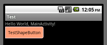
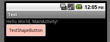
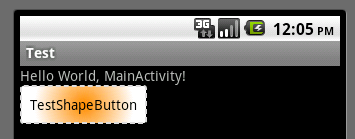
运行效果如下图:
一般状态:
获得焦点状态:
按下状态:
Android Selector 与 Shape 基本用法的更多相关文章
- Android Selector和Shape的用法
一.Shape的用法 :shape用于设定形状,可以在selector,layout等里面使用,有6个子标签,各属性如下: 填充:设置填充的颜色 间隔:设置四个方向上的间隔 大小:设置大小 圆角:同时 ...
- android中的selector背景选择器的用法
关于listview和button都要改变android原来控件的背景,在网上查找了一些资料不是很全,所以现在总结一下android的selector的用法. 首先android的selector是在 ...
- android 开发:shape和selector和layer-list的(详细说明)
目录(?)[+] Shape 简介 使用的方法 属性 Selector 简介 使用的方法 layer-list 简介 例子 最后 <shape>和<selector>在An ...
- Android之Selector、Shape介绍
------------整理自网络---------------------- <?xml version=”1.0″ encoding=”utf-8″?> <shape xmlns ...
- android selector shape 使用
先上效果图 message_toolbar_left_bg_selector <?xml version="1.0" encoding="utf-8"?& ...
- 【转】Android开发:shape和selector和layer-list的(详细说明)
<shape>和<selector>在Android UI设计中经常用到.比如我们要自定义一个圆角Button,点击Button有些效果的变化,就要用到<shape> ...
- android selector中使用shape
<shape> <!-- 实心 --> <solid android:color="#ff9d77"/> <!-- 渐变 --&g ...
- Android通过用代码画虚线椭圆边框背景来学习一下shape的用法
在Android程序开发中,我们经常会去用到Shape这个东西去定义各种各样的形状,shape可以绘制矩形环形以及椭圆,所以只需要用椭圆即可,在使用的时候将控件比如imageview或textview ...
- Android自己定义矩形及selector、shape的使用
[声明]转载请注明出处.此文出自指尖飞落的博客:http://blog.csdn.net/huntersnail --每天写一篇博客.每天做一点技术积累! Android自己定义矩形及selector ...
随机推荐
- TCP 三次握手原理,你真的理解吗?
最近,阿里中间件小哥哥蛰剑碰到一个问题——client端连接服务器总是抛异常.在反复定位分析.并查阅各种资料文章搞懂后,他发现没有文章把这两个队列以及怎么观察他们的指标说清楚. 因此,蛰剑写下这篇文章 ...
- 【C++】std::是什么?
引例: #include<iostream> int main() { std::cout<<"我喜欢C++";//输出一句话 std::cout<& ...
- Flutter - AAPT: error: resource android:attr/dialogCornerRadius not found.
Launching lib\main.dart on Nokia X6 in debug mode... FAILURE: Build failed with an exception. * What ...
- RabbitMQ TroubleShooting
RabbitMQ是一款优秀的消息队列中间件,提供了稳定.监控完善的产品,但是软件就会有bug.为了前进路径可以畅通,我们必须了解出现的一些故障的快速处理方式,毕竟在生产环境,时间就是生命,尽快的处理是 ...
- 对于ps基本操作的归纳
1.开始新的制作 1)新建 快捷键:Ctrl+n 格式:宽高根据要求自选:颜色模式常用R(红)G(绿)B(蓝) 2)打开电脑上的图片 快捷键:Ctrl+o 2.选框工具 快捷键:M 作用:能 ...
- WinForm多线程+委托防止界面假死
当有大量数据需要计算.显示在界面或者调用sleep函数时,容易导致界面卡死,可以采用多线程加委托的方法解决 using System; using System.Collections.Generic ...
- 继承:call、apply、bind方法
javascript 中,call 和 apply 都是为了改变某个函数运行时的上下文(context)而存在的,换句话说,就是为了改变函数体内部 this 的指向. call,apply,bind这 ...
- CentOS 网卡自动启动、配置等ifcfg-eth0教程
装完centos后发现网卡没有自动启动, vi /etc/sysconfig/network-scripts/ifcfg-eth0 将ONBOOT=no 改为yes即可 原文链接: http://yp ...
- Individual Project - Word_frequency
0x00 预先准备和时间规划 1.因为要用到visual studio 2013,准备学习C#,预计一天时间能基本使用. 3.了解需求并设计基本数据结构与大致流程 20min 2.根据提议实现simp ...
- 基于SSH框架的在线考勤系统开发的质量属性
我要开发的是一个基于SSH框架的在线考勤系统. 质量属性是指影响质量的相关因素,下面我将分别从6个系统质量属性(可用性,易用性,可修改性,性能,安全性,可测试性)来分析我的系统,以及如何实现这些质量属 ...