CSS图形
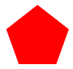
1、正方形
最终效果:

CSS代码如下:
width: 100px;
height: 100px;
background: red;
}
2、长方形
最终效果:

CSS代码如下:
width: 200px;
height: 100px;
background: red;
}
3、圆形
最终效果:

CSS代码如下:
width: 100px;
height: 100px;
background: red;
-moz-border-radius: 50px;
-webkit-border-radius: 50px;
border-radius: 50px;
}
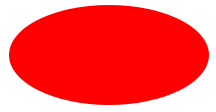
4、椭圆
最终效果:
CSS代码如下:
width: 200px;
height: 100px;
background: red;
-moz-border-radius: 100px / 50px;
-webkit-border-radius: 100px / 50px;
border-radius: 100px / 50px;
}
5、上三角
最终效果:

CSS代码如下:
width: 0;
height: 0;
border-left: 50px solid transparent;
border-right: 50px solid transparent;
border-bottom: 100px solid red;
}
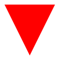
6、下三角
最终效果:
CSS代码如下:
width: 0;
height: 0;
border-left: 50px solid transparent;
border-right: 50px solid transparent;
border-top: 100px solid red;
}
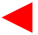
7、左三角
最终效果:
CSS代码如下:
width: 0;
height: 0;
border-top: 50px solid transparent;
border-right: 100px solid red;
border-bottom: 50px solid transparent;
}
8、右三角
最终效果:

CSS代码如下:
width: 0;
height: 0;
border-top: 50px solid transparent;
border-left: 100px solid red;
border-bottom: 50px solid transparent;
}
9、左上三角
最终效果:

CSS代码如下:
width: 0;
height: 0;
border-top: 100px solid red;
border-right: 100px solid transparent;
}
10、右上三角
最终效果:

CSS代码如下:
width: 0;
height: 0;
border-top: 100px solid red;
border-left: 100px solid transparent;
}
11、左下三角
最终效果:

CSS代码如下:
width: 0;
height: 0;
border-bottom: 100px solid red;
border-right: 100px solid transparent;
}
12、右下三角
最终效果:

CSS代码如下:
width: 0;
height: 0;
border-bottom: 100px solid red;
border-left: 100px solid transparent;
}
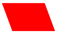
13、平行四边形
最终效果:
CSS代码如下:
width: 150px;
height: 100px;
margin-left:20px;
-webkit-transform: skew(20deg);
-moz-transform: skew(20deg);
-o-transform: skew(20deg);
background: red;
}
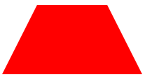
14、梯形
最终效果:
CSS代码如下:
border-bottom: 100px solid red;
border-left: 50px solid transparent;
border-right: 50px solid transparent;
height: 0;
width: 100px;
}
15、六角星
最终效果:

CSS代码如下:
width: 0;
height: 0;
border-left: 50px solid transparent;
border-right: 50px solid transparent;
border-bottom: 100px solid red;
position: relative;
}
#star-six:after {
width: 0;
height: 0;
border-left: 50px solid transparent;
border-right: 50px solid transparent;
border-top: 100px solid red;
position: absolute;
content: "";
top: 30px;
left: -50px;
}
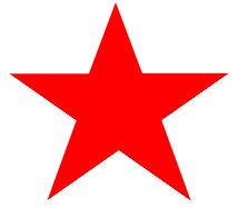
16、五角星
最终效果:
CSS代码如下:
margin: 50px 0;
position: relative;
display: block;
color: red;
width: 0px;
height: 0px;
border-right: 100px solid transparent;
border-bottom: 70px solid red;
border-left: 100px solid transparent;
-moz-transform: rotate(35deg);
-webkit-transform: rotate(35deg);
-ms-transform: rotate(35deg);
-o-transform: rotate(35deg);
}
#star-five:before {
border-bottom: 80px solid red;
border-left: 30px solid transparent;
border-right: 30px solid transparent;
position: absolute;
height: 0;
width: 0;
top: -45px;
left: -65px;
display: block;
content: '';
-webkit-transform: rotate(-35deg);
-moz-transform: rotate(-35deg);
-ms-transform: rotate(-35deg);
-o-transform: rotate(-35deg);
}
#star-five:after {
position: absolute;
display: block;
color: red;
top: 3px;
left: -105px;
width: 0px;
height: 0px;
border-right: 100px solid transparent;
border-bottom: 70px solid red;
border-left: 100px solid transparent;
-webkit-transform: rotate(-70deg);
-moz-transform: rotate(-70deg);
-ms-transform: rotate(-70deg);
-o-transform: rotate(-70deg);
content: '';
}
17、五角大楼
最终效果:
CSS代码如下:
position: relative;
width: 54px;
border-width: 50px 18px 0;
border-style: solid;
border-color: red transparent;
}
#pentagon:before {
content: "";
position: absolute;
height: 0;
width: 0;
top: -85px;
left: -18px;
border-width: 0 45px 35px;
border-style: solid;
border-color: transparent transparent red;
}
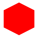
18、六边形
最终效果:
CSS代码如下:
width: 100px;
height: 55px;
background: red;
position: relative;
}
#hexagon:before {
content: "";
position: absolute;
top: -25px;
left: 0;
width: 0;
height: 0;
border-left: 50px solid transparent;
border-right: 50px solid transparent;
border-bottom: 25px solid red;
}
#hexagon:after {
content: "";
position: absolute;
bottom: -25px;
left: 0;
width: 0;
height: 0;
border-left: 50px solid transparent;
border-right: 50px solid transparent;
border-top: 25px solid red;
}
19、八角形
最终效果:

CSS代码如下:
width: 100px;
height: 100px;
background: red;
position: relative;
}
#octagon:before {
content: "";
position: absolute;
top: 0;
left: 0;
border-bottom: 29px solid red;
border-left: 29px solid #eee;
border-right: 29px solid #eee;
width: 42px;
height: 0;
}
#octagon:after {
content: "";
position: absolute;
bottom: 0;
left: 0;
border-top: 29px solid red;
border-left: 29px solid #eee;
border-right: 29px solid #eee;
width: 42px;
height: 0;
}
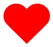
20、爱心
最终效果:
CSS代码如下:
position: relative;
width: 100px;
height: 90px;
}
#heart:before,
#heart:after {
position: absolute;
content: "";
left: 50px;
top: 0;
width: 50px;
height: 80px;
background: red;
-moz-border-radius: 50px 50px 0 0;
border-radius: 50px 50px 0 0;
-webkit-transform: rotate(-45deg);
-moz-transform: rotate(-45deg);
-ms-transform: rotate(-45deg);
-o-transform: rotate(-45deg);
transform: rotate(-45deg);
-webkit-transform-origin: 0 100%;
-moz-transform-origin: 0 100%;
-ms-transform-origin: 0 100%;
-o-transform-origin: 0 100%;
transform-origin: 0 100%;
}
#heart:after {
left: 0;
-webkit-transform: rotate(45deg);
-moz-transform: rotate(45deg);
-ms-transform: rotate(45deg);
-o-transform: rotate(45deg);
transform: rotate(45deg);
-webkit-transform-origin: 100% 100%;
-moz-transform-origin: 100% 100%;
-ms-transform-origin: 100% 100%;
-o-transform-origin: 100% 100%;
transform-origin :100% 100%;
}
21、无穷大符号
最终效果:

CSS代码如下:
position: relative;
width: 212px;
height: 100px;
}
#infinity:before,
#infinity:after {
content: "";
position: absolute;
top: 0;
left: 0;
width: 60px;
height: 60px;
border: 20px solid red;
-moz-border-radius: 50px 50px 0 50px;
border-radius: 50px 50px 0 50px;
-webkit-transform: rotate(-45deg);
-moz-transform: rotate(-45deg);
-ms-transform: rotate(-45deg);
-o-transform: rotate(-45deg);
transform: rotate(-45deg);
}
#infinity:after {
left: auto;
right: 0;
-moz-border-radius: 50px 50px 50px 0;
border-radius: 50px 50px 50px 0;
-webkit-transform: rotate(45deg);
-moz-transform: rotate(45deg);
-ms-transform: rotate(45deg);
-o-transform: rotate(45deg);
transform: rotate(45deg);
}
22、鸡蛋

最终效果
CSS代码如下:
display:block;
width: 126px;
height: 180px;
-webkit-border-radius: 63px 63px 63px 63px / 108px 108px 72px 72px;
border-radius: 50% 50% 50% 50% / 60% 60% 40% 40%;
}
23、食逗人(Pac-Man)
最终效果:

CSS代码如下:
width: 0px;
height: 0px;
border-right: 60px solid transparent;
border-top: 60px solid red;
border-left: 60px solid red;
border-bottom: 60px solid red;
border-top-left-radius: 60px;
border-top-right-radius: 60px;
border-bottom-left-radius: 60px;
border-bottom-right-radius: 60px;
}
24、提示对话框
最终效果:

CSS代码如下:
width: 120px;
height: 80px;
background: red;
position: relative;
-moz-border-radius: 10px;
-webkit-border-radius: 10px;
border-radius: 10px;
}
#talkbubble:before {
content:"";
position: absolute;
right: 100%;
top: 26px;
width: 0;
height: 0;
border-top: 13px solid transparent;
border-right: 26px solid red;
border-bottom: 13px solid transparent;
}
25、12角星
最终效果:

CSS代码如下:
background: red;
width: 80px;
height: 80px;
position: relative;
text-align: center;
}
#burst-12:before, #burst-12:after {
content: "";
position: absolute;
top: 0;
left: 0;
height: 80px;
width: 80px;
background: red;
}
#burst-12:before {
-webkit-transform: rotate(30deg);
-moz-transform: rotate(30deg);
-ms-transform: rotate(30deg);
-o-transform: rotate(30deg);
transform: rotate(30deg);
}
#burst-12:after {
-webkit-transform: rotate(60deg);
-moz-transform: rotate(60deg);
-ms-transform: rotate(60deg);
-o-transform: rotate(60deg);
transform: rotate(60deg);
}
26、8角星
最终效果:

CSS代码如下:
background: red;
width: 80px;
height: 80px;
position: relative;
text-align: center;
-webkit-transform: rotate(20deg);
-moz-transform: rotate(20deg);
-ms-transform: rotate(20deg);
-o-transform: rotate(20eg);
transform: rotate(20deg);
}
#burst-8:before {
content: "";
position: absolute;
top: 0;
left: 0;
height: 80px;
width: 80px;
background: red;
-webkit-transform: rotate(135deg);
-moz-transform: rotate(135deg);
-ms-transform: rotate(135deg);
-o-transform: rotate(135deg);
transform: rotate(135deg);
}
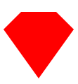
27、钻石
最终效果:
CSS代码如下:
border-style: solid;
border-color: transparent transparent red transparent;
border-width: 0 25px 25px 25px;
height: 0;
width: 50px;
position: relative;
margin: 20px 0 50px 0;
}
#cut-diamond:after {
content: "";
position: absolute;
top: 25px;
left: -25px;
width: 0;
height: 0;
border-style: solid;
border-color: red transparent transparent transparent;
border-width: 70px 50px 0 50px;
}
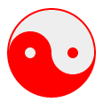
28、阴阳八卦(霸气的这个)
最终效果:
CSS代码如下:
width: 96px;
height: 48px;
background: #eee;
border-color: red;
border-style: solid;
border-width: 2px 2px 50px 2px;
border-radius: 100%;
position: relative;
}
#yin-yang:before {
content: "";
position: absolute;
top: 50%;
left: 0;
background: #eee;
border: 18px solid red;
border-radius: 100%;
width: 12px;
height: 12px;
}
#yin-yang:after {
content: "";
position: absolute;
top: 50%;
left: 50%;
background: red;
border: 18px solid #eee;
border-radius:100%;
width: 12px;
height: 12px;
}
CSS图形的更多相关文章
- 奇妙的 CSS shapes(CSS图形)
CSS 发展到今天已经越来越强大了.其语法的日新月异,让很多以前完成不了的事情,现在可以非常轻松的做到.今天就向大家介绍几个比较新的强大的 CSS 功能: clip-path shape-outsid ...
- 美丽的CSS图形和HTML5
1.HTML5基础 文档类型 <!DOCTYPE HTML PUBLIC "-//W3C//DTD HTML 4.01 Transitional//EN" "htt ...
- css图形——三角形
1.css图形简介 在浏览网页的时候,我们经常看见各种图形的效果,而但凡涉及到图形效果,我们第一个想到的就是用图片来实现.但是在前端开发中,为了网站的性能速度,我们都是秉承着少用图片的原生质. 因为图 ...
- 奇妙的 CSS shapes(CSS图形) 【css 图形,绘图,CSS 几何图形)】
http://www.cnblogs.com/coco1s/p/6992177.html <!DOCTYPE html> <html> <head> <met ...
- 有趣的css图形实现
css通过 border .border-radius .transform,实现各种图形. <!DOCTYPE html> <html lang="en"> ...
- CSS图形基础:纯CSS绘制图形
为了在页面中利用CSS3绘制图形,在页面中定义 <div class="container"> <div class="shape"> ...
- 利用噪声构建美妙的 CSS 图形
在平时,我非常喜欢利用 CSS 去构建一些有意思的图形. 我们首先来看一个简单的例子.首先,假设我们实现一个 10x10 的格子: 此时,我们可以利用一些随机效果,优化这个图案.譬如,我们给它随机添加 ...
- CSS图形形状大全
The Shapes of CSS All of the below use only a single HTML element. Any kind of CSS goes, as long as ...
- css图形——椭圆
在css中,我们也使用border-radius属性来实现椭圆 语法 border-radius:x/y; 说明: x表示圆角的水平半径,y表示圆角的垂直半径. 例如:border-radius:30 ...
随机推荐
- [jzoj]3456.【NOIP2013模拟联考3】恭介的法则(rule)
Link https://jzoj.net/senior/#main/show/3456 Description 终于,在众亲们的奋斗下,最终boss 恭介被关进了库特设计的密室.正当她们松了一口气时 ...
- Node.js_密码明文_密文_加密库_sha1
加密库 sha1 加密模块,能够将指定 明文 加密成一个长度相等的 密文 let pwd = 'qwe123456'; const secret = sha1(pwd); 同样的明文,加密得到同样的密 ...
- 2018-2019-1 20189210 《Linux内核原理与分析》第三周作业
一.学习笔记 计算机的"三大法宝" 1.程序存储计算机. 2.函数调用对栈.堆栈的作用是:记录函数调用框架.传递函数参数.保存返回值地址.提供函数内部局部变量的存储空间.函数调用堆 ...
- C博客作业01--分支,顺序结构
本章学习总结(2分) 1.1思维导图 1.2本章学习体会及代码量学习体会 1.2.1学习体会 本周初次接触C语言,一开始难度较大,很多代码都看不懂,书里面的章节要看很多遍.开始编写代码时也遇到很多困难 ...
- laravel整合vue 多入口解决
2018年8月10日23:10:29 其实整合是挺简单,因为laravel本身就准备的挺好了 laravel 版本5.6 注意php cli是web是不一样的 这个需要设置环境变量 ,php需要7 ...
- Kafka: Exactly-once Semantics
https://www.confluent.io/blog/enabling-exactly-kafka-streams/ https://cwiki.apache.org/confluence/di ...
- 安装_oracle11G_客户端_服务端_链接_oracle
在开始之前呢,有一些注细节需要注意,oracle11G_客户端_和_服务端, 分为两种 一种是 开发者使用 一种是 BDA 自己使用(同时也需要根据自己 PC 的系统来做_win7_与 ...
- WinAPI 字符及字符串函数(9): lstrcat - 合并字符串
unit Unit1; interface uses Windows, Messages, SysUtils, Variants, Classes, Graphics, Controls, For ...
- mysql中find_in_set的使用
首先举个例子来说: 有个文章表里面有个type字段,它存储的是文章类型,有 1头条.2推荐.3热点.4图文等等 .现在有篇文章他既是头条,又是热点,还是图文,type中以 1,3,4 的格式存储.那我 ...
- linux基础命令--groupdel 删除群组
描述 groupdel命令用于删除用户组. groupdel命令会去修改系统下的/etc/group和/group/gshadow文件,删除有关用户组的所有项目(一般来说使用groupadd或user ...