Flutter FlatButton 按钮基本各种用法
Flutter中给我们预先定义好了一些按钮控件给我们用,常用的按钮如下

    RaisedButton :凸起的按钮,其实就是Android中的Material Design风格的Button ,继承自MaterialButton

    FlatButton :扁平化的按钮,继承自MaterialButton

    OutlineButton    :带边框的按钮,继承自MaterialButton

    IconButton    :图标按钮,继承自StatelessWidget

我们先来看看MaterialButton中的属性,可以看到能设置的属性还是很多的。

  const MaterialButton({

    Key key,

    @required this.onPressed,

    this.onHighlightChanged,

    this.textTheme,

    this.textColor,

    this.disabledTextColor,

    this.color,

    this.disabledColor,

    this.highlightColor,

    this.splashColor,

    this.colorBrightness,

    this.elevation,

    this.highlightElevation,

    this.disabledElevation,

    this.padding,

    this.shape,

    this.clipBehavior = Clip.none,

    this.materialTapTargetSize,

    this.animationDuration,

    this.minWidth,

    this.height,

    this.child,

  }) : super(key: key);

下面我们来看看常用属性

属性     值类型     说明

onPressed     VoidCallback ,一般接收一个方法     必填参数,按下按钮时触发的回调,接收一个方法,传null表示按钮禁用,会显示禁用相关样式

child     Widget     文本控件

textColor     Color     文本颜色

color     Color     按钮的颜色

disabledColor     Color     按钮禁用时的颜色

disabledTextColor     Color     按钮禁用时的文本颜色

splashColor     Color     点击按钮时水波纹的颜色

highlightColor     Color     点击(长按)按钮后按钮的颜色

elevation     double     阴影的范围,值越大阴影范围越大

padding     EdgeInsetsGeometry (抽象类)     内边距

shape     ShapeBorder(抽象类)     设置按钮的形状

minWidth     double     最小宽度

height     double     高度

而在Android中如果我们要修改按钮样式的话,需要通过selector和Shape等方式进行修改,相比较Flutter来说是要麻烦不少的

RaisedButton

RaisedButton的构造方法如下,由于继承自MaterialButton,所以MaterialButton中的大多数属性这边都能用,且效果一致,这里就不在赘述了

  const RaisedButton({

    Key key,

    @required VoidCallback onPressed,

    ValueChanged<bool> onHighlightChanged,

    ButtonTextTheme textTheme,

    Color textColor,

    Color disabledTextColor,

    Color color,

    Color disabledColor,

    Color highlightColor,

    Color splashColor,

    Brightness colorBrightness,

    double elevation,

    double highlightElevation,

    double disabledElevation,

    EdgeInsetsGeometry padding,

    ShapeBorder shape,

    Clip clipBehavior = Clip.none,

    MaterialTapTargetSize materialTapTargetSize,

    Duration animationDuration,

    Widget child,

  })

下面我们来看一下属性

onPressed

接收一个方法,点击按钮时回调该方法。如果传null,则表示按钮禁用

 return RaisedButton(

      onPressed: null,

    );

如下图所示

下面我们定义一个方法传给onPressed

_log() {

    print("点击了按钮");

  }

  @override

  Widget build(BuildContext context) {

    return RaisedButton(

      onPressed: _log,

    );

  }

点击按钮后会调用log方法。

child
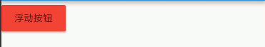
按钮文本控件,一般都是传一个Text Widget return RaisedButton(
onPressed: _log,
child: Text("浮动按钮"),
);

color

按钮的颜色

return RaisedButton(

      onPressed: _log,

      child: Text("浮动按钮"),

      color: Colors.red,

    );
textColor

按钮的文本颜色

 return RaisedButton(

      onPressed: _log,

      child: Text("浮动按钮"),

      color: Colors.red,

      textColor: Colors.white,

    );

splashColor

点击按钮时水波纹的颜色

   return RaisedButton(

      onPressed: _log,

      child: Text("浮动按钮"),

      color: Colors.red,

      textColor: Colors.white,

      splashColor: Colors.black,

    );

highlightColor

高亮颜色,点击(长按)按钮后的颜色

    return RaisedButton(

      onPressed: _log,

      child: Text("浮动按钮"),

      color: Colors.red,

      textColor: Colors.white,

      splashColor: Colors.black,

      highlightColor: Colors.green,

    );

elevation

阴影范围,一般不会设置太大

    return RaisedButton(

      onPressed: _log,

      child: Text("浮动按钮"),

      color: Colors.red,

      textColor: Colors.white,

      splashColor: Colors.black,

      highlightColor: Colors.green,

      elevation: 30,

    );

padding

内边距,其接收值的类型是EdgeInsetsGeometry类型的,EdgeInsetsGeometry是一个抽象类,我们来看看其实现类

我们一般都用EdgeInsets类中的方法来设置padding

常用方法如下

//单独设置左上右下的间距,四个参数都要填写

const EdgeInsets.fromLTRB(this.left, this.top, this.right, this.bottom);

//单独设置左上右下的间距,四个均为可选参数

  const EdgeInsets.only({

    this.left = 0.0,

    this.top = 0.0,

    this.right = 0.0,

    this.bottom = 0.0

  });

  //一次性设置上下左右的间距

  const EdgeInsets.all(double value)

      : left = value, top = value, right = value, bottom = value;

示例:

EdgeInsets.all()

      padding: EdgeInsets.all(20)

EdgeInsets.fromLTRB()

padding: EdgeInsets.fromLTRB(0,30,20,40)

EdgeInsets.only()

 padding: EdgeInsets.only(top: 30)

shape

shape用来设置按钮的形状,其接收值是ShapeBorder类型,ShapeBorder是一个抽象类,我们来看看有哪些实现类

可以看到,实现类还是很多的,我们主要来看看常用的即可。

    BeveledRectangleBorder 带斜角的长方形边框

    CircleBorder 圆形边框

    RoundedRectangleBorder 圆角矩形

    StadiumBorder 两端是半圆的边框

我们来简单用一用,在用之前我们先来看一下

常用的两个属性

    side 用来设置边线(颜色,宽度等)

    borderRadius 用来设置圆角

side接收一个BorderSide类型的值,比较简单,这里就不介绍了,看一下构造方法

  const BorderSide({

    this.color = const Color(0xFF000000),

    this.width = 1.0,

    this.style = BorderStyle.solid,

  })

borderRadius 接收一个BorderRadius类型的值,常用方法如下

我们可以把borderRadius分为上下左右四个方向,下面的方法都是对这四个方向进行设置,

    all 配置所有方向

    cricular 环形配置,跟all效果差不多,直接接收double类型的值

    horizontal 只配置左右方向

    only 可选左上,右上,左下,右下配置

    vertical 只配置上下方向

具体配置大家自行尝试

我们来简单用一下

BeveledRectangleBorder

带斜角的长方形边框

shape: BeveledRectangleBorder(

         side: BorderSide(

        color: Colors.white,

      ),

      borderRadius: BorderRadius.all(Radius.circular(10))

      ),

CircleBorder

圆形边框

     shape: CircleBorder(

        side: BorderSide(

          color: Colors.white,

        ),

      ),

RoundedRectangleBorder

圆角矩形

     shape: RoundedRectangleBorder(

        borderRadius: BorderRadius.all(Radius.circular(10)),

      ),

StadiumBorder

两端是半圆的边框

 shape: StadiumBorder(),

FlatButton

FlatButton跟RaisedButton用法基本一致,下面我们就直接用一下

/*扁平按钮*/

class FlatBtn extends StatelessWidget {

  _log() {

    print("点击了扁平按钮");

  }

  @override

  Widget build(BuildContext context) {

    return FlatButton(

      onPressed: _log,

      child: Text("扁平按钮"),

      color: Colors.blue,

      textColor: Colors.black,

      shape: RoundedRectangleBorder(

          side: BorderSide(

            color: Colors.white,

            width: 1,

          ),

          borderRadius: BorderRadius.circular(8)),

    );

  }

}

OutlineButton

注意,OutlineButton是一个有默认边线且背景透明的按钮,也就是说我们设置其边线和颜色是无效的,其他属性跟MaterialButton中属性基本一致

下面我们直接来使用

/*带边线的按钮*/

class outlineBtn extends StatelessWidget {

  _log() {

    print("点击了边线按钮");

  }

  @override

  Widget build(BuildContext context) {

    // TODO: implement build

    return OutlineButton(

      onPressed: _log,

      child: Text("边线按钮"),

      textColor: Colors.red,

      splashColor: Colors.green,

      highlightColor: Colors.black,

      shape: BeveledRectangleBorder(

        side: BorderSide(

          color: Colors.red,

          width: 1,

        ),

        borderRadius: BorderRadius.circular(10),

      ),

    );

  }

}

效果如下:

IconButton

IconButton是直接继承自StatelessWidget的,默认没有背景

我们来看一下他的构造方法

const IconButton({

    Key key,

    this.iconSize = 24.0,

    this.padding = const EdgeInsets.all(8.0),

    this.alignment = Alignment.center,

    @required this.icon,

    this.color,

    this.highlightColor,

    this.splashColor,

    this.disabledColor,

    @required this.onPressed,

    this.tooltip

  })

可以看到,icon是必填参数

icon接收一个Widget,但是一般我们都是传入一个Icon Widget

final Widget icon;

其他属性跟MaterialButton中的属性用法基本一致

我们来用一下

/*图标按钮*/

class IconBtn extends StatelessWidget {

  _log() {

    print("点击了图标按钮");

  }

  @override

  Widget build(BuildContext context) {

    return IconButton(

      icon: Icon(Icons.home),

      onPressed: _log,

      color: Colors.blueAccent,

      highlightColor: Colors.red,

    );

  }

}

效果如下

我们也可以传一个Text或其他Widget,这个大家自行尝试吧

Flutter中Button内容大概就是这些
Flutter FlatButton 按钮基本各种用法的更多相关文章
- flutter 底部按钮切换页面
界面如图: 我们就从上节里面的app.dartt修改 目录:lib lib/story 其它两个目录一样. 图片配置一下 app.dart import 'package:flutter/materi ...
- Flutter 中渐变的高级用法
Flutter 中渐变有三种: LinearGradient:线性渐变 RadialGradient:放射状渐变 SweepGradient:扇形渐变 看下原图,下面的渐变都是在此图基础上完成. Li ...
- flutter flutter_cupertino_date_picker 时间插件的用法
https://blog.csdn.net/sinat_37255207/article/details/100041023 https://github.com/wuzhendev/flutter- ...
- Flutter 的基本控件
文本控件 Text 支持两种类型的文本展示,一个是默认的展示单一样式文本 Text,另一个是支持多种混合样式的富文本 Text.rich. 单一样式文本 Text 单一样式文本 Text 的初始化,是 ...
- 你知道吗,Flutter内置了10多种Button控件
注意:无特殊说明,Flutter版本及Dart版本如下: Flutter版本: 1.12.13+hotfix.5 Dart版本: 2.7.0 Flutter内置了10多种Button(按钮)类控件供我 ...
- 决胜Flutter 第一章 熟悉战场
欢迎参加“决胜Flutter” 实训课程,这里是你此次实训之旅的起点. 本章将带您快速了解移动开发的现状,然后向您介绍Flutter的发展历史以及优势特点,最后一起动手,搭建高效的开发环境. 由于Fl ...
- Flutter基础系列之混合开发(二)
1.混合开发的场景 1.1作为独立页面加入 这是以页面级作为独立的模块加入,而不是页面的某个元素. 原生页面可以打开Flutter页面 Flutter页面可以打开原生页面 1.2作为页面的一部分嵌入 ...
- godot新手教程1[button信号使用]<godot节点信号对照及节点属性用法>
button(按钮)节点信号对照: 1:pressed() #按钮点击信号 #绑定按钮点击后触发信号 Pressed使用案例: func _on_”节点路径”_Button_pressed( ...
- bootstrap 图片类 和 按钮类 部分
bootstrap框架,来自 Twitter,基于 html ,css ,js.简介灵活. 首先引入 bootstrap.js bootstrap.css 及 jquery.js 这里不考虑 ...
随机推荐
- 理解k8s资源限制系列(二):cpu time
本文介绍几种在K8S中限制资源使用的几种方法. 资源类型 在K8S中可以对两类资源进行限制:cpu和内存. CPU的单位有: 正实数,代表分配几颗CPU,可以是小数点,比如0.5代表0.5颗CPU,意 ...
- Salt 系统初始化
目录 编辑states文件 1.DNS配置 dns.sls(在init目录下创建一个files文件,然后把resolv.conf放到文件下) [root@master init]# cat dns. ...
- JFinal笔记
目录 JFinalConfig 1. configConstant() 2. configRoute() 3. configEngine 4. configPlugin 5. configInterc ...
- Spring+hibernate+JSP实现Piano的数据库操作---3.Piano实体类
package com.entity; import org.springframework.stereotype.Component; import javax.persistence.*; @Co ...
- reverse 字符串翻转
头文件 algorithm string s="hello"; reverse(s.begin(),s.end()); char c[]="hello"; re ...
- ROS 机器人技术 - 广播与接收 TF 坐标
上次我们学习了 TF 的基本概念和如何发布静态的 TF 坐标: ROS 机器人技术 - TF 坐标系统基本概念 ROS 机器人技术 - 静态 TF 坐标帧 这次来总结下如何发布一个自定义的 TF 坐标 ...
- 在Linux系统中使用Vim读写远程文件
大家好,我是良许. 今天我们讨论一个 Vim 使用技巧--用 Vim 读写远程文件.要实现这个目的,我们需要使用到一个叫 netrw.vim 的插件.从 Vim 7.x 开始,netrw.vim 就被 ...
- Python第一次实验
''' 计算 1.输入半径,输出面积和周长 2.输入面积,输出半径及周长 3.输入周长,输出半径及面积 ''' # # 1.输入半径,输出面积和周长 # from math import pi # # ...
- PHP jdtogregorian() 函数
------------恢复内容开始------------ 实例 把格利高里历法的日期转换为儒略日计数,然后再转换回格利高里历法的日期: <?php$jd=gregoriantojd(6,20 ...
- PHP curl_multi_remove_handle函数
(PHP 5) curl_multi_remove_handle — 移除curl批处理句柄资源中的某个句柄资源 说明 int curl_multi_remove_handle ( resource ...