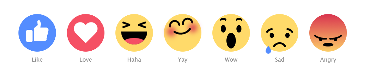
CSS3实现各种表情
CSS3实现各种表情
效果图:
代码如下,复制即可使用:
<!DOCTYPE html>

<html>

<head>

    <title></title>

    <style type="text/css">

        body {

  text-align: center;

  margin: 80px auto 0;

  font-family: "Lucida Sans Unicode", "Lucida Grande", sans-serif;

}

.emoji {

  width: 120px;

  height: 120px;

  margin: 15px;

  background: #FFDA6A;

  display: inline-block;

  border-radius: 50%;

  position: relative;

}

.emoji:after {

  position: absolute;

  bottom: -40px;

  font-size: 18px;

  width: 60px;

  left: calc(50% - 30px);

  color: #8A8A8A;

}

.emoji__face, .emoji__eyebrows, .emoji__eyes, .emoji__mouth, .emoji__tongue, .emoji__heart, .emoji__hand, .emoji__thumb {

  position: absolute;

}

.emoji__face:before, .emoji__face:after, .emoji__eyebrows:before, .emoji__eyebrows:after, .emoji__eyes:before, .emoji__eyes:after, .emoji__mouth:before, .emoji__mouth:after, .emoji__tongue:before, .emoji__tongue:after, .emoji__heart:before, .emoji__heart:after, .emoji__hand:before, .emoji__hand:after, .emoji__thumb:before, .emoji__thumb:after {

  position: absolute;

  content: '';

}

.emoji__face {

  width: inherit;

  height: inherit;

}

.emoji--like {

  background: #548DFF;

}

.emoji--like:after {

  content: 'Like';

}

.emoji--like .emoji__hand {

  left: 25px;

  bottom: 30px;

  width: 20px;

  height: 40px;

  background: #FFFFFF;

  border-radius: 5px;

  z-index: 0;

  animation: hands-up 2s linear infinite;

}

.emoji--like .emoji__hand:before {

  left: 25px;

  bottom: 5px;

  width: 40px;

  background: inherit;

  height: 10px;

  border-radius: 2px 10px 10px 2px;

  box-shadow: 1px -9px 0 1px #FFFFFF, 2px -19px 0 2px #FFFFFF, 3px -29px 0 3px #FFFFFF;

}

.emoji--like .emoji__thumb {

  border-bottom: 20px solid #FFFFFF;

  border-left: 20px solid transparent;

  top: -25px;

  right: -25px;

  z-index: 2;

  transform: rotate(5deg);

  transform-origin: 0% 100%;

  animation: thumbs-up 2s linear infinite;

}

.emoji--like .emoji__thumb:before {

  border-radius: 50% 50% 0 0;

  background: #FFFFFF;

  width: 10px;

  height: 12px;

  left: -10px;

  top: -8px;

  transform: rotate(-15deg);

  transform-origin: 100% 100%;

  box-shadow: -1px 4px 0 -1px #FFFFFF;

}

.emoji--love {

  background: #F55064;

}

.emoji--love:after {

  content: 'Love';

}

.emoji--love .emoji__heart {

  left: calc(50% - 40px);

  top: calc(50% - 40px);

  width: 80px;

  height: 80px;

  animation: heart-beat 1s linear infinite alternate;

}

.emoji--love .emoji__heart:before, .emoji--love .emoji__heart:after {

  left: calc(50% - 20px);

  top: calc(50% - 32px);

  width: 40px;

  height: 64px;

  background: #FFFFFF;

  border-radius: 20px 20px 0 0;

}

.emoji--love .emoji__heart:before {

  transform: translate(20px) rotate(-45deg);

  transform-origin: 0 100%;

}

.emoji--love .emoji__heart:after {

  transform: translate(-20px) rotate(45deg);

  transform-origin: 100% 100%;

}

.emoji--haha:after {

  content: 'Haha';

}

.emoji--haha .emoji__face {

  animation: haha-face 2s linear infinite;

}

.emoji--haha .emoji__eyes {

  width: 26px;

  height: 6px;

  border-radius: 2px;

  left: calc(50% - 13px);

  top: 35px;

  transform: rotate(20deg);

  background: transparent;

  box-shadow: -25px 5px 0 0 #000000, 25px -5px 0 0 #000000;

}

.emoji--haha .emoji__eyes:after {

  left: 0;

  top: 0;

  width: 26px;

  height: 6px;

  border-radius: 2px;

  transform: rotate(-40deg);

  background: transparent;

  box-shadow: -25px -5px 0 0 #000000, 25px 5px 0 0 #000000;

}

.emoji--haha .emoji__mouth {

  width: 80px;

  height: 40px;

  left: calc(50% - 40px);

  top: 50%;

  background: #000000;

  border-radius: 0 0 40px 40px;

  overflow: hidden;

  z-index: 1;

  animation: haha-mouth 2s linear infinite;

}

.emoji--haha .emoji__tongue {

  width: 70px;

  height: 30px;

  background: #F55064;

  left: calc(50% - 35px);

  bottom: -10px;

  border-radius: 50%;

}

.emoji--yay:after {

  content: 'Yay';

  animation: yay-reverse 1s linear infinite;

}

.emoji--yay .emoji__face {

  animation: yay 1s linear infinite alternate;

}

.emoji--yay .emoji__eyebrows {

  left: calc(50% - 3px);

  top: 30px;

  height: 6px;

  width: 6px;

  border-radius: 50%;

  background: transparent;

  box-shadow: -6px 0 0 0 #000000, -36px 0 0 0px #000000, 6px 0 0 0 #000000, 36px 0 0 0px #000000;

}

.emoji--yay .emoji__eyebrows:before, .emoji--yay .emoji__eyebrows:after {

  width: 36px;

  height: 18px;

  border-radius: 60px 60px 0 0;

  background: transparent;

  border: 6px solid black;

  box-sizing: border-box;

  border-bottom: 0;

  bottom: 3px;

  left: calc(50% - 18px);

}

.emoji--yay .emoji__eyebrows:before {

  margin-left: -21px;

}

.emoji--yay .emoji__eyebrows:after {

  margin-left: 21px;

}

.emoji--yay .emoji__mouth {

  top: 60px;

  background: transparent;

  left: 50%;

}

.emoji--yay .emoji__mouth:after {

  width: 80px;

  height: 80px;

  left: calc(50% - 40px);

  top: -75px;

  border-radius: 50%;

  background: transparent;

  border: 6px solid #000000;

  box-sizing: border-box;

  border-top-color: transparent;

  border-left-color: transparent;

  border-right-color: transparent;

  z-index: 1;

}

.emoji--yay .emoji__mouth:before {

  width: 6px;

  height: 6px;

  background: transparent;

  border-radius: 50%;

  bottom: 5px;

  left: calc(50% - 3px);

  box-shadow: -25px 0 0 0 #000000, 25px 0 0 0 #000000, -35px -2px 30px 10px #D5234C, 35px -2px 30px 10px #D5234C;

}

.emoji--wow:after {

  content: 'Wow';

}

.emoji--wow .emoji__face {

  animation: wow-face 3s linear infinite;

}

.emoji--wow .emoji__eyebrows {

  left: calc(50% - 3px);

  height: 6px;

  width: 6px;

  border-radius: 50%;

  background: transparent;

  box-shadow: -18px 0 0 0 #000000, -33px 0 0 0 #000000, 18px 0 0 0 #000000, 33px 0 0 0 #000000;

  animation: wow-brow 3s linear infinite;

}

.emoji--wow .emoji__eyebrows:before, .emoji--wow .emoji__eyebrows:after {

  width: 24px;

  height: 20px;

  border: 6px solid #000000;

  box-sizing: border-box;

  border-radius: 50%;

  border-bottom-color: transparent;

  border-left-color: transparent;

  border-right-color: transparent;

  top: -3px;

  left: calc(50% - 12px);

}

.emoji--wow .emoji__eyebrows:before {

  margin-left: -25px;

}

.emoji--wow .emoji__eyebrows:after {

  margin-left: 25px;

}

.emoji--wow .emoji__eyes {

  width: 16px;

  height: 24px;

  left: calc(50% - 8px);

  top: 35px;

  border-radius: 50%;

  background: transparent;

  box-shadow: 25px 0 0 0 #000000, -25px 0 0 0 #000000;

}

.emoji--wow .emoji__mouth {

  width: 30px;

  height: 45px;

  left: calc(50% - 15px);

  top: 50%;

  border-radius: 50%;

  background: #000000;

  animation: wow-mouth 3s linear infinite;

}

.emoji--sad:after {

  content: 'Sad';

}

.emoji--sad .emoji__face {

  animation: sad-face 2s ease-in infinite;

}

.emoji--sad .emoji__eyebrows {

  left: calc(50% - 3px);

  top: 35px;

  height: 6px;

  width: 6px;

  border-radius: 50%;

  background: transparent;

  box-shadow: -40px 9px 0 0 #000000, -25px 0 0 0 #000000, 25px 0 0 0 #000000, 40px 9px 0 0 #000000;

}

.emoji--sad .emoji__eyebrows:before, .emoji--sad .emoji__eyebrows:after {

  width: 30px;

  height: 20px;

  border: 6px solid #000000;

  box-sizing: border-box;

  border-radius: 50%;

  border-bottom-color: transparent;

  border-left-color: transparent;

  border-right-color: transparent;

  top: 2px;

  left: calc(50% - 15px);

}

.emoji--sad .emoji__eyebrows:before {

  margin-left: -30px;

  transform: rotate(-30deg);

}

.emoji--sad .emoji__eyebrows:after {

  margin-left: 30px;

  transform: rotate(30deg);

}

.emoji--sad .emoji__eyes {

  width: 14px;

  height: 16px;

  left: calc(50% - 7px);

  top: 50px;

  border-radius: 50%;

  background: transparent;

  box-shadow: 25px 0 0 0 #000000, -25px 0 0 0 #000000;

}

.emoji--sad .emoji__eyes:after {

  background: #548DFF;

  width: 12px;

  height: 12px;

  margin-left: 6px;

  border-radius: 0 100% 40% 50% / 0 50% 40% 100%;

  transform-origin: 0% 0%;

  animation: tear-drop 2s ease-in infinite;

}

.emoji--sad .emoji__mouth {

  width: 60px;

  height: 80px;

  left: calc(50% - 30px);

  top: 80px;

  box-sizing: border-box;

  border: 6px solid #000000;

  border-radius: 50%;

  border-bottom-color: transparent;

  border-left-color: transparent;

  border-right-color: transparent;

  background: transparent;

  animation: sad-mouth 2s ease-in infinite;

}

.emoji--sad .emoji__mouth:after {

  width: 6px;

  height: 6px;

  background: transparent;

  border-radius: 50%;

  top: 4px;

  left: calc(50% - 3px);

  box-shadow: -18px 0 0 0 #000000, 18px 0 0 0 #000000;

}

.emoji--angry {

  background: linear-gradient(#D5234C -10%, #FFDA6A);

  background-size: 100%;

  animation: angry-color 2s ease-in infinite;

}

.emoji--angry:after {

  content: 'Angry';

}

.emoji--angry .emoji__face {

  animation: angry-face 2s ease-in infinite;

}

.emoji--angry .emoji__eyebrows {

  left: calc(50% - 3px);

  top: 55px;

  height: 6px;

  width: 6px;

  border-radius: 50%;

  background: transparent;

  box-shadow: -44px 5px 0 0 #000000, -7px 16px 0 0 #000000, 7px 16px 0 0 #000000, 44px 5px 0 0 #000000;

}

.emoji--angry .emoji__eyebrows:before, .emoji--angry .emoji__eyebrows:after {

  width: 50px;

  height: 20px;

  border: 6px solid #000000;

  box-sizing: border-box;

  border-radius: 50%;

  border-top-color: transparent;

  border-left-color: transparent;

  border-right-color: transparent;

  top: 0;

  left: calc(50% - 25px);

}

.emoji--angry .emoji__eyebrows:before {

  margin-left: -25px;

  transform: rotate(15deg);

}

.emoji--angry .emoji__eyebrows:after {

  margin-left: 25px;

  transform: rotate(-15deg);

}

.emoji--angry .emoji__eyes {

  width: 12px;

  height: 12px;

  left: calc(50% - 6px);

  top: 70px;

  border-radius: 50%;

  background: transparent;

  box-shadow: 25px 0 0 0 #000000, -25px 0 0 0 #000000;

}

.emoji--angry .emoji__mouth {

  width: 36px;

  height: 18px;

  left: calc(50% - 18px);

  bottom: 15px;

  background: #000000;

  border-radius: 50%;

  animation: angry-mouth 2s ease-in infinite;

}

@keyframes heart-beat {

  25% {

    transform: scale(1.1);

  }

  75% {

    transform: scale(0.6);

  }

}

@keyframes haha-face {

  10% {

    transform: translateY(25px);

  }

  20% {

    transform: translateY(15px);

  }

  30% {

    transform: translateY(25px);

  }

  40% {

    transform: translateY(15px);

  }

  50% {

    transform: translateY(25px);

  }

  60% {

    transform: translateY(0);

  }

  70% {

    transform: translateY(-10px);

  }

  80% {

    transform: translateY(0);

  }

  90% {

    transform: translateY(-10px);

  }

}

@keyframes haha-mouth {

  10% {

    transform: scale(0.6);

    top: 45%;

  }

  20% {

    transform: scale(0.8);

    top: 45%;

  }

  30% {

    transform: scale(0.6);

    top: 45%;

  }

  40% {

    transform: scale(0.8);

    top: 45%;

  }

  50% {

    transform: scale(0.6);

    top: 45%;

  }

  60% {

    transform: scale(1);

    top: 50%;

  }

  70% {

    transform: scale(1.2);

    top: 50%;

  }

  80% {

    transform: scale(1);

    top: 50%;

  }

  90% {

    transform: scale(1.1);

    top: 50%;

  }

}

@keyframes yay {

  25% {

    transform: rotate(-15deg);

  }

  75% {

    transform: rotate(15deg);

  }

}

@keyframes wow-face {

  15%, 25% {

    transform: rotate(20deg) translateX(-25px);

  }

  45%, 65% {

    transform: rotate(-20deg) translateX(25px);

  }

  75%, 100% {

    transform: rotate(0deg) translateX(0);

  }

}

@keyframes wow-brow {

  15%, 65% {

    top: 25px;

  }

  75%, 100%, 0% {

    top: 15px;

  }

}

@keyframes wow-mouth {

  10%, 30% {

    width: 20px;

    height: 20px;

    left: calc(50% - 10px);

  }

  50%, 70% {

    width: 30px;

    height: 40px;

    left: calc(50% - 15px);

  }

  75%, 100% {

    height: 50px;

  }

}

@keyframes sad-face {

  25%, 35% {

    top: -15px;

  }

  55%, 95% {

    top: 10px;

  }

  100%, 0% {

    top: 0;

  }

}

@keyframes sad-mouth {

  25%, 35% {

    transform: scale(0.85);

    top: 70px;

  }

  55%, 100%, 0% {

    transform: scale(1);

    top: 80px;

  }

}

@keyframes tear-drop {

  0%, 100% {

    display: block;

    left: 35px;

    top: 15px;

    transform: rotate(45deg) scale(0);

  }

  25% {

    display: block;

    left: 35px;

    transform: rotate(45deg) scale(2);

  }

  49.9% {

    display: block;

    left: 35px;

    top: 65px;

    transform: rotate(45deg) scale(0);

  }

  50% {

    display: block;

    left: -35px;

    top: 15px;

    transform: rotate(45deg) scale(0);

  }

  75% {

    display: block;

    left: -35px;

    transform: rotate(45deg) scale(2);

  }

  99.9% {

    display: block;

    left: -35px;

    top: 65px;

    transform: rotate(45deg) scale(0);

  }

}

@keyframes hands-up {

  25% {

    transform: rotate(15deg);

  }

  50% {

    transform: rotate(-15deg) translateY(-10px);

  }

  75%, 100% {

    transform: rotate(0deg);

  }

}

@keyframes thumbs-up {

  25% {

    transform: rotate(20deg);

  }

  50%, 100% {

    transform: rotate(5deg);

  }

}

@keyframes angry-color {

  45%, 60% {

    background-size: 250%;

  }

  85%, 100%, 0% {

    background-size: 100%;

  }

}

@keyframes angry-face {

  35%, 60% {

    transform: translateX(0) translateY(10px) scale(0.9);

  }

  40% {

    transform: translateX(-5px) translateY(10px) scale(0.9);

  }

  45% {

    transform: translateX(5px) translateY(10px) scale(0.9);

  }

  50% {

    transform: translateX(-5px) translateY(10px) scale(0.9);

  }

  55% {

    transform: translateX(5px) translateY(10px) scale(0.9);

  }

}

@keyframes angry-mouth {

  25%, 50% {

    height: 6px;

    bottom: 25px;

  }

}

    </style>

</head>

<body>

    <div class="emoji  emoji--like">

  <div class="emoji__hand">

    <div class="emoji__thumb"></div>

  </div>

</div>

<div class="emoji  emoji--love">

  <div class="emoji__heart"></div>

</div>

<div class="emoji  emoji--haha">

  <div class="emoji__face">

    <div class="emoji__eyes"></div>

    <div class="emoji__mouth">

      <div class="emoji__tongue"></div>

    </div>

  </div>

</div>

<div class="emoji  emoji--yay">

  <div class="emoji__face">

    <div class="emoji__eyebrows"></div>

    <div class="emoji__mouth"></div>

  </div>

</div>

<div class="emoji  emoji--wow">

  <div class="emoji__face">

    <div class="emoji__eyebrows"></div>

    <div class="emoji__eyes"></div>

    <div class="emoji__mouth"></div>

  </div>

</div>

<div class="emoji  emoji--sad">

  <div class="emoji__face">

    <div class="emoji__eyebrows"></div>

    <div class="emoji__eyes"></div>

    <div class="emoji__mouth"></div>

  </div>

</div>

<div class="emoji  emoji--angry">

  <div class="emoji__face">

    <div class="emoji__eyebrows"></div>

    <div class="emoji__eyes"></div>

    <div class="emoji__mouth"></div>

  </div>

</div>

</body>

</html>
如有错误,欢迎联系我改正,非常感谢!!!
CSS3实现各种表情的更多相关文章
- 纯CSS3实现兔斯基简单害羞表情
前言 很不巧前天突然就感冒了,都怪自己吃太多饼干导致上火了.整个人都无精打采.本来想多做几个兔斯基表情的,但身体发热很难受.所以就只完成一个简单点的表情耍一耍. 正文 先看一下这个简单到不能再简单的小 ...
- 使用纯css3写出来的表情包 (^v^)
效果如图所示: 不多说,我们直接一个一个来写出,主要列出每个表情的结构,样式我们统一写出,基本全部会用到,颜色以及结构可以根据自己的需求来调整.(里面可是没有一张图片的哦) 页面预览:http://2 ...
- 纯CSS3实现的一些酷炫效果
之前在网上看到一些用纯CSS3实现的酷炫效果,以为实现起来比较困难,于是想看看具体是怎么实现的. 一.笑脸猫动画 实现效果如下: 这个实现起来确实比较麻烦,很多地方需要花时间,有耐心地调整. 1.先看 ...
- 使用css3新属性clip-path制作小图标
一般一个网页上面,或多或少都会用到一些小图标,展示这些小图标的方法有很多种.最简单的做法就是将UI图上面的每个小图标都保存为图片,一个小图标就一张图片.但这也是比较笨的方法,因为浏览器同一时间最多加载 ...
- 14款让前端开发者心动的jQuery/CSS3插件及源码
14款让前端开发者心动的jQuery/CSS3插件及源码,一起来看看. 1.jQuery左右滚动banner代码! DEMO演示 / 源码下载 2.jQuery QQ表情插件qqFace ...
- 分享8款最新HTML5/CSS3功能插件及源码下载
1.HTML5/CSS3鬼脸表情下拉菜单 超级可爱 这款HTML5/CSS3鬼脸表情下拉菜单真的很特别,虽然菜单的实现并没有利用复杂的HTML5/CSS3技术,但是创意的确不错. 在线演示 源码下载 ...
- 9款超酷的jQuery/CSS3插件
Article From here: http://js.itivy.com/?p=1883 1.jQuery向前滑动切换焦点图 这款jQuery焦点图非常绚丽,切换图片的时候每张图片是向前滑动的,很 ...
- 开始使用HTML5和CSS3验证表单
使用HTML5和CSS3验证表单 客户端验证是网页客户端程序最常用的功能之一,我们之前使用了各种各样的js库来进行表单的验证.HTML5其实早已为我们提供了表单验证的功能.至于为啥没有流行起来估计是兼 ...
- HTML5 CSS3专题 诱人的实例 CSS3打造百度贴吧的3D翻牌效果
首先感谢w3cfuns的老师~ 今天给大家带来一个CSS3制作的翻牌效果,就是鼠标移到元素上,感觉可以看到元素背后的信息.大家如果制作考验记忆力的连连看.扑克类的游戏神马的,甚至给女朋友写一些话语,放 ...
随机推荐
- 关于C++内联函数
关于C++内联函数有以下实验: 有三段测试代码 1.手动展开内联函数. 2.非内联函数. 3.inline标记的内联函数.(函数只有一行代码,以确保函数被内联) 测试三种情况: VS工程在Releas ...
- ESXi主机性能问题
服务器遇到一个问题 百度了下 基本发现是 四路的 windows 服务器的问题. 造成一些 性能降低. 然后查看了下几个虚拟机 的确是设置的4个虚拟插槽 根据百度的结果 要么改配置文件 要么改 这个四 ...
- 关于“代码规范”,“Review”和“Check list”
关于“代码规范”,“Review”和“Check list”,就我个人理解,这三者相辅相成.代码规范是在编程时就该注意的,为Review减轻负担.而要进行Review,又需要一个Check list作 ...
- Spring之配置文件中引入其它配置文件
<beans> ... <!--引入其它配置文件--> <import resource="classpath:com/helloworld/beans.xml ...
- 【刷题】BZOJ 4916 神犇和蒟蒻
Description 很久很久以前,有一只神犇叫yzy; 很久很久之后,有一只蒟蒻叫lty; Input 请你读入一个整数N;1<=N<=1E9,A.B模1E9+7; Output 请你 ...
- 学习Spring Boot:(十四)spring-shiro的密码加密
前言 前面配置了怎么使用 shiro ,这次研究下怎么使用spring shiro的密码加密,并且需要在新增.更新用户的时候,实现生成盐,加密后的密码进行入库操作. 正文 配置凭证匹配器 @Bean ...
- Tensorflow图像处理
Tensorflow图像处理主要包括:调整尺寸,图像翻转,调整色彩,处理标注框. 代码如下: #coding=utf-8 import matplotlib.pyplot as plt import ...
- python 基础数据类型之str
1.字符串去除空格 # S.strip(self, chars=None) #去除字符串两端空格# S.lstrip(self, chars=None) #去除字符串左端空格# S.rstrip(se ...
- MySQL简单查询详解-单表查询
MySQL简单查询详解-单表查询 作者:尹正杰 版权声明:原创作品,谢绝转载!否则将追究法律责任. 一.查询的执行路径 一条SQL查询语句的执行过程大致如下图所示: 1>.客户端和服务端通过my ...
- Apache POI - Excel
基于模板的EXCEL报表组件ExcelUtils:http://blog.csdn.net/hanqunfeng/article/details/4834875 http://blog.csdn.ne ...