python写入excel(xlswriter)--生成图表
一、折线图:
# -*- coding:utf-8 -*-

import xlsxwriter

# 创建一个excel

workbook = xlsxwriter.Workbook("chart_line.xlsx")

# 创建一个sheet

worksheet = workbook.add_worksheet()

# worksheet = workbook.add_worksheet("bug_analysis")

# 自定义样式,加粗

bold = workbook.add_format({'bold': 1})

# --------1、准备数据并写入excel---------------

# 向excel中写入数据,建立图标时要用到

headings = ['Number', 'testA', 'testB']

data = [

    ['2017-9-1', '2017-9-2', '2017-9-3', '2017-9-4', '2017-9-5', '2017-9-6'],

    [10, 40, 50, 20, 10, 50],

    [30, 60, 70, 50, 40, 30],

]

# 写入表头

worksheet.write_row('A1', headings, bold)

# 写入数据

worksheet.write_column('A2', data[0])

worksheet.write_column('B2', data[1])

worksheet.write_column('C2', data[2])

# --------2、生成图表并插入到excel---------------

# 创建一个柱状图(line chart)

chart_col = workbook.add_chart({'type': 'line'})

# 配置第一个系列数据

chart_col.add_series({

    # 这里的sheet1是默认的值,因为我们在新建sheet时没有指定sheet名

    # 如果我们新建sheet时设置了sheet名,这里就要设置成相应的值

    'name': '=Sheet1!$B$1',

    'categories': '=Sheet1!$A$2:$A$7',

    'values':   '=Sheet1!$B$2:$B$7',

    'line': {'color': 'red'},

})

# 配置第二个系列数据

chart_col.add_series({

    'name': '=Sheet1!$C$1',

    'categories':  '=Sheet1!$A$2:$A$7',

    'values':   '=Sheet1!$C$2:$C$7',

    'line': {'color': 'yellow'},

})

# 配置第二个系列数据(用了另一种语法)

# chart_col.add_series({

#     'name': ['Sheet1', 0, 2],

#     'categories': ['Sheet1', 1, 0, 6, 0],

#     'values': ['Sheet1', 1, 2, 6, 2],

#     'line': {'color': 'yellow'},

# })

# 设置图表的title 和 x,y轴信息

chart_col.set_title({'name': 'The xxx site Bug Analysis'})

chart_col.set_x_axis({'name': 'Test number'})

chart_col.set_y_axis({'name':  'Sample length (mm)'})

# 设置图表的风格

chart_col.set_style(1)

# 把图表插入到worksheet并设置偏移

worksheet.insert_chart('A10', chart_col, {'x_offset': 25, 'y_offset': 10})

workbook.close()
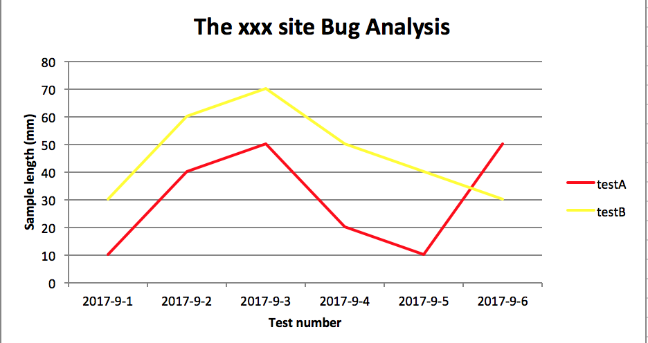
效果图:
二、柱状图:
# -*- coding:utf-8 -*-

import xlsxwriter

# 创建一个excel

workbook = xlsxwriter.Workbook("chart_column.xlsx")

# 创建一个sheet

worksheet = workbook.add_worksheet()

# worksheet = workbook.add_worksheet("bug_analysis")

# 自定义样式,加粗

bold = workbook.add_format({'bold': 1})

# --------1、准备数据并写入excel---------------

# 向excel中写入数据,建立图标时要用到

headings = ['Number', 'testA', 'testB']

data = [

    ['2017-9-1', '2017-9-2', '2017-9-3', '2017-9-4', '2017-9-5', '2017-9-6'],

    [10, 40, 50, 20, 10, 50],

    [30, 60, 70, 50, 40, 30],

]

# 写入表头

worksheet.write_row('A1', headings, bold)

# 写入数据

worksheet.write_column('A2', data[0])

worksheet.write_column('B2', data[1])

worksheet.write_column('C2', data[2])

# --------2、生成图表并插入到excel---------------

# 创建一个柱状图(column chart)

chart_col = workbook.add_chart({'type': 'column'})

# 配置第一个系列数据

chart_col.add_series({

    # 这里的sheet1是默认的值,因为我们在新建sheet时没有指定sheet名

    # 如果我们新建sheet时设置了sheet名,这里就要设置成相应的值

    'name': '=Sheet1!$B$1',

    'categories': '=Sheet1!$A$2:$A$7',

    'values':   '=Sheet1!$B$2:$B$7',

    'line': {'color': 'red'},

})

# 配置第二个系列数据(用了另一种语法)

chart_col.add_series({

    'name': '=Sheet1!$C$1',

    'categories':  '=Sheet1!$A$2:$A$7',

    'values':   '=Sheet1!$C$2:$C$7',

    'line': {'color': 'yellow'},

})

# 配置第二个系列数据(用了另一种语法)

# chart_col.add_series({

#     'name': ['Sheet1', 0, 2],

#     'categories': ['Sheet1', 1, 0, 6, 0],

#     'values': ['Sheet1', 1, 2, 6, 2],

#     'line': {'color': 'yellow'},

# })

# 设置图表的title 和 x,y轴信息

chart_col.set_title({'name': 'The xxx site Bug Analysis'})

chart_col.set_x_axis({'name': 'Test number'})

chart_col.set_y_axis({'name':  'Sample length (mm)'})

# 设置图表的风格

chart_col.set_style(1)

# 把图表插入到worksheet以及偏移

worksheet.insert_chart('A10', chart_col, {'x_offset': 25, 'y_offset': 10})

workbook.close()
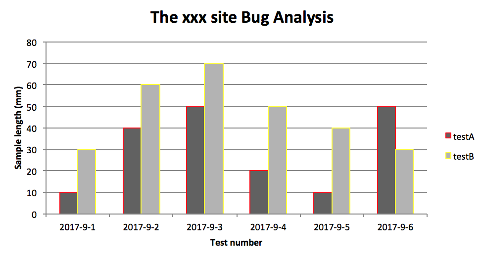
效果图:
PS:
其实前面两个图只变动一点:把 line 个性为 column
chart_col = workbook.add_chart({'type': 'column'})
三、饼图:
# -*- coding:utf-8 -*-

import xlsxwriter

# 创建一个excel

workbook = xlsxwriter.Workbook("chart_pie.xlsx")

# 创建一个sheet

worksheet = workbook.add_worksheet()

# 自定义样式,加粗

bold = workbook.add_format({'bold': 1})

# --------1、准备数据并写入excel---------------

# 向excel中写入数据,建立图标时要用到

data = [

    ['closed', 'active', 'reopen', 'NT'],

    [1012, 109, 123, 131],

]

# 写入数据

worksheet.write_row('A1', data[0], bold)

worksheet.write_row('A2', data[1])

# --------2、生成图表并插入到excel---------------

# 创建一个柱状图(pie chart)

chart_col = workbook.add_chart({'type': 'pie'})

# 配置第一个系列数据

chart_col.add_series({

    'name': 'Bug Analysis',

    'categories': '=Sheet1!$A$1:$D$1',

    'values': '=Sheet1!$A$2:$D$2',

    'points': [

        {'fill': {'color': '#00CD00'}},

        {'fill': {'color': 'red'}},

        {'fill': {'color': 'yellow'}},

        {'fill': {'color': 'gray'}},

    ],

})

# 设置图表的title 和 x,y轴信息

chart_col.set_title({'name': 'Bug Analysis'})

# 设置图表的风格

chart_col.set_style(10)

# 把图表插入到worksheet以及偏移

worksheet.insert_chart('B10', chart_col, {'x_offset': 25, 'y_offset': 10})

workbook.close()
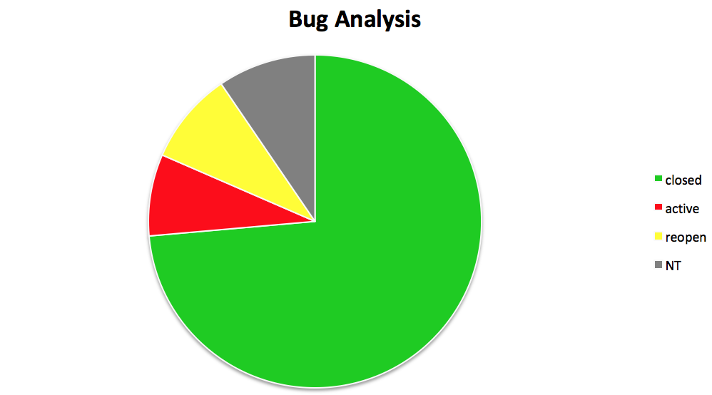
效果图:
参考资料:
http://xlsxwriter.readthedocs.io/chart_examples.html
http://xlsxwriter.readthedocs.io/chart.html
python写入excel(xlswriter)--生成图表的更多相关文章
- python 写入Excel
一.安装xlrd模块: 1.mac下打开终端输入命令: pip install XlsxWriter 2.验证安装是否成功: 在mac终端输入 python 进入python环境 然后输入 imp ...
- 【python】使用plotly生成图表数据
安装 在 ubuntu 环境下,安装 plotly 很简单 python 版本2.7+ pip install plotly 绘图 在 plotly 网站注册后,可以直接将生成的图片保存到网站上,便于 ...
- python写入Excel
一.dataframe存入Excel中: 注意:openpyxl打开的文件需是xlsx的后缀,因为比较新的. from openpyxl import load_workbook import pan ...
- python读取excel表格生成sql语句 第一版
由于单位设计数据库表·,都用sql.不知道什么原因不用 powerdesign或者ermaster工具,建表很痛苦 作为程序猿当然要想办法解决,用Python写一个程序解决 需要用到 xlrd li ...
- python 写入excel数据而不改变excel原有样式
目标:python写数据到excel,不改变原有样式 解决:在打开excel时,加入该参数formatting_info=True
- python写入excel(方式1)
import xlsxwriter li=["张三","李四","王五","周六","王琪",&qu ...
- python写入excel(方式二待完善)
import xlsxwriter #创建一个工作簿并添加一张工作表,当然工作表是可以命名的# workbook = xlsxwriter.Workbook('Expenses01.xlsx')# w ...
- Python 写入excel时的字体格式设置
转自:https://blog.csdn.net/kuangzhi9124/article/details/81940919 下面代码设置了单元格的字体.位置居中.框线,可以将格式调成自己需要的 im ...
- Python操作excel,及图表展示
学习:http://www.cnblogs.com/Lands-ljk/p/5444619.html
随机推荐
- 实体转xml 并以string输出
<?xml version="1.0" encoding="utf-8"?><Root> <Header> <Mess ...
- TMS320DM642开发之Bug1-Memory map error:READ access by cpu to address 0x1b3f018(Device Config Space)which is not supported in simulator
load程序到DM642开发板上之后,点击了run按钮出现了如下的错误: Memory map error:READ access by cpu to address 0x1b3f018(Device ...
- CodeForces - 893C Rumor【并查集】
<题目链接> 题目大意: 有n个人,其中有m对朋友,现在你有一个秘密你想告诉所有人,第i个人愿意出价a[i]买你的秘密,获得秘密的人会免费告诉它的所有朋友(他朋友的朋友也会免费知道),现在 ...
- windows下z3安装
从 github 上 clone Z3 git clone https://github.com/Z3Prover/z3.git 命令行中进入 Z3 文件夹,执行命令: python scripts/ ...
- ASP.NET Core 新建线程中使用依赖注入的问题
问题来自博问的一个提问 .net core 多线程数据保存的时候DbContext被释放 . TCPService 通过构造函数注入了 ContentService , ContentService ...
- SpringBoot使用WebJars
本人主要做的是java,但是从第一份工作开始,就一直在做一个写前端又写后端的程序员,相信很多朋友和我一样,不仅要会后台代码,还要懂得很多的前端代码,例如javascipt和css样式. 本文就为大家简 ...
- XamarinAndroid组件教程设置自定义子元素动画(二)
XamarinAndroid组件教程设置自定义子元素动画(二) (9)打开MainActivity.cs文件,为RecylerView的子元素设置添加和删除时的透明动画效果.代码如下: …… usin ...
- ppt标签打开文件 word标签打开文件 窗口打开文件 粘贴默认方式
ppt标签打开文件 word标签打开文件 word窗口打开文件 ppt粘贴默认方式 word粘贴默认方式 ppt粘贴默认方式 只保留文本 == 通过 视图 切换窗口. == 层叠 样式 如下. == ...
- BZOJ.4888.[TJOI2017]异或和(树状数组)
BZOJ 洛谷 \(Description\) 求所有区间和的异或和. \(n\leq 10^5,\ \sum a_i\leq 10^6\). \(Solution\) 这样的题还是要先考虑按位做. ...
- Linux搭建 SVN 服务器
安装 Subversion Subversion 是一个版本控制系统,相对于的 RCS . CVS ,采用了分支管理系统,它的设计目标就是取代 CVS . yum install -y subvers ...