FCC---CSS Flexbox: Align Elements Using the justify-content Property
Sometimes the flex items within a flex container do not fill all the space in the container. It is common to want to tell CSS how to align and space out the flex items a certain way. Fortunately, the justify-content property has several options to do this. But first, there is some important terminology to understand before reviewing those options.
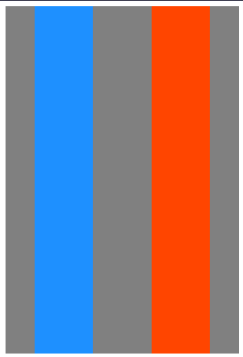
Here is a useful image showing a row to illustrate the concepts below.
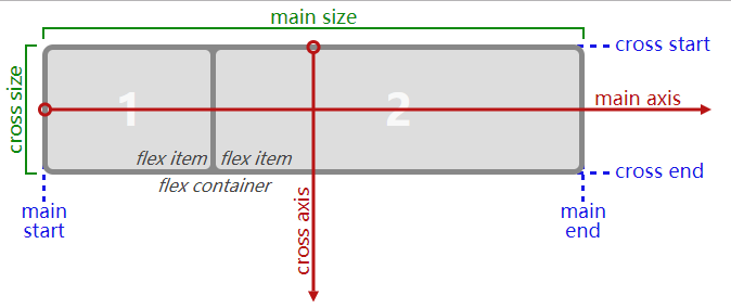
Recall that setting a flex container as a row places the flex items side-by-side from left-to-right. A flex container set as a column places the flex items in a vertical stack from top-to-bottom. For each, the direction the flex items are arranged is called the main axis. For a row, this is a horizontal line that cuts through each item. And for a column, the main axis is a vertical line through the items.
There are several options for how to space the flex items along the line that is the main axis. One of the most commonly used is justify-content: center;, which aligns all the flex items to the center inside the flex container. Others options include:
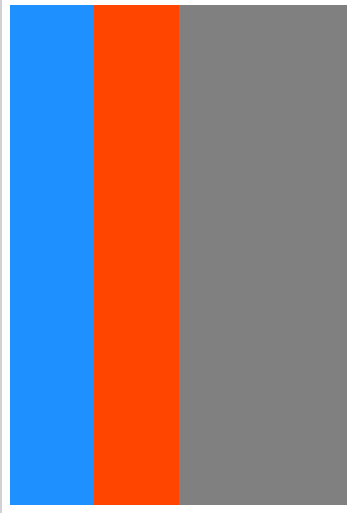
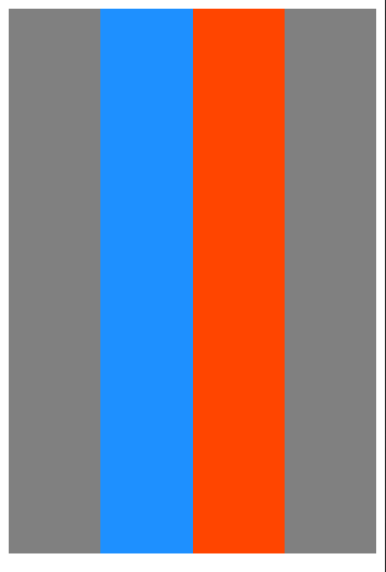
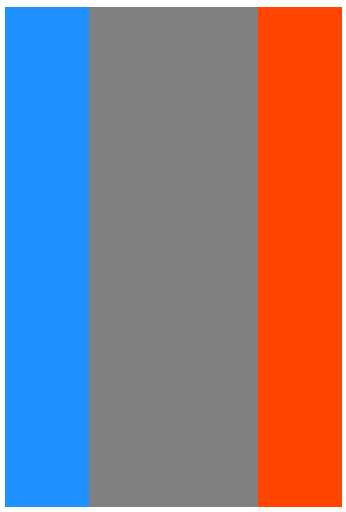
flex-start: aligns items to the start of the flex container. For a row, this pushes the items to the left of the container. For a column, this pushes the items to the top of the container. This is the default alignment if nojustify-contentis specified.flex-end: aligns items to the end of the flex container. For a row, this pushes the items to the right of the container. For a column, this pushes the items to the bottom of the container.space-between: aligns items to the center of the main axis, with extra space placed between the items. The first and last items are pushed to the very edge of the flex container. For example, in a row the first item is against the left side of the container, the last item is against the right side of the container, then the remaining space is distributed evenly among the other items.space-around: similar tospace-betweenbut the first and last items are not locked to the edges of the container, the space is distributed around all the items with a half space on either end of the flex container.space-evenly: Distributes space evenly between the flex items with a full space at either end of the flex container
An example helps show this property in action. Add the CSS property justify-content to the #box-container element, and give it a value of center.
Bonus
Try the other options for the justify-content property in the code editor to see their differences. But note that a value of center is the only one that will pass this challenge.
换上上面提到的几个属性,都可以操作,体会实际效果~
from:
to:
FCC---CSS Flexbox: Align Elements Using the justify-content Property的更多相关文章
- CSS Flexbox 学习指南、工具与框架
Flexbox 是一种更有效的布局方式,它能更好的分配容器空间,并控制项目的对齐.虽然,掌握它的理论有些复杂,但幸运的是,我们可以借助开放的网络来学习并逐步掌握它. 在本文中,我们整合了一些最佳的 F ...
- CSS Flexbox 弹性盒子模型
CSS Flexbox 弹性盒子模型 设置元素样式为 display: flex 或 display: inline-flex, 让元素变成flex容器, 从而可以通过flex模式布局它的子元素. f ...
- CSS#Flex-box, border-size, onresize() event, Media Queries
Flexbox Pseudo-classes box-sizing: border-box HTML DOM event resize() @media Queries: 根据一些css条件,触发一 ...
- css flexbox 弹性布局
flexbox 即css flexible box layout. ie9及以下不支持flexbox. flex详细规范(https://www.w3.org/TR/css-flexbox/) 为什么 ...
- CSS: Flexbox
Use flexbox to create a responsive website, containing a flexible navigation bar and flexible conten ...
- 使用css Flexbox实现垂直居中
CSS布局对我们来说一直是个噩梦,我们都认为flexbox是我们的救世主.是否真的如我们说说,还有待观察,但是flexbox确非常轻松的解决css长久一来比较难解决的居中问题.让我们来看看到底有多容易 ...
- [CSS] Target empty elements using the :empty pseudo-class
You can target an element that has no child elements by using the :empty pseudo-class. With browser ...
- [CSS] Dynamically Size Elements with Pure CSS
Learn how to size elements based on the dimensions of the viewport, even when the browser is resized ...
- [CSS] Target Positional Elements Using *-Of-Type CSS pseudo-classes
Learn how to target elements based on their position inside of a parent element in relation to its s ...
随机推荐
- React源码 React.Children
children是什么意思呢?就是我们拿到组件内部的props的时候,有props.children这么一个属性,大部分情况下,我们直接把 props.children 渲染到 JSX 里面就可以了. ...
- 【前端】 在前端利用数学函数知识+box-shadow解波浪图形
序 今天正在刷数学函数相关题目,刷到了下面这篇文章,哇哦-有意思. 利用cos和sin实现复杂的曲线.传送门在下面. CSS 技巧一则 -- 在 CSS 中使用三角函数绘制曲线图形及展示动画 正巧在复 ...
- SpringBoot 整合 Zookeeper 接入Starring微服务平台
背景 最近接的一个项目是基于公司产品Starring做的微服务支付平台,纯后台项目,实现三方支付公司和银行接口来完成用户账户扣款,整合成通用支付接口发布给前端调用. 但是扯蛋了,这边前端什么都不想做, ...
- Java中父类和子类代码执行顺序
执行顺序:父类静态块-->子类静态块-->父类非静态块-->父类构造方法-->子类非静态块-->子类构造方法 当父类或子类中有多个静态方法时按在代码中的顺序执行 pack ...
- Git实战指南----跟着haibiscuit学Git(第一篇)
笔名: haibiscuit 博客园: https://www.cnblogs.com/haibiscuit/ Git地址: https://github.com/haibiscuit?tab=re ...
- Mybatis分页插件PageHelper的学习与使用
目录 中文教程 PageHelper使用 后端程序员都知道,在Web系统中,分页是一种常见的功能,我之前写的分页方法都比较麻烦,移植性也不高,这就很不乐观了.作为一个积极开朗的程序员,怎么能不去了解P ...
- PHP安全之道3:常见漏洞和攻防
第一篇 SQL注入 安全配置和编程安全并不是万全之法,攻击者往往可以通过对漏洞的试探找到新的突破口,甚至0days. 下面总结以下常见漏洞,在日常开发维护工作中可以留意. *聊聊老朋友:SQL注入漏洞 ...
- Mysql基础01-语法
数据库 数据的存储:将数据放到表中,表再放到库中. 一个数据库中可以有多个表,每个表都有一个名字,用来标识自己.表名具有唯一性. 表由列组成,我们也称为字段.每个字段描述了它所含有的数据的意义表由列组 ...
- 初步认知jQuery
jQuery:是JavaScript的一个类库全写JavaScript query write less do more JavaScript查询写的更少做的更多 第一步先导入js文件: < ...
- [TimLinux] Python 类型与运算
1. 内建(built-in)数据类型种类 数字类型:int(), float() 顺序(sequence): 字符串:str() 元祖:tuple() 列表:list() 字典:dict() 集合: ...