吴裕雄--天生自然 R语言开发学习:基本图形(续三)


#---------------------------------------------------------------#
# R in Action (2nd ed): Chapter 6 #
# Basic graphs #
# requires packages vcd, plotrix, sm, vioplot to be installed #
# install.packages(c("vcd", "plotrix", "sm", "vioplot")) #
#---------------------------------------------------------------# par(ask=TRUE)
opar <- par(no.readonly=TRUE) # save original parameter settings library(vcd)
counts <- table(Arthritis$Improved)
counts # Listing 6.1 - Simple bar plot
# vertical barplot
barplot(counts,
main="Simple Bar Plot",
xlab="Improvement", ylab="Frequency")
# horizontal bar plot
barplot(counts,
main="Horizontal Bar Plot",
xlab="Frequency", ylab="Improvement",
horiz=TRUE) # obtain 2-way frequency table
library(vcd)
counts <- table(Arthritis$Improved, Arthritis$Treatment)
counts # Listing 6.2 - Stacked and grouped bar plots
# stacked barplot
barplot(counts,
main="Stacked Bar Plot",
xlab="Treatment", ylab="Frequency",
col=c("red", "yellow","green"),
legend=rownames(counts)) # grouped barplot
barplot(counts,
main="Grouped Bar Plot",
xlab="Treatment", ylab="Frequency",
col=c("red", "yellow", "green"),
legend=rownames(counts), beside=TRUE) # Listing 6.3 - Bar plot for sorted mean values
states <- data.frame(state.region, state.x77)
means <- aggregate(states$Illiteracy, by=list(state.region), FUN=mean)
means means <- means[order(means$x),]
means barplot(means$x, names.arg=means$Group.1)
title("Mean Illiteracy Rate") # Listing 6.4 - Fitting labels in bar plots
par(las=2) # set label text perpendicular to the axis
par(mar=c(5,8,4,2)) # increase the y-axis margin
counts <- table(Arthritis$Improved) # get the data for the bars # produce the graph
barplot(counts,
main="Treatment Outcome", horiz=TRUE, cex.names=0.8,
names.arg=c("No Improvement", "Some Improvement", "Marked Improvement")
)
par(opar) # Spinograms
library(vcd)
attach(Arthritis)
counts <- table(Treatment,Improved)
spine(counts, main="Spinogram Example")
detach(Arthritis) # Listing 6.5 - Pie charts
par(mfrow=c(2,2))
slices <- c(10, 12,4, 16, 8)
lbls <- c("US", "UK", "Australia", "Germany", "France") pie(slices, labels = lbls,
main="Simple Pie Chart") pct <- round(slices/sum(slices)*100)
lbls <- paste(lbls, pct)
lbls <- paste(lbls,"%",sep="")
pie(slices,labels = lbls, col=rainbow(length(lbls)),
main="Pie Chart with Percentages") library(plotrix)
pie3D(slices, labels=lbls,explode=0.1,
main="3D Pie Chart ") mytable <- table(state.region)
lbls <- paste(names(mytable), "\n", mytable, sep="")
pie(mytable, labels = lbls,
main="Pie Chart from a dataframe\n (with sample sizes)") par(opar) # Fan plots
library(plotrix)
slices <- c(10, 12,4, 16, 8)
lbls <- c("US", "UK", "Australia", "Germany", "France")
fan.plot(slices, labels = lbls, main="Fan Plot") # Listing 6.6 - Histograms
# simple histogram 1
hist(mtcars$mpg) # colored histogram with specified number of bins
hist(mtcars$mpg,
breaks=12,
col="red",
xlab="Miles Per Gallon",
main="Colored histogram with 12 bins") # colored histogram with rug plot, frame, and specified number of bins
hist(mtcars$mpg,
freq=FALSE,
breaks=12,
col="red",
xlab="Miles Per Gallon",
main="Histogram, rug plot, density curve")
rug(jitter(mtcars$mpg))
lines(density(mtcars$mpg), col="blue", lwd=2) # histogram with superimposed normal curve (Thanks to Peter Dalgaard)
x <- mtcars$mpg
h<-hist(x,
breaks=12,
col="red",
xlab="Miles Per Gallon",
main="Histogram with normal curve and box")
xfit<-seq(min(x),max(x),length=40)
yfit<-dnorm(xfit,mean=mean(x),sd=sd(x))
yfit <- yfit*diff(h$mids[1:2])*length(x)
lines(xfit, yfit, col="blue", lwd=2)
box() # Listing 6.7 - Kernel density plot
d <- density(mtcars$mpg) # returns the density data
plot(d) # plots the results d <- density(mtcars$mpg)
plot(d, main="Kernel Density of Miles Per Gallon")
polygon(d, col="red", border="blue")
rug(mtcars$mpg, col="brown") # Listing 6.8 - Comparing kernel density plots
par(lwd=2)
library(sm)
attach(mtcars) # create value labels
cyl.f <- factor(cyl, levels= c(4, 6, 8),
labels = c("4 cylinder", "6 cylinder", "8 cylinder")) # plot densities
sm.density.compare(mpg, cyl, xlab="Miles Per Gallon")
title(main="MPG Distribution by Car Cylinders") # add legend via mouse click
colfill<-c(2:(2+length(levels(cyl.f))))
cat("Use mouse to place legend...","\n\n")
legend(locator(1), levels(cyl.f), fill=colfill)
detach(mtcars)
par(lwd=1) # parallel box plots
boxplot(mpg~cyl,data=mtcars,
main="Car Milage Data",
xlab="Number of Cylinders",
ylab="Miles Per Gallon") # notched box plots
boxplot(mpg~cyl,data=mtcars,
notch=TRUE,
varwidth=TRUE,
col="red",
main="Car Mileage Data",
xlab="Number of Cylinders",
ylab="Miles Per Gallon") # Listing 6.9 - Box plots for two crossed factors
# create a factor for number of cylinders
mtcars$cyl.f <- factor(mtcars$cyl,
levels=c(4,6,8),
labels=c("","","")) # create a factor for transmission type
mtcars$am.f <- factor(mtcars$am,
levels=c(0,1),
labels=c("auto","standard")) # generate boxplot
boxplot(mpg ~ am.f *cyl.f,
data=mtcars,
varwidth=TRUE,
col=c("gold", "darkgreen"),
main="MPG Distribution by Auto Type",
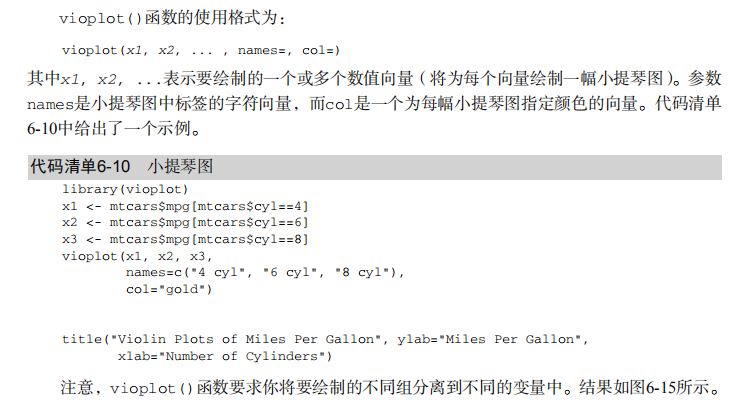
xlab="Auto Type") # Listing 6.10 - Violin plots library(vioplot)
x1 <- mtcars$mpg[mtcars$cyl==4]
x2 <- mtcars$mpg[mtcars$cyl==6]
x3 <- mtcars$mpg[mtcars$cyl==8]
vioplot(x1, x2, x3,
names=c("4 cyl", "6 cyl", "8 cyl"),
col="gold")
title("Violin Plots of Miles Per Gallon") # dot chart
dotchart(mtcars$mpg,labels=row.names(mtcars),cex=.7,
main="Gas Mileage for Car Models",
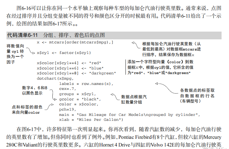
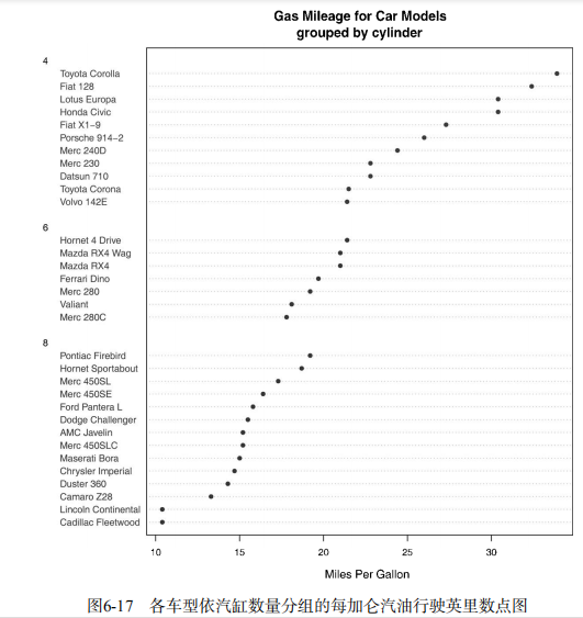
xlab="Miles Per Gallon") # Listing 6.11 - Dot plot grouped, sorted, and colored
x <- mtcars[order(mtcars$mpg),]
x$cyl <- factor(x$cyl)
x$color[x$cyl==4] <- "red"
x$color[x$cyl==6] <- "blue"
x$color[x$cyl==8] <- "darkgreen"
dotchart(x$mpg,
labels = row.names(x),
cex=.7,
pch=19,
groups = x$cyl,
gcolor = "black",
color = x$color,
main = "Gas Mileage for Car Models\ngrouped by cylinder",
xlab = "Miles Per Gallon")

吴裕雄--天生自然 R语言开发学习:基本图形(续三)的更多相关文章
- 吴裕雄--天生自然 R语言开发学习:图形初阶(续二)
# ----------------------------------------------------# # R in Action (2nd ed): Chapter 3 # # Gettin ...
- 吴裕雄--天生自然 R语言开发学习:图形初阶(续一)
# ----------------------------------------------------# # R in Action (2nd ed): Chapter 3 # # Gettin ...
- 吴裕雄--天生自然 R语言开发学习:图形初阶
# ----------------------------------------------------# # R in Action (2nd ed): Chapter 3 # # Gettin ...
- 吴裕雄--天生自然 R语言开发学习:R语言的安装与配置
下载R语言和开发工具RStudio安装包 先安装R
- 吴裕雄--天生自然 R语言开发学习:数据集和数据结构
数据集的概念 数据集通常是由数据构成的一个矩形数组,行表示观测,列表示变量.表2-1提供了一个假想的病例数据集. 不同的行业对于数据集的行和列叫法不同.统计学家称它们为观测(observation)和 ...
- 吴裕雄--天生自然 R语言开发学习:导入数据
2.3.6 导入 SPSS 数据 IBM SPSS数据集可以通过foreign包中的函数read.spss()导入到R中,也可以使用Hmisc 包中的spss.get()函数.函数spss.get() ...
- 吴裕雄--天生自然 R语言开发学习:使用键盘、带分隔符的文本文件输入数据
R可从键盘.文本文件.Microsoft Excel和Access.流行的统计软件.特殊格 式的文件.多种关系型数据库管理系统.专业数据库.网站和在线服务中导入数据. 使用键盘了.有两种常见的方式:用 ...
- 吴裕雄--天生自然 R语言开发学习:R语言的简单介绍和使用
假设我们正在研究生理发育问 题,并收集了10名婴儿在出生后一年内的月龄和体重数据(见表1-).我们感兴趣的是体重的分 布及体重和月龄的关系. 可以使用函数c()以向量的形式输入月龄和体重数据,此函 数 ...
- 吴裕雄--天生自然 R语言开发学习:基础知识
1.基础数据结构 1.1 向量 # 创建向量a a <- c(1,2,3) print(a) 1.2 矩阵 #创建矩阵 mymat <- matrix(c(1:10), nrow=2, n ...
- 吴裕雄--天生自然 R语言开发学习:基本图形(续二)
#---------------------------------------------------------------# # R in Action (2nd ed): Chapter 6 ...
随机推荐
- [Algo] 87. Max Product Of Cutting Rope
Given a rope with positive integer-length n, how to cut the rope into m integer-length parts with le ...
- ant design for vue select 数据回显问题
例如: 想要回显id为1的温度, 结果直接在select框中显示了1,而不是选中了温度, 此时因为select中的value是string类型, 而我们设置的id是number类型, 对应不上, 所以 ...
- java生成图形验证码
效果图 import java.awt.Color; import java.awt.Font; import java.awt.Graphics; import java.awt.image.Buf ...
- Django学习---多人博客项目(1)
一.创建项目和应用 在Pycharm中用Django模板创建一个工程文件 创建项目 python manage.py startproject 项目名 . 创建应用 python manage.p ...
- Pytorch基础——使用 RNN 生成简单序列
一.介绍 内容 使用 RNN 进行序列预测 今天我们就从一个基本的使用 RNN 生成简单序列的例子中,来窥探神经网络生成符号序列的秘密. 我们首先让神经网络模型学习形如 0^n 1^n 形式的上下文无 ...
- tomcat设置远程监听端口(linux&windows)
1.Linxu系统: apach/bin/startup.sh开始处中增加如下内容: declare -x CATALINA_OPTS="-server -Xdebug -Xnoagent ...
- easyui分页控件的应用
1.首先应用easyui的js和css文件 <link rel="stylesheet" type="text/css" href="../.. ...
- 关于前端html5的总结
简介 HTML5 是HTML语言的第5次重大修改产生的新的HTML语言版本 HTML5 是W3C组织和众多主要浏览器厂商以及众多开发者共同努力的结果,得之不易 HTML5 主要改进包括:增加新的HTM ...
- vue项目打包部署elementUI的字体图标丢失问题
自己搭建的Vue项目,没有使用vue-cli,引入elementUI时,使用的是webpack直接打包工具,发现字体图标丢失你 记录一下解决办法: webpack module配置:(build目录下 ...
- 二十三、NFS企业级优化
nfs内核优化:(对于本地文件系统也是有效的) [root@nfsserve ~]# cat /proc/sys/net/core/rmem_default(该文件指定了接收套接字缓冲区大小的缺省值) ...