
WPF开发实例——仿QQ登录界面
版权声明:本文为博主原创文章,如需转载请标明转载地址 http://blog.csdn.net/u013981858 https://blog.csdn.net/u013981858/article/details/49130885
刚开始学WPF,自己写了个小东西,说实话写的并不好,好多东西不懂只是用现在懂的东西来写的,效果如图
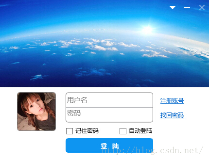
下面是源码,理论上很简单,我直接放代码了。
自定义用户控件RightButton.xaml
<UserControl x:Class="WpfApplication8.RigthButton"

             xmlns="http://schemas.microsoft.com/winfx/2006/xaml/presentation"

             xmlns:x="http://schemas.microsoft.com/winfx/2006/xaml"

             xmlns:mc="http://schemas.openxmlformats.org/markup-compatibility/2006"

             xmlns:d="http://schemas.microsoft.com/expression/blend/2008"

             mc:Ignorable="d"

             d:DesignHeight="300" d:DesignWidth="300">

    <UserControl.Resources>

        <Style x:Key="CloseButton" TargetType="{x:Type Button}">

            <Setter Property="Template">

                <Setter.Value>

                    <ControlTemplate TargetType="{x:Type Button}">

                        <Grid>

                            <Rectangle x:Name="rectangle">

                                <Rectangle.Fill>

                                    <ImageBrush ImageSource="skin/close_normal.png"/>

                                </Rectangle.Fill>

                            </Rectangle>

                        </Grid>

                        <ControlTemplate.Triggers>

                            <Trigger Property="IsFocused" Value="True"/>

                            <Trigger Property="IsDefaulted" Value="True"/>

                            <Trigger Property="IsMouseOver" Value="True">

                                <Setter Property="Fill" TargetName="rectangle">

                                    <Setter.Value>

                                        <ImageBrush ImageSource="skin/close_hot.png"/>

                                    </Setter.Value>

                                </Setter>

                            </Trigger>

                            <Trigger Property="IsPressed" Value="True">

                                <Setter Property="Fill" TargetName="rectangle">

                                    <Setter.Value>

                                        <ImageBrush ImageSource="skin/close_down.png"></ImageBrush>

                                    </Setter.Value>

                                </Setter>

                            </Trigger>

                            <Trigger Property="IsEnabled" Value="False"/>

                        </ControlTemplate.Triggers>

                    </ControlTemplate>

                </Setter.Value>

            </Setter>

        </Style>

        <Style x:Key="SmallButton" TargetType="{x:Type Button}">

            <Setter Property="Template">

                <Setter.Value>

                    <ControlTemplate TargetType="{x:Type Button}">

                        <Grid>

                            <Rectangle x:Name="rectangle">

                                <Rectangle.Fill>

                                    <ImageBrush ImageSource="skin/small_normal.png"/>

                                </Rectangle.Fill>

                            </Rectangle>

                        </Grid>

                        <ControlTemplate.Triggers>

                            <Trigger Property="IsFocused" Value="True"/>

                            <Trigger Property="IsDefaulted" Value="True"/>

                            <Trigger Property="IsMouseOver" Value="True">

                                <Setter Property="Fill" TargetName="rectangle">

                                    <Setter.Value>

                                        <ImageBrush ImageSource="skin/small_hot.png"/>

                                    </Setter.Value>

                                </Setter>

                            </Trigger>

                            <Trigger Property="IsPressed" Value="True">

                                <Setter Property="Fill" TargetName="rectangle">

                                    <Setter.Value>

                                        <ImageBrush ImageSource="skin/small_down.png"></ImageBrush>

                                    </Setter.Value>

                                </Setter>

                            </Trigger>

                            <Trigger Property="IsEnabled" Value="False"/>

                        </ControlTemplate.Triggers>

                    </ControlTemplate>

                </Setter.Value>

            </Setter>

        </Style>

        <Style x:Key="DownButton" TargetType="{x:Type Button}">

            <Setter Property="Template">

                <Setter.Value>

                    <ControlTemplate TargetType="{x:Type Button}">

                        <Grid>

                            <Rectangle x:Name="rectangle">

                                <Rectangle.Fill>

                                    <ImageBrush ImageSource="skin/down_normal.png"/>

                                </Rectangle.Fill>

                            </Rectangle>

                        </Grid>

                        <ControlTemplate.Triggers>

                            <Trigger Property="IsFocused" Value="True"/>

                            <Trigger Property="IsDefaulted" Value="True"/>

                            <Trigger Property="IsMouseOver" Value="True">

                                <Setter Property="Fill" TargetName="rectangle">

                                    <Setter.Value>

                                        <ImageBrush ImageSource="skin/down_hot.png"/>

                                    </Setter.Value>

                                </Setter>

                            </Trigger>

                            <Trigger Property="IsPressed" Value="True">

                                <Setter Property="Fill" TargetName="rectangle">

                                    <Setter.Value>

                                        <ImageBrush ImageSource="skin/down_down.png"></ImageBrush>

                                    </Setter.Value>

                                </Setter>

                            </Trigger>

                            <Trigger Property="IsEnabled" Value="False"/>

                        </ControlTemplate.Triggers>

                    </ControlTemplate>

                </Setter.Value>

            </Setter>

        </Style>

    </UserControl.Resources>

    <StackPanel Orientation="Horizontal">

        <Button Click="Button_Click" Width="30" Height="30" Style="{StaticResource DownButton}"></Button>

        <Button Click="Button_Click_1" Width="30" Height="30" Style="{StaticResource SmallButton}"></Button>

        <Button Click="Button_Click_2" Width="30" Height="30" Style="{StaticResource CloseButton}"></Button>

    </StackPanel>

</UserControl>
RightButton.xmal.cs
using System;

using System.Collections.Generic;

using System.Linq;

using System.Text;

using System.Threading.Tasks;

using System.Windows;

using System.Windows.Controls;

using System.Windows.Data;

using System.Windows.Documents;

using System.Windows.Input;

using System.Windows.Media;

using System.Windows.Media.Imaging;

using System.Windows.Navigation;

using System.Windows.Shapes;

namespace WpfApplication8

{

    /// <summary>

    /// RigthButton.xaml 的交互逻辑

    /// </summary>

    public partial class RigthButton : UserControl

    {

        public RigthButton()

        {

            InitializeComponent();

        }

        private void Button_Click(object sender, RoutedEventArgs e)

        {

        }

        private void Button_Click_1(object sender, RoutedEventArgs e)

        {

        }

        private void Button_Click_2(object sender, RoutedEventArgs e)

        {

            Application.Current.Shutdown();

        }

    }

}
MainWindow.xaml
<Window x:Class="WpfApplication8.MainWindow"

        xmlns="http://schemas.microsoft.com/winfx/2006/xaml/presentation"

        xmlns:x="http://schemas.microsoft.com/winfx/2006/xaml"

        xmlns:loc="clr-namespace:WpfApplication8"

        Title="企鹅球球" Height="330" Width="430" AllowsTransparency="True" WindowStyle="None" MouseDown="Window_MouseDown">

	<Window.Resources>

		<Style x:Key="FocusVisual">

			<Setter Property="Control.Template">

				<Setter.Value>

					<ControlTemplate>

						<Rectangle Margin="2" SnapsToDevicePixels="true" Stroke="{DynamicResource {x:Static SystemColors.ControlTextBrushKey}}" StrokeThickness="1" StrokeDashArray="1 2"/>

					</ControlTemplate>

				</Setter.Value>

			</Setter>

		</Style>

		<SolidColorBrush x:Key="Button.Static.Background" Color="#FFDDDDDD"/>

		<SolidColorBrush x:Key="Button.Static.Border" Color="#FF707070"/>

		<SolidColorBrush x:Key="Button.MouseOver.Background" Color="#FFBEE6FD"/>

		<SolidColorBrush x:Key="Button.MouseOver.Border" Color="#FF3C7FB1"/>

		<SolidColorBrush x:Key="Button.Pressed.Background" Color="#FFC4E5F6"/>

		<SolidColorBrush x:Key="Button.Pressed.Border" Color="#FF2C628B"/>

		<SolidColorBrush x:Key="Button.Disabled.Background" Color="#FFF4F4F4"/>

		<SolidColorBrush x:Key="Button.Disabled.Border" Color="#FFADB2B5"/>

		<SolidColorBrush x:Key="Button.Disabled.Foreground" Color="#FF838383"/>

		<Style x:Key="ButtonStyle1" TargetType="{x:Type Button}">

			<Setter Property="FocusVisualStyle" Value="{StaticResource FocusVisual}"/>

			<Setter Property="Background" Value="{StaticResource Button.Static.Background}"/>

			<Setter Property="BorderBrush" Value="{StaticResource Button.Static.Border}"/>

			<Setter Property="Foreground" Value="{DynamicResource {x:Static SystemColors.ControlTextBrushKey}}"/>

			<Setter Property="BorderThickness" Value="1"/>

			<Setter Property="HorizontalContentAlignment" Value="Center"/>

			<Setter Property="VerticalContentAlignment" Value="Center"/>

			<Setter Property="Padding" Value="1"/>

			<Setter Property="Template">

				<Setter.Value>

					<ControlTemplate TargetType="{x:Type Button}">

						<Border x:Name="border" BorderBrush="{TemplateBinding BorderBrush}" BorderThickness="{TemplateBinding BorderThickness}" Background="{TemplateBinding Background}" SnapsToDevicePixels="true">

							<ContentPresenter x:Name="contentPresenter" Focusable="False" HorizontalAlignment="{TemplateBinding HorizontalContentAlignment}" Margin="{TemplateBinding Padding}" RecognizesAccessKey="True" SnapsToDevicePixels="{TemplateBinding SnapsToDevicePixels}" VerticalAlignment="{TemplateBinding VerticalContentAlignment}"/>

						</Border>

						<ControlTemplate.Triggers>

							<Trigger Property="IsDefaulted" Value="true">

								<Setter Property="BorderBrush" TargetName="border" Value="{DynamicResource {x:Static SystemColors.HighlightBrushKey}}"/>

							</Trigger>

							<Trigger Property="IsMouseOver" Value="true">

								<Setter Property="BorderBrush" TargetName="border" Value="{StaticResource Button.MouseOver.Border}"/>

								<Setter Property="Background" TargetName="border" Value="#FF51B3EC"/>

							</Trigger>

							<Trigger Property="IsPressed" Value="true">

								<Setter Property="BorderBrush" TargetName="border" Value="{StaticResource Button.Pressed.Border}"/>

								<Setter Property="Background" Value="#FF3FA4E8"/>

								<Setter Property="Background" TargetName="border" Value="#FF42B5F0"/>

							</Trigger>

							<Trigger Property="IsEnabled" Value="false">

								<Setter Property="Background" TargetName="border" Value="{StaticResource Button.Disabled.Background}"/>

								<Setter Property="BorderBrush" TargetName="border" Value="{StaticResource Button.Disabled.Border}"/>

								<Setter Property="TextElement.Foreground" TargetName="contentPresenter" Value="{StaticResource Button.Disabled.Foreground}"/>

							</Trigger>

						</ControlTemplate.Triggers>

					</ControlTemplate>

				</Setter.Value>

			</Setter>

		</Style>

		<SolidColorBrush x:Key="OptionMark.Static.Background" Color="#FFFFFFFF"/>

		<SolidColorBrush x:Key="OptionMark.Static.Border" Color="#FF707070"/>

		<Style x:Key="OptionMarkFocusVisual">

			<Setter Property="Control.Template">

				<Setter.Value>

					<ControlTemplate>

						<Rectangle Margin="14,0,0,0" SnapsToDevicePixels="true" Stroke="{DynamicResource {x:Static SystemColors.ControlTextBrushKey}}" StrokeThickness="1" StrokeDashArray="1 2"/>

					</ControlTemplate>

				</Setter.Value>

			</Setter>

		</Style>

		<SolidColorBrush x:Key="OptionMark.MouseOver.Background" Color="#FFF3F9FF"/>

		<SolidColorBrush x:Key="OptionMark.MouseOver.Border" Color="#FF5593FF"/>

		<SolidColorBrush x:Key="OptionMark.MouseOver.Glyph" Color="#FF212121"/>

		<SolidColorBrush x:Key="OptionMark.Disabled.Background" Color="#FFE6E6E6"/>

		<SolidColorBrush x:Key="OptionMark.Disabled.Border" Color="#FFBCBCBC"/>

		<SolidColorBrush x:Key="OptionMark.Disabled.Glyph" Color="#FF707070"/>

		<SolidColorBrush x:Key="OptionMark.Pressed.Background" Color="#FFD9ECFF"/>

		<SolidColorBrush x:Key="OptionMark.Pressed.Border" Color="#FF3C77DD"/>

		<SolidColorBrush x:Key="OptionMark.Pressed.Glyph" Color="#FF212121"/>

		<SolidColorBrush x:Key="OptionMark.Static.Glyph" Color="#FF212121"/>

		<Style x:Key="CheckBoxStyle1" TargetType="{x:Type CheckBox}">

			<Setter Property="FocusVisualStyle" Value="{StaticResource FocusVisual}"/>

			<Setter Property="Background" Value="{StaticResource OptionMark.Static.Background}"/>

			<Setter Property="BorderBrush" Value="{StaticResource OptionMark.Static.Border}"/>

			<Setter Property="Foreground" Value="{DynamicResource {x:Static SystemColors.ControlTextBrushKey}}"/>

			<Setter Property="BorderThickness" Value="1"/>

			<Setter Property="Template">

				<Setter.Value>

					<ControlTemplate TargetType="{x:Type CheckBox}">

						<Grid x:Name="templateRoot" Background="Transparent" SnapsToDevicePixels="True">

							<Grid.ColumnDefinitions>

								<ColumnDefinition Width="Auto"/>

								<ColumnDefinition Width="*"/>

							</Grid.ColumnDefinitions>

							<Border x:Name="checkBoxBorder" BorderBrush="{TemplateBinding BorderBrush}" BorderThickness="{TemplateBinding BorderThickness}" Background="{TemplateBinding Background}" HorizontalAlignment="{TemplateBinding HorizontalContentAlignment}" Margin="1" VerticalAlignment="{TemplateBinding VerticalContentAlignment}">

								<Grid x:Name="markGrid">

									<Path x:Name="optionMark" Data="F1 M 9.97498,1.22334L 4.6983,9.09834L 4.52164,9.09834L 0,5.19331L 1.27664,3.52165L 4.255,6.08833L 8.33331,1.52588e-005L 9.97498,1.22334 Z " Fill="{StaticResource OptionMark.Static.Glyph}" Margin="1" Opacity="0" Stretch="None"/>

									<Rectangle x:Name="indeterminateMark" Fill="{StaticResource OptionMark.Static.Glyph}" Margin="2" Opacity="0"/>

								</Grid>

							</Border>

							<ContentPresenter x:Name="contentPresenter" Grid.Column="1" Focusable="False" HorizontalAlignment="{TemplateBinding HorizontalContentAlignment}" Margin="{TemplateBinding Padding}" RecognizesAccessKey="True" SnapsToDevicePixels="{TemplateBinding SnapsToDevicePixels}" VerticalAlignment="{TemplateBinding VerticalContentAlignment}"/>

						</Grid>

						<ControlTemplate.Triggers>

							<Trigger Property="HasContent" Value="true">

								<Setter Property="FocusVisualStyle" Value="{StaticResource OptionMarkFocusVisual}"/>

								<Setter Property="Padding" Value="4,-1,0,0"/>

							</Trigger>

							<Trigger Property="IsMouseOver" Value="true">

								<Setter Property="Background" TargetName="checkBoxBorder" Value="{StaticResource OptionMark.MouseOver.Background}"/>

								<Setter Property="BorderBrush" TargetName="checkBoxBorder" Value="{StaticResource OptionMark.MouseOver.Border}"/>

								<Setter Property="Fill" TargetName="optionMark" Value="{StaticResource OptionMark.MouseOver.Glyph}"/>

								<Setter Property="Fill" TargetName="indeterminateMark" Value="{StaticResource OptionMark.MouseOver.Glyph}"/>

							</Trigger>

							<Trigger Property="IsEnabled" Value="false">

								<Setter Property="Background" TargetName="checkBoxBorder" Value="{StaticResource OptionMark.Disabled.Background}"/>

								<Setter Property="BorderBrush" TargetName="checkBoxBorder" Value="{StaticResource OptionMark.Disabled.Border}"/>

								<Setter Property="Fill" TargetName="optionMark" Value="{StaticResource OptionMark.Disabled.Glyph}"/>

								<Setter Property="Fill" TargetName="indeterminateMark" Value="{StaticResource OptionMark.Disabled.Glyph}"/>

							</Trigger>

							<Trigger Property="IsPressed" Value="true">

								<Setter Property="Background" TargetName="checkBoxBorder" Value="{StaticResource OptionMark.Pressed.Background}"/>

								<Setter Property="BorderBrush" TargetName="checkBoxBorder" Value="{StaticResource OptionMark.Pressed.Border}"/>

								<Setter Property="Fill" TargetName="optionMark" Value="{StaticResource OptionMark.Pressed.Glyph}"/>

								<Setter Property="Fill" TargetName="indeterminateMark" Value="{StaticResource OptionMark.Pressed.Glyph}"/>

							</Trigger>

							<Trigger Property="IsChecked" Value="true">

								<Setter Property="Opacity" TargetName="optionMark" Value="1"/>

								<Setter Property="Opacity" TargetName="indeterminateMark" Value="0"/>

								<Setter Property="Background" TargetName="markGrid" Value="blue"/>

								<Setter Property="Fill" TargetName="optionMark" Value="white"/>

							</Trigger>

							<Trigger Property="IsChecked" Value="{x:Null}">

								<Setter Property="Opacity" TargetName="optionMark" Value="0"/>

								<Setter Property="Opacity" TargetName="indeterminateMark" Value="1"/>

							</Trigger>

						</ControlTemplate.Triggers>

					</ControlTemplate>

				</Setter.Value>

			</Setter>

		</Style>

	</Window.Resources>

    <StackPanel>

        <Grid Height="180">

        	<Grid.Background>

        		<ImageBrush ImageSource="bckpic.jpg"/>

        	</Grid.Background>

            <StackPanel Width="150" Height="30" HorizontalAlignment="Right" VerticalAlignment="Top">

                <loc:RigthButton HorizontalAlignment="Right"></loc:RigthButton>

            </StackPanel>

        </Grid>

        <StackPanel Height="150">

            <StackPanel Orientation="Horizontal" >

                <Border Height="80" Width="80" Margin="35,10,10,10" CornerRadius="5" BorderBrush="Gray" BorderThickness="1">

                    <Border.Background>

                        <ImageBrush ImageSource="touxiang1.jpg"/>

                    </Border.Background>

                </Border>

                <StackPanel Width="180" Height="89" Margin="10,10,0,0">

                    <Border BorderBrush="Gray" CornerRadius="5" BorderThickness="1">

                        <StackPanel Width="180" Height="60">

                            <TextBox Height="25" Width="180" Background="{x:Null}" BorderThickness="0,0,0,1" Margin="0,5,0,0" FontSize="14" Foreground="Gray">用户名</TextBox>

                            <TextBox Height="25" Width="180" Background="{x:Null}" BorderThickness="0" Margin="0,2,0,0" FontSize="14" Foreground="Gray">密码</TextBox>

                        </StackPanel>

                    </Border>

                    <StackPanel Orientation="Horizontal" Height="15" Width="180" Margin="0,10,0,0">

                        <CheckBox Style="{DynamicResource CheckBoxStyle1}">记住密码</CheckBox>

                        <CheckBox Style="{DynamicResource CheckBoxStyle1}" Margin="42,0,0,0">自动登陆</CheckBox>

                    </StackPanel>

                </StackPanel>

                <StackPanel Height="60" Margin="15">

                    <TextBlock Height="30">

						<Hyperlink NavigateUri="http://zc.qq.com">注册账号</Hyperlink>

					</TextBlock>

                    <TextBlock Height="30">

						<Hyperlink NavigateUri="http://aq.qq.com/">找回密码</Hyperlink>

					</TextBlock>

                </StackPanel>

            </StackPanel>

            <Border Height="30" Width="180" Margin="20,5,0,0" CornerRadius="5" BorderBrush="#FF0E95F1" BorderThickness="1">

                <Button Height="30" FontWeight="Bold" Width="180" Content="登  陆" FontFamily="宋体" Foreground="White" Background="#FF0E95F1" BorderThickness="0" Style="{DynamicResource ButtonStyle1}"></Button>

            </Border>

        </StackPanel>

    </StackPanel>

</Window>
WPF开发实例——仿QQ登录界面的更多相关文章
- 编写Java程序,使用Swing布局管理器和常用控件,实现仿QQ登录界面
返回本章节 返回作业目录 需求说明: 使用Swing布局管理器和常用控件,实现仿QQ登录界面 实现思路: 创建登录界面的类QQLogin,该类继承父类JFrame,在该类中创建无参数的构造方法,在构造 ...
- 零基础~仿qq登录界面
html代码: <!DOCTYPE html> <html> <head> <meta charset="utf-8"> <t ...
- JavaSwing仿QQ登录界面,注释完善,适合新手学习
使用说明: 这是一个java做的仿制QQ登录界面,界面仅使用一个类, JDK版本为jdk-11 素材包的名字为:素材(下载)请在项目中新建一个名字为“素材”的文件夹. 素材: https://pan. ...
- WPF和Expression Blend开发实例:模拟QQ登陆界面打开和关闭特效
不管在消费者的心中腾讯是一个怎么样的模仿者抄袭者的形象,但是腾讯在软件交互上的设计一直是一流的.正如某位已故的知名产品经理所说的:设计并非外观怎样,感觉如何.设计的是产品的工作原理.我觉得腾讯掌握了其 ...
- Android开发实例之miniTwitter登录界面的实现
原文: http://www.jizhuomi.com/android/example/134.html 本文要演示的Android开发实例是如何完成一个Android中的miniTwitter登录界 ...
- 32.qt quick-模仿QQ登录界面实现3D旋转(Rotation、Flipable)
要想模仿QQ登录界面的3D旋转,我们需要学习Rotation和Flipable.由于没找到QQ的资源图,所以我们以两个图片为例模仿QQ的3D旋转,如下图所示: 最终效果如下所示: 1.Rotation ...
- [转]Android:布局实例之模仿QQ登录界面
Android:布局实例之模仿QQ登录界面 预览图: 准备: 1.找到模仿对象 QQ登陆界面UI下载>>>>> 2.导入工程 3.查看布局结构和使用控件 其对应效果图分布 ...
- 界面编程模仿篇(QQ登录界面逼真篇)
写了好多天的爬虫,偷空前前后后用了两天的时间(排除吃饭睡觉)写完了这个QQ登录界面,看起来还凑和着吧,如果是的大神的,莫见笑,纯属业余作品,废话先不多说,截图如下,其中第二幅图片中的红色方框部份有待完 ...
- 高仿qq聊天界面
高仿qq聊天界面,给有需要的人,界面效果如下: 真心觉得做界面非常痛苦,给有需要的朋友. chat.xml <?xml version="1.0" encoding=&quo ...
随机推荐
- Activity的Theme主题风格
在AndroidManifest.xml文件里面: <activity name="test" android:theme="@andr ...
- selenium googleDrive
http://chromedriver.storage.googleapis.com/index.html?path=2.1/下载地址 把googledriver.exe 放到google浏览器下目录 ...
- C#队列Queue,利用队列处理订单
一.什么是队列 队列(Queue)代表了一个先进先出的对象集合.当您需要对各项进行先进先出的访问时,则使用队列.当您在列表中添加一项,称为入队,当您从列表中移除一项时,称为出队. 这是摘抄网上的.做了 ...
- 初看Mybatis 源码 (一)
Mybatis 的使用,首先需要构建一个SqlSessionFactory 实例.而该实例可以通过SqlSessionFactoryBuilder来创建. String resource = &quo ...
- tomcat8.5配置优化
1.应用程序安全&关闭自动部署 默认值: <Host name="localhost" appBase="webapps" unpackWARs= ...
- nginx配置vhost配置文件详解
//千锋PHP-PHP培训的实力派server { listen 80; server_name www.sina.com; root /data/www/sina; index index.php; ...
- 五环之歌之PHP分页
根据以往的经验,对于很多初学者,分页功能实现起来还是有一定的困难的,为了帮大家解决这样的问题:特此献上五环之歌.从此分页功能便是如小岳岳唱歌一样简练,漂亮,精干.哈哈,不闲扯了.正式进入千锋PHP五环 ...
- API:access_token
access_token存在意义: 1.身份验证(一个channel_id一般有0个或1个有效的access_token) 2.限制用户访问服务器数据的有效期 3.限制用户访问权限 access_ ...
- selenium安装及官方文档
selenium-python官方文档: https://selenium-python.readthedocs.io/ python3.5已安装的情况下,安装示意图如下 命令行输入 pip3 ins ...
- 其他信息: 尝试加载 Oracle 客户端库时引发 BadImageFormatException。如果在安装 32 位 Oracle 客户端组件的情况下以 64 位模式运行,将出现此问题。在VS中的解决方法
第一种,不使用dataaccess,使用通用的Oracle.ManagedDataAccess,可以忽略版本问题 第二种,在属性——生成——web中iis express换成用本地IIS执行,但是这样 ...