23、matplotlib数据可视化、绘图库模块
matplotlib官方文档:https://matplotlib.org/contents.html?v=20190307135750
matplotlib是一个绘图库,它可以创建常用的统计图,包括条形图、箱型图、折线图、散点图、饼图和直方图。
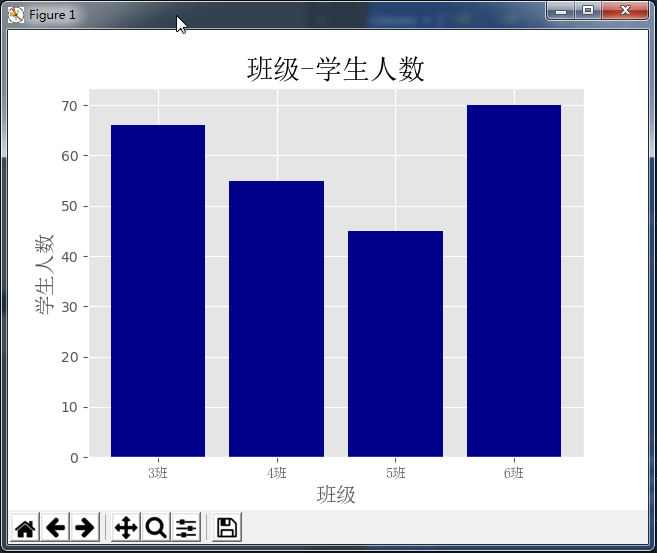
一、条形图bar()
import matplotlib.pyplot as plt

from matplotlib.font_manager import FontProperties

font = FontProperties(fname=r'c:\windows\fonts\simsun.ttc')

# 修改背景为条纹

plt.style.use('ggplot')

classes = ['3班', '4班', '5班', '6班']

classes_index = range(len(classes))

print(list(classes_index))

# [0, 1, 2, 3]

student_amounts = [66, 55, 45, 70]

# 画布设置

fig = plt.figure()

# 1,1,1表示一张画布切割成1行1列共一张图的第1个;2,2,1表示一张画布切割成2行2列共4张图的第一个(左上角)

ax1 = fig.add_subplot(1, 1, 1)

ax1.bar(classes_index, student_amounts, align='center', color='darkblue')

ax1.xaxis.set_ticks_position('bottom')

ax1.yaxis.set_ticks_position('left')

plt.xticks(classes_index,

           classes,

           rotation=0,

           fontsize=13,

           fontproperties=font)

plt.xlabel('班级', fontproperties=font, fontsize=15)

plt.ylabel('学生人数', fontproperties=font, fontsize=15)

plt.title('班级-学生人数', fontproperties=font, fontsize=20)

# 保存图片,bbox_inches='tight'去掉图形四周的空白

# plt.savefig('classes_students.png?x-oss-process=style/watermark', dpi=400, bbox_inches='tight')

plt.show()
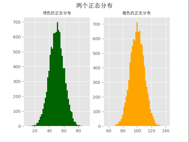
二、直方图
import numpy as np
import matplotlib.pyplot as plt
from matplotlib.font_manager import FontProperties
font = FontProperties(fname=r'c:\windows\fonts\simsun.ttc') # 修改背景为条纹
plt.style.use('ggplot')
mu1, mu2, sigma = 50, 100, 10 # 构造均值为50的符合正态分布的数据
x1 = mu1 + sigma * np.random.randn(10000)
print(x1)
# [59.00855949 43.16272141 48.77109774 ... 57.94645859 54.70312714
# 58.94125528] # 构造均值为100的符合正态分布的数据
x2 = mu2 + sigma * np.random.randn(10000)
print(x2)
# [115.19915511 82.09208214 110.88092454 ... 95.0872103 104.21549068
# 133.36025251] fig = plt.figure()
ax1 = fig.add_subplot(121)
# bins=50表示每个变量的值分成50份,即会有50根柱子
ax1.hist(x1, bins=50, color='darkgreen')ax2 = fig.add_subplot(122)
ax2.hist(x2, bins=50, color='orange') fig.suptitle('两个正态分布', fontproperties=font, fontweight='bold', fontsize=15)
ax1.set_title('绿色的正态分布', fontproperties=font)
ax2.set_title('橙色的正态分布', fontproperties=font)
plt.show()
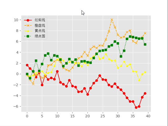
三、折线图
import numpy as np

from numpy.random import randn

import matplotlib.pyplot as plt

from matplotlib.font_manager import FontProperties

font = FontProperties(fname=r'c:\windows\fonts\simsun.ttc')

# 修改背景为条纹

plt.style.use('ggplot')

np.random.seed(1)

# 使用numpy的累加和,保证数据取值范围不会在(0,1)内波动

plot_data1 = randn(40).cumsum()

print(plot_data1)

# [ 1.62434536  1.01258895  0.4844172  -0.58855142  0.2768562  -2.02468249

#  -0.27987073 -1.04107763 -0.72203853 -0.97140891  0.49069903 -1.56944168

#  -1.89185888 -2.27591324 -1.1421438  -2.24203506 -2.41446327 -3.29232169

#  -3.25010794 -2.66729273 -3.76791191 -2.6231882  -1.72159748 -1.21910314

#  -0.31824719 -1.00197505 -1.12486527 -2.06063471 -2.32852279 -1.79816732

#  -2.48982807 -2.8865816  -3.5737543  -4.41895994 -5.09020607 -5.10287067

#  -6.22018102 -5.98576532 -4.32596314 -3.58391898]

plot_data2 = randn(40).cumsum()

plot_data3 = randn(40).cumsum()

plot_data4 = randn(40).cumsum()

plt.plot(plot_data1, marker='o', color='red', linestyle='-', label='红实线')

plt.plot(plot_data2, marker='x', color='orange', linestyle='--', label='橙虚线')

plt.plot(plot_data3, marker='*', color='yellow', linestyle='-.', label='黄点线')

plt.plot(plot_data4, marker='s', color='green', linestyle=':', label='绿点图')

# loc='best'给label自动选择最好的位置

plt.legend(loc='best', prop=font)

plt.show()
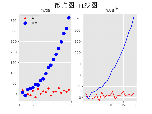
四、散点图+直线图
import numpy as np

from numpy.random import randn

import matplotlib.pyplot as plt

from matplotlib.font_manager import FontProperties

font = FontProperties(fname=r'c:\windows\fonts\simsun.ttc')

# 修改背景为条纹

plt.style.use('ggplot')

x = np.arange(1, 20, 1)

print(x)

# [ 1  2  3  4  5  6  7  8  9 10 11 12 13 14 15 16 17 18 19]

# 拟合一条水平散点线

np.random.seed(1)

y_linear = x + 10 * np.random.randn(19)

# print(y_linear)

# [ 17.24345364  -4.11756414  -2.28171752  -6.72968622  13.65407629

#  -17.01538697  24.44811764   0.38793099  12.19039096   7.50629625

#   25.62107937  -8.60140709   9.77582796  10.15945645  26.33769442

#    5.00108733  15.27571792   9.22141582  19.42213747]

# 拟合一条x²的散点线

y_quad = x**2 + 10 * np.random.randn(19)

print(y_quad)

# [  6.82815214  -7.00619177  20.4472371   25.01590721  30.02494339

#   45.00855949  42.16272141  62.77109774  71.64230566  97.3211192

#  126.30355467 137.08339248 165.03246473 189.128273   216.54794359

#  249.28753869 288.87335401 312.82689651 363.34415698]

# s是散点大小

fig = plt.figure()

ax1 = fig.add_subplot(121)

plt.scatter(x, y_linear, s=30, color='r', label='蓝点')

plt.scatter(x, y_quad, s=100, color='b', label='红点')

ax2 = fig.add_subplot(122)

plt.plot(x, y_linear, color='r')

plt.plot(x, y_quad, color='b')

# 限制x轴和y轴的范围取值

plt.xlim(min(x) - 1, max(x) + 1)

plt.ylim(min(y_quad) - 10, max(y_quad) + 10)

fig.suptitle('散点图+直线图', fontproperties=font, fontsize=20)

ax1.set_title('散点图', fontproperties=font)

ax1.legend(prop=font)

ax2.set_title('直线图', fontproperties=font)

plt.show()
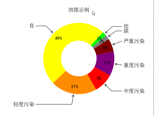
五、饼图
import numpy as np

import matplotlib.pyplot as plt

from pylab import mpl

from matplotlib.font_manager import FontProperties

font = FontProperties(fname=r'c:\windows\fonts\simsun.ttc')

mpl.rcParams['font.sans-serif'] = ['SimHei']

fig, ax = plt.subplots(subplot_kw=dict(aspect="equal"))

recipe = ['优', '良', '轻度污染', '中度污染', '重度污染', '严重污染', '缺']

data = [2, 49, 21, 9, 11, 6, 2]

colors = ['lime', 'yellow', 'darkorange', 'red', 'purple', 'maroon', 'grey']

wedges, texts, texts2 = ax.pie(data,

                               wedgeprops=dict(width=0.5),

                               startangle=40,

                               colors=colors,

                               autopct='%1.0f%%',

                               pctdistance=0.8)

plt.setp(texts2, size=14, weight="bold")

bbox_props = dict(boxstyle="square,pad=0.3", fc="w", ec="k", lw=0.72)

kw = dict(xycoords='data',

          textcoords='data',

          arrowprops=dict(arrowstyle="->"),

          bbox=None,

          zorder=0,

          va="center")

for i, p in enumerate(wedges):

    ang = (p.theta2 - p.theta1) / 2. + p.theta1

    y = np.sin(np.deg2rad(ang))

    x = np.cos(np.deg2rad(ang))

    horizontalalignment = {-1: "right", 1: "left"}[int(np.sign(x))]

    connectionstyle = "angle,angleA=0,angleB={}".format(ang)

    kw["arrowprops"].update({"connectionstyle": connectionstyle})

    ax.annotate(recipe[i],

                xy=(x, y),

                xytext=(1.25 * np.sign(x), 1.3 * y),

                size=16,

                horizontalalignment=horizontalalignment,

                fontproperties=font,

                **kw)

ax.set_title("饼图示例", fontproperties=font)

plt.show()

# plt.savefig('jiaopie2.png?x-oss-process=style/watermark')
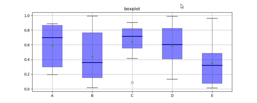
六、箱型图
箱型图:又称为盒须图、盒式图、盒状图或箱线图,是一种用作显示一组数据分散情况资料的统计图(在数据分析中常用在异常值检测)
包含一组数据的:最大值、最小值、中位数、上四分位数(Q3)、下四分位数(Q1)、异常值
- 中位数 → 一组数据平均分成两份,中间的数
- 上四分位数Q1 → 是将序列平均分成四份,计算(n+1)/4与(n-1)/4两种,一般使用(n+1)/4
- 下四分位数Q3 → 是将序列平均分成四份,计算(1+n)/4*3=6.75
- 内限 → T形的盒须就是内限,最大值区间Q3+1.5IQR,最小值区间Q1-1.5IQR (IQR=Q3-Q1)
- 外限 → T形的盒须就是内限,最大值区间Q3+3IQR,最小值区间Q1-3IQR (IQR=Q3-Q1)
- 异常值 → 内限之外 - 中度异常,外限之外 - 极度异常
import numpy as np

import matplotlib.pyplot as plt

import pandas as pd

from matplotlib.font_manager import FontProperties

font = FontProperties(fname=r'c:\windows\fonts\simsun.ttc')

df = pd.DataFrame(np.random.rand(10, 5), columns=['A', 'B', 'C', 'D', 'E'])

plt.figure(figsize=(10, 4))

# 创建图表、数据

f = df.boxplot(

    sym='o',  # 异常点形状,参考marker

    vert=True,  # 是否垂直

    whis=1.5,  # IQR,默认1.5,也可以设置区间比如[5,95],代表强制上下边缘为数据95%和5%位置

    patch_artist=True,  # 上下四分位框内是否填充,True为填充

    meanline=False,

    showmeans=True,  # 是否有均值线及其形状

    showbox=True,  # 是否显示箱线

    showcaps=True,  # 是否显示边缘线

    showfliers=True,  # 是否显示异常值

    notch=False,  # 中间箱体是否缺口

    return_type='dict'  # 返回类型为字典

)

plt.title('boxplot')

for box in f['boxes']:

    box.set(color='b', linewidth=1)  # 箱体边框颜色

    box.set(facecolor='b', alpha=0.5)  # 箱体内部填充颜色

for whisker in f['whiskers']:

    whisker.set(color='k', linewidth=0.5, linestyle='-')

for cap in f['caps']:

    cap.set(color='gray', linewidth=2)

for median in f['medians']:

    median.set(color='DarkBlue', linewidth=2)

for flier in f['fliers']:

    flier.set(marker='o', color='y', alpha=0.5)

# boxes, 箱线

# medians, 中位值的横线,

# whiskers, 从box到error bar之间的竖线.

# fliers, 异常值

# caps, error bar横线

# means, 均值的横线

plt.show()
七、plot函数参数
- 线型linestyle(-,-.,--,..)
- 点型marker(v,^,s,*,H,+,x,D,o,…)
- 颜色color(b,g,r,y,k,w,…)
八、图像标注参数
- 设置图像标题:plt.title()
- 设置x轴名称:plt.xlabel()
- 设置y轴名称:plt.ylabel()
- 设置X轴范围:plt.xlim()
- 设置Y轴范围:plt.ylim()
- 设置X轴刻度:plt.xticks()
- 设置Y轴刻度:plt.yticks()
- 设置曲线图例:plt.legend()
九、Matplolib应用
import pandas as pd

import matplotlib.pyplot as plt

from matplotlib.font_manager import FontProperties

font = FontProperties(fname=r'c:\windows\fonts\simsun.ttc')

header_list = ['方程组', '函数', '导数', '微积分', '线性代数', '概率论', '统计学']

py3_df = pd.read_excel('py3.xlsx', header=None,   skiprows=[0, 1], names=header_list)

# 处理带有NaN的行

py3_df = py3_df.dropna(axis=0) #<class 'pandas.core.frame.DataFrame'>

print(py3_df)

# 自定义映射

map_dict = {

    '不会': 0,

    '了解': 1,

    '熟悉': 2,

    '使用过': 3,

}

for header in header_list:

    py3_df[header] = py3_df[header].map(map_dict)

unable_series = (py3_df == 0).sum(axis=0)

know_series = (py3_df == 1).sum(axis=0)

familiar_series = (py3_df == 2).sum(axis=0)

use_series = (py3_df == 3).sum(axis=0)

unable_label = '不会'

know_label = '了解'

familiar_label = '熟悉'

use_label = '使用过'

for i in range(len(header_list)):

    bottom = 0

    # 描绘不会的条形图

    plt.bar(x=header_list[i], height=unable_series[i],  width=0.60, color='r', label=unable_label)

    if unable_series[i] != 0:

        plt.text(header_list[i], bottom, s=unable_series[i],   ha='center', va='bottom', fontsize=15, color='white')

    bottom += unable_series[i]

    # 描绘了解的条形图

    plt.bar(x=header_list[i], height=know_series[i],  width=0.60, color='y', bottom=bottom, label=know_label)

    if know_series[i] != 0:

        plt.text(header_list[i], bottom, s=know_series[i],  ha='center', va='bottom', fontsize=15, color='white')

    bottom += know_series[i]

    # 描绘熟悉的条形图

    plt.bar(x=header_list[i], height=familiar_series[i],    width=0.60, color='g', bottom=bottom, label=familiar_label)

    if familiar_series[i] != 0:

        plt.text(header_list[i], bottom, s=familiar_series[i], ha='center', va='bottom', fontsize=15, color='white')

    bottom += familiar_series[i]

    # 描绘使用过的条形图

    plt.bar(x=header_list[i], height=use_series[i],  width=0.60, color='b', bottom=bottom, label=use_label)

    if use_series[i] != 0:

        plt.text(header_list[i], bottom, s=use_series[i], ha='center', va='bottom', fontsize=15, color='white')

    unable_label = know_label = familiar_label = use_label = ''

plt.xticks(header_list, fontproperties=font)

plt.ylabel('人数', fontproperties=font)

plt.title('Python3期数学摸底可视化', fontproperties=font)

plt.legend(prop=font, loc='upper left')

plt.show()
    方程组   函数   导数        微积分       线性代数  概率论  统计学

0   使用过  使用过   不会         不会         不会   不会   不会

1   使用过  使用过   了解         不会         不会   不会   不会

2   使用过  使用过   熟悉         不会         不会   不会   不会

3    熟悉   熟悉   熟悉         了解         了解   了解   了解

4   使用过  使用过  使用过        使用过        使用过  使用过  使用过

5   使用过  使用过  使用过         不会         不会   不会   了解

6    熟悉   熟悉   熟悉         熟悉         熟悉   熟悉   不会

7   使用过  使用过  使用过        使用过        使用过  使用过  使用过

8    熟悉   熟悉   熟悉         熟悉         熟悉  使用过  使用过

9    熟悉   熟悉  使用过         不会        使用过  使用过   不会

10  使用过  使用过   熟悉         熟悉         熟悉   熟悉   熟悉

11  使用过  使用过  使用过        使用过        使用过   不会   不会

12  使用过  使用过  使用过        使用过        使用过  使用过  使用过

13  使用过  使用过   了解         不会         不会   不会   不会

14  使用过  使用过  使用过        使用过        使用过   不会   不会

15  使用过  使用过   熟悉         不会         不会   不会   不会

16   熟悉   熟悉  使用过        使用过        使用过   不会   不会

17  使用过  使用过  使用过         了解         不会   不会   不会

18  使用过  使用过  使用过        使用过         熟悉   熟悉   熟悉

19  使用过  使用过  使用过         了解         不会   不会   不会

20  使用过  使用过  使用过        使用过        使用过  使用过  使用过

21  使用过  使用过  使用过        使用过        使用过  使用过  使用过

22  使用过  很了解   熟悉  了解一点,不会运用  了解一点,不会运用   了解   不会

23  使用过  使用过  使用过        使用过         熟悉  使用过   熟悉

24   熟悉   熟悉   熟悉        使用过         不会   不会   不会

25  使用过  使用过  使用过        使用过        使用过  使用过  使用过

26  使用过  使用过  使用过        使用过        使用过   不会   不会

27  使用过  使用过   不会         不会         不会   不会   不会

28  使用过  使用过  使用过        使用过        使用过  使用过   了解

29  使用过  使用过  使用过        使用过        使用过   了解   不会

30  使用过  使用过  使用过        使用过        使用过   不会   不会

31  使用过  使用过  使用过        使用过         不会  使用过  使用过

32   熟悉   熟悉  使用过        使用过        使用过   不会   不会

33  使用过  使用过  使用过        使用过         熟悉  使用过   熟悉

34   熟悉   熟悉   熟悉        使用过        使用过   熟悉   不会

35  使用过  使用过  使用过        使用过        使用过  使用过  使用过

36  使用过  使用过  使用过        使用过        使用过  使用过   了解

37  使用过  使用过  使用过        使用过        使用过   不会   不会

38  使用过  使用过  使用过         不会         不会   不会   不会

39  使用过  使用过   不会         不会         不会   不会   不会

40  使用过  使用过  使用过        使用过        使用过   不会   不会

41  使用过  使用过   熟悉         了解         了解   了解   不会

42  使用过  使用过  使用过         不会         不会   不会   不会

43   熟悉  使用过   了解         了解         不会   不会   不会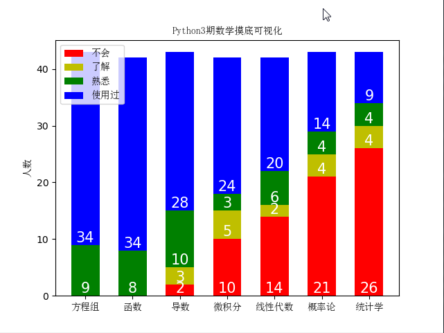
23、matplotlib数据可视化、绘图库模块的更多相关文章
- matplotlib python高级绘图库 一周总结
matplotlib python高级绘图库 一周总结 官网 http://matplotlib.org/ 是一个python科学作图库,可以快速的生成很多非常专业的图表. 只要你掌握要领,画图将变得 ...
- matplotlib 数据可视化
图的基本结构 通常,使用 numpy 组织数据, 使用 matplotlib API 进行数据图像绘制. 一幅数据图基本上包括如下结构: Data: 数据区,包括数据点.描绘形状 Axis: 坐标轴, ...
- 【Data Visual】一文搞懂matplotlib数据可视化
一文搞懂matplotlib数据可视化 作者:白宁超 2017年7月19日09:09:07 摘要:数据可视化主要旨在借助于图形化手段,清晰有效地传达与沟通信息.但是,这并不就意味着数据可视化就一定因为 ...
- Python - matplotlib 数据可视化
在许多实际问题中,经常要对给出的数据进行可视化,便于观察. 今天专门针对Python中的数据可视化模块--matplotlib这块内容系统的整理,方便查找使用. 本文来自于对<利用python进 ...
- Python第三方库matplotlib(2D绘图库)入门与进阶
Matplotlib 一 简介: 二 相关文档: 三 入门与进阶案例 1- 简单图形绘制 2- figure的简单使用 3- 设置坐标轴 4- 设置legend图例 5- 添加注解和绘制点以及在图形上 ...
- Matplotlib数据可视化(1):入门介绍
1 matplot入门指南¶ matplotlib是Python科学计算中使用最多的一个可视化库,功能丰富,提供了非常多的可视化方案,基本能够满足各种场景下的数据可视化需求.但功能丰富从另一方面来 ...
- Matplotlib数据可视化从入门到精通(持续更新)
目录 前言 如何添加标题-title 如何添加文字-text 如何添加注释-annotate 如何设置坐标轴名称-xlabel/ylabel 如何添加图例-legend 如何调整颜色-color 如何 ...
- Matplotlib数据可视化(2):三大容器对象与常用设置
上一篇博客中说到,matplotlib中所有画图元素(artist)分为两类:基本型和容器型.容器型元素包括三种:figure.axes.axis.一次画图的必经流程就是先创建好figure实例, ...
- python Matplotlib数据可视化神器安装与基本应用
Matplotlib Matplotlib 是一个非常强大的 Python 画图工具; 手中有很多数据, Matplotlib能帮你画出美丽的: 线图; 散点图; 等高线图; 条形图; 柱状图; 3D ...
随机推荐
- PatchMatch小详解
最近发了两片patch match的,其实自己也是有一些一知半解的,找了一篇不知道谁的大论文看了看,又回顾了一下,下面贴我的笔记. The PatchMatch Algorithm patchmatc ...
- FPGA成神之路
先占个坑,网上写的都太没有体系了,打算写一个从电路到语法,从软件使用到硬件调试,从IP核调用到时序分析的系列帖子,人就是太懒,想把自己这两年踩的坑分享一下,加油,特种兵
- 报错 xxx@1.0.0 dev D:\> webpack-dev-server --inline --progress --configbuild/webpack.dev.conf.js
是因为node_modules有意外改动,导致依赖库不完整. 解决:1.删除项目下的node_modules,在你的项目目录下 重新执行npm install,这会重新生成node_modules, ...
- 【题解】与查询 [51nod1406]
[题解]与查询 [51nod1406] 传送门:与查询 \([51nod1406]\) [题目描述] 给出 \(n\) 个整数,对于 \(x \in [0,1000000]\),分别求出在这 \(n\ ...
- .NET / C# HTTP中的GET和PSOT
需要引入using System.IO;using System.Net; public string GETs(string URL) { //创建httpWebRequest对象 HttpWebR ...
- VS 发布MVC网站缺少视图
mvc项目发布之后会有一些视图文件缺少,不包含在发布文件中,虽然可以直接从项目文件中直接拷贝过来,但还是想知道是什么原因,发布文件好像没有找到哪里有设置这个的地方 把生成操作:无-改成内容即可 原文
- C#读写修改设置调整UVC摄像头画面-滚动
有时,我们需要在C#代码中对摄像头的滚动进行读和写,并立即生效.如何实现呢? 建立基于SharpCamera的项目 首先,请根据之前的一篇博文 点击这里 中的说明,建立基于SharpCamera的摄像 ...
- (转载) js 单引号替换成双引号,双引号替换成单引号 操作
引言:刚开始用js遇到不少问题,表示看不懂,为什么替换单引号需要/g,现在知道/g是正则中的匹配全部 原文:http://blog.csdn.net/joyhen/article/details/43 ...
- [Windows] - Windows/Office纯绿色一键激活工具及方法
瘟到死网上有很多一件键激活工具(如KMS),但许多带毒或报毒.这里给出一个纯绿色命令行一键激活,及自已搭建激活服务器的方法. KMS现在算法都是公开的了,可以自行在网上找到,这里不详述. 使用命令行一 ...
- Java IO---字节流和字符流
一.IO流简介 流 流是一个抽象概念,Java程序和外部设备(可以是硬盘上的文件,也可以是网络设备)之间的输入输出操作是基于流的. 流就好比水管中的水流,具有流入和流出,类比数据的输入和输出. Jav ...