R TUTORIAL: VISUALIZING MULTIVARIATE RELATIONSHIPS IN LARGE DATASETS
In two previous blog posts I discussed some techniques for visualizing relationships involving two or three variables and a large number of cases. In this tutorial I will extend that discussion to show some techniques that can be used on large datasets and complex multivariate relationships involving three or more variables.
In this tutorial I will use the R package nmle which contains the dataset MathAchieve. Use the code below to install the package and load it into the R environment:
####################################################
#code for visual large dataset MathAchieve
#first show 3d scatterplot; then show tableplot variations
####################################################
install.packages(“nmle”) #install nmle package
library(nlme) #load the package into the R environment
####################################################
Once the package is installed take a look at the structure of the data set by using:
####################################################
attach(MathAchieve) #take a look at the structure of the dataset
str(MathAchieve)
####################################################
Classes ‘nfnGroupedData’, ‘nfGroupedData’, ‘groupedData’ and ‘data.frame’: 7185 obs. of 6 variables:
$ School : Ord.factor w/ 160 levels “8367”<“8854″<..: 59 59 59 59 59 59 59 59 59 59 …
$ Minority: Factor w/ 2 levels “No”,”Yes”: 1 1 1 1 1 1 1 1 1 1 …
$ Sex : Factor w/ 2 levels “Male”,”Female”: 2 2 1 1 1 1 2 1 2 1 …
$ SES : num -1.528 -0.588 -0.528 -0.668 -0.158 …
$ MathAch : num 5.88 19.71 20.35 8.78 17.9 …
$ MEANSES : num -0.428 -0.428 -0.428 -0.428 -0.428 -0.428 -0.428 -0.428 -0.428 -0.428 …
– attr(*, “formula”)=Class ‘formula’ language MathAch ~ SES | School
.. ..- attr(*, “.Environment”)=<environment: R_GlobalEnv>
– attr(*, “labels”)=List of 2
..$ y: chr “Mathematics Achievement score”
..$ x: chr “Socio-economic score”
– attr(*, “FUN”)=function (x)
..- attr(*, “source”)= chr “function (x) max(x, na.rm = TRUE)”
– attr(*, “order.groups”)= logi TRUE
>
As can be seen from the output shown above the MathAchievedataset consists of 7185 observations and six variables. Three of these variables are numeric and three are factors. This presents some difficulties when visualizing the data. With over 7000 cases a two-dimensional scatterplot showing bivariate correlations among the three numeric variables is of limited utility.
We can use a 3D scatterplot and a linear regression model to more clearly visualize and examine relationships among the three numeric variables. The variable SES is a vector measuring socio-economic status, MathAch is a numeric vector measuring mathematics achievment scores, and MEANSES is a vector measuring the mean SESfor the school attended by each student in the sample.
We can look at the correlation matrix of these 3 variables to get a sense of the relationships among the variables:
> ####################################################
> #do a correlation matrix with the 3 numeric vars;
> ###################################################
> data(“MathAchieve”)
> cor(as.matrix(MathAchieve[c(4,5,6)]), method=”pearson”)
SES MathAch MEANSES
SES 1.0000000 0.3607556 0.5306221
MathAch 0.3607556 1.0000000 0.3437221
MEANSES 0.5306221 0.3437221 1.0000000
>
In using the cor() function as seen above we can determine the variables used by specifying the column that each numeric variable is in as shown in the output from the str() function. The 3 numeric variables, for example, are in columns 4, 5, and 6 of the matrix.
As discussed in previous tutorials we can visualize the relationship among these three variable by using a 3D scatterplot. Use the code as seen below:
####################################################
#install.packages(“nlme”)
install.packages(“scatterplot3d”)
library(scatterplot3d)
library(nlme) #load nmle package
attach(MathAchieve) #MathAchive dataset is in environment
scatterplot3d(SES, MEANSES, MathAch, main=”Basic 3D Scatterplot”) #do the plot with default options
####################################################
The resulting plot is:

Even though the scatter plot lacks detail due to the large sample size it is still possible to see the moderate correlations shown in the correlation matrix by noting the shape and direction of the data points . A regression plane can be calculated and added to the plot using the following code:
scatterplot3d(SES, MEANSES, MathAch, main=”Basic 3D Scatterplot”) #do the plot with default options
####################################################
##use a linear regression model to plot a regression plane
#y=MathAchieve, SES, MEANSES are predictor variables
####################################################
model1=lm(MathAch ~ SES + MEANSES) ## generate a regression
#take a look at the regression output
summary(model1)
#run scatterplot again putting results in model
model <- scatterplot3d(SES, MEANSES, MathAch, main=”Basic 3D Scatterplot”) #do the plot with default options
#link the scatterplot and linear model using the plane3d function
model$plane3d(model1) ## link the 3d scatterplot in ‘model’ to the ‘plane3d’ option with ‘model1’ regression information
####################################################
The resulting output is seen below:
Call:
lm(formula = MathAch ~ SES + MEANSES)
Residuals:
Min 1Q Median 3Q Max
-20.4242 -4.6365 0.1403 4.8534 17.0496
Coefficients:
Estimate Std. Error t value Pr(>|t|)
(Intercept) 12.72590 0.07429 171.31 <2e-16 ***
SES 2.19115 0.11244 19.49 <2e-16 ***
MEANSES 3.52571 0.21190 16.64 <2e-16 ***
—
Signif. codes: 0 ‘***’ 0.001 ‘**’ 0.01 ‘*’ 0.05 ‘.’ 0.1 ‘ ’ 1
Residual standard error: 6.296 on 7182 degrees of freedom
Multiple R-squared: 0.1624, Adjusted R-squared: 0.1622
F-statistic: 696.4 on 2 and 7182 DF, p-value: < 2.2e-16
and the plot with the plane is:

While the above analysis gives us useful information, it is limited by the mixture of numeric values and factors. A more detailed visual analysis that will allow the display and comparison of all six of the variables is possible by using the functions available in the R packageTableplots. This package was created to aid in the visualization and inspection of large datasets with multiple variables.
The MathAchieve contains a total of six variables and 7185 cases. TheTableplots package can be used with datasets larger than 10,000 observations and up to 12 or so variables. It can be used visualize relationships among variables using the same measurement scale or mixed measurement types.
To look at a comparisons of each data type and then view all 6 together begin with the following:
####################################################
attach(MathAchieve) #attach the dataset
#set up 3 data frames with numeric, factors, and mixed
####################################################
mathmix <- data.frame(SES,MathAch,MEANSES,School=factor(School),Minority=factor(Minority),Sex=factor(Sex)) #all 6 vars
mathfact <- data.frame(School=factor(School),Minority=factor(Minority),Sex=factor(Sex)) #3 factor vars
mathnum <- data.frame(SES,MathAch,MEANSES) #3 numeric vars
####################################################
To view a comparison of the 3 numeric variables use:
####################################################
require(tabplot) #load tabplot package
tableplot(mathnum) #generate a table plot with numeric vars only
####################################################
resulting in the following output:
To view only the 3 factor variables use:
####################################################
require(tabplot) #load tabplot package
tableplot(mathfact) #generate a table plot with factors only
####################################################
Resulting in:

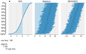
To view and compare table plots of all six variables use:
####################################################
require(tabplot) #load tabplot package
tableplot(mathmix) #generate a table plot with all six variables
####################################################
Resulting in:

Using tableplots is useful in visualizing relationships among a set of variabes. The fact that comparisons can be made using mixed levels of measurement and very large sample sizes provides a tool that the researcher can use for initial exploratory data analysis.
The above visual table comparisons agree with the moderate correlation among the three numeric variables found in the correlation and regression models discussed above. It is also possible to add some additional interpretation by viewing and comparing the mix of both factor and numeric variables.
In this tutorial I have provided a very basic introduction to the use of table plots in visualizing data. Interested readers can find an abundance of information about Tableplot options and interpretations in the CRAN documentation.
In my next tutorial I will continue a discussion of methods to visualize large and complex datasets by looking at some techniques that allow exploration of very large datasets and up to 12 variables or more.
转自:https://dmwiig.net/2017/02/06/r-tutorial-visualizing-multivariate-relationships-in-large-datasets/
R TUTORIAL: VISUALIZING MULTIVARIATE RELATIONSHIPS IN LARGE DATASETS的更多相关文章
- THE R QGRAPH PACKAGE: USING R TO VISUALIZE COMPLEX RELATIONSHIPS AMONG VARIABLES IN A LARGE DATASET, PART ONE
The R qgraph Package: Using R to Visualize Complex Relationships Among Variables in a Large Dataset, ...
- Factoextra R Package: Easy Multivariate Data Analyses and Elegant Visualization
factoextra is an R package making easy to extract and visualize the output of exploratory multivaria ...
- R tutorial
http://www.clemson.edu/economics/faculty/wilson/R-tutorial/Introduction.html https://www.youtube.com ...
- A Complete Tutorial on Tree Based Modeling from Scratch (in R & Python)
A Complete Tutorial on Tree Based Modeling from Scratch (in R & Python) MACHINE LEARNING PYTHON ...
- How-to go parallel in R – basics + tips(转)
Today is a good day to start parallelizing your code. I’ve been using the parallel package since its ...
- The leaflet package for online mapping in R(转)
It has been possible for some years to launch a web map from within R. A number of packages for doin ...
- Toward Scalable Systems for Big Data Analytics: A Technology Tutorial (I - III)
ABSTRACT Recent technological advancement have led to a deluge of data from distinctive domains (e.g ...
- A Tale of Three Apache Spark APIs: RDDs, DataFrames, and Datasets(中英双语)
文章标题 A Tale of Three Apache Spark APIs: RDDs, DataFrames, and Datasets 且谈Apache Spark的API三剑客:RDD.Dat ...
- 多组学分析及可视化R包
最近打算开始写一个多组学(包括宏基因组/16S/转录组/蛋白组/代谢组)关联分析的R包,避免重复造轮子,在开始之前随便在网上调研了下目前已有的R包工具,部分罗列如下: 1. mixOmics 应该是在 ...
随机推荐
- PHP弱类型语法的实现
PHP弱类型语法的实现 前言 借鉴了 TIPI, 对 php 源码进行学习 欢迎大家给予意见, 互相沟通学习 弱类型语法实现方式 (弱变量容器 zval) 所有变量用同一结构表示, 既表示变量值, 也 ...
- DbVisualizer:Oracle触发器,解决ORA-04098: 触发器 'USER.DECTUSERTEST_TRI' 无效且未通过重新验证
我没有用orcal的管理工具,而是用的DbVisualizer 9.5.2,管理数据库. 场景:需要在oracle里面实在自增字段,在网上一搜一堆文档,然后自己就找了一段自己写如下: drop tab ...
- stl_alloc.h分配器
五.分配器:5.1.头文件: 5.1.1.include<stl_alloc.h> //内存的分配. 5.1.2.include<stl_construct.h> //对象的构 ...
- CSS的position/float/display
一.position position属性取值:static(默认).relative.absolute.fixed.inherit. postision:static:始终处于文档流给予的位置.它可 ...
- CentOS编译安装emacs并配置
Liunxs中CentOS系列一向以稳定为目标,然而也会存在版本太旧的问题,emacs就是其中的一个,目前emacs都发行到25.2了,而CentOS上的emacs版本却还是23.1.所以需要下载源代 ...
- [瞎玩儿系列] 使用SQL实现Logistic回归
本来想发在知乎专栏的,但是文章死活提交不了,我也是醉了,于是乎我就干脆提交到CNBLOGS了. 前言 前段时间我们介绍了Logistic的数学原理和C语言实现,而我呢?其实还是习惯使用Matlab进行 ...
- linux服务器下安装node
在百度上搜了好久,都没有完整的答案,好多都已经过时了!特留下此脚印 # 检查是否已经安装pythonrpm -qa | grep python# 查版本python# 最好是重新安装 Python推荐 ...
- 利刃 MVVMLight 9:Messenger
MVVM的目标之一就是为了解耦View和ViewModel.View负责视图展示,ViewModel负责业务逻辑处理,尽量保证 View.xaml.cs中的简洁,不包含复杂的业务逻辑代码. 但是在实际 ...
- Java Swing 图形界面实现验证码(验证码可动态刷新)
import java.awt.Color;import java.awt.Font;import java.awt.Graphics;import java.awt.Toolkit;import j ...
- .NET面试题系列[16] - 多线程概念(1)
.NET面试题系列目录 这篇文章主要是各个百科中的一些摘抄,简述了进程和线程的来源,为什么出现了进程和线程. 操作系统层面中进程和线程的实现 操作系统发展史 直到20世纪50年代中期,还没出现操作系统 ...