R TUTORIAL: VISUALIZING MULTIVARIATE RELATIONSHIPS IN LARGE DATASETS
In two previous blog posts I discussed some techniques for visualizing relationships involving two or three variables and a large number of cases. In this tutorial I will extend that discussion to show some techniques that can be used on large datasets and complex multivariate relationships involving three or more variables.
In this tutorial I will use the R package nmle which contains the dataset MathAchieve. Use the code below to install the package and load it into the R environment:
####################################################
#code for visual large dataset MathAchieve
#first show 3d scatterplot; then show tableplot variations
####################################################
install.packages(“nmle”) #install nmle package
library(nlme) #load the package into the R environment
####################################################
Once the package is installed take a look at the structure of the data set by using:
####################################################
attach(MathAchieve) #take a look at the structure of the dataset
str(MathAchieve)
####################################################
Classes ‘nfnGroupedData’, ‘nfGroupedData’, ‘groupedData’ and ‘data.frame’: 7185 obs. of 6 variables:
$ School : Ord.factor w/ 160 levels “8367”<“8854″<..: 59 59 59 59 59 59 59 59 59 59 …
$ Minority: Factor w/ 2 levels “No”,”Yes”: 1 1 1 1 1 1 1 1 1 1 …
$ Sex : Factor w/ 2 levels “Male”,”Female”: 2 2 1 1 1 1 2 1 2 1 …
$ SES : num -1.528 -0.588 -0.528 -0.668 -0.158 …
$ MathAch : num 5.88 19.71 20.35 8.78 17.9 …
$ MEANSES : num -0.428 -0.428 -0.428 -0.428 -0.428 -0.428 -0.428 -0.428 -0.428 -0.428 …
– attr(*, “formula”)=Class ‘formula’ language MathAch ~ SES | School
.. ..- attr(*, “.Environment”)=<environment: R_GlobalEnv>
– attr(*, “labels”)=List of 2
..$ y: chr “Mathematics Achievement score”
..$ x: chr “Socio-economic score”
– attr(*, “FUN”)=function (x)
..- attr(*, “source”)= chr “function (x) max(x, na.rm = TRUE)”
– attr(*, “order.groups”)= logi TRUE
>
As can be seen from the output shown above the MathAchievedataset consists of 7185 observations and six variables. Three of these variables are numeric and three are factors. This presents some difficulties when visualizing the data. With over 7000 cases a two-dimensional scatterplot showing bivariate correlations among the three numeric variables is of limited utility.
We can use a 3D scatterplot and a linear regression model to more clearly visualize and examine relationships among the three numeric variables. The variable SES is a vector measuring socio-economic status, MathAch is a numeric vector measuring mathematics achievment scores, and MEANSES is a vector measuring the mean SESfor the school attended by each student in the sample.
We can look at the correlation matrix of these 3 variables to get a sense of the relationships among the variables:
> ####################################################
> #do a correlation matrix with the 3 numeric vars;
> ###################################################
> data(“MathAchieve”)
> cor(as.matrix(MathAchieve[c(4,5,6)]), method=”pearson”)
SES MathAch MEANSES
SES 1.0000000 0.3607556 0.5306221
MathAch 0.3607556 1.0000000 0.3437221
MEANSES 0.5306221 0.3437221 1.0000000
>
In using the cor() function as seen above we can determine the variables used by specifying the column that each numeric variable is in as shown in the output from the str() function. The 3 numeric variables, for example, are in columns 4, 5, and 6 of the matrix.
As discussed in previous tutorials we can visualize the relationship among these three variable by using a 3D scatterplot. Use the code as seen below:
####################################################
#install.packages(“nlme”)
install.packages(“scatterplot3d”)
library(scatterplot3d)
library(nlme) #load nmle package
attach(MathAchieve) #MathAchive dataset is in environment
scatterplot3d(SES, MEANSES, MathAch, main=”Basic 3D Scatterplot”) #do the plot with default options
####################################################
The resulting plot is:

Even though the scatter plot lacks detail due to the large sample size it is still possible to see the moderate correlations shown in the correlation matrix by noting the shape and direction of the data points . A regression plane can be calculated and added to the plot using the following code:
scatterplot3d(SES, MEANSES, MathAch, main=”Basic 3D Scatterplot”) #do the plot with default options
####################################################
##use a linear regression model to plot a regression plane
#y=MathAchieve, SES, MEANSES are predictor variables
####################################################
model1=lm(MathAch ~ SES + MEANSES) ## generate a regression
#take a look at the regression output
summary(model1)
#run scatterplot again putting results in model
model <- scatterplot3d(SES, MEANSES, MathAch, main=”Basic 3D Scatterplot”) #do the plot with default options
#link the scatterplot and linear model using the plane3d function
model$plane3d(model1) ## link the 3d scatterplot in ‘model’ to the ‘plane3d’ option with ‘model1’ regression information
####################################################
The resulting output is seen below:
Call:
lm(formula = MathAch ~ SES + MEANSES)
Residuals:
Min 1Q Median 3Q Max
-20.4242 -4.6365 0.1403 4.8534 17.0496
Coefficients:
Estimate Std. Error t value Pr(>|t|)
(Intercept) 12.72590 0.07429 171.31 <2e-16 ***
SES 2.19115 0.11244 19.49 <2e-16 ***
MEANSES 3.52571 0.21190 16.64 <2e-16 ***
—
Signif. codes: 0 ‘***’ 0.001 ‘**’ 0.01 ‘*’ 0.05 ‘.’ 0.1 ‘ ’ 1
Residual standard error: 6.296 on 7182 degrees of freedom
Multiple R-squared: 0.1624, Adjusted R-squared: 0.1622
F-statistic: 696.4 on 2 and 7182 DF, p-value: < 2.2e-16
and the plot with the plane is:

While the above analysis gives us useful information, it is limited by the mixture of numeric values and factors. A more detailed visual analysis that will allow the display and comparison of all six of the variables is possible by using the functions available in the R packageTableplots. This package was created to aid in the visualization and inspection of large datasets with multiple variables.
The MathAchieve contains a total of six variables and 7185 cases. TheTableplots package can be used with datasets larger than 10,000 observations and up to 12 or so variables. It can be used visualize relationships among variables using the same measurement scale or mixed measurement types.
To look at a comparisons of each data type and then view all 6 together begin with the following:
####################################################
attach(MathAchieve) #attach the dataset
#set up 3 data frames with numeric, factors, and mixed
####################################################
mathmix <- data.frame(SES,MathAch,MEANSES,School=factor(School),Minority=factor(Minority),Sex=factor(Sex)) #all 6 vars
mathfact <- data.frame(School=factor(School),Minority=factor(Minority),Sex=factor(Sex)) #3 factor vars
mathnum <- data.frame(SES,MathAch,MEANSES) #3 numeric vars
####################################################
To view a comparison of the 3 numeric variables use:
####################################################
require(tabplot) #load tabplot package
tableplot(mathnum) #generate a table plot with numeric vars only
####################################################
resulting in the following output:
To view only the 3 factor variables use:
####################################################
require(tabplot) #load tabplot package
tableplot(mathfact) #generate a table plot with factors only
####################################################
Resulting in:

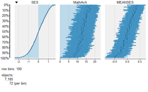
To view and compare table plots of all six variables use:
####################################################
require(tabplot) #load tabplot package
tableplot(mathmix) #generate a table plot with all six variables
####################################################
Resulting in:

Using tableplots is useful in visualizing relationships among a set of variabes. The fact that comparisons can be made using mixed levels of measurement and very large sample sizes provides a tool that the researcher can use for initial exploratory data analysis.
The above visual table comparisons agree with the moderate correlation among the three numeric variables found in the correlation and regression models discussed above. It is also possible to add some additional interpretation by viewing and comparing the mix of both factor and numeric variables.
In this tutorial I have provided a very basic introduction to the use of table plots in visualizing data. Interested readers can find an abundance of information about Tableplot options and interpretations in the CRAN documentation.
In my next tutorial I will continue a discussion of methods to visualize large and complex datasets by looking at some techniques that allow exploration of very large datasets and up to 12 variables or more.
转自:https://dmwiig.net/2017/02/06/r-tutorial-visualizing-multivariate-relationships-in-large-datasets/
R TUTORIAL: VISUALIZING MULTIVARIATE RELATIONSHIPS IN LARGE DATASETS的更多相关文章
- THE R QGRAPH PACKAGE: USING R TO VISUALIZE COMPLEX RELATIONSHIPS AMONG VARIABLES IN A LARGE DATASET, PART ONE
The R qgraph Package: Using R to Visualize Complex Relationships Among Variables in a Large Dataset, ...
- Factoextra R Package: Easy Multivariate Data Analyses and Elegant Visualization
factoextra is an R package making easy to extract and visualize the output of exploratory multivaria ...
- R tutorial
http://www.clemson.edu/economics/faculty/wilson/R-tutorial/Introduction.html https://www.youtube.com ...
- A Complete Tutorial on Tree Based Modeling from Scratch (in R & Python)
A Complete Tutorial on Tree Based Modeling from Scratch (in R & Python) MACHINE LEARNING PYTHON ...
- How-to go parallel in R – basics + tips(转)
Today is a good day to start parallelizing your code. I’ve been using the parallel package since its ...
- The leaflet package for online mapping in R(转)
It has been possible for some years to launch a web map from within R. A number of packages for doin ...
- Toward Scalable Systems for Big Data Analytics: A Technology Tutorial (I - III)
ABSTRACT Recent technological advancement have led to a deluge of data from distinctive domains (e.g ...
- A Tale of Three Apache Spark APIs: RDDs, DataFrames, and Datasets(中英双语)
文章标题 A Tale of Three Apache Spark APIs: RDDs, DataFrames, and Datasets 且谈Apache Spark的API三剑客:RDD.Dat ...
- 多组学分析及可视化R包
最近打算开始写一个多组学(包括宏基因组/16S/转录组/蛋白组/代谢组)关联分析的R包,避免重复造轮子,在开始之前随便在网上调研了下目前已有的R包工具,部分罗列如下: 1. mixOmics 应该是在 ...
随机推荐
- matlab实现可调节占空比的方波
我大概讲一下实现的原理:正弦波移相φ,当使得大于sin(φ)的值为1,其他值为-1,占空比就跟这个φ值之间有联系. 占空比原理图如下所示. 结果上图,可以实现调节占空比,方波频率,方波个数. 下面是函 ...
- Android报错:WindowManager$BadTokenException: Unable to add window -- window has already been added
很久之前测试通过的代码,现在手机升级了Android7.0后一运行就崩溃,报出这样的错误,具体错误如下: Process: com.example.sho.android_anti_theft, PI ...
- 使用Docker分分钟启动常用应用
前言 Docker是目前比较火的一个概念,同时也是微服务中比较关键的一个容器化技术.但是,单从理论上好难看出Docker的优势,因此,我希望在这篇文章中提供一些Docker的使用示例,希望从实际应用上 ...
- 变态版大鱼吃小鱼-基于pixi.js 2D游戏引擎
之前用CSS3画了一条
- 跟着刚哥梳理java知识点——IO(十五)
凡是与输入.输出相关的类.接口都定义在java.io包下 java.io.File类 1.File是一个类,可以有构造器创建其对象.此对象对应着一个文件或者一个目录. 2.File中的类,仅涉及到如何 ...
- gulp基于seaJs模块化项目打包实践【原创】
公司还一直在延续使用jq+seajs的技术栈,所以只能基于现在的技术栈进行静态文件打包,而众所周知seajs的打包比较"偏门",在查了不少的文档和技术分享后终于琢磨出了自己的打包策 ...
- vue2.0版cnode社区项目搭建及实战开发
_________________________________________________________________________ 初涉vue就深深的被vue强大的功能,快速的开发能力 ...
- linux c socket 并发 服务端
#include <stdio.h> #include <stdlib.h> #include <string.h> #include <sys/types. ...
- Linux -atime、mtime、ctime
Linux中,文件都有其自身的atime.mtime.ctime,在不同的命令下,各时间发生相应的改变.下面,我们来简单的介绍一下: atime (access time):表示最后一次访问文件或目录 ...
- R中基本统计图
一.条形图 1.安装包install.packages("vcd"); library(vcd);count<-table(Arthritis$Improved);#tabl ...