css3-弹性盒模型
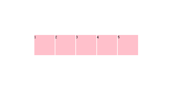
first
<style>

.box{width:1024px;height:100px; border:5px solid black; padding:10px; display:-webkit-box; display:-o-box;display:-moz-box; -webkit-box-orient:vertical; -o-box-orient:vertical; -moz-box-orient:vertical;}/*设置垂直显示,默认横向显示*/

.box div{

	width:100px;

	height:100px;

	background:pink;

	border:2px solid #fff;

	}

</style>

</head>

<body>

<div class="box">

	<div>1</div>

    <div>2</div>

    <div>3</div>

    <div>4</div>

    <div>5</div>

</div>

</body>
效果如图:

second
<style>

.box{width:1024px;height:100px; border:5px solid black; padding:10px; display:-webkit-box; display:-o-box;display:-moz-box;

-webkit-box-direction:Reverse;}/*横向显示,div顺序颠倒*/

.box div{

	width:100px;

	height:100px;

	background:pink;

	border:2px solid #fff;

	}

</style>

</head>

<body>

<div class="box">

	<div>1</div>

    <div>2</div>

    <div>3</div>

    <div>4</div>

    <div>5</div>

</div>

</body>
效果图:

third
<style>
.box{width:1024px;height:100px; border:5px solid black; padding:10px; display:-webkit-box; display:-o-box;display:-moz-box;
}
.box div{
width:100px;
height:100px;
background:pink;
border:2px solid #fff;
}
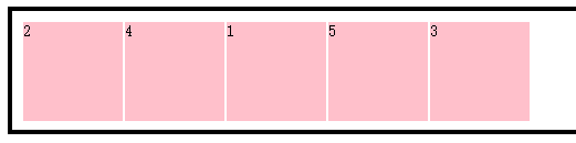
.box div:nth-of-type(1){-webkit-box-ordinal-group:3;}
.box div:nth-of-type(2){-webkit-box-ordinal-group:1;}
.box div:nth-of-type(3){-webkit-box-ordinal-group:5;}
.box div:nth-of-type(4){-webkit-box-ordinal-group:2;}
.box div:nth-of-type(5){-webkit-box-ordinal-group:4;}
/*设置全部元素在父级下的排列顺序*/
</style>
</head>
<body>
<div class="box">
<div>1</div>
<div>2</div>
<div>3</div>
<div>4</div>
<div>5</div>
</div>
</body>
效果图:
fourth-弹性空间
<style>

.box{width:1024px;height:100px; border:5px solid black; padding:10px; display:-webkit-box; display:-o-box;display:-moz-box;

}

.box div{

	width:100px;

	height:100px;

	background:pink;

	border:2px solid #fff;

	}

.box div:nth-of-type(1){width:200px;}

.box div:nth-of-type(2){-webkit-box-flex:1;}

.box div:nth-of-type(3){-webkit-box-flex:2;}

.box div:nth-of-type(4){-webkit-box-flex:3;}

.box div:nth-of-type(5){-webkit-box-flex:4;}

/*设置全部元素在父级下的排列顺序*/

</style>

</head>

<body>

<div class="box">

	<div>1</div>

    <div>2</div>

    <div>3</div>

    <div>4</div>

    <div>5</div>

</div>

</body>
效果图:

fifth
<style>
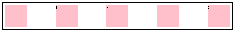
.box{width:1024px;height:100px; border:5px solid black; padding:10px; display:-webkit-box; display:-o-box;display:-moz-box;-webkit-box-pack:justify;}
/*所有子元素在左侧显示,空余空间在右侧:-webkit-box-pack:start;
所有子元素居中显示:-webkit-box-pack:center;
所有子元素在右侧显示,空余空间在左侧:-webkit-box-pack:end;
空余空间在子元素之间平均分布:-webkit-box-pack:justify;
*/
.box div{
width:100px;
height:100px;
background:pink;
border:2px solid #fff;
}
</style>
</head>
<body>
<div class="box">
<div>1</div>
<div>2</div>
<div>3</div>
<div>4</div>
<div>5</div>
</div>
</body>
效果图:
sixth-在垂直方向上对元素位置进行管理
start
end
center
一个位置宽高的元素水平垂直居中显示在页面中:
<style>

html{height:100%;}

body{height:100%;}

.box{height:100%; padding:10px; display:-webkit-box; display:-o-box;display:-moz-box;-webkit-box-pack:center;-webkit-box-align:center;}

.box div{

	width:100px;

	height:100px;

	background:pink;

	border:2px solid #fff;

	}

</style>

</head>
效果图:
css3-弹性盒模型的更多相关文章
- CSS3弹性盒模型flexbox布局基础版
原文链接:http://caibaojian.com/using-flexbox.html 最近看了社区上的一些关于flexbox的很多文章,感觉都没有我这篇文章实在,最重要的兼容性问题好多人都没有提 ...
- css3基础教程:CSS3弹性盒模型
今天给大家分享一篇关于CSS3基础教程 文章,主要是讲CSS3弹性盒模型.弹性布局的主要思想是让容器有能力来改变项目的宽度和高度,以填满可用空间(主要是为了容纳所有类型的显示设备和屏幕尺寸)的能力. ...
- CSS3弹性盒模型,Flex布局教程
布局的传统解决方案,基于盒状模型,依赖 display属性 + position属性 + float属性.它对于那些特殊布局非常不方便,比如,垂直居中就不容易实现. CSS3中引入flex的弹性盒模型 ...
- CSS3弹性盒模型布局模块介绍
来源:Robert’s talk原文:http://robertnyman.com/2010/12/02/css3-flexible-box-layout-module-aka-flex-box-in ...
- css3弹性盒模型flex快速入门与上手(align-content与align-items)
接着上文css3弹性盒模型flex快速入门与上手1继续,上文还剩下两个父容器的属性align-items和align-content. 一.align-content:多行的副轴对齐方式 含义 多行的 ...
- css和css3弹性盒模型实现元素宽度(高度)自适应
一.css实现左侧宽度固定右侧宽度自适应 1.定位 <!DOCTYPE html> <html lang="en"> <head> <me ...
- (转)详解css3弹性盒模型(Flexbox)
今天刚学了css3的弹性盒模型,这是一个可以让你告别浮动.完美实现垂直水平居中的新特性. Flexbox是布局模块,而不是一个简单的属性,它包含父元素和子元素的属性. Flexbox布局的主体思想是似 ...
- css3弹性盒模型
一.简介 css3引入了新的盒模型——弹性盒模型,该模型决定一个盒子在其他盒子中的分布方式以及如何处理可用的空间.使用该模型,可以很轻松的创建自适应浏览器窗口的流动布局或自适应字体大小的弹性布局. 目 ...
- CSS3弹性盒模型flexbox完整版教程
http://caibaojian.com/flexbox-guide.html 来自CSS Tricks上的一个教程,原文为:A Complete Guide to Flexbox.文中详细的介绍了 ...
- CSS3弹性盒模型之box-orient & box-direction
Css3引入了新的盒模型——弹性盒模型,其实上一篇文章已经讲到了一个box-flex,今天来讲讲另外的两个弹性盒模型属性box-orient 和 box-direction. 1.box-origen ...
随机推荐
- swift的@objc总结
One can explicitly write @objc on any Swift declaration that can be expressed in Objective-C. @objc相 ...
- 2018-2019-2 网络对抗技术 20165318 Exp4 恶意代码分析
2018-2019-2 网络对抗技术 20165318 Exp4 恶意代码分析 原理与实践说明 实践目标 实践内容概述 基础问题回答 实践过程记录 1.使用schtasks指令监控系统 2.使用sys ...
- sphinx笔记
sphinx笔记 下载中文版coreseek包 1:解压后,将etc下的mysql.conf文件复制一份放到上级目录下,改名为sphinx.conf 2:配置文件: 2.1:source配置数据源 s ...
- P1006 传纸条-洛谷luogu-dp动态规划
题目描述 小渊和小轩是好朋友也是同班同学,他们在一起总有谈不完的话题.一次素质拓展活动中,班上同学安排做成一个mm行nn列的矩阵,而小渊和小轩被安排在矩阵对角线的两端,因此,他们就无法直接交谈了.幸运 ...
- PAT A1153 Decode Registration Card of PAT (25 分)——多种情况排序
A registration card number of PAT consists of 4 parts: the 1st letter represents the test level, nam ...
- java StringBuilder和StringBuffer 用法
可变的字符串,兄弟关系StringBuilder:效率高,安全性低StringBuffer:效率低,安全性高 StringBuilder 的常用方法的使用,StringBuffer用法一样. publ ...
- Spring @Scheduled定时任务的fixedRate,fixedDelay,cron执行差异
import java.text.DateFormat; import java.text.SimpleDateFormat; import java.util.Date; import org.sp ...
- python简介及安装配置
概述 python是解释型语言,相对编译型语言,执行效率较低.python是通过c语言编写,官方解释器也是c语言编写cpython,也有其他的如用java编写的jpython.目前有2.0和3.0版本 ...
- 人生苦短之HTTP协议及Requests库的方法
requests库的主要方法:requests.request()构造一个请求 requests.get()获取HTML网页的主要方法,对应于HTTP的GET requests.head( ...
- c# create html table test
string html = "<html><head><title>44444444</title>"; html += @&quo ...