WPF 应用完全模拟 UWP 的标题栏按钮
WPF 自定义窗口样式有多种方式,不过基本核心实现都是在修改 Win32 窗口样式。然而,Windows 上的应用就应该有 Windows 应用的样子嘛,在保证自定义的同时也能与其他窗口样式保持一致当然能最大程度保证 Windows 操作系统上的体验一致性。
本文将分享一个我自制的标题栏按钮样式,使其与 UWP 原生应用一模一样(同时支持自定义)。
在 WPF 使用 WindowChrome,在自定义窗口标题栏的同时最大程度保留原生窗口样式(类似 UWP/Chrome) 一文中,我使用 WindowChrome 尽可能将 Windows 原生的窗口机制都用上了,试图完全模拟原生窗口的样式。不过,如果自定义了窗口的背景色,那么标题栏那三大金刚键的背景就显得很突兀。
由于 Win32 原生的方法顶多只支持修改标题栏按钮的背景色,而不支持让标题栏按钮全透明,所以我们只能完全由自己来实现这三个按钮的功能了。
标题栏的四个按钮
一开始我说三个按钮,是因为大家一般都只能看得见三个。但这里说四个按钮,是因为实际实现的时候我们是四个按钮。事实上,Windows 的原生实现也是四颗按钮。
- 最小化
- 还原
- 最大化
- 关闭
当窗口最小化时,显示还原、最大化和关闭按钮。当窗口普通显示时,显示最小化、最大化和关闭按钮,这也是我们见的最多的情况。当窗口最大化时,显示最小化、还原和关闭按钮。
自绘标题栏按钮
标题栏按钮并不单独存在,所以我直接做了一整个窗口样式。使用此窗口样式,窗口能够模拟得跟 UWP 一模一样。
以下是模拟的效果:
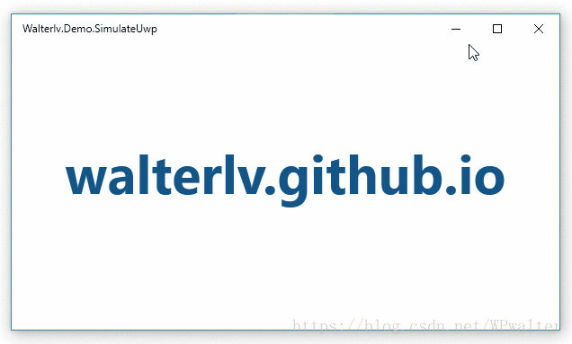
▲ WPF 模拟版本
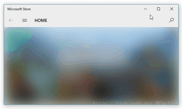
▲ UWP 原生版本(为避免说我拿同一个应用附图,我选了微软商店应用对比)
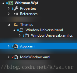
为了使用到这样近乎原生的窗口样式,我们需要两个文件。一个放 XAML 样式,一个放样式所需的逻辑代码。
因为代码很长,所以我把它们放到了最后。
如何使用我制作的原生窗口样式
当你把我的两份代码文件放入到你的项目中之后,在 App.xaml 中将资源引用即可:
<Application.Resources>

    <ResourceDictionary>

        <ResourceDictionary.MergedDictionaries>

            <ResourceDictionary Source="Themes/Window.Universal.xaml" />

        </ResourceDictionary.MergedDictionaries>

    </ResourceDictionary>

</Application.Resources>
随后,在 MainWindow 中就可以通过 Style="{StaticResource Style.Window.Universal}" 使用这份样式。
<Window x:Class="Walterlv.Demo.MainWindow"

        xmlns="http://schemas.microsoft.com/winfx/2006/xaml/presentation"

        xmlns:x="http://schemas.microsoft.com/winfx/2006/xaml"

        xmlns:themes="clr-namespace:Walterlv.Themes"

        Title="Walterlv.Demo.SimulateUwp" Width="800" Height="450"

        Background="#279EDA" Style="{StaticResource Style.Window.Universal}">

    <themes:UniversalWindowStyle.TitleBar>

        <themes:UniversalTitleBar ForegroundColor="White" InactiveForegroundColor="#7FFFFFFF"

                                  ButtonHoverForeground="White" ButtonHoverBackground="#3FFFFFFF"

                                  ButtonPressedForeground="#7FFFFFFF" ButtonPressedBackground="#3F000000" />

    </themes:UniversalWindowStyle.TitleBar>

    <Grid>

        <!-- 在这里添加你的正常窗口内容 -->

    </Grid>

</Window>
当然,我额外提供了 UniversalWindowStyle.TitleBar 附加属性,用于像 UWP 那样定制标题栏按钮的颜色。如果不设置,效果跟 UWP 默认情况下的效果完全一样。
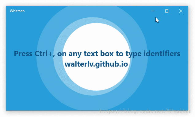
下面是这份样式在 Whitman - Microsoft Store 应用中实际使用的效果,其中的颜色设置就是上面代码中所指定的颜色:
附样式代码文件
样式文件 Window.Universal.xaml:
<!-- Window.Universal.xaml -->
<ResourceDictionary xmlns="http://schemas.microsoft.com/winfx/2006/xaml/presentation"
xmlns:x="http://schemas.microsoft.com/winfx/2006/xaml"
xmlns:themes="clr-namespace:Walterlv.Themes">
<Style x:Key="Style.Window.Universal" TargetType="Window">
<Style.Resources>
<SolidColorBrush x:Key="Brush.TitleBar.Foreground" Color="{Binding Path=(themes:UniversalWindowStyle.TitleBar).ForegroundColor, RelativeSource={RelativeSource TemplatedParent}, Mode=OneWay}" />
<SolidColorBrush x:Key="Brush.TitleBar.InactiveForeground" Color="{Binding Path=(themes:UniversalWindowStyle.TitleBar).InactiveForegroundColor, RelativeSource={RelativeSource TemplatedParent}, Mode=OneWay}" />
<SolidColorBrush x:Key="Brush.TitleBar.ButtonHoverForeground" Color="{Binding Path=(themes:UniversalWindowStyle.TitleBar).ButtonHoverForeground, RelativeSource={RelativeSource TemplatedParent}, Mode=OneWay}" />
<SolidColorBrush x:Key="Brush.TitleBar.ButtonHoverBackground" Color="{Binding Path=(themes:UniversalWindowStyle.TitleBar).ButtonHoverBackground, RelativeSource={RelativeSource TemplatedParent}, Mode=OneWay}" />
<SolidColorBrush x:Key="Brush.TitleBar.ButtonPressedForeground" Color="{Binding Path=(themes:UniversalWindowStyle.TitleBar).ButtonPressedForeground, RelativeSource={RelativeSource TemplatedParent}, Mode=OneWay}" />
<SolidColorBrush x:Key="Brush.TitleBar.ButtonPressedBackground" Color="{Binding Path=(themes:UniversalWindowStyle.TitleBar).ButtonPressedBackground, RelativeSource={RelativeSource TemplatedParent}, Mode=OneWay}" />
</Style.Resources>
<Setter Property="themes:UniversalWindowStyle.TitleBar">
<Setter.Value>
<themes:UniversalTitleBar />
</Setter.Value>
</Setter>
<Setter Property="WindowChrome.WindowChrome">
<Setter.Value>
<WindowChrome GlassFrameThickness="0 64 0 0" NonClientFrameEdges="Left,Bottom,Right" UseAeroCaptionButtons="False" />
</Setter.Value>
</Setter>
<Setter Property="Template">
<Setter.Value>
<ControlTemplate TargetType="Window">
<Border Padding="4 1 4 4">
<Grid x:Name="RootGrid" Background="{TemplateBinding Background}">
<Grid x:Name="TitleBarPanel" VerticalAlignment="Top" Height="31">
<FrameworkElement.Resources>
<Style TargetType="{x:Type Button}">
<Setter Property="Width" Value="46"/>
<Setter Property="BorderThickness" Value="0" />
<Setter Property="Foreground" Value="{StaticResource Brush.TitleBar.Foreground}" />
<Setter Property="Background" Value="Transparent"/>
<Setter Property="Stylus.IsPressAndHoldEnabled" Value="False" />
<Setter Property="Stylus.IsFlicksEnabled" Value="False" />
<Setter Property="Stylus.IsTapFeedbackEnabled" Value="False" />
<Setter Property="Stylus.IsTouchFeedbackEnabled" Value="False" />
<Setter Property="WindowChrome.IsHitTestVisibleInChrome" Value="True"/>
<Setter Property="Template">
<Setter.Value>
<ControlTemplate TargetType="Button">
<Border Name="OverBorder" BorderThickness="0 1 0 0" Background="{TemplateBinding Background}">
<TextBlock x:Name="MinimizeIcon"
Foreground="{TemplateBinding Foreground}" Text="{TemplateBinding Content}"
FontSize="10" FontFamily="Segoe MDL2 Assets"
HorizontalAlignment="Center" VerticalAlignment="Center"/>
</Border>
</ControlTemplate>
</Setter.Value>
</Setter>
<Style.Triggers>
<MultiTrigger>
<!-- When the pointer is over the button. -->
<MultiTrigger.Conditions>
<Condition Property="IsMouseOver" Value="True" />
<Condition Property="IsStylusOver" Value="False" />
</MultiTrigger.Conditions>
<Setter Property="Foreground" Value="{StaticResource Brush.TitleBar.ButtonHoverForeground}" />
<Setter Property="Background" Value="{StaticResource Brush.TitleBar.ButtonHoverBackground}" />
</MultiTrigger>
<!-- When the pointer is pressed. -->
<MultiTrigger>
<MultiTrigger.Conditions>
<Condition Property="IsPressed" Value="True" />
<Condition Property="AreAnyTouchesOver" Value="False" />
</MultiTrigger.Conditions>
<Setter Property="Foreground" Value="{StaticResource Brush.TitleBar.ButtonPressedForeground}" />
<Setter Property="Background" Value="{StaticResource Brush.TitleBar.ButtonPressedBackground}" />
</MultiTrigger>
<!-- When the touch device is pressed. -->
<MultiTrigger>
<MultiTrigger.Conditions>
<Condition Property="IsPressed" Value="True" />
<Condition Property="AreAnyTouchesOver" Value="True" />
</MultiTrigger.Conditions>
<Setter Property="Foreground" Value="{StaticResource Brush.TitleBar.ButtonPressedForeground}" />
<Setter Property="Background" Value="{StaticResource Brush.TitleBar.ButtonPressedBackground}" />
</MultiTrigger>
</Style.Triggers>
</Style>
<Style x:Key="Style.Button.Close" TargetType="Button" BasedOn="{StaticResource {x:Type Button}}">
<Style.Triggers>
<MultiTrigger>
<!-- When the pointer is over the button. -->
<MultiTrigger.Conditions>
<Condition Property="IsMouseOver" Value="True" />
<Condition Property="IsStylusOver" Value="False" />
</MultiTrigger.Conditions>
<Setter Property="Foreground" Value="White" />
<Setter Property="Background" Value="#E81123" />
</MultiTrigger>
<!-- When the pointer is pressed. -->
<MultiTrigger>
<MultiTrigger.Conditions>
<Condition Property="IsPressed" Value="True" />
<Condition Property="AreAnyTouchesOver" Value="False" />
</MultiTrigger.Conditions>
<Setter Property="Foreground" Value="Black" />
<Setter Property="Background" Value="#F1707A" />
</MultiTrigger>
<!-- When the touch device is pressed. -->
<MultiTrigger>
<MultiTrigger.Conditions>
<Condition Property="IsPressed" Value="True" />
<Condition Property="AreAnyTouchesOver" Value="True" />
</MultiTrigger.Conditions>
<Setter Property="Foreground" Value="Black" />
<Setter Property="Background" Value="#F1707A" />
</MultiTrigger>
</Style.Triggers>
</Style>
</FrameworkElement.Resources>
<TextBlock x:Name="TitleTextBlock" FontSize="12" Text="{TemplateBinding Title}"
Margin="12 0 156 0" VerticalAlignment="Center" Foreground="{StaticResource Brush.TitleBar.Foreground}" />
<StackPanel x:Name="TitleBarButtonPanel" Orientation="Horizontal"
Margin="0 -1 0 0" HorizontalAlignment="Right">
<Button x:Name="MinimizeButton" Content="" themes:UniversalWindowStyle.TitleBarButtonState="Minimized" />
<Button x:Name="RestoreButton" Content="" themes:UniversalWindowStyle.TitleBarButtonState="Normal" />
<Button x:Name="MaximizeButton" Content="" themes:UniversalWindowStyle.TitleBarButtonState="Maximized" />
<Button x:Name="CloseButton" Content="" Style="{StaticResource Style.Button.Close}" themes:UniversalWindowStyle.IsTitleBarCloseButton="True" />
</StackPanel>
</Grid>
<AdornerDecorator>
<ContentPresenter />
</AdornerDecorator>
</Grid>
</Border>
<ControlTemplate.Triggers>
<Trigger Property="WindowState" Value="Maximized">
<Setter TargetName="RootGrid" Property="Margin" Value="4 7 4 4" />
<Setter TargetName="TitleBarPanel" Property="Height" Value="32" />
<Setter TargetName="MaximizeButton" Property="Visibility" Value="Collapsed" />
</Trigger>
<Trigger Property="WindowState" Value="Normal">
<Setter TargetName="RestoreButton" Property="Visibility" Value="Collapsed" />
</Trigger>
<Trigger Property="WindowState" Value="Minimized">
<Setter TargetName="MinimizeButton" Property="Visibility" Value="Collapsed" />
</Trigger>
<Trigger Property="IsActive" Value="False">
<Setter TargetName="TitleTextBlock" Property="Foreground" Value="{StaticResource Brush.TitleBar.InactiveForeground}" />
<Setter TargetName="MinimizeButton" Property="Foreground" Value="{StaticResource Brush.TitleBar.InactiveForeground}" />
<Setter TargetName="RestoreButton" Property="Foreground" Value="{StaticResource Brush.TitleBar.InactiveForeground}" />
<Setter TargetName="MaximizeButton" Property="Foreground" Value="{StaticResource Brush.TitleBar.InactiveForeground}" />
<Setter TargetName="CloseButton" Property="Foreground" Value="{StaticResource Brush.TitleBar.InactiveForeground}" />
</Trigger>
</ControlTemplate.Triggers>
</ControlTemplate>
</Setter.Value>
</Setter>
</Style>
</ResourceDictionary>逻辑代码文件 Window.Universal.xaml.cs(当然,名字可以随意):
// Window.Universal.xaml.cs

using System;

using System.Windows;

using System.Windows.Controls;

using System.Windows.Media;

namespace Walterlv.Themes

{

    public class UniversalWindowStyle

    {

        public static readonly DependencyProperty TitleBarProperty = DependencyProperty.RegisterAttached(

            "TitleBar", typeof(UniversalTitleBar), typeof(UniversalWindowStyle),

            new PropertyMetadata(new UniversalTitleBar(), OnTitleBarChanged));

        public static UniversalTitleBar GetTitleBar(DependencyObject element)

            => (UniversalTitleBar) element.GetValue(TitleBarProperty);

        public static void SetTitleBar(DependencyObject element, UniversalTitleBar value)

            => element.SetValue(TitleBarProperty, value);

        public static readonly DependencyProperty TitleBarButtonStateProperty = DependencyProperty.RegisterAttached(

            "TitleBarButtonState", typeof(WindowState?), typeof(UniversalWindowStyle),

            new PropertyMetadata(null, OnButtonStateChanged));

        public static WindowState? GetTitleBarButtonState(DependencyObject element)

            => (WindowState?) element.GetValue(TitleBarButtonStateProperty);

        public static void SetTitleBarButtonState(DependencyObject element, WindowState? value)

            => element.SetValue(TitleBarButtonStateProperty, value);

        public static readonly DependencyProperty IsTitleBarCloseButtonProperty = DependencyProperty.RegisterAttached(

            "IsTitleBarCloseButton", typeof(bool), typeof(UniversalWindowStyle),

            new PropertyMetadata(false, OnIsCloseButtonChanged));

        public static bool GetIsTitleBarCloseButton(DependencyObject element)

            => (bool) element.GetValue(IsTitleBarCloseButtonProperty);

        public static void SetIsTitleBarCloseButton(DependencyObject element, bool value)

            => element.SetValue(IsTitleBarCloseButtonProperty, value);

        private static void OnTitleBarChanged(DependencyObject d, DependencyPropertyChangedEventArgs e)

        {

            if (e.NewValue is null) throw new NotSupportedException("TitleBar property should not be null.");

        }

        private static void OnButtonStateChanged(DependencyObject d, DependencyPropertyChangedEventArgs e)

        {

            var button = (Button) d;

            if (e.OldValue is WindowState)

            {

                button.Click -= StateButton_Click;

            }

            if (e.NewValue is WindowState)

            {

                button.Click -= StateButton_Click;

                button.Click += StateButton_Click;

            }

        }

        private static void OnIsCloseButtonChanged(DependencyObject d, DependencyPropertyChangedEventArgs e)

        {

            var button = (Button) d;

            if (e.OldValue is true)

            {

                button.Click -= CloseButton_Click;

            }

            if (e.NewValue is true)

            {

                button.Click -= CloseButton_Click;

                button.Click += CloseButton_Click;

            }

        }

        private static void StateButton_Click(object sender, RoutedEventArgs e)

        {

            var button = (DependencyObject) sender;

            var window = Window.GetWindow(button);

            var state = GetTitleBarButtonState(button);

            if (window != null && state != null)

            {

                window.WindowState = state.Value;

            }

        }

        private static void CloseButton_Click(object sender, RoutedEventArgs e)

            => Window.GetWindow((DependencyObject) sender)?.Close();

    }

    public class UniversalTitleBar

    {

        public Color ForegroundColor { get; set; } = Colors.Black;

        public Color InactiveForegroundColor { get; set; } = Color.FromRgb(0x99, 0x99, 0x99);

        public Color ButtonHoverForeground { get; set; } = Colors.Black;

        public Color ButtonHoverBackground { get; set; } = Color.FromRgb(0xE6, 0xE6, 0xE6);

        public Color ButtonPressedForeground { get; set; } = Colors.Black;

        public Color ButtonPressedBackground { get; set; } = Color.FromRgb(0xCC, 0xCC, 0xCC);

    }

}
兼容 Windows 10 之前的系统
上面的样式中我们使用了 Segoe MDL2 Assets 字体,而这款字体仅 Windows 10 上才有。于是如果我们的应用还要兼容 Windows 10 之前的系统怎么办呢?
需要改动两个地方:
- 按钮模板中图标的显示方式(从
TextBlock改成Path; - 按钮图标的指定方式(从字符串改成
StreamGeometry)。
<ControlTemplate TargetType="Button">

    <Border Name="OverBorder" BorderThickness="0 1 0 0" Background="{TemplateBinding Background}">

        <Path x:Name="MinimizeIcon"

                Fill="{TemplateBinding Foreground}" Data="{TemplateBinding Content}"

                Width="16" Height="16" SnapsToDevicePixels="True"

                HorizontalAlignment="Center" VerticalAlignment="Center"/>

    </Border>

</ControlTemplate>
<Button x:Name="MinimizeButton" themes:UniversalWindowStyle.TitleBarButtonState="Minimized">
<StreamGeometry>M 3,8 L 3,9 L 13,9 L 13,8 Z</StreamGeometry>
</Button>
<Button x:Name="RestoreButton" themes:UniversalWindowStyle.TitleBarButtonState="Normal">
<StreamGeometry>M 3,3 L 3,4 L 13,4 L 13,3 Z M 3,12 L 3,13 L 13,13 L 13,12 Z M 3,4 L 3,12 L 4,12 L 4,4 Z M 12,4 L 12,12 L 13,12 L 13,4 Z</StreamGeometry>
</Button>
<Button x:Name="MaximizeButton" themes:UniversalWindowStyle.TitleBarButtonState="Maximized">
<StreamGeometry>M 3,3 L 3,4 L 13,4 L 13,3 Z M 3,12 L 3,13 L 13,13 L 13,12 Z M 3,4 L 3,12 L 4,12 L 4,4 Z M 12,4 L 12,12 L 13,12 L 13,4 Z</StreamGeometry>
</Button>
<Button x:Name="CloseButton" Style="{StaticResource Style.Button.Close}" themes:UniversalWindowStyle.IsTitleBarCloseButton="True">
<StreamGeometry>M 3,3 L 3,4 L 4,4 L 4,3 Z M 5,5 L 5,6 L 6,6 L 6,5 Z M 7,7 L 7,9 L 9,9 L 9,7 Z M 9,9 L 9,10 L 10,10 L 10,9 Z M 11,11 L 11,12 L 12,12 L 12,11 Z M 4,4 L 4,5 L 5,5 L 5,4 Z M 6,6 L 6,7 L 7,7 L 7,6 Z M 12,3 L 12,4 L 13,4 L 13,3 Z M 10,10 L 10,11 L 11,11 L 11,10 Z M 12,12 L 12,13 L 13,13 L 13,12 Z M 11,4 L 11,5 L 12,5 L 12,4 Z M 10,5 L 10,6 L 11,6 L 11,5 Z M 9,6 L 9,7 L 10,7 L 10,6 Z M 6,9 L 6,10 L 7,10 L 7,9 Z M 5,10 L 5,11 L 6,11 L 6,10 Z M 4,11 L 4,12 L 5,12 L 5,11 Z M 3,12 L 3,13 L 4,13 L 4,12 Z</StreamGeometry>
</Button>WPF 应用完全模拟 UWP 的标题栏按钮的更多相关文章
- [UWP]浅谈按钮设计
一时兴起想谈谈UWP按钮的设计. 按钮是UI中最重要的元素之一,可能也是用得最多的交互元素.好的按钮设计可以有效提高用户体验,构造让人眼前一亮的UI.而且按钮通常不会影响布局,小小的按钮无论怎么改也不 ...
- UWP更改标题栏颜色
你是否因为UWP标题栏太丑而想过改变?那么这篇文章或许可以帮助你美化UWP界面,让你的UWP的标题栏也变好看 这里的代码,都要在MainPage的构造函数中.如果你在App类中更改了首页,则在该首页的 ...
- [UWP]占领标题栏
1. 前言 每一个有理想的UWP应用都会打标题栏的注意,尤其当微软提供 将 Acrylic 扩展到标题栏 这个功能后,大部分Windows 10的原生应用都不乖了,纷纷占领了标题栏的一亩三分地.这篇博 ...
- qml实现自定义标题栏按钮
自定义的标题栏按钮是由Rectangle来实现的,在Rectangle中需要4张图片,分别在鼠标进入按钮区.鼠标离开按钮区(正常状态下).鼠标按下和鼠标释放时所加载的图片.下面是实现自定义按钮的代码( ...
- WPF案例 (四) 模拟Windows7桌面任务栏
原文:WPF案例 (四) 模拟Windows7桌面任务栏 这个程序模彷了Windows7的桌面任务栏,当在桌面上双击某个快捷方式时,将打开一个新的子界面,并且在任务栏里创建一个链接到此界面的任务栏图标 ...
- WPF案例 (三) 模拟QQ“快速换装"界面
原文:WPF案例 (三) 模拟QQ"快速换装"界面 这个小程序使用Wpf模拟QQ快速换装页面的动画特效,通过使用组合快捷键Ctrl+Left或Ctrl+Right,可实现Image ...
- WPF点击不同界面上的按钮实现界面切换
原文:WPF点击不同界面上的按钮实现界面切换 版权声明:本文为博主原创文章,未经博主允许不得转载. https://blog.csdn.net/qq_29844879/article/details/ ...
- C# WPF 中用代码模拟鼠标和键盘的操作
原文:C# WPF 中用代码模拟鼠标和键盘的操作 原文地址 C#开发者都知道,在Winform开发中,SendKeys类提供的方法是很实用的.但是可惜的是,在WPF中不能使用这个方法了. 我们知道,在 ...
- Win10的UWP之标题栏的返回键(二)
原文:Win10的UWP之标题栏的返回键(二) 关于Win10的UWP的返回键的第二种处理的方法,是介于标题栏的强行修改,不是像上期的那样直接调用系统内置的API. - - - - - - - - - ...
随机推荐
- JavaScript之右下角广告
网站中,我们都遇到想这样的悬浮广告,我们先给图片设置右下角悬浮属性,关闭按钮键也就是节点的删除: window.onload = function(){ var TipBox = document.g ...
- 算法总结1:K-邻近算法
1. 算法原理: K-邻近算法的原理很简单,就是用你的“邻居”来推断出你的类别.用于离散型数据分析处理. 例子1:如下图有ABCD四个用于参考的样本点,都已知晓自己的坐标位置,这时E来了,不清楚自己的 ...
- nyoj35——逆波兰表达式
逆波兰表达式又称作后缀表达式,在四则混合运算的程序设计中用到. 例如: 1+2写成后缀表达式就是12+ 4+5*(3-2)的后缀表达式就是4532-*+ 后缀表达式在四则运算中带来了意想不到的方便,在 ...
- Mybatis Generator 扩展
目标 修改Model的名称 修改Dao的名称 配置文件 context.targetRuntime 替换为自定义的类型 原理在:org.mybatis.generator.internal.Objec ...
- IOS-CALayer(图层)
BWLayer.m // // BWLayer.m // IOS_0222_CALayer // // Created by ma c on 16/2/23. // Copyright © 2016年 ...
- laravel中单独获取一个错误信息的方法
获取单独的错误信息的方法
- 【LeetCode-128】Longest Consecutive Sequence
描述 输入一个乱序的连续数列,输出其中最长连续数列长度,要求算法复杂度为 O(n) . 输入 54,55,300,12,56 输出 3 通常我们看有没有连续序列时 找某个数有没有的前后的数,比如看到5 ...
- C++中几个值得分析的小问题(2)
下面有3个小问题,作为C++ Beginner你一定要知道错在哪里了. 1.派生类到基类的引用或指针转换一定“完美”存在? 一般情况,你很可能会认为:派生类对象的引用或指针转换为基类对象的引用或指针是 ...
- 马士兵_JAVA自学之路(为那些目标模糊的码农们)
转载自:http://blog.csdn.net/anlidengshiwei/article/details/42264301 JAVA自学之路 一:学会选择 为了就业,不少同学参加各种各样的培训. ...
- php获取excel文件数据
很简单就可以实现,下面为大家简单介绍下 1.下载PHPExcel类,是一个文件夹,还得有一个文件PHPExcel.php,两个在同级目录 require __DIR__ . './PHPExcel/I ...