13.Quick QML-RowLayout、ColumnLayout、GridLayout布局管理器介绍、并通过GridLayout设计的简易网站导航界面
上章我们学习了:12.Quick QML-QML 布局(Row、Column、Grid、Flow和嵌套布局) 、Repeater对象,本章我们继续来学习布局管理器
1.RowLayout、ColumnLayout、GridLayout布局管理器介绍
RowLayout、ColumnLayout、GridLayout布局管理器和Row、Column、Grid布局器非常相似,但是在布局管理器里就不支持使用Positioner附加属性了.
并且在布局器的基础上,为每个item提供了下面几个附加属性:
- Layout.minimumWidth
- Layout.minimumHeight
- Layout.maximumWidth
- Layout.maximumHeight
- Layout.preferredWidth : 首选宽度。如果未设置,那么布局将使用隐式宽度(implicitWidth)。默认值为-1。
- Layout.preferredHeight : 首选高度。如果未设置,那么布局将使用隐式高度。默认值为-1。
- Layout.fillWidth : bool类型,默认为false,如果为true,那么该item的宽度会尽可能宽(可以伸缩),如果为false,那么宽度的优先级选择为: Layout.preferredWidth > implicitWidth > Layout.minimumWidth
- Layout.fillHeight : 和Layout.fillWidth一样,设置高度是否可以伸缩
- Layout.alignment : 设置item在网格里的对齐方式,默认值为" Qt.AlignVCenter | Qt.AlignLeft "
- Layout.margins : 设置item的外边距
- Layout.leftMargin
- Layout.rightMargin
- Layout.topMargin
- Layout.bottomMargin
由于RowLayout和ColumnLayout其实本质就是单行或者单列的GridLayout.所以我们以GridLayout为例讲解.
2. GridLayout布局管理器介绍
它的属性如下所示:
- rowSpacing : real,设置每行的间隔,默认值为5
- columnSpacing : real,设置每列的间隔,默认值为5
- rows : int,默认值为-1,用来设置网格有多少行
- columns : int,默认值为-1,用来设置网格有多少列
- flow : enumeration,流布局,取值有:
- GridLayout.LeftToRight: 从左往右排列,如果剩余的宽度不足,则排下一行(默认值)
- Flow.TopToBottom: 从上往下排列,如果剩余的宽度不足,则排下一列.
- layoutDirection : enumeration,布局方向,取值有:
- Qt.LeftToRight (default) : 默认方向
- Qt.RightToLeft : 左右取反方向(比如布局顺序为123,将会变为321)
并且GridLayout在RowLayout和ColumnLayout的附加属性基础上,还额外增加了下面几个附加属性:
- Layout.row : 指定item在网格中的行位置。默认值为0,由布局为项目自动分配单元格。
- Layout.column: 指定item在网格中的列位置。默认值为0,由布局为项目自动分配单元格。
- Layout.rowSpan : 指定item在网格中的行跨度,默认值为1。
- Layout.columnSpan : 指定item在网格中的列跨度,默认值为1。
3.flow 和layoutDirection介绍
flow表示每个网格的排列方向.
layoutDirection表示布局方向,如果layoutDirection = Qt.RightToLeft,那么就会将水平方向的排列进行水平镜像.
比如默认显示的是:

设置layoutDirection = Qt.RightToLeft后,那么显示的将会是:

示例代码如下所示:
Window {

    width: 320;

    height: 240;

    visible: true;

    GridLayout{

          id: grid

          rows: 3

          flow: GridLayout.LeftToRight

          layoutDirection: Qt.LeftToRight

          anchors.fill: parent

          Repeater {

              model: 3

              Rectangle {

                  color: "yellow"

                  Layout.alignment: Qt.AlignLeft   // 水平靠左

                  Layout.fillHeight: true       // 设置高度可伸缩

                  Layout.preferredWidth: 40

                  Layout.preferredHeight: 70

                  Text {

                      anchors.centerIn: parent

                      font.pixelSize: 14

                      text: "水平靠左"+index

                  }

                  Component.onCompleted: {

                      console.log(Layout.row +","+ Layout.column)

                  }

              }

          }

          Repeater {

              model: 3

              Rectangle {

                  Layout.alignment: Qt.AlignVCenter | Qt.AlignRight

                  color: "green"

                  Layout.fillHeight: true       // 设置高度可伸缩

                  Layout.preferredWidth: 40

                  Layout.preferredHeight: 70

                  Text {

                      anchors.centerIn: parent

                      font.pixelSize: 14

                      text: "水平靠右"+index

                  }

              }

          }

    }

}
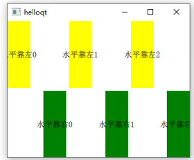
设置"flow: GridLayout.LeftToRight"、"layoutDirection: Qt.LeftToRight"的时候,效果如下所示:
设置"flow: GridLayout.LeftToRight"、"layoutDirection: Qt.RightToLeft"的时候,效果如下所示(水平方向取反,原来的顺序是012,变成了210,并且每个item的水平对齐方向也取反了):

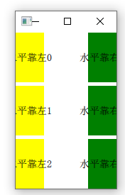
设置"flow: GridLayout.TopToBottom"、"layoutDirection: Qt.LeftToRight"的时候,效果如下所示:
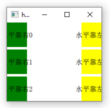
设置"flow: GridLayout.TopToBottom"、"layoutDirection: Qt. RightToLeft"的时候,效果如下所示(先绘制一列"yellow"、再绘制一列"green",然后再进行水平镜像变换):
4.Layout.rowSpan和Layout.columnSpan介绍
用来指定item在网格中显示的行跨度和列跨度,默认值为1.
我们以每个网格的宽高为1为例,比如当前item默认显示的区域是在(0,1)~(1,2)上:
000

X00

000
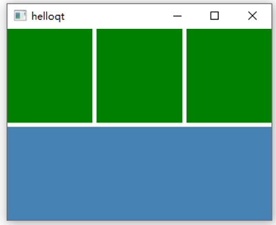
如果我们设置columnSpan=3, rowSpan=2,那么当前item显示的区域将是在(0,1)~(3,3)上面,也就是说列跨度(宽度)占了3个网格,行宽度(高度)占了2个网格,将会变为:
000

XXX

XXX
- 注意 : 使用跨度之前,必须设置Layout.fillWidth和Layout.fillHeight为true
示例如下所示:
Window {

    width: 320;

    height: 240;

    visible: true;

    GridLayout{

          id: grid

          columns: 3

          anchors.fill: parent

          Repeater {

            model: 3

            Rectangle {               // 显示区域

                color: "green"

                Layout.fillWidth: true

                Layout.fillHeight: true

            }

          }

          Rectangle {               // 显示区域

              color: "steelblue"

              Layout.fillWidth: true

              Layout.fillHeight: true

              Layout.columnSpan: 3

              Layout.rowSpan: 2

          }

    }

}
效果如下所示:
注意:
Layout.rowSpan和Layout.columnSpan有个bug,那就是如果我们定义的某一列的所有item如果都带了Layout.columnSpan值,那么是没有效果的,示例如下所示:
GridLayout{

              id: grid

              columns: 4

              anchors.fill: parent

              Rectangle {

                  color: "steelblue"

                  Layout.fillWidth: true

                  Layout.fillHeight: true

              }

              Rectangle {

                  color: "steelblue"

                  Layout.fillWidth: true

                  Layout.fillHeight: true

              }

              Rectangle {               // yellow区域

                  color: "yellow"

                  Layout.fillWidth: true

                  Layout.fillHeight: true

                  Layout.columnSpan: 2

              }

              Rectangle {

                  color: "steelblue"

                  Layout.fillWidth: true

                  Layout.fillHeight: true

                  Layout.columnSpan: 2

              }

              Rectangle {               // yellow区域

                  color: "yellow"

                  Layout.fillWidth: true

                  Layout.fillHeight: true

                  Layout.columnSpan: 2

              }

        }
效果如下所示:

可以看到我们设置yellow块的是Layout.columnSpan: 2,但是显示的效果并没有跨列.这是因为我们最后一列没有放置任何东西,所以它的位置被前面3列给均匀平摊了.
5.简易的网站导航界面设计
接下来我们便来通过GridLayout来做一个简易的网站导航界面,并支持自适应界面.当我们点击其中的某个按钮,就会打开浏览器跳到对应的网站上.
界面如下所示: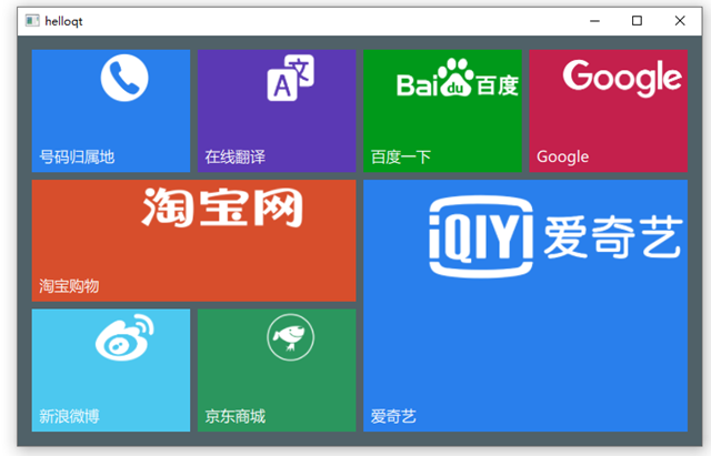
首先创建BoxButton组件:
import QtQuick 2.14

import QtQuick.Controls 2.0

Button {

    id: btn

    property var backColor: "#7BCBEB"       // 背景颜色

    property var iconUrl: ""                // 图标

    property var textSize: 12               // 图标

    property var openUrl: ""                // 链接

    text: "button"

    implicitWidth: 60

    implicitHeight: 60

    hoverEnabled: true

    contentItem: Label {                    // 设置文本,文本位于左下角

        id: btnForeground

        text: parent.text

        font.family: "Microsoft Yahei"

        font.pixelSize: textSize

        color: "#FFFFFF"

        horizontalAlignment: Text.AlignLeft

        verticalAlignment: Text.AlignBottom

    }

    background: Rectangle {              // 设置背景色

        id: btnBack

        color: backColor

        border.color: backColor

        border.width: 2

    }

    Image{                              // 设置图标,图标位于右上角

        source: iconUrl

        anchors.right: parent.right

        anchors.top: parent.top

        smooth: true

        anchors.rightMargin: parent.width * 0.01

        anchors.topMargin: parent.height * 0.03

        fillMode: Image.PreserveAspectFit

        height: parent.height * 0.4

        width: parent.width * 0.8

        mipmap: true

    }

    onDownChanged: {

        btnBack.color = down ? Qt.lighter(backColor, 0.9) : backColor     // 设置按下的背景颜色

        btnBack.border.color = backColor

    }

    onHoveredChanged: {

        btnBack.color = hovered ? Qt.lighter(backColor, 1.09) : backColor // 设置徘徊的背景颜色

        btnBack.border.color = hovered ? Qt.lighter(backColor, 1.24) : backColor

    }

    onClicked: {

        if (openUrl.length > 0) {

            Qt.openUrlExternally(openUrl);

        }

    }

}
然后在main.cpp来生成组件:
import QtQuick 2.14

import QtQuick.Window 2.0

import QtQuick.Layouts 1.14

Window {

    width: 550;

    height: 400;

    visible: true;

    color: "#506168"

    property var btnTextSize: Math.min(grid.height,grid.width) * 0.04

    function boxButtonInit(item,color,text,icon,url) {

        item.Layout.fillWidth = true

        item.Layout.fillHeight = true

        item.backColor = color

        item.text = text

        item.iconUrl = icon

        item.openUrl = url

    }

    GridLayout{

          id: grid

          columns: 4

          anchors.fill: parent

          anchors.margins: 15

          rowSpacing: 8

          columnSpacing: 8

          BoxButton {

              textSize : btnTextSize

              Component.onCompleted: boxButtonInit(this,

                                                   "#297FEC",

                                                   "号码归属地",

                                                   "qrc:/phone.png",

                                                   "https://www.ip138.com/sj/");

          }

          BoxButton {

              textSize : btnTextSize

              Component.onCompleted: boxButtonInit(this,

                                                   "#5B39B4",

                                                   "在线翻译",

                                                   "qrc:/translate.png",

                                                   "https://fanyi.baidu.com/");

          }

          BoxButton {

              textSize : btnTextSize

              Component.onCompleted: boxButtonInit(this,

                                                   "#00991A",

                                                   "百度一下",

                                                   "qrc:/baidu.png",

                                                   "https://www.baidu.com/");

          }

          BoxButton {

              textSize : btnTextSize

              Component.onCompleted: boxButtonInit(this,

                                                   "#C4204C",

                                                   "Google",

                                                   "qrc:/google.png",

                                                   "https://www.google.cn/");

          }

          BoxButton {

              Layout.columnSpan: 2

              textSize : btnTextSize

              Component.onCompleted: boxButtonInit(this,

                                                   "#D74E2C",

                                                   "淘宝购物",

                                                   "qrc:/tb.png",

                                                   "https://www.taobao.com/");

          }

          BoxButton {

              Layout.columnSpan: 2

              Layout.rowSpan: 2

              textSize : btnTextSize

              Component.onCompleted: boxButtonInit(this,

                                                   "#297FEC",

                                                   "爱奇艺",

                                                   "qrc:/aiyiqi.png",

                                                   "https://www.iqiyi.com/");

          }

          BoxButton {

              textSize : btnTextSize

              Component.onCompleted: boxButtonInit(this,

                                                   "#4CC8EF",

                                                   "新浪微博",

                                                   "qrc:/weibo.png",

                                                   "https://weibo.com/");

          }

          BoxButton {

              textSize : btnTextSize

              Component.onCompleted: boxButtonInit(this,

                                                   "#2B965E",

                                                   "京东商城",

                                                   "qrc:/jd.png",

                                                   "https://www.jd.com/");

          }

    }

}
13.Quick QML-RowLayout、ColumnLayout、GridLayout布局管理器介绍、并通过GridLayout设计的简易网站导航界面的更多相关文章
- 编写Java程序,使用Swing布局管理器和常用控件,实现仿QQ登录界面
返回本章节 返回作业目录 需求说明: 使用Swing布局管理器和常用控件,实现仿QQ登录界面 实现思路: 创建登录界面的类QQLogin,该类继承父类JFrame,在该类中创建无参数的构造方法,在构造 ...
- 第13章 Swing程序组件----常用布局管理器
在Swing中,每个组件在容器中都有一个具体的位置和大小,而在容器中摆放各种组件时很难判断其具体位置和大小.布局管理器提供了Swing组件安排.展示在容器中的方法及基本的布局功能. Swing提供的常 ...
- Swing布局管理器介绍
创作品,允许转载,转载时请务必以超链接形式标明文章 原始出处 .作者信息和本声明.否则将追究法律责任.http://zhangjunhd.blog.51cto.com/113473/128174 当选 ...
- learning java AWT 布局管理器 GridLayout
GridLayout布局管理器将容器分割成纵横线分格的网格,每个网格所占的区域大小相同. import java.awt.*; public class GridLayoutTest { public ...
- java 图形化小工具Abstract Window Toolit ;布局管理器FlowLayout流式布局;BorderLayout边界布局;GridLayout网格布局;CardLayou重叠卡片布局;BoxLayout方框布局;绝对定位
1.FlowLayout流式布局管理器: FlowLayout布局管理器中,组件像水流一样向某方向流动(排列),遇到障碍(边界)就折回,重头开始排列 .在默认情况下,FlowLayout局管理器从左向 ...
- AWT03-LayoutManager布局管理器
1.LayoutManager布局管理器 在之前的学习中,我们使用setBounds()方法设置容器的位置大小,但我们不得不明白一件事--如果我们手动为容器设置位置大小的话,就会造成程序通用性的下降. ...
- 【java】浅析java组件中的布局管理器
这篇博文笔者介绍一下java组件中,常用的布局管理器.java组件中的布局方式有好几十种,所有的这些布局管理器都实现了java.awt.LayoutManager接口.接下来笔者介绍一下常用的5种布局 ...
- GUI容器之布局管理器
布局管理器 布局管理器:frame.setLayout(); 默认值为new flowLayout() 流式布局 frame.setLayout(new FlowLayout(FlowLayout.R ...
- PyQt5(2)——调整布局(布局管理器)第一个程序
我们拖拽一个UI文件,转为PY文件后生成一个类Ui_MainWindow 此时,我们新建一个文件,用来控制业务逻辑(继承界面中的类),跟界面分开,这样我们就完成了界面和逻辑相分离(这段代码使用率基本1 ...
随机推荐
- idea中Maven-build lifecycle中下面标签详解
原文链接:https://blog.csdn.net/mr_orange_klj/article/details/82153945 Maven是基于一个build lifecycle的中心概念,意味着 ...
- R语言学习4:函数,流程控制,数据框重塑
本系列是一个新的系列,在此系列中,我将和大家共同学习R语言.由于我对R语言的了解也甚少,所以本系列更多以一个学习者的视角来完成. 参考教材:<R语言实战>第二版(Robert I.Kaba ...
- cocos2dx创建工程
p.p1 { margin: 0; font: 17px "Helvetica Neue"; color: rgba(69, 69, 69, 1) } 官网镇楼: http://w ...
- 用 hexo 快速搭建博客
如何做到一毛不拔的搭建网站 以下操作全程使用管理员权限,因为我不清楚哪里会出现 permission denied 1.下载 nodejs 对应 windows 用户,下载对应的 ".msi ...
- java 方法详解
什么是方法 方法的定义和调用 值传递与引用传递 值传递:指的是在方法调用时,传递的是参数是按值的拷贝传递. 特点:传递的是值的拷贝,也就是传递后就互不相关了. 引用传递:指的是在方法调用时,传递的参数 ...
- YoloV3 记录
常用于目标检测,因为最近要从目标分类问题转到目标检测中去. tensoflow.Keras(大公司一般都用这个).pytorch(本次学习)------------------主要框架 程序设计模块规 ...
- idea启动项目address localhost:1099 is already in use异常解决
IDEA中启动Tomcat报错,Error running Tomcat7.0.52: Address localhost:1099 is already in use 或者是 java.rmi.se ...
- Python中异步协程的使用方法介绍
1. 前言 在执行一些 IO 密集型任务的时候,程序常常会因为等待 IO 而阻塞.比如在网络爬虫中,如果我们使用 requests 库来进行请求的话,如果网站响应速度过慢,程序一直在等待网站响应,最后 ...
- TextRank算法及生产文本摘要方法介绍
TextRank 算法是一种用于文本的基于图的排序算法,其基本思想来源于谷歌的 PageRank算法,通过把文本分割成若干组成单元(句子),构建节点连接图,用句子之间的相似度作为边的权重,通过循环迭代 ...
- DataTable.SELECT日期类型筛选处理
初始化: public DataTable1() { InitializeComponent(); Init(); } private void Init() { dt = new DataTable ...