数据可视化基础专题(十一):Matplotlib 基础(三)常用图表(一)折线图、散点图、柱状图
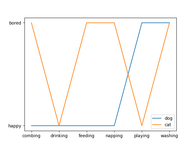
1 折线图
折线图主要用于表现随着时间的推移而产生的某种趋势。
cat = ["bored", "happy", "bored", "bored", "happy", "bored"]

dog = ["happy", "happy", "happy", "happy", "bored", "bored"]

activity = ["combing", "drinking", "feeding", "napping", "playing", "washing"]

fig, ax = plt.subplots()

ax.plot(activity, dog, label="dog")

ax.plot(activity, cat, label="cat")

ax.legend()

plt.show()
2.散点图
散点图经常用来表示数据之间的关系,使用的是 plt 库中的 scatter() 方法,还是先看下 scatter() 的语法,来自官方文档:
matplotlib.pyplot.scatter(x, y, s=None, c=None, marker=None, cmap=None, norm=None, vmin=None, vmax=None, alpha=None, linewidths=None, verts=<deprecated parameter>, edgecolors=None, *, plotnonfinite=False, data=None, **kwargs)
- s : 表示的是每个点的大小,如果只有一个数值的时候,则所有的点都是一样大的,也可以传入一个列表,这时候每个点的大小都不一样,散点图也就成了气泡图。
- c : 表示点的颜色,如果只有一种颜色的时候,则每个点的颜色都会相同,也可以使用列表定义不同的颜色
- linewidths : 表示每个散点的线宽
- edgecolors : 每个散点外轮廓的颜色
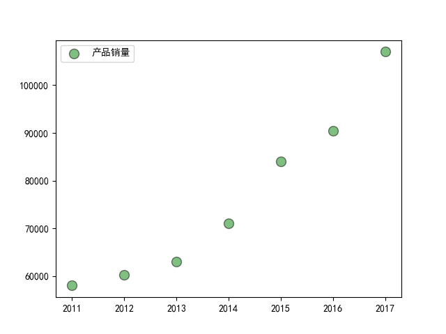
例子一:
import matplotlib.pyplot as plt

import numpy as np

# 处理中文乱码

plt.rcParams['font.sans-serif']=['SimHei']

x_data = np.array([2011,2012,2013,2014,2015,2016,2017])

y_data = np.array([58000,60200,63000,71000,84000,90500,107000])

plt.scatter(x_data, y_data, s = 100, c = 'green', marker='o', edgecolor='black', alpha=0.5, label = '产品销量')

plt.legend()

plt.savefig("scatter_demo.png")
例子二
import matplotlib.pyplot as plt

import numpy as np

# unit area ellipse

rx, ry = 3., 1.

area = rx * ry * np.pi

theta = np.arange(0, 2 * np.pi + 0.01, 0.1)

verts = np.column_stack([rx / area * np.cos(theta), ry / area * np.sin(theta)])

x, y, s, c = np.random.rand(4, 30)

s *= 10**2.

fig, ax = plt.subplots()

ax.scatter(x, y, s, c, marker=verts)

plt.show()

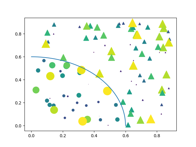
例子三
import matplotlib.pyplot as plt

import numpy as np

# Fixing random state for reproducibility

np.random.seed(19680801)

N = 100

r0 = 0.6

x = 0.9 * np.random.rand(N)

y = 0.9 * np.random.rand(N)

area = (20 * np.random.rand(N))**2  # 0 to 10 point radii

c = np.sqrt(area)

r = np.sqrt(x ** 2 + y ** 2)

area1 = np.ma.masked_where(r < r0, area)

area2 = np.ma.masked_where(r >= r0, area)

plt.scatter(x, y, s=area1, marker='^', c=c)

plt.scatter(x, y, s=area2, marker='o', c=c)

# Show the boundary between the regions:

theta = np.arange(0, np.pi / 2, 0.01)

plt.plot(r0 * np.cos(theta), r0 * np.sin(theta))

plt.show()
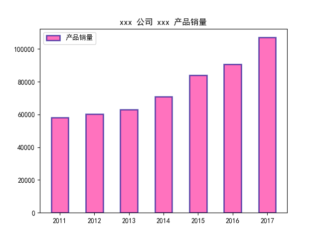
3.柱状图
柱状图主要用于查看各分组数据的数量分布,以及各个分组数据之间的数量比较。
3.1 普通柱状图
matplotlib.pyplot.bar(left, height, width=0.8, bottom=None, hold=None, data=None, **kwargs)
| 参数 | 接收值 | 说明 | 默认值 |
|---|---|---|---|
| left | array | x 轴; | 无 |
| height | array | 柱形图的高度,也就是y轴的数值; | 无 |
| alpha | 数值 | 柱形图的颜色透明度 ; | 1 |
| width | 数值 | 柱形图的宽度; | 0.8 |
| color(facecolor) | string | 柱形图填充的颜色; | 随机色 |
| edgecolor | string | 图形边缘颜色 | None |
| label | string | 解释每个图像代表的含义 | 无 |
| linewidth(linewidths / lw) | 数值 | 边缘or线的宽度 | 1 |
import matplotlib.pyplot as plt

import numpy as np

# 处理中文乱码

plt.rcParams['font.sans-serif']=['SimHei']

x_data = np.array([2011,2012,2013,2014,2015,2016,2017])

y_data = np.array([58000,60200,63000,71000,84000,90500,107000])

y_data_1 = np.array([78000,80200,93000,101000,64000,70500,87000])

plt.title(label='xxx 公司 xxx 产品销量')

plt.bar(x_data, y_data, width=0.5, alpha=0.6, facecolor = 'deeppink', edgecolor = 'darkblue', lw=2, label='产品销量')

plt.legend()

plt.savefig("bar_demo_1.png")
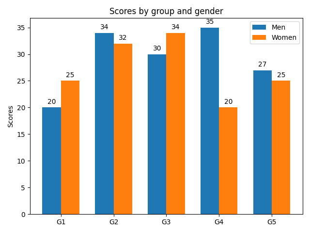
3.2 并排柱状图
接下来是两个柱形图并列显示,这里调用的还是 bar() ,只不过需要调整的是柱子的位置:
import matplotlib

import matplotlib.pyplot as plt

import numpy as np

labels = ['G1', 'G2', 'G3', 'G4', 'G5']

men_means = [20, 34, 30, 35, 27]

women_means = [25, 32, 34, 20, 25]

x = np.arange(len(labels))  # the label locations

width = 0.35  # the width of the bars

fig, ax = plt.subplots()

rects1 = ax.bar(x - width/2, men_means, width, label='Men')

rects2 = ax.bar(x + width/2, women_means, width, label='Women')

# Add some text for labels, title and custom x-axis tick labels, etc.

ax.set_ylabel('Scores')

ax.set_title('Scores by group and gender')

ax.set_xticks(x)

ax.set_xticklabels(labels)

ax.legend()

def autolabel(rects):

    """Attach a text label above each bar in *rects*, displaying its height."""

    for rect in rects:

        height = rect.get_height()

        ax.annotate('{}'.format(height),

                    xy=(rect.get_x() + rect.get_width() / 2, height),

                    xytext=(0, 3),  # 3 points vertical offset

                    textcoords="offset points",

                    ha='center', va='bottom')

autolabel(rects1)

autolabel(rects2)

fig.tight_layout()

plt.show()
3.3 堆积柱状图
Note the parameters yerr used for error bars, and bottom to stack the women's bars on top of the men's bars.
import numpy as np

import matplotlib.pyplot as plt

labels = ['G1', 'G2', 'G3', 'G4', 'G5']

men_means = [20, 35, 30, 35, 27]

women_means = [25, 32, 34, 20, 25]

men_std = [2, 3, 4, 1, 2]

women_std = [3, 5, 2, 3, 3]

width = 0.35       # the width of the bars: can also be len(x) sequence

fig, ax = plt.subplots()

ax.bar(labels, men_means, width, yerr=men_std, label='Men')

ax.bar(labels, women_means, width, yerr=women_std, bottom=men_means,

       label='Women')

ax.set_ylabel('Scores')

ax.set_title('Scores by group and gender')

ax.legend()

plt.show()

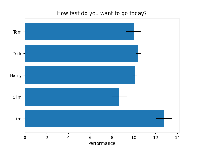
3.4 横向柱状图
import matplotlib.pyplot as plt

import numpy as np

# Fixing random state for reproducibility

np.random.seed(19680801)

plt.rcdefaults()

fig, ax = plt.subplots()

# Example data

people = ('Tom', 'Dick', 'Harry', 'Slim', 'Jim')

y_pos = np.arange(len(people))

performance = 3 + 10 * np.random.rand(len(people))

error = np.random.rand(len(people))

ax.barh(y_pos, performance, xerr=error, align='center')

ax.set_yticks(y_pos)

ax.set_yticklabels(people)

ax.invert_yaxis()  # labels read top-to-bottom

ax.set_xlabel('Performance')

ax.set_title('How fast do you want to go today?')

plt.show()
import matplotlib.pyplot as plt

import numpy as np # 处理中文乱码

plt.rcParams['font.sans-serif']=['SimHei']

x_data = np.array([2011,2012,2013,2014,2015,2016,2017])

y_data = np.array([58000,60200,63000,71000,84000,90500,107000])

y_data_1 = np.array([78000,80200,93000,101000,64000,70500,87000])

plt.title(label='xxx 公司 xxx 产品销量')

plt.bar(x_data, y_data, width=0.5, alpha=0.6, facecolor = 'deeppink', edgecolor = 'darkblue', lw=2, label='产品销量')

plt.legend()

plt.savefig("bar_demo_1.png")
import matplotlib.pyplot as plt import numpy as np # 处理中文乱码 plt.rcParams['font.sans-serif']=['SimHei'] x_data = np.array([2011,2012,2013,2014,2015,2016,2017]) y_data = np.array([58000,60200,63000,71000,84000,90500,107000]) y_data_1 = np.array([78000,80200,93000,101000,64000,70500,87000]) plt.title(label='xxx 公司 xxx 产品销量') plt.bar(x_data, y_data, width=0.5, alpha=0.6, facecolor = 'deeppink', edgecolor = 'darkblue', lw=2, label='产品销量') plt.legend() plt.savefig("bar_demo_1.png")
数据可视化基础专题(十一):Matplotlib 基础(三)常用图表(一)折线图、散点图、柱状图的更多相关文章
- 数据可视化:绘图库-Matplotlib
为什么要绘图? 一个图表数据的直观分析,下面先看一组北京和上海上午十一点到十二点的气温变化数据: 数据: 这里我用一段代码生成北京和上海的一个小时内每分钟的温度如下: import random co ...
- Qt数据可视化(散点图、折线图、柱状图、盒须图、饼状图、雷达图)开发实例
目录 散点图 折线图 柱状图 水平柱状图 水平堆叠图 水平百分比柱状图 盒须图 饼状图 雷达图 Qt散点图.折线图.柱状图.盒须图.饼状图.雷达图开发实例. 在开发过程中我们会使用多各种各样的图 ...
- echarts、higncharts折线图或柱状图显示数据为0的点
echarts.higncharts折线图或柱状图只需要后端传到前端一段json数据,接送数据的x轴与y周有对应数据,折线图或柱状图就会渲染出这数据. 比如,x轴表示美每天日期,y轴表示数量.他们的数 ...
- 安卓图表引擎AChartEngine(三) - 示例源码折线图、饼图和柱状图
折线图: package org.achartengine.chartdemo.demo.chart; import java.util.ArrayList; import java.util.Lis ...
- 数据可视化利器pyechart和matplotlib比较
python中用作数据可视化的工具有多种,其中matplotlib最为基础.故在工具选择上,图形美观之外,操作方便即上乘. 本文着重说明常见图表用基础版matplotlib和改良版pyecharts作 ...
- 数据可视化(一)-Matplotlib简易入门
本节的内容来源:https://www.dataquest.io/mission/10/plotting-basics 本节的数据来源:https://archive.ics.uci.edu/ml/d ...
- ajax实现highchart与数据库数据结合完整案例分析(三)---柱状折线图
作者原创,未经博主允许,不可转载 在前面分析和讲解了用java代码分别实现饼状图和折线图,在工作当中,也会遇到很多用ajax进行异步请求 实现highchart. 先展示一下实现的效果图: 用ajax ...
- Matplotlib中plot画点图和折线图
引入: import matplotlib.pyplot as plt 基本语法: plt.plot(x, y, format_string, **kwargs) x:x轴数据,列表或数组,可选 y: ...
- matplotlib库的基本使用与折线图
matplotlib:最流行的Python底层绘图库,主要做数据可视化图表,名字取材于MATLAB,模仿MATLAB构建 基本使用: x和y的长度必须一致 figure()方法用来设置图片大小 x,y ...
- 使用matplotlib绘图(一)之折线图
# 使用matplotlib绘制折线图 import matplotlib.pyplot as plt import numpy as np # 在一个图形中创建两条线 fig = plt.figur ...
随机推荐
- Postgresql DB安装和使用问题记录
2.选择语言后提示: Error: There has been an error. Please put SELinux in permissive mode and then run instal ...
- C# .net framework .net core 3.1 请求参数校验, DataAnnotations, 自定义参数校验
前言 在实际应用场景中我们常常要对接口的入参进行校验, 例如分页大小是否正确, 必填参数是否已经填写等等. 最简单的实现方式如下图, 这种在实际开发中代码过于冗余, 而且不灵活. 今天介绍一种统一参数 ...
- filebeat v6.3 如何增加ip 字段
我们知道filebeat获取数据之后是会自动获取主机名的,项目上有需要filebeat送数据的时候送一个ip字段出来 方法:配置filebeat配置文件 解释一下:field 是字段模块 在这个模块下 ...
- JPA 中 find() 和 getReference() 的区别
在查询的时候有两个方法:find()和getReference(),这两个方法的参数以及调用方式都相同.那么这两个方法有什么不一样的呢? find()称为 立即加载,顾名思义就是在调用的时候立即执行查 ...
- 域名注册诈骗邮件We are an agency engaging in registering brand name and domain names
最近收到了一封自称是某公司的邮件,说有人要注册我已经申请的域名,需要我回复确认,看邮件发件人是个人邮箱,通篇没有提到公司,也不是什么正规机构,大概率就是诈骗邮件了. 为了完全确认这封诈骗邮件,我登陆了 ...
- 团队进行Alpha冲刺--项目测试
这个作业属于哪个课程 软件工程 (福州大学至诚学院 - 计算机工程系) 这个作业要求在哪里 团队作业第五次--Alpha冲刺 这个作业的目标 团队进行Alpha冲刺--项目测试 作业正文 如下 其他参 ...
- ViewPager2 学习
ViewPager2 延迟加载数据 ViewPager2 延迟加载数据 ViewPager 实现预加载的方案 ViewPager2 实现预加载的方案 总结 ViewPager 实现预加载的方案 背景 ...
- Java垃圾回收机制(GC)
Java内存分配机制 这里所说的内存分配,主要指的是在堆上的分配,一般的,对象的内存分配都是在堆上进行,但现代技术也支持将对象拆成标量类型(标量类型即原子类型,表示单个值,可以是基本类型或String ...
- Charles的介绍,配置与使用
简介 Charles中文名叫青花瓷 它是一款基于HTTP协议的代理服务器 通过成为客户端或者浏览器的代理 然后截取请求和请求结果达到分析抓包的目的. 特点 跨平台 win linux mac 半免费 ...
- 恕我直言你可能真的不会java第5篇:Stream的状态与并行操作
一.回顾Stream管道流操作 通过前面章节的学习,我们应该明白了Stream管道流的基本操作.我们来回顾一下: 源操作:可以将数组.集合类.行文本文件转换成管道流Stream进行数据处理 中间操作: ...