
how to create modals with Bootstrap
In this tutorial you will learn how to create modals with Bootstrap.
Creating Modals with Bootstrap
Modals are basically a dialog box that is used to provide important information to the user or prompt user to take necessary actions before moving on. Modal windows are widely used to warn users for situations like session time out or to receive their final confirmation before going to perform any critical actions such as saving or deleting important data.
You can easily create very smart and flexible dialog boxes with the Bootstrap modal plugin. The following example will show you how to create a simple modal with a header, message body and the footer containing action buttons for the user.
Example
<div id="myModal" class="modal fade">
<div class="modal-dialog">
<div class="modal-content">
<div class="modal-header">
<button type="button" class="close" data-dismiss="modal" aria-hidden="true">×</button>
<h4 class="modal-title">Confirmation</h4>
</div>
<div class="modal-body">
<p>Do you want to save changes you made to document before closing?</p>
<p class="text-warning"><small>If you don't save, your changes will be lost.</small></p>
</div>
<div class="modal-footer">
<button type="button" class="btn btn-default" data-dismiss="modal">Close</button>
<button type="button" class="btn btn-primary">Save changes</button>
</div>
</div>
</div>
</div>
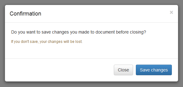
— The above example launches the modal window when the DOM is fully loaded via JavaScript. The output will look something like this:
Activate Modals via Data Attributes
You can activate a Bootstrap modal by clicking on the button or link via data attributes without writing any JavaScript code. See the following example:
Example
<!-- Button HTML (to Trigger Modal) -->
<a href="#myModal" role="button" class="btn btn-large btn-primary" data-toggle="modal">Launch Demo Modal</a>
<!-- Modal HTML -->
<div id="myModal" class="modal fade">
<div class="modal-dialog">
<div class="modal-content">
<div class="modal-header">
<button type="button" class="close" data-dismiss="modal" aria-hidden="true">×</button>
<h4 class="modal-title">Confirmation</h4>
</div>
<div class="modal-body">
<p>Do you want to save changes you made to document before closing?</p>
<p class="text-warning"><small>If you don't save, your changes will be lost.</small></p>
</div>
<div class="modal-footer">
<button type="button" class="btn btn-default" data-dismiss="modal">Close</button>
<button type="button" class="btn btn-primary">Save changes</button>
</div>
</div>
</div>
</div>
The above example launches the modal window on click of the "Launch Demo Modal" button. Let's go through each part of this modal code one by one for a better understanding.
Explanation of Code
To activate a Bootstrap modal via data attributes we basically need two components — the controller element like a button or link, and the modal element itself.
- The outermost container of every modal in a document must have a unique id (in this case
id="myModal"), so that it can be targeted viadata-target(for buttons) orhref(for hyperlinks) attribute of the controller element. - The attribute
data-toggle="modal"is required to add on the controller element, like a button or an anchor, along with a attributedata-target="#myModal"orhref="#myModal"to target a specific modal to toggle. - The
.modal-dialogclass sets the width as well as horizontal and vertical alignment of the modal box. Whereas the class.modal-contentsets the styles like text and background color, borders, rounded corners etc.
Rest of the thing is self explanatory, such as the .modal-header element defines a header for the modal that usually contains a modal title and a close button, whereas the .modal-bodyelement contains the actual content like text, images, forms etc. and the .modal-footerelement defines the footer that typically contains action buttons for the user.
Note:The .fade class on the .modal element adds a fading and sliding animation effect while showing and hiding the modal window. If you want the modal that simply appear without any effect you can just remove this class.
Activate Modals via JavaScript
You may also activate a Bootstrap modal window via JavaScript — just call the modal()Bootstrap method with the modal "id" or "class" selector in your JavaScript code.
Example
<script type="text/javascript">
$(document).ready(function(){$(".btn").click(function(){$("#myModal").modal('show');});
});
</script>
Changing the Sizes of Modals
Bootstrap gives you option further to scaling a modal up or down. You can make modals larger or smaller by adding an extra class .modal-lg or .modal-sm on .modal-dialog.
Example
<!-- Large modal -->
<button class="btn btn-primary" data-toggle="modal" data-target="#largeModal">Large modal</button>
<div id="largeModal" class="modal fade bs-example-modal-lg" tabindex="-1" role="dialog">
<div class="modal-dialog modal-lg">
<div class="modal-content">
<div class="modal-header">
<button type="button" class="close" data-dismiss="modal" aria-hidden="true">×</button>
<h4 class="modal-title">Large Modal</h4>
</div>
<div class="modal-body">
<p>Add the <code>.modal-lg</code> class on <code>.modal-dialog</code> to create this large modal.</p>
</div>
<div class="modal-footer">
<button type="button" class="btn btn-default" data-dismiss="modal">Cancel</button>
<button type="button" class="btn btn-primary">OK</button>
</div>
</div>
</div>
</div>
<!-- Small modal -->
<button class="btn btn-primary" data-toggle="modal" data-target="#smallModal">Small modal</button>
<div id="smallModal" class="modal fade" tabindex="-1" role="dialog">
<div class="modal-dialog modal-sm">
<div class="modal-content">
<div class="modal-header">
<button type="button" class="close" data-dismiss="modal" aria-hidden="true">×</button>
<h4 class="modal-title">Small Modal</h4>
</div>
<div class="modal-body">
<p>Add the <code>.modal-sm</code> class on <code>.modal-dialog</code> to create this small modal.</p>
</div>
<div class="modal-footer">
<button type="button" class="btn btn-default" data-dismiss="modal">Cancel</button>
<button type="button" class="btn btn-primary">OK</button>
</div>
</div>
</div>
</div>
Changing Modal Content Based on Trigger Button
Often several modal on a web page has almost same content with minor differences.
You can use the modal events to create slightly different modal windows based on the same modal HTML. The following example will change the title of the modal window according to the trigger button's data-title attribute value.
Example
<script type="text/javascript">
$(document).ready(function(){$("#myModal").on('show.bs.modal', function(event){// Get button that triggered the modal
var button = $(event.relatedTarget);
// Extract value from data-* attributes
var titleData = button.data('title');$(this).find('.modal-title').text(titleData + ' Form');});
});
</script>
Options
There are certain options which may be passed to modal() Bootstrap method to customize the functionality of a modal window.
| Name | Type | Default Value | Description |
|---|---|---|---|
| backdrop | boolean or the string 'static' |
true | Includes a modal-backdrop (black overlay area) element. Alternatively, you may specify static for a backdrop which doesn't close the modal on click. |
| keyboard | boolean | true | Closes the modal window on press of escape key. |
| show | boolean | true | Shows the modal when initialized or activate. |
| remote | URL | false | Deprecated If a remote url is provided, content will be loaded one time via jQuery's load method and injected into the '.modal-content' div. |
You may set these options either through the use of data attributes or JavaScript. For setting the modals options via data attributes, just append the option name to data-, like data-backdrop="static", data-keyboard="false" etc.
However, JavaScript is the more preferable way for setting these options as it prevents you from repetitive work. See the modal's method .modal(options) in the section below to know how to set the options for modals using the JavaScript.
If you're using the data api for setting the options for modal window, you may alternatively use the "href" attribute to provide the URL of remote source, like this:
Example
<!-- Button HTML (to Trigger Modal) -->
<a href="remote.html" role="button" class="btn btn-large btn-primary" data-toggle="modal" data-target="#myModal">Launch Demo Modal</a>
<!-- Modal HTML -->
<div id="myModal" class="modal fade">
<div class="modal-dialog">
<div class="modal-content">
<!-- Content will be loaded here from "remote.php" file -->
</div>
</div>
</div>
Note:The remote option for the Bootstrap modals is deprecated since v3.3.0 and will be removed in v4. Use the client-side templating or a data binding framework instead, or call the jQuery.load method yourself.
Methods
These are the standard bootstrap's modals methods:
.modal(options)
This method activates the content as a modal. It also allows you to set options for them.
The jQuery code in the following example will prevent the modal from closing when a user clicks on the backdrop i.e. black overlay area behind the modal.
Example
<script type="text/javascript">
$(document).ready(function(){$(".launch-modal").click(function(){$("#myModal").modal({backdrop: 'static'
});
});
});
</script>
The following jQuery code will prevent the modal from closing on press of the escape key.
Example
<script type="text/javascript">
$(document).ready(function(){$(".launch-modal").click(function(){$("#myModal").modal({keyboard: false
});
});
});
</script>
The jQuery code in the following example will create a modal in which content of the modal will be inserted from a remote file upon activation.
Example
<script type="text/javascript">
$(document).ready(function(){$(".launch-modal").click(function(){$("#myModal").modal({remote: '../remote.php'
});
});
});
</script>
.modal('toggle')
This method toggles a modal window manually.
Example
<script type="text/javascript">
$(document).ready(function(){$(".toggle-modal").click(function(){$("#myModal").modal('toggle');});
});
</script>
.modal('show')
This method can be used to open a modal window manually.
Example
<script type="text/javascript">
$(document).ready(function(){$(".open-modal").click(function(){$("#myModal").modal('show');});
});
</script>
.modal('hide')
This method can be used to hide a modal window manually.
Example
<script type="text/javascript">
$(document).ready(function(){$(".hide-modal").click(function(){$("#myModal").modal('hide');});
});
</script>
.modal('handleUpdate')
This method readjusts the modal's position to counter the jerk that is occurring due to the appearance of the viewport scrollbar in case if the modal height changes in such a way that it becomes higher than the viewport height while it is open.
A common example of this scenario is showing the hidden elements inside the modal via JavaScript or loading content inside the modal using Ajax after activation.
Example
<script type="text/javascript">
$(document).ready(function(){$(".show-text").click(function(){$('#myModal').find(".lots-of-text").toggle();$('#myModal').modal('handleUpdate')});
});
</script>
Events
Bootstrap's modal class includes few events for hooking into modal functionality.
| Event | Description |
|---|---|
| show.bs.modal | This event fires immediately when the show instance method is called. |
| shown.bs.modal | This event is fired when the modal has been made visible to the user. It will wait until the CSS transition process has been fully completed before getting fired. |
| hide.bs.modal | This event is fired immediately when the hide instance method has been called. |
| hidden.bs.modal | This event is fired when the modal has finished being hidden from the user. It will wait until the CSS transition process has been fully completed before getting fired. |
| loaded.bs.modal | This event is fired when the modal has loaded content using the remoteoption. |
The following example displays an alert message to the user when fade out transition of the modal window has been fully completed.
Example
<script type="text/javascript">
$(document).ready(function(){$("#myModal").on('hidden.bs.modal', function(){alert("Modal window has been completely closed.");});
});
</script>
Tip:See also the Bootstrap FAQ section for more examples on modals, like setting vertical alignment, changing default width, embedding video, etc.
how to create modals with Bootstrap的更多相关文章
- Bootstrap库之Modals
Bootstrap库之Modals. Bootstrap是Twitter推出的一个开发工具包,包含了一些比较常用的CSS,JavaScript代码.使用Bootstrap可以加快前端开发的速度.本站( ...
- bootstrap弹框
http://v3.bootcss.com/javascript/#modals 参考bootstrap官网 模态框做php后端 前端一直不行,但是很多时候 用到ajax都要用到弹框,一直在代码里面找 ...
- AngularJS从构建项目开始
AngularJS从构建项目开始 AngularJS体验式编程系列文章,将介绍如何用angularjs构建一个强大的web前端系统.angularjs是由Google团队开发的一款非常优秀web前端框 ...
- How to handle Imbalanced Classification Problems in machine learning?
How to handle Imbalanced Classification Problems in machine learning? from:https://www.analyticsvidh ...
- Create Dynamic Modal Dialog Form in AdminLTE Bootstrap template
原文地址 Create modal dialog form in jquery using bootstrap framework, slightly different from the usual ...
- [转]ASP.NET MVC 5 List Editor with Bootstrap Modals
本文转自:https://www.codeproject.com/articles/786085/asp-net-mvc-list-editor-with-bootstrap-modals With ...
- Bootstrap Modals(模态框)
http://www.runoob.com/bootstrap/bootstrap-v2-modal-plugin.html 描述 Bootstrap Modals(模态框)是使用定制的 Jquery ...
- bootstrap学习--模态弹出框modals轮子
1.点击按钮型 <link rel="stylesheet" href="lib/bootstrap/css/bootstrap.min.css"> ...
- js学习之--Bootstrap Modals(模态框)
http://www.runoob.com/bootstrap/bootstrap-v2-modal-plugin.html http://outofmemory.cn/bootstrap/tutor ...
随机推荐
- Android布局之相对布局——RelativeLayout
此博文主要是相对布局xml属性的解析及实例. android:layout_above:此控件底部的边缘位于设定ID控件的上方 <Button android:id="@+id/btn ...
- Redis 主从复制与哨兵
Redis 可以使用从属服务器来实现读写分离提高吞吐量或在主服务器故障时接替主服务器以提高可用性. 每个 Redis 服务器实例都可以配置多个 slave 节点,slave 服务器也可以拥有次级 sl ...
- 洛谷P4779 Dijkstra 模板
这道题很久之前做过 今天复习(复读)一遍 有疑问的就是pair的专属头文件#include<utility> 但是据说iostream和vector等已经包含了这个 #include< ...
- 大数据学习——flume日志分类采集汇总
1. 案例场景 A.B两台日志服务机器实时生产日志主要类型为access.log.nginx.log.web.log 现在要求: 把A.B 机器中的access.log.nginx.log.web.l ...
- Leetcode 236.二叉树的最近公共祖先
二叉树的最近公共祖先 给定一个二叉树, 找到该树中两个指定节点的最近公共祖先. 百度百科中最近公共祖先的定义为:"对于有根树 T 的两个结点 p.q,最近公共祖先表示为一个结点 x,满足 x ...
- 【概率dp】D. Card Collector
https://www.bnuoj.com/v3/contest_show.php?cid=9147#problem/D [题意] 为了集齐n张卡片,必须要买多少袋零食?题目给定每种卡片出现在零食中的 ...
- [NOIP2003] 提高组 洛谷P1039 侦探推理
题目描述 明明同学最近迷上了侦探漫画<柯南>并沉醉于推理游戏之中,于是他召集了一群同学玩推理游戏.游戏的内容是这样的,明明的同学们先商量好由其中的一个人充当罪犯(在明明不知情的情况下),明 ...
- 【BZOJ1430】小猴打架(Prufer编码)
题意:求n个点带编号生成树的不同加边序列个数 n<=10^6 思路: WJMZBMR:额.首先他们打架的关系是一颗无根树,就有n^(n-2)种情况,还有打架的顺序,是(n-1)!种,乘起来就可以 ...
- 洛谷 P4720 【模板】扩展 / 卢卡斯 模板题
扩展卢卡斯定理 : https://www.luogu.org/problemnew/show/P4720 卢卡斯定理:https://www.luogu.org/problemnew/show/P3 ...
- mybatis几种开发方式
mybatis是比较轻巧的半自动化的CRM框架,它有几种开发方式,现今张列于此: 一.注解方式:在接口方法上面写SQL语句,有点类似springdataJPA 的query sql 语句 范例 @se ...