【Flutter学习】页面跳转之SliverAppBar,CustomScrollView,NestedScrollView的使用
一,flutter SliverAppbar 控件介绍
SliverAppBar “应用栏” 相当于升级版的 appbar 于 AppBar 位置的固定的应用最上面的; 而 SliverAppBar 是可以跟随内容滚动的;
- 使用方法
- 与CustomScrollView、NestedScrollView集成的材质设计应用栏。应用栏由工具栏和其他小部件组成,例如 TabBar和FlexibleSpaceBar。应用栏通常会使用IconButton公开一个或多个常见操作,后者可选地后跟 PopupMenuButton以进行不太常见的操作
- 注意点:
通常结合 CustomScrollView 、 NestedScrollView 来使用它, NestedScrollView里面可以嵌套Listview 完成滑动
- 构造函数
const SliverAppBar({

    Key key,

    this.leading,         //在标题左侧显示的一个控件,在首页通常显示应用的 logo;在其他界面通常显示为返回按钮

    this.automaticallyImplyLeading = true,//? 控制是否应该尝试暗示前导小部件为null

    this.title,               //当前界面的标题文字

    this.actions,          //一个 Widget 列表,代表 Toolbar 中所显示的菜单,对于常用的菜单,通常使用 IconButton 来表示;对于不常用的菜单通常使用 PopupMenuButton 来显示为三个点,点击后弹出二级菜单

    this.flexibleSpace,        //一个显示在 AppBar 下方的控件,高度和 AppBar 高度一样, // 可以实现一些特殊的效果,该属性通常在 SliverAppBar 中使用

    this.bottom,         //一个 AppBarBottomWidget 对象,通常是 TabBar。用来在 Toolbar 标题下面显示一个 Tab 导航栏

    this.elevation,            //阴影

    this.forceElevated = false,

    this.backgroundColor,       //APP bar 的颜色,默认值为 ThemeData.primaryColor。改值通常和下面的三个属性一起使用

    this.brightness,   //App bar 的亮度,有白色和黑色两种主题,默认值为 ThemeData.primaryColorBrightness

    this.iconTheme,  //App bar 上图标的颜色、透明度、和尺寸信息。默认值为 ThemeData().primaryIconTheme

    this.textTheme,    //App bar 上的文字主题。默认值为 ThemeData().primaryTextTheme

    this.primary = true,  //此应用栏是否显示在屏幕顶部

    this.centerTitle,     //标题是否居中显示,默认值根据不同的操作系统,显示方式不一样,true居中 false居左

    this.titleSpacing = NavigationToolbar.kMiddleSpacing,//横轴上标题内容 周围的间距

    this.expandedHeight,     //展开高度

    this.floating = false,       //是否随着滑动隐藏标题

    this.pinned = false,  //是否固定在顶部

    this.snap = false,   //与floating结合使用

  })
二,常用属性
- 在标题前面显示的一个控件,在首页通常显示应用的logo;在其他界面通常显示为返回按钮
leading: Icon(_selectedChoice.icon) ,
- 控制是否应该尝试暗示前导小部件为null(如果有 leading 这个不会管用 ,相当于忽略这个参数 ; 如果没有leading ,当有侧边栏的时候, false:不会显示默认的图片,true 会显示 默认图片,并响应打开侧边栏的事件)
automaticallyImplyLeading:true,
- 当前界面的标题文字
title: Text(_selectedChoice.title )
- 一个 Widget 列表,代表 Toolbar 中所显示的菜单,对于常用的菜单,通常使用 IconButton 来表示;对于不常用的菜单通常使用 PopupMenuButton 来显示为三个点,点击后弹出二级菜单
 actions: <Widget>[

     new IconButton( // action button

         icon: new Icon(choices[0].icon),

         onPressed: () { _select(choices[0]); },

     ),

     new IconButton( // action button

         icon: new Icon(choices[1].icon),

         onPressed: () { _select(choices[1]); },

     ),

     new PopupMenuButton<Choice>( // overflow menu

         onSelected: _select,

         itemBuilder: (BuildContext context) {

            return choices.skip(2).map((Choice choice) {

               return new PopupMenuItem<Choice>(

                  value: choice,

                  child: new Text(choice.title),

               );

            }).toList();

         },

      )

   ],
- 一个显示在 AppBar 下方的控件,高度和 AppBar 高度一样,可以实现一些特殊的效果,该属性通常在 SliverAppBar 中使用
flexibleSpace: Container(
color: Colors.blue,
width: MediaQuery.of(context).size.width,
child: Text("aaaaaaaaaa"),
height: 10,
)
- 一个 AppBarBottomWidget 对象,通常是 TabBar。用来在 Toolbar 标题下面显示一个 Tab 导航栏
 bottom: new TabBar(

            isScrollable: true,

            tabs: choices.map((Choice choice) {

              return new Tab(

                text: choice.title,

                icon: new Icon(choice.icon),

              );

            }).toList(),

          )
- 材料设计中控件的 z 坐标顺序,默认值为 4,对于可滚动的 SliverAppBar, 当 SliverAppBar 和内容同级的时候,该值为 0, 当内容滚动 SliverAppBar 变为 Toolbar 的时候,修改 elevation 的值
elevation: 1
- APP bar 的颜色,默认值为 ThemeData.primaryColor。改值通常和下面的三个属性一起使用
backgroundColor: Colors.red,
- App bar 的亮度,有白色和黑色两种主题,默认值为 ThemeData.primaryColorBrightness
brightness:Brightness.light ,
- App bar 上图标的颜色、透明度、和尺寸信息。默认值为 ThemeData().primaryIconTheme
iconTheme: ThemeData().iconTheme,
- App bar 上的文字主题。默认值为 ThemeData().primaryTextTheme
textTheme: ThemeData().accentTextTheme,
- 此应用栏是否显示在屏幕顶部
primary: true,
- 标题是否居中显示,默认值根据不同的操作系统,显示方式不一样,true居中 false居左
centerTitle: true,
- 横轴上标题内容 周围的间距
titleSpacing: NavigationToolbar.kMiddleSpacing,
- 顶部的工具栏部分的透明度 <=1.0
toolbarOpacity:1.0,
- bottom的工具栏部分的透明度 <=1.0
bottomOpacity: 0.5,
- appbar是否随着滑动隐藏标题
floating: true,
- tab 是否固定在顶部(为true是固定,为false是不固定)
pinned: true,
- 与floating结合使用,如果snap和floating为true,则浮动应用栏将“捕捉”到视图中
snap: true,
- 可滚动视图的高度(默认高度是状态栏和导航栏的高度,如果有滚动视差的话,要大于前两者的高度)
expandedHeight: 200.0,
三,CustomScrollView
CustomScrollView是可以使用sliver来自定义滚动模型(效果)的ScrollView类型的widget。它可以包含多种滚动模型,举个例子,假设有一个页面,顶部需要一个GridView,底部需要一个ListView,而要求整个页面的滑动效果是统一的,即它们看起来是一个整体,如果使用GridView+ListView来实现的话,就不能保证一致的滑动效果,因为它们的滚动效果是分离的,所以这时就需要一个"胶水",把这些彼此独立的可滚动widget(Sliver)"粘"起来,而CustomScrollView的功能就相当于“胶水”。
CustomScrollView让你可以直接提供 slivers来创建不同的滚动效果,比如Lists,grids 以及 expanding headers。
Sliver
Sliver有细片、小片之意,在Flutter中,Sliver通常指具有特定滚动效果的可滚动块。可滚动widget,如ListView、GridView等都有对应的Sliver实现如SliverList、SliverGrid等。对于大多数Sliver来说,它们和可滚动Widget最主要的区别是Sliver不会包含Scrollable Widget,也就是说Sliver本身不包含滚动交互模型 ,正因如此,CustomScrollView才可以将多个Sliver"粘"在一起,这些Sliver共用CustomScrollView的Scrollable,最终实现统一的滑动效果。
Sliver系列Widget比较多,我们不会一一介绍,读者只需记住它的特点,需要时再去查看文档即可。上面之所以说“大多数“Sliver都和可滚动Widget对应,是由于还有一些如SliverPadding、SliverAppBar等是和可滚动Widget无关的,它们主要是为了结合CustomScrollView一起使用,这是因为CustomScrollView的子widget必须都是Sliver。
构造函数
const CustomScrollView({

    Key key,

    Axis scrollDirection = Axis.vertical,

    bool reverse = false,

    ScrollController controller,

    bool primary,

    ScrollPhysics physics,

    bool shrinkWrap = false,

    Key center,

    double anchor = 0.0,

    double cacheExtent,

    this.slivers = const <Widget>[],

    int semanticChildCount,

    DragStartBehavior dragStartBehavior = DragStartBehavior.start,

  }) : super(

    key: key,

    scrollDirection: scrollDirection,

    reverse: reverse,

    controller: controller,

    primary: primary,

    physics: physics,

    shrinkWrap: shrinkWrap,

    center: center,

    anchor: anchor,

    cacheExtent: cacheExtent,

    semanticChildCount: semanticChildCount,

    dragStartBehavior: dragStartBehavior,

);- 与CustomScrollView集成SLiverAppBar
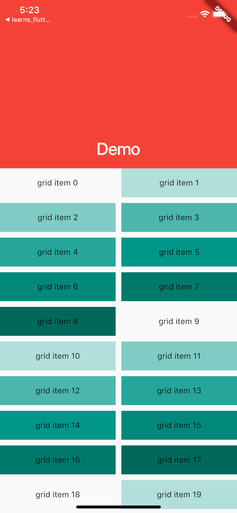
  //例子2

  @override

  Widget build(BuildContext context) {

    return  Scaffold(

      body:CustomScrollView(

        slivers: <Widget>[

          const SliverAppBar(

            pinned: true,

            expandedHeight: 250.0,

            flexibleSpace: FlexibleSpaceBar(

              title: Text('Demo'),

            ),

          ),

          SliverGrid(

            gridDelegate: SliverGridDelegateWithMaxCrossAxisExtent(

              maxCrossAxisExtent: 200.0,

              mainAxisSpacing: 10.0,

              crossAxisSpacing: 10.0,

              childAspectRatio: 4.0,

            ),

            delegate: SliverChildBuilderDelegate(

                  (BuildContext context, int index) {

                return Container(

                  alignment: Alignment.center,

                  color: Colors.teal[100 * (index % 9)],

                  child: Text('grid item $index'),

                );

              },

              childCount: 20,

            ),

          ),

          SliverFixedExtentList(

            itemExtent: 50.0,

            delegate: SliverChildBuilderDelegate(

                  (BuildContext context, int index) {

                return Container(

                  alignment: Alignment.center,

                  color: Colors.lightBlue[100 * (index % 9)],

                  child: Text('list item $index'),

                );

              },

            ),

          ),

        ],

      ),

    );

  }
四,NestedScrollView
- 概述:
NestedScrollView 即 支持嵌套滑动的 ScrollView。
因此,我们可以简单的把 NestedScrollView 类比为 ScrollView,其作用就是作为控件父布局,从而具备(嵌套)滑动功能。
- 与ScrollView的区别
NestedScrollView 与 ScrollView 的区别就在于 NestedScrollView 支持 嵌套滑动,无论是作为父控件还是子控件,嵌套滑动都支持,且默认开启。
因此,在一些需要支持嵌套滑动的情景中,比如一个 ScrollView 内部包裹一个 RecyclerView,那么就会产生滑动冲突,这个问题就需要你自己去解决。而如果使用 NestedScrollView 包裹 RecyclerView,嵌套滑动天然支持,你无需做什么就可以实现前面想要实现的功能了。
- 构造函数
const NestedScrollView({

    Key key,

    this.controller,

    this.scrollDirection = Axis.vertical,

    this.reverse = false,

    this.physics,

    @required this.headerSliverBuilder,

    @required this.body,

    this.dragStartBehavior = DragStartBehavior.start,

  }) : assert(scrollDirection != null),

       assert(reverse != null),

       assert(headerSliverBuilder != null),

       assert(body != null),

super(key: key); - 与NestedScrollView 集成SliverAppBar
@override

  Widget build(BuildContext context) {

    return DefaultTabController(

        length: choices.length,

        child: Scaffold(

            body: NestedScrollView(

              headerSliverBuilder: _headerSliverBuilder,

              body : TabBarView(

                children: choices.map((Choice choice) {

                  return new Padding(

                    padding: const EdgeInsets.all(16.0),

                    child: new ChoiceCard(choice: choice),

                  );

                }).toList(),

              ),

            )

        )

    );

  }
五,完成的例子
- 代码demo
import 'package:flutter/material.dart';

void main() => runApp(MyApp());

class MyApp extends StatelessWidget{

  @override

  Widget build(BuildContext context) {

    return MaterialApp(

      title: 'Text Demo',

      theme: ThemeData(

          primarySwatch: Colors.green

      ),

      home: MyHomePage(title: 'Text Demo'),

    );

  }

}

class MyHomePage extends StatefulWidget {

  MyHomePage({Key key, this.title}) : super(key: key);

  final String title;

  @override

  _MyHomePageState createState() => _MyHomePageState();

}

class _MyHomePageState extends State<MyHomePage>{

  Choice _selectedChoice = choices[0]; // The app's "state".

  void _select(Choice choice) {

    setState(() { // Causes the app to rebuild with the new _selectedChoice.

      _selectedChoice = choice;

    });

  }

  @override

  Widget build(BuildContext context) {

    return DefaultTabController(

        length: choices.length,

        child: Scaffold(

            body: NestedScrollView(

              headerSliverBuilder: _headerSliverBuilder,

              body : TabBarView(

                children: choices.map((Choice choice) {

                  return new Padding(

                    padding: const EdgeInsets.all(16.0),

                    child: new ChoiceCard(choice: choice),

                  );

                }).toList(),

              ),

            )

        )

    );

  }

  List<Widget> _headerSliverBuilder(BuildContext context, bool innerBoxIsScrolled){

    return <Widget>[

    SliverAppBar(

      //1.在标题左侧显示的一个控件,在首页通常显示应用的 logo;在其他界面通常显示为返回按钮

      leading: Icon(_selectedChoice.icon) ,

      //2. ? 控制是否应该尝试暗示前导小部件为null

      automaticallyImplyLeading:true ,

      //3.当前界面的标题文字

      title: Text(_selectedChoice.title ),

      //4.一个 Widget 列表,代表 Toolbar 中所显示的菜单,对于常用的菜单,通常使用 IconButton 来表示;

      //对于不常用的菜单通常使用 PopupMenuButton 来显示为三个点,点击后弹出二级菜单

      actions: <Widget>[

        new IconButton( // action button

          icon: new Icon(choices[0].icon),

          onPressed: () { _select(choices[0]); },

        ),

        new IconButton( // action button

          icon: new Icon(choices[1].icon),

          onPressed: () { _select(choices[1]); },

        ),

        new PopupMenuButton<Choice>( // overflow menu

          onSelected: _select,

          itemBuilder: (BuildContext context) {

            return choices.skip(2).map((Choice choice) {

              return new PopupMenuItem<Choice>(

                value: choice,

                child: new Text(choice.title),

              );

            }).toList();

          },

        )

      ],

      //5.一个显示在 AppBar 下方的控件,高度和 AppBar 高度一样,

      // 可以实现一些特殊的效果,该属性通常在 SliverAppBar 中使用

        flexibleSpace: FlexibleSpaceBar(

          centerTitle: true,

          background: Image(

              image: NetworkImage("https://timgsa.baidu.com/timg?image&quality=80&size=b9999_10000&sec=1551944816841&di=329f747e3f4c2554f24c609fd6f77c49&imgtype=0&src=http%3A%2F%2Fimg.tupianzj.com%2Fuploads%2Fallimg%2F160610%2F9-160610114520.jpg"),

              fit: BoxFit.cover,

          ),

        ),

      //6.一个 AppBarBottomWidget 对象,通常是 TabBar。用来在 Toolbar 标题下面显示一个 Tab 导航栏

      bottom: new TabBar(

        isScrollable: true,

        tabs: choices.map((Choice choice) {

          return new Tab(

            text: choice.title,

            icon: new Icon(choice.icon),

          );

        }).toList(),

      ) ,

      //7.? 材料设计中控件的 z 坐标顺序,默认值为 4,对于可滚动的 SliverAppBar,

      // 当 SliverAppBar 和内容同级的时候,该值为 0, 当内容滚动 SliverAppBar 变为 Toolbar 的时候,修改 elevation 的值

      elevation: 1,

      //APP bar 的颜色,默认值为 ThemeData.primaryColor。改值通常和下面的三个属性一起使用

      backgroundColor: Colors.red,

      //App bar 的亮度,有白色和黑色两种主题,默认值为 ThemeData.primaryColorBrightness

      brightness:Brightness.light ,

      //App bar 上图标的颜色、透明度、和尺寸信息。默认值为 ThemeData().primaryIconTheme

      iconTheme: ThemeData().primaryIconTheme,

      //App bar 上的文字主题。默认值为 ThemeData().primaryTextTheme

      textTheme: ThemeData().accentTextTheme,

      //此应用栏是否显示在屏幕顶部

      primary: true,

      //标题是否居中显示,默认值根据不同的操作系统,显示方式不一样,true居中 false居左

      centerTitle: true,

      //横轴上标题内容 周围的间距

      titleSpacing: NavigationToolbar.kMiddleSpacing,

      //展开高度

      expandedHeight: 200,

      //是否随着滑动隐藏标题

      floating: true,

      //tab 是否固定在顶部

      pinned: true,

      //与floating结合使用

      snap: true,

    )

    ];

  }

//  //例子2

//  @override

//  Widget build(BuildContext context) {

//    return  Scaffold(

//      body:CustomScrollView(

//        slivers: <Widget>[

//          const SliverAppBar(

//            pinned: true,

//            expandedHeight: 250.0,

//            flexibleSpace: FlexibleSpaceBar(

//              title: Text('Demo'),

//            ),

//          ),

//          SliverGrid(

//            gridDelegate: SliverGridDelegateWithMaxCrossAxisExtent(

//              maxCrossAxisExtent: 200.0,

//              mainAxisSpacing: 10.0,

//              crossAxisSpacing: 10.0,

//              childAspectRatio: 4.0,

//            ),

//            delegate: SliverChildBuilderDelegate(

//                  (BuildContext context, int index) {

//                return Container(

//                  alignment: Alignment.center,

//                  color: Colors.teal[100 * (index % 9)],

//                  child: Text('grid item $index'),

//                );

//              },

//              childCount: 20,

//            ),

//          ),

//          SliverFixedExtentList(

//            itemExtent: 50.0,

//            delegate: SliverChildBuilderDelegate(

//                  (BuildContext context, int index) {

//                return Container(

//                  alignment: Alignment.center,

//                  color: Colors.lightBlue[100 * (index % 9)],

//                  child: Text('list item $index'),

//                );

//              },

//            ),

//          ),

//        ],

//      ),

//    );

//  }

}

class Choice {

  const Choice({ this.title, this.icon });

  final String title;

  final IconData icon;

}

const List<Choice> choices = const <Choice>[

  const Choice(title: 'Car', icon: Icons.directions_car),

  const Choice(title: 'Bicycle', icon: Icons.directions_bike),

  const Choice(title: 'Boat', icon: Icons.directions_boat),

  const Choice(title: 'Bus', icon: Icons.directions_bus),

  const Choice(title: 'Train', icon: Icons.directions_railway),

  const Choice(title: 'Walk', icon: Icons.directions_walk),

];

class ChoiceCard extends StatelessWidget {

  const ChoiceCard({ Key key, this.choice }) : super(key: key);

  final Choice choice;

  @override

  Widget build(BuildContext context) {

    final TextStyle textStyle = Theme.of(context).textTheme.display1;

    Widget _itemBuilder(BuildContext context,int index){

      return ListTile(

        leading: Icon(choice.icon),

        title: Text("this is a " + choice.title),

      );

    }

    return new Card(

      color: Colors.white,

      child: Center(

        child: ListView.builder(

            itemBuilder: _itemBuilder,

            itemCount: 30,

        ),

      ),

//          body: Center(

//            child: ListView.builder(

//                itemBuilder: _itemBuilder,

//                itemCount: 100,

//

//            ),

//          )),

//      child: new Center(

//        child: new Column(

//          mainAxisSize: MainAxisSize.min,

//          crossAxisAlignment: CrossAxisAlignment.center,

//          children: <Widget>[

//            new Icon(choice.icon, size: 128.0, color: textStyle.color),

//            new Text(choice.title, style: textStyle),

//          ],

//        ),

//      ),

    );

  }

}
【Flutter学习】页面跳转之SliverAppBar,CustomScrollView,NestedScrollView的使用的更多相关文章
- JavaWeb学习——页面跳转方式
JavaWeb学习——页面跳转方式 摘要:本文主要学习了请求转发和响应重定向,以及两者之间的区别. 请求转发 相关方法 使用HttpServletRequest对象的 getRequestDispat ...
- 【Flutter学习】页面跳转之路由及导航
一,概述 移动应用通常通过成为‘屏幕’或者‘页面’的全屏元素显示其内容,在Flutter中,这些元素统称为路由,它们由导航器Navigator组件管理.导航器管理一组路由Route对象,并提供了管理堆 ...
- Flutter学习六之实现一个带筛选的列表页面
上期实现了一个网络轮播图的效果,自定义了一个轮播图组件,继承自StatefulWidget,我们知道Flutter中并没有像Android中activity的概念.页面见的跳转是通过路由从一个全屏组件 ...
- 微信小程序开发:学习笔记[8]——页面跳转及传参
微信小程序开发:学习笔记[8]——页面跳转及传参 页面跳转 一个小程序拥有多个页面,我们可以通过wx.navigateTo推入一个新的页面.在首页使用2次wx.navigateTo后,页面层级会有三层 ...
- flutter -------- 页面跳转和传值
在安卓原生开发中,页面跳转可以用Intent类来具体实现: Intent intent =new Intent(MainActivity.this,second.class); startActivi ...
- Flutter页面跳转返回数据
Dart中的异步请求和等待和ES6中的方法很像,直接使用async...await就可以实现. 核心代码: _navigateToAddress(BuildContext context) async ...
- 【Flutter学习】页面布局之列表和表格处理
一,概述 Flutter中拥有30多种预定义的布局widget,常用的有Container.Padding.Center.Flex.Row.Colum.ListView.GridView.按照< ...
- android 学习第一天 了解事件机制,页面跳转等常用操作
点击时间2种 第一种,通过初始化页面 写入点击事件 protected void onCreate(Bundle savedInstanceState) { super.onCreate(savedI ...
- Android+Jquery Mobile学习系列(4)-页面跳转及参数传递
关于页面转场,这个必须得专门列出来说明一下,因为Jquery Mobile与普通的Web发开有一些区别,这个对于新手如果不了解的话,就会钻到死胡同.撸主前段时间就是很急躁地上手开发程序,结果在页面转场 ...
随机推荐
- webpack对icon-font图片的处理
一.对图片的处理 安装url-loader 然后再loaderli配置这样会把图片打包成base64格式 { test: /\.(gif|png|jpg)\??.*$/, loader: 'url-l ...
- bugku | 你从哪里来
题目链接 之前一直以为要用x-forwarded-for ,谁道用的是referer,Orz.在此特地记录,x-forwarded-for 和 referer的区别 X-Forwarded-For(X ...
- Redis的高级特性一览
更多内容,欢迎关注微信公众号:全菜工程师小辉.公众号回复关键词,领取免费学习资料. 应用场景 缓存系统:用于缓解数据库的高并发压力 计数器:使用Redis原子操作,用于社交网络的转发数,评论数,粉丝数 ...
- Windows下使用Composer安装yii2
Composer简介 Composer 是PHP中用来管理依赖(dependency)关系的工具.你可以在自己的项目中声明所依赖的外部工具库(libraries),Composer会帮你安装这些依赖的 ...
- java常用排序
1.冒泡排序 public static int[] bubble(int[] a){ for(int i=0;i<a.length-1;i++){ int tmp=0; for(int j=0 ...
- python 装饰器 第五步(2):带有返回值得装饰器
#第五步:带有返回值的装饰器 把第四步复制过来 #用于扩展基本函数的函数 def kuozhan(func): #内部函数(扩展之后的eat函数) def neweat(): #以下三步就是扩展之后的 ...
- 关于列表倒序输出的几种方法——python第7天
项目:将列表li1 = [1, 6, 4, 3, 7, 9]倒序输出为[9, 7, 6, 4, 3, 1] li2 = ['a', 'm', 's', 'g']倒序输出为['g', 's', 'm', ...
- jmeter工作原理介绍,以及常见错误
JMeter结果树响应数据中文乱码解决办法 打开jmeter配置文件搜索encoding修改编码格式改为utf-8 Jmeter服务器反馈登陆不成功问题 导入到JMeter后,执行场景,发现登录校验成 ...
- 哈希算法和字典类的定义,DataSet中数据遍历的几种方法
哈希算法的基本操作: 1. 哈希表(HashTable)简述 在.NET Framework中,Hashtable是System.Collections命名空间提供的一个容器,用于处理和表现类似 ...
- C# 笔记 获取程序当前目录
在C#中,我们有以下几种方式获取程序当前目录: Console.WriteLine(System.IO.Path.GetDirectoryName(Assembly.GetExecutingAssem ...